Overview Component in Angular Diagram Component
7 Jul 202617 minutes to read
The Overview component provides a miniature preview of the entire diagram content, enabling efficient navigation and viewport management for large diagrams. This component displays a scaled-down version of the diagram with a highlighted rectangle representing the current viewport, allowing users to quickly navigate to specific areas without manual zooming and panning.
When to Use Overview
The Overview component is essential when working with:
- Large diagrams that exceed the visible viewport
- Complex flowcharts or organizational charts requiring frequent navigation
- Multi-section diagrams where users need to jump between different areas
- Applications where users need spatial awareness of their current position within the diagram
Create Overview Component
To implement an overview, configure the sourceID property to reference the target diagram’s identifier. This establishes the connection between the overview and the main diagram.
Define the overview dimensions using the width and height properties to ensure optimal visibility and performance.
The following code demonstrates basic overview implementation:
import { DiagramComponent, SnapSettingsModel, DiagramModule, OverviewModule, DataBindingService, HierarchicalTreeService, ScrollSettingsModel, SnapConstraints } from '@syncfusion/ej2-angular-diagrams'
import { Component, ViewEncapsulation, ViewChild } from '@angular/core';


@Component({
imports: [
         DiagramModule, OverviewModule
    ],

providers: [DataBindingService, HierarchicalTreeService],
standalone: true,
    selector: "app-container",
    template: ` <div id="container" style="width: 100%; display: flex">
     <div id="element" style="flex: 7"><ejs-diagram #diagram id="diagram" width="100%" height="790px" [scrollSettings]="scrollSettings" [snapSettings]="snapSettings" >
     <e-nodes>
            <e-node id='node1' [offsetX]=400 [offsetY]=400 [height]=100  [width]=200  ></e-node>
        </e-nodes>
    </ejs-diagram>
    </div>
   <div style="flex: 3;height: 250px;padding: 0px;right: 30px;bottom: 20px;border: #eeeeee;border-style: solid;box-shadow: 0px 2px 2px rgba(0, 0, 0, 0.3);
background: #f7f7f7;">
    <ejs-overview id="overview"  width= '300px'
  height= '150ppx' sourceID="diagram" >
        </ejs-overview>
</div>

</div>`,
    encapsulation: ViewEncapsulation.None
})
export class AppComponent {
    @ViewChild("diagram")
    public diagram?: DiagramComponent;
    public scrollSettings?: ScrollSettingsModel;
    public snapSettings?: SnapSettingsModel;
    //Initializes data
    ngOnInit(): void {
        this.scrollSettings = {
            scrollLimit: 'Diagram',

        }
        this.snapSettings = {
            constraints: SnapConstraints.None
        }
    }

}
import { bootstrapApplication } from '@angular/platform-browser';
import { AppComponent } from './app.component';
import 'zone.js';
bootstrapApplication(AppComponent).catch((err) => console.error(err));Overview Interactions
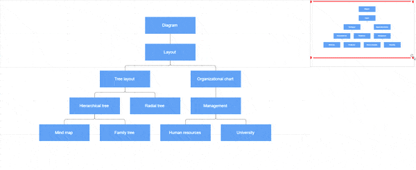
The overview displays the current viewport as a red rectangle overlay. This rectangle serves as an interactive control for diagram navigation and zoom operations.
Available Interactions
- Resize the rectangle: Adjusts diagram zoom level proportionally
- Drag the rectangle: Pans the diagram to follow rectangle movement
- Click on a position: Instantly navigates to the clicked location
- Click and drag selection: Defines a specific region for navigation and zoom
Interactive Navigation Example
import { Component, ViewEncapsulation, ViewChild } from '@angular/core';
import { DiagramComponent, Diagram, NodeModel, ConnectorModel, SnapSettingsModel, LayoutModel, DataSourceModel, TextModel, DecoratorModel, ShapeStyleModel, DiagramModule, OverviewModule, DataBindingService, HierarchicalTreeService  } from '@syncfusion/ej2-angular-diagrams';
import { DataManager, Query } from '@syncfusion/ej2-data';

@Component({
imports: [
         DiagramModule, OverviewModule
    ],

providers: [DataBindingService, HierarchicalTreeService],
standalone: true,
    selector: "app-container",
    template: `<div><ejs-diagram #diagram id="diagram" width="100%" height="580px" [getNodeDefaults]="getNodeDefaults" [getConnectorDefaults]="getConnectorDefaults" [snapSettings]="snapSettings" [layout]="layout" [dataSourceSettings]="dataSourceSettings">
    </ejs-diagram></div>
    <div style=" width:50%; height: 200px padding:0px;right:5px;bottom:5px;background:#f7f7f7;position:absolute">
    <ejs-overview id="overview" width="100%" sourceID="diagram">
        </ejs-overview>
        </div>`,
    encapsulation: ViewEncapsulation.None
})
export class AppComponent {
    @ViewChild("diagram")
    public diagram?: DiagramComponent;
    public snapSettings?: SnapSettingsModel;
    public items?: DataManager;
    public layout?: LayoutModel;
    public dataSourceSettings?: DataSourceModel;
    //Initializes data source
    public data: object[] = [{
            Id: "parent",
            Role: "Project Management"
        },
        {
            Id: 1,
            Role: "R&D Team",
            Team: "parent"
        },
        {
            Id: 3,
            Role: "Philosophy",
            Team: "1"
        },
        {
            Id: 4,
            Role: "Organization",
            Team: "1"
        },
        {
            Id: 5,
            Role: "Technology",
            Team: "1"
        },
        {
            Id: 7,
            Role: "Funding",
            Team: "1"
        },
        {
            Id: 8,
            Role: "Resource Allocation",
            Team: "1"
        },
        {
            Id: 9,
            Role: "Targeting",
            Team: "1"
        },
        {
            Id: 11,
            Role: "Evaluation",
            Team: "1"
        },
        {
            Id: 156,
            Role: "HR Team",
            Team: "parent"
        },
        {
            Id: 13,
            Role: "Recruitment",
            Team: "156"
        },
        {
            Id: 113,
            Role: "Training",
            Team: "12"
        },
        {
            Id: 112,
            Role: "Employee Relation",
            Team: "156"
        },
        {
            Id: 14,
            Role: "Record Keeping",
            Team: "12"
        },
        {
            Id: 15,
            Role: "Compensations & Benefits",
            Team: "12"
        },
        {
            Id: 16,
            Role: "Compliances",
            Team: "12"
        },
        {
            Id: 17,
            Role: "Production & Sales Team",
            Team: "parent"
        },
        {
            Id: 119,
            Role: "Design",
            Team: "17"
        },
        {
            Id: 19,
            Role: "Operation",
            Team: "17"
        },
        {
            Id: 20,
            Role: "Support",
            Team: "17"
        },
        {
            Id: 21,
            Role: "Quality Assurance",
            Team: "17"
        },
        {
            Id: 23,
            Role: "Customer Interaction",
            Team: "17"
        },
        {
            Id: 24,
            Role: "Support and Maintenance",
            Team: "17"
        },
        {
            Id: 25,
            Role: "Task Coordination",
            Team: "17"
        }
    ];
    //Sets the default properties for all the Nodes
    public getNodeDefaults(obj: NodeModel, diagram: Diagram): NodeModel {
        obj.shape = {
            type: 'Text',
            content: (obj.data as {
                Role: 'string'
            }).Role
        };
        obj.style = {
            fill: 'None',
            strokeColor: 'none',
            strokeWidth: 2,
            bold: true,
            color: 'white'
        };
        obj.borderColor = 'white';
        obj.backgroundColor = '#6BA5D7';
        obj.borderWidth = 1;
        obj.width = 75;
        obj.height = 40;
        (obj.shape as TextModel).margin = {
            left: 5,
            right: 5,
            top: 5,
            bottom: 5
        };
        return obj;
    }
    //Sets the default properties for all the connectors
    public getConnectorDefaults(connector: ConnectorModel, diagram: Diagram): ConnectorModel {
        connector.style = {
            strokeColor: '#6BA5D7',
            strokeWidth: 2
        };
        (((connector as ConnectorModel).targetDecorator as DecoratorModel).style as ShapeStyleModel).fill = '#6BA5D7';
        (((connector as ConnectorModel).targetDecorator as DecoratorModel).style as ShapeStyleModel).strokeColor = '#6BA5D7';
        connector.type = 'Orthogonal';
        return connector;
    }
    ngOnInit(): void {
        this.snapSettings = {
            constraints: 0
        }
        this.items = new DataManager(this.data as JSON[], new Query().take(5));
        //Uses layout to auto-arrange nodes on the Diagram page
        this.layout = {
            //set the type as Organizational Chart
            type: 'OrganizationalChart'
        }
        //Configures data source for Diagram
        this.dataSourceSettings = {
            id: 'Id',
            parentId: 'Team',
            dataSource: this.items
        }
    }
}
import { bootstrapApplication } from '@angular/platform-browser';
import { AppComponent } from './app.component';
import 'zone.js';
bootstrapApplication(AppComponent).catch((err) => console.error(err));The following demonstration shows overview interaction capabilities: