User Handle in Angular Diagram Component
7 Jul 202624 minutes to read
User handles are interactive UI elements that provide quick access to frequently used commands around selected diagram elements. They appear as customizable icons positioned around nodes and connectors, enabling users to perform actions like cloning, deleting, or editing without accessing traditional menus or toolbars.
The Angular Diagram component supports two types of user handles:
- User handles: Appear when elements are selected and are defined globally for all selected items
- Fixed user handles: Permanently visible on specific nodes or connectors, regardless of selection state
Create user handle
To create user handles, define and add them to the userHandles collection of the selectedItems property. The name property of userHandles is used to define the name of the user handle, which can then be used at runtime for identification and customization. The pathData property is used to define the SVG path data that determines the visual appearance of the user handle icon.
The following example shows how to render user handle.
import { Component, ViewEncapsulation, ViewChild } from '@angular/core';
import { DiagramComponent, DiagramModule, UserHandleModel, SelectorModel } from '@syncfusion/ej2-angular-diagrams';

@Component({
    imports: [
        DiagramModule
    ],
    standalone: true,
  selector: 'app-container',

  template: `
    <ejs-diagram #diagram id="diagram" width="100%" height="600px" [selectedItems]='selectedItems'>
      <e-nodes>
        <e-node id='node1' [offsetX]=100 [offsetY]=100 [height]=100 [width]= 100></e-node>
      </e-nodes>
    </ejs-diagram>
  `,
  encapsulation: ViewEncapsulation.None,
})
export class AppComponent {
  @ViewChild('diagram')
   public diagram?: DiagramComponent;

  public userHandles: UserHandleModel[] = [
    {
      name: 'copy',
      pathData: 'M0,3.42 L1.36,3.42 L1.36,12.39 L9.62,12.39 L9.62,13.75 L1.36,13.75 C0.97,13.75,0.65,13.62,0.39,13.36 C0.13,13.1,0,12.78,0,12.39 Z M4.13,0 L12.39,0 C12.78,0,13.1,0.13,13.36,0.39 C13.62,0.65,13.75,0.97,13.75,1.36 L13.75,9.62 C13.75,10.01,13.62,10.33,13.36,10.6 C13.1,10.87,12.78,11.01,12.39,11.01 L4.13,11.01 C3.72,11.01,3.39,10.87,3.13,10.6 C2.87,10.33,2.74,10.01,2.74,9.62 L2.74,1.36 C2.74,0.97,2.87,0.65,3.13,0.39 C3.39,0.13,3.72,0,4.13,0 Z ',

    }
  ];

  public selectedItems: SelectorModel = {
    userHandles: this.userHandles
  };

}
import { bootstrapApplication } from '@angular/platform-browser';
import { AppComponent } from './app.component';
import 'zone.js';
bootstrapApplication(AppComponent).catch((err) => console.error(err));Customize user handle click
When a user handle is clicked, the onUserHandleMouseDown event allows identification of which user handle was clicked using the name property. Based on this name, diagram elements can be customized accordingly. Several events are triggered while interacting with a user handle. In the following example, the onUserHandleMouseDown event is used to clone nodes on user handle click.
import { Component, ViewEncapsulation, ViewChild } from '@angular/core';
import { DiagramComponent, UserHandleModel, SelectorModel, DiagramModule, UserHandleEventsArgs } from '@syncfusion/ej2-angular-diagrams';

@Component({
    imports: [
        DiagramModule
    ],
    standalone: true,
  selector: 'app-container',

  template: `
    <ejs-diagram #diagram id="diagram" width="100%" height="600px" [selectedItems]='selectedItems' (onUserHandleMouseDown) = "onUserHandleMouseDown($event)">
      <e-nodes>
        <e-node id='node1' [offsetX]=100 [offsetY]=100 [height]=100 [width]= 100 ></e-node>
      </e-nodes>
    </ejs-diagram>
  `,
  encapsulation: ViewEncapsulation.None,
})
export class AppComponent {
  @ViewChild('diagram')
   public diagram?: DiagramComponent;

  public userHandles: UserHandleModel[] = [
    {
      name: 'clone',
      pathData: 'M0,3.42 L1.36,3.42 L1.36,12.39 L9.62,12.39 L9.62,13.75 L1.36,13.75 C0.97,13.75,0.65,13.62,0.39,13.36 C0.13,13.1,0,12.78,0,12.39 Z M4.13,0 L12.39,0 C12.78,0,13.1,0.13,13.36,0.39 C13.62,0.65,13.75,0.97,13.75,1.36 L13.75,9.62 C13.75,10.01,13.62,10.33,13.36,10.6 C13.1,10.87,12.78,11.01,12.39,11.01 L4.13,11.01 C3.72,11.01,3.39,10.87,3.13,10.6 C2.87,10.33,2.74,10.01,2.74,9.62 L2.74,1.36 C2.74,0.97,2.87,0.65,3.13,0.39 C3.39,0.13,3.72,0,4.13,0 Z ',

    }
  ];
//Define user handles in selectedItems property
  public selectedItems: SelectorModel = {
    userHandles: this.userHandles
  };

  public onUserHandleMouseDown(args: UserHandleEventsArgs)
  {
    if (args.element) {
        //To clone the selected node
        ((this.diagram)as DiagramComponent).copy();
        ((this.diagram)as DiagramComponent).paste();
      }
  };

}
import { bootstrapApplication } from '@angular/platform-browser';
import { AppComponent } from './app.component';
import 'zone.js';
bootstrapApplication(AppComponent).catch((err) => console.error(err));Alignment
User handles can be precisely positioned relative to node boundaries using alignment properties. The positioning system provides margin, offset, side, horizontalAlignment, and verticalAlignment properties to align user handles based on specific requirements.
Offset
The offset property of userHandles aligns the user handle based on fractional coordinates. For example, 0 represents the top-left corner, 1 represents the top-right corner, and 0.5 represents the top-center position.
Side
The side property of userHandles aligns the user handle using the following options: Top, Bottom, Left, and Right.
Horizontal and vertical alignments
The horizontalAlignment property of userHandles determines how the user handle is horizontally aligned at the position based on the offset. The verticalAlignment property determines how user handle is vertically aligned at the position.
Margin for the user handle
The margin property adds blank space to any of the four sides of the user handle, providing precise displacement from the calculated position.
In the following example, the user handle is aligned to the bottom-right corner of the node.
import { Component, ViewEncapsulation, ViewChild } from '@angular/core';
import { DiagramComponent, UserHandleModel, SelectorModel, DiagramModule, UserHandleEventsArgs } from '@syncfusion/ej2-angular-diagrams';

@Component({
    imports: [
        DiagramModule
    ],
    standalone: true,
  selector: 'app-container',

  template: `
    <ejs-diagram #diagram id="diagram" width="100%" height="600px" [selectedItems]='selectedItems' (onUserHandleMouseDown) = "onUserHandleMouseDown($event)">
      <e-nodes>
        <e-node id='node1' [offsetX]=100 [offsetY]=100 [height]=100 [width]= 100 ></e-node>
      </e-nodes>
    </ejs-diagram>
  `,
  encapsulation: ViewEncapsulation.None,
})
export class AppComponent {
  @ViewChild('diagram')
   public diagram?: DiagramComponent;

  public userHandles: UserHandleModel[] = [
    {
      name: 'clone',
      pathData: 'M0,3.42 L1.36,3.42 L1.36,12.39 L9.62,12.39 L9.62,13.75 L1.36,13.75 C0.97,13.75,0.65,13.62,0.39,13.36 C0.13,13.1,0,12.78,0,12.39 Z M4.13,0 L12.39,0 C12.78,0,13.1,0.13,13.36,0.39 C13.62,0.65,13.75,0.97,13.75,1.36 L13.75,9.62 C13.75,10.01,13.62,10.33,13.36,10.6 C13.1,10.87,12.78,11.01,12.39,11.01 L4.13,11.01 C3.72,11.01,3.39,10.87,3.13,10.6 C2.87,10.33,2.74,10.01,2.74,9.62 L2.74,1.36 C2.74,0.97,2.87,0.65,3.13,0.39 C3.39,0.13,3.72,0,4.13,0 Z ',
      //Alignment options
      offset: 1,
      side: 'Bottom',
      horizontalAlignment: 'Left',
      verticalAlignment: 'Bottom',
      margin: { left: 5, bottom: 10 },

    }
  ];
//Define user handles in selectedItems property
  public selectedItems: SelectorModel = {
    userHandles: this.userHandles
  };

  public onUserHandleMouseDown(args: UserHandleEventsArgs)
  {
    if (args.element) {
        //To clone the selected node
        ((this.diagram)as DiagramComponent).copy();
        ((this.diagram)as DiagramComponent).paste();
      }
  };

}
import { bootstrapApplication } from '@angular/platform-browser';
import { AppComponent } from './app.component';
import 'zone.js';
bootstrapApplication(AppComponent).catch((err) => console.error(err));The following table shows all the possible alignments of user handle around the node.
| Offset | side | Output |
|---|---|---|
| 0 | Left | 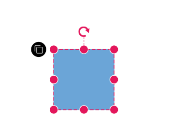 |
| 0 | Right | 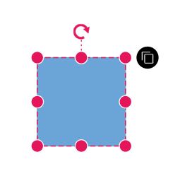 |
| 0 | Top | 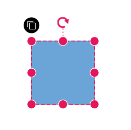 |
| 0 | Bottom | 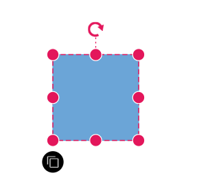 |
| 1 | Left | 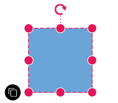 |
| 1 | Right | 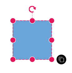 |
| 1 | Top | 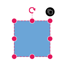 |
| 1 | Bottom | 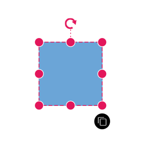 |
User handle tooltip
The diagram provides support to show a tooltip when the mouse hovers over any user handle. To display the tooltip on mouse hover, set the tooltip property of the user handle with the tooltip content as shown in the following example.
import { Component, ViewEncapsulation, ViewChild } from '@angular/core';
import { DiagramComponent, UserHandleModel, SelectorModel, DiagramModule, UserHandleEventsArgs } from '@syncfusion/ej2-angular-diagrams';

@Component({
    imports: [
        DiagramModule
    ],
    standalone: true,
  selector: 'app-container',

  template: `
    <ejs-diagram #diagram id="diagram" width="100%" height="600px" [selectedItems]='selectedItems' (onUserHandleMouseDown) = "onUserHandleMouseDown($event)">
      <e-nodes>
        <e-node id='node1' [offsetX]=200 [offsetY]=200 [height]=100 [width]= 100 ></e-node>
      </e-nodes>
    </ejs-diagram>
  `,
  encapsulation: ViewEncapsulation.None,
})
export class AppComponent {
  @ViewChild('diagram')
   public diagram?: DiagramComponent;

  public userHandles: UserHandleModel[] = [
    {
      name: 'clone',
      pathData: 'M0,3.42 L1.36,3.42 L1.36,12.39 L9.62,12.39 L9.62,13.75 L1.36,13.75 C0.97,13.75,0.65,13.62,0.39,13.36 C0.13,13.1,0,12.78,0,12.39 Z M4.13,0 L12.39,0 C12.78,0,13.1,0.13,13.36,0.39 C13.62,0.65,13.75,0.97,13.75,1.36 L13.75,9.62 C13.75,10.01,13.62,10.33,13.36,10.6 C13.1,10.87,12.78,11.01,12.39,11.01 L4.13,11.01 C3.72,11.01,3.39,10.87,3.13,10.6 C2.87,10.33,2.74,10.01,2.74,9.62 L2.74,1.36 C2.74,0.97,2.87,0.65,3.13,0.39 C3.39,0.13,3.72,0,4.13,0 Z ',
      offset: 1,
      //Sets tooltip for user handle
      tooltip: { content: 'Clone Node' },

    }
  ];
//Define user handles in selectedItems property
  public selectedItems: SelectorModel = {
    userHandles: this.userHandles
  };

  public onUserHandleMouseDown(args: UserHandleEventsArgs)
  {
    if (args.element) {
        //To clone the selected node
        (this.diagram as DiagramComponent).copy();
        (this.diagram as DiagramComponent).paste();
      }
  };

}
import { bootstrapApplication } from '@angular/platform-browser';
import { AppComponent } from './app.component';
import 'zone.js';
bootstrapApplication(AppComponent).catch((err) => console.error(err));Additional tooltip properties can be customized, such as position, width, height, etc. For more information refer to the tooltip section.
Appearance
The appearance of user handles can be customized using the size, borderColor, backgroundColor, borderWidth, visible, and pathColor properties of the userHandles.
The following example demonstrates how to use these properties to customize the appearance of user handle.
import { Component, ViewEncapsulation, ViewChild } from '@angular/core';
import { DiagramComponent, UserHandleModel, SelectorModel, DiagramModule, UserHandleEventsArgs } from '@syncfusion/ej2-angular-diagrams';

@Component({
    imports: [
        DiagramModule
    ],
    providers: [ ],
    standalone: true,
    selector: 'app-container',

  template: `
    <ejs-diagram #diagram id="diagram" width="100%" height="600px" [selectedItems]='selectedItems' (onUserHandleMouseDown) = "onUserHandleMouseDown($event)">
      <e-nodes>
        <e-node id='node1' [offsetX]=200 [offsetY]=200 [height]=100 [width]= 100 ></e-node>
      </e-nodes>
    </ejs-diagram>
  `,
  encapsulation: ViewEncapsulation.None,
})
export class AppComponent {
  @ViewChild('diagram')
   public diagram?: DiagramComponent;

  public userHandles: UserHandleModel[] = [
    {
        name: 'clone',
        pathData:
          'M0,3.42 L1.36,3.42 L1.36,12.39 L9.62,12.39 L9.62,13.75 L1.36,13.75 C0.97,13.75,0.65,13.62,0.39,13.36 C0.13,13.1,0,12.78,0,12.39 Z M4.13,0 L12.39,0 C12.78,0,13.1,0.13,13.36,0.39 C13.62,0.65,13.75,0.97,13.75,1.36 L13.75,9.62 C13.75,10.01,13.62,10.33,13.36,10.6 C13.1,10.87,12.78,11.01,12.39,11.01 L4.13,11.01 C3.72,11.01,3.39,10.87,3.13,10.6 C2.87,10.33,2.74,10.01,2.74,9.62 L2.74,1.36 C2.74,0.97,2.87,0.65,3.13,0.39 C3.39,0.13,3.72,0,4.13,0 Z ',
        offset: 1,
        //Sets the border width of user handle
        borderWidth: 5,
        //Sets the border color of user handle
        borderColor: '#64Abbb',
        //Sets the background color of user handle
        backgroundColor: 'yellow',
        //Sets the path data color of user handle
        pathColor: 'green',
        //Sets the size of user handle
        size: 40,
        //Sets the visibility of user handle
        visible: true,

    }
  ];
//Define user handles in selectedItems property
  public selectedItems: SelectorModel = {
    userHandles: this.userHandles
  };

  public onUserHandleMouseDown(args: UserHandleEventsArgs)
  {
    if (args.element) {
        //To clone the selected node
        (this.diagram as DiagramComponent).copy();
        (this.diagram as DiagramComponent).paste();
      }
  };

}
import { bootstrapApplication } from '@angular/platform-browser';
import { AppComponent } from './app.component';
import 'zone.js';
bootstrapApplication(AppComponent).catch((err) => console.error(err));Multiple user handles
Multiple user handles can be rendered for the selected objects (nodes/connectors) simultaneously to perform different operations on the same element.
Disable nodes and disable connectors
User handles are typically defined within the selectedItems property of the diagram, applying them universally to both nodes and connectors. However, in some scenarios, specific user handles may need to be excluded from connectors or nodes selectively. To address this requirement, the disableNodes and disableConnectors properties are available. These properties allow certain user handles to be disabled based on the type of selected item.
In the example below, multiple user handles are utilized for various functionalities, with some handles hidden selectively for nodes or connectors depending on their intended functionality.
import { Diagram, DiagramModule, PointModel, UserHandleEventsArgs, DiagramComponent, UserHandleModel, SelectorModel } from '@syncfusion/ej2-angular-diagrams';
import { Component, ViewEncapsulation, ViewChild } from '@angular/core';


@Component({
  imports: [DiagramModule],
  providers: [],
  standalone: true,
  selector: 'app-container',

  template: `
    <ejs-diagram #diagram id="diagram" width="100%" height="600px" [selectedItems]='selectedItems' (onUserHandleMouseDown) = "onUserHandleMouseDown($event)">
      <e-nodes>
        <e-node id='node1' [offsetX]=300 [offsetY]=300 [height]=100 [width]= 100 ></e-node>
      </e-nodes>
      <e-connectors>
            <e-connector id='connector' type='Orthogonal' [sourcePoint]='sourcePoint1' [targetPoint]='targetPoint1'></e-connector>
        </e-connectors>
    </ejs-diagram>
  `,
  encapsulation: ViewEncapsulation.None,
})
export class AppComponent {
  @ViewChild('diagram')
  public diagram?: DiagramComponent;
  public sourcePoint1?: PointModel;
  public targetPoint1?: PointModel;
  ngOnInit(): void {
    this.sourcePoint1 = { x: 100, y: 100 };
    this.targetPoint1 = { x: 300, y: 200 };
  }
  public userHandles: UserHandleModel[] = [
    {
      name: 'clone',
      pathData:
        'M0,3.42 L1.36,3.42 L1.36,12.39 L9.62,12.39 L9.62,13.75 L1.36,13.75 C0.97,13.75,0.65,13.62,0.39,13.36 C0.13,13.1,0,12.78,0,12.39 Z M4.13,0 L12.39,0 C12.78,0,13.1,0.13,13.36,0.39 C13.62,0.65,13.75,0.97,13.75,1.36 L13.75,9.62 C13.75,10.01,13.62,10.33,13.36,10.6 C13.1,10.87,12.78,11.01,12.39,11.01 L4.13,11.01 C3.72,11.01,3.39,10.87,3.13,10.6 C2.87,10.33,2.74,10.01,2.74,9.62 L2.74,1.36 C2.74,0.97,2.87,0.65,3.13,0.39 C3.39,0.13,3.72,0,4.13,0 Z ',
      tooltip: { content: 'Clone' },
      offset: 1,
      side: 'Bottom',
    },
    {
      name: 'delete',
      pathData:
        'M0.97,3.04 L12.78,3.04 L12.78,12.21 C12.78,12.64,12.59,13,12.2,13.3 C11.82,13.6,11.35,13.75,10.8,13.75 L2.95,13.75 C2.4,13.75,1.93,13.6,1.55,13.3 C1.16,13,0.97,12.64,0.97,12.21 Z M4.43,0 L9.32,0 L10.34,0.75 L13.75,0.75 L13.75,2.29 L0,2.29 L0,0.75 L3.41,0.75 Z ',
      tooltip: { content: 'Delete' },
      offset: 0,
      side: 'Bottom',
    },
    {
      name: 'star',
      pathData:
        'M50,5 63,37 100,37 70,60 82,92 50,75 18,92 30,60 0,37 37,37z    ',
      tooltip: { content: 'Star' },
      offset: 0,
      side: 'Top',
      disableConnectors: true,
    },
    {
      name: 'triangle',
      pathData: 'M2,8 L5,2 L8,8 L2,8, z',
      tooltip: { content: 'Triangle' },
      offset: 1,
      side: 'Top',
      disableConnectors: true,
    },
    {
      name: 'rectangle',
      pathData: 'M10,10 L90,10 L90,90 L10,90 Z',
      tooltip: { content: 'Rectangle' },
      offset: 0.5,
      side: 'Left',
      disableConnectors: true,
    },
    {
      name: 'triangle',
      pathData: 'M2,8 L5,2 L8,8 L2,8, z',
      tooltip: { content: 'Triangle' },
      offset: 1,
      side: 'Top',
      disableConnectors: true,
    },
    {
      name: 'changeConnectorType',
      pathData:
        'M6.09,0 L13.75,6.88 L6.09,13.75 L6.09,9.64 L0,9.64 L0,4.11 L6.09,4.11 Z ',
      tooltip: { content: 'Change Connector Type' },
      offset: 0.7,
      side: 'Bottom',
      disableNodes: true,
    },
  ];
  //Define user handles in selectedItems property
  public selectedItems: SelectorModel = {
    userHandles: this.userHandles,
  };

  public onUserHandleMouseDown(args: UserHandleEventsArgs) {
    if (args.element) {
      switch (args.element.name) {
        // To clone the selected node
        case 'clone':
          this.diagram?.copy();
          this.diagram?.paste();
          break;
        case 'delete':
          this.diagram?.remove();
          break;
        case 'star':
        case 'rectangle':
        case 'triangle':
          ((this.diagram as Diagram).selectedItems as any).nodes[0].shape = {
            type: 'Basic',
            shape: (args.element.tooltip as any).content,
          }
          this.diagram?.dataBind();

          break;
        case 'changeConnectorType':
          ((this.diagram as Diagram).selectedItems as any).connectors[0].type =
            ((this.diagram as Diagram).selectedItems as any).connectors[0]
              .type === 'Orthogonal'
              ? 'Straight'
              : ((this.diagram as Diagram).selectedItems as any).connectors[0]
                  .type === 'Straight'
              ? 'Bezier'
              : 'Orthogonal';
          this.diagram?.dataBind();
          break;
      }
    }
  }
}
import { bootstrapApplication } from '@angular/platform-browser';
import { AppComponent } from './app.component';
import 'zone.js';
bootstrapApplication(AppComponent).catch((err) => console.error(err));Different types of user handles
The diagram provides support to render different types of user handles based on the content source:
-
Source: Renders an image as a user handle using an image source URL. -
Content: Renders a user handle using SVG content markup. -
pathData: Renders a user handle using custom SVG path data. -
template: Renders a user handle using a predefined template (userHandleTemplate) defined in the diagram.
The precedence order for user handles is as follows:
- pathData
- Content
- Source
- userHandleTemplate
This means that if multiple options are specified for the same user handle, the one with higher precedence will be rendered.
The below example code demonstrates different types of user handles.
import { DiagramModule,  } from '@syncfusion/ej2-angular-diagrams';
import { Component, ViewEncapsulation, ViewChild } from '@angular/core';
import { DiagramComponent, UserHandleModel, SelectorModel } from '@syncfusion/ej2-angular-diagrams';

@Component({
    imports: [
        DiagramModule
    ],
    providers: [ ],
    standalone: true,
    selector: 'app-container',

  template: `
    <ejs-diagram #diagram id="diagram" width="100%" height="600px" [selectedItems]='selectedItems'  >
      <e-nodes>
        <e-node id='node1' [offsetX]=200 [offsetY]=200 [height]=100 [width]= 100 ></e-node>
      </e-nodes>
      <ng-template #userHandleTemplate >
            <input id="colorPicker" type="color"  value="#008000"/>
      </ng-template>
    </ejs-diagram>
  `,
  encapsulation: ViewEncapsulation.None,
})
export class AppComponent {
  @ViewChild('diagram')
   public diagram?: DiagramComponent;

  public userHandles: UserHandleModel[] = [
    {
      name: 'handle1',
      pathData:
        'M0,3.42 L1.36,3.42 L1.36,12.39 L9.62,12.39 L9.62,13.75 L1.36,13.75 C0.97,13.75,0.65,13.62,0.39,13.36 C0.13,13.1,0,12.78,0,12.39 Z M4.13,0 L12.39,0 C12.78,0,13.1,0.13,13.36,0.39 C13.62,0.65,13.75,0.97,13.75,1.36 L13.75,9.62 C13.75,10.01,13.62,10.33,13.36,10.6 C13.1,10.87,12.78,11.01,12.39,11.01 L4.13,11.01 C3.72,11.01,3.39,10.87,3.13,10.6 C2.87,10.33,2.74,10.01,2.74,9.62 L2.74,1.36 C2.74,0.97,2.87,0.65,3.13,0.39 C3.39,0.13,3.72,0,4.13,0 Z ',
      tooltip: { content: 'Path data user handle' },
      offset: 1,
      side: 'Bottom',
    },
    {
      name: 'handle2',
      source:
        'data:image/png;base64,iVBORw0KGgoAAAANSUhEUgAAAOEAAADhCAMAAAAJbSJIAAAAulBMVEUQpxH///9Qt0gAoAAAowD7/fv2/PYAqQAIpAlJs0Dm9OZRtklowGLh9OEiqSPe895exF/I7Mk4rzhwx3HS7tLx+vGAyoFYu1hlvmU6tzs/tz8yri5PvEdSt0oArQBcvV3W7NRPvUek2qCT1I6/4ryDz3214LFfwleu3qqa1JZXv09PwEVyyWzL68uB0IGt3a2K04p9x3kAmABeul4nsyg1qzVvw2+V1pW337UbsBxQtVAxtzEzrjCN1I0hiyvlAAANX0lEQVR4nO2dfXuiOhOHgQpZQBetYlcbXVEURXx7Tk/V7fb7f60noFXEBIIECL3O79rdP6xruZ1kZpJMEkHMV7KsaEZrNp50p179ZTAYSOjvS917707Gs9ZIU2Q55ycQcvtkxdQMe7z1HLXfXy6XFoTSVRBa6LX+s+p427FtaKaSG2g+hGZjZC+mdaguLSsA842HpEuXf8+v+KjPanO6sEcNM5dnYU8oNzqHveeqMDCafvqjS/dCL+pnXmhB1fX2h1WDvSkZE8qjw2LqQIQn4aAIClgh+l/OdHEYMYZkSmhsush49GQRTt+YyJTdjcHyodgRmrOd48JEjgRj6n6TdXYzdn2SEaHc6cKlJV06VhY7+pBLOO0waq0sCBVtVu8vJf3sVrLLN6XVr880hcHTZSc0R2OnD6UBC7SQBqi1voxH2VtrVkKzM3H7MDAeE/NdhT4Q9p1JJytjNkLT/nTgyT/kIP9zoTOxszFmIrS3TkbnSSHobO2SCDs755y15M3oTjslEGoTC7LyncmM1qdWMKE5l5aFsAVCTmcpzR/sjg8RKqv2UhoUY74TIQoeVnv1UHh8hNBYuKkSazaUA+guRoUQKrbXL5juS33PTm/G1ISNvQuZR3daQXffyJvQ9mBRDvRefk7upQ2O6QiVBcw/xMcQ+pkcXKRrqakItdJ64IVR8ntjqpaaglBuQUsqr4leES3YSjF2pCc052rxMQIrHaopwj81oTYpsweGFcznTKizOFpCY8oLoHTyqVPa6E9J2KlzBCj5jLBOOd6gI2xJRaahdIISXWSkIty8lu1CMRpIr3NGhPK8VzYNRv433ptTRI1kQmXMVxcMC46T85tEQnPsls1BEjKjO04MjEmEig/IXR88K0BMsmICocwz4BkxoS8mEM757YOB/Nif4FHjCbn0olH14hFjCe3Xsp+eSq+xoT+OsMN6tSUvDeISuBhCg7NclKgBrMek4WRCjafRRJyCkQZ5MEUkNCecjHepBCfEyE8ilHmPExFBYopKImw9XFJRktRVOsJGqbOGjwhCwgwcnlDxrOr0wZN0y8NnqHjCRb9ygLreW9AT2lVroidBbG6DI2x4VQoUV0HsZDiGUNmXt7iUSTrcY7oihtDmdlAfL3+wiGmn94Qjr5q9MJhE9e4T1DtCZaFWsYWe1b9fersjXHE9bZEo9y61iRKa7aq20ZNgO5qCRwnnVtnPmE2D5SaeUKt0E5WCp9diCSfLagMixOUkjrBjVdyEvqxODOGuxFISZoI7MqHt5lQLW6R0ybFJhOb24UihS2qBSmhncKsQCG3nUUCkenH6nTSPe2PEEKH5+XiwVyWtOK3in0XXb2beQoSdDCZUpby3EYbUeP6ZYEUn5E6vhOYEPu5mVInF5g9KGc+11zjEWyNeCUdZhoVFEwoJa0bOdRR1IVTGWWafCib8IcQj6up1afhCqL1kaKQlEMYi6tC5ZKcXwlmmhK0EwjhEXe/PooRytqW0MgiFOHcD61/O/Yuwk602thTCH3GI/a+A8UW4szIVrl0J5b3bzEcX5/FFGIeoW91bQjPj3MWFUFZ+/e8pH+3MKCFCJAGidmreEM6W2UYVIcL2k5CLat17whh3oy9nN4Q7djYslpCMaO3ChIaTceBbHiEJEQ0TjRDhJutEfomExKBhba6EchdmHNyXSYhHROl3V74Qjjz8yRUVISQFjdMiRkB4yLzaFCJ8/5mPBCIhCdE9fBHKi6SZD3pC9PtbOcmQSYQEd6Mu5DNhY5plWBElzF8YQhyiDqeNM+Eqa6zggBCDqJ8mM3zCQ/Zl+/IJ7z2qLsHDidDcZ69/4oAQEzTUvRkQNhgsa/NAeOdRddjWAsKRm32tggfCO0QduqOA0GZQpMcFYXQwpUuq7RMqi8yx4oZQMxr5SEskjHpU3d8zLIjmlMHC9jWnkfd/XnLRn/sxfiKiNTURodZkUJtwk5fWctETOWsjIsKmhggNFsUXpWbeEcSwu4EGImThaHgivPGoyNUI4phFfQlHhDeIy7EoyFuLwcYRnghDQUO3trIge9+OMORuLE8WFCaHWXFGeEGEjiKYTLYd8EZ4QeybwojJYR7cEZ6Chi49G0LrmxIGHlWX+i1htmRRBcUfYYCoS8uZMGZSq8chYRA0BsuxwKYakUdC390Mlnuhy2T/D5+Ewl/J6grvieGQ4hsYcEoo/IVTgWaShqaaLkT4g6TiCYWPtlCnaYTJ38HgSlgDJJVACKDwkvz0kqkkS/ySYhKkGD+zWPExQuGnkJx2q1BkI60MQkEYJHoSVWVUd9goizDRhhUnTASsPOH3t+F//bD6hBTx8EookyWS31MyYXJOcyU0mx89ki6z+tu32x98tLUyCd8o8tIQYY80Y/9UC1XuRX70UiphT0jeURki7NcIn/MDEMcWtd9lEqK8dJ045V1tQpdijF9pwqEnjJdJxcHVJlxTzLVVm3BCMV9K40trgLhC+vTSKJEQbCjmvK+Eyu6fXwTVL/FwEXnPP5MybVhbCWYKQpE0fEf6esv9GP8y/C+FsEGx9lTlvBQARZA9mJB8V5qwp1CsAVeZcNiUBXGcdJ1KlQnBWqaoxagyYW1DU09TZULQoamJqjAheNNo6tquhHKHWGZ+PfjmrpJ9pJRGOHQ1mtrEUNb28u8zXv++XnKabuQ9/76Xl9OAtSlT1JeGM+8nAb+odJOX3rxHKHOMX9vIQY2wE2/ECo8tjiuqOu/qEgLLONfqf1cbgnMlu7/f4psS+ue1n/fMFESYAfARwjf/FBeKfU8pCe92Ov+5jPEF1jud4wX8zQiXvWusCEV5/Kt9I2//9WTmtJ1Fc5pK9hvCnSJS7T9MR4isGNE156MoB4jR5XNoCY9jUbzuIWVHeL80Q/5JKolpCXsrUabaB5yWMHdREoJfwTOd93LHjfOrSjjci1dCIy5eVJXwYxUijD1ToaKE4I8YJpzFrF5UlPDcSC9nm8Ts5qYjLPA0M0obajeEYkyZKR2heRcHMSVvTCSOaAiHjnhLGHPGEA2hP7tMUvMrL9WO5DelEoUFBWBHCOU6cbaGjpBYVBpee6oR35VKNIAf0XOixFmfFPTpCIliNbZIJ7AQ5QihRpzLYEiYrUo4hcDb5Yh9ijP3Kkm4vj9zTxy5hKhfRcLhdf725uzLb0MI2hqGMDi/FNdQqdbxY3YoM5ovTaNj6BBaijNoQ4TtB3ai/+kWTgg8DUtIOkc4tDKjNdKfidsw5aIJ38Inz1OcBc3J2hO9wO/w7QGR87xxPbFyhMebywOiZ7JjbpipGiFwbp6X4lz9qhEOby+bubsb4f7ktooRDn/f/laK+y0qRgiMWELcHSWc7HuiBfyM/FaKe2ZUadRholYBhKAfvc2S5q6gwYt/cVtWSbqaOx/qhYcoEOa+J8x8xmv6dBSn/AFrOzORUDRw98q95v9wLAR69/fm0t679rfsh6fSMXoVEp4QV2Cj61VABO+YG2VJ9x9i+mLZz58o0Mfd7ZziDkvurQgwbZR8DymGUH8tbJrlIYEdNvci3iWLIeQbEXzgr3Um3AesQdyZplwjAsLt46Q7nVfY8gydX3dTmxFIYu7lxgyGdW7dDfhUCCOg2LvVceLTijeza5SEojaF2HVhHq0IXIPIQSYUjTr2BGX9L3fuBvRIF6vHE4odbDPVJf486kEkT0PEEYqtV+w8P29BozaPAYwnFDc9vBm5cjfgMw4wgVCcYy+15CpoDLfxCAmE8phwATI3VjyuEyp5EghFhXPE4xqfjdITiuYYX3zKR9BIBkwmRFYkXDDLgUcdJgNSEKIUtSfhbmkpP2iALUU1HQWhKM74jIu16PT244Ria8BfjgqEOdWz0xGKHfzlgSWGftCLS9XSE4rGlK/B1NBd0QFSE4raBEtYUkMFnkEJSE8omnOIregvw93UPokD3gyEoryC1r1PLWEGDoBZiprrFISopXo8zKOCjxFtC01N6C9p+GsaUTsW2RcBaCfnMY8TiqKNWdMoctkG9DYpqwrSEoqNhYsptS0oaADwjlt8YUsoKranltRQa71Nuhb6GCGK/siMAz0yYZz/YAoMdzFTakwJRWXVjsaN/GfgQP+Q3oCPEvrhX1r6WCHKfIPGEKQI8iwI/SzOinjVHNNwMGySJ7XzIkTjjZ0Dw2bMLWiAo3MQ0wR5VoRo2LgNjtG6NtU8rAjefqcNgewIRdOe+Ha8JuTMrQiO3uzBDsiEEDF2Jo4Kg3kcH5PtDBxAKZqdjS87IWIcjZ0+lAZnSnYeFYDjepWVjwUhCo/arN5fnpwOs8HUEHzsDRYbU1kQiv75Sl24PGUBLDwqGALXZlS3y4gQyZztnGDr1CAjIji+/dn7rZMNIjtCJGPT9XzIx4MG6nu9X/sVy03FTAnR124cFtMmfHvksg7kOd/c3XjFeFc4Y0IkudE57JtHgPpSGrja0WqP7RH7Te/sCX2ZiHLrfIAawozn9L+IGrLderMytKBxst72ng+hL0XTRpt1swdqiHMYJQXBa+hHveZ609E0kzXYRfkRBpJlRWm05pN13YW9twvfWw+69fVk3mooipyL5a76Px2BE1vbEb1JAAAAAElFTkSuQmCC',
      tooltip: { content: 'Image user handle' },
      offset: 0,
      side: 'Bottom',
    },
    {
      name: 'handle3',
      content:
        '<g><path d="M90,43.841c0,24.213-19.779,43.841-44.182,43.841c-7.747,0-15.025-1.98-21.357-5.455L0,90l7.975-23.522' +
        'c-4.023-6.606-6.34-14.354-6.34-22.637C1.635,19.628,21.416,0,45.818,0C70.223,0,90,19.628,90,43.841z M45.818,6.982' +
        'c-20.484,0-37.146,16.535-37.146,36.859c0,8.065,2.629,15.534,7.076,21.61L11.107,79.14l14.275-4.537' +
        'c5.865,3.851,12.891,6.097,20.437,6.097c20.481,0,37.146-16.533,37.146-36.857S66.301,6.982,45.818,6.982z' +
        ' M68.129,53.938' +
        'c-0.273-0.447-0.994-0.717-2.076-1.254c-1.084-0.537-6.41-3.138-7.4-3.495c-0.993-0.358-1.717-0.538-2.438,0.537' +
        'c-0.721,1.076-2.797,3.495-3.43,4.212c-0.632,0.719-1.263,0.809-2.347,0.271c-1.082-0.537-4.571-1.673-8.708-5.333' +
        'c-3.219-2.848-5.393-6.364-6.025-7.441c-0.631-1.075-0.066-1.656,0.475-2.191c0.488-0.482,1.084-1.255,1.625-1.882' +
        'c0.543-0.628,0.723-1.075,1.082-1.793c0.363-0.717,0.182-1.344-0.09-1.883c-0.27-0.537-2.438-5.825-3.34-7.977' +
        'c-0.902-2.15-1.803-1.792-2.436-1.792c-0.631,0-1.354-0.09-2.076-0.09c-0.722,0-1.896,0.269-2.889,1.344' +
        'c-0.992,1.076-3.789,3.676-3.789,8.963c0,5.288,3.879,10.397,4.422,11.113c0.541,0.716,7.49,11.92,18.5,16.223' +
        'C58.2,65.771,58.2,64.336,60.186,64.156c1.984-0.179,6.406-2.599,7.312-5.107' +
        'C68.398,56.537,68.398,54.386,68.129,53.938z"></path></g>',
      tooltip: { content: 'Content user handle' },
      offset: 0,
      side: 'Top',
    },
    {
      name: 'handle4',
      tooltip: { content: 'Template user handle' },
      offset: 1,
      side: 'Top',
    },
  ];
//Define user handles in selectedItems property
  public selectedItems: SelectorModel = {
    userHandles: this.userHandles
  };

}
import { bootstrapApplication } from '@angular/platform-browser';
import { AppComponent } from './app.component';
import 'zone.js';
bootstrapApplication(AppComponent).catch((err) => console.error(err));User handle events
When interacting with user handles, specific events are triggered that can be used to customize the appearance and functionality of the handles. The user handle events are explained below.
-
click- Triggered when the user handle is clicked. -
onUserHandleMouseEnter- Triggered when the mouse enters the user handle region. -
onUserHandleMouseDown- Triggered when the mouse is pressed down on the user handle. -
onUserHandleMouseUp- Triggered when the mouse is released on the user handle. -
onUserHandleMouseLeave- Triggered when the mouse leaves the user handle region.
In the following example, the above events are used to customize the appearance of user handles during different interaction states.
import { Component, ViewEncapsulation, ViewChild } from '@angular/core';
import { DiagramComponent, UserHandleModel, SelectorModel, DiagramModule, UserHandleEventsArgs } from '@syncfusion/ej2-angular-diagrams';

@Component({
    imports: [
        DiagramModule
    ],
    providers: [ ],
    standalone: true,
    selector: 'app-container',

  template: `
    <ejs-diagram #diagram id="diagram" width="100%" height="600px" [selectedItems]='selectedItems' (onUserHandleMouseDown) = "onUserHandleMouseDown($event)" (onUserHandleMouseEnter)="onUserHandleMouseEnter($event)" (onUserHandleMouseUp)="onUserHandleMouseUp($event)" (onUserHandleMouseLeave)="onUserHandleMouseLeave($event)" >
      <e-nodes>
        <e-node id='node1' [offsetX]=250 [offsetY]=250 [height]=100 [width]= 100 ></e-node>
      </e-nodes>
    </ejs-diagram>
  `,
  encapsulation: ViewEncapsulation.None,
})
export class AppComponent {
  @ViewChild('diagram')
   public diagram?: DiagramComponent;

  public userHandles: UserHandleModel[] = [
    {
      name: 'clone',
      pathData:
        'M0,3.42 L1.36,3.42 L1.36,12.39 L9.62,12.39 L9.62,13.75 L1.36,13.75 C0.97,13.75,0.65,13.62,0.39,13.36 C0.13,13.1,0,12.78,0,12.39 Z M4.13,0 L12.39,0 C12.78,0,13.1,0.13,13.36,0.39 C13.62,0.65,13.75,0.97,13.75,1.36 L13.75,9.62 C13.75,10.01,13.62,10.33,13.36,10.6 C13.1,10.87,12.78,11.01,12.39,11.01 L4.13,11.01 C3.72,11.01,3.39,10.87,3.13,10.6 C2.87,10.33,2.74,10.01,2.74,9.62 L2.74,1.36 C2.74,0.97,2.87,0.65,3.13,0.39 C3.39,0.13,3.72,0,4.13,0 Z ',
      offset: 1,
      //Sets the border width of user handle
      borderWidth: 5,
      //Sets the border color of user handle
      borderColor: '#64Abbb',
      //Sets the background color of user handle
      backgroundColor: 'yellow',
      //Sets the path data color of user handle
      pathColor: 'green',
      //Sets the size of user handle
      size: 40,
      //Sets the visibility of user handle
      visible: true,
    },
  ];
//Define user handles in selectedItems property
  public selectedItems: SelectorModel = {
    userHandles: this.userHandles
  };

  public onUserHandleMouseDown(args: UserHandleEventsArgs)
  {
    if (args.element) {
        //To clone the selected node
        ((this.diagram)as DiagramComponent).copy();
        ((this.diagram)as DiagramComponent).paste();
      }
  };
  public onUserHandleMouseEnter(args: UserHandleEventsArgs)
  {
    if (args.element) {
      args.element.pathColor = 'red';
      args.element.backgroundColor = 'pink';
      }
  };
  public onUserHandleMouseUp(args: UserHandleEventsArgs)
  {
     //Customize
  };
  public onUserHandleMouseLeave(args: UserHandleEventsArgs)
  {
    if (args.element) {
      args.element.pathColor = 'green';
      args.element.backgroundColor = 'yellow';
      }
  };


}
import { bootstrapApplication } from '@angular/platform-browser';
import { AppComponent } from './app.component';
import 'zone.js';
bootstrapApplication(AppComponent).catch((err) => console.error(err));Fixed user handles
Fixed user handles are used to perform specific actions when interacted with. Unlike regular user handles that appear only when elements are selected, fixedUserHandles are defined within individual node or connector objects. This allows different fixed user handles to be added to different elements, and these handles remain visible and positioned consistently, regardless of selection state.
Create fixed user handles
To create fixedUserHandles, define and add them to the collection of nodes and connectors. The pathData property of fixedUserHandles is used to define the SVG path data for the fixed user handle icon. The id property in fixedUserHandles assigns a unique identifier to each handle. This identifier helps locate and modify fixed user handles during runtime. The click event of a fixed user handle can be handled using the fixedUserHandleClick event. This event allows customization based on the type of fixed user handle clicked.
The following code example demonstrates how to create fixed user handles for nodes and connectors and how to handle fixed user handle click:
import { Component, ViewEncapsulation, ViewChild } from '@angular/core';
import { DiagramComponent, NodeModel, ShapeStyleModel, MarginModel, DiagramModule, FixedUserHandleClickEventArgs } from '@syncfusion/ej2-angular-diagrams';

@Component({
imports: [
         DiagramModule
    ],

providers: [ ],
standalone: true,
    selector: "app-container",
    template: `<ejs-diagram #diagram id="diagram" width="100%" height="580px" (fixedUserHandleClick) = "fixedUserHandleClick($event)">
        <e-nodes>
            <e-node id='node1' [height]=100 [width]= 100 [offsetX]=250 [offsetY]=250 >
                       <e-node-fixeduserhandles>
                                <e-node-fixeduserhandle  id = 'color'[margin]='margin1' [width] = 20 [height] = 20 pathData= 'M31.5,13.5 C31.5,20.95,24.44,27,15.75,27 C7.059999999999999,27,0,20.95,0,13.5 C0,6.050000000000001,7.06,0,15.75,0 C24.44,0,31.5,6.05,31.5,13.5 Z M13.12,4.5 L13.12,11.25 L5.25,11.25 L5.25,15.75 L13.12,15.75 L13.12,22.5 L18.38,22.5 L18.38,15.75 L26.25,15.75 L26.25,11.25 L18.38,11.25 L18.38,4.5 Z '>
                                </e-node-fixeduserhandle>
                        </e-node-fixeduserhandles>
        </e-node>
        </e-nodes>
    </ejs-diagram>`,
    encapsulation: ViewEncapsulation.None
})
export class AppComponent {
    @ViewChild("diagram")
    public margin1?: MarginModel;
    ngOnInit(): void {
        this.margin1 = { right: 20 };
    }
    public diagram?: DiagramComponent;
    public fixedUserHandleClick(args: FixedUserHandleClickEventArgs)
    {
      if (args.element) {
        let node = args.element;
        ((node as NodeModel).style as ShapeStyleModel).fill = ((node as NodeModel).style as ShapeStyleModel).fill === '#64A6' ? '#64Abbb' : '#64A6';
        this.diagram?.dataBind();
        }
    };
}
import { bootstrapApplication } from '@angular/platform-browser';
import { AppComponent } from './app.component';
import 'zone.js';
bootstrapApplication(AppComponent).catch((err) => console.error(err));Note: The fixed user handle id need to be unique.
Alignment
Fixed user handles can be aligned relative to the node boundaries. It has margin, offset, padding properties to align them based on user’s needs.
Margin
Margin is an absolute value used to add some blank space in any one of its four sides. The fixed user handle can be displaced with the margin property.
Offset
The offset property of fixed user handle is used to align the user handle based on the x and y points. (0,0) represents the top-left corner and (1,1) represents the bottom-right corner.
Padding
The padding is used to leave the space that is inside the fixed user handle between the icon and border.
The following example demonstrates how to align fixed user handle for both node and connector.
import { Component, ViewEncapsulation, ViewChild } from '@angular/core';
import { DiagramComponent, NodeModel, ShapeStyleModel, MarginModel, DiagramModule, FixedUserHandleClickEventArgs, PointModel } from '@syncfusion/ej2-angular-diagrams';

@Component({
imports: [
         DiagramModule
    ],

providers: [ ],
standalone: true,
    selector: "app-container",
    template: `<ejs-diagram #diagram id="diagram" width="100%" height="580px" (onFixedUserHandleMouseDown) = "onFixedUserHandleMouseDown($event)">
        <e-nodes>
            <e-node id='node1' [height]=100 [width]= 100 [offsetX]=300 [offsetY]=300 [style]="style1">
                       <e-node-fixeduserhandles>
                                <e-node-fixeduserhandle  id='color' [offset] = 'offset1' [margin]='margin1' [width] = 20 [height] = 20 pathData= 'M31.5,13.5 C31.5,20.95,24.44,27,15.75,27 C7.059999999999999,27,0,20.95,0,13.5 C0,6.050000000000001,7.06,0,15.75,0 C24.44,0,31.5,6.05,31.5,13.5 Z M13.12,4.5 L13.12,11.25 L5.25,11.25 L5.25,15.75 L13.12,15.75 L13.12,22.5 L18.38,22.5 L18.38,15.75 L26.25,15.75 L26.25,11.25 L18.38,11.25 L18.38,4.5 Z '>
                                </e-node-fixeduserhandle>
                        </e-node-fixeduserhandles>
            </e-node>
        </e-nodes>
        <e-connectors>
            <e-connector id='connector1' [sourcePoint]='sourcePoint1' [targetPoint]='targetPoint1' [style]="style2">
                <e-connector-fixeduserhandles>
                        <e-connector-fixeduserhandle
                        id='stroke'  [width]=20 [height]=10 pathData = 'M0,13.85 L15.62,13.85 L15.62,20 L25,9.74 L15.62,0 L15.62,6.41 L0,6.41 L0,13.85 Z ' >
                        </e-connector-fixeduserhandle>
                    </e-connector-fixeduserhandles>
            </e-connector>
        </e-connectors>
    </ejs-diagram>`,
    encapsulation: ViewEncapsulation.None
})
export class AppComponent {
    @ViewChild("diagram")
    public margin1?: MarginModel;
    public offset1?: PointModel;
    public sourcePoint1?: PointModel;
    public targetPoint1?: PointModel;
    ngOnInit(): void {
        this.margin1 = { left: 20, bottom: 10 };
        this.offset1 = { x: 1, y: 0 };
        this.sourcePoint1 = { x: 100, y: 100 };
        this.targetPoint1 = { x: 300, y: 200 };
    }
    public diagram?: DiagramComponent;
    public style1 = {fill: '#64a6', strokeColor: '#64Abbb', strokeWidth: 3 };
    public style2 = {strokeColor: '#64Abbb', fill: '#64A6', strokeWidth: 3 };
    public onFixedUserHandleMouseDown(args: FixedUserHandleClickEventArgs)
    {
      if (args.element) {
        let node = (args.element as any).parentObj;
        ((node as NodeModel).style as ShapeStyleModel).strokeColor  = ((node as NodeModel).style as ShapeStyleModel).strokeColor  === '#64A6' ? '#64Abbb' : '#64A6';
        this.diagram?.dataBind();
        }
    };
}
import { bootstrapApplication } from '@angular/platform-browser';
import { AppComponent } from './app.component';
import 'zone.js';
bootstrapApplication(AppComponent).catch((err) => console.error(err));The following table shows all the possible alignments of fixed user handle around the node.
| Offset | Margin | Output |
|---|---|---|
| (0,0) | Right = 20 | 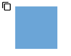 |
| (0.5,0) | Bottom = 20 | 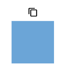 |
| (1,0) | Left = 20 | 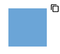 |
| (0,0.5) | Right = 20 | 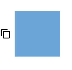 |
| (0,1) | Left = 20 | 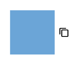 |
| (0,1) | Right = 20 | 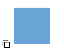 |
| (0.5,1) | Top = 20 | 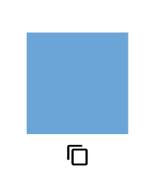 |
| (1,1) | Left = 20 | 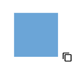 |
Note: Both
displacementandalignmentare applicable only to connector fixed user handles.
Customizing the connector fixed user handle
The connector fixed user handle can be aligned relative to the connector boundaries. It has alignment, displacement and offset settings. The displacement property displaces the handle from its aligned position and its functioning only when the alignment property is set to ‘After’ or ‘Before’.
Offset
The offset property of fixed user handle aligns the fixed user handle based on fractions. For example, 0 represents the left or top corner, 1 represents the bottom or right corner, and 0.5 represents the center.
Alignment
The connector’s fixed user handle can be aligned over its segment path using the alignment property of fixed user handle.
The following table shows all the possible offset and alignment combinations of connector fixed user handle.
| Offset | Alignment | Output |
|---|---|---|
| 0 | Before | 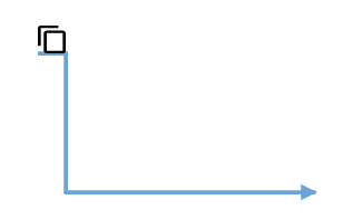 |
| 0.5 | Before | 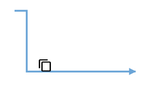 |
| 1 | Before | 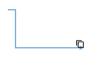 |
| 0 | Center | 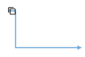 |
| 0.5 | Center | 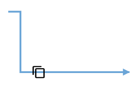 |
| 1 | Center | 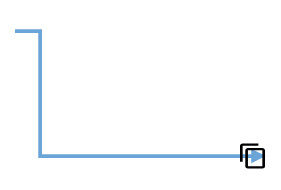 |
| 0 | After | 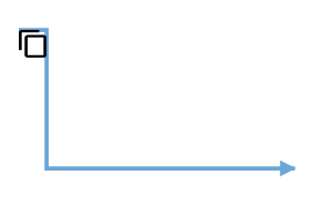 |
| 0.5 | After | 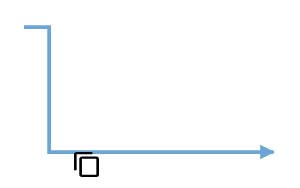 |
| 1 | After | 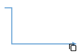 |
Displacement
The displacement property displaces the handle from its aligned position based on the provided x and y value.
The following table shows all the possible alignment and displacement combinations of fixed user handle.
| Displacement | Alignment | Output |
|---|---|---|
| x=10 | Before | 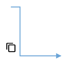 |
| x=10 | After | 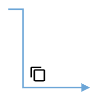 |
| y=10 | Before | 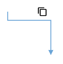 |
| y=10 | After | 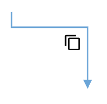 |
Note: Displacement will not be done if the alignment is set to be center.
The following code explains how to customize the alignment of connector fixed user handle.
import { Component, ViewEncapsulation, ViewChild } from '@angular/core';
import { DiagramComponent, DiagramModule, ConnectorModel, PointModel } from '@syncfusion/ej2-angular-diagrams';

@Component({
imports: [
         DiagramModule
    ],

providers: [ ],
standalone: true,
    selector: "app-container",
    template: `<ejs-diagram #diagram id="diagram" width="100%" height="580px" >
        <e-connectors>
            <e-connector id='connector' type='Orthogonal' [sourcePoint]='sourcePoint1' [targetPoint]='targetPoint1'>
                <e-connector-fixeduserhandles>
                    <e-connector-fixeduserhandle id='usercon1' [width]=20 [height]=20 [offset] = 0.5 [alignment]='alignment' [displacement]= 'displacement' pathData='M60.3,18H27.5c-3,0-5.5,2.4-5.5,5.5v38.2h5.5V23.5h32.7V18z M68.5,28.9h-30c-3,0-5.5,2.4-5.5,5.5v38.2c0,3,2.4,5.5,5.5,5.5h30c3,0,5.5-2.4,5.5-5.5V34.4C73.9,31.4,71.5,28.9,68.5,28.9z M68.5,72.5h-30V34.4h30V72.5z'>
                    </e-connector-fixeduserhandle>
                </e-connector-fixeduserhandles>
            </e-connector>
        </e-connectors>
    </ejs-diagram>`,
    encapsulation: ViewEncapsulation.None
})
export class AppComponent {
    @ViewChild("diagram")
    public diagram?: DiagramComponent;
    public sourcePoint1?: PointModel;
    targetPoint1?: Object;
    ngOnInit(): void {
        this.sourcePoint1 = { x: 300, y: 100 };
        this.targetPoint1 = { x: 400, y: 200 };
    }
    public alignment = "Before";
    public displacement = {x:10,y:10};
}
import { bootstrapApplication } from '@angular/platform-browser';
import { AppComponent } from './app.component';
import 'zone.js';
bootstrapApplication(AppComponent).catch((err) => console.error(err));Fixed user handle tooltip
The diagram provides support to show a tooltip when the mouse hovers over any fixed user handle. To show the tooltip on mouse hover, set the tooltip property of the fixed user handle with the tooltip content as shown in the following example.
import { Component, ViewEncapsulation, ViewChild } from '@angular/core';
import { DiagramComponent, DiagramTooltipModel, DiagramConstraints, NodeModel, MarginModel, ShapeStyleModel, DiagramModule, FixedUserHandleEventsArgs, PointModel } from '@syncfusion/ej2-angular-diagrams';

@Component({
imports: [
         DiagramModule
    ],

providers: [ ],
standalone: true,
    selector: "app-container",
    template: `<ejs-diagram #diagram id="diagram" width="100%" height="580px" (onFixedUserHandleMouseDown) = "onFixedUserHandleMouseDown($event)">
        <e-nodes>
            <e-node id='node1' [offsetX]=300 [offsetY]=300 [height]=100 [width]= 100 >
                <e-node-fixeduserhandles>
                    <e-node-fixeduserhandle id='color' [width]=20 [height]=20 [margin]='margin1' [offset]='offset1' [tooltip]="tooltip"  pathData='M31.5,13.5 C31.5,20.95,24.44,27,15.75,27 C7.059999999999999,27,0,20.95,0,13.5 C0,6.050000000000001,7.06,0,15.75,0 C24.44,0,31.5,6.05,31.5,13.5 Z M13.12,4.5 L13.12,11.25 L5.25,11.25 L5.25,15.75 L13.12,15.75 L13.12,22.5 L18.38,22.5 L18.38,15.75 L26.25,15.75 L26.25,11.25 L18.38,11.25 L18.38,4.5 Z '>
                    </e-node-fixeduserhandle>
                </e-node-fixeduserhandles>
             </e-node>
        </e-nodes>
        <e-connectors>
            <e-connector id='connector' [sourcePoint]='sourcePoint1' [targetPoint]='targetPoint1'  >
                <e-connector-fixeduserhandles>
                    <e-connector-fixeduserhandle id='stroke' [width]=20 [height]=10 [offset] = 0.5 pathData= 'M0,13.85 L15.62,13.85 L15.62,20 L25,9.74 L15.62,0 L15.62,6.41 L0,6.41 L0,13.85 Z ' [tooltip]="tooltip" >
                    </e-connector-fixeduserhandle>
                </e-connector-fixeduserhandles>
            </e-connector>
        </e-connectors>

    </ejs-diagram>`,
    encapsulation: ViewEncapsulation.None
})
export class AppComponent {
    @ViewChild("diagram")
    public margin1?: MarginModel;
    public offset1?: PointModel;
    public sourcePoint1?: PointModel;
    public targetPoint1?: PointModel;
    public tooltip?: DiagramTooltipModel;
    public constraints?: DiagramConstraints;
    ngOnInit(): void {
        this.margin1 = {left: 20, bottom: 10 };
        this.offset1 = { x: 1, y: 0 };
        this.sourcePoint1 = { x: 100, y: 100 };
        this.targetPoint1 = { x: 300, y: 200 };
        this.tooltip = {
            //Sets the content of the Tooltip
            content: 'Change stroke color',
            //Sets the position of the Tooltip
            position: 'BottomRight',
            //Sets the tooltip position relative to the node
            relativeMode: 'Object'
        }
    }
    public diagram?: DiagramComponent;

    public onFixedUserHandleMouseDown(args: FixedUserHandleEventsArgs)
    {
        if (args.element) {
            let node = (args.element as any).parentObj;
            ((node as NodeModel).style as ShapeStyleModel).strokeColor  = ((node as NodeModel).style as ShapeStyleModel).strokeColor  === '#64A6' ? '#64Abbb' : '#64A6';
            this.diagram?.dataBind();
            }
    };
}
import { bootstrapApplication } from '@angular/platform-browser';
import { AppComponent } from './app.component';
import 'zone.js';
bootstrapApplication(AppComponent).catch((err) => console.error(err));Additional tooltip properties can be customized, such as position, width, height, etc. For more information refer to the tooltip section.
Appearance
The appearance of fixed user handles can be customized by using the cornerRadius, fill, handleStrokeColor, handleStrokeWidth, iconStrokeColor, iconStrokeWidth and visibility properties of the fixed user handles.
Size
The height and width properties of fixed user handle are used to define the size of the fixed user handle.
Style
The fixed user handle’s iconStrokeColor and iconStrokeWidth properties are used to change the stroke color and stroke width of the given pathData.
The fixed user handle’s handleStrokeColor and handleStrokeWidth properties are used to define the stroke color and stroke width of the fixed user handle and the fill property is used to define the fill color of fixed user handle.
The cornerRadius property of the fixed user handle is used to apply border radius for the fixed user handle.
The visibility property of the fixed user handle enables or disables the visibility of fixed user handle.
The following example demonstrates how to use these properties to customize the appearance of the fixed user handle.
import { Component, ViewEncapsulation, ViewChild } from '@angular/core';
import { DiagramComponent, DiagramConstraints, NodeModel, MarginModel, ShapeStyleModel, DiagramModule, FixedUserHandleEventsArgs, PointModel } from '@syncfusion/ej2-angular-diagrams';

@Component({
imports: [
         DiagramModule
    ],

providers: [ ],
standalone: true,
    selector: "app-container",
    template: `<ejs-diagram #diagram id="diagram" width="100%" height="580px"  (onFixedUserHandleMouseDown) = "onFixedUserHandleMouseDown($event)">
        <e-nodes>
            <e-node id='node1' [offsetX]=300 [offsetY]=300 [height]=100 [width]= 100>
                <e-node-fixeduserhandles>
                    <e-node-fixeduserhandle id='color' [width]=30 [height]=30 [margin]='margin1' [offset]='offset1'
                    [handleStrokeColor]="handleStrokeColor1" [handleStrokeWidth] = 4 [iconStrokeColor]="iconStrokeColor1" [iconStrokeWidth] = 1
                    [fill]="fill1" [cornerRadius]= 5 pathData='M31.5,13.5 C31.5,20.95,24.44,27,15.75,27 C7.059999999999999,27,0,20.95,0,13.5 C0,6.050000000000001,7.06,0,15.75,0 C24.44,0,31.5,6.05,31.5,13.5 Z M13.12,4.5 L13.12,11.25 L5.25,11.25 L5.25,15.75 L13.12,15.75 L13.12,22.5 L18.38,22.5 L18.38,15.75 L26.25,15.75 L26.25,11.25 L18.38,11.25 L18.38,4.5 Z '>
                    </e-node-fixeduserhandle>
                </e-node-fixeduserhandles>
             </e-node>
        </e-nodes>
        <e-connectors>
            <e-connector id='connector' [sourcePoint]='sourcePoint1' [targetPoint]='targetPoint1'  >
                <e-connector-fixeduserhandles>
                    <e-connector-fixeduserhandle id='stroke' [width]=30 [height]=25 [offset] = 0.5  [handleStrokeColor]="handleStrokeColor1" [handleStrokeWidth] = 4 [iconStrokeColor]="iconStrokeColor1" [iconStrokeWidth] = 1
                    [fill]="fill1" [cornerRadius]= 5 pathData= 'M0,13.85 L15.62,13.85 L15.62,20 L25,9.74 L15.62,0 L15.62,6.41 L0,6.41 L0,13.85 Z '  >
                    </e-connector-fixeduserhandle>
                </e-connector-fixeduserhandles>
            </e-connector>
        </e-connectors>

    </ejs-diagram>`,
    encapsulation: ViewEncapsulation.None
})
export class AppComponent {
    @ViewChild("diagram")
    public margin1?: MarginModel;
    public offset1?: PointModel;
    public sourcePoint1?: PointModel;
    public targetPoint1?: PointModel;
    public constraints?: DiagramConstraints;
    ngOnInit(): void {
        this.margin1 = {left: 20, bottom: 10 };
        this.offset1 = { x: 1, y: 0 };
        this.sourcePoint1 = { x: 100, y: 100 };
        this.targetPoint1 = { x: 300, y: 200 };
    }
    public diagram?: DiagramComponent;
    public handleStrokeColor1 = 'green';
    public iconStrokeColor1 = '#64Abbb';
    public fill1 = 'yellow';

    public onFixedUserHandleMouseDown(args: FixedUserHandleEventsArgs)
    {
        if (args.element) {
            let node = (args.element as any).parentObj;
            ((node as NodeModel).style as ShapeStyleModel).strokeColor  = ((node as NodeModel).style as ShapeStyleModel).strokeColor  === '#64A6' ? '#64Abbb' : '#64A6';
            this.diagram?.dataBind();
            }
    };
}
import { bootstrapApplication } from '@angular/platform-browser';
import { AppComponent } from './app.component';
import 'zone.js';
bootstrapApplication(AppComponent).catch((err) => console.error(err));Customizing Fixed User Handles with HTML Templates
Fixed user handles are interactive elements added to nodes and connectors. Their appearance can be customized using HTML templates. To render fixedUserHandleTemplate with HTML templates, create an HTML element inside a <ng-template> tag.
import { Component, ViewEncapsulation, ViewChild } from '@angular/core';
import { DiagramComponent, Diagram, MarginModel, ConnectorModel,  DiagramModule } from '@syncfusion/ej2-angular-diagrams';
import { NgIf } from '@angular/common';

@Component({
  imports: [DiagramModule,NgIf],

  providers: [],
  standalone: true,
  selector: 'app-container',
  template: `<ejs-diagram #diagram id="diagram" width="100%" height="580px" >
        <e-nodes>
            <e-node id='node1' [offsetX]=250 [offsetY]=250 [height]=100 [width]= 100>
                <e-node-fixeduserhandles>
                    <e-node-fixeduserhandle id='usercon1' [margin]='margin1' [width]=50 [height]=20 [offset]="fixedUserHandleOffset1" >
                    </e-node-fixeduserhandle>
                </e-node-fixeduserhandles>
            </e-node>
        </e-nodes>
        <e-connectors>
            <e-connector id='connector1'  type= 'Orthogonal' [sourcePoint]='sourcePoint' [targetPoint]='targetPoint'>
                <e-connector-fixeduserhandles>
                    <e-connector-fixeduserhandle id='usercon2'  [width]=120 [height]=20 [offset]="fixedUserHandleOffset2" >
                    </e-connector-fixeduserhandle>
                </e-connector-fixeduserhandles>
            </e-connector>
        </e-connectors>
        <ng-template #fixedUserHandleTemplate let-data>
            <ng-container *ngIf="data.id == 'usercon1'" style="width: 100%; height: 100%">
                <input id="colorPicker" type="color" (change)="onchange($event)" value="#008000"/>
            </ng-container>
            <ng-container *ngIf="data.id == 'usercon2'" style="width:100%;height:100%">
                <input type="button" value="FixedUserHandleTemplate" style="color:red; "/>
            </ng-container>
        </ng-template>

    </ejs-diagram>`,
  encapsulation: ViewEncapsulation.None,
})
export class AppComponent {
  @ViewChild('diagram')
  public diagram?: DiagramComponent;
  public margin1?: MarginModel;
  ngOnInit(): void {
    this.margin1 = { right: 20 };
  }

  public fixedUserHandleOffset1 = { x: 0, y: 0 };
  public sourcePoint = { x: 400, y: 200 };
  public targetPoint = { x: 500, y: 300 };
  public margin2 = { right: 20 };
  public fixedUserHandleOffset2 = 0.5;
  public getConnectorDefaults(obj: ConnectorModel): void {
    obj.style = {
      strokeColor: '#6BA5D7',
      fill: '#6BA5D7',
      strokeWidth: 2,
    };
    obj.targetDecorator = {
      style: {
        fill: '#6BA5D7',
        strokeColor: '#6BA5D7',
      },
    };
  }

  public onchange(args:any) {
    let currentColor = (document.getElementById('colorPicker') as HTMLSelectElement).value;
    (((this.diagram as Diagram).nodes[0] as any).style.fill) = currentColor;
    (this.diagram as Diagram).dataBind(); // Ensure the diagram is updated

  }
}
import { bootstrapApplication } from '@angular/platform-browser';
import { AppComponent } from './app.component';
import 'zone.js';
bootstrapApplication(AppComponent).catch((err) => console.error(err));Fixed user handle events
When interacting with fixed user handles, certain events are triggered that can be used to customize the appearance and functionality of the handles. The fixed user handle events are explained below.
-
click- Triggered when the fixed user handle is clicked. -
onFixedUserHandleMouseEnter- Triggered when the mouse enters the fixed user handle region. -
onFixedUserHandleMouseDown- Triggered when the mouse is pressed down on the fixed user handle. -
onFixedUserHandleMouseUp- Triggered when the mouse is released on the fixed user handle. -
onFixedUserHandleMouseLeave- Triggered when the mouse leaves the fixed user handle region. -
fixedUserHandleClick- Triggered when the fixed user handle is clicked.
In the following example, the above events are used to customize the appearance of fixed user handles.
import { Component, ViewEncapsulation, ViewChild } from '@angular/core';
import { DiagramComponent, DiagramConstraints, NodeModel, MarginModel, ShapeStyleModel, DiagramModule, FixedUserHandleEventsArgs, PointModel } from '@syncfusion/ej2-angular-diagrams';

@Component({
imports: [
         DiagramModule
    ],

providers: [ ],
standalone: true,
    selector: "app-container",
    template: `<ejs-diagram #diagram id="diagram" width="100%" height="580px" (onFixedUserHandleMouseDown) = "onFixedUserHandleMouseDown($event)" (onFixedUserHandleMouseEnter) = "onFixedUserHandleMouseEnter($event)" (onFixedUserHandleMouseUp) = "onFixedUserHandleMouseUp($event)" (onFixedUserHandleMouseLeave) = "onFixedUserHandleMouseLeave($event)">
        <e-nodes>
            <e-node id='node1' [offsetX]=300 [offsetY]=300 [height]=100 [width]= 100>
                <e-node-fixeduserhandles>
                    <e-node-fixeduserhandle id='color' [width]=30 [height]=30 [margin]='margin1' [offset]='offset1'
                    [handleStrokeColor]="handleStrokeColor1" [handleStrokeWidth] = 4 [iconStrokeColor]="iconStrokeColor1" [iconStrokeWidth] = 1
                    [fill]="fill1" [cornerRadius]= 5 pathData='M31.5,13.5 C31.5,20.95,24.44,27,15.75,27 C7.059999999999999,27,0,20.95,0,13.5 C0,6.050000000000001,7.06,0,15.75,0 C24.44,0,31.5,6.05,31.5,13.5 Z M13.12,4.5 L13.12,11.25 L5.25,11.25 L5.25,15.75 L13.12,15.75 L13.12,22.5 L18.38,22.5 L18.38,15.75 L26.25,15.75 L26.25,11.25 L18.38,11.25 L18.38,4.5 Z '>
                    </e-node-fixeduserhandle>
                </e-node-fixeduserhandles>
             </e-node>
        </e-nodes>
        <e-connectors>
            <e-connector id='connector1' [sourcePoint]='sourcePoint1' [targetPoint]='targetPoint1' >
                <e-connector-fixeduserhandles>
                    <e-connector-fixeduserhandle id='stroke' [width]=30 [height]=25 [offset] = 0.5  [handleStrokeColor]="handleStrokeColor1" [handleStrokeWidth] = 4 [iconStrokeColor]="iconStrokeColor1" [iconStrokeWidth] = 1 [fill]="fill1" [cornerRadius]= 5 pathData= 'M0,13.85 L15.62,13.85 L15.62,20 L25,9.74 L15.62,0 L15.62,6.41 L0,6.41 L0,13.85 Z '  >
                    </e-connector-fixeduserhandle>
                </e-connector-fixeduserhandles>
            </e-connector>
        </e-connectors>

    </ejs-diagram>`,
    encapsulation: ViewEncapsulation.None
})
export class AppComponent {
    @ViewChild("diagram")
    public margin1?: MarginModel;
    public offset1?: PointModel;
    public sourcePoint1?: PointModel;
    public targetPoint1?: PointModel;
    public constraints?: DiagramConstraints;
    ngOnInit(): void {
        this.margin1 = {left: 20, bottom: 10 };
        this.offset1 = { x: 1, y: 0 };
        this.sourcePoint1 = { x: 100, y: 100 };
        this.targetPoint1 = { x: 300, y: 200 };
    }
    public diagram?: DiagramComponent;
    public handleStrokeColor1 = 'green';
    public iconStrokeColor1 = '#64Abbb';
    public fill1 = 'yellow';

    public onFixedUserHandleMouseDown(args: FixedUserHandleEventsArgs)
    {
        if (args.element) {
            let node = (args.element as any).parentObj;
            ((node as NodeModel).style as ShapeStyleModel).strokeColor  = ((node as NodeModel).style as ShapeStyleModel).strokeColor  === '#64A6' ? '#64Abbb' : '#64A6';
            this.diagram?.dataBind();
            }
    };

    public onFixedUserHandleMouseEnter(args: FixedUserHandleEventsArgs)
    {
        if(args.element)
        {
            args.element.fill = 'red';
            args.element.handleStrokeColor = 'pink';
        }
    };

    public onFixedUserHandleMouseUp(args: FixedUserHandleEventsArgs)
    {
         //Customize
    }

    public onFixedUserHandleMouseLeave(args: FixedUserHandleEventsArgs)
    {
      if (args.element) {
        args.element.fill = 'yellow';
        args.element.handleStrokeColor = 'green';
      }
    }
}
import { bootstrapApplication } from '@angular/platform-browser';
import { AppComponent } from './app.component';
import 'zone.js';
bootstrapApplication(AppComponent).catch((err) => console.error(err));