Style in Angular Diagram Component
7 Jul 20265 minutes to read
The Angular Diagram component provides extensive styling capabilities through CSS classes. This guide demonstrates how to customize various visual elements including connector handles, selection indicators, and interactive controls using CSS overrides.
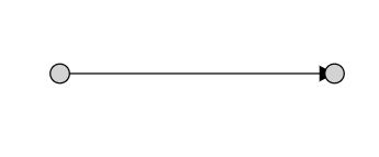
Customizing connector endpoint handles
The connector endpoint handles are visual indicators that appear when hovering over or interacting with connector endpoints. These handles can be styled to match application themes or improve visibility.
Default endpoint handle styling
Use the following CSS to customize the connector endpoint handle appearance:
.e-diagram-endpoint-handle {
    fill: red;
    stroke: green;
    stroke-width: 3px;
}
Connected endpoint handle styling
When a connector endpoint is connected to a node or another connector, apply different styling to indicate the connected state:
.e-diagram-endpoint-handle.e-connected {
    fill: red;
    stroke: green;
    stroke-width: 3px;
}
Disabled endpoint handle styling
For disabled connector endpoints, customize the appearance to clearly indicate the non-interactive state:
.e-diagram-endpoint-handle.e-disabled {
    fill: lightgrey;
    opacity: 1;
    stroke: black;
}
Customizing connector segment handles
Connector segment handles allow users to manipulate different types of connector paths. Each connector type has specific handle styling options.
Bezier segment handles
The Bezier segment handles control the curvature of Bezier connectors:
.e-diagram-bezier-segment-handle {
    stroke: yellow;
    stroke-width: 2px;
    fill: green;
}
Bezier control point handles
Control points define the curve shape of Bezier connectors and can be styled independently:
.e-diagram-bezier-control-handle {
    stroke: yellow;
    stroke-width: 2px;
    fill: green;
}
Orthogonal segment handles
Orthogonal connectors use segment handles for adjusting right-angled path segments:
.e-diagram-ortho-segment-handle {
    stroke: yellow;
    stroke-width: 2px;
    fill: green;
}
Straight segment handles
Straight connectors provide handles for direct path manipulation:
.e-diagram-straight-segment-handle {
    stroke: yellow;
    stroke-width: 2px;
    fill: green;
}
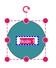
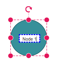
Customizing selection and manipulation handles
Selection handles and related controls provide visual feedback during object manipulation operations.
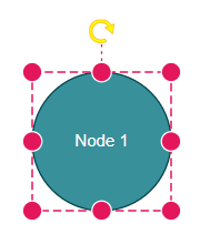
Resize handles
Resize handles appear on selected objects to enable size adjustments:
.e-diagram-resize-handle {
    fill: yellow;
    opacity: 1;
    stroke: orange;
}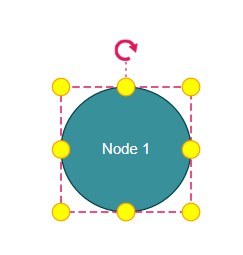
Selection indicator
The selector outline indicates which objects are currently selected:
.e-diagram-selector {
    stroke: yellow;
    stroke-width: 2px;
}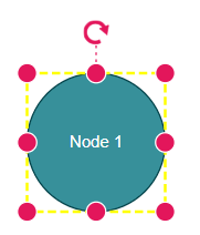
Selection border
Customize the border that surrounds selected objects:
.e-diagram-border {
    stroke: red;
}
Pivot line
The pivot line connects the selection area to the rotation handle:
.e-diagram-pivot-line {
    stroke: black;
    stroke-width: 2px;
}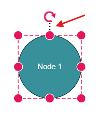
Rotation handle
The rotation handle enables object rotation and can be customized for better visibility:
.e-diagram-rotate-handle {
    fill: yellow;
    stroke: orange;
}
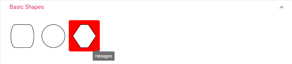
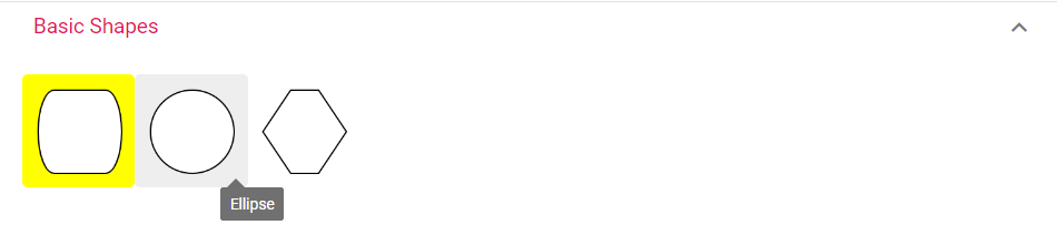
Customizing Symbol Palette interactions
The Symbol Palette provides drag-and-drop functionality with interactive states that can be styled.
Hover state styling
Customize the appearance when hovering over symbols in the palette:
.e-symbolpalette .e-symbol-hover:hover {
    background: red;
}
Selection state styling
Style the selected symbol appearance in the palette:
.e-symbolpalette .e-symbol-selected {
    background: yellow;
}
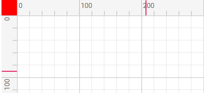
Customizing ruler elements
The ruler provides measurement guidance and can be styled to match the application design.
Ruler background and text
Customize the ruler’s background color and font properties:
.e-diagram .e-ruler {
    background-color: blue;
    font-size: 13px;
}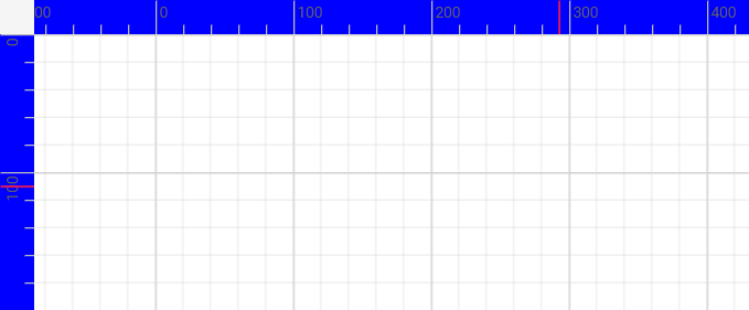
Ruler overlap area
The overlap area where horizontal and vertical rulers intersect can be styled separately:
.e-diagram .e-ruler-overlap {
    background-color: red;
}
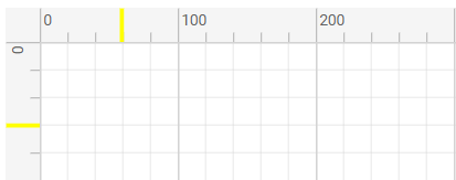
Ruler measurement markers
Customize the color and thickness of measurement markers on the ruler:
.e-diagram .e-d-ruler-marker {
    stroke: yellow;
    stroke-width: 3px;
}
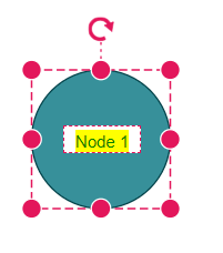
Customizing text editing interface
The text editing interface appears when editing text content within diagram objects.
Text edit container
Style the text editing container that appears during text input:
.e-diagram .e-diagram-text-edit {
    background: white;
    border-color: blue;
    border-style: dashed;
    border-width: 3px;
    box-sizing: content-box;
    color: black;
    min-width: 50px;
}
Text selection highlighting
Customize the appearance of selected text within the editing interface:
.e-diagram-text-edit::selection {
    background: yellow;
    color: green;
}
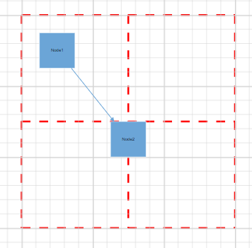
Customizing page break indicators
Page break lines help visualize page boundaries when printing or exporting diagrams.
.e-diagram-page-break {
    stroke: red;
    stroke-width: 2px;
}