Getting Started with Angular Diagram
02 Sep 202612 minutes to read
This section explains the steps required to create a simple diagram and demonstrates the basic usage of the Angular Diagram component.
Ready to streamline your Syncfusion® Angular development? Discover the full potential of Syncfusion® Angular components with Syncfusion® AI Coding Assistant. Effortlessly integrate, configure, and enhance your projects with intelligent, context-aware code suggestions, streamlined setups, and real-time insights—all seamlessly integrated into your preferred AI-powered IDEs like VS Code, Cursor, Syncfusion® Code Studio and more. Explore Syncfusion® AI Coding Assistant.
Prerequisites
- Node.js 24+ (LTS recommended).
- Syncfusion CLI.
Install the Syncfusion CLI
Install the Syncfusion CLI globally using the following command:
npm install -g @syncfusion/syncfusion-cliCreate a new Angular application using Syncfusion CLI
You can create an Angular application using the Syncfusion CLI. The CLI provides two ways to create a project:
Non-interactive mode
Non-interactive mode allows you to create a project directly using a single command with the required command-line arguments.
sf new syncfusion-angular-app --framework angular --template diagramIn this mode, the project configuration is passed directly in the command. The above command creates an Angular application configured with the Syncfusion® Diagram component.
Interactive mode
Interactive mode guides you through the project creation process with step-by-step prompts.
sfWhen you run the sf command, the CLI prompts you to select the required project configuration. To create an Angular application with the Syncfusion® Diagram component, select the following options:
√ Project name? ... syncfusion-angular-app
√ Choose Framework: » Angular
√ Choose Template: » Diagram
√ Choose Theme: » Material3
√ Choose Style Format: » CSS
√ Would you like to integrate the Syncfusion MCP Server (AI Assistant) into this project? ... no
√ Would you like to install Syncfusion Component Skills for AI-powered development? ... no
√ Install dependencies and start app now? ... no
The above selections generate an Angular application configured with the Syncfusion® Diagram component. You can choose different values for language, theme, style format, MCP setup, and skills installation based on your project requirements.
The Syncfusion® CLI creates the project with a predefined template. After the project is generated, you can customize or replace the component code based on your application requirements.
Run the project
Once the project is created, navigate to the project directory and run the following commands in your terminal.
cd syncfusion-angular-app
npm install
ng serve
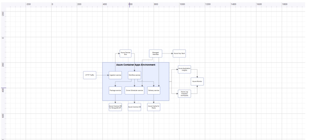
The output will appear as follows:
Prerequisites
| Requirement | Version |
|---|---|
| Angular | 12 and above |
| Node.js | 14.0.0 or above, Recommended: Latest Version |
Angular supported versions
| Angular Version | Minimum Syncfusion® Angular Diagram Version |
|---|---|
| Angular v22 | 34.1.29 |
| Angular v21 | 31.1.17 |
| Angular v20 | 29.2.8 |
| Angular v19 | 26.1.35 |
| Angular v18 | 25.2.3 |
| Angular v17 | 23.2.4 |
| Angular v16 | 21.1.39 |
| Angular v15 | 20.4.38 |
| Angular v14 | 20.2.36 |
| Angular v13 | 19.4.38 and above |
| Angular v12 | 19.3.43 |
Browser Support
| Browser | Supported Versions |
|---|---|
| Google Chrome, including Android & iOS | Latest 2 versions |
| Mozilla Firefox | Latest version |
| Microsoft Edge | Latest 2 versions |
| Apple Safari, including iOS | Latest 2 versions |
Before You Begin
This guide uses the standalone application structure generated by the latest Angular CLI.
The main files used in this guide are:
-
src/app/app.ts— Defines the root standalone component. -
src/styles.css— Contains global styles and Syncfusion® theme references. -
src/index.html— Contains the Angular root element (e.g.,<app-root>).
In newer Angular CLI standalone projects, the root component may be generated as src/app/app.ts. In NgModule-based Angular projects, the equivalent file is typically src/app/app.component.ts.
If your application uses an older NgModule-based structure, import
DiagramModulein the application module, such asapp.module.ts, instead of adding it to the standalone componentimportscollection.
Step 1: Set up the Angular environment
Use Angular CLI to create and manage Angular applications. Install Angular CLI globally using the following command:
npm install -g @angular/cli
Step 2: Create an Angular application
Create a new Angular application using the following command.
ng new my-diagram-app
During project creation, Angular CLI may prompt you to choose stylesheet, SSR/SSG, and AI tool configuration options. For this basic Diagram sample, you can use the following options:
-
Stylesheet system: Choose any option. This guide uses
CSSfor simplicity and applies the Syncfusion® Tailwind 3 theme through CSS imports. -
SSR and SSG/Pre-rendering: Select
No. -
AI tools configuration: Select
None.
Navigate to the project folder:
cd my-diagram-app
Step 3: Install the Syncfusion® Angular Diagram package
All Syncfusion Essential® JS 2 packages are available in the npmjs.com registry.
Install the Angular Diagram package using the following command:
npm install @syncfusion/ej2-angular-diagrams
Installing
@syncfusion/ej2-angular-diagramsautomatically installs the required dependency packages.
A Syncfusion® license key is not required for local development. However, a valid Syncfusion® license key must be registered before deploying the application to production. For details, see Registering a Syncfusion® license key.
For the latest tested version of the Diagram package, refer to the
@syncfusion/ej2-angular-diagramspackage page.
Step 4: Add the required styles
The Angular Diagram component needs Syncfusion® theme styles to display correctly. Syncfusion® theme packages include ready-to-use styles for supported components. Install the Tailwind 3 theme package using the following command:
npm install @syncfusion/ej2-tailwind3-theme
Then add the following CSS reference to the src/styles.css file:
@import "../node_modules/@syncfusion/ej2-tailwind3-theme/styles/diagram/index.css";
For the list of available themes, refer to the Themes documentation.
The
../node_modules/...path is relative tosrc/styles.css; adjust the path if your bundler relocates dependencies.
Syncfusion® provides multiple built-in themes. If the application uses a different theme, replace the
@syncfusion/ej2-tailwind3-theme/styles/diagram/index.cssreference with the corresponding theme path, such as@syncfusion/ej2-material3-theme/styles/diagram/index.css.
Step 5: Import the Diagram component
Import DiagramModule from @syncfusion/ej2-angular-diagrams and add it to the imports collection of the standalone component. Then, add the Angular Diagram component using the <ejs-diagram> selector in the component template.
Update the src/app/app.ts file as follows:
import { Component } from '@angular/core';
import { DiagramModule } from '@syncfusion/ej2-angular-diagrams';

@Component({
  selector: 'app-root',
  standalone: true,
  imports: [DiagramModule],
  template: `<ejs-diagram id="diagram" width="100%" height="580px"></ejs-diagram>`
})
export class App {}
This renders an empty diagram in the application. Step 6 replaces it with a complete flowchart example.
The component selector must match the root element used in the src/index.html file. Angular CLI commonly uses
<app-root></app-root>, so this example usesselector: 'app-root'.
The Angular Diagram component must have a valid height. If the height is not set, the diagram canvas may not be visible.
Step 6: Create your first Diagram with nodes and connectors
This section explains how to create a simple flowchart by adding nodes, customizing their appearance, and connecting them using connectors.
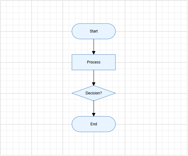
The following example creates a flowchart with four nodes: Start, Process, Decision, and End. It also applies common node and connector settings through the getNodeDefaults and getConnectorDefaults input bindings.
Replace the entire contents of src/app/app.ts with the following code:
import { Component } from '@angular/core';
import {
  ConnectorModel,
  DiagramModule,
  FlowShapeModel,
  NodeModel
} from '@syncfusion/ej2-angular-diagrams';

@Component({
  selector: 'app-root',
  standalone: true,
  imports: [DiagramModule],
  template: `
    <ejs-diagram
      id="diagram"
      width="100%"
      height="580px"
      [getNodeDefaults]="getNodeDefaults"
      [getConnectorDefaults]="getConnectorDefaults">

      <e-nodes>
        <e-node id="node1" [offsetX]="300" [offsetY]="100" [shape]="terminator">
          <e-node-annotations>
            <e-node-annotation content="Start"></e-node-annotation>
          </e-node-annotations>
        </e-node>

        <e-node id="node2" [offsetX]="300" [offsetY]="200" [shape]="process">
          <e-node-annotations>
            <e-node-annotation content="Process"></e-node-annotation>
          </e-node-annotations>
        </e-node>

        <e-node id="node3" [offsetX]="300" [offsetY]="300" [shape]="decision">
          <e-node-annotations>
            <e-node-annotation content="Decision?"></e-node-annotation>
          </e-node-annotations>
        </e-node>

        <e-node id="node4" [offsetX]="300" [offsetY]="400" [shape]="terminator">
          <e-node-annotations>
            <e-node-annotation content="End"></e-node-annotation>
          </e-node-annotations>
        </e-node>
      </e-nodes>

      <e-connectors>
        <e-connector id="connector1" sourceID="node1" targetID="node2"></e-connector>
        <e-connector id="connector2" sourceID="node2" targetID="node3"></e-connector>
        <e-connector id="connector3" sourceID="node3" targetID="node4"></e-connector>
      </e-connectors>
    </ejs-diagram>
  `
})
export class App {
  public terminator: FlowShapeModel = {
    type: 'Flow',
    shape: 'Terminator'
  };

  public process: FlowShapeModel = {
    type: 'Flow',
    shape: 'Process'
  };

  public decision: FlowShapeModel = {
    type: 'Flow',
    shape: 'Decision'
  };

  public getNodeDefaults(node: NodeModel): NodeModel {
    node.width = 140;
    node.height = 50;
    node.style = {
      fill: '#E8F4FF',
      strokeColor: '#357BD2'
    };
    return node;
  }

  public getConnectorDefaults(connector: ConnectorModel): ConnectorModel {
    connector.type = 'Orthogonal';
    connector.targetDecorator = {
      shape: 'Arrow',
      width: 10,
      height: 10
    };
    return connector;
  }
}
In this example:
Template directives (used inside the <ejs-diagram> template):
-
e-nodes,e-connectors, ande-node-annotationsare Angular Diagram child directives used to define nodes, connectors, and node annotations. -
e-node-annotationadds text inside each node using thecontentproperty.
Node and connector configuration:
-
offsetXandoffsetYdefine the position of each node. -
shapedefines the node shape configuration, andFlowShapeModel.shapespecifies flowchart shapes such asTerminator,Process, orDecision. -
sourceIDandtargetIDconnect one node to another.
Common defaults applied via callbacks:
-
getNodeDefaultsapplies common width, height, fill color, and stroke color to all nodes. -
getConnectorDefaultsapplies common connector settings, such as orthogonal routing and target arrows.
Step 7: Run the application
Run the application using the following command:
npm start
The
npm startscript runsng serveby default in an Angular CLI project. You can also runng servedirectly.
Open the generated local URL (http://localhost:4200) in the browser. The application displays the diagram as shown below:
If port 4200 is already in use, start the app on a different port with
ng serve --port 4201.
To stop the development server, press
Ctrl + Cin the terminal where it is running.
To build the application for production, run
ng build. The generated output is placed in thedistfolder.
Next steps
To explore the Angular Diagram component in more depth, refer to the following topics: