How can I help you?
Toolbar items in ASP.NET Core Grid component
9 Jul 202519 minutes to read
The Syncfusion ASP.NET Core Grid offers a flexible toolbar that enables the addition of custom toolbar items or modification of existing ones. This customizable toolbar is positioned above the grid, providing a convenient way to access various actions and functionalities
Built-in toolbar items
Built-in toolbar items in the Syncfusion ASP.NET Core Grid component involves utilizing pre-defined actions to perform standard operations within the Grid.
These items can be added by defining the toolbar property as a collection of built-in items. Each item is rendered as a button with an icon and text. The following table lists the built-in toolbar items and their respective actions.
| Built-in Toolbar Items | Actions |
|---|---|
| Add | Adds a new row to the Grid. |
| Edit | Enables editing mode for the selected row in the Grid. |
| Update | Saves the changes made during the editing mode. |
| Delete | Deletes the selected record from the Grid. |
| Cancel | Discards the changes made during the editing mode. |
| Search | Displays a search box to filter the Grid records. |
| Print the Grid content. | |
| ColumnChooser | Choose the column’s visibility. |
| PdfExport | Exports the Grid data to a PDF file. |
| ExcelExport | Exports the Grid data to an Excel file. |
| CsvExport | Exports the Grid data to a CSV file. |
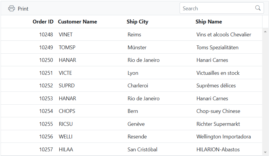
The following example demonstrates how to enable built-in toolbar items such as Print and Search in the grid.
<ejs-grid id="grid" dataSource="@ViewBag.dataSource" toolbar="@(new List<string>() {"Print","Search"})" height="348">
    <e-grid-columns>
        <e-grid-column field="OrderID" headerText="Order ID" textAlign="Right" width="120"></e-grid-column>
        <e-grid-column field="CustomerID" headerText="Customer Name" width="140"></e-grid-column>
        <e-grid-column field="ShipCity" headerText="ShipCity" width="120"></e-grid-column>
        <e-grid-column field="ShipName" headerText="Ship Name" width="140"></e-grid-column>
    </e-grid-columns>
</ejs-grid>
public IActionResult Index()
{
ViewBag.dataSource = OrderDetails.GetAllRecords();
return View();
}
The toolbar has options to define both built-in and custom toolbar items.
Show only icons in built-in toolbar items
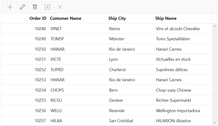
Showing only icons in the built-in toolbar items of the Grid involves customizing the appearance of the toolbar to display icons without text.
To display only icons in the built-in toolbar items of the Grid, you can use CSS to hide the text portion of the buttons using the following CSS style.
.e-grid .e-toolbar .e-tbar-btn-text,
.e-grid .e-toolbar .e-toolbar-items .e-toolbar-item .e-tbar-btn-text {
    display: none;
}
This is demonstrated in the following sample:
<ejs-grid id="grid" dataSource="@ViewBag.dataSource" toolbar="@(new List<string>() {"Add", "Edit", "Delete", "Update", "Cancel"})" height="348px">
    <e-grid-editSettings allowAdding="true" allowDeleting="true" allowEditing="true"></e-grid-editSettings>
    <e-grid-columns>
        <e-grid-column field="OrderID" headerText="Order ID" textAlign="Right" width="120" isPrimaryKey="true"></e-grid-column>
        <e-grid-column field="CustomerID" headerText="Customer Name" width="140"></e-grid-column>
        <e-grid-column field="ShipCity" headerText="Ship City" width="120"></e-grid-column>
        <e-grid-column field="ShipName" headerText="Ship Name" width="140"></e-grid-column>
    </e-grid-columns>
</ejs-grid>
<style>
    .e-grid .e-toolbar .e-tbar-btn-text,
    .e-grid .e-toolbar .e-toolbar-items .e-toolbar-item .e-tbar-btn-text {
        display: none;
    }
</style>
public IActionResult Index()
{
ViewBag.dataSource = OrderDetails.GetAllRecords();
return View();
}
Customize the built-in toolbar items
The Syncfusion ASP.NET Core Grid component allows you to customize the built-in toolbar items to meet your specific requirements. This can include adding, removing, or modifying toolbar items, as well as handling custom actions when toolbar buttons are clicked.
To customize the built-in toolbar items, you can use the toolbarClick event of the grid.
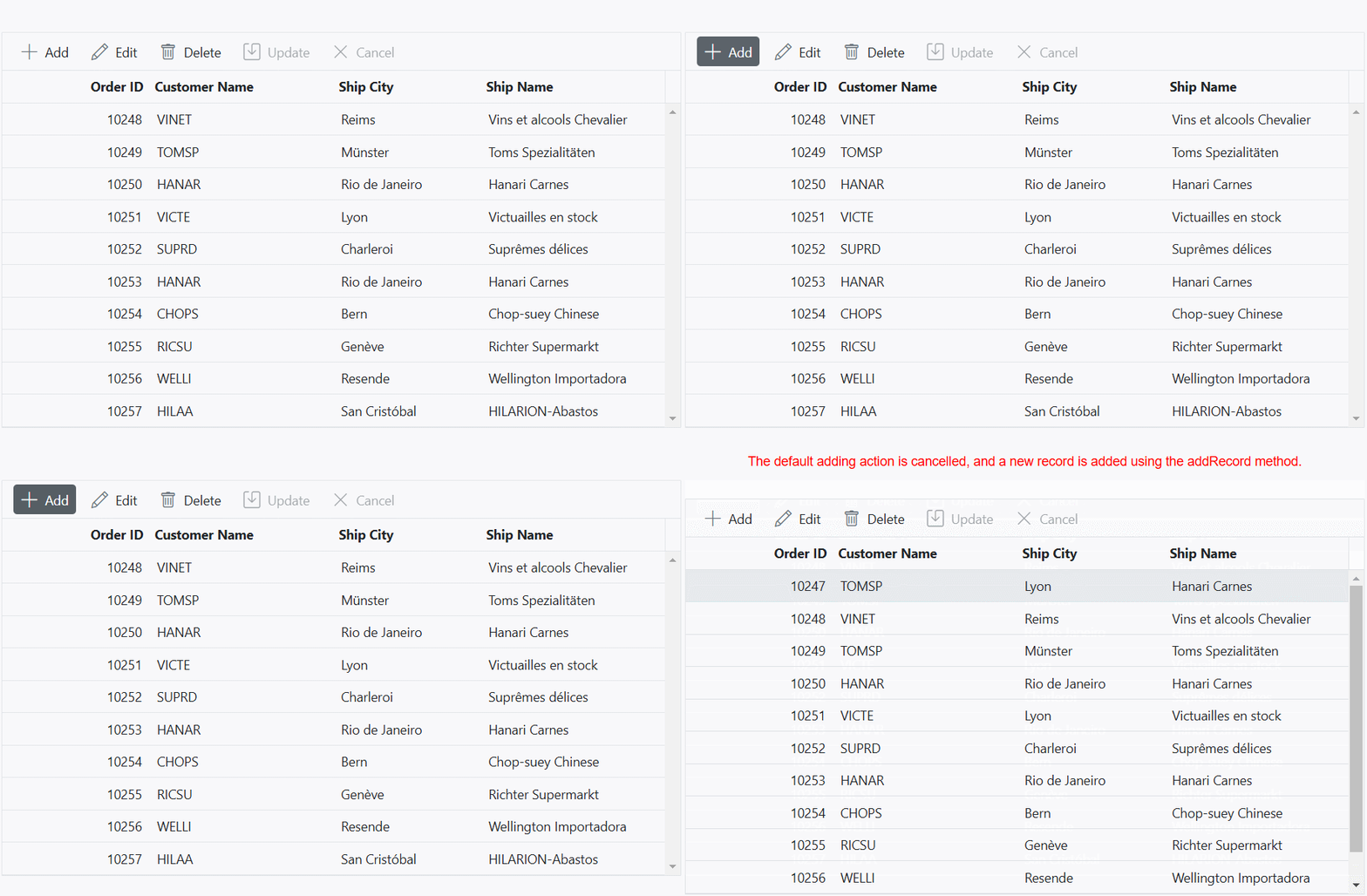
The following example demonstrate how to customize the toolbar by disabling and canceling the Add button functionlity and showing a custom message when the Add button of toolbar is clicked.
@{
    List<object> toolbarItems = new List<object>();
    toolbarItems.Add("Add");
    toolbarItems.Add("Edit");
    toolbarItems.Add("Delete");
    toolbarItems.Add("Update");
    toolbarItems.Add("Cancel");
}
<div><p style="color:red;text-align: center;" id="message"></p></div>
<ejs-grid id="grid" dataSource="@ViewBag.dataSource" height="348px" toolbarClick="toolbarClick" toolbar=toolbarItems>
    <e-grid-editSettings allowAdding="true" allowDeleting="true" allowEditing="true" mode="Normal"></e-grid-editSettings>
    <e-grid-columns>
        <e-grid-column field="OrderID" headerText="Order ID" isPrimaryKey="true" width="120"></e-grid-column>
        <e-grid-column field="CustomerID" headerText="Customer Name" width="120"></e-grid-column>
        <e-grid-column field="ShipCity" headerText="Ship City" width="120"></e-grid-column>
        <e-grid-column field="ShipName" headerText="Ship Name" width="120"></e-grid-column>
    </e-grid-columns>
</ejs-grid>
<script>
    function toolbarClick(args)
    {
        var grid = document.getElementById("grid").ej2_instances[0];
        if (args.item.id === 'grid_add') {
            args.cancel = true;
            const newRecord = {
                OrderID: 10247,
                CustomerID: 'TOMSP',
                ShipName: 'Hanari Carnes',
                ShipCity: 'Lyon',
            };
            grid.addRecord(newRecord);
            document.getElementById("message").innerText= 'The default adding action is cancelled, and a new record is added using the addRecord method.';
        }
        else
        document.getElementById("message").innerText = '';
    }
</script>
public IActionResult Index()
{
ViewBag.dataSource = OrderDetails.GetAllRecords();
return View();
}
Custom toolbar items
Adding custom toolbar items to the Syncfusion ASP.NET Core Grid involves incorporating personalized functionality into the toolbar.
Custom toolbar items can be added to the Grid component by defining the toolbar property as a collection of ItemModel objects. These objects define the custom items and their corresponding actions. The actions for the customized toolbar items are defined in the toolbarClick event.
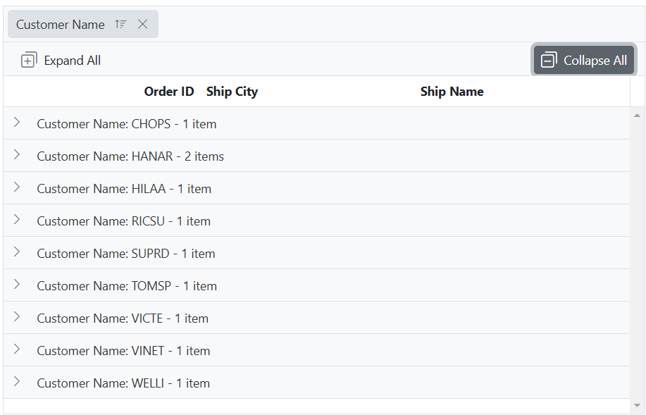
By default, custom toolbar items are positioned on the left side of the toolbar. However, you can change the position by using the align property of the ItemModel. The following example demonstrates how to apply the align property with the value Right for the Collapse All toolbar item.
@{
    List<object> toolbarItems = new List<object>();
    toolbarItems.Add(new { text= "Expand All", tooltipText= "Expand All", prefixIcon= "e-expand", id= "expandall" });
    toolbarItems.Add(new { text= "Collapse All", tooltipText= "Collapse All", prefixIcon= "e-collapse-2", id= "collapseall", align= "Right"  });
}
<ejs-grid id="grid" dataSource="@ViewBag.dataSource" toolbarClick="toolbarClick" toolbar=toolbarItems height="348px" allowGrouping="true">
    <e-grid-groupsettings columns="@(new string[] {"CustomerID"})"></e-grid-groupsettings>
    <e-grid-columns>
        <e-grid-column field="OrderID" headerText="Order ID" textAlign="Right" width="120"></e-grid-column>
        <e-grid-column field="CustomerID" headerText="Customer Name" width="140"></e-grid-column>
        <e-grid-column field="ShipCity" headerText="Ship City" width="120"></e-grid-column>
        <e-grid-column field="ShipName" headerText="Ship Name" width="140"></e-grid-column>
    </e-grid-columns>
</ejs-grid>
<script>
    function toolbarClick(args) {
        if (args.item.id === 'expandall') this.groupModule.expandAll();
        else this.groupModule.collapseAll();
    }
</script>
public IActionResult Index()
{
ViewBag.datasource = OrderDetails.GetAllRecords();
return View();
}
- The toolbar has options to define both built-in and custom toolbar items.
- If a toolbar item does not match with built-in items, it will be treated as custom toolbar item.
Both built-in and custom items in toolbar
Built-in and custom items in a toolbar within the Syncfusion ASP.NET Core Grid provides the flexibility to create a customized toolbar with a combination of standard actions and custom actions.
To use both types of toolbar items, you can define the toolbar property of the Grid as an array that includes both built-in and custom items. The built-in items are specified as strings, while the custom items are defined as objects with properties such as text, prefixIcon, and id within the toolbar component.
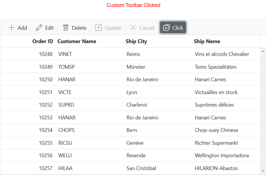
The following example demonstrates, how to use both built-in and custom toolbar items in the grid. The built-in toolbar items includes Add, Edit, Delete, Update, and Cancel, while the custom toolbar item is Click.
@{
    List<object> toolbarItems = new List<object>();
    toolbarItems.Add("Add");
    toolbarItems.Add("Edit");
    toolbarItems.Add("Delete");
    toolbarItems.Add("Update");
    toolbarItems.Add("Cancel");
    toolbarItems.Add(new { text = "Click", tooltipText = "Click", id = "Click", prefixIcon = "e-expand" });
}
<div><p style="color:red;text-align: center;" id="message"></p></div>
<ejs-grid id="grid" dataSource="@ViewBag.dataSource" height="348px" toolbarClick="toolbarClick" toolbar=toolbarItems>
    <e-grid-editSettings allowAdding="true" allowDeleting="true" allowEditing="true" mode="Normal"></e-grid-editSettings>
    <e-grid-columns>
        <e-grid-column field="OrderID" headerText="Order ID" isPrimaryKey="true" width="120"></e-grid-column>
        <e-grid-column field="CustomerID" headerText="Customer Name" width="120"></e-grid-column>
        <e-grid-column field="ShipCity" headerText="Ship City" width="120"></e-grid-column>
        <e-grid-column field="ShipName" headerText="Ship Name" width="120"></e-grid-column>
    </e-grid-columns>
</ejs-grid>
<script>
    function toolbarClick(args)
    {
        var grid = document.getElementById("grid").ej2_instances[0];
        if (args.item.id === 'Click')
            document.getElementById("message").innerText= 'Custom Toolbar Clicked';
        else
         document.getElementById("message").innerText = '';
    }
</script>
public IActionResult Index()
{
ViewBag.dataSource = OrderDetails.GetAllRecords();
return View();
}
Add custom components to the Grid toolbar using template
The Syncfusion ASP.NET Core Grid provides the flexibility to customize its toolbar by embedding custom components using the template property of the ItemModel. This feature allows developers to add UI elements such as buttons, dropdowns, or input controls directly into the toolbar, alongside built-in actions like Add, Edit, and Delete.
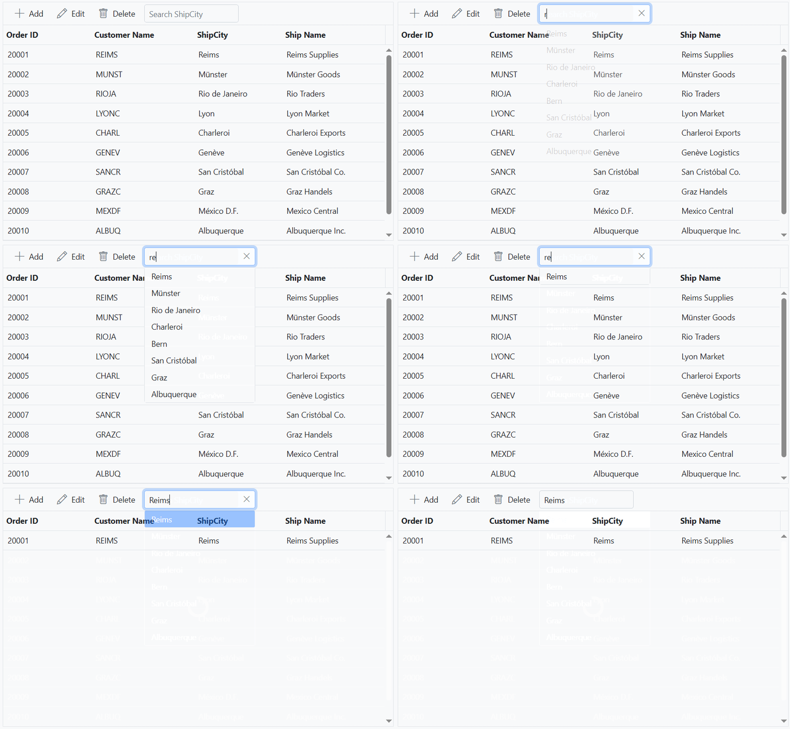
In the following example, an AutoComplete is defined as a custom toolbar item using the template property. The AutoComplete is populated with unique values from the ShipCity field of the Grid data. When you select a value from the AutoComplete, the Grid is filtered to display only the records that match the selected city. Once the Grid is rendered, the custom AutoComplete appears as part of the toolbar, allowing you to interact with both standard and custom toolbar elements.
Additionally, the change event of the AutoComplete is used to trigger a search operation within the Grid. When you select or type a value, the event handler invokes the Grid’s search method, dynamically filtering the displayed records in the ShipCity column based on the input.
@{
    var data = new string[] {
        "Reims",
        "Münster",
        "Rio de Janeiro",
        "Lyon",
        "Charleroi",
        "Bern",
        "Genève",
        "San Cristóbal",
        "Graz",
        "México D.F.",
        "Albuquerque",
        "Köln",
   };
}

<ejs-grid id="grid" dataSource="@ViewBag.DataSource" toolbar="@(new List<object>{"Add", "Edit", "Delete",new { template = "#toolbar-template", align = "Left", tooltipText = "Custom Component Autocomplete" }})" height="348">
    <e-grid-editSettings allowAdding="true" allowDeleting="true" allowEditing="true" Mode="Normal"></e-grid-editSettings>
    <e-grid-columns>
        <e-grid-column field="OrderID" headerText="Order ID" textAlign="Right" isPrimaryKey="true" width="120"></e-grid-column>
        <e-grid-column field="CustomerID" headerText="Customer Name" width="140"></e-grid-column>
        <e-grid-column field="ShipCity" headerText="ShipCity" width="120"></e-grid-column>
        <e-grid-column field="ShipName" headerText="Ship Name" width="140"></e-grid-column>
    </e-grid-columns>
</ejs-grid>
<div id="toolbar-template">
    <ejs-autocomplete id="shipCityValue" dataSource="@data" placeholder="Search ShipCity" change="onChange">
</ejs-autocomplete>
</div>

<script>
    function onChange(event) {
        var grid = document.getElementById("grid").ej2_instances[0];
		const selectedCity = event.value;
        // perform search action for ShipCity column.
        grid.search(selectedCity);
    }
</script>
public IActionResult Index()
{
ViewBag.dataSource = OrderDetails.GetAllRecords();
return View();
}
Custom toolbar items in a specific position
Customizing the position of a custom toolbar within the Syncfusion ASP.NET Core Grid involves modifying the default placement of the custom toolbar items. This enables you to precisely control the positioning of each custom toolbar item according to your specific requirements and desired layout within the Grid.
By default, custom toolbar items in Grid component are aligned on the left side of the toolbar. However, you have the ability to modify the position of the custom toolbar items by utilizing the align property of the ItemModel.
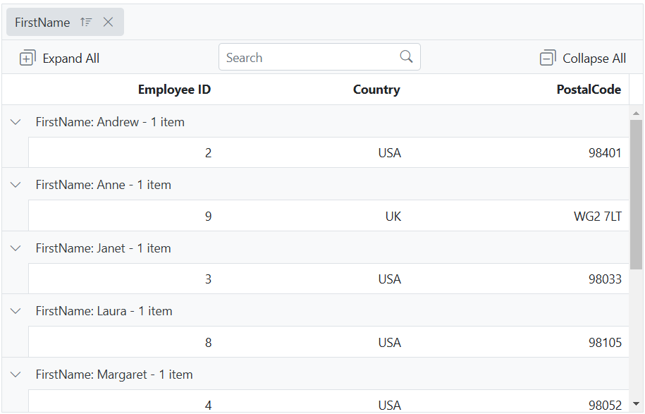
In the following sample, the Collapse All toolbar item is positioned on the Right, the Expand All toolbar item is positioned on the Left, and the Search toolbar item is positioned at the Center.
@{
    List<object> toolbarItems = new List<object>();
    toolbarItems.Add(new { text = "Expand All", tooltipText = "Expand All", prefixIcon = "e-expand", id = "expandall", align= "Left"});
    toolbarItems.Add(new {  text= "Collapse All", tooltipText= "Collapse All", prefixIcon= "e-collapse-2", id= "collapseall", align= "Right" });
    toolbarItems.Add(new { text = "Search", align = "Center" });
}
<ejs-grid id="grid" dataSource="@ViewBag.dataSource" toolbarClick="toolbarClick" toolbar=toolbarItems height="348px" allowGrouping="true">
    <e-grid-groupsettings columns="@(new string[] {"FirstName"})"></e-grid-groupsettings>
    <e-grid-columns>
        <e-grid-column field="EmployeeID" headerText="Employee ID" isPrimaryKey="true" textAlign="Right" width="120"></e-grid-column>
        <e-grid-column field="FirstName" headerText="First Name" width="140"></e-grid-column>
        <e-grid-column field="Country" headerText="Country" textAlign="Right" width="120"></e-grid-column>
        <e-grid-column field="PostalCode" headerText="Postal Code" textAlign="Right" width="140"></e-grid-column>
    </e-grid-columns>
</ejs-grid>
<script>
    function toolbarClick(args) {
        var grid = document.getElementById("grid").ej2_instances[0];
        if (args.item.id === 'expandall') grid.groupModule.expandAll();
        else grid.groupModule.collapseAll();
    }
</script>
public IActionResult Index()
{
ViewBag.dataSource = EmployeeDetails.GetAllRecords();
return View();
}