How can I help you?
Columns in ASP.NET Core Grid Component
16 Dec 202424 minutes to read
In Syncfusion® ASP.NET Core Grid, Columns are fundamental elements that play a pivotal role in organizing and displaying data within your application. They serve as the building blocks for data presentation, allowing you to specify what data fields to show, how to format and style them, and how to enable various interactions within the grid.
Column types
The Syncfusion® Grid component allows you to specify the type of data that a column binds using the columns.type property. The type property is used to determine the appropriate format, such as number or date, for displaying the column data.
Grid supports the following column types:
-
string: Represents a column that binds to string data. This is the default type if the
typeproperty is not defined. - number: Represents a column that binds to numeric data. It supports formatting options for displaying numbers.
- boolean: Represents a column that binds to boolean data. It displays checkboxes for boolean values.
- date: Represents a column that binds to date data. It supports formatting options for displaying dates.
- datetime: Represents a column that binds to date and time data. It supports formatting options for displaying date and time values.
- checkbox: Represents a column that displays checkboxes.
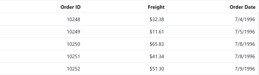
Here is an example of how to specify column types in a grid using the types mentioned above.
<ejs-grid id="Grid" dataSource="@ViewBag.DataSource" height="315">
<e-grid-columns>
<e-grid-column type="checkbox" width="90"></e-grid-column>
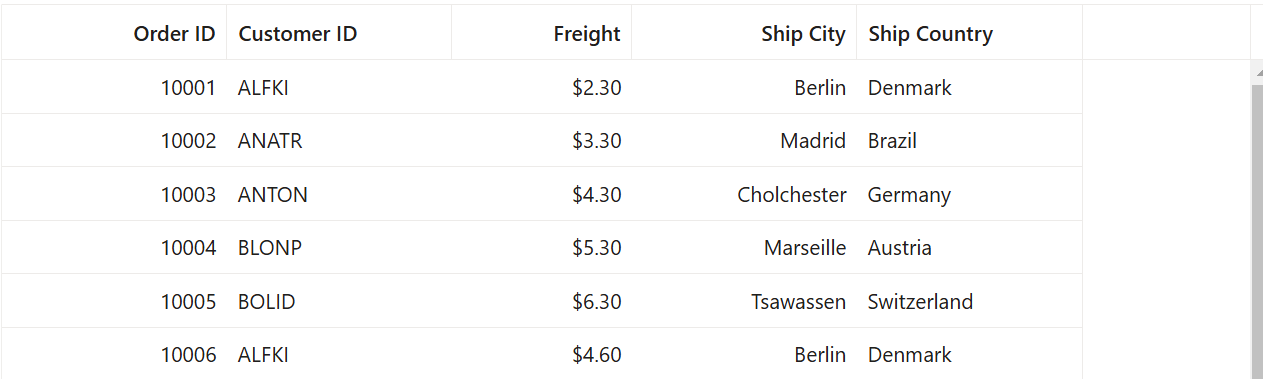
<e-grid-column field="OrderID" headerText="Order ID" width="90" textAlign="Right" type="number"></e-grid-column>
<e-grid-column field="CustomerID" headerText="Customer ID" width="120" type="string"></e-grid-column>
<e-grid-column field="Freight" headerText="Freight" width="90" format="C2" textAlign="Right" type="number"></e-grid-column>
<e-grid-column field="OrderDate" headerText="Order Date" width="120" format="yMd" textAlign="Right" type="date"></e-grid-column>
<e-grid-column field="ShippedDate" headerText="Shipped Date" width="200" format="dd/MM/yyyy hh:mm" textAlign="Right" type="dateTime"></e-grid-column>
<e-grid-column field="Verified" headerText="Verified" width="100" type="boolean" displayAsCheckBox="true"></e-grid-column>
</e-grid-columns>
</ejs-grid>public IActionResult Index()
{
var Order = OrderDetails.GetAllRecords();
ViewBag.DataSource = Order;
return View();
}
- If the
typeis not defined, then it will be determined from the first record of the dataSource.- Incase if the first record of the dataSource is null/blank value for a column then it is necessary to define the
typefor that column. This is because the grid uses the column type to determine which filter dialog to display for that column.
Difference between boolean type and checkbox type column
- Use the boolean column type when you want to bind boolean values from your datasource and/or edit boolean property values from your type.
- Use the checkbox column type when you want to enable selection/deselection of the whole row.
- When the grid column
typeis a checkbox, the selection type of the gridselectionSettingswill be multiple. This is the default behavior. - If you have more than one column with the column type as a checkbox, the grid will automatically enable the other column’s checkbox when selecting one column checkbox.
To learn more about how to render boolean values as checkboxes in a Syncfusion® GridColumn, please refer to the Render Boolean Values as Checkbox section.
Column width
To adjust the column width in a Grid, you can use the width property within the columns property of the Grid configuration. This property enables you to define the column width in pixels or as a percentage. You can set the width to a specific value, like 100 for 100 pixels, or as a percentage value, such as 25% for 25% of the available width.
- Grid column width is calculated based on the sum of column widths. For example, a grid container with 4 columns and a width of 800 pixels will have columns with a default width of 200 pixels each.
- If you specify widths for some columns but not others, the Grid will distribute the available width equally among the columns without explicit widths. For example, if you have 3 columns with widths of 100px, 200px, and no width specified for the third column, the third column will occupy the remaining width after accounting for the first two columns.
- Columns with percentage widths are responsive and adjust their width based on the size of the grid container. For example, a column with a width of 50% will occupy 50% of the grid width and will adjust proportionally when the grid container is resized to a smaller size.
- When you manually resize columns in Syncfusion® Grid, a minimum width is set to ensure that the content within the cells remains readable. By default, the minimum width is set to 10 pixels if not explicitly specified for a column.
- If the total width of all columns exceeds the width of the grid container, a horizontal scrollbar will automatically appear to allow horizontal scrolling within the grid.
- When the columns is hide using the column chooser, the width of the hidden columns is removed from the total grid width, and the remaining columns will be resized to fill the available space.
- If the parent element has a fixed width, the grid component will inherit that width and occupy the available space. However, if the parent element does not have a fixed width, the grid component will adjust its width dynamically based on the available space.
Supported types for column width
Syncfusion® Grid supports the following three types of column width:
1. Auto
The column width is automatically calculated based on the content within the column cells. If the content exceeds the width of the column, it will be truncated with an ellipsis (…) at the end. You can set the width for columns as auto in your Grid configuration as shown below:
<e-grid-column field="OrderID" headerText="Order ID" textAlign='Right' width='auto'></e-grid-column>2. Percentage
The column width is specified as a percentage value relative to the width of the grid container. For example, a column width of 25% will occupy 25% of the total grid width. You can set the width for columns as percentage in your Grid configuration as shown below:
<e-grid-column field='OrderID' headerText='Order ID' textAlign='Right' width='25%'></e-grid-column>3. Pixel
The column width is specified as an absolute pixel value. For example, a column width of 100px will have a fixed width of 100 pixels regardless of the grid container size. You can set the width for columns as pixel in your Grid configuration as shown below:
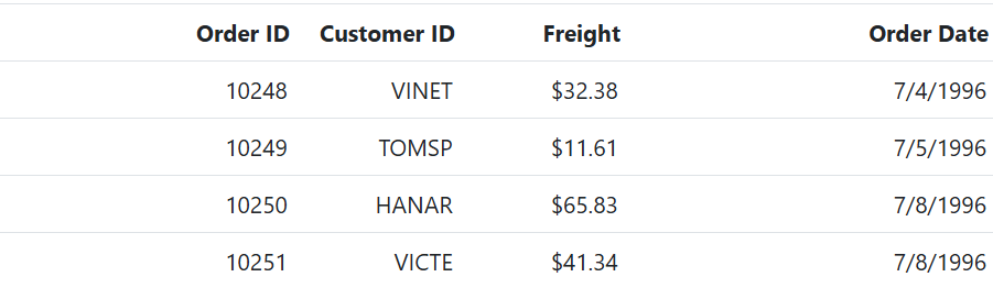
<e-grid-column field='OrderID' headerText='Order ID' textAlign='Right' width='100'></e-grid-column><ejs-grid id="Grid" dataSource="@ViewBag.DataSource">
<e-grid-columns>
<e-grid-column field="OrderID" headerText="Order ID" textAlign="Right" width="auto"></e-grid-column>
<e-grid-column field="CustomerID" headerText="Customer ID" width="120"></e-grid-column>
<e-grid-column field="Freight" headerText="Freight" textAlign="Right" format="C2" width="100"></e-grid-column>
<e-grid-column field="OrderDate" headerText="Order Date" textAlign="Right" format="yMd" width="30%"></e-grid-column>
</e-grid-columns>
</ejs-grid>public IActionResult Index()
{
var Order = OrderDetails.GetAllRecords();
ViewBag.DataSource = Order;
return View();
}
Column formatting
Column formatting is a powerful feature in Syncfusion® Grid that allows you to customize the display of data in grid columns. You can apply different formatting options to columns based on your requirements, such as displaying numbers with specific formats, formatting dates according to a specific locale, and using templates to format column values.
You can use the columns.format property to specify the format for column values.
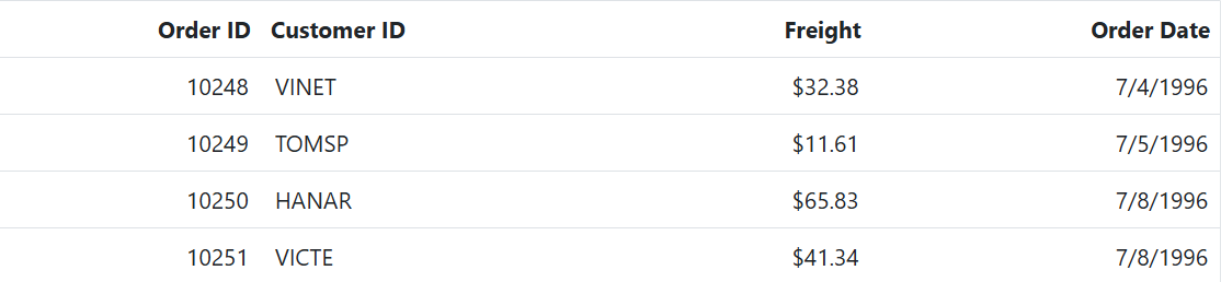
<ejs-grid id="Grid" dataSource="@ViewBag.DataSource" height="315">
    <e-grid-columns>
        <e-grid-column field="OrderID" headerText="Order ID" textAlign="Right" width="90"></e-grid-column>
        <e-grid-column field="CustomerID" headerText="Customer ID" width="120"></e-grid-column>
        <e-grid-column field="Freight" headerText="Freight" textAlign="Right" format="C2" width="90"></e-grid-column>
        <e-grid-column field="OrderDate" headerText="Order Date" format='yMd' textAlign="Right" width="120"></e-grid-column>
    </e-grid-columns>
</ejs-grid>
public IActionResult Index()
{
var Order = OrderDetails.GetAllRecords();
ViewBag.DataSource = Order;
return View();
}
- The grid uses the Internalization library to format values based on the specified format and culture.
- By default, the number and date values are formatted in en-US locale. You can localize the currency and date in different locale as explained here.
- The available format codes may vary depending on the data type of the column.
- You can also customize the formatting further by providing a custom function to the
formatproperty, instead of a format string.- Make sure that the format string is valid and compatible with the data type of the column, to avoid unexpected results.
Number formatting
Number formatting allows you to customize the display of numeric values in grid columns. You can use standard numeric format strings or custom numeric format strings to specify the desired format. The columns.format property can be used to specify the number format for numeric columns. For example, you can use the following format strings to format numbers:
| Format | Description | Remarks |
|---|---|---|
| N | Denotes numeric type. | The numeric format is followed by integer value as N2, N3. etc which denotes the number of precision to be allowed. |
| C | Denotes currency type. | The currency format is followed by integer value as C2, C3. etc which denotes the number of precision to be allowed. |
| P | Denotes percentage type | The percentage format expects the input value to be in the range of 0 to 1. For example the cell value 0.2 is formatted as 20%. The percentage format is followed by integer value as P2, P3. etc which denotes the number of precision to be allowed. |
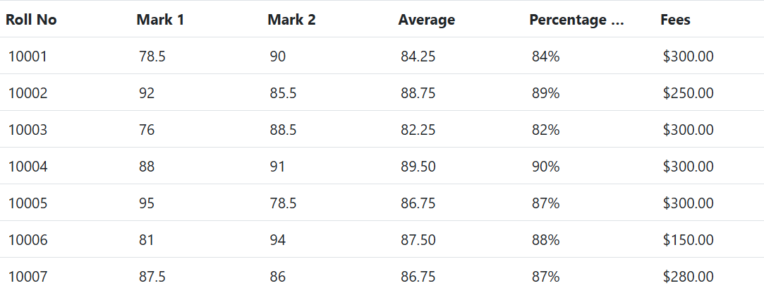
The following example code demonstrates the formatting of data for Mark 1 and Mark 2 using the ‘N’ format, Percentage of Marks using the ‘P’ format, and Fees using the ‘C’ format.
<ejs-grid id="Grid" dataSource="@ViewBag.DataSource">
    <e-grid-columns>
        <e-grid-column field="RollNo" headerText="Roll No"></e-grid-column>
        <e-grid-column field="Mark1" headerText="Mark 1"></e-grid-column>
        <e-grid-column field="Mark2" headerText="Mark 2" format="N"></e-grid-column>
        <e-grid-column field="Average" headerText="Average" format="N2"></e-grid-column>
        <e-grid-column field="Percentage" headerText="Percentage of Marks" format="P"></e-grid-column>
        <e-grid-column field="Fees" headerText="Fees" format="C"></e-grid-column>
    </e-grid-columns>
</ejs-grid>
public IActionResult Index()
{
var Order = StudentDetails.GetAllRecords();
ViewBag.DataSource = Order;
return View();
}
To learn more about number formatting, you can refer to the number section.
Date formatting
Date formatting in grid columns allows you to customize how date values are displayed. You can use standard date format strings, such as “d,” “D,” “MMM dd, yyyy,” and more, or create your own custom format strings. To specify the desired date format, you can use the formatproperty of the Grid columns. For example, you can set columns.format as a string like “yMd” for a built-in date format.
Additionally, you can use custom format strings to format date values, and examples of custom formats and formatted date values are provided in the table below.
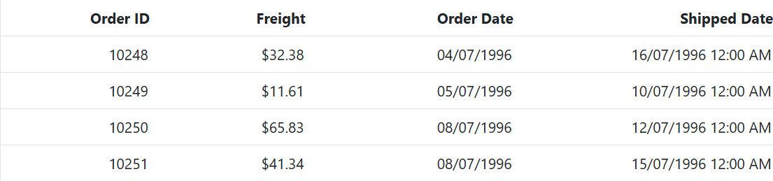
| Format | Formatted value |
|---|---|
| { type:’date’, format:’dd/MM/yyyy’ } | 04/07/1996 |
| { type:’date’, format:’dd.MM.yyyy’ } | 04.07.1996 |
| { type:’date’, skeleton:’short’ } | 7/4/96 |
| { type: ‘dateTime’, format: ‘dd/MM/yyyy hh:mm a’ } | 04/07/1996 12:00 AM |
| { type: ‘dateTime’, format: ‘MM/dd/yyyy hh:mm:ss a’ } | 07/04/1996 12:00:00 AM |
<ejs-grid id="Grid" dataSource="@ViewBag.DataSource" height="315">
    <e-grid-columns>
        <e-grid-column field="OrderID" headerText="Order ID" textAlign="Right" width="90"></e-grid-column>
        <e-grid-column field="Freight" headerText="Freight" textAlign="Right" format="C2" width="90"></e-grid-column>
        <e-grid-column field="OrderDate" headerText="Order Date" format="dd/MM/yyyy" type="date" textAlign="Right" width="120"></e-grid-column>
        <e-grid-column field="ShippedDate" headerText="Shipped Date" format="dd/MM/yyyy hh:mm a" type="dateTime" textAlign="Right" width="150"></e-grid-column>
    </e-grid-columns>
</ejs-grid>
public IActionResult Index()
{
var Order = StudentDetails.GetAllRecords();
ViewBag.DataSource = Order;
return View();
}
To learn more about date formatting, you can refer to Date formatting.
Format the date column based on localization
You can also format the date column based on the localization settings of the user’s browser. You can use the format property of the Grid columns along with the locale property to specify the desired date format based on the locale.
In this example, the format property specifies the date format as “yyyy-MMM-dd”, and the locale property specifies the locale as “es-AR” for Spanish (Argentina).
<ejs-grid id="Grid" dataSource="@ViewBag.DataSource" height="315" locale="es-AR">
    <e-grid-columns>
        <e-grid-column field="OrderID" headerText="Order ID" textAlign="Right" width="120" ></e-grid-column>
        <e-grid-column field="CustomerID" headerText="Customer ID" width="150"></e-grid-column>
        <e-grid-column field="Freight" headerText="Freight" textAlign="Right" width="150" format="C2"></e-grid-column>
        <e-grid-column field="OrderDate" headerText="Order Date" textAlign="Right" width="150" format="yyyy-MMM-dd"></e-grid-column>
        <e-grid-column field="ShipCity" headerText="ShipCity" width="150"></e-grid-column>
    </e-grid-columns>
</ejs-grid>
<script>
    loadCultureFiles('es-AR');
    function loadCultureFiles(name) {
        var files = ['ca-gregorian.json', 'numberingSystems.json', 'currencies.json', 'timeZoneNames.json'];
        var loader = ej.base.loadCldr;
        var loadCulture = function (prop) {
            var val, fetch;
            if (files[prop] === 'numberingSystems.json') {
                fetch = new ej.base.Fetch(location.origin + '/../cldr-data/supplemental/' + files[prop], 'GET', false);
            } else {
                fetch = new ej.base.Fetch(location.origin + '/../cldr-data/main/' + name + '/' + files[prop], 'GET', false);
            }
       fetch.onSuccess = function (response) {
                if (typeof response === 'object') {
                    // If the response is an object, convert it to a JSON string
                    var jsonString = JSON.stringify(response);
                    ej.base.loadCldr(JSON.parse(jsonString));
                } else if (typeof response === 'string') {
                    // If the response is already a JSON string, parse and load it
                    ej.base.loadCldr(JSON.parse(response));

                } else {
                    console.error('Invalid responsetype received:', response);
                }
                ej.base.setCulture('es-AR');
                ej.base.setCurrencyCode('ARS');
            };
            fetch.send();
        };
        for (var prop = 0; prop < files.length; prop++) {
            loadCulture(prop);
        }
    }
</script>
public IActionResult Index()
{
var Order = OrderDetails.GetAllRecords();
ViewBag.DataSource = Order;
return View();
}
Format template column value
In the Syncfusion® ASP.NET Core Grid, you have the ability to customize the display of data in a column through the use of template columns. Formatting template column values is essential for enhancing the visual representation of data in a web application. It allows the customization of the appearance of specific column data, such as dates and numbers, to improve readability and user understanding.
To illustrate how to format a template column value, consider the following example where the OrderDate column is formatted to display dates in the ‘dd/MMM/yyyy’ format.
<ejs-grid id="Grid" dataSource="@ViewBag.DataSource" height="315">
<e-grid-columns>
    <e-grid-column field="OrderID" headerText="Order ID" textAlign="Right" width="90"></e-grid-column>
    <e-grid-column field="Freight" headerText="Freight" textAlign="Right" format="C2" width="90"></e-grid-column>
    <e-grid-column field="OrderDate" headerText="Order Date" textAlign="Right" width="120" template="#dateTemplate"></e-grid-column>
    <e-grid-column field="ShipCountry" headerText="Ship Country" textAlign="Right" width="150"></e-grid-column>
</e-grid-columns>
</ejs-grid>

<script type="text/x-template" id="dateTemplate">
    ${formatDate(OrderDate)}
</script>

<script>
    function formatDate(date) {
        let orderDate = new Date(date);
        let day = orderDate.getDate();
        let month = orderDate.toLocaleDateString('default', { month: 'short' });
        let year = orderDate.getFullYear();
        return `${day}/${month}/${year}`;
    }
</script>
public IActionResult Index()
{
var Order = OrderDetails.GetAllRecords();
ViewBag.DataSource = Order;
return View();
}
Custom formatting
Syncfusion® Grid allows you to customize the formatting of data in the grid columns. You can apply custom formats to numeric or date columns to display data in a specific way according to the requirements. To apply custom formatting to grid columns in Syncfusion® Grid, you can use the format property. Here’s an example of how you can use custom formatting for numeric and date columns:
In the below example, the numberFormatOptions object is used as the format property for the ‘Freight’ column to apply a custom numeric format with four decimal places. Similarly, the dateFormatOptions object is used as the format property for the ‘OrderDate’ column to apply a custom date format displaying the date in the format of day-of-the-week, month abbreviation, day, and 2-digit year (e.g. Sun, May 8, ‘23).
@{
    var numberFormatOptions = "##.0000";
    var dateFormatOptions = "EEE, MMM d, ''yy";
}
<ejs-grid id="Grid" dataSource="@ViewBag.DataSource" height="315">
    <e-grid-columns>
         <e-grid-column field="OrderID" headerText="Order ID" textAlign="Right" width="90"></e-grid-column>
         <e-grid-column field="CustomerID" headerText="Customer ID" width="120"></e-grid-column>
         <e-grid-column field="Freight" headerText="Freight" textAlign="Right" width="90" format="@numberFormatOptions"></e-grid-column>
         <e-grid-column field="OrderDate" headerText="Order Date" textAlign="Right" width="120" type="date" format="@dateFormatOptions"></e-grid-column>
    </e-grid-columns>
</ejs-grid>
public IActionResult Index()
{
var Order = OrderDetails.GetAllRecords();
ViewBag.DataSource = Order;
return View();
}
To learn more about custom formatting, you can refer to Custom Date formatting and Custom Number formatting.
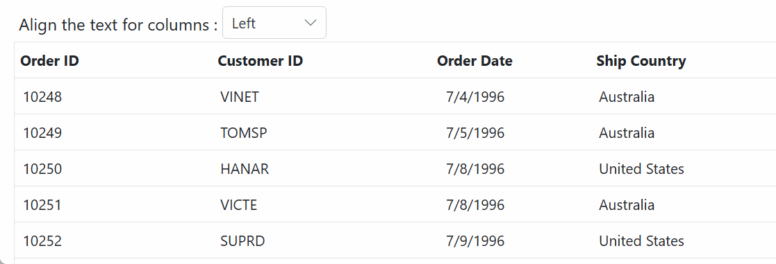
Align the text of content
You can align the text in the content of a Grid column using the textAlign property. This property allows you to specify the alignment of the text within the cells of a particular column in the Grid. By default, the text is aligned to the left, but you can change the alignment by setting the value of the textAlign property to one of the following options:
- Left: Aligns the text to the left (default).
- Center: Aligns the text to the center.
- Right: Aligns the text to the right.
- Justify: Align the text to the justify.
Here is an example of using the textAlign property to align the text of a Grid column:
@{
    var alignmentOptions = new List<object> {
        new { text = "Left", value = "Left" },
        new { text = "Right", value = "Right" },
        new { text = "Center", value = "Center" },
        new { text = "Justify", value = "Justify" }
    };
}
<script>
    function changeAlignment(args) {
        let grid = document.getElementById("Grid").ej2_instances[0];
        grid.columns.forEach(function (col) {
            col.textAlign = args.value;
        });
        grid.refreshColumns();
    }
</script>
<div>
    <ejs-dropdownlist id="alignmentDropdown" width="100px" dataSource="@alignmentOptions" index="0" change="changeAlignment">
        <e-dropdownlist-fields text="text" value="value"></e-dropdownlist-fields>
    </ejs-dropdownlist>
</div>
<ejs-grid id="Grid" dataSource="@ViewBag.DataSource">
    <e-grid-columns>
        <e-grid-column field="OrderID" headerText="Order ID" type="number" width="120"></e-grid-column>
        <e-grid-column field="CustomerID" headerText="Customer ID" type="string" width="90"></e-grid-column>
        <e-grid-column field="OrderDate" headerText="Order Date" type="date" textAlign="Center" format="yMd" width="140"></e-grid-column>
        <e-grid-column field="ShipCountry" headerText="Ship Country" type="string" width="120"></e-grid-column>
    </e-grid-columns>
</ejs-grid>
public IActionResult Index()
{
var Order = OrderDetails.GetAllRecords();
ViewBag.DataSource = Order;
return View();
}
- The
textAlignproperty only changes the alignment content not the column header. If you want to align both the column header and content, you can use theheaderTextAlignproperty.
Render boolean value as checkbox
The Grid component allows you to render boolean values as checkboxes in columns. This can be achieved by using the displayAsCheckBox property, which is available in the columns. This property is useful when you have a boolean column in your Grid and you want to display the values as checkboxes instead of the default text representation of true or false.
To enable the rendering of boolean values as checkboxes, you need to set the displayAsCheckBox property of the columns to true.
<ejs-grid id="Grid" dataSource="ViewBag.DataSource">
    <e-grid-columns>
        <e-grid-column field="OrderID"  headerText="Order ID" textAlign="Right" width="100"></e-grid-column>
        <e-grid-column field="CustomerID" headerText="Customer ID" width="100"></e-grid-column>
        <e-grid-column field="Freight" headerText="Freight" textAlign="Right" format="C2" width="100" ></e-grid-column>
        <e-grid-column field="Verified" headerText="Verified" displayAsCheckBox="true" width="150"></e-grid-column>
    </e-grid-columns>
</ejs-grid>
public IActionResult Index()
{
var orders = OrdersDetails.GetAllRecords();
ViewBag.DataSource = orders;
return View();
}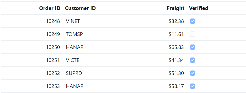
- The
displayAsCheckBoxproperty is only applicable to boolean values in Grid columns.- When
displayAsCheckBoxis set to true, the boolean values will be rendered as checkboxes in the Grid column, with checked state indicating true and unchecked state indicating false.
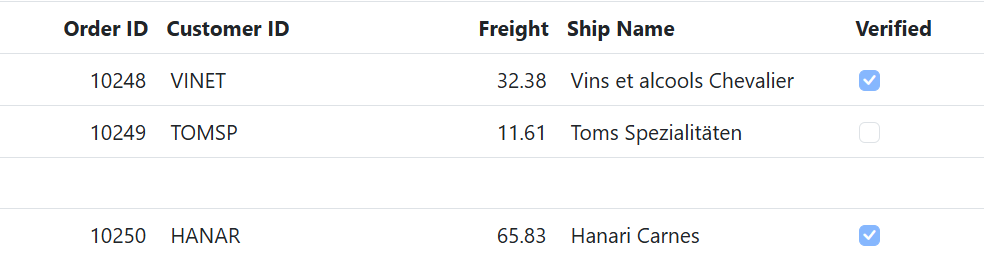
How to prevent checkbox in the blank row
To prevent the checkbox in the blank row of the Grid, even if the displayAsCheckBox property is set to true for that column, you can use the rowDataBound event and check for empty or null values in the row data. If all the values in the row are empty or null, you can set the inner HTML of the corresponding cell to an empty string to hide the checkbox.
Here is an example of how you can prevent a checkbox from being displayed in a blank row in a Grid:
<ejs-grid id="Grid" dataSource="@ViewBag.DataSource" rowDataBound="rowDataBound">
    <e-grid-columns>
        <e-grid-column field="OrderID" headerText="Order ID" textAlign="Right" width="100" isPrimaryKey="true"></e-grid-column>
        <e-grid-column field="CustomerID" headerText="Customer ID" width="150"></e-grid-column>
        <e-grid-column field="Freight" headerText="Freight" width="100" textAlign="Right"></e-grid-column>
        <e-grid-column field="ShipName" headerText="Ship Name" width="180"></e-grid-column>
        <e-grid-column field="Verified" headerText="Verified" width="150" displayAsCheckBox="true"></e-grid-column>
    </e-grid-columns>
</ejs-grid>

<script>
    function rowDataBound(args) {
         let grid = document.getElementById('Grid').ej2_instances[0];
         let count = 0;
         let keys = Object.keys(args.data);
         for (let i = 0; i < keys.length; i++) {
             if (args.data[keys[i]] == null || args.data[keys[i]] == '' || args.data[keys[i]] == undefined) {
                 count++;
             }
         }
         if (count == keys.length) {
             for (let i = 0; i < grid.columns.length; i++) {
                 if (grid.columns[i].displayAsCheckBox) {
                     args.row.children[i].innerHTML = '';
                 }
             }
         }
        }
</script>
public IActionResult Index()
{
var orders = OrdersDetails.GetAllRecords();
ViewBag.DataSource = orders;
return View();
}
AutoFit columns
The Grid has a feature that allows to automatically adjust column widths based on the maximum content width of each column when you double-click on the resizer symbol located in a specific column header. This feature ensures that all data in the grid rows is displayed without wrapping. To use this feature, you need to enable the resizer symbol in the column header by setting the allowResizing property to true in the grid.
Resizing a column to fit its content using AutoFit method
The autoFitColumns method resizes the column to fit the widest cell’s content without wrapping. You can AutoFit specific columns at initial rendering by invoking the autoFitColumns method in dataBound event.
<ejs-grid id="Grid" dataSource="@ViewBag.DataSource" dataBound="dataBound" height="315" gridLines='Both'>
    <e-grid-columns>
        <e-grid-column field="OrderID" headerText="Order ID"  width="140"></e-grid-column>
        <e-grid-column field="CustomerID" headerText="Customer ID" width="130"></e-grid-column>
        <e-grid-column field="ShipName" headerText="Ship Name" width="80"></e-grid-column>
        <e-grid-column field="ShipAddress" headerText="Ship Address" width="120"></e-grid-column>
        <e-grid-column field="ShipCity" headerText="Ship City" width="100"></e-grid-column>
    </e-grid-columns>
</ejs-grid>

<script>
    function dataBound(args) {
        this.autoFitColumns(['ShipName', 'ShipAddress']);
    }
</script>
public IActionResult Index()
{
var Order = OrderDetails.GetAllRecords();
ViewBag.DataSource = Order;
return View();
}
You can autoFit all the columns by invoking the
autoFitColumnsmethod without specifying column names.
AutoFit columns with empty space
The AutoFit feature is utilized to display columns in a grid based on the defined width specified in the columns declaration. If the total width of the columns is less than the width of the grid, this means that white space will be displayed in the grid instead of the columns auto-adjusting to fill the entire grid width.
You can enable this feature by setting the autoFit property set to true. This feature ensures that the column width is rendered only as defined in the Grid column definition.
<ejs-grid id="Grid" dataSource="@ViewBag.DataSource"  height="315" allowResizing= "true" height= "400" width= "850" autoFit= "true" >
    <e-grid-columns>
        <e-grid-column field="OrderID" headerText="Order ID" minWidth="100" width="150" maxWidth="200" textAlign="Right"></e-grid-column>
        <e-grid-column field="CustomerID" headerText="Customer ID" minWidth="8" width="150"></e-grid-column>
        <e-grid-column field="Freight" headerText="Freight" minWidth="8" width="120" format="C2" textAlign="Right"></e-grid-column>
        <e-grid-column field="ShipCity" headerText="Ship City" allowResizing= "false" width="150" textAlign="Right"></e-grid-column>
        <e-grid-column field="ShipCountry" headerText="Ship Country" minWidth="8" width="150"></e-grid-column>
    </e-grid-columns>
</ejs-grid>
public IActionResult Index()
{
var Order = OrderDetails.GetAllRecords();
ViewBag.DataSource = Order;
return View();
}
If any one of the column width is undefined, then the particular column will automatically adjust to fill the entire width of the grid table, even if you have enabled the
autoFitproperty of grid.
AutoFit columns when changing column visibility using column chooser
In Syncfusion® Grid, you can auto-fit columns when the column visibility is changed using the column chooser. This can be achieved by calling the autoFitColumns method in the actionComplete event. By using the requestType property in the event arguments, you can differentiate between different actions, and then call the autoFitColumns method when the request type is columnState.
Here’s an example code snippet in ASP.NET Core that demonstrates how to AutoFit columns when changing column visibility using column chooser:
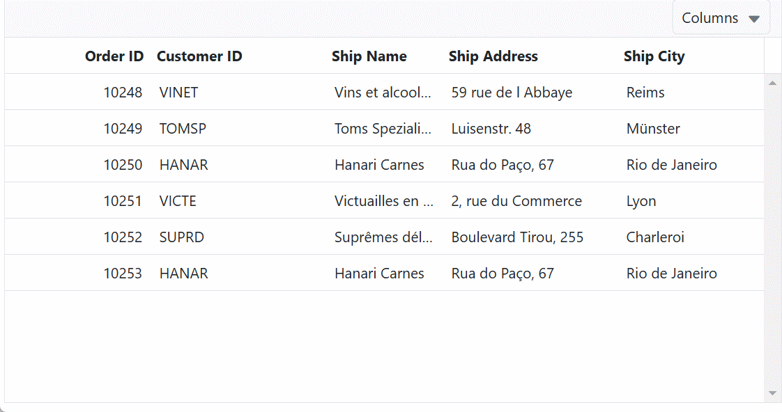
<ejs-grid id="Grid" dataSource="@ViewBag.DataSource"  height="315" showColumnChooser="true" toolbar="@(new List<string>() { "ColumnChooser"})">
    <e-grid-columns>
       <e-grid-column field="OrderID" headerText="Order ID" textAlign="Right" width="100"></e-grid-column>
       <e-grid-column field="CustomerID" headerText="Customer ID" width="120"></e-grid-column>
       <e-grid-column field="ShipName" headerText="Ship Name" width="80"></e-grid-column>
       <e-grid-column field="ShipAddress" headerText="Ship Address" width="120"></e-grid-column>
       <e-grid-column field="ShipCity" headerText="Ship City" width="100"></e-grid-column>
    </e-grid-columns>
</ejs-grid>

<script>
    var grid = document.getElementById('Grid').ej2_instances[0];
    grid.actionComplete = function (args) {
        if (args.requestType === 'columnstate') {
            grid.autoFitColumns();
        }
    };
</script>
public IActionResult Index()
{
var Order = OrderDetails.GetAllRecords();
ViewBag.DataSource = Order;
return View();
}
AutoFit columns with specific rows
To adjust the column widths of a specific range of rows based on their content, you can use the autoFitColumns method by simply passing the second and third parameters (optional) as the start and end index for the column you want to fit. You can AutoFit specific columns at initial rendering by invoking the autoFitColumns method in dataBound event.
This feature will calculate the appropriate width based on the maximum content width of the specified range of rows or the header text width. Subsequently, the maximum width of the content of the specified rows or header text will be applied to the entire column of the grid.
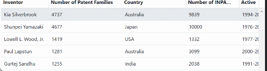
Here is an example of how to AutoFit columns with specific rows. The first parameter is an array containing the specific column field names, such as Inventor, Number of INPADOC patents and Main fields of invention is passed to apply the AutoFit functionality to these columns. After, the second parameter are start index is set to 1 and third parameter are end index is set to 3. When specifying these start and end index, the AutoFit operation is applied only to the range of rows from 1 to 3 for column width adjustment.
<ejs-grid id="Grid" dataSource="@ViewBag.DataSource" dataBound="dataBound" height="315" allowResizing="true">
    <e-grid-columns>
            <e-grid-column field="Inventor" headerText="Inventor" width="100" clipMode="EllipsisWithTooltip"></e-grid-column>
            <e-grid-column field="NumberOfPatentFamilies" headerText="Number of Patent Families" width="120"></e-grid-column>
            <e-grid-column field="Country" headerText="Country" width="180"></e-grid-column>
            <e-grid-column field="NumberOfINPADOCPatents" headerText="Number of INPADOC patents" width="150"></e-grid-column>
            <e-grid-column field="Active" headerText="Active" width="100"></e-grid-column>
            <e-grid-column field="MainFieldsOfInvention" headerText="Main fields of invention" width="100"></e-grid-column>
    </e-grid-columns>
</ejs-grid>

<script>
    function dataBound(args) {
        this.autoFitColumns(['Inventor', 'NumberOfPatentFamilies', 'MainFieldsOfInvention'], 1, 3);
    }
</script>
public IActionResult Index()
{
var orders = InventorDetails.GetAllRecords();
ViewBag.datasource = orders;
return View();
}
Locked columns
The Syncfusion® Grid allows you to lock columns, which prevents them from being reordered and moves them to the first position. This functionality can be achieved by setting the column.lockColumn property to true, which locks the column and moves it to the first position in the grid.
Here’s an example of how you can use the lockColumn property to lock a column in the Syncfusion® Grid:
<ejs-grid id="Grid" dataSource="@ViewBag.DataSource" allowReordering="true" allowSelection="false">
    <e-grid-columns>
 <e-grid-column field="OrderID" headerText="Order ID" textAlign="Right" width="100"></e-grid-column>
 <e-grid-column field="CustomerID" headerText="Customer ID" width="120"></e-grid-column>
 <e-grid-column field="ShipCity" headerText="Ship City" width="100" lockColumn="true" customAttributes=@(new{@class="custom-css"})></e-grid-column>
 <e-grid-column field="ShipName" headerText="Ship Name" width="100"></e-grid-column>
    </e-grid-columns>
</ejs-grid>
<style>
    .custom-css {
            background-color: #ecedee;
    }
</style>
public IActionResult Index()
{
var order = OrderDetails.GetAllRecords();
ViewBag.DataSource = order;
return View();
}
Show or hide columns
The Syncfusion® Grid component allows you to show or hide columns dynamically by using property or methods available in the grid. This feature can be useful when you want to customize the visibility of columns in the Grid based on the requirements.
To work with showing and hiding columns, it is necessary to have at least one column of the grid in a visible state
Using property
You can show or hide columns in the ASP.NET Core Grid using the visible property of each column. By setting the visible property to true or false, you can component whether the column should be visible or hidden in the grid. Here’s an example of how to show or hide a column in the ASP.NET Core Grid using the visible property:
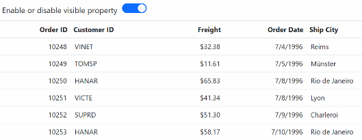
In the following example, the EJ2 Toggle Switch Button component is added to enable and disable the visible property. When the switch is toggled, the change event is triggered and the visible property of the ShipCity column is updated accordingly. The refreshColumns method is called to refresh the grid and display the updated content.
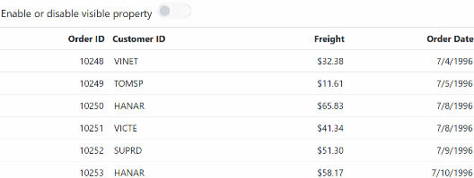
<label style="padding: 10px 5px">Enable or disable visible property</label>
<ejs-switch id="switch" change="Change"></ejs-switch>
<ejs-grid id="Grid" dataSource="@ViewBag.DataSource" height="315">
    <e-grid-columns>
           <e-grid-column field="OrderID" headerText="Order ID" textAlign="Right" width="120"></e-grid-column>
           <e-grid-column field="CustomerID" headerText="Customer ID" width="140"></e-grid-column>
           <e-grid-column field="Freight" headerText="Freight" textAlign="Right" format="C" width="120"></e-grid-column>
           <e-grid-column field="OrderDate" headerText="Order Date" textAlign="Right" format="yMd" width="140"></e-grid-column>
           <e-grid-column field="ShipCity" headerText="Ship City" visible="false" width="100"></e-grid-column>
    </e-grid-columns>
</ejs-grid>
<script>
   function Change(args) {
    var grid = document.getElementById("Grid").ej2_instances[0];
    if (args.checked) {
        grid.getColumnByField('ShipCity').visible = true;
    } else {
        grid.getColumnByField('ShipCity').visible = false;
    }
    grid.refreshColumns();
    }
</script>
public IActionResult Index()
{
var Order = OrderDetails.GetAllRecords();
ViewBag.DataSource = Order;
return View();
}
- Hiding a column using the
visibleproperty only affects the UI representation of the grid. The data for the hidden column will still be available in the underlying data source, and can be accessed or modified programmatically.- When a column is hidden, its width is not included in the calculation of the total grid width.
- To hide a column permanently, you can set its visible property to false in the column definition, or remove the column definition altogether.
Using methods
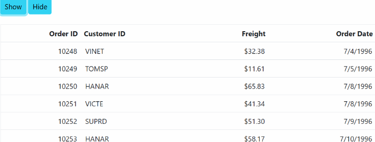
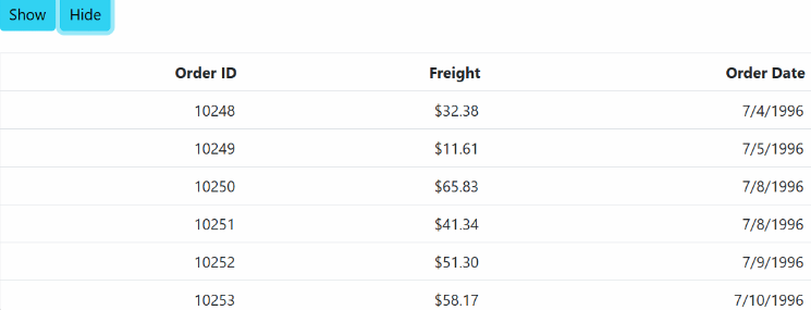
You can also show or hide columns in the ASP.NET Core Grid using the showColumns and hideColumns methods of the grid component. These methods allow you to show or hide columns based on either the headerText or the field of the column.
Based on header text
You can dynamically show or hide columns in the Grid based on the header text by invoking the showColumns or hideColumns methods. These methods take an array of column header texts as the first parameter, and the value headerText as the second parameter to specify that you are showing or hiding columns based on the header text.
Here’s an example of how to show or hide a column based on the headerText in the ASP.NET Core Grid:
<div style="padding:0px 0px 20px 0px">
    <ejs-button id='show' cssClass='e-info' content="Show"></ejs-button>
    <ejs-button id='hide' cssClass='e-info' content="Hide"></ejs-button>
</div>
<ejs-grid id="Grid" dataSource="@ViewBag.DataSource" height="315">
    <e-grid-columns>
        <e-grid-column field="OrderID" headerText="Order ID" textAlign="Right" width="90"></e-grid-column>
        <e-grid-column field="CustomerID" headerText="Customer ID" width="120"></e-grid-column>
        <e-grid-column field="Freight" headerText="Freight" textAlign="Right" format="C2" width="90"></e-grid-column>
        <e-grid-column field="OrderDate" headerText="Order Date" textAlign="Right" format="yMd" width="120"></e-grid-column>
    </e-grid-columns>
</ejs-grid>
<script type="text/javascript">
    document.getElementById('show').addEventListener('click', function () {
        var grid = document.getElementById("Grid").ej2_instances[0];
        grid.showColumns('Customer ID', 'headerText'); //show by HeaderText
    });
    document.getElementById('hide').addEventListener('click', function () {
        var grid = document.getElementById("Grid").ej2_instances[0];
        grid.hideColumns('Customer ID', 'headerText'); //hide by HeaderText
    });
</script>
public IActionResult Index()
{
var Order = OrderDetails.GetAllRecords();
ViewBag.DataSource = Order;
return View();
}
Based on field
You can dynamically show or hide columns in the Grid using external buttons based on the field by invoking the showColumns or hideColumns methods. These methods take an array of column fields as the first parameter, and the value field as the second parameter to specify that you are showing or hiding columns based on the field.
Here’s an example of how to show or hide a column based on the field in the ASP.NET Core Grid:
<div style="padding:0px 0px 20px 0px">
    <ejs-button id='show' cssClass='e-info' content="Show"></ejs-button>
    <ejs-button id='hide' cssClass='e-info' content="Hide"></ejs-button>
</div>
<ejs-grid id="Grid" dataSource="@ViewBag.DataSource" height="315">
    <e-grid-columns>
        <e-grid-column field="OrderID" headerText="Order ID" textAlign="Right" width="90"></e-grid-column>
        <e-grid-column field="CustomerID" headerText="Customer ID" width="120"></e-grid-column>
        <e-grid-column field="Freight" headerText="Freight" textAlign="Right" format="C2" width="90"></e-grid-column>
        <e-grid-column field="OrderDate" headerText="Order Date" textAlign="Right" format="yMd" width="120"></e-grid-column>
    </e-grid-columns>
</ejs-grid>
<script type="text/javascript">
    document.getElementById('show').addEventListener('click', function () {
        var grid = document.getElementById("Grid").ej2_instances[0];
        grid.showColumns('CustomerID', 'field'); //show by Field
    });
    document.getElementById('hide').addEventListener('click', function () {
        var grid = document.getElementById("Grid").ej2_instances[0];
        grid.hideColumns('CustomerID', 'field'); //hide by Field
    });
</script>
public IActionResult Index()
{
var Order = OrderDetails.GetAllRecords();
ViewBag.DataSource = Order;
return View();
}
Controlling Grid actions
You can component various actions such as filtering, grouping, sorting, resizing, reordering, editing, and searching for specific columns in the Syncfusion® ASP.NET Core Grid using the following properties:
-
allowEditing: Enables or disables editing for a column. - allowFiltering: Enables or disables filtering for a column.
- allowGrouping: Enables or disables grouping for a column.
- allowSorting: Enables or disables sorting for a column.
- allowReordering: Enables or disables reordering for a column.
- allowResizing: Enables or disables resizing for a column
-
allowSearching: Enables or disables searching for a column
Here is an example code that demonstrates how to component grid actions for specific columns:
<ejs-grid id="Grid" dataSource="@ViewBag.DataSource" allowFiltering="true" allowGrouping="true" allowSorting="true" allowReordering="true" allowResizing="true" toolbar="@(new List<string>() {"Search"})">
    <e-grid-columns>
        <e-grid-column field="OrderID" headerText="Order ID" textAlign="Right" width="120" allowGrouping="false" allowResizing="false"></e-grid-column>
        <e-grid-column field="CustomerID" headerText="Customer ID" textAlign="Left" width="150" allowSorting="false"></e-grid-column>
        <e-grid-column field="ShipCity" headerText="Ship City" textAlign="Left" width="150" allowReordering="false"></e-grid-column>
        <e-grid-column field="ShipCountry" headerText="Ship Country" textAlign="Left" width="150" allowSearching="false"></e-grid-column>
        <e-grid-column field="Freight" headerText="Freight" textAlign="Right" width="150" format="C2" allowFiltering="false"></e-grid-column>
    </e-grid-columns>
</ejs-grid>
public IActionResult Index()
{
var Order = OrderDetails.GetAllRecords();
ViewBag.DataSource = Order;
return View();
}
Customize column styles
Customizing the grid column styles allows you to modify the appearance of columns in the Grid component to meet your design requirements. You can customize the font, background color, and other styles of the columns. To customize the columns styles in the grid, you can use grid event, css, property or method support.
For more information check on this documentation.
Manipulating columns
The Syncfusion® Grid for ASP.NET Core provides powerful features for manipulating columns in a grid. This section explains how to access columns, update column definitions, and add/remove columns using Syncfusion® Grid properties, methods, and events.
Accessing Columns
To access columns in the Syncfusion® Grid, you can use the following methods in the grid.
-
getColumns:
This method returns the array of columns defined in the grid.
let columns = grid.getColumns();-
getColumnByField:
This method returns the column object that matches the specified field name.
let column = grid.getColumnByField('ProductName');-
getColumnByUid:
This method returns the column object that matches the specified UID.
let column = grid.getColumnByUid();-
getVisibleColumns:
This method returns the array of visible columns.
let visibleColumns = grid.getVisibleColumns();-
getForeignKeyColumns:
This method returns the array of foreignkey columns.
let foreignKeyColumns = grid.getForeignKeyColumns();getColumnFieldNames
This method returns an array of field names of all the columns in the Grid.
let fieldNames = grid.getColumnFieldNames()For a complete list of column methods and properties, refer to this section.
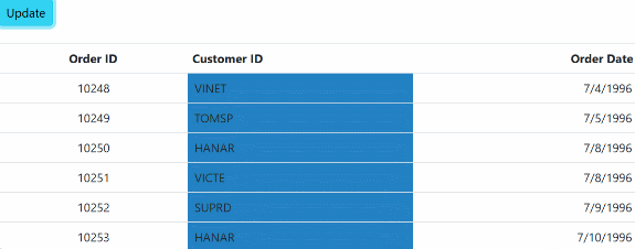
Updating column definitions
You can update the column definitions in the Grid using the columns property. You can modify the properties of the column objects in the columns array to update the columns dynamically. For example, you can change the headerText, width, visible, and other properties of a column to update its appearance and behavior in the grid and then call the refreshColumns method to apply the changes to the grid.
<div style="padding:0px 0px 20px 0px">
    <ejs-button id='updateButton' cssClass='e-info' content="Update"></ejs-button>
</div>
<ejs-grid id="Grid" dataSource="@ViewBag.DataSource" height="315">
    <e-grid-columns>
        <e-grid-column field="OrderID" headerText="Order ID" textAlign="Right" width="90"></e-grid-column>
        <e-grid-column field="CustomerID" headerText="Customer ID" width="120"></e-grid-column>
        <e-grid-column field="Freight" headerText="Freight" textAlign="Right" format="C2" width="90"></e-grid-column>
        <e-grid-column field="OrderDate" headerText="Order Date" textAlign="Right" format="yMd" width="120"></e-grid-column>
    </e-grid-columns>
</ejs-grid>

<style>
    .customcss {
        background-color: #2382c3;
    }
</style>
<script type="text/javascript">
    document.getElementById('updateButton').addEventListener('click', function () {
        var grid = document.getElementById("Grid").ej2_instances[0];
            grid.columns[0].textAlign = 'Center';
            grid.columns[0].width = '100';
            grid.columns[2].visible = false;
            grid.columns[1].customAttributes = { class: 'customcss' };
            grid.refreshColumns();
      });
</script>
public IActionResult Index()
{
var Order = OrderDetails.GetAllRecords();
ViewBag.DataSource = Order;
return View();
}
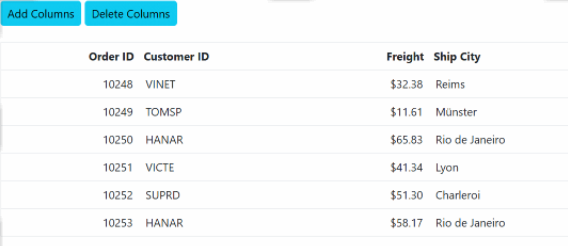
Adding/Removing Columns
The Grid component allows you to dynamically add or remove columns to and from the grid using the columns property, which can be accessed through the instance of the Grid.
To add a new column to the Grid, you can directly push the new column object to the columns property.To remove a column from the Grid, you can use the pop method, which removes the last element from the columns array of the Grid. Alternatively, you can use the splice method to remove a specific column from the columns array.
Here’s an example of how you can add and remove a column from the grid:
<div style="padding:0px 0px 20px 0px">
    <ejs-button id='add' cssClass='e-info' content="Add Columns"></ejs-button>
    <ejs-button id='delete' cssClass='e-info' content="Delete Columns"></ejs-button>
</div>
<ejs-grid id="Grid" dataSource="@ViewBag.DataSource" height="315">
    <e-grid-columns>
        <e-grid-column field="OrderID" headerText="Order ID" textAlign="Right" width="100"></e-grid-column>
        <e-grid-column field="CustomerID" headerText="Customer ID" width="120"></e-grid-column>
        <e-grid-column field="Freight" headerText="Freight" textAlign="Right" format="C2" width="90"></e-grid-column>
        <e-grid-column field="ShipCity" headerText="Ship City" width="120"></e-grid-column>
    </e-grid-columns>
</ejs-grid>
<script type="text/javascript">
    document.getElementById('add').addEventListener('click', function () {
        var grid = document.getElementById('Grid').ej2_instances[0];
        var newColumns = [
            { field: 'EmployeeID', headerText: 'Employee ID', width: 120 },
            { field: 'OrderDate', headerText: 'Order Date', width: 120, format: 'yMd' }
        ];
        newColumns.forEach(function (col) {
            grid.columns.push(col);
        });
        grid.refreshColumns();
    });

    document.getElementById('delete').addEventListener('click', function () {
        var grid = document.getElementById('Grid').ej2_instances[0];
        grid.columns.pop();
        grid.refreshColumns();
    });
</script>
public IActionResult Index()
{
var Order = OrderDetails.GetAllRecords();
ViewBag.DataSource = Order;
return View();
}
How to refresh columns
You can use the refreshColumns method of the Syncfusion® Grid to refresh the columns in the grid. This method can be used when you need to update the grid columns dynamically based on user actions or data changes.
grid.refreshColumns();Responsive columns
The Syncfusion® ASP.NET Grid Core provides a built-in feature to toggle the visibility of columns based on media queries using the hideAtMedia property of the column object. The hideAtMedia accepts valid Media Queries.
In this example, we have a Grid that displays data with three columns: Order ID, Customer ID, and Freight. We have set the hideAtMedia property of the OrderID column to (min-width: 700px) which means that this column will be hidden when the browser screen width is less than or equal to 700px.
<ejs-grid id="Grid" dataSource="@ViewBag.DataSource">
    <e-grid-columns>
        <e-grid-column field="OrderID" headerText="Order ID" hideAtMedia='(min-width: 700px)' width="120" textAlign="Right"></e-grid-column>
        // column visibility hide when browser screen width lessthan 700px;
        <e-grid-column field="CustomerID" headerText="Customer ID" hideAtMedia='(max-width: 700px)' width="140"></e-grid-column>
        // column Visibility show when browser screen width  500px or less;
        <e-grid-column field="Freight" headerText="Freight" hideAtMedia='(min-width: 500px)' textAlign="Right" format="C" width="120"></e-grid-column>
        // column visibility hide when browser screen width lessthan 500px;
        <e-grid-column field="OrderDate" headerText="Order Date" textAlign="Right" format="yMd" width="130"></e-grid-column>
        // it always shown
    </e-grid-columns>
</ejs-grid>
public IActionResult Index()
{
var Order = OrderDetails.GetAllRecords();
ViewBag.DataSource = Order;
return View();
}