How can I help you?
Hierarchy grid in ASP.NET Core Grid component
18 Dec 202524 minutes to read
The Hierarchy Grid in an ASP.NET Core Grid component is typically used when you need to display hierarchical data in a tabular format with expandable and collapsible rows. It allows you to represent parent and child relationships within the grid, making it easier for you to navigate and understand the data.
This feature can be enabled by utilizing the childGrid and childGrid.queryString properties of the grid component.
To enable the Hierarchy Grid feature:
-
Define the
childGridproperty within the Grid component configuration. This property describes the options of the child grid. -
Specify the
childGrid.queryStringproperty to establish the relation between the parent and child grids and visualizes the data in a hierarchical structure. This property determines how the child records are fetched based on the parent record.
The following example demonstrates how to enable the hierarchy feature in the grid
@{
    ViewData["Title"] = "Home page";
    var ChildGrid = new Syncfusion.EJ2.Grids.Grid()
            {
                DataSource = ViewBag.DataSource,
                QueryString = "EmployeeID",
                Columns = new List<Syncfusion.EJ2.Grids.GridColumn> {
                new Syncfusion.EJ2.Grids.GridColumn(){ Field="OrderID", HeaderText="Order ID", Width="120" },
                new Syncfusion.EJ2.Grids.GridColumn(){ Field="CustomerID", HeaderText="Customer ID", Width="150" },
                new Syncfusion.EJ2.Grids.GridColumn(){ Field="ShipCity", HeaderText="Ship City", Width="120" },
                new Syncfusion.EJ2.Grids.GridColumn(){ Field="ShipName", HeaderText="Ship Name", Width="130" },
        },
            };
}

<div>
    <ejs-grid id="Grid" dataSource="@ViewBag.EmployeeDataSource" childGrid="@ChildGrid" height="250">
        <e-grid-columns>
            <e-grid-column field="EmployeeID" headerText="Employee ID" textAlign="Right" width="80"></e-grid-column>
            <e-grid-column field="FirstName" headerText="Name" width="120"></e-grid-column>
            <e-grid-column field="LastName" headerText="LastName" width="120"></e-grid-column>
            <e-grid-column field="City" headerText="City" width="130"></e-grid-column>
        </e-grid-columns>
    </ejs-grid>
</div>
public IActionResult Index()
{
ViewBag.DataSource = OrderDetails.GetAllRecords();
ViewBag.EmployeeDataSource = EmployeeDetails.GetAllRecords();
return View();
}
- Grid supports n level of child grids.
- Hierarchical binding is not supported when Detail Template is enabled.
- In Syncfusion® ASP.NET Core Grid component, searching operates independently for parent and child grids. Searching within the parent grid filters only parent records, and similarly, searching within the child grid filters only child records. The component does not support simultaneous searching across both parent and child grids.
Bind hierarchy grid with different field
By default, the parent and child grids have the same field name to map and render a hierarchical grid. However, the component supports establishing a parent-child relationship between grids with different field names. This feature is beneficial when you want to create a parent-child relationship between grids but need to use distinct field names for mapping the data. As a result, you can easily establish the desired relationship between the parent and child grids, even with different field names for data mapping.
By default, the parent and child grid relation is maintained using the queryString property, which requires the same field name for both grids. However, to achieve the parent and child relation with different fields, you need to modify the mapping value in the load event of child grid.
In the following example, the load event is utilized to customize the mapping value for the child grid. By accessing the parentDetails property and its parentKeyFieldValue, you can set the desired mapping value. The parentRowData property contains the data of the parent row, and by using the EmployeeID field name, you can extract the corresponding value from the parent row data.
@{
    ViewData["Title"] = "Home page";
    var ChildGrid = new Syncfusion.EJ2.Grids.Grid()
            {
                DataSource = ViewBag.DataSource,
                QueryString = "ID",
                Load="load",
                Columns = new List<Syncfusion.EJ2.Grids.GridColumn> {
                    new Syncfusion.EJ2.Grids.GridColumn(){ Field="OrderID", HeaderText="Order ID", Width="120" },
                    new Syncfusion.EJ2.Grids.GridColumn(){ Field="CustomerID", HeaderText="Customer ID", Width="150" },
                    new Syncfusion.EJ2.Grids.GridColumn(){ Field="ShipCity", HeaderText="Ship City", Width="120" },
                    new Syncfusion.EJ2.Grids.GridColumn(){ Field="ShipName", HeaderText="Ship Name", Width="130" },
            },
            };
}

<div>
    <ejs-grid id="Grid" dataSource="@ViewBag.EmployeeDataSource" childGrid="@ChildGrid" height="250">
        <e-grid-columns>
            <e-grid-column field="EmployeeID" headerText="Employee ID" textAlign="Right" width="80"></e-grid-column>
            <e-grid-column field="FirstName" headerText="Name" width="120"></e-grid-column>
            <e-grid-column field="LastName" headerText="LastName" width="120"></e-grid-column>
            <e-grid-column field="City" headerText="City" width="130"></e-grid-column>
        </e-grid-columns>
    </ejs-grid>
</div>
<script>
    function load() {
        this.parentDetails.parentKeyFieldValue = this.parentDetails.parentRowData['EmployeeID'];
    }
</script>
public IActionResult Index()
{
ViewBag.DataSource = OrderDetails.GetAllRecords();
ViewBag.EmployeeDataSource = EmployeeDetails.GetAllRecords();
return View();
}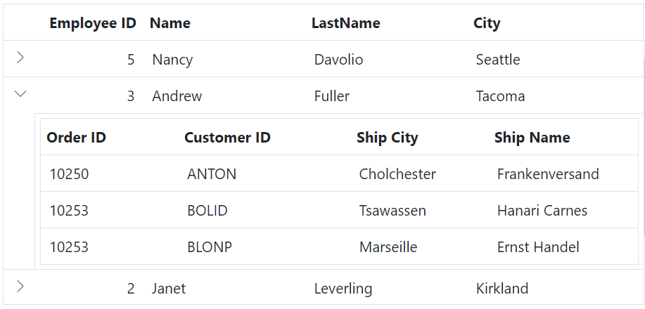
Make sure to adjust the field name according to your specific scenario.
Expand child grid initially
Expanding the child grid initially in the Data Grid component is helpful when you want to display the child rows of the hierarchical grid expanded by default upon grid load. This can be beneficial in scenarios where you want to provide immediate visibility into the hierarchical data without requiring you to manually expand each child row.
To achieve this, you can use the expand method with the desired target index (number) in the dataBound event of the grid.
In the provided example, expand the third record of the grid by utilizing the expand method within the dataBound event.
@{
    ViewData["Title"] = "Home page";
    var ChildGrid = new Syncfusion.EJ2.Grids.Grid()
            {
                DataSource = ViewBag.DataSource,
                QueryString = "EmployeeID",
                Columns = new List<Syncfusion.EJ2.Grids.GridColumn> {
                    new Syncfusion.EJ2.Grids.GridColumn(){ Field="OrderID", HeaderText="Order ID", Width="120" },
                    new Syncfusion.EJ2.Grids.GridColumn(){ Field="CustomerID", HeaderText="Customer ID", Width="150" },
                    new Syncfusion.EJ2.Grids.GridColumn(){ Field="ShipCity", HeaderText="Ship City", Width="120" },
                    new Syncfusion.EJ2.Grids.GridColumn(){ Field="ShipName", HeaderText="Ship Name", Width="130" },
        },
            };
}

<div>
    <ejs-grid id="Grid" dataSource="@ViewBag.EmployeeDataSource" childGrid="@ChildGrid" dataBound="dataBound" height="250">
        <e-grid-columns>
            <e-grid-column field="EmployeeID" headerText="Employee ID" textAlign="Right" width="80"></e-grid-column>
            <e-grid-column field="FirstName" headerText="Name" width="120"></e-grid-column>
            <e-grid-column field="LastName" headerText="LastName" width="120"></e-grid-column>
            <e-grid-column field="City" headerText="City" width="130"></e-grid-column>
        </e-grid-columns>
    </ejs-grid>
</div>
<script>
    function dataBound() {
        this.detailRowModule.expand(2); // initial expand 2 chid Grid.
    }
</script>
public IActionResult Index()
{
ViewBag.DataSource = OrderDetails.GetAllRecords();
ViewBag.EmployeeDataSource = EmployeeDetails.GetAllRecords();
return View();
}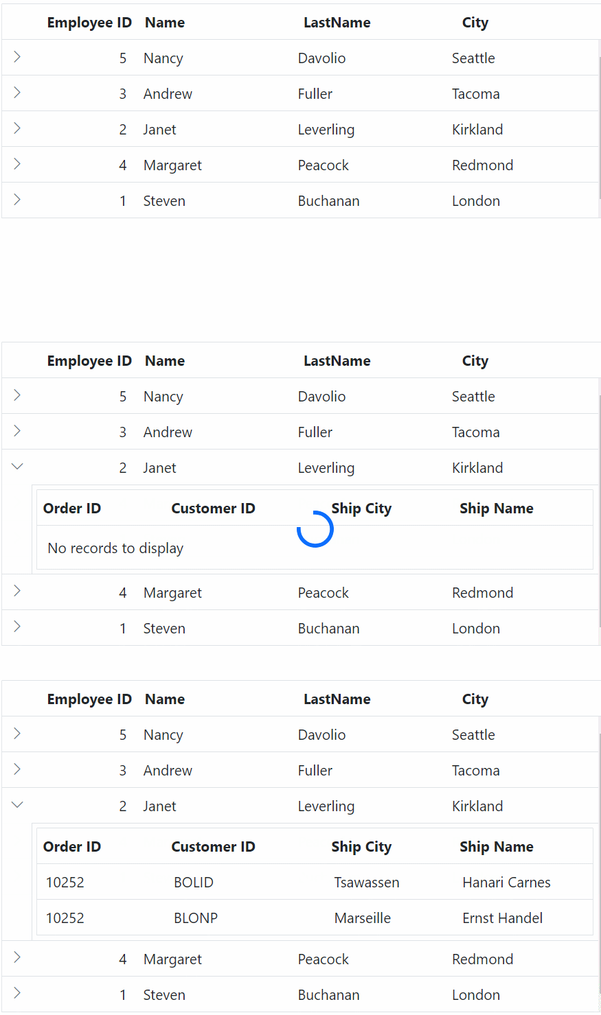
Index values begin with “0”, allowing you to provide the desired target index to expand a specific child grid initially.
Dynamically load child grid data
Dynamically load child grid data in Data Grid helps improve performance, optimize data transmission, and enhance the your experience by providing on-demand access to relevant information. Additionally, it offers flexibility in data presentation, which helps improve the overall efficiency of your application.
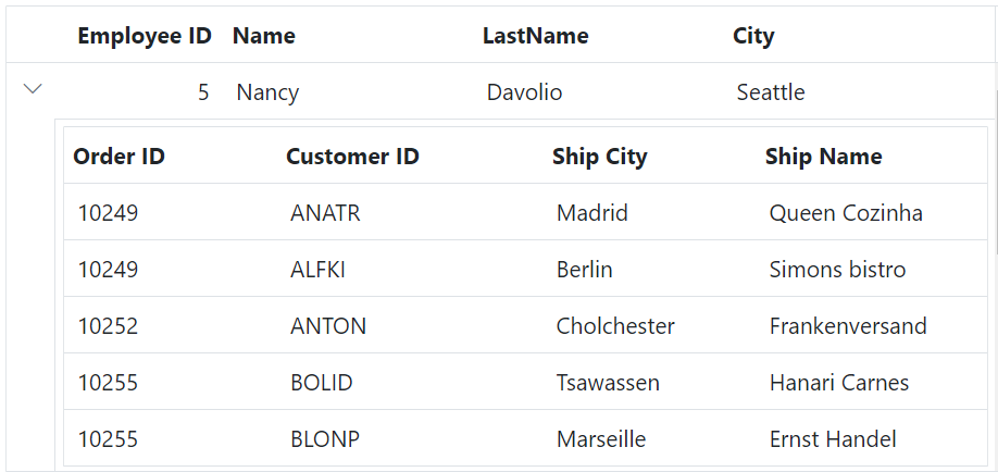
To dynamically load the dataSource of a child grid in the Grid, you can utilize the load event of parent grid. This event allows you to customize the loading behavior of the child grid based on the data of parent grid.
The following example demonstrates how to dynamically load child grid data using the load event.
@{
    ViewData["Title"] = "Home page";
    var ChildGrid = new Syncfusion.EJ2.Grids.Grid()
            {
                QueryString = "EmployeeID",
                Columns = new List<Syncfusion.EJ2.Grids.GridColumn> {
                new Syncfusion.EJ2.Grids.GridColumn(){ Field="OrderID", HeaderText="Order ID", Width="120" },
                new Syncfusion.EJ2.Grids.GridColumn(){ Field="CustomerID", HeaderText="Customer ID", Width="150" },
                new Syncfusion.EJ2.Grids.GridColumn(){ Field="ShipCity", HeaderText="Ship City", Width="120" },
                new Syncfusion.EJ2.Grids.GridColumn(){ Field="ShipName", HeaderText="Ship Name", Width="130" },
        },
            };
}

<div>
    <ejs-grid id="Grid" dataSource="@ViewBag.EmployeeDataSource" childGrid="@ChildGrid" Load="load" height="250">
        <e-grid-columns>
            <e-grid-column field="EmployeeID" headerText="Employee ID" textAlign="Right" width="80"></e-grid-column>
            <e-grid-column field="FirstName" headerText="Name" width="120"></e-grid-column>
            <e-grid-column field="LastName" headerText="LastName" width="120"></e-grid-column>
            <e-grid-column field="City" headerText="City" width="130"></e-grid-column>
        </e-grid-columns>
    </ejs-grid>
</div>
<script>
    function load() {
        var ordersDataSource = @Html.Raw(JsonConvert.SerializeObject(ViewBag.DataSource));
        this.childGrid.dataSource = ordersDataSource;
    }
</script>
public IActionResult Index()
{
ViewBag.DataSource = OrderDetails.GetAllRecords();
ViewBag.EmployeeDataSource = EmployeeDetails.GetAllRecords();
return View();
}
Dynamically bind data to child grid based on parent row data
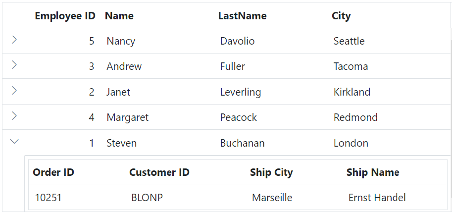
Dynamically binding data to a child grid based on the parent row data in the Data Grid component is useful when you want to display child grid data that is specific to each parent row. This feature allows for a dynamic and contextual representation of data within the child grid.
To dynamically bind data to the child grid based on the parent row data instead of using the queryString property, you can utilize the detailDataBound event of the grid. This event is triggered when expanding the child grid.
In the detailDataBound event handler, you can filter the child grid’s dataSource based on the EmployeeID column value of the parent row data. This can be achieved by using the DataManager plugin and applying a filter to the child grid’s dataSource. The filtered data can be assigned as the new dataSource for the child grid. This can be demonstrated by the following sample.
@{
    ViewData["Title"] = "Home page";
    var ChildGrid = new Syncfusion.EJ2.Grids.Grid()
            {
                Columns = new List<Syncfusion.EJ2.Grids.GridColumn> {
                new Syncfusion.EJ2.Grids.GridColumn(){ Field="OrderID", HeaderText="Order ID", Width="120" },
                new Syncfusion.EJ2.Grids.GridColumn(){ Field="CustomerID", HeaderText="Customer ID", Width="150" },
                new Syncfusion.EJ2.Grids.GridColumn(){ Field="ShipCity", HeaderText="Ship City", Width="120" },
                new Syncfusion.EJ2.Grids.GridColumn(){ Field="ShipName", HeaderText="Ship Name", Width="130" },
        },
            };
}

<div>
    <ejs-grid id="Grid" dataSource="@ViewBag.EmployeeDataSource" childGrid="@ChildGrid" detailDataBound="detailDataBound" height="250">
        <e-grid-columns>
            <e-grid-column field="EmployeeID" headerText="Employee ID" textAlign="Right" width="80"></e-grid-column>
            <e-grid-column field="FirstName" headerText="Name" width="120"></e-grid-column>
            <e-grid-column field="LastName" headerText="LastName" width="120"></e-grid-column>
            <e-grid-column field="City" headerText="City" width="130"></e-grid-column>
        </e-grid-columns>
    </ejs-grid>
</div>
<script>
    function detailDataBound(args) {
        var ordersDataSource = @Html.Raw(JsonConvert.SerializeObject(ViewBag.DataSource));
        var employeeIdValue = args.data['EmployeeID'];
        var childGridData = new ej.data.DataManager(ordersDataSource).executeLocal(
            new ej.data.Query().where('EmployeeID', 'equal', employeeIdValue, true)
        );
        args.childGrid.query = new ej.data.Query();
        args.childGrid.dataSource = childGridData;
    }
</script>
public IActionResult Index()
{
ViewBag.DataSource = OrderDetails.GetAllRecords();
ViewBag.EmployeeDataSource = EmployeeDetails.GetAllRecords();
return View();
}
Adding record in child grid
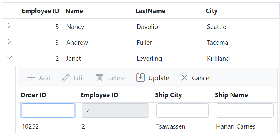
Adding a record in a child grid within the Data Grid component is useful when you want to provide the ability to add new records to the child grid. This feature allows you to input and save additional data specific to each parent row.
To maintain the parent-child relationship in the Grid when adding a record to the child grid, you need to set the value for the queryString in the added data. This can be done using the actionBegin event.
In the following example, the parent and child grids are related by the EmployeeID field. To add a new record in the child grid, the EmployeeID field needs to be set with the value of the parent record’s queryString in the actionBegin event.
@{
    ViewData["Title"] = "Home page";
    var ChildGrid = new Syncfusion.EJ2.Grids.Grid()
    {
        DataSource = ViewBag.DataSource,
        QueryString = "EmployeeID",
        Toolbar = new List<string> { "Add", "Edit", "Delete", "Update", "Cancel" },
        EditSettings = new Syncfusion.EJ2.Grids.GridEditSettings{ AllowAdding = true, AllowEditing = true, AllowDeleting = true },
        ActionBegin="actionBegin",
        Columns = new List<Syncfusion.EJ2.Grids.GridColumn> {
            new Syncfusion.EJ2.Grids.GridColumn(){ Field="OrderID", HeaderText="Order ID", Width="120", IsPrimaryKey=true  },
            new Syncfusion.EJ2.Grids.GridColumn(){ Field="EmployeeID", HeaderText="Employee ID", AllowEditing=false, Width="150" },
            new Syncfusion.EJ2.Grids.GridColumn(){ Field="ShipCity", HeaderText="Ship City", Width="120" },
            new Syncfusion.EJ2.Grids.GridColumn(){ Field="ShipName", HeaderText="Ship Name", Width="130" },
        },
    };
}

<div>
    <ejs-grid id="Grid" dataSource="@ViewBag.EmployeeDataSource" childGrid="@ChildGrid" height="250">
        <e-grid-columns>
            <e-grid-column field="EmployeeID" headerText="Employee ID" textAlign="Right" width="80"></e-grid-column>
            <e-grid-column field="FirstName" headerText="Name" width="120"></e-grid-column>
            <e-grid-column field="LastName" headerText="LastName" width="120"></e-grid-column>
            <e-grid-column field="City" headerText="City" width="130"></e-grid-column>
        </e-grid-columns>
    </ejs-grid>
</div>
<script>
    function actionBegin(args) {
        if (args.requestType === 'add') {
        // `parentKeyFieldValue` refers to the queryString field value of the parent record.
        var parentFieldValue = this.parentDetails?.parentKeyFieldValue;

            if (typeof parentFieldValue === 'number') {
                args.data.EmployeeID = parentFieldValue;
            }
        }
    }
</script>
public IActionResult Index()
{
ViewBag.DataSource = OrderDetails.GetAllRecords();
ViewBag.EmployeeDataSource = EmployeeDetails.GetAllRecords();
return View();
}
Template column in child grid
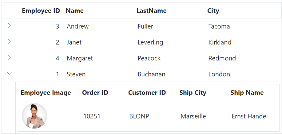
A template column in a child grid within the Data Grid component is valuable when you want to customize the appearance and functionality of specific columns in the child grid. It is useful for incorporating interactive elements, custom formatting, or complex data representation within specific columns of the child grid.
To achieve this, you can utilize the template property of a column to display a custom element instead of a field value in the Grid.
The following example demonstrates, how to show a custom image in the Employee Image column of the child grid by utilizing the template property of the column.
@{
    ViewData["Title"] = "Home page";
    var ChildGrid = new Syncfusion.EJ2.Grids.Grid()
            {
                DataSource = ViewBag.DataSource,
                QueryString = "EmployeeID",
                Columns = new List<Syncfusion.EJ2.Grids.GridColumn> {
                    new Syncfusion.EJ2.Grids.GridColumn(){ HeaderText="Employee Image", Template="#template", Width="120"   },
                    new Syncfusion.EJ2.Grids.GridColumn(){ Field="OrderID", HeaderText="Order ID", Width="120" },
                    new Syncfusion.EJ2.Grids.GridColumn(){ Field="CustomerID", HeaderText="Customer ID", Width="150" },
                    new Syncfusion.EJ2.Grids.GridColumn(){ Field="ShipCity", HeaderText="Ship City", Width="120" },
                    new Syncfusion.EJ2.Grids.GridColumn(){ Field="ShipName", HeaderText="Ship Name", Width="130" },
                },
            };
}

<div>
    <ejs-grid id="Grid" dataSource="@ViewBag.EmployeeDataSource" childGrid="@ChildGrid" height="250">
        <e-grid-columns>
            <e-grid-column field="EmployeeID" headerText="Employee ID" textAlign="Right" width="80"></e-grid-column>
            <e-grid-column field="FirstName" headerText="Name" width="120"></e-grid-column>
            <e-grid-column field="LastName" headerText="LastName" width="120"></e-grid-column>
            <e-grid-column field="City" headerText="City" width="130"></e-grid-column>
        </e-grid-columns>
    </ejs-grid>
</div>

<script id="template" type="text/x-template">
<div class="image">
    <img src="https://ej2.syncfusion.com/demos/src/grid/images/${EmployeeID}.png" alt="employee"/>
</div>
</script>

<style type="text/css" class="cssStyles">
    .image img {
        height: 55px;
        width: 55px;
        border-radius: 50px;
        box-shadow: inset 0 0 1px #e0e0e0, inset 0 0 14px rgba(0, 0, 0, 0.2);
    }
</style>
public IActionResult Index()
{
ViewBag.DataSource = OrderDetails.GetAllRecords();
ViewBag.EmployeeDataSource = EmployeeDetails.GetAllRecords();
return View();
}
How to get parent detail in child grid
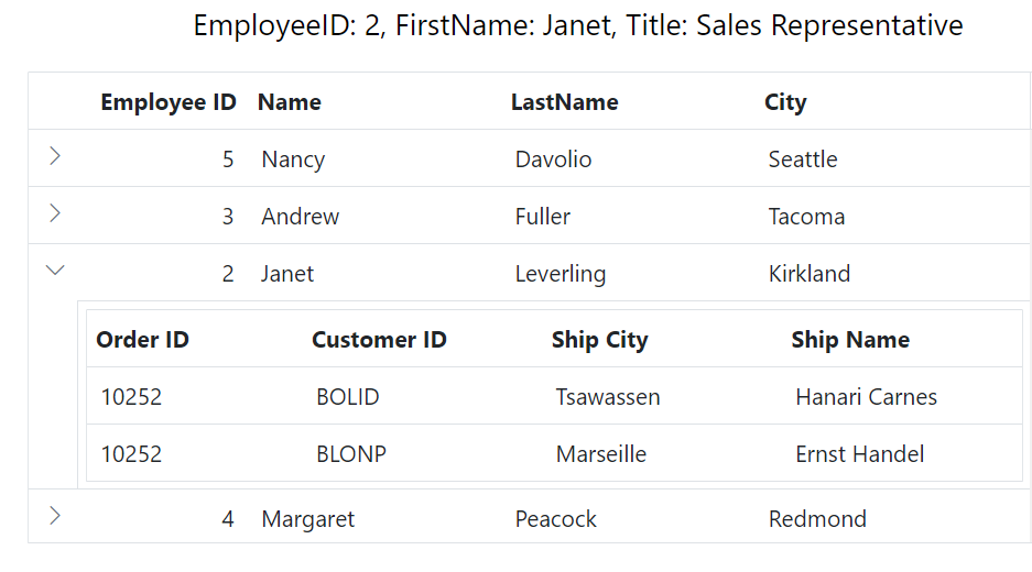
Getting parent details in a child grid in an ASP.NET Core Grid component is useful when you want to display and utilize information from the parent row within the child grid. This can be beneficial in scenarios where you need to provide additional context or perform calculations based on the parent row’s data
To achieve this, you can utilize the created event. This event is triggered when the child grid is created and can be used to handle the child grid.
The following example demonstrates how to obtain parent details in a child grid using the created event. Within the created event, you can access the parent row data using this.parentDetails.parentRowData and display the desired details in the message.
@{
    ViewData["Title"] = "Home page";
    var ChildGrid = new Syncfusion.EJ2.Grids.Grid()
            {
                DataSource = ViewBag.DataSource,
                QueryString = "EmployeeID",
                Created="created",
                Columns = new List<Syncfusion.EJ2.Grids.GridColumn> {
                    new Syncfusion.EJ2.Grids.GridColumn(){ Field="OrderID", HeaderText="Order ID", Width="120" },
                    new Syncfusion.EJ2.Grids.GridColumn(){ Field="CustomerID", HeaderText="Customer ID", Width="150" },
                    new Syncfusion.EJ2.Grids.GridColumn(){ Field="ShipCity", HeaderText="Ship City", Width="120" },
                    new Syncfusion.EJ2.Grids.GridColumn(){ Field="ShipName", HeaderText="Ship Name", Width="130" },
                },
            };
}

<div>
    <div style="margin-left:100px;">
      <p style="color:black; font-size: large;" id="message"></p>
    </div>
    <ejs-grid id="Grid" dataSource="@ViewBag.EmployeeDataSource" childGrid="@ChildGrid" height="250">
        <e-grid-columns>
            <e-grid-column field="EmployeeID" headerText="Employee ID" textAlign="Right" width="80"></e-grid-column>
            <e-grid-column field="FirstName" headerText="Name" width="120"></e-grid-column>
            <e-grid-column field="LastName" headerText="LastName" width="120"></e-grid-column>
            <e-grid-column field="City" headerText="City" width="130"></e-grid-column>
        </e-grid-columns>
    </ejs-grid>
</div>
<script>
   function created() {
      var parentRowData = this.parentDetails.parentRowData; // 'this' refers to the instance of the child grid.
      document.getElementById(
        'message'
      ).innerHTML = `EmployeeID: ${parentRowData.EmployeeID}, FirstName: ${parentRowData.FirstName}, Title: ${parentRowData.Title}`;
    }
</script>
public IActionResult Index()
{
ViewBag.DataSource = OrderDetails.GetAllRecords();
ViewBag.EmployeeDataSource = EmployeeDetails.GetAllRecords();
return View();
}
Render aggregates in child grid
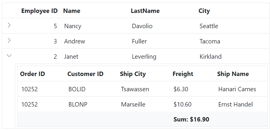
The Aggregates feature in the Data Grid component allows you to display aggregate values in the footer, group footer, and group caption of the child grid. With this feature, you can easily perform calculations on specific columns and show summary information.
Rendering aggregates in a child grid involves displaying summary data at the footer or group caption of the grid. This can be particularly useful in hierarchical grids where each child grid represents detailed data that needs to be summarized.
The following example demonstrates how to render aggregates in a child grid to display the sum and maximum values of the Freight column.
@{
    ViewData["Title"] = "Home page";
    var ChildGrid = new Syncfusion.EJ2.Grids.Grid()
            {
                DataSource = ViewBag.DataSource,
                QueryString = "EmployeeID",
                Columns = new List<Syncfusion.EJ2.Grids.GridColumn> {
                    new Syncfusion.EJ2.Grids.GridColumn(){ Field="OrderID", HeaderText="Order ID", Width="120" },
                    new Syncfusion.EJ2.Grids.GridColumn(){ Field="CustomerID", HeaderText="Customer ID", Width="150" },
                    new Syncfusion.EJ2.Grids.GridColumn(){ Field="ShipCity", HeaderText="Ship City", Width="120" },
                    new Syncfusion.EJ2.Grids.GridColumn(){ Field="Freight", HeaderText="Freight", Format="C2", Width="100" },
                    new Syncfusion.EJ2.Grids.GridColumn(){ Field="ShipName", HeaderText="Ship Name", Width="130" },
                },
                Aggregates = new List<Syncfusion.EJ2.Grids.GridAggregate>
                {
                    new Syncfusion.EJ2.Grids.GridAggregate
                    {
                        Columns = new List<Syncfusion.EJ2.Grids.GridAggregateColumn>
                        {
                            new Syncfusion.EJ2.Grids.GridAggregateColumn
                            {
                                Field = "Freight",
                                Type = "Sum",
                                Format = "C2",
                                FooterTemplate = "Sum: ${Sum}"
                            }
                        }
                    }
                },
            };
}

<div>
    <ejs-grid id="Grid" dataSource="@ViewBag.EmployeeDataSource" childGrid="@ChildGrid" height="250">
        <e-grid-columns>
            <e-grid-column field="EmployeeID" headerText="Employee ID" textAlign="Right" width="80"></e-grid-column>
            <e-grid-column field="FirstName" headerText="Name" width="120"></e-grid-column>
            <e-grid-column field="LastName" headerText="LastName" width="120"></e-grid-column>
            <e-grid-column field="City" headerText="City" width="130"></e-grid-column>
        </e-grid-columns>
    </ejs-grid>
</div>
public IActionResult Index()
{
ViewBag.DataSource = OrderDetails.GetAllRecords();
ViewBag.EmployeeDataSource = EmployeeDetails.GetAllRecords();
return View();
}
Expand all by external button
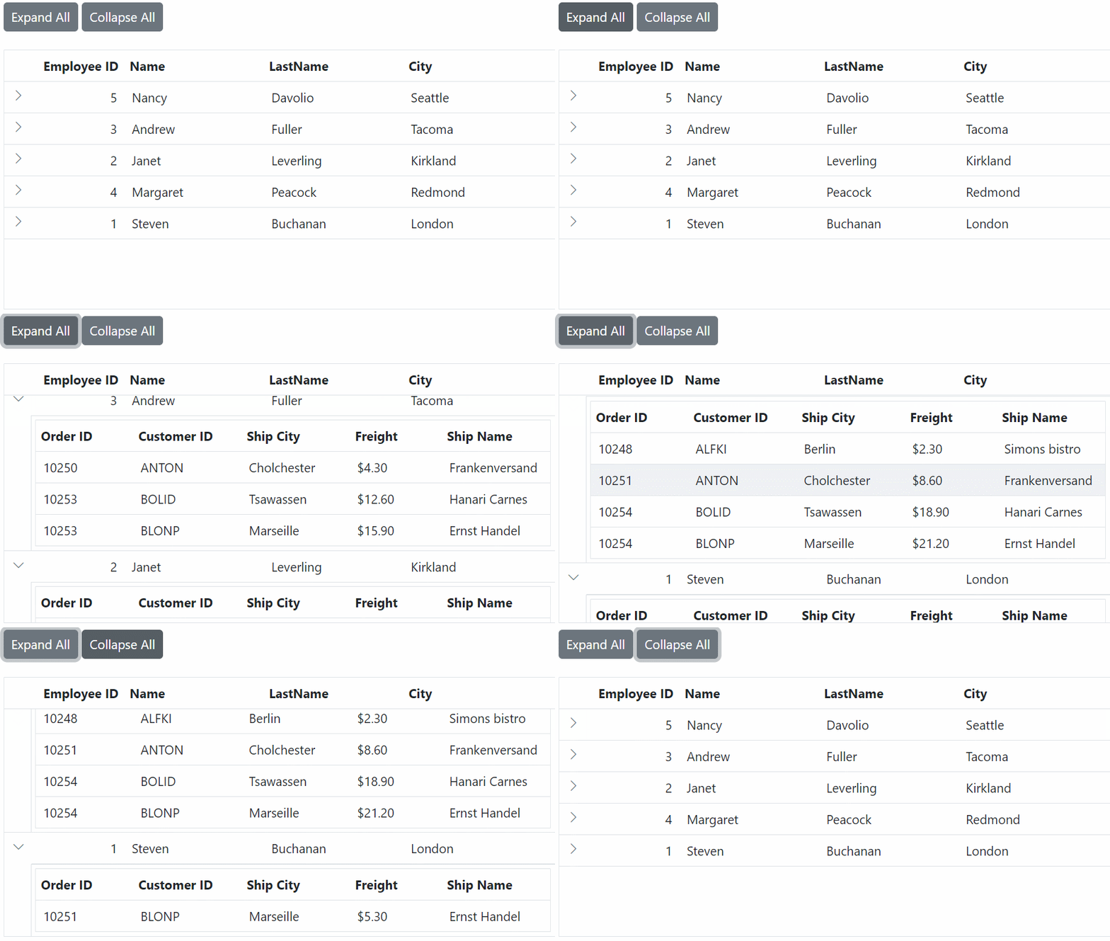
The Hierarchy Grid in the Data Grid component allows you to expand all child grid rows using an external button. This feature provides you with a convenient overview of all the hierarchical data within the grid, eliminating the need to manually expand each row individually.
By default, Grid renders all child grid rows in collapsed state. To expand all child grid rows in the Grid using an external button, you can utilize the expandAll method provided by the DetailRow module. Similarly, to collapse all grid rows, you can use the collapseAll method.
The following example demonstrates how to expand and collapse the hierarchy grid using an external button click function.
@{
    ViewData["Title"] = "Home page";
    var ChildGrid = new Syncfusion.EJ2.Grids.Grid()
            {
                DataSource = ViewBag.DataSource,
                QueryString = "EmployeeID",
                Columns = new List<Syncfusion.EJ2.Grids.GridColumn> {
                new Syncfusion.EJ2.Grids.GridColumn(){ Field="OrderID", HeaderText="Order ID", Width="120" },
                new Syncfusion.EJ2.Grids.GridColumn(){ Field="CustomerID", HeaderText="Customer ID", Width="150" },
                new Syncfusion.EJ2.Grids.GridColumn(){ Field="ShipCity", HeaderText="Ship City", Width="120" },
                new Syncfusion.EJ2.Grids.GridColumn(){ Field="ShipName", HeaderText="Ship Name", Width="130" },
        },
            };
}

<div>
    <div style="margin:0px 0px 10px 0px">
        <ejs-button id="expand"  content="Expand All"></ejs-button>
        <ejs-button id="collapse" content="Collapse All"></ejs-button>
    </div>
    <ejs-grid id="Grid" dataSource="@ViewBag.EmployeeDataSource" childGrid="@ChildGrid" height="250">
        <e-grid-columns>
            <e-grid-column field="EmployeeID" headerText="Employee ID" textAlign="Right" width="80"></e-grid-column>
            <e-grid-column field="FirstName" headerText="Name" width="120"></e-grid-column>
            <e-grid-column field="LastName" headerText="LastName" width="120"></e-grid-column>
            <e-grid-column field="City" headerText="City" width="130"></e-grid-column>
        </e-grid-columns>
    </ejs-grid>
</div>
<script>
    document.getElementById('expand').addEventListener('click', function () {
        var grid = document.getElementById("Grid").ej2_instances[0];
        grid.detailRowModule.expandAll();
    });
    document.getElementById('collapse').addEventListener('click', function () {
        var grid = document.getElementById("Grid").ej2_instances[0];
        grid.detailRowModule.collapseAll();
    })
</script>
public IActionResult Index()
{
ViewBag.DataSource = OrderDetails.GetAllRecords();
ViewBag.EmployeeDataSource = EmployeeDetails.GetAllRecords();
return View();
}
The
expandAllandcollapseAllmethods are not recommended for large datasets due to the considerable time it takes to update the changes in the UI.
Hide the expand/collapse icon in parent row when no record in child grid
The Data Grid allows you to hide the expand/collapse icon in the parent row when there are no records in the child grid. However, in certain scenarios, you may want to hide the expand/collapse icon for parent rows that do not have any child records, providing a cleaner and more intuitive interface by eliminating unnecessary icons in empty parent rows.
To achieve this, you can utilize the rowDataBound event to hide the icon when there are no records in the child grid.
To hide the expand/collapse icon in parent row when no records in child grid, follow the given steps:
- Create a CSS Class with Custom Style: Define a CSS class that overrides the default appearance of the Grid. This class will be used to customize the background color of the parent row when it is selected and when hovering over rows.
    .e-row[aria-selected="true"] .e-customizedexpandcell {
        background-color: #e0e0e0;
    }

    .e-grid.e-gridhover tr[role='row']:hover {
        background-color: #eee;
}- Implement the rowDataBound Event Handler: This event is triggered for each row in the grid when data is bound, allowing you to customize the row’s appearance and behavior. In the provided code, the handler checks if the current row has any child records associated with it. If not, it hides the content of the first element, which contains the expand/collapse icon, and applies a custom CSS class (e-customizedexpandcell) to modify its appearance.
function rowDataBound(args){
    var ordersDataSource = @Html.Raw(JsonConvert.SerializeObject(ViewBag.DataSource));
    var parentData = (args.data)['EmployeeID'];
    var childrecord = new ej.data.DataManager(ordersDataSource).executeLocal(new ej.data.Query().where('EmployeeID', 'equal', parentData, true));
    if (childrecord.length === 0) {
        // Here hide which parent row has no child records
       var rowElement = args.row;
       var cellElement= rowElement.querySelector('td')
        cellElement.innerHTML = ' ';
        cellElement.className = 'e-customizedexpandcell';
    }
}
The following example demonstrates how to hide the expand/collapse icon in the row with EmployeeID as 1, which does not have record in child Grid.
@using Newtonsoft.Json;
@{
    ViewData["Title"] = "Home page";
    var ChildGrid = new Syncfusion.EJ2.Grids.Grid()
            {
                DataSource = ViewBag.DataSource,
                QueryString = "EmployeeID",
                Columns = new List<Syncfusion.EJ2.Grids.GridColumn> {
                    new Syncfusion.EJ2.Grids.GridColumn(){ Field="OrderID", HeaderText="Order ID", Width="120" },
                    new Syncfusion.EJ2.Grids.GridColumn(){ Field="CustomerID", HeaderText="Customer ID", Width="150" },
                    new Syncfusion.EJ2.Grids.GridColumn(){ Field="ShipCity", HeaderText="Ship City", Width="120" },
                    new Syncfusion.EJ2.Grids.GridColumn(){ Field="ShipName", HeaderText="Ship Name", Width="130" },
                },
            };
}

<div>
    <div style="margin-left:100px;">
      <p style="color:black; font-size: large;" id="message"></p>
    </div>
    <ejs-grid id="Grid" dataSource="@ViewBag.EmployeeDataSource" childGrid="@ChildGrid" rowDataBound="rowDataBound" height="250">
        <e-grid-columns>
            <e-grid-column field="EmployeeID" headerText="Employee ID" textAlign="Right" width="80"></e-grid-column>
            <e-grid-column field="FirstName" headerText="Name" width="120"></e-grid-column>
            <e-grid-column field="LastName" headerText="LastName" width="120"></e-grid-column>
            <e-grid-column field="City" headerText="City" width="130"></e-grid-column>
        </e-grid-columns>
    </ejs-grid>
</div>
<script>
   function rowDataBound(args) {
        var ordersDataSource = @Html.Raw(JsonConvert.SerializeObject(ViewBag.DataSource));
        var parentData = (args.data)['EmployeeID'];
        var childRecord = new ej.data.DataManager(ordersDataSource).executeLocal(new ej.data.Query().where('EmployeeID', 'equal', parentData, true));
        if (childRecord.length === 0) {
            // Here hide which parent row has no child records
            var rowElement = args.row;
            var cellElement = rowElement.querySelector('td')
            cellElement.innerHTML = ' ';
            cellElement.className = 'e-customizedexpandcell';
        }
    }
</script>
<style>
        .e-row[aria-selected="true"] .e-customizedexpandcell {
    background-color: #e0e0e0;
    }

    .e-grid.e-gridhover tr[role='row']:hover {
        background-color: #eee;
    }
</style>
public IActionResult Index()
{
ViewBag.DataSource = OrderDetails.GetAllRecords();
ViewBag.EmployeeDataSource = EmployeeDetails.GetAllRecords();
return View();
}![]()
Customize hierarchy Grid icons
The Data Grid component provides built-in expand/collapse icons for hierarchical Grid. However, you can customize these icons using custom CSS to modify their visual representation.
To change the default icons, add the following CSS styles to your index.html file:
    .e-grid .e-icon-grightarrow::before,
        .e-grid-menu .e-icon-grightarrow::before {
            content: '\e7f9';
        }
    .e-grid .e-icon-gdownarrow::before,
        .e-grid-menu .e-icon-gdownarrow::before {
            content: '\e7d8';
        }
In the demo below, the expand/collapse icons have been changed to arrow-down and arrow-right icons:
@{
    var ChildGrid = new Syncfusion.EJ2.Grids.Grid()
    {
        DataSource = ViewBag.DataSource,
        QueryString = "EmployeeID",
        Columns = new List<Syncfusion.EJ2.Grids.GridColumn> {
            new Syncfusion.EJ2.Grids.GridColumn(){ Field="OrderID", HeaderText="Order ID", TextAlign = Syncfusion.EJ2.Grids.TextAlign.Right, Width="120" },
            new Syncfusion.EJ2.Grids.GridColumn(){ Field="CustomerID", HeaderText="Customer ID", Width="150" },
            new Syncfusion.EJ2.Grids.GridColumn(){ Field="ShipCity", HeaderText="Ship City", Width="120" },
            new Syncfusion.EJ2.Grids.GridColumn(){ Field="ShipName", HeaderText="Ship Name", Width="130" },
        },
    };
}
<div>
    <ejs-grid id="grid" dataSource="@ViewBag.EmployeeDataSource" childGrid="@ChildGrid" height="250">
        <e-grid-columns>
            <e-grid-column field="EmployeeID" headerText="Employee ID" textAlign="Right" width="80"></e-grid-column>
            <e-grid-column field="FirstName" headerText="Name" width="120"></e-grid-column>
            <e-grid-column field="LastName" headerText="Last Name" width="120"></e-grid-column>
            <e-grid-column field="City" headerText="City" width="130"></e-grid-column>
        </e-grid-columns>
    </ejs-grid>
</div>
<style>
    .e-grid .e-icon-grightarrow::before,
    .e-grid-menu .e-icon-grightarrow::before {
        content: '\e7f9';
    }
    .e-grid .e-icon-gdownarrow::before,
    .e-grid-menu .e-icon-gdownarrow::before {
        content: '\e7d8';
    }
</style>
public IActionResult Index()
{
ViewBag.DataSource = OrderDetails.GetAllRecords();
ViewBag.EmployeeDataSource = EmployeeDetails.GetAllRecords();
return View();
}![]()
Detail row events
The Grid control’s detailExpand and detailCollapse events fire before a detail row actually expands or collapses, allowing you a chance to control whether the action should continue. The detailExpand event is raised just before a row expands, and detailCollapse fires just before a row collapses, with both events providing respective details through their event arguments.
In the example below, expansion is prevented for the “Nancy” row, and collapse is prevented for the “Andrew” row.
@{
    ViewData["Title"] = "Home page";
    var ChildGrid = new Syncfusion.EJ2.Grids.Grid()
    {
        DataSource = ViewBag.DataSource,
        QueryString = "EmployeeID",
        Columns = new List<Syncfusion.EJ2.Grids.GridColumn> {
            new Syncfusion.EJ2.Grids.GridColumn(){ Field="OrderID", HeaderText="Order ID", Width="120" },
            new Syncfusion.EJ2.Grids.GridColumn(){ Field="CustomerID", HeaderText="Customer ID", Width="150" },
            new Syncfusion.EJ2.Grids.GridColumn(){ Field="ShipCity", HeaderText="Ship City", Width="120" },
            new Syncfusion.EJ2.Grids.GridColumn(){ Field="ShipName", HeaderText="Ship Name", Width="150" },
        },
    };
}

<div>
    <ejs-grid id="Grid" dataSource="@ViewBag.EmployeeDataSource" childGrid="@ChildGrid" detailExpand='detailExpand' detailCollapse='detailCollapse'>
        <e-grid-columns>
            <e-grid-column field="EmployeeID" headerText="Employee ID" textAlign="Right" width="120"></e-grid-column>
            <e-grid-column field="FirstName" headerText="Name" width="150"></e-grid-column>
            <e-grid-column field="City" headerText="City" width="150"></e-grid-column>
            <e-grid-column field="Country" headerText="Country" width="150"></e-grid-column>
        </e-grid-columns>
    </ejs-grid>
</div>

<script>
    // Prevent expanding detail row.
    function detailExpand(args) {
        if (args.rowData.FirstName === 'Nancy') {
            args.cancel = true;
        }
    }
    // Prevent collapsing detail row.
    function detailCollapse(args){
      if (args.rowData.FirstName === 'Andrew') {
        args.cancel = true;
      }
    }
</script>
public IActionResult Index()
{
ViewBag.DataSource = OrderDetails.GetAllRecords();
ViewBag.EmployeeDataSource = EmployeeDetails.GetAllRecords();
return View();
}Customize the child grid
The Data Grid component offers various ways to customize the child grid appearance using both default CSS and custom themes. To access the child grid elements, you can use the .e-detailcell class selector, which targets the child grid.
Header
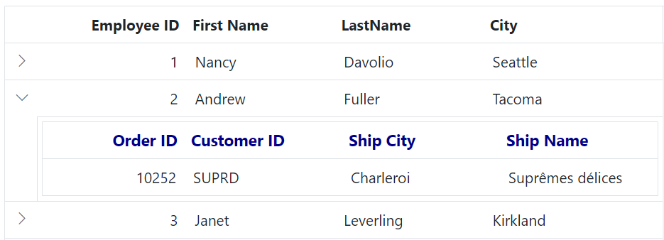
You can customize the appearance of the header elements in the child grid using CSS. Here are examples of how to customize the child grid header, header cell, and header cell div element.
Customizing the child grid header
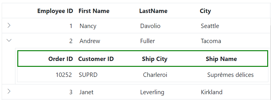
To customize the appearance of the child grid header root element, you can use the following CSS code:
.e-detailcell .e-grid .e-headercontent{
    border: 2px solid green;
}
In this example, the .e-detailcell class targets the child grid and .e-headercontent targets its header root element. You can modify the border property to change the style of the header border. This customization allows you to override the thin line between the header and content of the child grid.
Customizing the child grid header cell
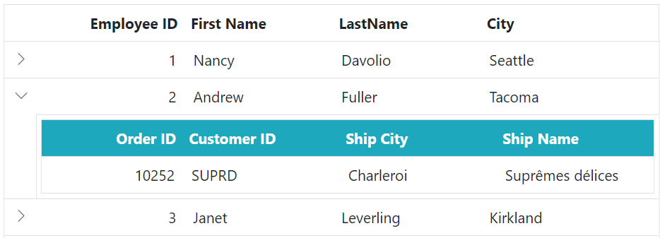
To customize the appearance of the grid header cell elements, you can use the following CSS code:
.e-detailcell .e-grid .e-headercontent .e-headercell{
    color: #ffffff;
    background-color: #1ea8bd;
}
In this example, the .e-headercell class targets the header cell elements. You can modify the color and background-color properties to change the text color and background of the child grid’s header cells.
Customizing the child grid header cell div element
To customize the appearance of the child grid header cell div element, you can use the following CSS code:
.e-detailcell .e-grid .e-headercelldiv {
    font-size: 15px;
    font-weight: bold;
    color: darkblue;
}
In this example, the .e-headercelldiv class targets the div element within the header cell of the child grid. You can modify the font-size, font-weight, color properties to change the font size, font-weight and color of the header text content.
Paging
You can customize the appearance of the paging elements in the child grid using CSS. Here are examples of how to customize the pager root element, pager container element, pager navigation elements, pager page numeric link elements, and pager current page numeric element of the child grid.
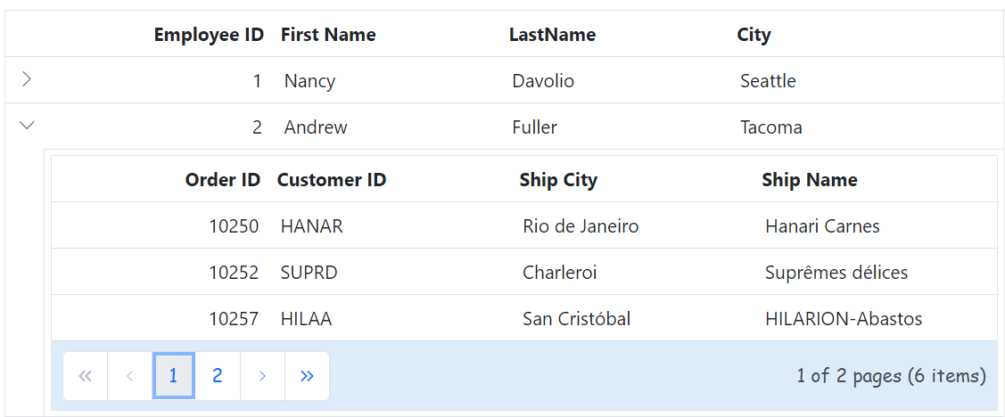
Customizing the child grid pager root element
To customize the appearance of the child grid pager root element, you can use the following CSS code:
.e-detailcell .e-grid  .e-gridpager {
    font-family: cursive;
    background-color: #deecf9;
}
In this example, the .e-detailcell class targets the child grid and the .e-gridpager class targets the pager root element. You can modify the font-family to change the font family and background-color property to change the background color of the pager.
Customizing the child grid pager container element
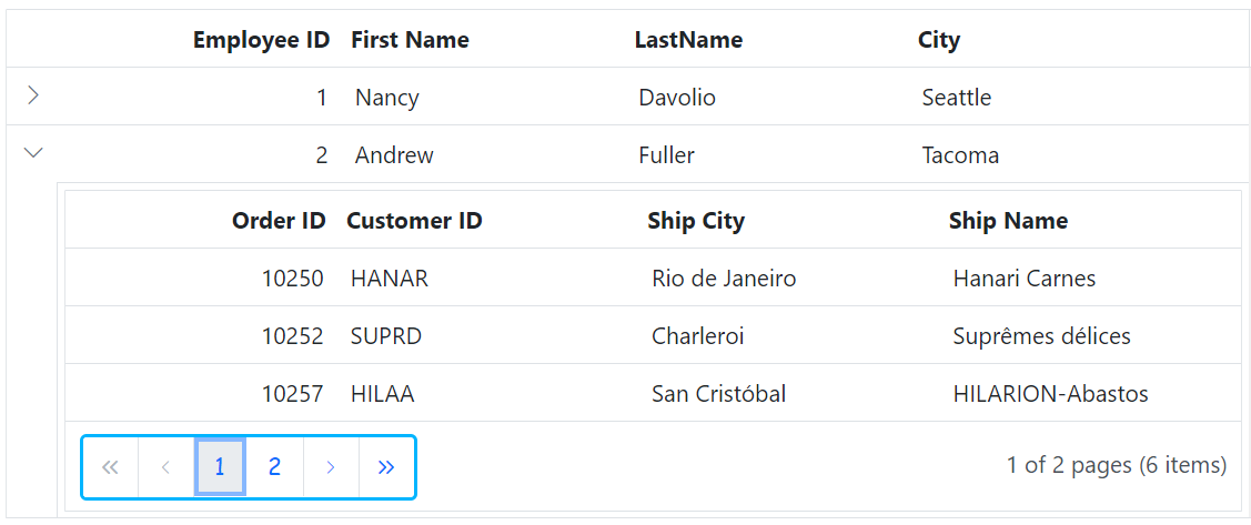
To customize the appearance of the child grid pager container element, you can use the following CSS code:
.e-detailcell .e-grid .e-pagercontainer {
    border: 2px solid #00b5ff;
    font-family: cursive;
}
In this example, the .e-pagercontainer class targets the pager container element. You can modify the border property and font-family property to change the border color and font family of the pager container.
Customizing the child grid pager navigation elements
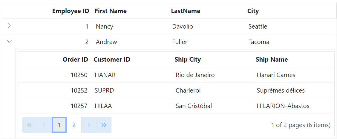
To customize the appearance of the child grid pager navigation elements, you can use the following CSS code:
.e-detailcell .e-grid .e-gridpager .e-prevpagedisabled,
.e-detailcell .e-grid .e-gridpager .e-prevpage,
.e-detailcell .e-grid .e-gridpager .e-nextpage,
.e-detailcell .e-grid .e-gridpager .e-nextpagedisabled,
.e-detailcell .e-grid .e-gridpager .e-lastpagedisabled,
.e-detailcell .e-grid .e-gridpager .e-lastpage,
.e-detailcell .e-grid .e-gridpager .e-firstpage,
.e-detailcell .e-grid .e-gridpager .e-firstpagedisabled {
    background-color: #deecf9;
}
In this example, the classes .e-prevpagedisabled, .e-prevpage, .e-nextpage, .e-nextpagedisabled, .e-lastpagedisabled, .e-lastpage, .e-firstpage, and .e-firstpagedisabled target the various pager navigation elements of the child grid. You can modify the background-color property to change the background color of these elements.
Customizing the child grid pager page numeric link elements
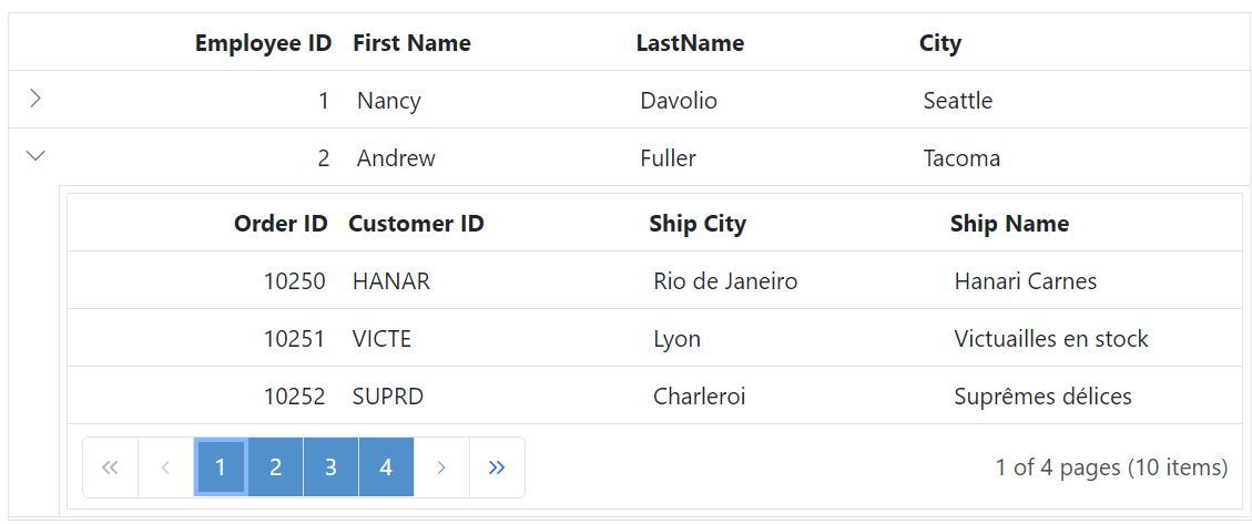
To customize the appearance of the child grid pager current page numeric link elements, you can use the following CSS code:
.e-detailcell .e-grid .e-gridpager .e-numericitem {
    background-color: #5290cb;
    color: #ffffff;
    cursor: pointer;
}

.e-detailcell .e-grid .e-gridpager .e-numericitem:hover {
    background-color: white;
    color: #007bff;
}
In this example, the .e-numericitem class targets the page numeric link elements. You can modify the background-color, color properties to change the background color and text color of these elements.
Customizing the child grid pager current page numeric element
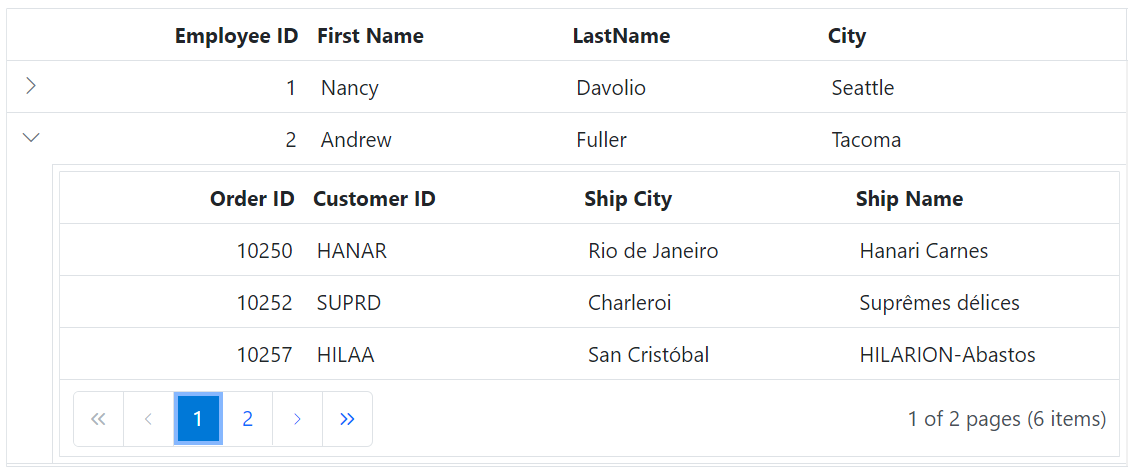
To customize the appearance of the child grid pager current page numeric element, you can use the following CSS code:
.e-detailcell .e-grid .e-gridpager .e-currentitem {
    background-color: #0078d7;
    color: #fff;
}
In this example, the .e-currentitem class targets the current page numeric item. You can modify the background-color property to change the background color of this element and color property to change the text color.
Sorting
You can customize the appearance of the sorting icons and multi sorting icons in the child grid using CSS.You can use the available Syncfusion® icons based on your theme. Here’s how to do it:
Customizing the child grid sorting icon
To customize the sorting icon that appears in the child grid header when sorting is applied, you can use the following CSS code:
.e-detailcell .e-grid .e-icon-ascending::before {
    content: '\e7a3';
    /* Icon code for ascending order */
}

.e-detailcell .e-grid .e-icon-descending::before {
    content: '\e7b6';
    /* Icon code for descending order */
}
In this example, the .e-detailcell class targets the child grid and the .e-icon-ascending::before class targets the sorting icon for ascending order, and the .e-icon-descending::before class targets the sorting icon for descending order.
![]()
Customizing the child grid multi sorting icon
To customize the multi sorting icon that appears in the child grid header when multiple columns are sorted, you can use the following CSS code:
.e-detailcell .e-grid .e-sortnumber {
    background-color: #deecf9;
    font-family: cursive;
}
In this example, the .e-sortnumber class targets the background color and font family of the multi sorting icon. You can modify the background-color and font-family properties to customize the appearance of the multi sorting icon.
![]()
Filtering
You can customize the appearance of filtering elements in the child grid using CSS. Below are examples of how to customize various filtering elements, including filter bar cell elements, filter bar input elements, focus styles, clear icons, filter icons, filter dialog content, filter dialog footer, filter dialog input elements, filter dialog button elements, and Excel filter dialog number filters.
Customizing the child grid filter bar cell element
To customize the appearance of the filter bar cell element in the child grid header, you can use the following CSS code:
.e-detailcell .e-grid .e-filterbar .e-filterbarcell {
  background-color: #045fb4;
}
In this example, the .e-detailcell class targets the child grid and the .e-filterbarcell class targets the filter bar cell element in the child grid header. You can modify the background-color property to change the color of the filter bar cell element.

Customizing the child grid filter bar input element
To customize the appearance of the filter bar input element in the child grid header, you can use the following CSS code:
.e-detailcell .e-grid .e-filterbarcell .e-input-group input.e-input{
    font-family: cursive;
}
In this example, the .e-filterbarcell class targets the filter bar cell element, and the .e-input class targets the input element within the cell. You can modify the font-family property to change the font of the filter bar input element.

Customizing the child grid filter bar input focus
To customize the appearance of the child grid’s filter bar input element’s focus highlight, you can use the following CSS code:
.e-detailcell .e-grid .e-filterbarcell .e-input-group.e-input-focus{
    background-color: #deecf9;
}
In this example, the .e-filterbarcell class targets the filter bar cell element, and the .e-input-group.e-input-focus class targets the focused input element. You can modify the background-color property to change the color of the focus highlight.

Customizing the child grid filter bar input clear icon
To customize the appearance of the child grid’s filter bar input element’s clear icon, you can use the following CSS code:
.e-detailcell .e-grid .e-filterbarcell .e-input-group .e-clear-icon::before {
    content: '\e72c';
}
In this example, the .e-clear-icon class targets the clear icon element within the input group. You can modify the content property to change the icon displayed.
![]()
Customizing the child grid child grid filtering icon
To customize the appearance of the filtering icon in the child grid header, you can use the following CSS code:
.e-detailcell .e-grid .e-icon-filter::before{
    content: '\e81e';
}
In this example, the .e-icon-filter class targets the filtering icon element. You can modify the content property to change the icon displayed.
![]()
Customizing the child grid filter dialog content
To customize the appearance of the child grid’s filter dialog’s content element, you can use the following CSS code:
.e-detailcell .e-grid .e-filter-popup .e-dlg-content {
    background-color: #deecf9;
}
In this example, the .e-filter-popup .e-dlg-content classes target the content element within the filter dialog. You can modify the background-color property to change the color of the dialog’s content.

Customizing the child grid filter dialog footer
To customize the appearance of the child grid’s filter dialog’s footer element, you can use the following CSS code:
.e-detailcell .e-grid .e-filter-popup .e-footer-content {
    background-color: #deecf9;
}
In this example, the .e-filter-popup .e-footer-content classes target the footer element within the filter dialog. You can modify the background-color property to change the color of the dialog’s footer.

Customizing the child grid filter dialog input element
To customize the appearance of the child grid’s filter dialog’s input elements, you can use the following CSS code:
.e-detailcell .e-grid .e-filter-popup .e-input-group input.e-input{
    font-family: cursive;
}
In this example, the .e-filter-popup class targets the filter dialog, and the .e-input class targets the input elements within the dialog. You can modify the font-family property to change the font of the input elements.

Customizing the child grid filter dialog button element
To customize the appearance of the child grid’s filter dialog’s button elements, you can use the following CSS code:
.e-detailcell .e-grid .e-filter-popup .e-btn{
    font-family: cursive;
}
In this example, the .e-filter-popup class targets the filter dialog, and the .e-btn class targets the button elements within the dialog. You can modify the font-family property to change the font of the button elements.

Customizing the child grid excel filter dialog number filters element
To customize the appearance of the excel filter dialog’s number filters in the child grid, you can use the following CSS code:
.e-detailcell .e-grid .e-filter-popup .e-contextmenu-wrapper ul{
    background-color: #deecf9;
}
In this example, the .e-filter-popup .e-contextmenu-wrapper ul classes target the number filter elements within the excel filter dialog. You can modify the background-color property to change the color of these elements.

Grouping
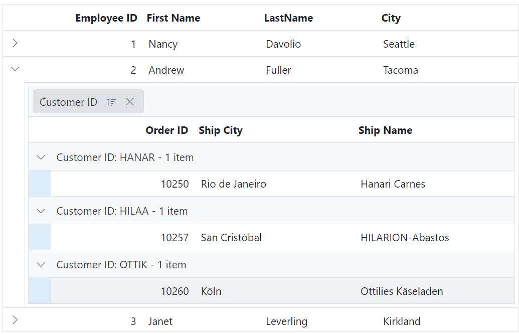
You can customize the appearance of grouping elements in the child grid using CSS. Here are examples of how to customize the group header, group expand/collapse icons, group caption row, and grouping indent cell.
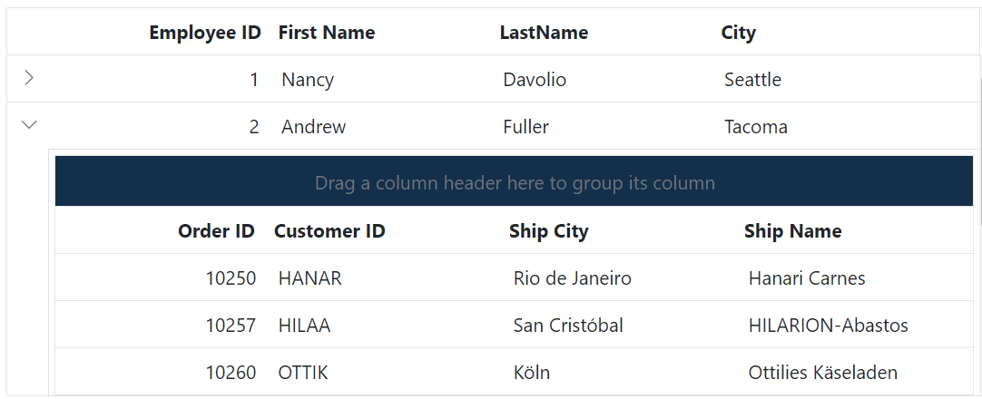
Customizing the child grid group header
To customize the appearance of the child grid’s group header element, you can use the following CSS code:
.e-detailcell .e-grid .e-groupdroparea {
    background-color: #132f49;
}
In this example, the .e-detailcell class targets the child grid and the .e-groupdroparea class targets the group header element. You can modify the background-color property to change the color of the group header.
Customizing the child grid group expand or collapse icons
To customize the appearance of the group expand/collapse icons in the child grid, you can use the following CSS code:
.e-detailcell .e-grid .e-icon-gdownarrow::before{
    content:'\e7c9'
}
.e-detailcell .e-grid .e-icon-grightarrow::before{
    content:'\e80f'
}
In this example, the .e-icon-gdownarrow and .e-icon-grightarrow classes target the expand and collapse icons, respectively. You can modify the content property to change the icon displayed. You can use the available Syncfusion® icons based on your theme.
![]()
Customizing the child grid group caption row
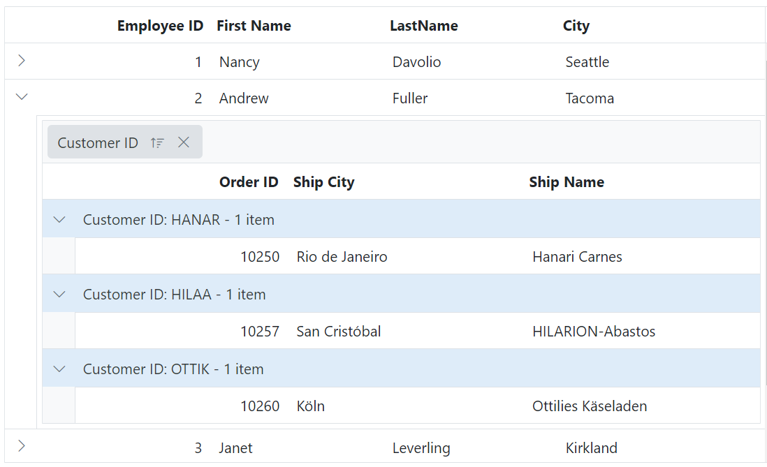
To customize the appearance of the child grid’s group caption row and the icons indicating record expansion or collapse, you can use the following CSS code:
.e-detailcell .e-grid .e-groupcaption {
    background-color: #deecf9;
}

.e-detailcell .e-grid .e-recordplusexpand,
.e-detailcell .e-grid .e-recordpluscollapse {
    background-color: #deecf9;
}
In this example, the .e-groupcaption class targets the group caption row element, and the .e-recordplusexpand and .e-recordpluscollapse classes target the icons indicating record expansion or collapse. You can modify the background-color property to change the color of these elements.
Customizing the child grid grouping indent cell
To customize the appearance of the child grid’s grouping indent cell element, you can use the following CSS code:
.e-detailcell .e-grid .e-indentcell {
    background-color: #deecf9;
}
In this example, the .e-indentcell class targets the grouping indent cell element. You can modify the background-color property to change the color of the indent cell.
Toolbar
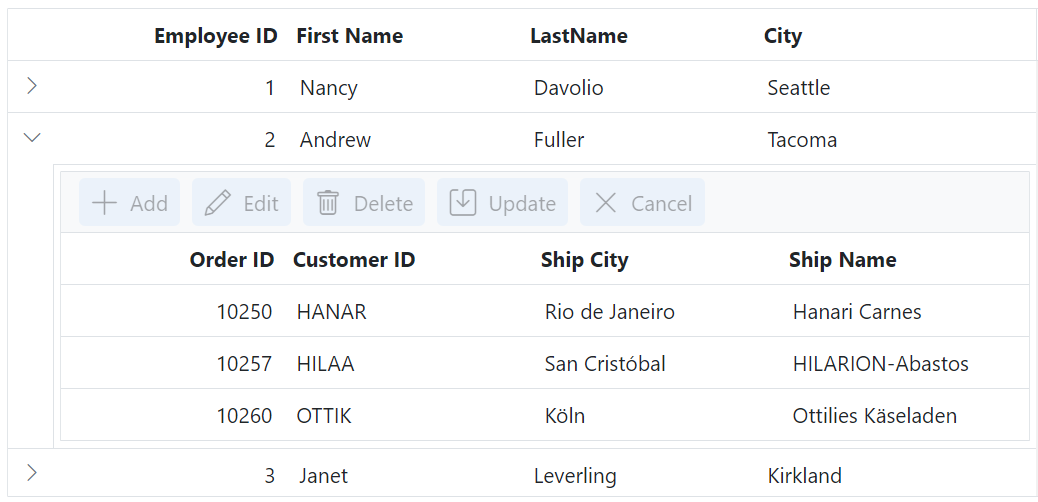
You can customize the appearance of the toolbar in the child grid using CSS. Here are examples of how to customize the toolbar root element and toolbar button element.
Customizing the child grid toolbar root element
To customize the appearance of the child grid’s toolbar root element, you can use the following CSS code:
.e-detailcell .e-grid .e-toolbar-items {
    background-color: #deecf9;
}
In this example, the .e-detailcell class targets the child grid and the .e-toolbar-items class targets the background color of the toolbar root element. You can modify the background-color property to change the background color of the toolbar.
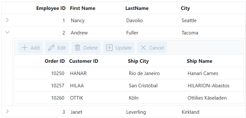
Customizing the child grid toolbar button element
To customize the appearance of the child grid’s toolbar buttons, you can use the following CSS code:
.e-detailcell .e-grid .e-toolbar .e-btn {
    background-color: #deecf9;
}
In this example, the .e-toolbar .e-btn selector targets the background color of the toolbar button elements. You can modify the background-color property to change the background color of the toolbar buttons.
Editing
You can customize the appearance of editing-related elements in the child grid using CSS. Below are examples of how to customize various editing-related elements.
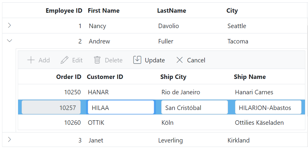
Customizing the child grid edited and added row element
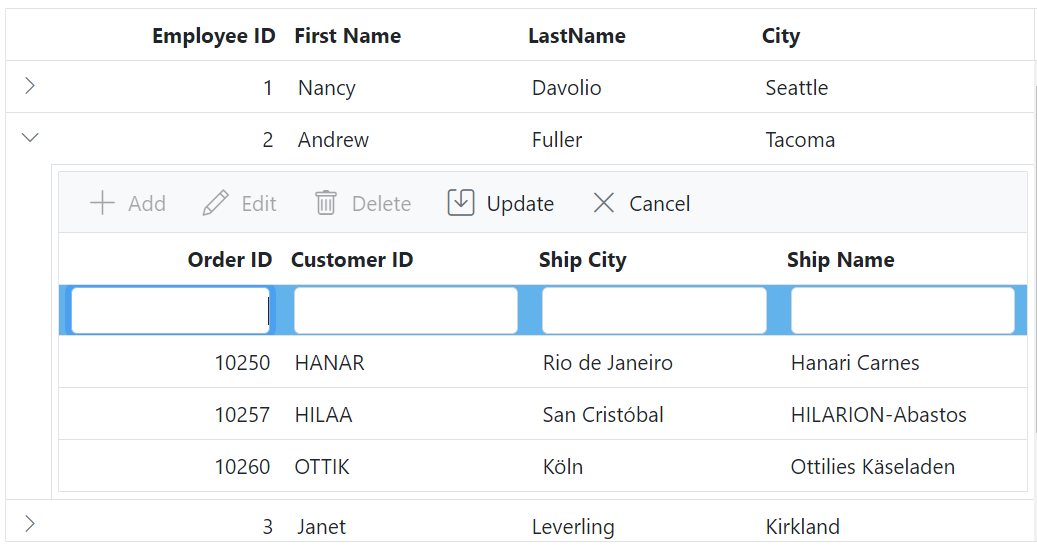
To customize the appearance of edited and added row table elements in the child grid, you can use the following CSS code:
.e-detailcell .e-grid .e-editedrow table,
.e-detailcell .e-grid .e-addedrow table {
	background-color: #62b2eb;
}
In this example, the .e-detailcell class targets the child grid and the .e-editedrow class represents the edited row element, and the .e-addedrow class represents the added row element. You can modify the background-color property to change the color of these row table elements.
Customizing the child grid edited row input element
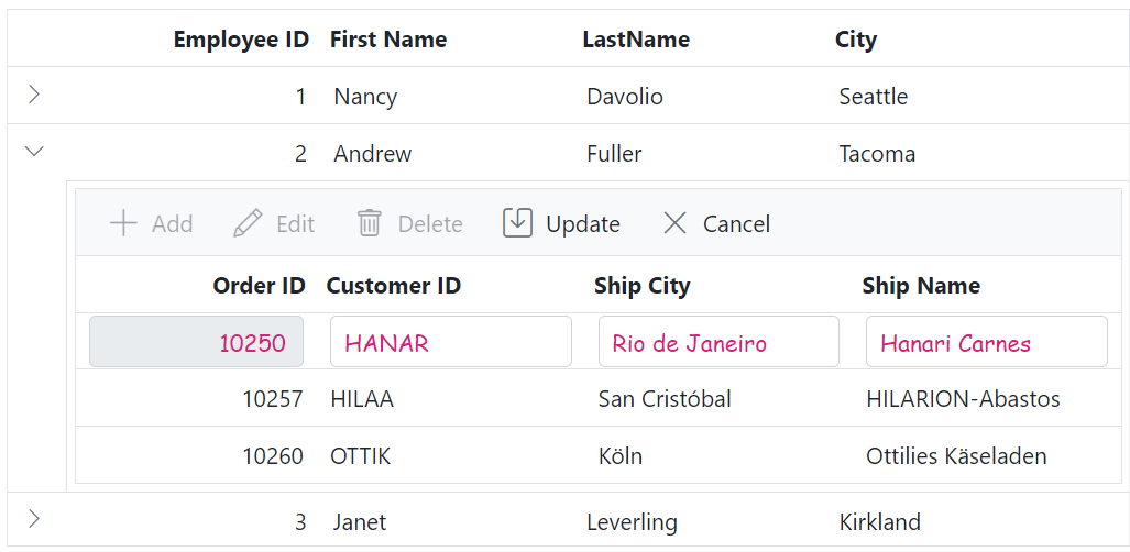
To customize the appearance of edited row input elements in the child grid, you can use the following CSS code:
.e-detailcell .e-grid .e-editedrow .e-input-group input.e-input{
  font-family: cursive;
  color:rgb(214, 33, 123)
}
In this example, the .e-editedrow class represents the edited row element, and the .e-input class represents the input elements within the form. You can modify the font-family property to change the font and color property to change text color of the input elements.
Customizing the child grid edit dialog header element
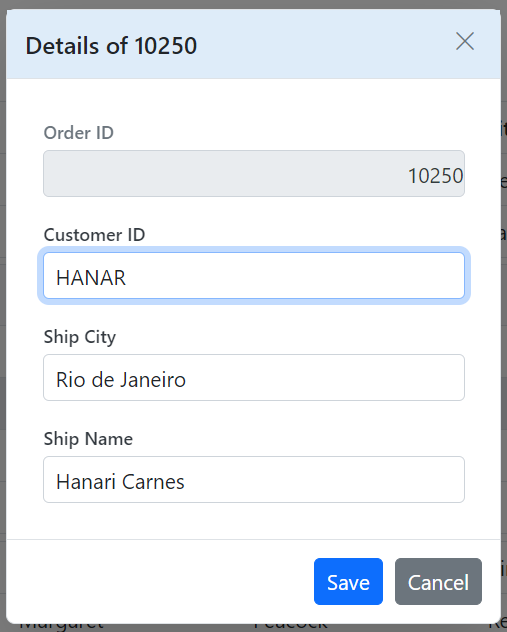
To customize the appearance of the edit dialog header element in the child grid, you can use the following CSS code:
.e-edit-dialog .e-dlg-header-content {
    background-color: #deecf9;
}
In this example, the .e-edit-dialog class represents the edit dialog, and the .e-dlg-header-content class targets the header content within the dialog. You can modify the background-color property to change the color of the header element.
Customizing the child grid edited row input element in dialog edit mode
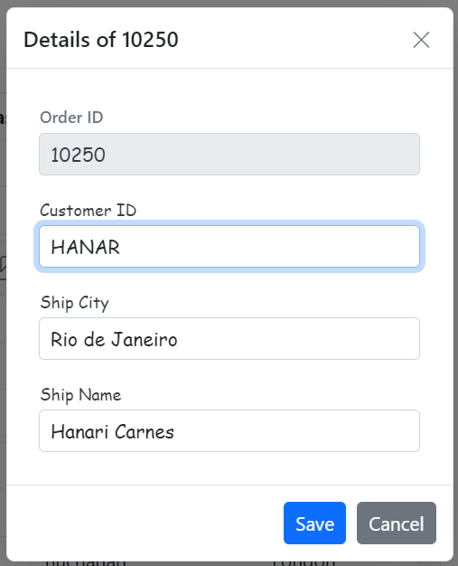
To customize the appearance of the child grid’s edited row input elements in dialog edit mode, you can use the following CSS code:
.e-grid .e-gridform .e-rowcell .e-float-input .e-field {
    font-family: cursive;
}
In this example, the .e-gridform class represents the editing form, and the .e-float-input class targets the floating input elements within the form. You can modify the font-family property to change the font of the input elements.
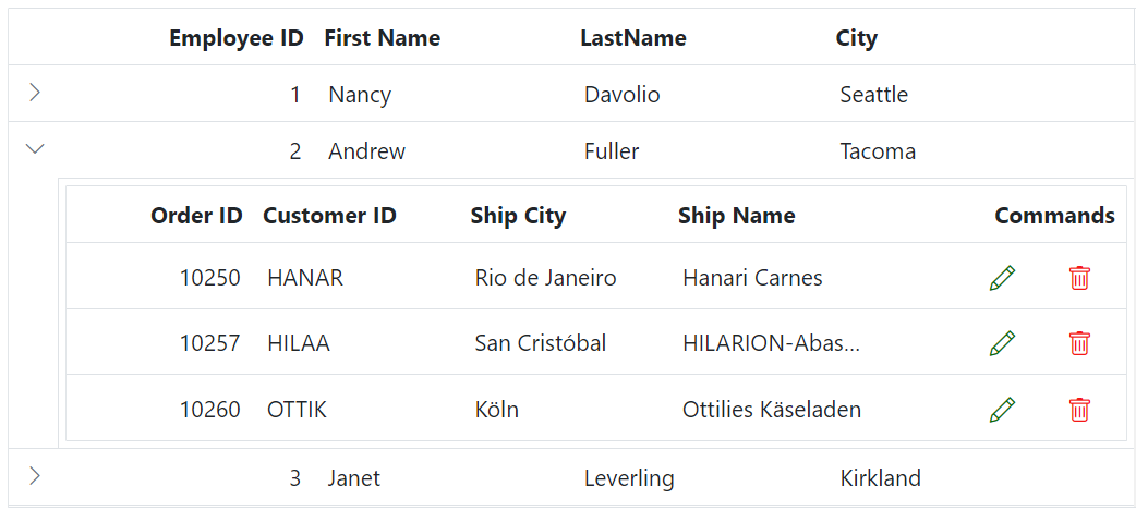
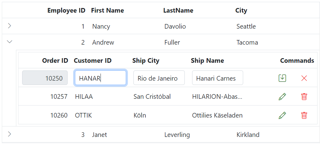
Customizing the child grid command column buttons
To customize the appearance of the child grid’s command column buttons such as edit, delete, update, and cancel, you can use the following CSS code:
.e-detailcell .e-grid .e-delete::before ,.e-grid .e-cancel-icon::before{
    color: #f51717;
}
.e-detailcell .e-grid .e-edit::before, .e-grid .e-update::before {
    color: #077005;
}
In this example, the .e-edit, .e-delete, .e-update, and .e-cancel-icon classes represent the respective command column buttons. You can modify the color property to change the color of these buttons.
Aggregate
You can customize the appearance of aggregate elements in the child grid using CSS. Below are examples of how to customize the aggregate root element and the aggregate cell elements.
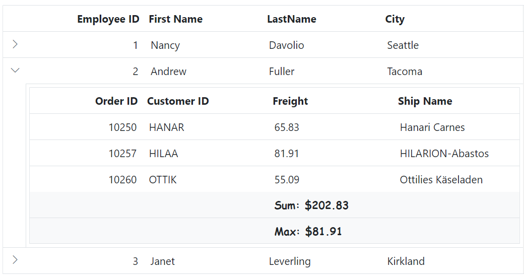
Customizing the child grid aggregate root element
To customize the appearance of the child grid’s aggregate root elements, you can use the following CSS code:
.e-detailcell .e-grid .e-gridfooter {
    font-family: cursive;
}
In this example, the .e-detailcell class targets the child grid and the e-gridfooter class represents the root element of the aggregate row in the grid footer. You can modify the font-family property to change the font of the aggregate root element.
Customizing the child grid aggregate cell elements
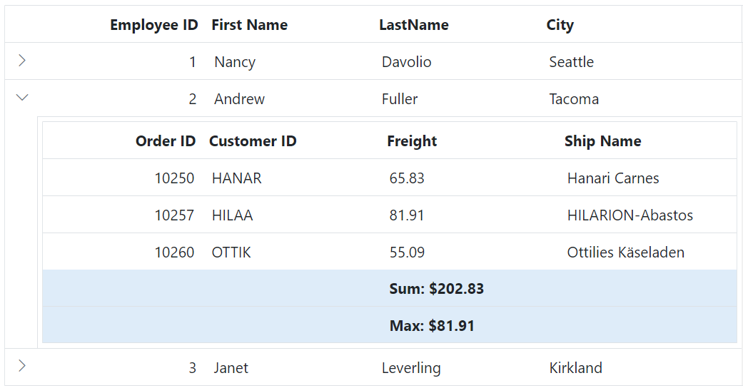
To customize the appearance of the child grid’s aggregate cell elements (summary row cell elements), you can use the following CSS code:
.e-detailcell .e-grid .e-summaryrow .e-summarycell {
    background-color: #deecf9;
}
In this example, the e-summaryrow class represents the summary row containing aggregate cells, and the e-summarycell class targets individual aggregate cells within the summary row. You can modify the background-color property to change the color of the aggregate cell elements.
Selection
You can customize the appearance of the selection in the child grid using CSS. Here are examples of how to customize the row selection background, cell selection background, and column selection background.
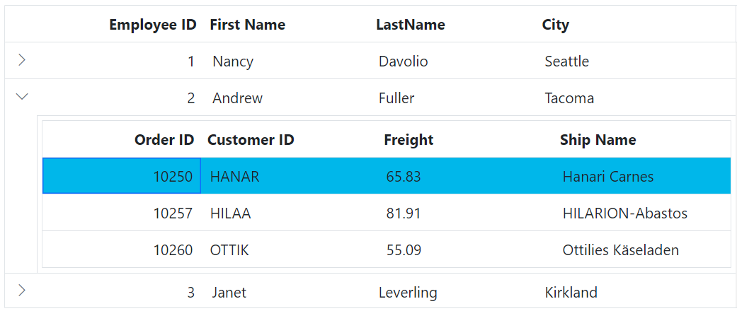
Customizing the child grid row selection background
To customize the appearance of the child grid’s row selection, you can use the following CSS code:
.e-detailcell .e-grid td.e-selectionbackground {
    background-color: #00b7ea;
}
In this example, the .e-detailcell class targets the child grid and the .e-selectionbackground class targets the background color of the row selection. You can modify the background-color property to change the background color of the selected rows.
Customizing the child grid cell selection background
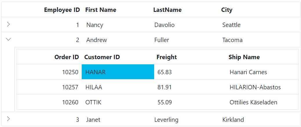
To customize the appearance of the child grid’s cell selection, you can use the following CSS code:
.e-detailcell .e-grid td.e-cellselectionbackground {
    background-color: #00b7ea;
}
In this example, the .e-cellselectionbackground class targets the background color of the cell selection. You can modify the background-color property to change the background color of the selected cells.
Customizing the child grid column selection background
To customize the appearance of the child grid’s column selection, you can use the following CSS code:
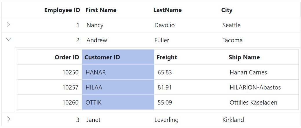
.e-detailcell .e-grid .e-columnselection {
    background-color: #aec2ec;
}
In this example, the .e-columnselection class targets the background color of the column selection. You can modify the background-color property to change the background color of the selected columns.
