How can I help you?
Custom toolbar in ASP.NET Core Grid component
6 Dec 202412 minutes to read
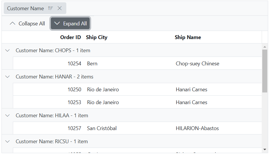
Custom toolbar in Syncfusion ASP.NET Core Grid allows you to create a distinctive toolbar layout, style, and functionality that aligns with the specific needs of your application, providing a personalized experience within the Grid component.
This can be achieved by utilizing the toolbarTemplate property, which offers extensive customization options for the toolbar. You can define a custom template for the toolbar and handle the actions of the toolbar items in the clicked event.
The following example demonstrates, how to render the custom toolbar using toolbarTemplate
@using Syncfusion.EJ2.Navigations;

<ejs-grid id="grid" dataSource="@ViewBag.dataSource" height="348px" allowGrouping="true" toolbarTemplate="#template">
    <e-grid-groupsettings columns="@(new string[] {"CustomerID"})"></e-grid-groupsettings>
    <e-grid-columns>
        <e-grid-column field="OrderID" headerText="Order ID" textAlign="Right" width="120"></e-grid-column>
        <e-grid-column field="CustomerID" headerText="Customer Name" width="140"></e-grid-column>
        <e-grid-column field="ShipCity" headerText="Ship City" width="120"></e-grid-column>
        <e-grid-column field="ShipName" headerText="Ship Name" width="140"></e-grid-column>
    </e-grid-columns>
</ejs-grid>
<div id="template">
  <ejs-toolbar id="defaultToolbar" clicked="clickHandler">
    <e-toolbar-items>
      <e-toolbar-item id="collapse" text="Collapse All" prefixIcon="e-chevron-up icon"></e-toolbar-item>
      <e-toolbar-item id="expand" text="Expand All" prefixIcon="e-chevron-down icon"></e-toolbar-item>
    </e-toolbar-items>
  </ejs-toolbar>
</div>
<script>
  function clickHandler(args){
      var grid = document.getElementById("grid").ej2_instances[0];
      var target = (args.originalEvent.target).closest('button');
      if (target.id === 'collapse') grid.groupModule.collapseAll();
      else grid.groupModule.expandAll();
    };
</script>
public IActionResult Index()
{
ViewBag.dataSource = OrderDetails.GetAllRecords();
return View();
}
Render image with text in custom toolbar
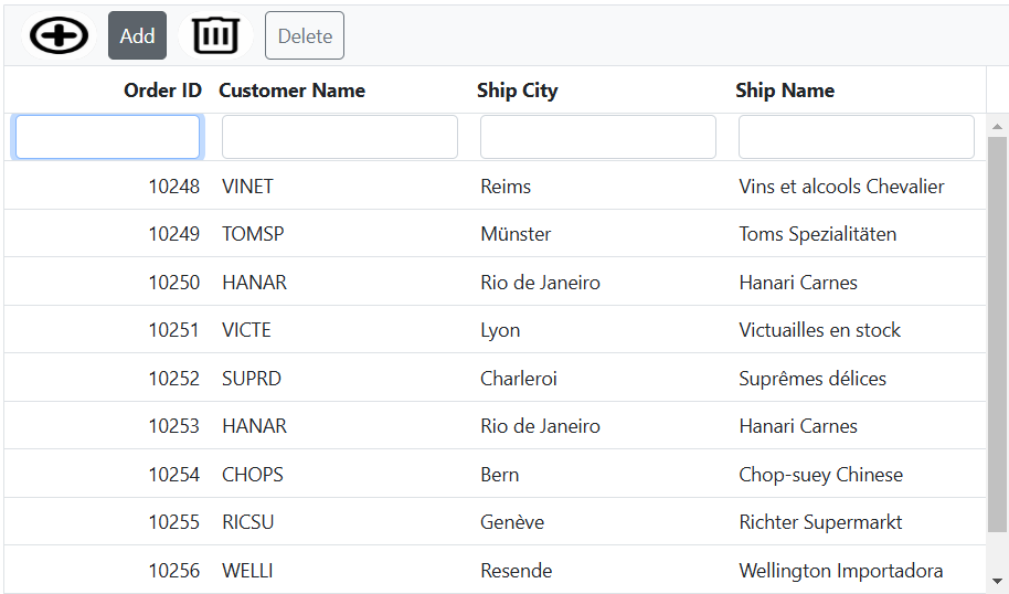
Render an image with text in custom toolbar in Syncfusion ASP.NET Core Grid allows easily render an image along with text in the toolbar of the Grid. This feature enhances the visual presentation of the Grid, providing additional context and improving the overall experience.
To render an image with text in custom toolbar, This can be achieved by utilizing the toolbarTemplateproperty.
The following example demonstrates how to render an image in the toolbar of the grid using toolbarTemplate.
<ejs-grid id="grid" dataSource="@ViewBag.dataSource" height="348px" toolbarTemplate="#template">
    <e-grid-editSettings allowAdding="true" allowDeleting="true" allowEditing="true"></e-grid-editSettings>
    <e-grid-columns>
        <e-grid-column field="OrderID" headerText="Order ID" textAlign="Right" width="120"></e-grid-column>
        <e-grid-column field="CustomerID" headerText="Customer Name" width="140"></e-grid-column>
        <e-grid-column field="ShipCity" headerText="Ship City" width="120"></e-grid-column>
        <e-grid-column field="ShipName" headerText="Ship Name" width="140"></e-grid-column>
    </e-grid-columns>
</ejs-grid>
<div id="template">
    <div>
        <div class="image"><img src="~/Images/add.jpg" /></div>
        <div>
            <ejs-button id="addButton" cssClass= "e-outline"  content="Add"></ejs-button>
        </div >
        <div class="image"><img src="~/Images/delete.jpg" /></div>
        <div>
            <ejs-button id="deleteButton" cssClass= "e-outline"  content="Delete"></ejs-button>
        </div>
    </div>
</div >
<script>
    document.getElementById('addButton').onclick = clickHandler;
    document.getElementById('deleteButton').onclick = clickHandler;
    function clickHandler(event) {
        var grid = document.getElementById("grid").ej2_instances[0];
        if (event.target.id === "addButton") {
            grid.addRecord();
        }
        else {
            var selectedRecord = grid.getSelectedRecords()[0];
            grid.deleteRecord(selectedRecord);
        }
     }
</script>
<style>
    .image img {
        border-radius: 50px;
        box-shadow: inset 0 0 1px #e0e0e0, inset 0 0 14px rgba(0, 0, 0, 0.2);
        height: 35px;
        width: 55px;
    }
    .e-grid .e-toolbar .e-toolbar-item > * {
        text-overflow: ellipsis;
        height: 35px;
    }
</style>
public IActionResult Index()
{
ViewBag.dataSource = OrderDetails.GetAllRecords();
return View();
}
You can further customize the styles and layout of the image and text in the custom toolbar to suit your specific design requirements.
Render DropDownList in custom toolbar
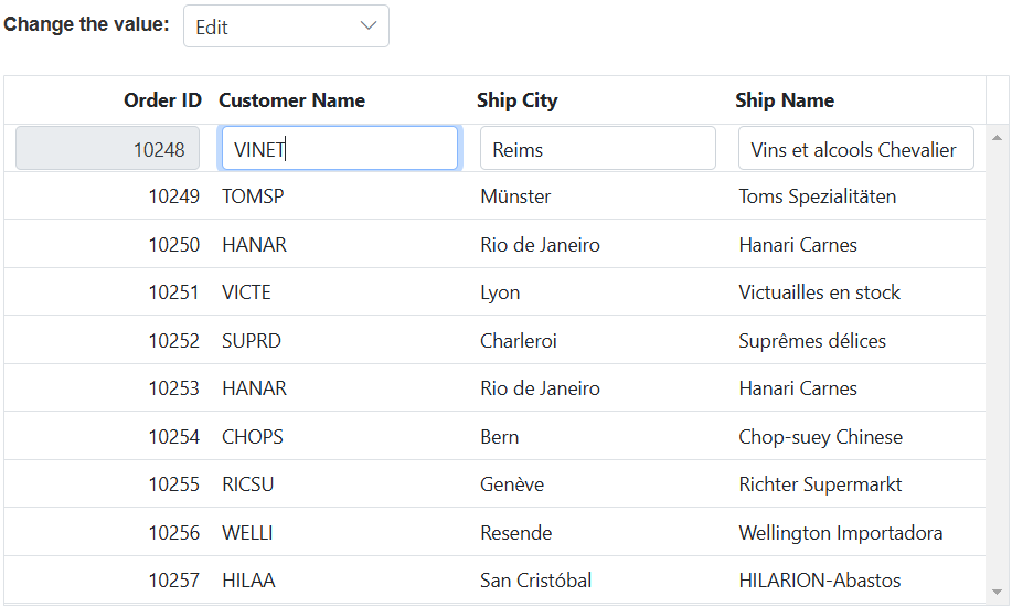
Render DropDownList in custom toolbar in Syncfusion ASP.NET Core Grid enables you to extend the functionality of the custom toolbar by incorporating a DropDownList component, allowing you to perform various actions within the Grid based on their selections.
This can be achieved by utilizing the toolbarTemplate. The example below demonstrates how to render the DropDownList component in the custom toolbar, where the toolbar template includes the its change event is bound to the onChange method.
In the onChange method, the text of the selected item is checked to determine the appropriate action. For example, if Update is chosen, the endEdit method is called to exit the edit mode. If Edit is selected, the selected record is passed to the startEdit method to initiate the edit mode dynamically. Similarly, if Delete is picked, the selected record is passed to the deleteRecord method to remove it from the grid.
@{
    var dropDownData = new[] {
        new { value = "Edit", text = "Edit" },
        new { value = "Delete", text = "Delete" },
        new { value = "Update", text = "Update" }
    };
}
<div style="padding-bottom: 20px; display: flex">
    <label style="padding: 2px 10px 0 0;font-weight: bold"> Change the value:</label>
    <span style="height:fit-content">
        <ejs-dropdownlist id="dropDown" dataSource="dropDownData" width="150px" change="onChange" placeholder="Select a value">
        </ejs-dropdownlist>
    </span>
</div>
<ejs-grid id="grid" dataSource="@ViewBag.dataSource" height="348px">
   <e-grid-editSettings allowAdding="true" allowDeleting="true" allowEditing="true"></e-grid-editSettings>
    <e-grid-columns>
        <e-grid-column field="OrderID" headerText="Order ID" textAlign="Right" width="120"></e-grid-column>
        <e-grid-column field="CustomerID" headerText="Customer Name" width="140"></e-grid-column>
        <e-grid-column field="ShipCity" headerText="Ship City" width="120"></e-grid-column>
        <e-grid-column field="ShipName" headerText="Ship Name" width="140"></e-grid-column>
    </e-grid-columns>
</ejs-grid>
<script>
    function onChange(args) {
        var grid = document.getElementById("grid").ej2_instances[0];
        var dropDownObject = document.getElementById("dropDown").ej2_instances[0];
        let selectedRow = grid.getSelectedRecords()[0];
        if (args.itemData.text === 'Update') grid.endEdit();
        else if (args.itemData.text === 'Edit') grid.startEdit();
        else grid.deleteRecord(selectedRow);
        dropDownObject.value = '';
        dropDownObject.placeholder = args.itemData.text;
    }
</script>
public IActionResult Index()
{
ViewBag.dataSource = OrderDetails.GetAllRecords();
return View();
}
Render a component or element using the toolbar template
Rendering a component or element using the toolbar template in the Syncfusion ASP.NET Core Grid allows you to extend the capabilities of the grid toolbar by incorporating custom components or elements. This provides flexibility to enhance the toolbar with custom buttons, dropdowns, input fields, icons, or any other desired UI elements. You can bind event handlers or handle interactions within the template to enable specific actions or behaviors associated with the added components or elements.
To render custom components or elements within the toolbar, use the toolbarTemplate. This allows you to include other components, such as a Button, and perform specific grid actions based on the button click. For example, when the ExcelExport button is clicked, the excelExport method is called to export the grid to Excel. Similarly, when the PdfExport button is clicked, the pdfExport method is called to export the grid to PDF format.Likewise, when the Print button is clicked, the print method will triggered to print the grid.
The following example demonstrates how to render a Button component in the toolbar using toolbarTemplate and perform grid action based on the respected button click.
<div style="padding-bottom:20px">
    <ejs-button id="excelButton" cssClass="e-primary" content="Excel Export"></ejs-button>
    <ejs-button id="pdfButton" cssClass="e-primary" content="Pdf Export"></ejs-button>
    <ejs-button id="printButton" cssClass="e-primary" content="Print"></ejs-button>
</div>
<ejs-grid id="grid" dataSource="@ViewBag.dataSource" allowExcelExport="true" allowPdfExport="true" height="348px">
    <e-grid-columns>
        <e-grid-column field="OrderID" headerText="Order ID" textAlign="Right" width="120"></e-grid-column>
        <e-grid-column field="CustomerID" headerText="Customer Name" width="140"></e-grid-column>
        <e-grid-column field="ShipCity" headerText="Ship City" width="120"></e-grid-column>
        <e-grid-column field="ShipName" headerText="Ship Name" width="140"></e-grid-column>
    </e-grid-columns>
</ejs-grid>
<script>
    document.getElementById('excelButton').onclick = clickHandler;
    document.getElementById('pdfButton').onclick = clickHandler;
    document.getElementById('printButton').onclick = clickHandler;
    function clickHandler(event) {
        var grid = document.getElementById("grid").ej2_instances[0];
        if(event.target.id === "excelButton")
            grid.excelExport();
        else if(event.target.id === "pdfButton")
            grid.pdfExport();
        else
            grid.print();
    }
</script>
public IActionResult Index()
{
ViewBag.dataSource = OrderDetails.GetAllRecords();
return View();
}