How can I help you?
Context menu in ASP.NET Core Grid component
6 Dec 202416 minutes to read
The Syncfusion ASP.NET Core Grid component comes equipped with a context menu feature, which is triggered when a user right-clicks anywhere within the grid. This feature serves to enrich the user experience by offering immediate access to a variety of supplementary actions and operations that can be executed on the data displayed in the grid.
To activate the context menu within the grid, you have an option to configure the grid’s contextMenuItems property. You can set this property to either include the default context menu items or define your own custom context menu items, tailoring the menu options to suit your specific needs. This customization allows you to enhance the grid’s functionality by providing context-sensitive actions for interacting with your data.
The context menu is triggered when you right-click on different areas of the grid, including:
- Header: When you right-click on the grid’s header section.
- Content: When you right-click on the grid’s main content area.
- Pager: When you right-click on the pager section.
The default context menu items in the header area of the grid are as follows:
| Items | Description |
|---|---|
AutoFit |
Automatically adjust the column width to fit the content. |
AutoFitAll |
Automatically adjust all column widths to fit their content. |
Group |
Group the data based on the current column. |
Ungroup |
Remove grouping for the current column. |
SortAscending |
Sort the current column in ascending order. |
SortDescending |
Sort the current column in descending order. |
The default context menu items in the content area of the grid are as follows:
| Items | Description |
|---|---|
Edit |
Edit the currently selected record in the grid. |
Delete |
Delete the currently selected record. |
Save |
Save the changes made to the edited record. |
Cancel |
Cancel the edit state and revert changes made to the edited record. |
Copy |
Copy the selected records to the clipboard. |
PdfExport |
Export the grid data as a PDF document. |
ExcelExport |
Export the grid data as an Excel document. |
CsvExport |
Export the grid data as a CSV document. |
The default context menu items in the pager area of the grid are as follows:
| Items | Description |
|---|---|
FirstPage |
Navigate to the first page of the grid. |
PrevPage |
Navigate to the previous page of the grid. |
LastPage |
Navigate to the last page of the grid. |
NextPage |
Navigate to the next page of the grid. |
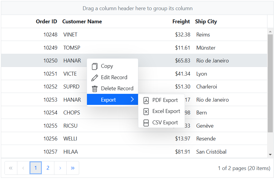
The following example demonstrates how to enable context menu feature in the grid.
<ejs-grid id="grid" dataSource="@ViewBag.dataSource" allowGrouping="true" allowSorting="true" height="348px" allowExcelExport="true" allowPdfExport="true" contextMenuItems="@(new List<object>() {"AutoFit","AutoFitAll","SortAscending","SortDescending","Copy","Edit","Delete","Save","Cancel","PdfExport","ExcelExport","CsvExport","FirstPage","PrevPage","LastPage","NextPage","Group","Ungroup"})" allowPaging="true">
    <e-grid-editSettings allowDeleting="true" allowEditing="true"></e-grid-editSettings>
    <e-grid-columns>
        <e-grid-column field="OrderID" headerText="Order ID" isPrimaryKey="true" textAlign="Right" width="120"></e-grid-column>
        <e-grid-column field="CustomerID" headerText="Customer Name" width="150" ></e-grid-column>
        <e-grid-column field="Freight" headerText="Freight" editType="numericedit" textAlign="Right" format="C2" width="120"></e-grid-column>
        <e-grid-column field="ShipCity" headerText="Ship City" width="150"></e-grid-column>
    </e-grid-columns>
</ejs-grid>
public IActionResult Index()
{
ViewBag.dataSource = OrderDetails.GetAllRecords();
return View();
}
Custom context menu items
The Syncfusion ASP.NET Core Grid empowers you to enhance your user experience by incorporating custom context menu items into the default context menu. These customized options enable you to tailor the context menu to meet the unique requirements of your application.
To incorporate custom context menu items in the Syncfusion ASP.NET Core Grid, you can achieve this by specifying the contextMenuItems property as a collection of contextMenuItemModel. This allows you to define and customize the appearance and behavior of these additional context menu items according to your requirements.
Furthermore, you can assign actions to these custom items by utilizing the contextMenuClick event. This event provides you with the means to handle user interactions with the custom context menu items, enabling you to execute specific actions or operations when these items are clicked.
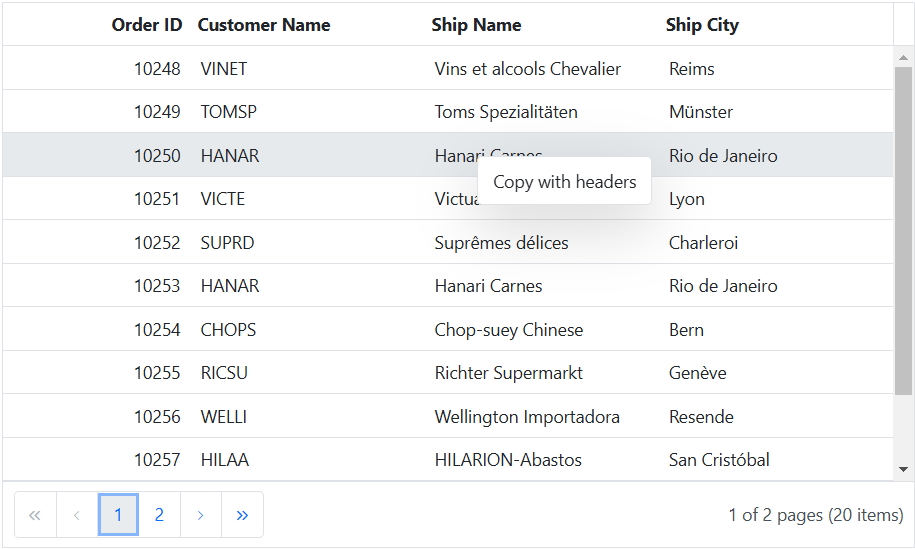
The following example demonstrates how to add custom context menu items in the Grid component.
@{
    List<object> ContextMenuitems = new List<object>();
    ContextMenuitems.Add(new { text = "Copy with headers", target= ".e-content", id = "copywithheader" });
 }
 <ejs-grid id="grid" dataSource="@ViewBag.dataSource" allowSelection="true" allowPaging="true" height="348px" contextMenuItems="ContextMenuitems" contextMenuClick="contextMenuClick" >
    <e-grid-columns>
        <e-grid-column field="OrderID" headerText="Order ID" isPrimaryKey="true" textAlign="Right" width="125"></e-grid-column>
        <e-grid-column field="CustomerID" headerText="Customer ID" textAlign="Right" width="150"></e-grid-column>
        <e-grid-column field="ShipName" headerText="Ship Name"  width="120"></e-grid-column>
        <e-grid-column field="ShipCity" headerText="Ship City" width="170"></e-grid-column>
    </e-grid-columns>
</ejs-grid>
<script>
    function contextMenuClick(args) {
        if (args.item.id === 'copywithheader') {
            var grid = document.getElementById("grid").ej2_instances[0];
            grid.copy(true);
        }
    }
</script>
public IActionResult Index()
{
ViewBag.dataSource = OrderDetails.GetAllRecords()
return View();
}
Show context menu on left click
The Syncfusion ASP.NET Core Grid provides the ability to show the context menu items on a left mouse click instead of the default right mouse click action.
This can be achieved by using the created event and the context menu’s beforeOpen event of the Grid.
By using the onClick event listener of the Grid, you can obtain the clicked position values. The obtained positions are then sent to the open method of the context menu within the onClick event of the Grid. Additionally, the default action of right-clicking to open the context menu items items is prevented by utilizing the created event of the Grid.
The following example demonstrates how to show context menu on left click using created event.
<ejs-grid id="grid" dataSource="@ViewBag.dataSource" created="created" allowExcelExport="true" allowPdfExport="true" allowSorting="true" contextMenuItems="@(new List<object>() { "SortAscending","SortDescending","FirstPage","PrevPage","LastPage","NextPage","PdfExport","ExcelExport"})" allowPaging="true">
    <e-grid-pageSettings pageSize="10"></e-grid-pageSettings>
    <e-grid-columns>
        <e-grid-column field="OrderID" headerText="Order ID" isPrimaryKey="true" textAlign="Right" width="120"></e-grid-column>
        <e-grid-column field="CustomerID" headerText="Customer Name" width="150"></e-grid-column>
        <e-grid-column field="ShipName" headerText="Ship Name" width="200"></e-grid-column>
        <e-grid-column field="ShipCity" headerText="Ship City" width="150"></e-grid-column>
    </e-grid-columns>
</ejs-grid>
<script>
   let values;
    function created() {
        var grid = document.getElementById("grid").ej2_instances[0];
        grid.contextMenuModule.contextMenu.beforeOpen = (args) => {
            if (args.event && args.event.which === 3) args.cancel = true;
            args.event = values;
            grid.contextMenuModule.contextMenuBeforeOpen(args);
        };
    }
    document.getElementById("grid").onclick = (event) => {
        values = event;
        var grid = document.getElementById("grid").ej2_instances[0];
        grid.contextMenuModule.contextMenu.open(
            values.pageY + pageYOffset,
            values.pageX + pageXOffset
        );
    };
</script>
public IActionResult Index()
{
ViewBag.dataSource = OrderDetails.GetAllRecords();
return View();
}You can hide or show an item in context menu for specific area inside of grid by defining the
targetproperty.
Enable or disable context menu items
With the Syncfusion ASP.NET Core Grid, you have the ability to manage the activation or deactivation of both default and custom context menu items. This feature provides you with the flexibility to tailor the behavior of context menu items to suit specific conditions or individual interactions within your application.
This can be achieved using the enableItems method of the context menu. By setting the enable parameter in the enableItems method to true, you can enable context menu items, and by setting it to false, you can disable them. Based on your specific condition or requirements, you can enable or disable the context menu item using the enableItems method.
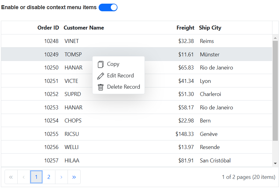
In the following example, the EJ2 Toggle Switch Button component is added to enable and disable the context menu items using enableItems method. When the switch is toggled, the change event is triggered, and the Copy items is updated accordingly.
<div style="padding-bottom: 20px; display: flex">
    <label style="margin-right:5px;margin-top: -3px;font-weight: bold;">Enable or disable context menu items</label>
    <ejs-switch id="switch" checked="true" change="onSwitchChange"></ejs-switch>
 </div>
<ejs-grid id="grid" dataSource="@ViewBag.dataSource" contextMenuItems="@(new List<object>() {"Copy", "Edit", "Delete"})" allowPaging="true" height="348px">
    <e-grid-editSettings allowAdding="true" allowDeleting="true" allowEditing="true"></e-grid-editSettings>
    <e-grid-columns>
        <e-grid-column field="OrderID" headerText="Order ID" isPrimaryKey="true" textAlign="Right" width="120"></e-grid-column>
        <e-grid-column field="CustomerID" headerText="Customer Name" width="150"></e-grid-column>
        <e-grid-column field="Freight" headerText="Freight" editType="numericedit" textAlign="Right" format="C2" width="120"></e-grid-column>
        <e-grid-column field="ShipCity" headerText="Ship City" width="150"></e-grid-column>
    </e-grid-columns>
</ejs-grid>
<script>
    function onSwitchChange(args) {
        var grid = document.getElementById("grid").ej2_instances[0];
        grid.contextMenuModule.contextMenu.enableItems(['Copy'], args.checked);
    }
</script>
public IActionResult Index()
{
ViewBag.dataSource = OrderDetails.GetAllRecords();
return View();
}
Show or hide context menu items
The Syncfusion ASP.NET Core Grid provides the flexibility to show or hide both default and custom context menu items. This feature allows you to customize the context menu items based on various conditions or individuals interactions.
This can be achieved using the showItems and hideItems methods of the context menu by specifying the item you want to show or hide as an argument.
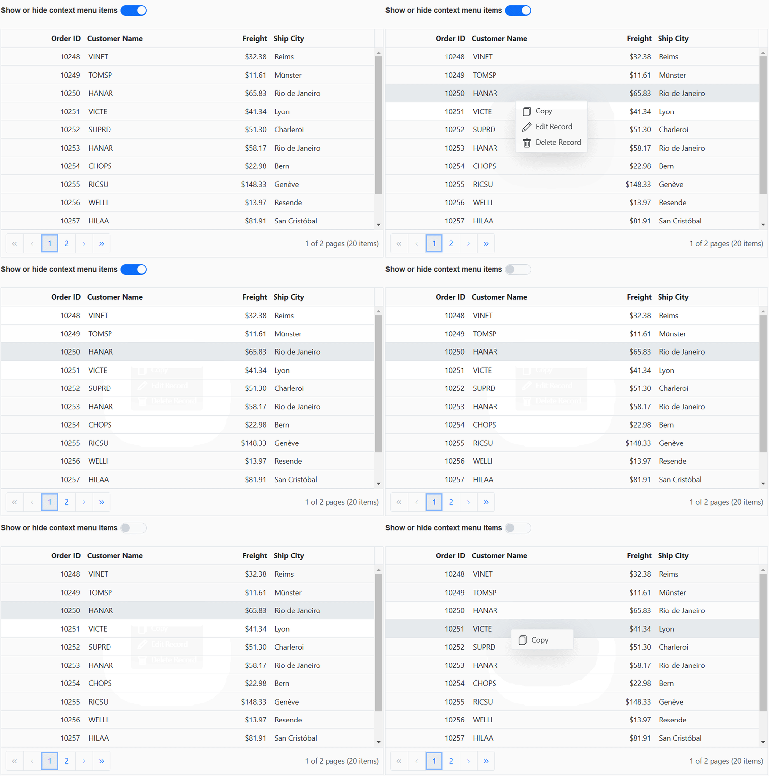
In the following example, the EJ2 Toggle Switch Button component is added to show or hide the context menu items using showItems and hideItems methods. When the switch is toggled, the change event is triggered, and the Edit and Delete items are updated accordingly.
<div style="padding-bottom: 20px; display: flex">
    <label style="margin-right:5px;margin-top: -3px;font-weight: bold;"> Show or hide context menu items</label>
    <ejs-switch id="switch" checked="true" change="onSwitchChange"></ejs-switch>
 </div>
<ejs-grid id="grid" dataSource="@ViewBag.dataSource" contextMenuItems="@(new List<object>() {"Copy", "Edit", "Delete"})" allowPaging="true" height="348px">
    <e-grid-editSettings allowAdding="true" allowDeleting="true" allowEditing="true"></e-grid-editSettings>
    <e-grid-columns>
        <e-grid-column field="OrderID" headerText="Order ID" isPrimaryKey="true" textAlign="Right" width="120"></e-grid-column>
        <e-grid-column field="CustomerID" headerText="Customer Name" width="150"></e-grid-column>
        <e-grid-column field="Freight" headerText="Freight" editType="numericedit" textAlign="Right" format="C2" width="120"></e-grid-column>
        <e-grid-column field="ShipCity" headerText="Ship City" width="150"></e-grid-column>
    </e-grid-columns>
</ejs-grid>
<script>
    function onSwitchChange(args) {
        var grid = document.getElementById("grid").ej2_instances[0];
        if (args.checked) {
            grid.contextMenuModule.contextMenu.showItems([
                'Edit Record',
                'Delete Record',
            ]);
        } else {
            grid.contextMenuModule.contextMenu.hideItems([
                'Edit Record',
                'Delete Record',
            ]);
        }
    }
</script>
public IActionResult Index()
{
ViewBag.dataSource = OrderDetails.GetAllRecords();
return View();
}