How can I help you?
Grouping in ASP.NET Core Grid component
2 Apr 202524 minutes to read
The grouping feature in the Syncfusion® ASP.NET Core Grid allows you to organize data into a hierarchical structure, making it easier to expand and collapse records. You can group the columns by simply dragging and dropping the column header to the group drop area. To enable grouping in the grid, you need to set the allowGrouping property to true. Additionally, you can customize the grouping options using the groupSettings property.
<ejs-grid id="Grid" dataSource="@ViewBag.dataSource" allowGrouping="true" height="348px">
    <e-grid-columns>
        <e-grid-column field="OrderID" headerText="Order ID" textAlign="Right" width="120"></e-grid-column>
        <e-grid-column field="CustomerID" headerText="Customer ID" width="150"></e-grid-column>
        <e-grid-column field="ShipCity" headerText="Ship City" width="150"></e-grid-column>
        <e-grid-column field="ShipName" headerText="Ship Name" width="150"></e-grid-column>
    </e-grid-columns>
</ejs-grid>
public IActionResult Index()
{
ViewBag.dataSource =OrderDetails.GetAllRecords();;
return View();
}
- You can group and ungroup columns in the Grid by using the
groupColumnandungroupColumnmethods respectively.- To disable grouping for a specific column, set the
columns.allowGroupingto false.
Initial group
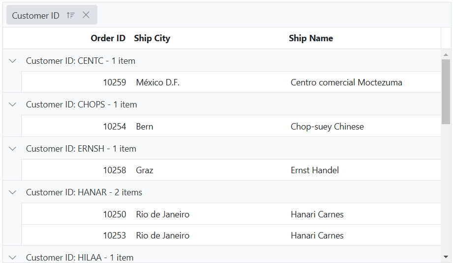
To enable initial grouping in the Grid, you can use the groupSettings property and set the groupSettings.columns property to an array of column names(field of the column) that you want to group by. This feature is particularly useful when working with large datasets, as it allows you to quickly organize and analyze the data based on specific criteria.
The following example demonstrates how to set an initial grouping for the CustomerID and ShipCity columns during the initial rendering grid, by using the groupSettings.columns property.
<ejs-grid id="grid" dataSource="@ViewBag.dataSource" allowGrouping="true" height="330px">
    <e-grid-groupsettings columns="@(new string[] {"CustomerID","Freight"})"></e-grid-groupsettings>
    <e-grid-columns>
        <e-grid-column field="OrderID" headerText="Order ID" textAlign="Right" width="120"></e-grid-column>
        <e-grid-column field="CustomerID" headerText="Customer Name" width="150"></e-grid-column>
        <e-grid-column field="OrderDate" headerText="Order Date" format="yMd" width="150"></e-grid-column>
        <e-grid-column field="Freight" headerText="Freight" format="C2" width="150"></e-grid-column>
        <e-grid-column field="ShipCountry" headerText="Ship Country" width="150"></e-grid-column>
    </e-grid-columns>
</ejs-grid>
public IActionResult Index()
{
ViewBag.dataSource =OrderDetails.GetAllRecords();;
return View();
}
You can group by multiple columns by specifying an array of column names in the columns property of the
groupSettings.
Prevent grouping for particular column
The Grid component provides the ability to prevent grouping for a particular column. This can be useful when you have certain columns that you do not want to be included in the grouping process. It can be achieved by setting the allowGrouping property of the particular column to false. The following example demonstrates, how to disable grouping for CustomerID column.
<ejs-grid id="grid" dataSource="@ViewBag.dataSource" allowGrouping="true" height="330px">
    <e-grid-columns>
        <e-grid-column field="OrderID" headerText="Order ID" textAlign="Right" width="120"></e-grid-column>
        <e-grid-column field="CustomerID" headerText="Customer ID" allowGrouping="false" width="150"></e-grid-column>
        <e-grid-column field="ShipCity" headerText="Ship City" width="150"></e-grid-column>
        <e-grid-column field="ShipName" headerText="Ship Name" width="150"></e-grid-column>
    </e-grid-columns>
</ejs-grid>
public IActionResult Index()
{
ViewBag.dataSource =OrderDetails.GetAllRecords();;
return View();
}Hide drop area
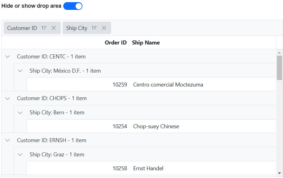
By default, the Grid provides a drop area for grouping columns. This drop area allows you to drag and drop columns to group and ungroup them. However, in some cases, you may want to prevent ungrouping or further grouping a column after initial grouping.
To hide the drop area in the Syncfusion® ASP.NET Core Grid, you can set the groupSettings.showDropArea property to false.
In the following example, the EJ2 Toggle Switch Button component is added to hide or show the drop area. When the switch is toggled, the change event is triggered and the groupSettings.showDropArea property of the grid is updated accordingly.
<div style="padding-bottom: 20px;display: flex">
    <label style="margin-right:5px;margin-top: -3px;font-weight: bold;">Hide or show drop area</label>
    <ejs-switch id="switch" checked="true" change="onSwitchChange"></ejs-switch>
</div>
<ejs-grid id="grid" dataSource="@ViewBag.DataSource" allowGrouping="true" height="330px" >
    <e-grid-groupsettings showDropArea="true" columns="@(new string[] {"CustomerID", "ShipCity"})"></e-grid-groupsettings>
    <e-grid-columns>
        <e-grid-column field="OrderID" headerText="Order ID" textAlign="Right" width="120"></e-grid-column>
        <e-grid-column field="CustomerID" headerText="Customer ID" width="150"></e-grid-column>
        <e-grid-column field="ShipCity" headerText="Ship City" width="150"></e-grid-column>
        <e-grid-column field="ShipName" headerText="Ship Name" width="150"></e-grid-column>
    </e-grid-columns>
</ejs-grid>
<script>
    function onSwitchChange(args) {
        var grid = document.getElementById("grid").ej2_instances[0];
        grid.groupSettings.showDropArea = args.checked;
    }
</script>
public IActionResult Index()
{
ViewBag.dataSource =OrderDetails.GetAllRecords();;
return View();
}
By default, the group drop area will be shown only if there is at least one column available to group.
Show the grouped column
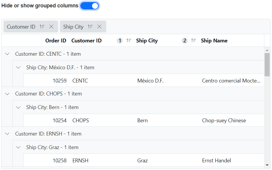
The Syncfusion® ASP.NET Core Grid has a default behavior where the grouped column is hidden, to provide a cleaner and more focused view of your data. However, if you prefer to show the grouped column in the grid, you can achieve this by setting the groupSettings.showGroupedColumn property to true.
In the following example, the EJ2 Toggle Switch Button component is added to hide or show the grouped columns. When the switch is toggled, the change event is triggered and the groupSettings.showGroupedColumn property of the grid is updated accordingly.
<div style="padding-bottom: 20px; display: flex">
    <label style="margin-right:5px;margin-top: -3px;font-weight: bold;">Hide or show grouped columns</label>
    <ejs-switch id="switch" checked="true" change="onSwitchChange"></ejs-switch>
</div>
<ejs-grid id="grid" dataSource="@ViewBag.dataSource" allowGrouping="true" height="330px" >
    <e-grid-groupsettings showGroupedColumn="true" columns="@(new string[] {"CustomerID", "ShipCity"})"></e-grid-groupsettings>
    <e-grid-columns>
        <e-grid-column field="OrderID" headerText="Order ID" textAlign="Right" width="120"></e-grid-column>
        <e-grid-column field="CustomerID" headerText="Customer ID" width="150"></e-grid-column>
        <e-grid-column field="ShipCity" headerText="Ship City" width="150"></e-grid-column>
        <e-grid-column field="ShipName" headerText="Ship Name" width="150"></e-grid-column>
    </e-grid-columns>
</ejs-grid>
<script>
   function onSwitchChange(args) {
      var grid = document.getElementById("grid").ej2_instances[0];
      grid.groupSettings.showGroupedColumn = args.checked;
   }
</script>
public IActionResult Index()
{
ViewBag.dataSource =OrderDetails.GetAllRecords();;
return View();
}
Reordering on grouped columns
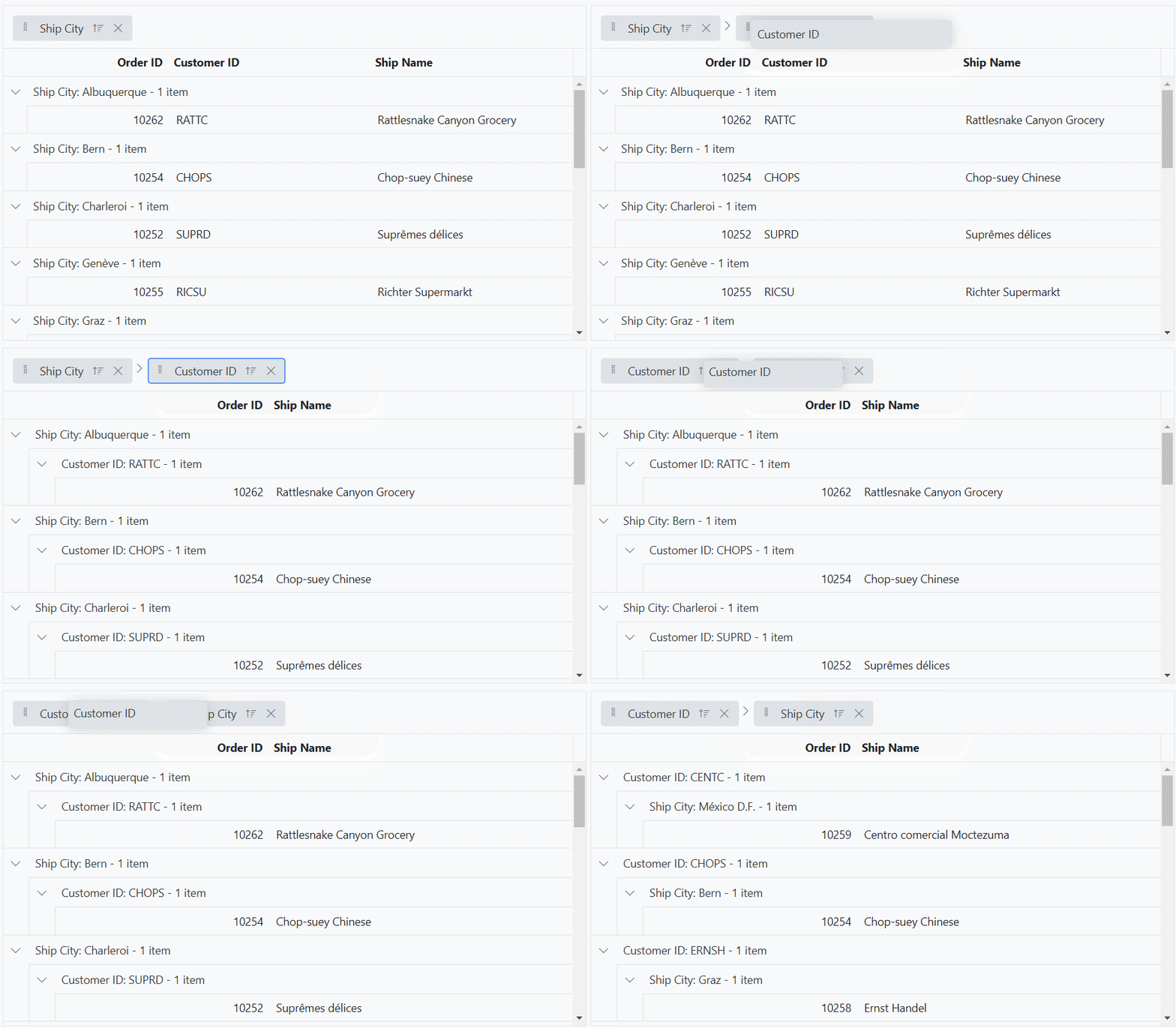
The Syncfusion® ASP.NET Core Grid allows you to easily reorder the grouped columns by dragging and dropping the grouped header cells in the group drag area. By changing the order of the grouped columns, the corresponding changes are automatically reflected in the grouping hierarchy of the grid. The grid dynamically adjusts the grouping based on the reordered columns in the group drag area. Additionally, you can also drop new columns into specific positions within the group drag area.
To enable this feature, you have to set the groupSettings.allowReordering property as true. This is demonstrated in the sample below.
<ejs-grid id="grid" dataSource="@ViewBag.dataSource" allowGrouping="true" height="330px">
    <e-grid-groupsettings allowReordering="true" columns="@(new string[] { "ShipCity"})"></e-grid-groupsettings>
    <e-grid-columns>
        <e-grid-column field="OrderID" headerText="Order ID" textAlign="Right" width="120"></e-grid-column>
        <e-grid-column field="CustomerID" headerText="Customer ID" width="150"></e-grid-column>
        <e-grid-column field="ShipCity" headerText="Ship City" width="150"></e-grid-column>
        <e-grid-column field="ShipName" headerText="Ship Name" width="150"></e-grid-column>
    </e-grid-columns>
</ejs-grid>
public IActionResult Index()
{
ViewBag.dataSource =OrderDetails.GetAllRecords();;
return View();
}
Sort grouped columns in descending order during initial grouping
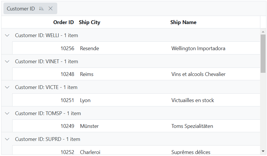
By default, grouped columns are sorted in ascending order. However, you can sort them in descending order during initial grouping by setting the field and direction in the sortSettings.columns property.
The following example demonstrates how to sort the CustomerID column by setting the sortSettings.columns property to Descending during the initial grouping of the grid.
@{
    List<object> sortOptions = new List<object>();
    sortOptions.Add(new { field = "CustomerID", direction = "Descending" });
 }
<ejs-grid id="grid" dataSource="@ViewBag.dataSource" allowGrouping="true" allowSorting="true" height="358px" >
    <e-grid-groupsettings columns="@(new string[] {"CustomerID"})"></e-grid-groupsettings>
    <e-grid-sortsettings columns="sortOptions"></e-grid-sortsettings>
    <e-grid-columns>
        <e-grid-column field="OrderID" headerText="Order ID" textAlign="Right" width="120"></e-grid-column>
        <e-grid-column field="CustomerID" headerText="Customer ID" width="150"></e-grid-column>
        <e-grid-column field="ShipCity" headerText="Ship City" width="150"></e-grid-column>
        <e-grid-column field="ShipName" headerText="Ship Name" width="150"></e-grid-column>
    </e-grid-columns>
</ejs-grid>
public IActionResult Index()
{
ViewBag.dataSource =OrderDetails.GetAllRecords();;
return View();
}
Group with paging
The Grid component supports grouping columns with paging feature. When grouping is applied, the grid displays aggregated information and total items based on the current page. However, by default, the group footer and group caption footer does not consider the aggregated information and total items from other pages. To get additional details from other pages, set the groupSettings.disablePageWiseAggregates property to false.
If remote data is bound to grid dataSource, two requests will be sent when performing grouping action one for getting the grouped data and another for getting aggregate details and total items count.
Group by format
By default, columns are grouped by the data or value present for the particular row. However, you can also group numeric or datetime columns based on the specified format. To enable this feature, you need to set the enableGroupByFormat property of the corresponding grid column. This feature allows you to group numeric or datetime columns based on a specific format.
The following example demonstrates how to perform a group action using the enableGroupByFormat property for the OrderDate and Freight columns of the grid.
<ejs-grid id="grid" dataSource="@ViewBag.dataSource" allowGrouping="true" height="330px" >
    <e-grid-groupsettings showDropArea="false" columns="@(new string[] { "OrderDate","Freight"})"></e-grid-groupsettings>
    <e-grid-columns>
        <e-grid-column field="OrderID" headerText="Order ID" textAlign="Right" width="120"></e-grid-column>
        <e-grid-column field="CustomerID" headerText="Customer ID" width="150"></e-grid-column>
        <e-grid-column field="OrderDate" headerText="Order Date" format="yMMM" enableGroupByFormat="true" width="150"></e-grid-column>
        <e-grid-column field="Freight" headerText="Freight" format="C2" enableGroupByFormat="true" width="150"></e-grid-column>
    </e-grid-columns>
</ejs-grid>
public IActionResult Index()
{
ViewBag.dataSource =OrderDetails.GetAllRecords();;
return View();
}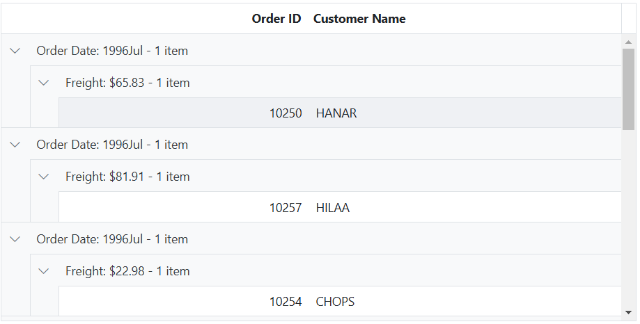
Numeric columns can be grouped based on formats such as currency or percentage, while datetime columns can be grouped based on specific date or time formats.
Collapse all grouped rows at initial rendering
The Syncfusion® ASP.NET Core Grid offers a convenient feature to expand or collapse grouped rows, allowing you to control the visibility of grouped data. The option is useful when dealing with a large dataset that contains many groups, and there is a need to provide a summarized view by initially hiding the details.
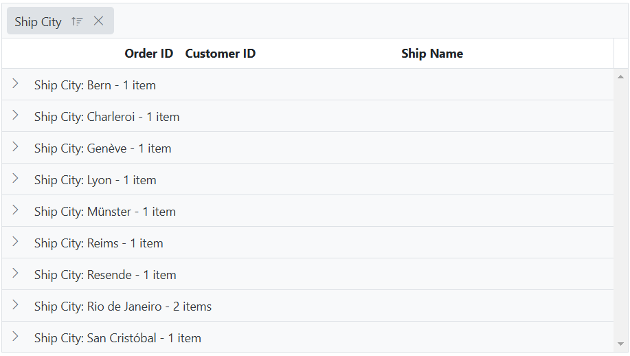
To collapse all grouped rows at the initial rendering of the Grid using the dataBound event along with the collapseAll method.
The following example demonstrates how to collapse all grouped rows at the initial rendering.
<ejs-grid id="grid" dataSource="@ViewBag.dataSource" dataBound="dataBound" allowGrouping="true" height="330px" >
    <e-grid-groupsettings columns="@(new string[] {"ShipCity"})"></e-grid-groupsettings>
    <e-grid-columns>
        <e-grid-column field="OrderID" headerText="Order ID" textAlign="Right" width="120"></e-grid-column>
        <e-grid-column field="CustomerID" headerText="Customer ID" width="150"></e-grid-column>
        <e-grid-column field="ShipCity" headerText="Ship City" width="150"></e-grid-column>
        <e-grid-column field="ShipName" headerText="Ship Name" width="150"></e-grid-column>
    </e-grid-columns>
</ejs-grid>
<script>
    let isFirstDataBound = true;
   function dataBound() {
        if (isFirstDataBound === true) {
            var grid = document.getElementById("grid").ej2_instances[0];
            grid.groupModule.collapseAll();
            isFirstDataBound = false;
        }
    }
</script>
public IActionResult Index()
{
ViewBag.dataSource =OrderDetails.GetAllRecords();;
return View();
}
You can also collapse all the grouped rows at the initial rendering using the
groupCollapseAllmethod inside the dataBound event. This is demonstrated in the below code snippet,
    dataBound() {
        if (this.initial === true) {
           var grid = document.getElementById("grid").ej2_instances[0];
           grid.groupCollapseAll();
           initial = false;
        }
    }
The collapse all approach is suggested for a limited number of records since collapsing every grouped record takes some time. If you have a large dataset, it is recommended to use lazy-load grouping. This approach is also applicable for the
groupExpandAllmethod.
Group or ungroup column externally
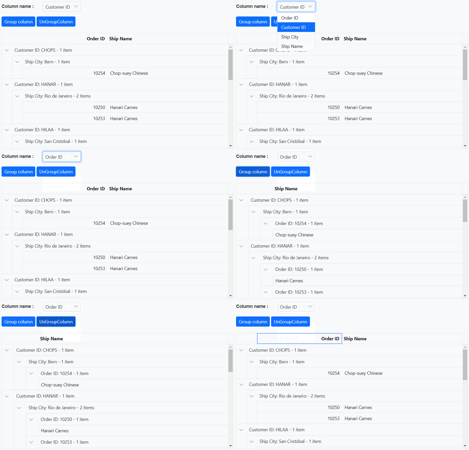
By default, the Syncfusion® Grid supports interaction-oriented column grouping, where users manually group columns by dragging and dropping them into the grouping area of the grid. Grid provides an ability to group and ungroup a column using groupColumn and ungroupColumn methods. These methods provide a programmatic approach to perform column grouping and ungrouping.
The following example demonstrates how to group and ungroup the columns in a grid. It utilizes the DropDownList component to select the column. When an external button is clicked, the groupColumn and ungroupColumn methods are called to group or ungroup the selected column.
@{
    ViewBag.dropDownData = new List<object>
    {
        new { value = "OrderID", text = "Order ID" },
        new { value = "CustomerID", text = "Customer ID" },
        new { value = "ShipCity", text = "Ship City" },
        new { value = "ShipName", text = "Ship Name" },
    };
}
<div style="padding-bottom:20px">
    <div style="display: flex">
        <label style="padding: 5px 28px 0 0"> Column name :</label>
        <span style="height:fit-content">
            <ejs-dropdownlist id="dropDownColumn" index="1" dataSource="@ViewBag.dropDownData">
                <e-dropdownlist-fields value="value" text="text"></e-dropdownlist-fields>
            </ejs-dropdownlist>
        </span>
    </div>
    <div style="margin-top: 15px">
        <ejs-button id="groupButton" cssClass="e-primary" content="Group column"></ejs-button>
        <ejs-button id="ungroupButton" cssClass="e-primary" content="UnGroupColumn"></ejs-button>
    </div>
</div>
<ejs-grid id="grid" dataSource="@ViewBag.dataSource" allowGrouping="true" height="330px">
    <e-grid-groupsettings showDropArea="false" columns="@(new string[] {"CustomerID", "ShipCity"})"></e-grid-groupsettings>
    <e-grid-columns>
        <e-grid-column field="OrderID" headerText="Order ID" textAlign="Right" width="120"></e-grid-column>
        <e-grid-column field="CustomerID" headerText="Customer ID" width="150"></e-grid-column>
        <e-grid-column field="ShipCity" headerText="Ship City" width="150"></e-grid-column>
        <e-grid-column field="ShipName" headerText="Ship Name" width="150"></e-grid-column>
    </e-grid-columns>
</ejs-grid>
<script>
    document.getElementById('groupButton').onclick = handleGroupAction;
    document.getElementById('ungroupButton').onclick = handleGroupAction;
    function handleGroupAction(event) {
        var grid = document.getElementById("grid").ej2_instances[0];
        var dropDownValue=document.getElementById("dropDownColumn").ej2_instances[0].value
        event.target.id === "groupButton" ? grid.groupColumn(dropDownValue):grid.ungroupColumn(dropDownValue);
    }
</script>
public IActionResult Index()
{
ViewBag.dataSource =OrderDetails.GetAllRecords();;
return View();
}
Expand or collapse externally
The Syncfusion® ASP.NET Core Grid offers a convenient feature to expand or collapse grouped rows, allowing you to control the visibility of grouped data. This section will provide guidance on enabling this functionality and integrating it into your application using the Grid properties and methods.
Expand or collapse all grouped rows
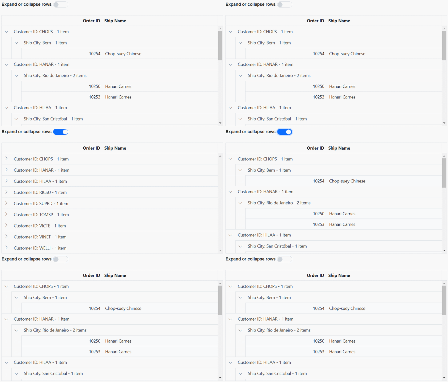
Grid provides an ability to expand or collapse grouped rows using groupExpandAll and groupCollapseAll methods respectively.
In the following example, the EJ2 Toggle Switch Button component is added to expand or collapse grouped rows. When the switch is toggled, the change event is triggered and the groupExpandAll and groupCollapseAll methods are called to expand or collapse grouped rows.
<div style="padding-bottom: 20px; display: flex">
    <label style="margin-right:5px;margin-top: -3px;font-weight: bold;">Expand or collapse rows</label>
    <ejs-switch id="switch" change="onSwitchChange"></ejs-switch>
 </div>
<ejs-grid id="grid" dataSource="@ViewBag.dataSource" allowGrouping="true" height="330px" >
   <e-grid-groupsettings showDropArea="false" columns="@(new string[] {"CustomerID", "ShipCity"})"></e-grid-groupsettings>
    <e-grid-columns>
        <e-grid-column field="OrderID" headerText="Order ID" textAlign="Right" width="120"></e-grid-column>
        <e-grid-column field="CustomerID" headerText="Customer ID" width="150"></e-grid-column>
        <e-grid-column field="ShipCity" headerText="Ship City" width="150"></e-grid-column>
        <e-grid-column field="ShipName" headerText="Ship Name" width="150"></e-grid-column>
    </e-grid-columns>
</ejs-grid>
<script>
    function onSwitchChange(args) {
       var grid = document.getElementById("grid").ej2_instances[0];
       if (args.checked) {
          grid.groupCollapseAll();
       } else {
          grid.groupExpandAll();
       }
    }
 </script>
public IActionResult Index()
{
ViewBag.dataSource =OrderDetails.GetAllRecords();;
return View();
}
Expand or collapse selected grouped row
Expanding or collapsing selected grouped rows in a Syncfusion® ASP.NET Core Grid involves implementing the functionality to expand or collapse grouped records programatically.
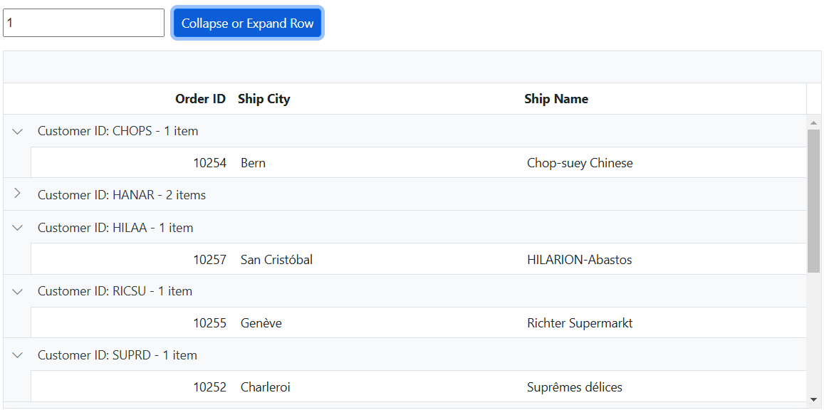
To enable the expand and collapse functionality for grouped rows in a grid, you can utilize the expandCollapseRows method. This method is designed to handle two scenarios such as expanding collapsed grouped records and collapsing expanded grouped records.
To implement this functionality, follow these steps:
- Include an
inputelement to capture the grouped row index. - Add a
buttonelement with a click event binding to trigger the onExpandCollapseButtonClick method. This method retrieve the grouped rows from the grid’s content table using thequerySelectorAllmethod. - Check if there are any grouped rows available.
- If grouped rows exist, locate the group caption element based on the entered row index.
- Call the
expandCollapseRowsmethod of the grid’s group module, passing the group caption element to toggle its expand/collapse state.
The following example demonstrates the function that collapses the selected row using an external button click.
<div style="display:flex">
    <input type="number" id="rowIndex" placeholder="Enter Grouped Row Index" />
    <ejs-button id="valueButton" cssClass="e-primary" content="Collapse or Expand Row"></ejs-button>
 </div>
 <div style="padding-top:5px">
     <p style="color:red;" id="message"></p>
 </div>
<ejs-grid id="grid" dataSource="@ViewBag.dataSource" allowGrouping="true" height="330px">
    <e-grid-groupsettings columns="@(new string[] {"CustomerID"})"></e-grid-groupsettings>
    <e-grid-columns>
        <e-grid-column field="OrderID" headerText="Order ID" textAlign="Right" width="120" allowGrouping="false"></e-grid-column>
        <e-grid-column field="CustomerID" headerText="Customer ID" width="150" allowGrouping="false"></e-grid-column>
        <e-grid-column field="ShipCity" headerText="Ship City" width="150" allowGrouping="false"></e-grid-column>
        <e-grid-column field="ShipName" headerText="Ship Name" width="150" allowGrouping="false"></e-grid-column>
    </e-grid-columns>
</ejs-grid>
<script>
    document.getElementById('valueButton').addEventListener('click', function () {
        var grid = document.getElementById("grid").ej2_instances[0];
        const groupedRows = Array.from(
            grid.getContentTable().querySelectorAll('.e-recordplusexpand, .e-recordpluscollapse')
        );
        let groupedRowIndex = parseInt(document.getElementById('rowIndex').value);
        if (groupedRows.length >= 0 && (groupedRowIndex < groupedRows.length)) {
            document.getElementById('message').innerText = '';
            const groupCaptionElement = groupedRows[groupedRowIndex];
            grid.groupModule.expandCollapseRows(groupCaptionElement);
        } else {
            document.getElementById('message').innerText =
               'The entered index exceeds the total number of grouped rows. Please enter a valid grouped index.';
        }
    });
</script>
<style>
    #rowIndex {
        margin-right: 10px;
    }
</style>
public IActionResult Index()
{
ViewBag.dataSource =OrderDetails.GetAllRecords();;
return View();
}
Clear grouping
The clear grouping feature in the Syncfusion® ASP.NET Core Grid allows you to removing all the grouped columns from the grid. This feature provides a convenient way to clear the grouping of columns in your application.
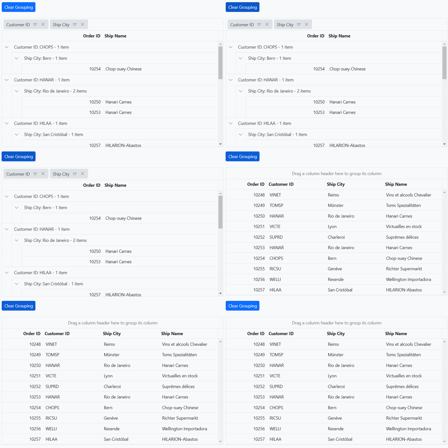
To clear all the grouped columns in the Grid, you can utilize the clearGrouping method of the grid.
The following example demonstrates how to clear the grouping using clearGrouping method in the external button click.
<div style="padding-bottom:20px">
    <ejs-button id="clearButton" cssClass="e-primary" content="Clear Grouping"></ejs-button>
</div>
<ejs-grid id="grid" dataSource="@ViewBag.dataSource" allowGrouping="true" height="348px">
    <e-grid-groupsettings columns="@(new string[] {"CustomerID", "ShipCity"})"></e-grid-groupsettings>
    <e-grid-columns>
        <e-grid-column field="OrderID" headerText="Order ID" textAlign="Right" width="120"></e-grid-column>
        <e-grid-column field="CustomerID" headerText="Customer ID" width="150"></e-grid-column>
        <e-grid-column field="ShipCity" headerText="Ship City" width="150"></e-grid-column>
        <e-grid-column field="ShipName" headerText="Ship Name" width="150"></e-grid-column>
    </e-grid-columns>
</ejs-grid>
<script>
    document.getElementById('clearButton').addEventListener('click', function () {
        var grid = document.getElementById("grid").ej2_instances[0];
        grid.clearGrouping()
    });
</script>
public IActionResult Index()
{
ViewBag.dataSource =OrderDetails.GetAllRecords();;
return View();
}
Grouping Events
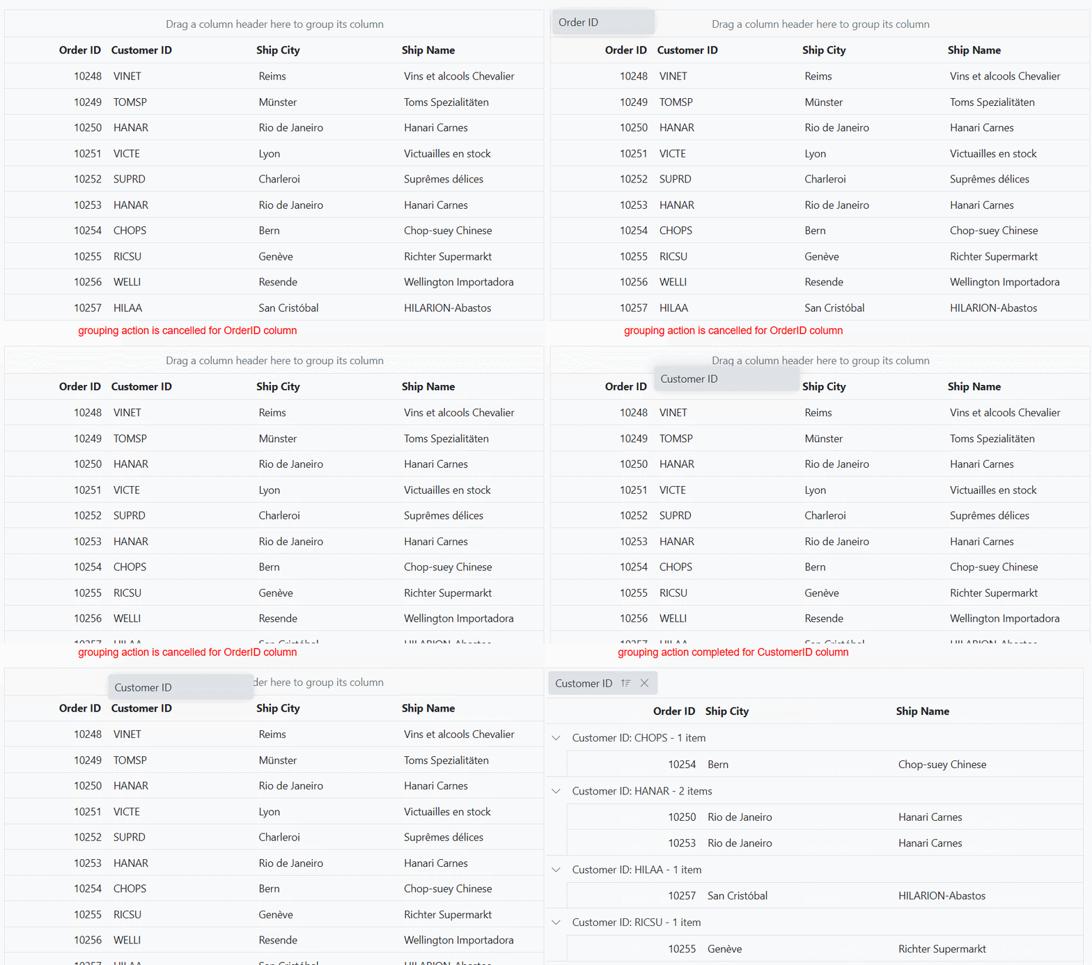
The Grid component provides two events that are triggered during the group action such as actionBegin and actionComplete. The actionBegin event is triggered before the group action starts, and the actionComplete event is triggered after the group action is completed. You can use these events to perform any custom action based on the grouping.
-
actionBegin event:
actionBeginevent is triggered before the group action begins. It provides a way to perform any necessary operations before the group action takes place. This event provides a parameter that contains the current grid state, including the current group field name, requestType information and etc. -
actionComplete event:
actionCompleteevent is triggered after the group action is completed. It provides a way to perform any necessary operations after the group action has taken place. This event provides a parameter that contains the current grid state, including the grouped data and column information and etc.
The following example demonstrates how the actionBegin and actionComplete events work when grouping is performed. The actionBegin event event is used to cancel the grouping of the OrderID column. The actionComplete event is used to display a message.
<div style="margin-left:100px;"><p style="color:red;" id="message"></p></div>
<ejs-grid id="grid" dataSource="@ViewBag.dataSource" allowGrouping="true" actionBegin="actionBegin" actionComplete="actionComplete">
    <e-grid-columns>
        <e-grid-column field="OrderID" headerText="Order ID" textAlign="Right" width="120"></e-grid-column>
        <e-grid-column field="CustomerID" headerText="Customer ID" width="150"></e-grid-column>
        <e-grid-column field="ShipCity" headerText="ShipCity" width="150"></e-grid-column>
        <e-grid-column field="ShipName" headerText="Ship Name" width="150"></e-grid-column>
    </e-grid-columns>
</ejs-grid>
<script>
    function actionBegin(args) {
        if (args.requestType === 'grouping' && args.columnName === 'OrderID') {
            args.cancel = true
            document.getElementById('message').innerText = args.requestType + ' action is cancelled for ' + args.columnName + ' column';
        }
    }
    function actionComplete(args) {
        if (args.requestType === 'grouping') {
            document.getElementById('message').innerText = args.requestType + ' action completed for ' + args.columnName + ' column';
        }
        else {
            document.getElementById('message').innerText = ''
        }
    }
</script>
public IActionResult Index()
{
ViewBag.dataSource =OrderDetails.GetAllRecords();;
return View();
}
The
args.requestTypeproperty represents the name of the current action being performed. For instance, during grouping, theargs.requestTypevalue will be grouping.
Limitations
- Grouping is not compatible with the following features:
- Autofill