How can I help you?
Toolbar in ASP.NET Core Grid component
3 Feb 20258 minutes to read
The toolbar in the Syncfusion ASP.NET Core Grid component offers several general use cases to enhance data manipulation and overall experience. Actions such as adding, editing, and deleting records within the grid can be performed, providing efficient data manipulation capabilities. The toolbar also facilitates data export and import functionality, allowing you to generate downloadable files in formats like Excel, CSV, or PDF.
The toolbar can be customized with built-in toolbar items or custom toolbar items using the toolbar property. The toolbar property accepts an array of strings representing the built-in toolbar items or an array of ItemModel objects for custom toolbar items.
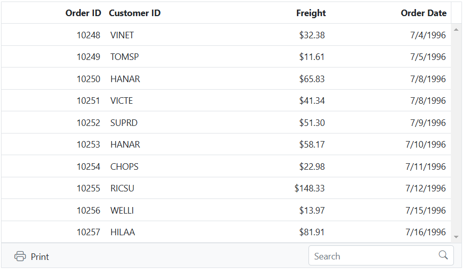
The following example demonstrates how to enable toolbar items in the grid.
<ejs-grid id="grid" dataSource="@ViewBag.dataSource" toolbar="@(new List<string>() {"Print","Search"})" height="348">
    <e-grid-columns>
        <e-grid-column field="OrderID" headerText="Order ID" type="number" textAlign="Right" width="120"></e-grid-column>
        <e-grid-column field="CustomerID" headerText="Customer Name" width="140"></e-grid-column>
        <e-grid-column field="ShipCity" headerText="ShipCity" width="120"></e-grid-column>
        <e-grid-column field="ShipName" headerText="Ship Name" width="140"></e-grid-column>
    </e-grid-columns>
</ejs-grid>
public IActionResult Index()
{
ViewBag.dataSource = OrderDetails.GetAllRecords();
return View();
}
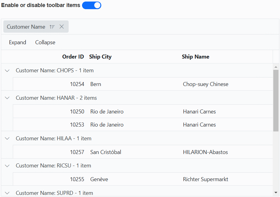
Enable or disable toolbar items
Enabling or disabling toolbar items dynamically in Syncfusion ASP.NET Core Grid is to provide control over the availability of specific functionality based on application logic. This feature allows you to customize the toolbar based on various conditions or individuals interactions.
You can enable or disable toolbar items dynamically by using the enableToolbarItems method. This method allows you to control the availability of specific toolbar items based on your application logic.
In the following example, the EJ2 Toggle Switch Button component is added to enable and disable the toolbar items using enableToolbarItems method. When the switch is toggled, the change event is triggered and the toolbar items are updated accordingly.
<div style="padding-bottom: 20px; display: flex">
   <label style="margin-right:5px;margin-top: -3px;font-weight: bold;">Enable or disable toolbar items</label>
   <ejs-switch id="switch" checked="true" change="onSwitchChange"></ejs-switch>
</div>
<ejs-grid id="grid" dataSource="@ViewBag.dataSource" toolbarClick="toolbarClick" toolbar="@( new List<string>(){"Expand","Collapse"})" height="348px" allowGrouping="true">
    <e-grid-columns>
        <e-grid-column field="OrderID" headerText="Order ID" textAlign="Right" width="120"></e-grid-column>
        <e-grid-column field="CustomerID" headerText="Customer Name" width="140"></e-grid-column>
        <e-grid-column field="ShipCity" headerText="Ship City" width="120"></e-grid-column>
        <e-grid-column field="ShipName" headerText="Ship Name" width="140"></e-grid-column>
    </e-grid-columns>
    <e-grid-groupSettings columns="@(new string[] { "CustomerID"})"></e-grid-groupSettings>
</ejs-grid>
<script>
    function toolbarClick(args){
        var grid = document.getElementById("grid").ej2_instances[0];
        if (args.item.id === 'grid_Collapse') grid.groupModule.collapseAll();
        else grid.groupModule.expandAll();
    }
    function onSwitchChange(args)
    {
        var grid = document.getElementById("grid").ej2_instances[0];
        grid.toolbarModule.enableItems(['grid_Collapse', 'grid_Expand'], args.checked);
    }
</script>
public IActionResult Index()
{
ViewBag.dataSource = OrderDetails.GetAllRecords();
return View();
}
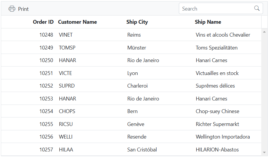
Add toolbar at the bottom of grid
By adding the toolbar at the bottom of the Syncfusion ASP.NET Core Grid, important actions and functionality remain consistently visible and easily accessible, providing easy access to actions and operations without the need for scrolling.
To add the toolbar at the bottom of the Grid, you can utilize the created event. By handling this event, you can dynamically insert the toolbar items at the desired position in the grid layout.
The following example shows how to add the toolbar items at the bootom using created event of the grid.
<ejs-grid id="grid" dataSource="@ViewBag.dataSource" toolbar="@(new List<string>() {"Print","Search"})" created="created" height="348px">
    <e-grid-columns>
        <e-grid-column field="OrderID" headerText="Order ID" textAlign="Right" isPrimaryKey="true" width="120"></e-grid-column>
        <e-grid-column field="CustomerID" headerText="Customer ID" width="140"></e-grid-column>
        <e-grid-column field="Freight" headerText="Freight" textAlign="Right" format="C" width="120"></e-grid-column>
        <e-grid-column field="OrderDate" headerText="Order Date" textAlign="Right" format='yMd' width="140"></e-grid-column>
    </e-grid-columns>
</ejs-grid>
<script>
    function created() {
        let toolbar = this.element.querySelector('.e-toolbar');
        this.element.appendChild(toolbar);
    }
</script>
public IActionResult Index()
{
ViewBag.dataSource = OrderDetails.GetAllRecords();
return View();
}
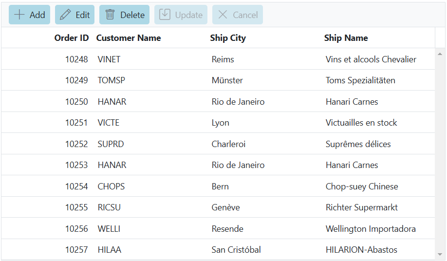
Customize toolbar buttons using CSS
Customizing toolbar buttons in Syncfusion ASP.NET Core Grid using CSS involves modifying the appearance of built-in toolbar buttons by applying CSS styles. This provides a flexible and customizable way to enhance the visual presentation of the toolbar and create a cohesive interface.
The appearance of the built-in toolbar buttons can be modified by applying the following CSS styles.
.e-grid .e-toolbar .e-tbar-btn .e-icons,
.e-grid .e-toolbar .e-toolbar-items .e-toolbar-item .e-tbar-btn {
    background: #add8e6;
}
The following example demonstrates how to change the background color of the Add, Edit, Delete, Update and Cancel toolbar buttons by applying CSS styles
<ejs-grid id="grid" dataSource="@ViewBag.dataSource" toolbar="@(new List<string>() {"Print","Search"})" height="348px">
   <e-grid-editSettings allowAdding="true" allowDeleting="true" allowEditing="true"></e-grid-editSettings>
   <e-grid-columns>
        <e-grid-column field="OrderID" headerText="Order ID" type="number" textAlign="Right" width="120"></e-grid-column>
        <e-grid-column field="CustomerID" headerText="Customer Name" type="string" width="140"></e-grid-column>
        <e-grid-column field="ShipCity" headerText="Ship City" width="120"></e-grid-column>
        <e-grid-column field="ShipName" headerText="Ship Name" width="140"></e-grid-column>
    </e-grid-columns>
</ejs-grid>
<style>
    .e-grid .e-toolbar .e-tbar-btn .e-icons,
    .e-grid .e-toolbar .e-toolbar-items .e-toolbar-item .e-tbar-btn {
        background: #add8e6;
    }
</style>
public IActionResult Index()
{
ViewBag.dataSource = OrderDetails.GetAllRecords();
return View();
}