Getting Started with ASP.NET Core Ribbon Control
26 Dec 202524 minutes to read
This section briefly explains about how to include ASP.NET Core Ribbon control in your ASP.NET Core application using Visual Studio.
Prerequisites
System requirements for ASP.NET Core controls
Create ASP.NET Core web application with Razor pages
Install ASP.NET Core package in the application
To add ASP.NET Core controls in the application, open the NuGet package manager in Visual Studio (Tools → NuGet Package Manager → Manage NuGet Packages for Solution), search for Syncfusion.EJ2.AspNet.Core and then install it. Alternatively, you can utilize the following package manager command to achieve the same.
Install-Package Syncfusion.EJ2.AspNet.Core -Version 34.1.29NOTE
Syncfusion® ASP.NET Core controls are available in nuget.org. Refer to NuGet packages topic to learn more about installing NuGet packages in various OS environments. The Syncfusion.EJ2.AspNet.Core NuGet package has dependencies, Newtonsoft.Json for JSON serialization and Syncfusion.Licensing for validating Syncfusion® license key.
Add Syncfusion® ASP.NET Core Tag Helper
Open ~/Pages/_ViewImports.cshtml file and import the Syncfusion.EJ2 TagHelper.
@addTagHelper *, Syncfusion.EJ2Add stylesheet and script resources
Here, the theme and script is referred using CDN inside the <head> of ~/Pages/Shared/_Layout.cshtml file as follows,
<head>
    ...
    <!-- Syncfusion ASP.NET Core controls styles -->
    <link rel="stylesheet" href="https://cdn.syncfusion.com/ej2/34.1.29/fluent.css" />
    <!-- Syncfusion ASP.NET Core controls scripts -->
    <script src="https://cdn.syncfusion.com/ej2/34.1.29/dist/ej2.min.js"></script>
</head>
NOTE
Checkout the Themes topic to learn different ways (CDN, NPM package, and CRG) to refer styles in ASP.NET Core application, and to have the expected appearance for Syncfusion® ASP.NET Core controls.
NOTE
Checkout the Adding Script Reference topic to learn different approaches for adding script references in your ASP.NET Core application.
Register Syncfusion® Script Manager
Also, register the script manager <ejs-script> at the end of <body> in the ASP.NET Core application as follows.
<body>
    ...
    <!-- Syncfusion ASP.NET Core Script Manager -->
    <ejs-scripts></ejs-scripts>
</body>
Add ASP.NET Core Ribbon control
Now, add the Syncfusion® ASP.NET Core Ribbon tag helper in ~/Pages/Index.cshtml page.
<ejs-ribbon id="ribbon"></ejs-ribbon>Adding Ribbon Tab
In Ribbon, the options are arranged in tabs for easy access. You can use the e-ribbon-tab tag helper to define the ribbon tab like below.
<ejs-ribbon id="ribbon">
    <e-ribbon-tabs>
        <e-ribbon-tab header="Home"></e-ribbon-tab>
    </e-ribbon-tabs>
</ejs-ribbon>
Adding Ribbon Group
To define a ribbon group under each tab, you can use the e-ribbon-group tag helper like below. The Orientation property of ribbon group defines whether the collection of items will be rendered column-wise or row-wise.
<ejs-ribbon id="ribbon">
    <e-ribbon-tabs>
        <e-ribbon-tab header="Home">
            <e-ribbon-groups>
                <e-ribbon-group header="Clipboard" orientation=Row></e-ribbon-group>
            </e-ribbon-groups>
        </e-ribbon-tab>
    </e-ribbon-tabs>
</ejs-ribbon>
Adding Ribbon Items
You can use the e-ribbon-collection tag helper to define each ribbon collection that contains one or more items. To define each ribbon item, you can use the e-ribbon-item tag helper and the Type property to specify the type of control to be rendered, like a button, a drop-down button, a combo box, and more.
@using Syncfusion.EJ2.Ribbon
@using Syncfusion.EJ2.Navigations
@{
List<MenuItem> pasteOptions = new List<MenuItem>() { new MenuItem { Text = "Keep Source Format" }, new MenuItem { Text = "Merge format" }, new MenuItem { Text = "Keep text only" } };
}
<ejs-ribbon id="ribbon">
<e-ribbon-tabs>
<e-ribbon-tab header="Home">
<e-ribbon-groups>
<e-ribbon-group header="Clipboard" orientation=Row>
<e-ribbon-collections>
<e-ribbon-collection id="paste-collection">
<e-ribbon-items>
<e-ribbon-item type=SplitButton>
<e-ribbon-splitbuttonsettings iconCss="e-icons e-paste" content="Paste" items=pasteOptions></e-ribbon-splitbuttonsettings>
</e-ribbon-item>
</e-ribbon-items>
</e-ribbon-collection>
<e-ribbon-collection id="cutcopy-collection">
<e-ribbon-items>
<e-ribbon-item type=Button>
<e-ribbon-buttonsettings iconCss="e-icons e-cut" content="Cut"></e-ribbon-buttonsettings>
</e-ribbon-item>
<e-ribbon-item type=Button>
<e-ribbon-buttonsettings iconCss="e-icons e-copy" content="Copy"></e-ribbon-buttonsettings>
</e-ribbon-item>
</e-ribbon-items>
</e-ribbon-collection>
</e-ribbon-collections>
</e-ribbon-group>
</e-ribbon-groups>
</e-ribbon-tab>
</e-ribbon-tabs>
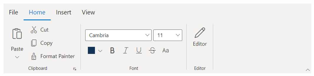
</ejs-ribbon>The following example illustrates how tabs, groups, collections, and items are used in a ribbon control to form the ribbon layout.
@using Syncfusion.EJ2
@using Syncfusion.EJ2.Ribbon
@using Syncfusion.EJ2.Navigations

@{
    List<MenuItem> pasteOptions = new List<MenuItem>() { new MenuItem { Text = "Keep Source Format" }, new MenuItem { Text = "Merge format" }, new MenuItem { Text = "Keep text only" } };
    List<MenuItem> tableOptions = new List<MenuItem>() { new MenuItem { Text = "Insert Table" }, new MenuItem { Text = "This device" }, new MenuItem { Text = "Convert Table" }, new MenuItem { Text = "Excel SpreadSheet" } };

    List<string> fontSize = new List<string>() { "8", "9", "10", "11", "12", "14", "16", "18", "20", "22", "24", "26", "28", "36", "48", "72", "96" };
    List<string> fontStyle = new List<string>() { "Algerian", "Arial", "Calibri", "Cambria", "Cambria Math", "Courier New", "Candara", "Georgia", "Impact", "Segoe Print", "Segoe Script", "Segoe UI", "Symbol", "Times New Roman", "Verdana", "Windings" };

    List<MenuItem> fileOptions = new List<MenuItem>() {
        new MenuItem { Text = "New", IconCss = "e-icons e-file-new", Id="new" },
        new MenuItem { Text = "Open", IconCss = "e-icons e-folder-open", Id="open" },
        new MenuItem { Text = "Rename", IconCss = "e-icons e-rename", Id="rename" },
        new MenuItem { Text = "Save", IconCss = "e-icons e-save", Id="save" }
    };
}


<ejs-ribbon id="default">
    <e-ribbon-filemenusettings text="File" visible="true" menuItems=fileOptions></e-ribbon-filemenusettings>
    <e-ribbon-tabs>
        <e-ribbon-tab header="Home">
            <e-ribbon-groups>
                <e-ribbon-group header="Clipboard" groupIconCss="e-icons e-paste" showLauncherIcon=true>
                    <e-ribbon-collections>
                        <e-ribbon-collection>
                            <e-ribbon-items>
                                <e-ribbon-item type=SplitButton allowedSizes=Large>
                                    <e-ribbon-splitbuttonsettings iconCss="e-icons e-paste" content="Paste" items=pasteOptions></e-ribbon-splitbuttonsettings>
                                </e-ribbon-item>
                            </e-ribbon-items>
                        </e-ribbon-collection>
                        <e-ribbon-collection>
                            <e-ribbon-items>
                                <e-ribbon-item type=Button>
                                    <e-ribbon-buttonsettings iconCss="e-icons e-cut" content="Cut"></e-ribbon-buttonsettings>
                                </e-ribbon-item>
                                <e-ribbon-item type=Button>
                                    <e-ribbon-buttonsettings iconCss="e-icons e-copy" content="Copy"></e-ribbon-buttonsettings>
                                </e-ribbon-item>
                                <e-ribbon-item type=Button>
                                    <e-ribbon-buttonsettings iconCss="e-icons e-format-painter" content="Format Painter"></e-ribbon-buttonsettings>
                                </e-ribbon-item>
                            </e-ribbon-items>
                        </e-ribbon-collection>
                    </e-ribbon-collections>
                </e-ribbon-group>
                <e-ribbon-group header="Font" orientation=Row enableGroupOverflow=true isCollapsible=false groupIconCss="e-icons e-bold" cssClass="font-group">
                    <e-ribbon-collections>
                        <e-ribbon-collection>
                            <e-ribbon-items>
                                <e-ribbon-item type=ComboBox>
                                    <e-ribbon-comboboxsettings dataSource=fontStyle index=3 allowFiltering=true width="150px"></e-ribbon-comboboxsettings>
                                </e-ribbon-item>
                                <e-ribbon-item type=ComboBox>
                                    <e-ribbon-comboboxsettings dataSource=fontSize index=3 width="65px"></e-ribbon-comboboxsettings>
                                </e-ribbon-item>
                            </e-ribbon-items>
                        </e-ribbon-collection>
                        <e-ribbon-collection>
                            <e-ribbon-items>
                                <e-ribbon-item type=ColorPicker allowedSizes=Small>
                                    <e-ribbon-colorpickersettings value="#123456"></e-ribbon-colorpickersettings>
                                </e-ribbon-item>
                                <e-ribbon-item type=Button allowedSizes=Small>
                                    <e-ribbon-buttonsettings iconCss="e-icons e-bold" isToggle=true></e-ribbon-buttonsettings>
                                </e-ribbon-item>
                                <e-ribbon-item type=Button allowedSizes=Small>
                                    <e-ribbon-buttonsettings iconCss="e-icons e-italic" isToggle=true></e-ribbon-buttonsettings>
                                </e-ribbon-item>
                                <e-ribbon-item type=Button allowedSizes=Small>
                                    <e-ribbon-buttonsettings iconCss="e-icons e-underline" isToggle=true></e-ribbon-buttonsettings>
                                </e-ribbon-item>
                                <e-ribbon-item type=Button allowedSizes=Small>
                                    <e-ribbon-buttonsettings iconCss="e-icons e-strikethrough" isToggle=true></e-ribbon-buttonsettings>
                                </e-ribbon-item>
                                <e-ribbon-item type=Button allowedSizes=Small>
                                    <e-ribbon-buttonsettings iconCss="e-icons e-change-case" isToggle=true></e-ribbon-buttonsettings>
                                </e-ribbon-item>
                            </e-ribbon-items>
                        </e-ribbon-collection>
                    </e-ribbon-collections>
                </e-ribbon-group>
                <e-ribbon-group header="Editor" isCollapsible=false groupIconCss="e-icons e-edit">
                    <e-ribbon-collections>
                        <e-ribbon-collection>
                            <e-ribbon-items>
                                <e-ribbon-item type=Button allowedSizes=Large>
                                    <e-ribbon-buttonsettings iconCss="e-icons e-edit" content="Editor"></e-ribbon-buttonsettings>
                                </e-ribbon-item>
                            </e-ribbon-items>
                        </e-ribbon-collection>
                    </e-ribbon-collections>
                </e-ribbon-group>
            </e-ribbon-groups>
        </e-ribbon-tab>
        <e-ribbon-tab header="Insert">
            <e-ribbon-groups>
                <e-ribbon-group header="Tables" isCollapsible="false">
                    <e-ribbon-collections>
                        <e-ribbon-collection>
                            <e-ribbon-items>
                                <e-ribbon-item type=DropDown allowedSizes=Large>
                                    <e-ribbon-dropdownsettings iconCss="e-icons e-table" content="Table" items="tableOptions"></e-ribbon-dropdownsettings>
                                </e-ribbon-item>
                            </e-ribbon-items>
                        </e-ribbon-collection>
                    </e-ribbon-collections>
                </e-ribbon-group>
                <e-ribbon-group header="Illustrations" orientation=Row enableGroupOverflow=true groupIconCss="e-icons e-image">
                    <e-ribbon-collections>
                        <e-ribbon-collection>
                            <e-ribbon-items>
                                <e-ribbon-item type=Button>
                                    <e-ribbon-buttonsettings iconCss="e-icons e-chart" content="Chart"></e-ribbon-buttonsettings>
                                </e-ribbon-item>
                            </e-ribbon-items>
                        </e-ribbon-collection>
                    </e-ribbon-collections>
                </e-ribbon-group>
                <e-ribbon-group header="Media" isCollapsible=false>
                    <e-ribbon-collections>
                        <e-ribbon-collection>
                            <e-ribbon-items>
                                <e-ribbon-item type=Template itemTemplate='<span class="ribbonTemplate ${activeSize}"><span class="e-icons e-video"></span><span class="text">Video</span></span>'>
                                </e-ribbon-item>
                            </e-ribbon-items>
                        </e-ribbon-collection>
                    </e-ribbon-collections>
                </e-ribbon-group>
            </e-ribbon-groups>
        </e-ribbon-tab>
        <e-ribbon-tab header="View">
            <e-ribbon-groups>
                <e-ribbon-group header="Views" orientation=Row groupIconCss="e-icons e-print">
                    <e-ribbon-collections>
                        <e-ribbon-collection>
                            <e-ribbon-items>
                                <e-ribbon-item type=Button>
                                    <e-ribbon-buttonsettings iconCss="e-icons e-print-layout" content="Print Layout"></e-ribbon-buttonsettings>
                                </e-ribbon-item>
                                <e-ribbon-item type=Button>
                                    <e-ribbon-buttonsettings iconCss="e-icons e-web-layout" content="Web Layout"></e-ribbon-buttonsettings>
                                </e-ribbon-item>
                            </e-ribbon-items>
                        </e-ribbon-collection>
                    </e-ribbon-collections>
                </e-ribbon-group>
                <e-ribbon-group header="show" isCollapsible=false>
                    <e-ribbon-collections>
                        <e-ribbon-collection>
                            <e-ribbon-items>
                                <e-ribbon-item type=CheckBox>
                                    <e-ribbon-checkboxsettings checked=false label="Ruler"></e-ribbon-checkboxsettings>
                                </e-ribbon-item>
                                <e-ribbon-item type=CheckBox>
                                    <e-ribbon-checkboxsettings checked=false label="Gridlines"></e-ribbon-checkboxsettings>
                                </e-ribbon-item>
                                <e-ribbon-item type=CheckBox>
                                    <e-ribbon-checkboxsettings checked=true label="Navigation Pane"></e-ribbon-checkboxsettings>
                                </e-ribbon-item>
                            </e-ribbon-items>
                        </e-ribbon-collection>
                    </e-ribbon-collections>
                </e-ribbon-group>
            </e-ribbon-groups>
        </e-ribbon-tab>
    </e-ribbon-tabs>
</ejs-ribbon>

<style>

    .ribbonTemplate {
        display: flex;
        align-items: center;
        justify-content: center;
        cursor: pointer;
    }

    .ribbonTemplate.Large {
        flex-direction: column;
    }

    .ribbonTemplate.Large .e-icons {
        font-size: 35px;
    }

    .ribbonTemplate.Medium .e-icons,
    .ribbonTemplate.Small .e-icons {
        font-size: 20px;
        margin: 15px 5px;
    }

    .ribbonTemplate.Small .text {
        display: none;
    }

    .font-group .e-ribbon-group-content {
        justify-content: center;
    }

</style>
Press Ctrl+F5 (Windows) or ⌘+F5 (macOS) to run the app. Then, the Syncfusion® ASP.NET Core Ribbon control will be rendered in the default web browser.