Keytips in ASP.NET Core Ribbon control
19 Mar 202424 minutes to read
The Ribbon supports keyboard navigations to interact the ribbon items using the keytips which can be enabled by setting the enableKeyTips property.
The keytips will be shown when the Alt + Windows/Command keys are pressed.
Ribbon items keytip
You can add keytips to all the ribbon items by using the keyTip property.
@using Syncfusion.EJ2.Ribbon
@using Syncfusion.EJ2.Navigations


@{

    List<MenuItem> pasteOptions = new List<MenuItem>() { new MenuItem { Text = "Keep Source Format" }, new MenuItem { Text = "Merge Format" }, new MenuItem { Text = "Keep Text Only" } };
    List<MenuItem> tableOptions = new List<MenuItem>() { new MenuItem { Text = "Insert Table" }, new MenuItem { Text = "Draw Table" }, new MenuItem { Text = "Convert Table" }, new MenuItem { Text = "Excel SpreadSheet" } };
    List<string> fontStyle = new List<string>() { "Algerian", "Arial", "Calibri", "Cambria", "Cambria Math", "Courier New", "Candara", "Georgia", "Impact", "Segoe Print", "Segoe Script", "Segoe UI", "Symbol", "Times New Roman", "Verdana", "Windings" };
    List<string> fontSize = new List<string>() { "8", "9", "10", "11", "12", "14", "16", "18", "20", "22", "24", "26", "28", "36", "48", "72", "96" };
    List<RibbonGroupButtonItem> groupButtonSingle = new List<RibbonGroupButtonItem>() {

      new RibbonGroupButtonItem { IconCss = "e-icons e-bold", Content = "Bold", Selected = true, KeyTip="1" },
      new RibbonGroupButtonItem {IconCss = "e-icons e-italic", Content = "Italic", KeyTip="2" },
      new RibbonGroupButtonItem {IconCss = "e-icons e-underline", Content = "Underline", KeyTip="3" },
      new RibbonGroupButtonItem { IconCss = "e-icons e-strikethrough", Content = "Strikethrough", KeyTip="4" },
      new RibbonGroupButtonItem { IconCss = "e-icons e-change-case", Content = "Change Case", KeyTip="5" }
    };
}
<ejs-ribbon id="ribbon" enableKeyTips=true created="ribbonCreated">
     <e-ribbon-tabs>
        <e-ribbon-tab header="Home" keyTip="H">
            <e-ribbon-groups>
                <e-ribbon-group header="Clipboard" id="clipboard" groupIconCss="e-icons e-paste" keyTip="CD">
                    <e-ribbon-collections>
                        <e-ribbon-collection>
                            <e-ribbon-items>
                                <e-ribbon-item type="SplitButton" id="pastebtn" allowedSizes=Large keyTip="PA">
                                    <e-ribbon-splitButtonSettings iconCss="e-icons e-paste" content="Paste" items=pasteOptions></e-ribbon-splitButtonSettings>
                                </e-ribbon-item>
                            </e-ribbon-items>
                        </e-ribbon-collection>
                        <e-ribbon-collection>
                            <e-ribbon-items>
                                <e-ribbon-item type="Button" keyTip="CD">
                                    <e-ribbon-buttonsettings iconCss="e-icons e-cut" content="Cut"></e-ribbon-buttonsettings>
                                </e-ribbon-item>
                                <e-ribbon-item type="Button" keyTip="CO">
                                    <e-ribbon-buttonsettings iconCss="e-icons e-copy" content="Copy"></e-ribbon-buttonsettings>
                                </e-ribbon-item>
                                <e-ribbon-item type="Button" keyTip="CS">
                                    <e-ribbon-buttonsettings iconCss="e-icons e-format-painter" content="Format Painter"></e-ribbon-buttonsettings>
                                </e-ribbon-item>
                            </e-ribbon-items>
                        </e-ribbon-collection>
                    </e-ribbon-collections>
                </e-ribbon-group>
                <e-ribbon-group header="Font" orientation=Row enableGroupOverflow=true overflowHeader="More Font Options" isCollapsible=false groupIconCss="e-icons e-bold" cssClass="font-group">
                    <e-ribbon-collections>
                        <e-ribbon-collection>
                            <e-ribbon-items>
                                <e-ribbon-item type="ComboBox" keyTip="O1">
                                    <e-ribbon-comboboxsettings dataSource=fontStyle label="Font Style" index=3 allowFiltering=true width="115px" popupWidth="150px"></e-ribbon-comboboxsettings>
                                </e-ribbon-item>
                                <e-ribbon-item type="ComboBox" keyTip="O2">
                                    <e-ribbon-comboboxsettings dataSource=fontSize label="Font Size" index=3 allowFiltering=true width="65px" popupWidth="85px"></e-ribbon-comboboxsettings>
                                </e-ribbon-item>
                            </e-ribbon-items>
                        </e-ribbon-collection>
                        <e-ribbon-collection>
                            <e-ribbon-items>
                                <e-ribbon-item type=GroupButton allowedSizes=Small keyTip="GB">
                                    <e-ribbon-groupbuttonsettings selection=Single header="Format Styles" items=groupButtonSingle></e-ribbon-groupbuttonsettings>
                                </e-ribbon-item>
                                <e-ribbon-item type=ColorPicker allowedSizes=Small keyTip="CP">
                                    <e-ribbon-colorpickersettings value="#123456"></e-ribbon-colorpickersettings>
                                </e-ribbon-item>
                            </e-ribbon-items>
                        </e-ribbon-collection>
                    </e-ribbon-collections>
                </e-ribbon-group>
                <e-ribbon-group header="Gallery" groupIconCss="e-icons e-paste">
                  <e-ribbon-collections>
                    <e-ribbon-collection>
                      <e-ribbon-items>
                        <e-ribbon-item type=Gallery keyTip="GY">
                          <e-ribbon-gallerysettings itemCount=3>
                            <e-ribbon-gallery-groups>
                              <e-ribbon-gallery-group itemWidth="100" header="Styles">
                                <e-ribbon-gallery-items>
                                  <e-ribbon-gallery-item content="Normal"></e-ribbon-gallery-item>
                                  <e-ribbon-gallery-item content="No Spacing"></e-ribbon-gallery-item>
                                  <e-ribbon-gallery-item content="Heading 1"></e-ribbon-gallery-item>
                                  <e-ribbon-gallery-item content="Heading 2"></e-ribbon-gallery-item>
                                  <e-ribbon-gallery-item content="Heading 3"></e-ribbon-gallery-item>
                                  <e-ribbon-gallery-item content="Heading 4"></e-ribbon-gallery-item>
                                  <e-ribbon-gallery-item content="Heading 5"></e-ribbon-gallery-item>
                                </e-ribbon-gallery-items>
                              </e-ribbon-gallery-group>
                            </e-ribbon-gallery-groups>
                          </e-ribbon-gallerysettings>
                        </e-ribbon-item>
                      </e-ribbon-items>
                    </e-ribbon-collection>
                  </e-ribbon-collections>
                </e-ribbon-group>
                <e-ribbon-group header="Tables" groupIconCss="e-icons e-table">
                  <e-ribbon-collections>
                    <e-ribbon-collection>
                      <e-ribbon-items>
                        <e-ribbon-item type=DropDown keyTip="T" allowedSizes=Large>
                          <e-ribbon-dropdownsettings content="Table" iconCss="e-icons e-table" items=tableOptions></e-ribbon-dropdownsettings>
                        </e-ribbon-item>
                      </e-ribbon-items>
                    </e-ribbon-collection>
                  </e-ribbon-collections>
                </e-ribbon-group>
                <e-ribbon-group header="Show" isCollapsible=false>
                  <e-ribbon-collections>
                    <e-ribbon-collection>
                        <e-ribbon-items>
                          <e-ribbon-item type=CheckBox keyTip="R1">
                              <e-ribbon-checkboxsettings checked=false label="Ruler"></e-ribbon-checkboxsettings>
                          </e-ribbon-item>
                          <e-ribbon-item type=CheckBox keyTip="R2">
                              <e-ribbon-checkboxsettings checked=false label="Gridlines"></e-ribbon-checkboxsettings>
                          </e-ribbon-item>
                          <e-ribbon-item type=CheckBox keyTip="R3">
                              <e-ribbon-checkboxsettings checked=true label="Navigation Pane"></e-ribbon-checkboxsettings>
                          </e-ribbon-item>
                      </e-ribbon-items>
                    </e-ribbon-collection>
                </e-ribbon-collections>
              </e-ribbon-group>
            </e-ribbon-groups>
         </e-ribbon-tab>
    </e-ribbon-tabs>
</ejs-ribbon>


<script>
  function ribbonCreated() {
        var ribbon = document.getElementById('ribbon').ej2_instances[0];
        ribbon.ribbonKeyTipModule.showKeyTips('H');
    }
</script>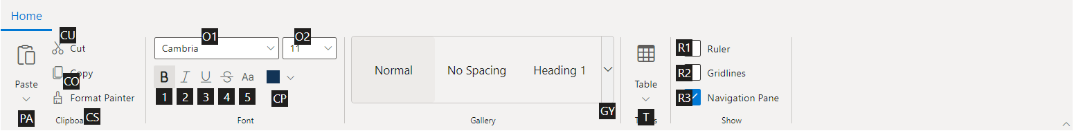
File menu keytip
You can add keytips to the file menu by using the keyTip property.
@using Syncfusion.EJ2.Ribbon
@using Syncfusion.EJ2.Navigations


@{
    List<MenuItem> pasteOptions = new List<MenuItem>() { new MenuItem { Text = "Keep Source Format" }, new MenuItem { Text = "Merge Format" }, new MenuItem { Text = "Keep Text Only" } };
    List<MenuItem> fileOptions = new List<MenuItem>() {
        new MenuItem { Text = "New", IconCss = "e-icons e-file-new", Id="new" },
        new MenuItem { Text = "Open", IconCss = "e-icons e-folder-open", Id="Open" },
        new MenuItem { Text = "Rename", IconCss = "e-icons e-rename", Id="rename" },
        new MenuItem { Text = "Save as", IconCss = "e-icons e-save", Id="save",
        Items= new List<MenuItem>() {
                new MenuItem { Text = "Microsoft Word (.docx)", IconCss = "sf-icon-word", Id="word" },
                new MenuItem { Text = "Microsoft Word 97-2003(.doc)", IconCss = "sf-icon-word", Id="word97" },
                new MenuItem { Text = "Download as PDF", IconCss = "e-icons e-export-pdf", Id="pdf" },
            }
        }
    };
}
<ejs-ribbon id="ribbon" enableKeyTips=true created="ribbonCreated">
    <e-ribbon-filemenusettings text="File" visible="true" menuItems=fileOptions keyTip="F"></e-ribbon-filemenusettings>
     <e-ribbon-tabs>
        <e-ribbon-tab header="Home">
            <e-ribbon-groups>
                <e-ribbon-group header="Clipboard" id="clipboard" groupIconCss="e-icons e-paste">
                    <e-ribbon-collections>
                        <e-ribbon-collection>
                            <e-ribbon-items>
                                <e-ribbon-item type="SplitButton" id="pastebtn" allowedSizes=Large>
                                    <e-ribbon-splitButtonSettings iconCss="e-icons e-paste" content="Paste" items=pasteOptions></e-ribbon-splitButtonSettings>
                                </e-ribbon-item>
                            </e-ribbon-items>
                        </e-ribbon-collection>
                        <e-ribbon-collection>
                            <e-ribbon-items>
                                <e-ribbon-item type="Button">
                                    <e-ribbon-buttonsettings iconCss="e-icons e-cut" content="Cut"></e-ribbon-buttonsettings>
                                </e-ribbon-item>
                                <e-ribbon-item type="Button">
                                    <e-ribbon-buttonsettings iconCss="e-icons e-copy" content="Copy"></e-ribbon-buttonsettings>
                                </e-ribbon-item>
                            </e-ribbon-items>
                        </e-ribbon-collection>
                    </e-ribbon-collections>
                </e-ribbon-group>
            </e-ribbon-groups>
         </e-ribbon-tab>
    </e-ribbon-tabs>
</ejs-ribbon>


<script>
  function ribbonCreated() {
        var ribbon = document.getElementById('ribbon').ej2_instances[0];
        ribbon.ribbonKeyTipModule.showKeyTips();
    }
</script>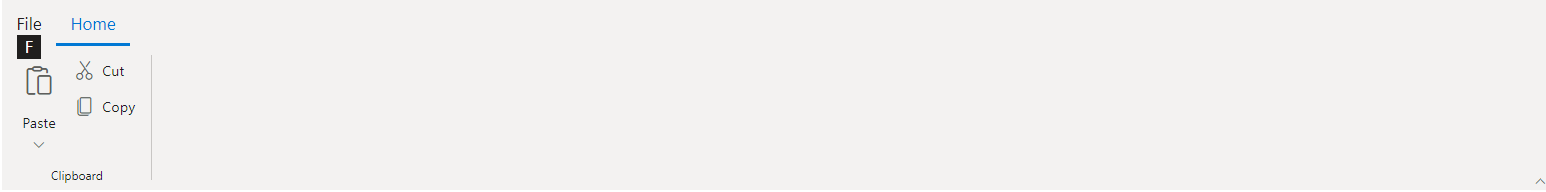
Backstage menu keytip
You can add keytips to backstage menu items by using the keyTip property.
@using Syncfusion.EJ2.Ribbon
@using Syncfusion.EJ2.Navigations


@{
    List<MenuItem> pasteOptions = new List<MenuItem>() { new MenuItem { Text = "Keep Source Format" }, new MenuItem { Text = "Merge Format" }, new MenuItem { Text = "Keep Text Only" } };
    var backButtonSettings = new { text = "Close" };
    List<BackstageItem> backstageItems = new List<BackstageItem>() {
        new BackstageItem { Id = "home", Text = "Home", KeyTip="H", IconCss = "e-icons e-home", Content = processBackstageContent("home") },
        new BackstageItem { Id = "new", Text = "New", KeyTip="N", IconCss = "e-icons e-file-new", Content = processBackstageContent("new") },
        new BackstageItem { Id = "open", Text = "Open", KeyTip="O", IconCss = "e-icons e-folder-open", Content = processBackstageContent("open") }
    };
    string processBackstageContent(string item)
    {
        string content = "";
        switch (item)
        {
            case "home":
                {
                    content = "<div id='block-wrapper'><div class='section-title'> Recent </div><div class='section-content' style='padding: 12px 0px; cursor: pointer'><table><tbody><tr><td> <span class='doc_icon e-icons e-open-link'></span> </td><td> <span style='display: block; font-size: 14px'> Ribbon.docx </span><span style='font-size: 12px'> EJ2 >> Components >> Navigations >> Ribbon >> default </span></td></tr></tbody></table></div></div></div>";
                    break;
                }
            case "new":
                {
                    content = "<div id='new-section' class='new-wrapper'><div class='section-title'> New </div><div class='category_container'><div class='doc_category_image'></div> <span class='doc_category_text'> New document </span></div></div>";
                    break;
                }
            case "open":
                {
                    content = "<div id='open-content' style='padding: 20px;'><div class='section-content' style='padding: 12px 0px; cursor: pointer'><table><tbody><tr><td> <span class='doc_icon e-icons e-open-link'></span> </td><td> <span style='display: block; font-size: 14px'> Open in Desktop App </span><span style='font-size: 12px'> Use the full functionality of Ribbon </span></td></tr></tbody></table></div><div class='section-content' style='padding: 12px 0px; cursor: pointer'><table><tbody><tr><td> <span class='doc_icon e-icons e-protect-sheet'></span> </td><td> <span style='display: block; font-size: 14px'> Protect Document </span><span style='font-size: 12px'>To prevent accidental changes, this document has been set to open as view-only.</span></td></tr></tbody></table></div></div>";
                    break;
                }
            case "print":
                {
                    content = "<div style='min-width: 300px; padding: 20px;'><h2>Print this document</h2><button id='togglebtn' class='e-control e-btn e-lib e-flat e-primary'><span class='e-btn-icon e-btn-sb-icons e-icons e-print e-icon-left'></span>Print</button></div>";
                    break;
                }
        }
        return content;
    }
}
<ejs-ribbon id="ribbon" enableKeyTips=true created="ribbonCreated">
    <e-ribbon-backstagemenusettings text="File" keyTip="F" visible="true" backButton=backButtonSettings items=backstageItems></e-ribbon-backstagemenusettings>
     <e-ribbon-tabs>
        <e-ribbon-tab header="Home">
            <e-ribbon-groups>
                <e-ribbon-group header="Clipboard" id="clipboard" groupIconCss="e-icons e-paste">
                    <e-ribbon-collections>
                        <e-ribbon-collection>
                            <e-ribbon-items>
                                <e-ribbon-item type="SplitButton" id="pastebtn" allowedSizes=Large>
                                    <e-ribbon-splitButtonSettings iconCss="e-icons e-paste" content="Paste" items=pasteOptions></e-ribbon-splitButtonSettings>
                                </e-ribbon-item>
                            </e-ribbon-items>
                        </e-ribbon-collection>
                        <e-ribbon-collection>
                            <e-ribbon-items>
                                <e-ribbon-item type="Button">
                                    <e-ribbon-buttonsettings iconCss="e-icons e-cut" content="Cut"></e-ribbon-buttonsettings>
                                </e-ribbon-item>
                                <e-ribbon-item type="Button">
                                    <e-ribbon-buttonsettings iconCss="e-icons e-copy" content="Copy"></e-ribbon-buttonsettings>
                                </e-ribbon-item>
                            </e-ribbon-items>
                        </e-ribbon-collection>
                    </e-ribbon-collections>
                </e-ribbon-group>
            </e-ribbon-groups>
         </e-ribbon-tab>
    </e-ribbon-tabs>
</ejs-ribbon>

<script>
  function ribbonCreated() {
        var ribbon = document.getElementById('ribbon').ej2_instances[0];
        ribbon.ribbonKeyTipModule.showKeyTips('F');
    }
</script>

<style>
    .e-ribbon-backstage-content{
        width: 500px;
        height: 350px;
    }

    .section-title {
        font-size: 22px;
    }

    .new-docs {
        display: flex;
        justify-content: space-around;
        flex-wrap: wrap;
    }

    .category_container {
        width: 150px;
        padding: 15px;
        text-align: center;
        cursor: pointer;
    }

    .doc_category_image {
        width: 80px;
        height: 100px;
        background-color: #fff;
        border: 1px solid rgb(125, 124, 124);
        text-align: center;
        overflow: hidden;
        margin: 0px auto 10px;
    }

    .doc_category_text {
        font-size: 16px;
    }

    .section-content {
        padding: 12px 0px;
        cursor: pointer;
    }

    .doc_icon {
        font-size: 16px;
        padding: 0px 10px;
    }

    .category_container:hover, .section-content:hover {
        background-color: #dfdfdf;
        border-radius: 5px;
        transition: all 0.3s;
    }
</style>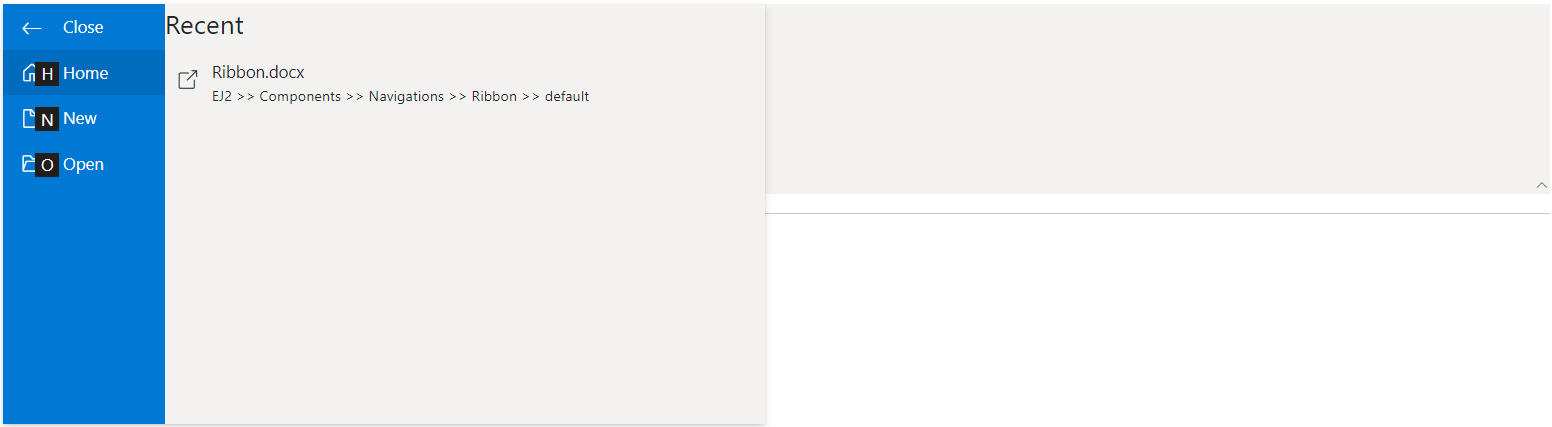
Ribbon layout switcher keytip
You can add keytip to the layout switcher by using the layoutSwitcherKeyTip property.
@using Syncfusion.EJ2.Ribbon
@using Syncfusion.EJ2.Navigations


@{
    List<MenuItem> pasteOptions = new List<MenuItem>() { new MenuItem { Text = "Keep Source Format" }, new MenuItem { Text = "Merge Format" }, new MenuItem { Text = "Keep Text Only" } };
    List<MenuItem> fileOptions = new List<MenuItem>() {
        new MenuItem { Text = "New", IconCss = "e-icons e-file-new", Id="new" },
        new MenuItem { Text = "Open", IconCss = "e-icons e-folder-open", Id="Open" },
        new MenuItem { Text = "Rename", IconCss = "e-icons e-rename", Id="rename" },
        new MenuItem { Text = "Save as", IconCss = "e-icons e-save", Id="save",
        Items= new List<MenuItem>() {
                new MenuItem { Text = "Microsoft Word (.docx)", IconCss = "sf-icon-word", Id="word" },
                new MenuItem { Text = "Microsoft Word 97-2003(.doc)", IconCss = "sf-icon-word", Id="word97" },
                new MenuItem { Text = "Download as PDF", IconCss = "e-icons e-export-pdf", Id="pdf" },
            }
        }
    };
}
<ejs-ribbon id="ribbon" enableKeyTips=true layoutSwitcherKeyTip="LS" created="ribbonCreated">
    <e-ribbon-filemenusettings text="File" visible="true" menuItems=fileOptions></e-ribbon-filemenusettings>
     <e-ribbon-tabs>
        <e-ribbon-tab header="Home">
            <e-ribbon-groups>
                <e-ribbon-group header="Clipboard" id="clipboard" groupIconCss="e-icons e-paste">
                    <e-ribbon-collections>
                        <e-ribbon-collection>
                            <e-ribbon-items>
                                <e-ribbon-item type="SplitButton" id="pastebtn" allowedSizes=Large>
                                    <e-ribbon-splitButtonSettings iconCss="e-icons e-paste" content="Paste" items=pasteOptions></e-ribbon-splitButtonSettings>
                                </e-ribbon-item>
                            </e-ribbon-items>
                        </e-ribbon-collection>
                        <e-ribbon-collection>
                            <e-ribbon-items>
                                <e-ribbon-item type="Button">
                                    <e-ribbon-buttonsettings iconCss="e-icons e-cut" content="Cut"></e-ribbon-buttonsettings>
                                </e-ribbon-item>
                                <e-ribbon-item type="Button">
                                    <e-ribbon-buttonsettings iconCss="e-icons e-copy" content="Copy"></e-ribbon-buttonsettings>
                                </e-ribbon-item>
                            </e-ribbon-items>
                        </e-ribbon-collection>
                    </e-ribbon-collections>
                </e-ribbon-group>
            </e-ribbon-groups>
         </e-ribbon-tab>
    </e-ribbon-tabs>
</ejs-ribbon>


<script>
  function ribbonCreated() {
        var ribbon = document.getElementById('ribbon').ej2_instances[0];
        ribbon.ribbonKeyTipModule.showKeyTips();
    }
</script>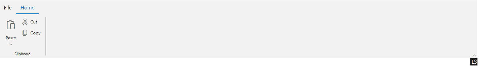
Ribbon launcher icon keytip
You can add keytip to the launcher icon by using the launcherIconKeyTip property.
@using Syncfusion.EJ2.Ribbon
@using Syncfusion.EJ2.Navigations


@{
    List<MenuItem> pasteOptions = new List<MenuItem>() { new MenuItem { Text = "Keep Source Format" }, new MenuItem { Text = "Merge Format" }, new MenuItem { Text = "Keep Text Only" } };
    List<MenuItem> fileOptions = new List<MenuItem>() {
        new MenuItem { Text = "New", IconCss = "e-icons e-file-new", Id="new" },
        new MenuItem { Text = "Open", IconCss = "e-icons e-folder-open", Id="Open" },
        new MenuItem { Text = "Rename", IconCss = "e-icons e-rename", Id="rename" },
        new MenuItem { Text = "Save as", IconCss = "e-icons e-save", Id="save",
        Items= new List<MenuItem>() {
                new MenuItem { Text = "Microsoft Word (.docx)", IconCss = "sf-icon-word", Id="word" },
                new MenuItem { Text = "Microsoft Word 97-2003(.doc)", IconCss = "sf-icon-word", Id="word97" },
                new MenuItem { Text = "Download as PDF", IconCss = "e-icons e-export-pdf", Id="pdf" },
            }
        }
    };
}
<ejs-ribbon id="ribbon" enableKeyTips=true created="ribbonCreated">
    <e-ribbon-filemenusettings text="File" visible="true" menuItems=fileOptions></e-ribbon-filemenusettings>
     <e-ribbon-tabs>
        <e-ribbon-tab header="Home" keyTip="H">
            <e-ribbon-groups>
                <e-ribbon-group header="Clipboard" id="clipboard" groupIconCss="e-icons e-paste" showLauncherIcon=true launcherIconKeyTip="L">
                    <e-ribbon-collections>
                        <e-ribbon-collection>
                            <e-ribbon-items>
                                <e-ribbon-item type="SplitButton" id="pastebtn" allowedSizes=Large>
                                    <e-ribbon-splitButtonSettings iconCss="e-icons e-paste" content="Paste" items=pasteOptions></e-ribbon-splitButtonSettings>
                                </e-ribbon-item>
                            </e-ribbon-items>
                        </e-ribbon-collection>
                        <e-ribbon-collection>
                            <e-ribbon-items>
                                <e-ribbon-item type="Button">
                                    <e-ribbon-buttonsettings iconCss="e-icons e-cut" content="Cut"></e-ribbon-buttonsettings>
                                </e-ribbon-item>
                                <e-ribbon-item type="Button">
                                    <e-ribbon-buttonsettings iconCss="e-icons e-copy" content="Copy"></e-ribbon-buttonsettings>
                                </e-ribbon-item>
                            </e-ribbon-items>
                        </e-ribbon-collection>
                    </e-ribbon-collections>
                </e-ribbon-group>
            </e-ribbon-groups>
         </e-ribbon-tab>
    </e-ribbon-tabs>
</ejs-ribbon>


<script>
  function ribbonCreated() {
        var ribbon = document.getElementById('ribbon').ej2_instances[0];
        ribbon.ribbonKeyTipModule.showKeyTips('H');
    }
</script>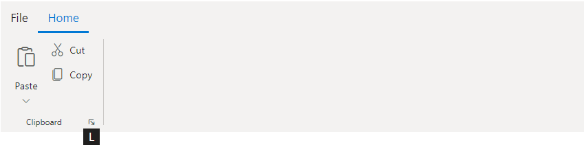
Methods
Show keytips
You can use the showKeyTips method to shown the keytips dynamically.
In order to show specific keytips, pass the key string as an argument in the showKeyTips('H') method.
Hide keytips
You can use the hideKeyTips method in Ribbon to remove the keytips dynamically. This will remove all the visible keytips.
Guidelines for adding keytips
Before adding keytips to the ribbon items consider the following:
- Avoid using the same keytip setting on multiple items.
For example: When you add the keytip text
HorHFfor the same items, it activates the first item occurrence ofH, while any subsequent instances ofHorHFare ignored.
- Do not use the same first letter for the single and double keytip items.
For example: When accessing keytip text
F,FPandFPFadded for the different ribbon items and pressingFkey, only theFkey tip associated item will be activated while theFP,FPFconfigured ribbon items will be ignored.