Gallery Items in ASP.NET Core Ribbon control
22 Mar 202424 minutes to read
The Ribbon supports Gallery view which allows users to perform specific actions by displaying a collection of related items, including icons, content, or images. You can render the gallery item by setting the type property to Gallery and customize it by using the RibbonGallerySettings, which provides options such as groups, itemCount, popupHeight, popupWidth and more.
Groups
You can render the groups inside the gallery items by using groups property and customize the groups using RibbonGalleryGroup, which provides options such as items, cssClass, header and more.
Adding items
You can render the gallery items by using items property and customize using the RibbonGalleryItem, which provides options such as content, iconCss, disabled and more.
@using Syncfusion.EJ2
@using Syncfusion.EJ2.Ribbon
@using Syncfusion.EJ2.Navigations

@{
    List<MenuItem> pasteOptions = new List<MenuItem>() { new MenuItem { Text = "Keep Source Format" }, new MenuItem { Text = "Merge format" }, new MenuItem { Text = "Keep text only" } };
}

<ejs-ribbon id="ribbon">
    <e-ribbon-tabs>
        <e-ribbon-tab header="Home">
            <e-ribbon-groups>
                <e-ribbon-group header="Clipboard" groupIconCss="e-icons e-paste">
                    <e-ribbon-collections>
                        <e-ribbon-collection>
                            <e-ribbon-items>
                                <e-ribbon-item type="SplitButton">
                                    <e-ribbon-splitButtonSettings iconCss="e-icons e-paste" content="Paste" items=pasteOptions></e-ribbon-splitButtonSettings>
                                </e-ribbon-item>
                            </e-ribbon-items>
                        </e-ribbon-collection>
                        <e-ribbon-collection>
                            <e-ribbon-items>
                                <e-ribbon-item type="Button">
                                    <e-ribbon-buttonsettings iconCss="e-icons e-cut" content="Cut"></e-ribbon-buttonsettings>
                                </e-ribbon-item>
                                <e-ribbon-item type="Button">
                                    <e-ribbon-buttonsettings iconCss="e-icons e-copy" content="Copy"></e-ribbon-buttonsettings>
                                </e-ribbon-item>
                                <e-ribbon-item type="Button">
                                    <e-ribbon-buttonsettings iconCss="e-icons e-format-painter" content="Format Painter"></e-ribbon-buttonsettings>
                                </e-ribbon-item>
                            </e-ribbon-items>
                        </e-ribbon-collection>
                    </e-ribbon-collections>
                </e-ribbon-group>
                <e-ribbon-group header="Gallery">
                    <e-ribbon-collections>
                        <e-ribbon-collection>
                            <e-ribbon-items>
                                <e-ribbon-item type="Gallery">
                                    <e-ribbon-gallerySettings>
                                        <e-ribbon-gallery-groups>
                                            <e-ribbon-gallery-group header="Styles">
                                                <e-ribbon-gallery-items>
                                                    <e-ribbon-gallery-item content="Normal"></e-ribbon-gallery-item>
                                                    <e-ribbon-gallery-item content="No Spacing"></e-ribbon-gallery-item>
                                                    <e-ribbon-gallery-item content="Heading 1"></e-ribbon-gallery-item>
                                                    <e-ribbon-gallery-item content="Heading 2"></e-ribbon-gallery-item>
                                                </e-ribbon-gallery-items>
                                            </e-ribbon-gallery-group>
                                        </e-ribbon-gallery-groups>
                                    </e-ribbon-gallerySettings>
                                </e-ribbon-item>
                            </e-ribbon-items>
                        </e-ribbon-collection>
                    </e-ribbon-collections>
                </e-ribbon-group>
            </e-ribbon-groups>
        </e-ribbon-tab>
    </e-ribbon-tabs>
</ejs-ribbon>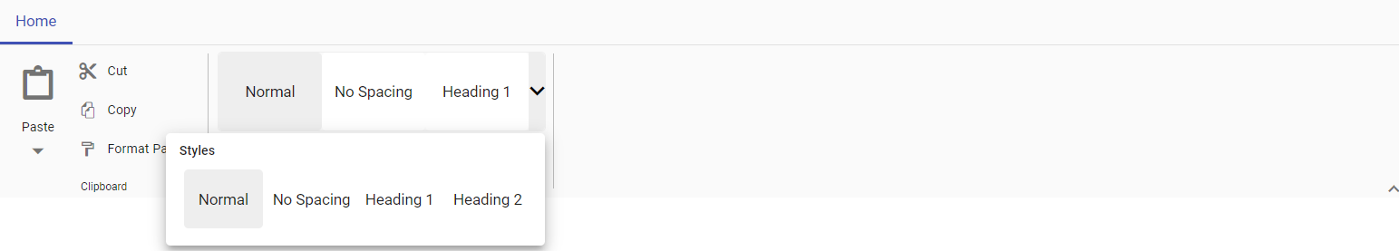
Adding content
You can use the content property to define the text content for the gallery item.
@using Syncfusion.EJ2
@using Syncfusion.EJ2.Ribbon
@using Syncfusion.EJ2.Navigations

@{
    List<MenuItem> pasteOptions = new List<MenuItem>() { new MenuItem { Text = "Keep Source Format" }, new MenuItem { Text = "Merge format" }, new MenuItem { Text = "Keep text only" } };
}

<ejs-ribbon id="ribbon">
    <e-ribbon-tabs>
        <e-ribbon-tab header="Home">
            <e-ribbon-groups>
                <e-ribbon-group header="Clipboard" groupIconCss="e-icons e-paste">
                    <e-ribbon-collections>
                        <e-ribbon-collection>
                            <e-ribbon-items>
                                <e-ribbon-item type="SplitButton">
                                    <e-ribbon-splitButtonSettings iconCss="e-icons e-paste" content="Paste" items=pasteOptions></e-ribbon-splitButtonSettings>
                                </e-ribbon-item>
                            </e-ribbon-items>
                        </e-ribbon-collection>
                        <e-ribbon-collection>
                            <e-ribbon-items>
                                <e-ribbon-item type="Button">
                                    <e-ribbon-buttonsettings iconCss="e-icons e-cut" content="Cut"></e-ribbon-buttonsettings>
                                </e-ribbon-item>
                                <e-ribbon-item type="Button">
                                    <e-ribbon-buttonsettings iconCss="e-icons e-copy" content="Copy"></e-ribbon-buttonsettings>
                                </e-ribbon-item>
                                <e-ribbon-item type="Button">
                                    <e-ribbon-buttonsettings iconCss="e-icons e-format-painter" content="Format Painter"></e-ribbon-buttonsettings>
                                </e-ribbon-item>
                            </e-ribbon-items>
                        </e-ribbon-collection>
                    </e-ribbon-collections>
                </e-ribbon-group>
                <e-ribbon-group header="Gallery">
                    <e-ribbon-collections>
                        <e-ribbon-collection>
                            <e-ribbon-items>
                                <e-ribbon-item type="Gallery">
                                    <e-ribbon-gallerySettings>
                                        <e-ribbon-gallery-groups>
                                            <e-ribbon-gallery-group header="Styles">
                                                <e-ribbon-gallery-items>
                                                    <e-ribbon-gallery-item content="Normal"></e-ribbon-gallery-item>
                                                    <e-ribbon-gallery-item content="No Spacing"></e-ribbon-gallery-item>
                                                    <e-ribbon-gallery-item content="Heading 1"></e-ribbon-gallery-item>
                                                    <e-ribbon-gallery-item content="Heading 2"></e-ribbon-gallery-item>
                                                </e-ribbon-gallery-items>
                                            </e-ribbon-gallery-group>
                                        </e-ribbon-gallery-groups>
                                    </e-ribbon-gallerySettings>
                                </e-ribbon-item>
                            </e-ribbon-items>
                        </e-ribbon-collection>
                    </e-ribbon-collections>
                </e-ribbon-group>
            </e-ribbon-groups>
        </e-ribbon-tab>
    </e-ribbon-tabs>
</ejs-ribbon>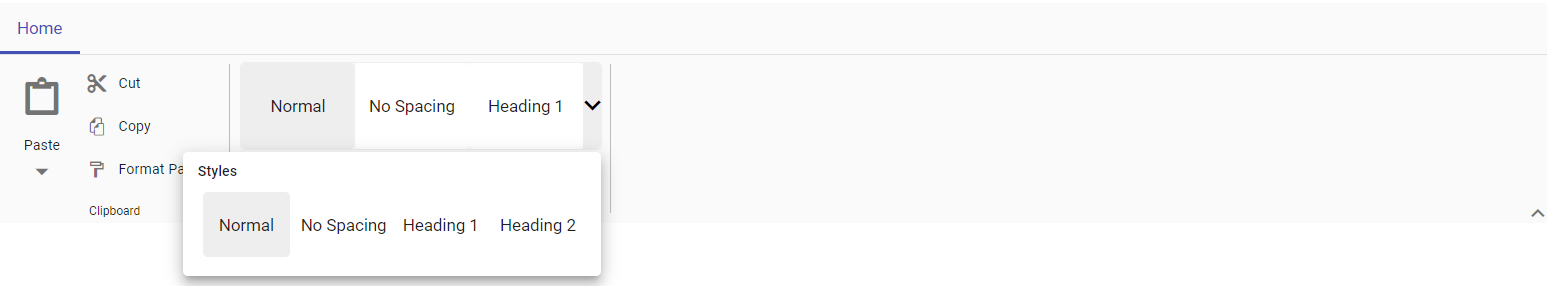
Adding icons
You can use the iconCss property to define the icons for the gallery item.
@using Syncfusion.EJ2
@using Syncfusion.EJ2.Ribbon
@using Syncfusion.EJ2.Navigations

@{
    List<MenuItem> pasteOptions = new List<MenuItem>() { new MenuItem { Text = "Keep Source Format" }, new MenuItem { Text = "Merge format" }, new MenuItem { Text = "Keep text only" } };
}

<ejs-ribbon id="ribbon">
    <e-ribbon-tabs>
        <e-ribbon-tab header="Home">
            <e-ribbon-groups>
                <e-ribbon-group header="Clipboard" groupIconCss="e-icons e-paste">
                    <e-ribbon-collections>
                        <e-ribbon-collection>
                            <e-ribbon-items>
                                <e-ribbon-item type="SplitButton">
                                    <e-ribbon-splitButtonSettings iconCss="e-icons e-paste" content="Paste" items=pasteOptions></e-ribbon-splitButtonSettings>
                                </e-ribbon-item>
                            </e-ribbon-items>
                        </e-ribbon-collection>
                        <e-ribbon-collection>
                            <e-ribbon-items>
                                <e-ribbon-item type="Button">
                                    <e-ribbon-buttonsettings iconCss="e-icons e-cut" content="Cut"></e-ribbon-buttonsettings>
                                </e-ribbon-item>
                                <e-ribbon-item type="Button">
                                    <e-ribbon-buttonsettings iconCss="e-icons e-copy" content="Copy"></e-ribbon-buttonsettings>
                                </e-ribbon-item>
                                <e-ribbon-item type="Button">
                                    <e-ribbon-buttonsettings iconCss="e-icons e-format-painter" content="Format Painter"></e-ribbon-buttonsettings>
                                </e-ribbon-item>
                            </e-ribbon-items>
                        </e-ribbon-collection>
                    </e-ribbon-collections>
                </e-ribbon-group>
                <e-ribbon-group header="Gallery">
                    <e-ribbon-collections>
                        <e-ribbon-collection>
                            <e-ribbon-items>
                                <e-ribbon-item type="Gallery">
                                    <e-ribbon-gallerySettings>
                                        <e-ribbon-gallery-groups>
                                            <e-ribbon-gallery-group header="Transitions">
                                                <e-ribbon-gallery-items>
                                                    <e-ribbon-gallery-item content="None" iconCss="e-icons e-rectangle"></e-ribbon-gallery-item>
                                                    <e-ribbon-gallery-item content="Fade" iconCss="e-icons e-send-backward"></e-ribbon-gallery-item>
                                                    <e-ribbon-gallery-item content="Reveal" iconCss="e-icons e-bring-forward"></e-ribbon-gallery-item>
                                                    <e-ribbon-gallery-item content="Zoom" iconCss="e-icons e-zoom-to-fit"></e-ribbon-gallery-item>
                                                </e-ribbon-gallery-items>
                                            </e-ribbon-gallery-group>
                                        </e-ribbon-gallery-groups>
                                    </e-ribbon-gallerySettings>
                                </e-ribbon-item>
                            </e-ribbon-items>
                        </e-ribbon-collection>
                    </e-ribbon-collections>
                </e-ribbon-group>
            </e-ribbon-groups>
        </e-ribbon-tab>
    </e-ribbon-tabs>
</ejs-ribbon>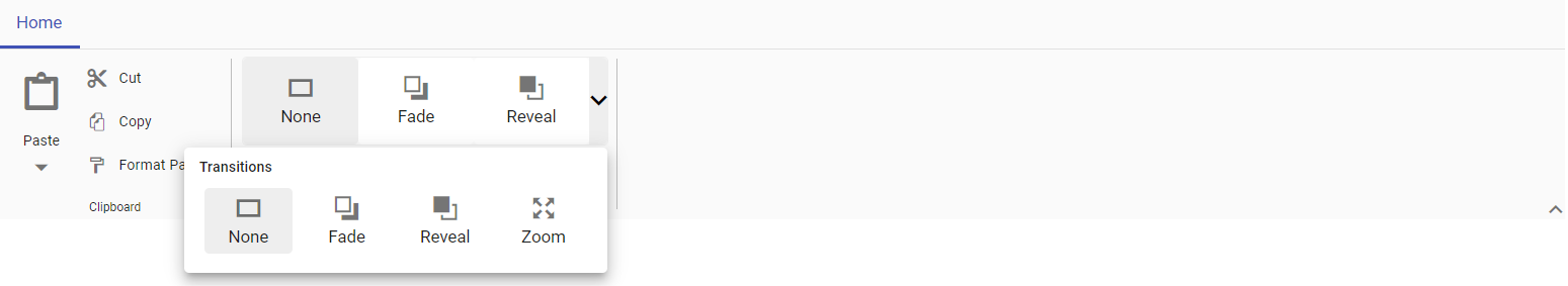
Adding html attributes
You can use the htmlAttributes property to add HTML attributes to the Ribbon gallery item.
The following sample showcases how to add title attribute to the gallery item using htmlAttributes property.
@using Syncfusion.EJ2
@using Syncfusion.EJ2.Ribbon
@using Syncfusion.EJ2.Navigations

@{
    List<MenuItem> pasteOptions = new List<MenuItem>() { new MenuItem { Text = "Keep Source Format" }, new MenuItem { Text = "Merge format" }, new MenuItem { Text = "Keep text only" } };
    IDictionary<string, object> customAttribute1 = new Dictionary<string, object>()
    {
       { "title", "Normal" }
    };
    IDictionary<string, object> customAttribute2 = new Dictionary<string, object>()
    {
       { "title", "No Spacing" }
    };
    IDictionary<string, object> customAttribute3 = new Dictionary<string, object>()
    {
       { "title", "Heading 1" }
    };
    IDictionary<string, object> customAttribute4 = new Dictionary<string, object>()
    {
       { "title", "Heading 2" }
    };
}

<ejs-ribbon id="ribbon">
    <e-ribbon-tabs>
        <e-ribbon-tab header="Home">
            <e-ribbon-groups>
                <e-ribbon-group header="Clipboard" groupIconCss="e-icons e-paste">
                    <e-ribbon-collections>
                        <e-ribbon-collection>
                            <e-ribbon-items>
                                <e-ribbon-item type="SplitButton">
                                    <e-ribbon-splitButtonSettings iconCss="e-icons e-paste" content="Paste" items=pasteOptions></e-ribbon-splitButtonSettings>
                                </e-ribbon-item>
                            </e-ribbon-items>
                        </e-ribbon-collection>
                        <e-ribbon-collection>
                            <e-ribbon-items>
                                <e-ribbon-item type="Button">
                                    <e-ribbon-buttonsettings iconCss="e-icons e-cut" content="Cut"></e-ribbon-buttonsettings>
                                </e-ribbon-item>
                                <e-ribbon-item type="Button">
                                    <e-ribbon-buttonsettings iconCss="e-icons e-copy" content="Copy"></e-ribbon-buttonsettings>
                                </e-ribbon-item>
                                <e-ribbon-item type="Button">
                                    <e-ribbon-buttonsettings iconCss="e-icons e-format-painter" content="Format Painter"></e-ribbon-buttonsettings>
                                </e-ribbon-item>
                            </e-ribbon-items>
                        </e-ribbon-collection>
                    </e-ribbon-collections>
                </e-ribbon-group>
                <e-ribbon-group header="Gallery">
                    <e-ribbon-collections>
                        <e-ribbon-collection>
                            <e-ribbon-items>
                                <e-ribbon-item type="Gallery">
                                    <e-ribbon-gallerySettings>
                                        <e-ribbon-gallery-groups>
                                            <e-ribbon-gallery-group header="Styles">
                                                <e-ribbon-gallery-items>
                                                    <e-ribbon-gallery-item content="Normal" htmlAttributes="customAttribute1"></e-ribbon-gallery-item>
                                                    <e-ribbon-gallery-item content="No Spacing" htmlAttributes="customAttribute2"></e-ribbon-gallery-item>
                                                    <e-ribbon-gallery-item content="Heading 1" htmlAttributes="customAttribute3"></e-ribbon-gallery-item>
                                                    <e-ribbon-gallery-item content="Heading 2" htmlAttributes="customAttribute4"></e-ribbon-gallery-item>
                                                </e-ribbon-gallery-items>
                                            </e-ribbon-gallery-group>
                                        </e-ribbon-gallery-groups>
                                    </e-ribbon-gallerySettings>
                                </e-ribbon-item>
                            </e-ribbon-items>
                        </e-ribbon-collection>
                    </e-ribbon-collections>
                </e-ribbon-group>
            </e-ribbon-groups>
        </e-ribbon-tab>
    </e-ribbon-tabs>
</ejs-ribbon>
Css class
You can use the cssClass property to customize the gallery item.
The following sample showcases how to customize the appearance of each gallery item using the cssClass property .
@using Syncfusion.EJ2
@using Syncfusion.EJ2.Ribbon
@using Syncfusion.EJ2.Navigations

@{
    List<MenuItem> pasteOptions = new List<MenuItem>() { new MenuItem { Text = "Keep Source Format" }, new MenuItem { Text = "Merge format" }, new MenuItem { Text = "Keep text only" } };
}

<ejs-ribbon id="ribbon">
    <e-ribbon-tabs>
        <e-ribbon-tab header="Home">
            <e-ribbon-groups>
                <e-ribbon-group header="Clipboard" groupIconCss="e-icons e-paste">
                    <e-ribbon-collections>
                        <e-ribbon-collection>
                            <e-ribbon-items>
                                <e-ribbon-item type="SplitButton">
                                    <e-ribbon-splitButtonSettings iconCss="e-icons e-paste" content="Paste" items=pasteOptions></e-ribbon-splitButtonSettings>
                                </e-ribbon-item>
                            </e-ribbon-items>
                        </e-ribbon-collection>
                        <e-ribbon-collection>
                            <e-ribbon-items>
                                <e-ribbon-item type="Button">
                                    <e-ribbon-buttonsettings iconCss="e-icons e-cut" content="Cut"></e-ribbon-buttonsettings>
                                </e-ribbon-item>
                                <e-ribbon-item type="Button">
                                    <e-ribbon-buttonsettings iconCss="e-icons e-copy" content="Copy"></e-ribbon-buttonsettings>
                                </e-ribbon-item>
                                <e-ribbon-item type="Button">
                                    <e-ribbon-buttonsettings iconCss="e-icons e-format-painter" content="Format Painter"></e-ribbon-buttonsettings>
                                </e-ribbon-item>
                            </e-ribbon-items>
                        </e-ribbon-collection>
                    </e-ribbon-collections>
                </e-ribbon-group>
                <e-ribbon-group header="Gallery">
                    <e-ribbon-collections>
                        <e-ribbon-collection>
                            <e-ribbon-items>
                                <e-ribbon-item type="Gallery">
                                    <e-ribbon-gallerySettings>
                                        <e-ribbon-gallery-groups>
                                            <e-ribbon-gallery-group header="Good, Bad and Neutral">
                                                <e-ribbon-gallery-items>
                                                    <e-ribbon-gallery-item content="Normal" cssClass="normal"></e-ribbon-gallery-item>
                                                    <e-ribbon-gallery-item content="Bad" cssClass="bad"></e-ribbon-gallery-item>
                                                    <e-ribbon-gallery-item content="Good" cssClass="good"></e-ribbon-gallery-item>
                                                    <e-ribbon-gallery-item content="Neutral" cssClass="neutral"></e-ribbon-gallery-item>
                                                </e-ribbon-gallery-items>
                                            </e-ribbon-gallery-group>
                                        </e-ribbon-gallery-groups>
                                    </e-ribbon-gallerySettings>
                                </e-ribbon-item>
                            </e-ribbon-items>
                        </e-ribbon-collection>
                    </e-ribbon-collections>
                </e-ribbon-group>
            </e-ribbon-groups>
        </e-ribbon-tab>
    </e-ribbon-tabs>
</ejs-ribbon>

<style>
    .e-ribbon-gallery-item {
        margin: 5px;
    }

    .e-ribbon-gallery-item.normal {
        background: #f0f0f0;
        color: #333;
    }

    .e-ribbon-gallery-item.bad {
        background: #ffb6b6;
        color: #800000;
    }

    .e-ribbon-gallery-item.good {
        background: #c7ebc9;
        color: #004d00;
    }

    .e-ribbon-gallery-item.neutral {
        background: #eedd9d;
        color: #6c5429;
    }
</style>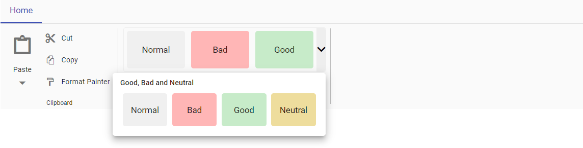
Disabled
You can use the disabled property to disable the Ribbon gallery item. It prevents the user interaction when set to true. By default, the value is false.
@using Syncfusion.EJ2
@using Syncfusion.EJ2.Ribbon
@using Syncfusion.EJ2.Navigations

@{
    List<MenuItem> pasteOptions = new List<MenuItem>() { new MenuItem { Text = "Keep Source Format" }, new MenuItem { Text = "Merge format" }, new MenuItem { Text = "Keep text only" } };
}

<ejs-ribbon id="ribbon">
    <e-ribbon-tabs>
        <e-ribbon-tab header="Home">
            <e-ribbon-groups>
                <e-ribbon-group header="Clipboard" groupIconCss="e-icons e-paste">
                    <e-ribbon-collections>
                        <e-ribbon-collection>
                            <e-ribbon-items>
                                <e-ribbon-item type="SplitButton">
                                    <e-ribbon-splitButtonSettings iconCss="e-icons e-paste" content="Paste" items=pasteOptions></e-ribbon-splitButtonSettings>
                                </e-ribbon-item>
                            </e-ribbon-items>
                        </e-ribbon-collection>
                        <e-ribbon-collection>
                            <e-ribbon-items>
                                <e-ribbon-item type="Button">
                                    <e-ribbon-buttonsettings iconCss="e-icons e-cut" content="Cut"></e-ribbon-buttonsettings>
                                </e-ribbon-item>
                                <e-ribbon-item type="Button">
                                    <e-ribbon-buttonsettings iconCss="e-icons e-copy" content="Copy"></e-ribbon-buttonsettings>
                                </e-ribbon-item>
                                <e-ribbon-item type="Button">
                                    <e-ribbon-buttonsettings iconCss="e-icons e-format-painter" content="Format Painter"></e-ribbon-buttonsettings>
                                </e-ribbon-item>
                            </e-ribbon-items>
                        </e-ribbon-collection>
                    </e-ribbon-collections>
                </e-ribbon-group>
                <e-ribbon-group header="Gallery">
                    <e-ribbon-collections>
                        <e-ribbon-collection>
                            <e-ribbon-items>
                                <e-ribbon-item type="Gallery">
                                    <e-ribbon-gallerySettings>
                                        <e-ribbon-gallery-groups>
                                            <e-ribbon-gallery-group header="Styles">
                                                <e-ribbon-gallery-items>
                                                    <e-ribbon-gallery-item content="Normal" disabled=true></e-ribbon-gallery-item>
                                                    <e-ribbon-gallery-item content="No Spacing"></e-ribbon-gallery-item>
                                                    <e-ribbon-gallery-item content="Heading 1"></e-ribbon-gallery-item>
                                                    <e-ribbon-gallery-item content="Heading 2"></e-ribbon-gallery-item>
                                                </e-ribbon-gallery-items>
                                            </e-ribbon-gallery-group>
                                        </e-ribbon-gallery-groups>
                                    </e-ribbon-gallerySettings>
                                </e-ribbon-item>
                            </e-ribbon-items>
                        </e-ribbon-collection>
                    </e-ribbon-collections>
                </e-ribbon-group>
            </e-ribbon-groups>
        </e-ribbon-tab>
    </e-ribbon-tabs>
</ejs-ribbon>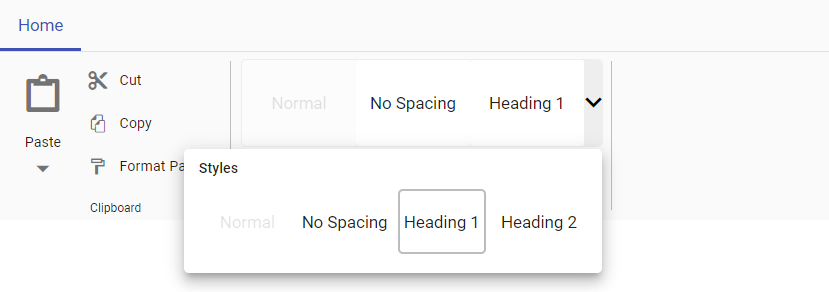
Custom header
You can use the header property to set header for the group items in the Ribbon gallery popup.
@using Syncfusion.EJ2
@using Syncfusion.EJ2.Ribbon
@using Syncfusion.EJ2.Navigations

@{
    List<MenuItem> pasteOptions = new List<MenuItem>() { new MenuItem { Text = "Keep Source Format" }, new MenuItem { Text = "Merge format" }, new MenuItem { Text = "Keep text only" } };
}

<ejs-ribbon id="ribbon">
    <e-ribbon-tabs>
        <e-ribbon-tab header="Home">
            <e-ribbon-groups>
                <e-ribbon-group header="Clipboard" groupIconCss="e-icons e-paste">
                    <e-ribbon-collections>
                        <e-ribbon-collection>
                            <e-ribbon-items>
                                <e-ribbon-item type="SplitButton">
                                    <e-ribbon-splitButtonSettings iconCss="e-icons e-paste" content="Paste" items=pasteOptions></e-ribbon-splitButtonSettings>
                                </e-ribbon-item>
                            </e-ribbon-items>
                        </e-ribbon-collection>
                        <e-ribbon-collection>
                            <e-ribbon-items>
                                <e-ribbon-item type="Button">
                                    <e-ribbon-buttonsettings iconCss="e-icons e-cut" content="Cut"></e-ribbon-buttonsettings>
                                </e-ribbon-item>
                                <e-ribbon-item type="Button">
                                    <e-ribbon-buttonsettings iconCss="e-icons e-copy" content="Copy"></e-ribbon-buttonsettings>
                                </e-ribbon-item>
                                <e-ribbon-item type="Button">
                                    <e-ribbon-buttonsettings iconCss="e-icons e-format-painter" content="Format Painter"></e-ribbon-buttonsettings>
                                </e-ribbon-item>
                            </e-ribbon-items>
                        </e-ribbon-collection>
                    </e-ribbon-collections>
                </e-ribbon-group>
                <e-ribbon-group header="Gallery">
                    <e-ribbon-collections>
                        <e-ribbon-collection>
                            <e-ribbon-items>
                                <e-ribbon-item type="Gallery">
                                    <e-ribbon-gallerySettings>
                                        <e-ribbon-gallery-groups>
                                            <e-ribbon-gallery-group header="Styles">
                                                <e-ribbon-gallery-items>
                                                    <e-ribbon-gallery-item content="Normal"></e-ribbon-gallery-item>
                                                    <e-ribbon-gallery-item content="No Spacing"></e-ribbon-gallery-item>
                                                    <e-ribbon-gallery-item content="Heading 1"></e-ribbon-gallery-item>
                                                    <e-ribbon-gallery-item content="Heading 2"></e-ribbon-gallery-item>
                                                </e-ribbon-gallery-items>
                                            </e-ribbon-gallery-group>
                                        </e-ribbon-gallery-groups>
                                    </e-ribbon-gallerySettings>
                                </e-ribbon-item>
                            </e-ribbon-items>
                        </e-ribbon-collection>
                    </e-ribbon-collections>
                </e-ribbon-group>
            </e-ribbon-groups>
        </e-ribbon-tab>
    </e-ribbon-tabs>
</ejs-ribbon>
Setting item width
You can use the itemWidth property to specify the width of gallery items.
Setting item height
You can use the itemHeight property to set the height of the gallery items. If the itemHeight of the gallery item is smaller the remaining gallery items are aligned based on the itemCount specified.
The provided example demonstrates how to customize gallery items using the itemWidth and itemHeight properties.
@using Syncfusion.EJ2
@using Syncfusion.EJ2.Ribbon
@using Syncfusion.EJ2.Navigations

@{
    List<MenuItem> pasteOptions = new List<MenuItem>() { new MenuItem { Text = "Keep Source Format" }, new MenuItem { Text = "Merge format" }, new MenuItem { Text = "Keep text only" } };
}

<ejs-ribbon id="ribbon">
    <e-ribbon-tabs>
        <e-ribbon-tab header="Home">
            <e-ribbon-groups>
                <e-ribbon-group header="Clipboard" groupIconCss="e-icons e-paste">
                    <e-ribbon-collections>
                        <e-ribbon-collection>
                            <e-ribbon-items>
                                <e-ribbon-item type="SplitButton">
                                    <e-ribbon-splitButtonSettings iconCss="e-icons e-paste" content="Paste" items=pasteOptions></e-ribbon-splitButtonSettings>
                                </e-ribbon-item>
                            </e-ribbon-items>
                        </e-ribbon-collection>
                        <e-ribbon-collection>
                            <e-ribbon-items>
                                <e-ribbon-item type="Button">
                                    <e-ribbon-buttonsettings iconCss="e-icons e-cut" content="Cut"></e-ribbon-buttonsettings>
                                </e-ribbon-item>
                                <e-ribbon-item type="Button">
                                    <e-ribbon-buttonsettings iconCss="e-icons e-copy" content="Copy"></e-ribbon-buttonsettings>
                                </e-ribbon-item>
                                <e-ribbon-item type="Button">
                                    <e-ribbon-buttonsettings iconCss="e-icons e-format-painter" content="Format Painter"></e-ribbon-buttonsettings>
                                </e-ribbon-item>
                            </e-ribbon-items>
                        </e-ribbon-collection>
                    </e-ribbon-collections>
                </e-ribbon-group>
                <e-ribbon-group header="Gallery">
                    <e-ribbon-collections>
                        <e-ribbon-collection>
                            <e-ribbon-items>
                                <e-ribbon-item type="Gallery">
                                    <e-ribbon-gallerySettings popupWidth="350">
                                        <e-ribbon-gallery-groups>
                                            <e-ribbon-gallery-group header="Styles" itemWidth="100" itemHeight="30">
                                                <e-ribbon-gallery-items>
                                                    <e-ribbon-gallery-item content="Normal"></e-ribbon-gallery-item>
                                                    <e-ribbon-gallery-item content="No Spacing"></e-ribbon-gallery-item>
                                                    <e-ribbon-gallery-item content="Heading 1"></e-ribbon-gallery-item>
                                                    <e-ribbon-gallery-item content="Heading 2"></e-ribbon-gallery-item>
                                                    <e-ribbon-gallery-item content="Title"></e-ribbon-gallery-item>
                                                    <e-ribbon-gallery-item content="Subtitle"></e-ribbon-gallery-item>
                                                </e-ribbon-gallery-items>
                                            </e-ribbon-gallery-group>
                                        </e-ribbon-gallery-groups>
                                    </e-ribbon-gallerySettings>
                                </e-ribbon-item>
                            </e-ribbon-items>
                        </e-ribbon-collection>
                    </e-ribbon-collections>
                </e-ribbon-group>
            </e-ribbon-groups>
        </e-ribbon-tab>
    </e-ribbon-tabs>
</ejs-ribbon>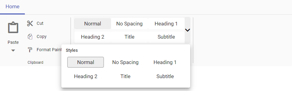
Group styling
You can use the cssClass property to customize the appearance of gallery groups.
@using Syncfusion.EJ2
@using Syncfusion.EJ2.Ribbon
@using Syncfusion.EJ2.Navigations

@{
    List<MenuItem> pasteOptions = new List<MenuItem>() { new MenuItem { Text = "Keep Source Format" }, new MenuItem { Text = "Merge format" }, new MenuItem { Text = "Keep text only" } };
}

<ejs-ribbon id="ribbon">
    <e-ribbon-tabs>
        <e-ribbon-tab header="Home">
            <e-ribbon-groups>
                <e-ribbon-group header="Clipboard" groupIconCss="e-icons e-paste">
                    <e-ribbon-collections>
                        <e-ribbon-collection>
                            <e-ribbon-items>
                                <e-ribbon-item type="SplitButton">
                                    <e-ribbon-splitButtonSettings iconCss="e-icons e-paste" content="Paste" items=pasteOptions></e-ribbon-splitButtonSettings>
                                </e-ribbon-item>
                            </e-ribbon-items>
                        </e-ribbon-collection>
                        <e-ribbon-collection>
                            <e-ribbon-items>
                                <e-ribbon-item type="Button">
                                    <e-ribbon-buttonsettings iconCss="e-icons e-cut" content="Cut"></e-ribbon-buttonsettings>
                                </e-ribbon-item>
                                <e-ribbon-item type="Button">
                                    <e-ribbon-buttonsettings iconCss="e-icons e-copy" content="Copy"></e-ribbon-buttonsettings>
                                </e-ribbon-item>
                                <e-ribbon-item type="Button">
                                    <e-ribbon-buttonsettings iconCss="e-icons e-format-painter" content="Format Painter"></e-ribbon-buttonsettings>
                                </e-ribbon-item>
                            </e-ribbon-items>
                        </e-ribbon-collection>
                    </e-ribbon-collections>
                </e-ribbon-group>
                <e-ribbon-group header="Gallery">
                    <e-ribbon-collections>
                        <e-ribbon-collection>
                            <e-ribbon-items>
                                <e-ribbon-item type="Gallery">
                                    <e-ribbon-gallerySettings>
                                        <e-ribbon-gallery-groups>
                                            <e-ribbon-gallery-group header="Styles" cssClass="custom-group">
                                                <e-ribbon-gallery-items>
                                                    <e-ribbon-gallery-item content="Normal"></e-ribbon-gallery-item>
                                                    <e-ribbon-gallery-item content="No Spacing"></e-ribbon-gallery-item>
                                                    <e-ribbon-gallery-item content="Heading 1"></e-ribbon-gallery-item>
                                                    <e-ribbon-gallery-item content="Heading 2"></e-ribbon-gallery-item>
                                                </e-ribbon-gallery-items>
                                            </e-ribbon-gallery-group>
                                        </e-ribbon-gallery-groups>
                                    </e-ribbon-gallerySettings>
                                </e-ribbon-item>
                            </e-ribbon-items>
                        </e-ribbon-collection>
                    </e-ribbon-collections>
                </e-ribbon-group>
            </e-ribbon-groups>
        </e-ribbon-tab>
    </e-ribbon-tabs>
</ejs-ribbon>

<style>
    .custom-group {
        font-style: italic;
    }
</style>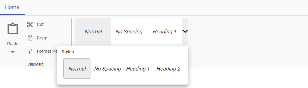
Setting item count
You can customize the number if items to be displayed in Ribbon gallery by using the itemCount property. By default the itemCount will be 3.
The following example showcases the utilization of the itemCount property, displaying a ribbon gallery with 4 items.
@using Syncfusion.EJ2
@using Syncfusion.EJ2.Ribbon
@using Syncfusion.EJ2.Navigations

@{
    List<MenuItem> pasteOptions = new List<MenuItem>() { new MenuItem { Text = "Keep Source Format" }, new MenuItem { Text = "Merge format" }, new MenuItem { Text = "Keep text only" } };
}

<ejs-ribbon id="ribbon">
    <e-ribbon-tabs>
        <e-ribbon-tab header="Home">
            <e-ribbon-groups>
                <e-ribbon-group header="Clipboard" groupIconCss="e-icons e-paste">
                    <e-ribbon-collections>
                        <e-ribbon-collection>
                            <e-ribbon-items>
                                <e-ribbon-item type="SplitButton">
                                    <e-ribbon-splitButtonSettings iconCss="e-icons e-paste" content="Paste" items=pasteOptions></e-ribbon-splitButtonSettings>
                                </e-ribbon-item>
                            </e-ribbon-items>
                        </e-ribbon-collection>
                        <e-ribbon-collection>
                            <e-ribbon-items>
                                <e-ribbon-item type="Button">
                                    <e-ribbon-buttonsettings iconCss="e-icons e-cut" content="Cut"></e-ribbon-buttonsettings>
                                </e-ribbon-item>
                                <e-ribbon-item type="Button">
                                    <e-ribbon-buttonsettings iconCss="e-icons e-copy" content="Copy"></e-ribbon-buttonsettings>
                                </e-ribbon-item>
                                <e-ribbon-item type="Button">
                                    <e-ribbon-buttonsettings iconCss="e-icons e-format-painter" content="Format Painter"></e-ribbon-buttonsettings>
                                </e-ribbon-item>
                            </e-ribbon-items>
                        </e-ribbon-collection>
                    </e-ribbon-collections>
                </e-ribbon-group>
                <e-ribbon-group header="Gallery">
                    <e-ribbon-collections>
                        <e-ribbon-collection>
                            <e-ribbon-items>
                                <e-ribbon-item type="Gallery">
                                    <e-ribbon-gallerySettings itemCount=4>
                                        <e-ribbon-gallery-groups>
                                            <e-ribbon-gallery-group header="Styles">
                                                <e-ribbon-gallery-items>
                                                    <e-ribbon-gallery-item content="Normal"></e-ribbon-gallery-item>
                                                    <e-ribbon-gallery-item content="No Spacing"></e-ribbon-gallery-item>
                                                    <e-ribbon-gallery-item content="Heading 1"></e-ribbon-gallery-item>
                                                    <e-ribbon-gallery-item content="Heading 2"></e-ribbon-gallery-item>
                                                </e-ribbon-gallery-items>
                                            </e-ribbon-gallery-group>
                                        </e-ribbon-gallery-groups>
                                    </e-ribbon-gallerySettings>
                                </e-ribbon-item>
                            </e-ribbon-items>
                        </e-ribbon-collection>
                    </e-ribbon-collections>
                </e-ribbon-group>
            </e-ribbon-groups>
        </e-ribbon-tab>
    </e-ribbon-tabs>
</ejs-ribbon>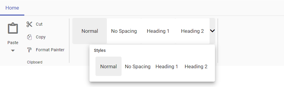
Setting selected item
You can use the selectedItemIndex property to define the currently selected item in the Ribbon gallery items.
@using Syncfusion.EJ2
@using Syncfusion.EJ2.Ribbon
@using Syncfusion.EJ2.Navigations

@{
    List<MenuItem> pasteOptions = new List<MenuItem>() { new MenuItem { Text = "Keep Source Format" }, new MenuItem { Text = "Merge format" }, new MenuItem { Text = "Keep text only" } };
}

<ejs-ribbon id="ribbon">
    <e-ribbon-tabs>
        <e-ribbon-tab header="Home">
            <e-ribbon-groups>
                <e-ribbon-group header="Clipboard" groupIconCss="e-icons e-paste">
                    <e-ribbon-collections>
                        <e-ribbon-collection>
                            <e-ribbon-items>
                                <e-ribbon-item type="SplitButton">
                                    <e-ribbon-splitButtonSettings iconCss="e-icons e-paste" content="Paste" items=pasteOptions></e-ribbon-splitButtonSettings>
                                </e-ribbon-item>
                            </e-ribbon-items>
                        </e-ribbon-collection>
                        <e-ribbon-collection>
                            <e-ribbon-items>
                                <e-ribbon-item type="Button">
                                    <e-ribbon-buttonsettings iconCss="e-icons e-cut" content="Cut"></e-ribbon-buttonsettings>
                                </e-ribbon-item>
                                <e-ribbon-item type="Button">
                                    <e-ribbon-buttonsettings iconCss="e-icons e-copy" content="Copy"></e-ribbon-buttonsettings>
                                </e-ribbon-item>
                                <e-ribbon-item type="Button">
                                    <e-ribbon-buttonsettings iconCss="e-icons e-format-painter" content="Format Painter"></e-ribbon-buttonsettings>
                                </e-ribbon-item>
                            </e-ribbon-items>
                        </e-ribbon-collection>
                    </e-ribbon-collections>
                </e-ribbon-group>
                <e-ribbon-group header="Gallery">
                    <e-ribbon-collections>
                        <e-ribbon-collection>
                            <e-ribbon-items>
                                <e-ribbon-item type="Gallery">
                                    <e-ribbon-gallerySettings selectedItemIndex=1>
                                        <e-ribbon-gallery-groups>
                                            <e-ribbon-gallery-group header="Styles">
                                                <e-ribbon-gallery-items>
                                                    <e-ribbon-gallery-item content="Normal"></e-ribbon-gallery-item>
                                                    <e-ribbon-gallery-item content="No Spacing"></e-ribbon-gallery-item>
                                                    <e-ribbon-gallery-item content="Heading 1"></e-ribbon-gallery-item>
                                                    <e-ribbon-gallery-item content="Heading 2"></e-ribbon-gallery-item>
                                                </e-ribbon-gallery-items>
                                            </e-ribbon-gallery-group>
                                        </e-ribbon-gallery-groups>
                                    </e-ribbon-gallerySettings>
                                </e-ribbon-item>
                            </e-ribbon-items>
                        </e-ribbon-collection>
                    </e-ribbon-collections>
                </e-ribbon-group>
            </e-ribbon-groups>
        </e-ribbon-tab>
    </e-ribbon-tabs>
</ejs-ribbon>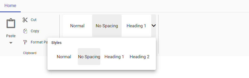
Setting popup height
You can specify the height of the gallery popup by using the popupHeight property.
Setting popup width
you can specify the width of the gallery popup by using the popupWidth propery.
The example demonstrates the customization of popup with popupHeight and popupWidth properties.
@using Syncfusion.EJ2
@using Syncfusion.EJ2.Ribbon
@using Syncfusion.EJ2.Navigations

@{
    List<MenuItem> pasteOptions = new List<MenuItem>() { new MenuItem { Text = "Keep Source Format" }, new MenuItem { Text = "Merge format" }, new MenuItem { Text = "Keep text only" } };
}

<ejs-ribbon id="ribbon">
    <e-ribbon-tabs>
        <e-ribbon-tab header="Home">
            <e-ribbon-groups>
                <e-ribbon-group header="Clipboard" groupIconCss="e-icons e-paste">
                    <e-ribbon-collections>
                        <e-ribbon-collection>
                            <e-ribbon-items>
                                <e-ribbon-item type="SplitButton">
                                    <e-ribbon-splitButtonSettings iconCss="e-icons e-paste" content="Paste" items=pasteOptions></e-ribbon-splitButtonSettings>
                                </e-ribbon-item>
                            </e-ribbon-items>
                        </e-ribbon-collection>
                        <e-ribbon-collection>
                            <e-ribbon-items>
                                <e-ribbon-item type="Button">
                                    <e-ribbon-buttonsettings iconCss="e-icons e-cut" content="Cut"></e-ribbon-buttonsettings>
                                </e-ribbon-item>
                                <e-ribbon-item type="Button">
                                    <e-ribbon-buttonsettings iconCss="e-icons e-copy" content="Copy"></e-ribbon-buttonsettings>
                                </e-ribbon-item>
                                <e-ribbon-item type="Button">
                                    <e-ribbon-buttonsettings iconCss="e-icons e-format-painter" content="Format Painter"></e-ribbon-buttonsettings>
                                </e-ribbon-item>
                            </e-ribbon-items>
                        </e-ribbon-collection>
                    </e-ribbon-collections>
                </e-ribbon-group>
                <e-ribbon-group header="Gallery">
                    <e-ribbon-collections>
                        <e-ribbon-collection>
                            <e-ribbon-items>
                                <e-ribbon-item type="Gallery">
                                    <e-ribbon-gallerySettings popupWidth="350" popupHeight="180">
                                        <e-ribbon-gallery-groups>
                                            <e-ribbon-gallery-group header="Styles">
                                                <e-ribbon-gallery-items>
                                                    <e-ribbon-gallery-item content="Normal"></e-ribbon-gallery-item>
                                                    <e-ribbon-gallery-item content="No Spacing"></e-ribbon-gallery-item>
                                                    <e-ribbon-gallery-item content="Heading 1"></e-ribbon-gallery-item>
                                                    <e-ribbon-gallery-item content="Heading 2"></e-ribbon-gallery-item>
                                                    <e-ribbon-gallery-item content="Title"></e-ribbon-gallery-item>
                                                    <e-ribbon-gallery-item content="Subtitle"></e-ribbon-gallery-item>
                                                </e-ribbon-gallery-items>
                                            </e-ribbon-gallery-group>
                                        </e-ribbon-gallery-groups>
                                    </e-ribbon-gallerySettings>
                                </e-ribbon-item>
                            </e-ribbon-items>
                        </e-ribbon-collection>
                    </e-ribbon-collections>
                </e-ribbon-group>
            </e-ribbon-groups>
        </e-ribbon-tab>
    </e-ribbon-tabs>
</ejs-ribbon>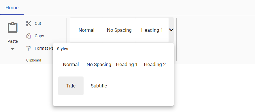
Template
You can customize the default appearance and content of Ribbon gallery items by using the template property.
Popup template
You can customize the appearance of Ribbon gallery popup by using the popupTemplate property.
The below example demonstrates the customization of both the template and popupTemplate properties:
@using Syncfusion.EJ2
@using Syncfusion.EJ2.Ribbon
@using Syncfusion.EJ2.Navigations

@{
    List<MenuItem> pasteOptions = new List<MenuItem>() { new MenuItem { Text = "Keep Source Format" }, new MenuItem { Text = "Merge format" }, new MenuItem { Text = "Keep text only" } };
}

<ejs-ribbon id="ribbon">
    <e-ribbon-tabs>
        <e-ribbon-tab header="Home">
            <e-ribbon-groups>
                <e-ribbon-group header="Clipboard" groupIconCss="e-icons e-paste">
                    <e-ribbon-collections>
                        <e-ribbon-collection>
                            <e-ribbon-items>
                                <e-ribbon-item type="SplitButton">
                                    <e-ribbon-splitButtonSettings iconCss="e-icons e-paste" content="Paste" items=pasteOptions></e-ribbon-splitButtonSettings>
                                </e-ribbon-item>
                            </e-ribbon-items>
                        </e-ribbon-collection>
                        <e-ribbon-collection>
                            <e-ribbon-items>
                                <e-ribbon-item type="Button">
                                    <e-ribbon-buttonsettings iconCss="e-icons e-cut" content="Cut"></e-ribbon-buttonsettings>
                                </e-ribbon-item>
                                <e-ribbon-item type="Button">
                                    <e-ribbon-buttonsettings iconCss="e-icons e-copy" content="Copy"></e-ribbon-buttonsettings>
                                </e-ribbon-item>
                                <e-ribbon-item type="Button">
                                    <e-ribbon-buttonsettings iconCss="e-icons e-format-painter" content="Format Painter"></e-ribbon-buttonsettings>
                                </e-ribbon-item>
                            </e-ribbon-items>
                        </e-ribbon-collection>
                    </e-ribbon-collections>
                </e-ribbon-group>
                <e-ribbon-group header="Table Styles">
                    <e-ribbon-collections>
                        <e-ribbon-collection>
                            <e-ribbon-items>
                                <e-ribbon-item type="Gallery">
                                    <e-ribbon-gallerySettings itemCount=7 template="#galleryTemplate" popupTemplate="#galleryTemplate">
                                        <e-ribbon-gallery-groups>
                                            <e-ribbon-gallery-group header="Plain Tables">
                                                <e-ribbon-gallery-items>
                                                    <e-ribbon-gallery-item cssClass="plainTables_item_1"></e-ribbon-gallery-item>
                                                    <e-ribbon-gallery-item cssClass="plainTables_item_2"></e-ribbon-gallery-item>
                                                    <e-ribbon-gallery-item cssClass="plainTables_item_3"></e-ribbon-gallery-item>
                                                    <e-ribbon-gallery-item cssClass="plainTables_item_4"></e-ribbon-gallery-item>
                                                    <e-ribbon-gallery-item cssClass="plainTables_item_5"></e-ribbon-gallery-item>
                                                    <e-ribbon-gallery-item cssClass="plainTables_item_6"></e-ribbon-gallery-item>
                                                    <e-ribbon-gallery-item cssClass="plainTables_item_7"></e-ribbon-gallery-item>
                                                </e-ribbon-gallery-items>
                                            </e-ribbon-gallery-group>
                                            <e-ribbon-gallery-group header="List Tables">
                                                <e-ribbon-gallery-items>
                                                    <e-ribbon-gallery-item cssClass="listTables_item_1"></e-ribbon-gallery-item>
                                                    <e-ribbon-gallery-item cssClass="listTables_item_2"></e-ribbon-gallery-item>
                                                    <e-ribbon-gallery-item cssClass="listTables_item_3"></e-ribbon-gallery-item>
                                                    <e-ribbon-gallery-item cssClass="listTables_item_4"></e-ribbon-gallery-item>
                                                    <e-ribbon-gallery-item cssClass="listTables_item_5"></e-ribbon-gallery-item>
                                                    <e-ribbon-gallery-item cssClass="listTables_item_6"></e-ribbon-gallery-item>
                                                    <e-ribbon-gallery-item cssClass="listTables_item_7"></e-ribbon-gallery-item>
                                                </e-ribbon-gallery-items>
                                            </e-ribbon-gallery-group>
                                        </e-ribbon-gallery-groups>
                                    </e-ribbon-gallerySettings>
                                </e-ribbon-item>
                            </e-ribbon-items>
                        </e-ribbon-collection>
                    </e-ribbon-collections>
                </e-ribbon-group>
                <e-ribbon-group header="Insert">
                    <e-ribbon-collections>
                        <e-ribbon-collection>
                            <e-ribbon-items>
                                <e-ribbon-item type="Button">
                                    <e-ribbon-buttonsettings iconCss="e-icons e-insert-above" content="Above"></e-ribbon-buttonsettings>
                                </e-ribbon-item>
                                <e-ribbon-item type="Button">
                                    <e-ribbon-buttonsettings iconCss="e-icons e-insert-below" content="Below"></e-ribbon-buttonsettings>
                                </e-ribbon-item>
                            </e-ribbon-items>
                        </e-ribbon-collection>
                        <e-ribbon-collection>
                            <e-ribbon-items>
                                <e-ribbon-item type="Button">
                                    <e-ribbon-buttonsettings iconCss="e-icons e-insert-left" content="Left"></e-ribbon-buttonsettings>
                                </e-ribbon-item>
                                <e-ribbon-item type="Button">
                                    <e-ribbon-buttonsettings iconCss="e-icons e-insert-right" content="Right"></e-ribbon-buttonsettings>
                                </e-ribbon-item>
                            </e-ribbon-items>
                        </e-ribbon-collection>
                    </e-ribbon-collections>
                </e-ribbon-group>
            </e-ribbon-groups>
        </e-ribbon-tab>
    </e-ribbon-tabs>
</ejs-ribbon>

<script type="text/x-jsrender" id="galleryTemplate">
    <div class="gallery-template ${items.cssClass}">
      <table class="gallery-table">
        <tbody>
          <tr class="row_one">
            <td class="tableContent">—</td>
            <td class="tableContent">—</td>
            <td class="tableContent">—</td>
            <td class="tableContent">—</td>
            <td class="tableContent">—</td>
          </tr>
          <tr class="row_two">
            <td class="tableContent">—</td>
            <td class="tableContent">—</td>
            <td class="tableContent">—</td>
            <td class="tableContent">—</td>
            <td class="tableContent">—</td>
          </tr>
          <tr class="row_three">
            <td class="tableContent">—</td>
            <td class="tableContent">—</td>
            <td class="tableContent">—</td>
            <td class="tableContent">—</td>
            <td class="tableContent">—</td>
          </tr>
        </tbody>
      </table>
    </div>
</script>

<style>

    /* plain table styles */
    .plainTables_item_1 .tableContent {
        border: 1px solid black;
    }

    .plainTables_item_2 .tableContent,
    .plainTables_item_3 .tableContent {
        border: 1px solid #c1c1c1;
    }

    .plainTables_item_4 .row_one .tableContent {
        border-top: 1px solid black;
        border-bottom: 1px solid black;
    }

    .plainTables_item_4 .row_three .tableContent {
        border-bottom: 1px solid black;
    }

    .plainTables_item_5 .row_one .tableContent {
        border-bottom: 1px solid black;
    }

    .plainTables_item_5 .row_one .tableContent,
    .plainTables_item_7 .row_one .tableContent {
        border-bottom: 1px solid black;
    }

    .plainTables_item_5 .row_two .tableContent:first-child,
    .plainTables_item_5 .row_three .tableContent:first-child,
    .plainTables_item_7 .row_two .tableContent:first-child,
    .plainTables_item_7 .row_three .tableContent:first-child {
        border-right: 1px solid black;
    }

    /* list table styles */

    .listTables_item_1 .row_one .tableContent {
        border-bottom: 1px solid #83caeb;
    }

    .listTables_item_2 .row_one .tableContent,
    .listTables_item_2 .row_two .tableContent,
    .listTables_item_2 .row_three .tableContent {
        border-bottom: 1px solid #83caeb;
        border-top: 1px solid #83caeb;
    }

    .listTables_item_3 .row_one .tableContent {
        border-top: 1px solid #156082;
        border-bottom: 1px solid #156082;
        background-color: #156082;
        color: white;
    }

    .listTables_item_3 .row_three .tableContent {
        border-bottom: 1px solid #156082;
    }

    .listTables_item_5 .row_one .tableContent,
    .listTables_item_7 .row_one .tableContent {
        border-bottom: 1px solid white;
    }

    .listTables_item_5 .row_two .tableContent:first-child,
    .listTables_item_5 .row_three .tableContent:first-child,
    .listTables_item_7 .row_two .tableContent:first-child,
    .listTables_item_7 .row_three .tableContent:first-child {
        border-right: 1px solid white;
    }

    .listTables_item_5 .tableContent {
        background-color: #156082;
        color: white;
    }

    .listTables_item_7 .row_one .tableContent {
        border-bottom: 1px solid black;
    }

    .listTables_item_7 .row_two .tableContent:first-child,
    .listTables_item_7 .row_three .tableContent:first-child {
        border-right: 1px solid black;
    }

    .listTables_item_4 .row_one .tableContent {
        border-top: 1px solid #156082;
        border-bottom: 1px solid #156082;
    }

    .listTables_item_4 .row_three .tableContent {
        border-bottom: 1px solid #156082;
    }

    .gallery-table {
        border-collapse: collapse;
        line-height: 14px;
    }
</style>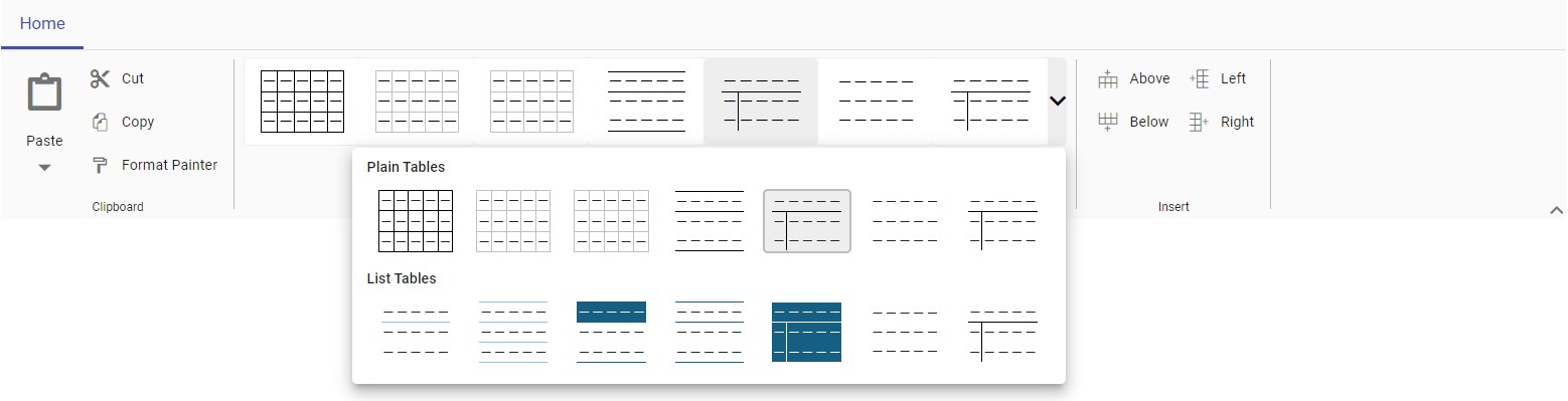
To know more about the built-in Ribbon items, please refer to the Ribbon Items section.