Scroll Settings in React Diagram Component
3 Jun 202624 minutes to read
The diagram component provides comprehensive scrolling capabilities through both vertical and horizontal scrollbars, as well as mouse wheel navigation. The diagram’s scrollSettings enable developers to monitor the current scroll status, viewport dimensions, zoom levels, and programmatically control diagram navigation. These settings are essential for managing large diagrams and providing smooth user interaction experiences.
Access and Customize Scroll Settings
Scroll settings in a diagram provide access to various properties that control navigation and viewport behavior, including horizontalOffset, verticalOffset, viewPortWidth, viewPortHeight, currentZoom, zoomFactor, maxZoom, minZoom, scrollLimit, canAutoScroll, autoScrollBorder, padding, scrollableArea.
These properties enable developers to read and adjust the scroll status, scroll offsets, zoom levels, and scrolling behavior. For a comprehensive overview of all available properties, refer to the Scroll Settings
Define Scroll Offset
The diagram allows developers to set the initial scroll position before loading, ensuring that any desired region of a large diagram is immediately visible. The initial scroll position can be programmatically configured using the horizontalOffset and verticalOffset properties of the scroll settings. The following code illustrates how to programmatically set the diagram’s initial scroll position upon initialization, with scrollLimit defined as ‘Infinity’ to enable infinite scrolling. To learn more about scroll limits, refer to the scrollLimit
In the example below, the vertical scrollbar is scrolled down by 100 px, and the horizontal scrollbar is scrolled to the right by 100 px.
import * as React from "react";
import * as ReactDOM from "react-dom";
import { DiagramComponent } from "@syncfusion/ej2-react-diagrams";
//Sets scroll status
let diagramInstance;
function App() {
    return (<DiagramComponent id="container" ref={(diagram) => (diagramInstance = diagram)} width={700} height={700} rulerSettings= scrollSettings=
        created={() => {
            diagramInstance.scrollSettings.horizontalOffset = 100;
            diagramInstance.scrollSettings.verticalOffset = 100;
            diagramInstance.dataBind();
        }}/>);
}
const root = ReactDOM.createRoot(document.getElementById('diagram'));
root.render(<App />);
import * as React from "react";
import * as ReactDOM from "react-dom";
import {
DiagramComponent
} from "@syncfusion/ej2-react-diagrams";
//Sets scroll status
let diagramInstance: DiagramComponent;
function App() {
return (
<DiagramComponent
id="container"
ref={(diagram) => (diagramInstance = diagram)}
width={700}
height={700}
rulerSettings=
scrollSettings=
created={() => {
diagramInstance.scrollSettings.horizontalOffset = 100;
diagramInstance.scrollSettings.verticalOffset = 100;
diagramInstance.dataBind();
}}
/>
);
}
const root = ReactDOM.createRoot(document.getElementById('diagram'));
root.render(<App />);Update Scroll Offset at Runtime
The diagram provides multiple methods to update scroll offsets during runtime:
- Scrollbar: Use the horizontal and vertical scrollbars of the diagram for direct navigation.
- Mouse wheel: Scroll vertically with the mouse wheel. Hold the Shift key while scrolling to scroll horizontally.
-
Pan Tool: Activate the ZoomPan
toolin the diagram to scroll by panning. - Touch: Use touch pad gestures for smooth scrolling on touch-enabled devices.
Programmatically Update Scroll Offset
The scroll offsets of the diagram can be programmatically modified by customizing the horizontalOffset and verticalOffset of Scroll Settings at runtime. The following code demonstrates how to change the scroll offsets dynamically.
import * as React from "react";
import * as ReactDOM from "react-dom";
import { DiagramComponent } from "@syncfusion/ej2-react-diagrams";
let diagramInstance;
let node = [{
    offsetX: 300,
    offsetY: 300
}]
function App() {
    const updateOffset = () => {
        diagramInstance.scrollSettings.horizontalOffset = 200;
        diagramInstance.scrollSettings.verticalOffset = 100;
        diagramInstance.dataBind();
    };
    return (
    <div>
        <button id="updateOffset" onClick={updateOffset}>Update Scroller Offset</button>
        <DiagramComponent id="container" ref={(diagram) => (diagramInstance = diagram)} width={700} height={700} nodes={node} rulerSettings= scrollSettings=/>
    </div>);
}
const root = ReactDOM.createRoot(document.getElementById('diagram'));
root.render(<App />);
import * as React from "react";
import * as ReactDOM from "react-dom";
import {
NodeModel,
DiagramComponent
} from "@syncfusion/ej2-react-diagrams";
let diagramInstance: DiagramComponent;
let node: NodeModel[] = [{
offsetX: 300,
offsetY: 300,
}];
function App() {
const updateOffset = () => {
diagramInstance.scrollSettings.horizontalOffset = 200;
diagramInstance.scrollSettings.verticalOffset = 100;
diagramInstance.dataBind();
};
return (
<div>
<button id="updateOffset" onClick={updateOffset}>Update Scroller Offset</button>
<DiagramComponent
id="container"
ref={(diagram) => (diagramInstance = diagram)}
width={700}
height={700}
nodes={node}
rulerSettings=
scrollSettings=
/>
</div>
);
}
const root = ReactDOM.createRoot(document.getElementById('diagram'));
root.render(<App />);Update Zoom at Runtime
Zoom Using Mouse Wheel
The mouse wheel provides a convenient method to zoom in and out of the diagram quickly without requiring additional tools or gestures.
-
Zoom in: Press Ctrl+mouse wheel, then scroll upward.
-
Zoom out: Press Ctrl+mouse wheel, then scroll downward.
Zoom Using Keyboard Shortcuts
Keyboard shortcuts offer a quick and efficient way to zoom the diagram without using the mouse or touch pad.
-
Zoom in: Press Ctrl and the plus (+) key.
-
Zoom out: Press Ctrl and the minus (-) key.
Programmatically Update Zoom
The current zoom level of the diagram can be programmatically modified by utilizing the zoomTo public method.
ZoomOptions
The zoomTo method takes one parameter zoomOptions. In that zoomOptions we can specify the focusPoint, type and zoomFactor
The following example demonstrates how to zoom in and zoom out of the diagram using the zoomTo method:
import * as React from "react";
import * as ReactDOM from "react-dom";
import { DiagramComponent } from "@syncfusion/ej2-react-diagrams";
let diagramInstance;
let node = [{
    offsetX: 300,
    offsetY: 300
}]
function App() {
    const zoomIn = () => {
        let zoomOptions = {
            type: 'ZoomIn',
            zoomFactor: 0.2,
            focusPoint: { x: 0.5, y: 0.5 },
        };
        diagramInstance.zoomTo(zoomOptions);
        diagramInstance.dataBind();
    };
    const zoomOut = () => {
        let zoomOptions = {
            type: 'ZoomOut',
            zoomFactor: 0.2,
            focusPoint: { x: 0.5, y: 0.5 },
        };
        diagramInstance.zoomTo(zoomOptions);
        diagramInstance.dataBind();
    };
    return (
    <div>
        <button id="zoomIn" onClick={zoomIn}>Zoom In</button>
        <button id="zoomOut" onClick={zoomOut}>Zoom Out</button>
        <DiagramComponent id="container" ref={(diagram) => (diagramInstance = diagram)} width={700} height={700} nodes={node} rulerSettings= scrollSettings=/>
    </div>);
}
const root = ReactDOM.createRoot(document.getElementById('diagram'));
root.render(<App />);
import * as React from "react";
import * as ReactDOM from "react-dom";
import {
NodeModel,
DiagramComponent,
ZoomOptions
} from "@syncfusion/ej2-react-diagrams";
let diagramInstance: DiagramComponent;
let node: NodeModel[] = [{
offsetX: 300,
offsetY: 300,
}];
function App() {
const zoomIn = () => {
let zoomOptions: ZoomOptions = {
type: 'ZoomIn',
zoomFactor: 0.2,
focusPoint: { x: 0.5, y: 0.5 },
};
diagramInstance.zoomTo(zoomOptions);
diagramInstance.dataBind();
};
const zoomOut = () => {
let zoomOptions: ZoomOptions = {
type: 'ZoomOut',
zoomFactor: 0.2,
focusPoint: { x: 0.5, y: 0.5 },
};
diagramInstance.zoomTo(zoomOptions);
diagramInstance.dataBind();
};
return (
<div>
<button id="zoomIn" onClick={zoomIn}>Zoom In</button>
<button id="zoomOut" onClick={zoomOut}>Zoom Out</button>
<DiagramComponent
id="container"
ref={(diagram) => (diagramInstance = diagram)}
width={700}
height={700}
nodes={node}
rulerSettings=
scrollSettings=
/>
</div>
);
}
const root = ReactDOM.createRoot(document.getElementById('diagram'));
root.render(<App />);For more information on various ways to zoom and pan the diagram, refer to zoomPan with various ways
AutoScroll
The autoscroll feature automatically scrolls the diagram when a node or connector is moved beyond the visible boundary. This functionality ensures that elements remain visible during operations such as dragging, resizing, and selection, providing a seamless user experience.
The autoscroll behavior activates automatically when any of the following actions occur near the edges of the diagram:
- Node dragging or resizing operations.
- Connector control point editing.
- Rubber band selection.
The client-side event ScrollChange is triggered when autoscroll occurs, enabling custom behavior implementation. Refer to the scrollChange-event for more information.
Autoscroll behavior can be enabled or disabled using the canAutoScroll property of the diagram.
Autoscroll border
The autoscroll border defines the maximum distance from the mouse pointer to the diagram edge that triggers autoscroll behavior. By default, this distance is set to 15 pixels for all sides (left, right, top, and bottom). This distance can be customized using the autoScrollBorder property of the scroll settings.
The following example demonstrates how to configure autoscroll:
import * as React from "react";
import * as ReactDOM from "react-dom";
import { DiagramComponent, ConnectorConstraints, ConnectorEditing, Inject  } from "@syncfusion/ej2-react-diagrams";

let connector = [
    {
      id: 'connetor',
      type: 'Bezier',
      segments: [{ type: 'Bezier', point: { x: 150, y: 100 } }],
      sourcePoint: { x: 100, y: 100 },
      targetPoint: { x: 300, y: 100 },
      annotations: [
        {
          content: 'Adjust control point or end point to autoScroll',
          alignment: 'After',
        },
      ],
      constraints:
        ConnectorConstraints.Default | ConnectorConstraints.DragSegmentThumb,
    },
  ];
let nodes = [{
    id: 'node1',
    width: 100,
    height: 60,
    offsetX: 200,
    offsetY: 300,
    annotations: [
      { content: 'Drag or resize the node to activate autoscroll' },
    ],
  }];
const scrollSettings = {
    scrollLimit: 'Infinity',
    canAutoScroll: true,
    autoScrollBorder: {
        left: 100,
        right: 100,
        top: 100,
        bottom: 100
    }
};
function App() {
    return (<DiagramComponent id="container" width={'100%'} height={'600px'} nodes={nodes} connectors={connector} rulerSettings=
    scrollSettings={scrollSettings}>
    <Inject services={[ConnectorEditing]}/>
    </DiagramComponent>);
}
const root = ReactDOM.createRoot(document.getElementById('diagram'));
root.render(<App />);
import * as React from "react";
import * as ReactDOM from "react-dom";
import {
NodeModel,
ConnectorModel,
DiagramComponent,
ConnectorConstraints,
ConnectorEditing,
Inject
} from "@syncfusion/ej2-react-diagrams";
let connector: ConnectorModel[] = [
{
id: 'connetor',
type: 'Bezier',
segments: [{ type: 'Bezier', point: { x: 150, y: 100 } }],
sourcePoint: { x: 100, y: 100 },
targetPoint: { x: 300, y: 100 },
annotations: [
{
content: 'Adjust control point or end point to autoScroll',
alignment: 'After',
},
],
constraints:
ConnectorConstraints.Default | ConnectorConstraints.DragSegmentThumb,
},
];
let nodes: NodeModel[] = [{
id: 'node1',
width: 100,
height: 60,
offsetX: 200,
offsetY: 300,
annotations: [
{ content: 'Drag or resize the node to activate autoscroll' },
],
}];
const scrollSettings = {
scrollLimit: 'Infinity',
canAutoScroll: true,
autoScrollBorder: {
left: 100,
right: 100,
top: 100,
bottom: 100
}
};
function App() {
return (
<DiagramComponent
id="container"
width={'100%'}
height={'600px'}
nodes={nodes}
connectors={connector}
rulerSettings=
// set the autoScrollBorder
scrollSettings = {scrollSettings}>
<Inject services={[ConnectorEditing]}/>
</DiagramComponent>
);
}
const root = ReactDOM.createRoot(document.getElementById('diagram'));
root.render(<App />);NOTE
To use auto scroll the scrollLimit should be set as ‘Infinity’
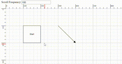
Controlling Autoscroll Speed
The frequency of automatic scrolling in the Diagram component during autoscroll behavior can be precisely controlled. The scrolling frequency can be adjusted from slow and smooth to quick and rapid to suit different requirements. Configure this by setting a value in milliseconds to the autoScrollFrequency property within the scrollSettings, allowing precise control over autoscroll timing.
Scroll limit
The scrollLimit allows you to define the scrollable region of the diagram. It includes the following options:
- Infinity: Allows scrolling in all directions without any restriction.
- Diagram: Allows scrolling within the diagram region only.
- Limited: Allows scrolling within a specified scrollable area.
The scrollLimit property in scroll settings helps to define these scrolling boundaries.
Scrollable Area
Scrolling beyond a particular rectangular area can be restricted by using the scrollableArea property in scrollSettings. To restrict scrolling beyond a custom region, set the scrollLimit to “limited” and define the desired bounds in scrollableArea property.
The following code example illustrates how to specify the scroll limit and customize the scrollable area.
import * as React from "react";
import * as ReactDOM from "react-dom";
import { Rect, DiagramComponent } from "@syncfusion/ej2-react-diagrams";
let diagramInstance;
let nodes = [{
        id: 'Start',
        width: 140,
        height: 50,
        offsetX: 300,
        offsetY: 50,
        annotations: [{
                id: 'label1',
                content: 'Start'
            }],
        shape: {
            type: 'Flow',
            shape: 'Terminator'
        }
    }];
function App() {
    const scrollableArea = (args) => {
        diagramInstance.scrollSettings.scrollLimit = args.target.value;
        diagramInstance.dataBind();
    };
    return (
    <div>
        <label>Scrollable Area</label>
        <select id="scrollLimit" onChange={scrollableArea}>
        <option value="Limited">Limited</option>
        <option value="Infinity">Infinity</option>
        <option value="Diagram">Diagram</option>
        </select>
        <DiagramComponent id="container" ref={(diagram) => (diagramInstance = diagram)} width={'100%'} height={'600px'} nodes={nodes} rulerSettings= scrollSettings=/>
    </div>);
}
const root = ReactDOM.createRoot(document.getElementById('diagram'));
root.render(<App />);
import * as React from "react";
import * as ReactDOM from "react-dom";
import {
NodeModel,
ConnectorModel,
Rect,
DiagramComponent
} from "@syncfusion/ej2-react-diagrams";
let diagramInstance: DiagramComponent;
let nodes: NodeModel[] = [{
id: 'Start',
width: 140,
height: 50,
offsetX: 300,
offsetY: 50,
annotations: [{
id: 'label1',
content: 'Start'
}],
shape: {
type: 'Flow',
shape: 'Terminator'
}
}];
function App() {
const scrollableArea = (args: any) => {
diagramInstance.scrollSettings.scrollLimit = args.target.value;
diagramInstance.dataBind();
};
return (
<div>
<label>Scrollable Area</label>
<select id="scrollLimit" onChange={scrollableArea}>
<option value="Limited">Limited</option>
<option value="Infinity">Infinity</option>
<option value="Diagram">Diagram</option>
</select>
<DiagramComponent
id="container"
ref={(diagram) => (diagramInstance = diagram)}
width={'100%'}
height={'600px'}
nodes={nodes}
rulerSettings=
scrollSettings=
/>
</div>
);
}
const root = ReactDOM.createRoot(document.getElementById('diagram'));
root.render(<App />);Scroll Padding
The padding property of the scroll settings allows you to extend the scrollable region based on the scroll limit. This property is useful for adding extra space around the diagram content, making it easier to navigate and interact with elements near the edges.
The following code example illustrates how to set scroll padding for the diagram region:
import * as React from "react";
import * as ReactDOM from "react-dom";
import { DiagramComponent } from "@syncfusion/ej2-react-diagrams";
let nodes = [{
        id: 'node',
        width: 100, height: 100,
        offsetX: 350, offsetY: 350,
    }];

const scrollSettings = {
    //Sets the scroll padding
    padding: { left: 100, top: 100 }
};

function App() {
    return (<DiagramComponent id="container" width={'100%'} height={'600px'} nodes={nodes} rulerSettings= scrollSettings={scrollSettings}/>);
}
const root = ReactDOM.createRoot(document.getElementById('diagram'));
root.render(<App />);
import * as React from "react";
import * as ReactDOM from "react-dom";
import {
NodeModel,
DiagramComponent
} from "@syncfusion/ej2-react-diagrams";
let nodes: NodeModel[] = [{
id: 'node',
width: 100, height: 100,
offsetX: 350, offsetY: 350,
}];
const scrollSettings = {
//Sets the scroll padding
padding: { left: 100, top: 100 }
};
function App() {
return (
<DiagramComponent
id="container"
width={'100%'}
height={'600px'}
nodes={nodes}
rulerSettings=
scrollSettings={scrollSettings}
/>
);
}
const root = ReactDOM.createRoot(document.getElementById('diagram'));
root.render(<App />);Reset scroll
The reset method resets both the zoom level and scroller offsets to their default values. This is useful for returning the diagram to its initial state after user interactions.
//Resets the scroll and zoom to default values
diagramInstance.reset();
Update Viewport Dimensions
The updateViewPort method is used to update the dimensions of the diagram viewport. This method is typically called when the diagram container size changes or when dynamic resizing is required.
//Updates diagram viewport
diagramInstance.updateViewPort();
Events
Scroll Change Event
The scrollChange event is triggered whenever the scrollbar is updated. This can occur during actions such as zooming in, zooming out, using the mouse wheel, or panning. The following example shows how to capture the scrollChange event.
import * as React from "react";
import * as ReactDOM from "react-dom";
import { DiagramComponent, DiagramTools } from "@syncfusion/ej2-react-diagrams";
let nodes = [{
        id: 'Start',
        width: 140,
        height: 50,
        offsetX: 300,
        offsetY: 50,
        annotations: [{
            id: 'label1',
            content: 'Rectangle'
        }],
    }];
let tool = DiagramTools.ZoomPan;
function App() {
    const scrollChange= (args) => {
        console.log(args.panState);
        //Handle scrollChange event for custom logic
      };
    return (<DiagramComponent id="container" width={'100%'} height={'600px'} tool={tool} nodes={nodes} scrollSettings=
        scrollChange={scrollChange} />);
}
const root = ReactDOM.createRoot(document.getElementById('diagram'));
root.render(<App />);
import * as React from "react";
import * as ReactDOM from "react-dom";
import {
NodeModel,
DiagramComponent,
DiagramTools,
IScrollChangeEventArgs
} from "@syncfusion/ej2-react-diagrams";
let nodes: NodeModel[] = [{
id: 'Start',
width: 140,
height: 50,
offsetX: 300,
offsetY: 50,
annotations: [{
id: 'label1',
content: 'Rectangle'
}],
}];
let tool: DiagramTools = DiagramTools.ZoomPan;
function App() {
const scrollChange= (args: IScrollChangeEventArgs) => {
console.log(args.panState);
//Handle scrollChange event for custom logic
};
return (
<DiagramComponent
id="container"
width={'100%'}
height={'600px'}
tool={tool}
nodes={nodes}
scrollSettings=
scrollChange={scrollChange}
/>
);
}
const root = ReactDOM.createRoot(document.getElementById('diagram'));
root.render(<App />);