Grid Lines in EJ2 React Diagram Component
3 Jun 202624 minutes to read
Gridlines are crisscross lines drawn in diagram pages like the lines on traditional graph paper. They help position diagram elements precisely on the diagram page and provide visual reference points for accurate layout design.
Prerequisites
To use gridlines and snapping functionality, ensure that the snapping module is injected into the diagram component.
The snapSettings property is used to customize the gridlines and control the snapping behavior in the diagram.
Customize the Gridlines Visibility
The snapConstraints enables you to show/hide the gridlines. The following code example illustrates how to show the gridlines.
import * as React from "react";
import * as ReactDOM from "react-dom";
import { Diagram, DiagramComponent, SnapConstraints, Snapping } from "@syncfusion/ej2-react-diagrams";
Diagram.Inject(Snapping);
// Display both Horizontal and Vertical gridlines
let snapSettings = {
    constraints: SnapConstraints.ShowLines,
};
// initialize Diagram component
function App() {
    return (<DiagramComponent id="container" width={'100%'} height={'600px'}
    snapSettings={snapSettings}/>);
}
const root = ReactDOM.createRoot(document.getElementById('diagram'));
root.render(<App />);
import * as React from "react";
import * as ReactDOM from "react-dom";
import {
DiagramComponent,
SnapSettingsModel,
SnapConstraints,
} from "@syncfusion/ej2-react-diagrams";
// Display both Horizontal and Vertical gridlines
let snapSettings: SnapSettingsModel = {
constraints: SnapConstraints.ShowLines,
};
// initialize Diagram component
function App() {
return (
<DiagramComponent
id="container"
width={'100%'}
height={'600px'}
snapSettings={snapSettings}
// render initialized Diagram
/>
);
}
const root = ReactDOM.createRoot(document.getElementById('diagram'));
root.render(<App />);NOTE
If you want to enable snapping, then inject snapping module into the diagram.
To show only horizontal/vertical gridlines or to hide gridlines, refer to Constraints.
Appearance
The appearance of the gridlines can be customized using a set of predefined properties to match your application’s design requirements.
-
The
horizontalGridLinesand theverticalGridLinesproperties allow you to customize the appearance of the horizontal and vertical gridlines respectively. -
The horizontal gridlines
lineColorandlineDashArrayproperties are used to customizes the line color and line style of the horizontal gridlines. -
The vertical gridlines
lineColorandlineDashArrayproperties are used to customizes the line color and line style of the vertical gridlines.
The following code example illustrates how to customize the appearance of gridlines.
import * as React from "react";
import * as ReactDOM from "react-dom";
import { Diagram, DiagramComponent, SnapConstraints, Snapping } from "@syncfusion/ej2-react-diagrams";
Diagram.Inject(Snapping);
let snapSettings = {
    // Define the Constraints for gridlines and snapping
    constraints: SnapConstraints.ShowLines,
    horizontalGridlines: {
      // Sets the line color of gridlines
      lineColor: "blue",
      // Defines the lineDashArray of gridlines
      lineDashArray: '2 2'
    },
    verticalGridlines: {
      // Sets the line color of gridlines
      lineColor: "blue",
      // Defines the lineDashArray of gridlines
      lineDashArray: '2 2'
    }
};
// initialize Diagram component
function App() {
    return (<DiagramComponent id="container" width={'100%'} height={'600px'}
    // Define the snap setting for the diagram
    snapSettings={snapSettings}/>);
}
const root = ReactDOM.createRoot(document.getElementById('diagram'));
root.render(<App />);
import * as React from "react";
import * as ReactDOM from "react-dom";
import {
Diagram,
DiagramComponent,
SnapSettingsModel,
SnapConstraints,
Snapping,
} from "@syncfusion/ej2-react-diagrams";
// Defines the Gridlines for SnapSettings
Diagram.Inject(Snapping);
let snapSettings: SnapSettingsModel = {
// Define the Constraints for gridlines and snapping
constraints: SnapConstraints.ShowLines,
horizontalGridlines: {
// Sets the line color of gridlines
lineColor: "blue",
// Defines the lineDashArray of gridlines
lineDashArray: '2 2'
},
verticalGridlines: {
// Sets the line color of gridlines
lineColor: "blue",
// Defines the lineDashArray of gridlines
lineDashArray: '2 2'
}
};
// initialize Diagram component
function App() {
return (
<DiagramComponent
id="container"
width={'100%'}
height={'600px'}
// Define the snap setting for the diagram
snapSettings={snapSettings}
// render initialized Diagram
/>
);
}
const root = ReactDOM.createRoot(document.getElementById('diagram'));
root.render(<App />);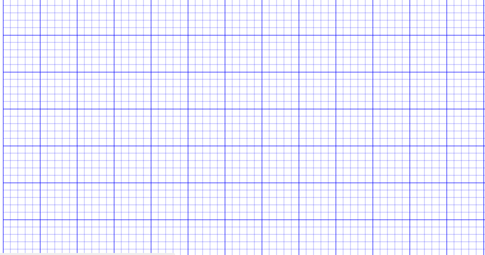
Line Intervals
The thickness and spacing between gridlines can be customized using the horizontal gridlines’s linesInterval and vertical gridlines’s linesInterval properties. In the lines interval collections, values at the odd places are referred as the thickness of lines and values at the even places are referred as the space between gridlines.
The following code example illustrates how to customize the thickness of lines and the line intervals.
import * as React from "react";
import * as ReactDOM from "react-dom";
import { Diagram, DiagramComponent, SnapConstraints, Snapping } from "@syncfusion/ej2-react-diagrams";
Diagram.Inject(Snapping);
let snapSettings = {
    constraints: SnapConstraints.ShowLines,
    horizontalGridlines: {
        // Sets the lineIntervals of Gridlines
        lineIntervals: [1.25, 10, 0.25, 10, 0.25, 10, 0.25, 10, 0.25, 10],
        lineColor: 'black',
      },
    verticalGridlines:  {
        // Sets the lineIntervals of Gridlines
        lineIntervals: [1.25, 10, 0.25, 10, 0.25, 10, 0.25, 10, 0.25, 10],
        lineColor: 'black',
      }
};

// initialize Diagram component
function App() {
    return (<DiagramComponent id="container" width={'100%'} height={'600px'}
     snapSettings={snapSettings}/>);
}
const root = ReactDOM.createRoot(document.getElementById('diagram'));
root.render(<App />);
import * as React from "react";
import * as ReactDOM from "react-dom";
import {
Diagram,
DiagramComponent,
SnapSettingsModel,
SnapConstraints,
Snapping,
} from "@syncfusion/ej2-react-diagrams";
Diagram.Inject(Snapping);
let snapSettings: SnapSettingsModel = {
constraints: SnapConstraints.ShowLines,
horizontalGridlines: {
// Sets the lineIntervals of Gridlines
lineIntervals: [1.25, 10, 0.25, 10, 0.25, 10, 0.25, 10, 0.25, 10],
lineColor: 'black',
},
verticalGridlines: {
// Sets the lineIntervals of Gridlines
lineIntervals: [1.25, 10, 0.25, 10, 0.25, 10, 0.25, 10, 0.25, 10],
lineColor: 'black',
}
};
// initialize Diagram component
function App() {
return (<DiagramComponent id="container" width={'100%'} height={'600px'}
snapSettings={snapSettings}/>);
}
const root = ReactDOM.createRoot(document.getElementById('diagram'));
root.render(<App />);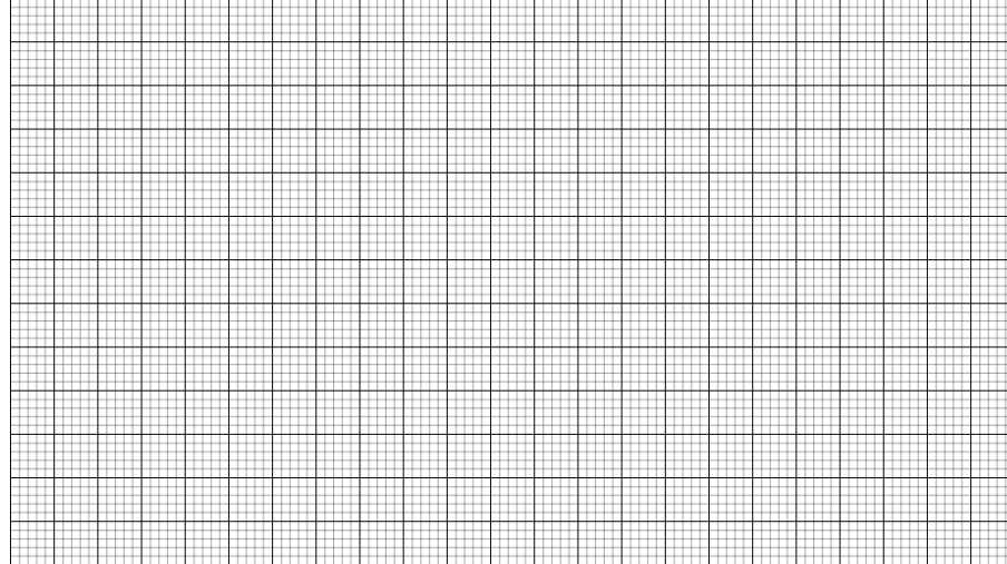
Dot Grid Patterns
The appearance of the grid lines can be changed into dots by setting the gridType of snapSettings as Dots. By default, the grid type is Lines.Dot patterns can be particularly useful for creating a less intrusive visual guide while maintaining alignment functionality.
The following code illustrates how to render grid patterns as dots.
import * as React from "react";
import * as ReactDOM from "react-dom";
import { Diagram, DiagramComponent, SnapConstraints, Snapping } from "@syncfusion/ej2-react-diagrams";
Diagram.Inject(Snapping);

let snapSettings = {
    constraints: SnapConstraints.ShowLines,
    //set gridtype as dot
    gridType: 'Dots',
    horizontalGridlines:{
        // Sets the line color of gridlines
        lineColor: 'blue',
        // Defines the dot intervals of gridlines
        dotIntervals: [3, 20, 1, 20, 1, 20, 1, 20, 1, 20],
      },
    // Defines the verticalGridlines for SnapSettings
    verticalGridlines: {
        // Defines the dot intervals of gridlines
        dotIntervals: [3, 20, 1, 20, 1, 20],
        // Sets the line color of gridlines
        lineColor: 'blue',
      },

};

// initialize Diagram component
function App() {
    return (<DiagramComponent id="container" width={'100%'} height={'600px'}
     snapSettings={snapSettings}/>);
}
const root = ReactDOM.createRoot(document.getElementById('diagram'));
root.render(<App />);
import * as React from "react";
import * as ReactDOM from "react-dom";
import { Diagram, DiagramComponent, SnapConstraints, Snapping,SnapSettingsModel } from "@syncfusion/ej2-react-diagrams";
Diagram.Inject(Snapping);
let snapSettings: SnapSettingsModel = {
constraints: SnapConstraints.ShowLines,
//set gridtype as dot
gridType: 'Dots',
horizontalGridlines:{
// Sets the line color of gridlines
lineColor: 'blue',
// Defines the dot intervals of gridlines
dotIntervals: [3, 20, 1, 20, 1, 20, 1, 20, 1, 20],
},
// Defines the verticalGridlines for SnapSettings
verticalGridlines: {
// Defines the dot intervals of gridlines
dotIntervals: [3, 20, 1, 20, 1, 20],
// Sets the line color of gridlines
lineColor: 'blue',
},
};
// initialize Diagram component
function App() {
return (<DiagramComponent id="container" width={'100%'} height={'600px'}
snapSettings={snapSettings}/>);
}
const root = ReactDOM.createRoot(document.getElementById('diagram'));
root.render(<App />);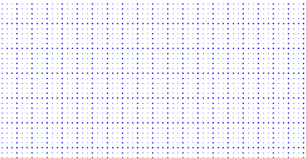
Snapping
Snapping functionality works in conjunction with gridlines to provide precise alignment capabilities. When you draw, resize, or move a diagram element on the page, you can set it to align or snap to the nearest intersection, regardless of whether the grid is visible.
Snap to Lines
This feature allows diagram objects to snap to the nearest intersection of gridlines while being dragged or resized, facilitating easier alignment during layout or design.
Snapping to gridlines can be enabled or disabled using the snapConstraints property of the SnapSettings class. The default value is All.
import * as React from "react";
import * as ReactDOM from "react-dom";
import { Diagram, DiagramComponent, SnapConstraints, Snapping } from "@syncfusion/ej2-react-diagrams";
Diagram.Inject(Snapping);
let snapSettings = {
    // Enables the object to snap with both horizontal and Vertical gridlines
    constraints: SnapConstraints.SnapToLines | SnapConstraints.ShowLines
};
// A node is created and stored in nodes array.
let node = [{
        // Position of the node
        offsetX: 250,
        offsetY: 250,
        // Size of the node
        width: 100,
        height: 100,
        style: {
            fill: '#6BA5D7',
            strokeColor: 'white'
        },
    }];
// initialize Diagram component
function App() {
    return (<DiagramComponent id="container" width={'100%'} height={'600px'}
    // Add node
    nodes={node} snapSettings={snapSettings}/>);
}
const root = ReactDOM.createRoot(document.getElementById('diagram'));
root.render(<App />);
import * as React from "react";
import * as ReactDOM from "react-dom";
import {
Diagram,
NodeModel,
DiagramComponent,
SnapSettingsModel,
SnapConstraints,
Snapping,
} from "@syncfusion/ej2-react-diagrams";
Diagram.Inject(Snapping);
let snapSettings: SnapSettingsModel = {
// Enables the object to snap with both horizontal and Vertical gridlines
constraints: SnapConstraints.SnapToLines | SnapConstraints.ShowLines
};
// A node is created and stored in nodes array.
let node: NodeModel[] = [{
// Position of the node
offsetX: 250,
offsetY: 250,
// Size of the node
width: 100,
height: 100,
style: {
fill: '#6BA5D7',
strokeColor: 'white'
},
}];
// initialize Diagram component
function App() {
return (
<DiagramComponent
id="container"
width={'100%'}
height={'600px'}
// Add node
nodes={node}
snapSettings={snapSettings}
/>
);
}
const root = ReactDOM.createRoot(document.getElementById('diagram'));
root.render(<App />);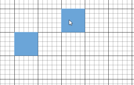
Snap to Objects
The snap-to-object feature provides visual cues to assist with aligning and spacing diagram elements. A node can snap to its neighboring objects based on specific alignments, such as the same size and position. These alignments are visually represented by smart guide lines in a cyan shade, with the color code ‘#07EDE1’.
The snapObjectDistance property allows you to define minimum distance between the selected object and the nearest object. By default, the snap object distance is set to 5 pixels.
import * as React from "react";
import * as ReactDOM from "react-dom";
import { Diagram, DiagramComponent, SnapConstraints, Snapping } from "@syncfusion/ej2-react-diagrams";
Diagram.Inject(Snapping);
let snapSettings = {
      // Enable snap to object constraint
      constraints: SnapConstraints.SnapToObject | SnapConstraints.ShowLines,
      // Sets the Snap object distance
      snapObjectDistance: 10,
};
// A node is created and stored in nodes array.
let node = [{
        // Position of the node
        offsetX: 250,
        offsetY: 250,
        // Size of the node
        width: 100,
        height: 100,
        style: {
            fill: '#6BA5D7',
            strokeColor: 'white'
        },
    },{
        id: 'node2',
        style: { fill: '#6BA5D7', strokeColor: '#6BA5D7' },
        width: 100,
        height: 100,
        offsetX: 300,
        offsetY: 100,
    }
];
// initialize Diagram component
function App() {
    return (<DiagramComponent id="container" width={'100%'} height={'600px'}
    // Add node
    nodes={node} snapSettings={snapSettings}/>);
}
const root = ReactDOM.createRoot(document.getElementById('diagram'));
root.render(<App />);
import * as React from "react";
import * as ReactDOM from "react-dom";
import {
Diagram,
NodeModel,
DiagramComponent,
SnapSettingsModel,
SnapConstraints,
Snapping,
} from "@syncfusion/ej2-react-diagrams";
Diagram.Inject(Snapping);
let snapSettings: SnapSettingsModel = {
// Enable snap to object constraint
constraints: SnapConstraints.SnapToObject | SnapConstraints.ShowLines,
// Sets the Snap object distance
snapObjectDistance: 10,
};
// A node is created and stored in nodes array.
let node: NodeModel[] = [{
// Position of the node
offsetX: 250,
offsetY: 250,
// Size of the node
width: 100,
height: 100,
style: {
fill: '#6BA5D7',
strokeColor: 'white'
},
},
{
id: 'node2',
style: { fill: '#6BA5D7', strokeColor: '#6BA5D7' },
width: 100,
height: 100,
offsetX: 300,
offsetY: 100,
},
];
// initialize Diagram component
function App() {
return (
<DiagramComponent
id="container"
width={'100%'}
height={'600px'}
// Add node
nodes={node}
snapSettings={snapSettings}
/>
);
}
const root = ReactDOM.createRoot(document.getElementById('diagram'));
root.render(<App />);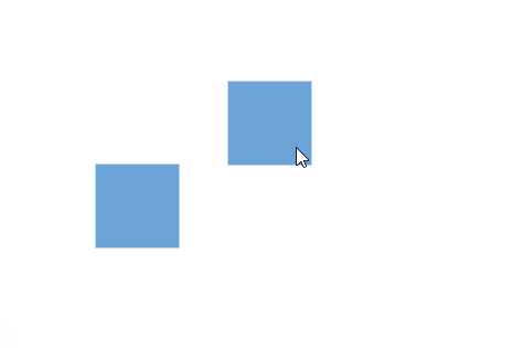
Snap Angle
The snapAngle property defines the increments by which an object can be rotated within a diagram.
For example, if the snapAngle is set to 15 degrees, an object can only be rotated to angles that are multiples of 15 degrees, such as 15°, 30°, 45°, and so on. This ensures precise angular alignment and consistent object positioning, enhancing the overall design accuracy. By default, the snap angle is set to 5 degrees.
The following code example demonstrates how to set the snapAngle property and update it dynamically.
import * as React from "react";
import * as ReactDOM from "react-dom";
import { Diagram, DiagramComponent, Snapping } from "@syncfusion/ej2-react-diagrams";
Diagram.Inject(Snapping);
let diagramInstance;
let snapSettings = {
    // Sets the Snap Angle
    snapAngle: 20,
};
// A node is created and stored in nodes array.
let node = [{
        // Position of the node
        offsetX: 250,
        offsetY: 250,
        // Size of the node
        width: 100,
        height: 100,
        style: {
            fill: '#6BA5D7',
            strokeColor: 'white'
        },
    }];
// initialize Diagram component
function App() {
    const SnapAngle = (args) =>{
       //Update snapAngle dynamically
       diagramInstance.snapSettings.snapAngle = Number(args.target.value);
       diagramInstance.dataBind();
    }
    return (
    <div>
    <label>SnapAngle :</label>
    <input type="number" max="360" min="5" defaultValue="20" onChange={SnapAngle} />
    <DiagramComponent id="container" width={'100%'} height={'600px'}
    ref={(diagram) => (diagramInstance = diagram)}
    // Add node
    nodes={node} snapSettings={snapSettings}/>
    </div>
    );
}
const root = ReactDOM.createRoot(document.getElementById('diagram'));
root.render(<App />);
import * as React from "react";
import * as ReactDOM from "react-dom";
import { Diagram, DiagramComponent, Snapping,SnapSettingsModel } from "@syncfusion/ej2-react-diagrams";
Diagram.Inject(Snapping);
let diagramInstance:DiagramComponent;
let snapSettings:SnapSettingsModel = {
// Sets the Snap Angle
snapAngle: 20,
};
// A node is created and stored in nodes array.
let node = [{
// Position of the node
offsetX: 250,
offsetY: 250,
// Size of the node
width: 100,
height: 100,
style: {
fill: '#6BA5D7',
strokeColor: 'white'
},
}];
// initialize Diagram component
function App() {
const SnapAngle = (args: any) =>{
//Update snapAngle dynamically
diagramInstance.snapSettings.snapAngle = Number(args.target.value);
diagramInstance.dataBind();
}
return (
<div>
<label>SnapAngle :</label>
<input type="number" max="360" min="5" defaultValue="20" onChange={SnapAngle} />
<DiagramComponent id="container" width={'100%'} height={'600px'}
ref={(diagram) => (diagramInstance = diagram)}
// Add node
nodes={node} snapSettings={snapSettings}/>
</div>
);
}
const root = ReactDOM.createRoot(document.getElementById('diagram'));
root.render(<App />);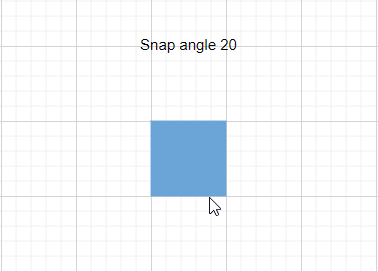
Snap Line Color
The snapLineColor property allows you to define the color of the snap line used in the diagram. By customizing the snap line color, you can enhance the visual contrast and visibility of these guides, making it easier to achieve accurate alignment.
This property accepts color values in various formats, such as hexadecimal, RGB, or predefined color names, providing flexibility in how you choose to represent the snap lines in your diagramming application. By default the snap line color is set to '#07EDE1'.
The following code example demonstrates how to set the snapLineColor property and update it dynamically.
import * as React from "react";
import * as ReactDOM from "react-dom";
import { Diagram, DiagramComponent, Snapping } from "@syncfusion/ej2-react-diagrams";
Diagram.Inject(Snapping);
let diagramInstance;
let snapSettings = {
    snapLineColor: "red",
};
// A node is created and stored in nodes array.
let node = [{
        // Position of the node
        offsetX: 100,
        offsetY: 250,
        // Size of the node
        width: 100,
        height: 100,
        style: {
            fill: '#6BA5D7',
            strokeColor: 'white'
        },
    },
    {
        // Position of the node
        offsetX: 300,
        offsetY: 250,
        // Size of the node
        width: 100,
        height: 100,
        style: {
            fill: '#6BA5D7',
            strokeColor: 'white'
        },
    }
];
// initialize Diagram component
function App() {
    const SnapColor = (args) =>{
       //Update snapcolor dynamically
       diagramInstance.snapSettings.snapLineColor  = args.target.value
       diagramInstance.dataBind();
    }
    return (
    <div>
    <label>SnapColor :</label>
    <input type="color" onChange={SnapColor} />
    <DiagramComponent id="container" width={'100%'} height={'600px'}
    ref={(diagram) => (diagramInstance = diagram)}
    // Add node
    nodes={node} snapSettings={snapSettings}/>
    </div>
    );
}
const root = ReactDOM.createRoot(document.getElementById('diagram'));
root.render(<App />);
import * as React from "react";
import * as ReactDOM from "react-dom";
import { Diagram, DiagramComponent, Snapping,NodeModel } from "@syncfusion/ej2-react-diagrams";
Diagram.Inject(Snapping);
let diagramInstance:DiagramComponent;
let snapSettings = {
snapLineColor: "red",
};
// A node is created and stored in nodes array.
let node:NodeModel[] = [{
// Position of the node
offsetX: 100,
offsetY: 250,
// Size of the node
width: 100,
height: 100,
style: {
fill: '#6BA5D7',
strokeColor: 'white'
},
},
{
// Position of the node
offsetX: 300,
offsetY: 250,
// Size of the node
width: 100,
height: 100,
style: {
fill: '#6BA5D7',
strokeColor: 'white'
},
}
];
// initialize Diagram component
function App() {
const SnapColor = (args:any) =>{
//Update snapcolor dynamically
diagramInstance.snapSettings.snapLineColor = args.target.value
diagramInstance.dataBind();
}
return (
<div>
<label>SnapColor :</label>
<input type="color" onChange={SnapColor} />
<DiagramComponent id="container" width={'100%'} height={'600px'}
ref={(diagram) => (diagramInstance = diagram)}
// Add node
nodes={node} snapSettings={snapSettings}/>
</div>
);
}
const root = ReactDOM.createRoot(document.getElementById('diagram'));
root.render(<App />);Customization of Snap Intervals
By default, the objects are snapped towards the nearest gridline. The gridline or position towards where the diagram object snaps can be customized with the horizontal gridlines’s snapInterval and the vertical gridlines’s snapInterval properties.
import * as React from "react";
import * as ReactDOM from "react-dom";
import { Diagram, DiagramComponent, SnapConstraints, Snapping } from "@syncfusion/ej2-react-diagrams";
Diagram.Inject(Snapping);
let snapSettings = {
    horizontalGridlines: {
        // Defines the snap interval for object
        snapIntervals: [10]
    },
    verticalGridlines: {
        snapIntervals: [10]
    },
    constraints: SnapConstraints.All
};
// A node is created and stored in nodes array.
let node = [{
        // Position of the node
        offsetX: 250,
        offsetY: 250,
        // Size of the node
        width: 100,
        height: 100,
        style: {
            fill: '#6BA5D7',
            strokeColor: 'white'
        },
    },
    {
        // Position of the node
        offsetX: 450,
        offsetY: 250,
        // Size of the node
        width: 100,
        height: 100,
        style: {
            fill: '#6BA5D7',
            strokeColor: 'white'
        },
    }];
// initialize Diagram component
function App() {
    return (<DiagramComponent id="container" width={'100%'} height={'600px'}
    // Add node
    nodes={node} snapSettings={snapSettings}/>);
}
const root = ReactDOM.createRoot(document.getElementById('diagram'));
root.render(<App />);
import * as React from "react";
import * as ReactDOM from "react-dom";
import {
Diagram,
NodeModel,
DiagramComponent,
SnapSettingsModel,
SnapConstraints,
Snapping,
} from "@syncfusion/ej2-react-diagrams";
Diagram.Inject(Snapping);
let snapSettings: SnapSettingsModel = {
horizontalGridlines: {
// Defines the snap interval for object
snapIntervals: [10]
},
verticalGridlines: {
snapIntervals: [10]
},
constraints: SnapConstraints.All
};
// A node is created and stored in nodes array.
let node: NodeModel[] = [{
// Position of the node
offsetX: 250,
offsetY: 250,
// Size of the node
width: 100,
height: 100,
style: {
fill: '#6BA5D7',
strokeColor: 'white'
},
},
{
// Position of the node
offsetX: 450,
offsetY: 250,
// Size of the node
width: 100,
height: 100,
style: {
fill: '#6BA5D7',
strokeColor: 'white'
},
}];
// initialize Diagram component
function App() {
return (
<DiagramComponent
id="container"
width={'100%'}
height={'600px'}
// Add node
nodes={node}
snapSettings={snapSettings}
/>
);
}
const root = ReactDOM.createRoot(document.getElementById('diagram'));
root.render(<App />);Snap Constraints
The snapConstraints property allows you to enable or disable certain features of the snapping functionality. For detailed information refer to constraints.