Adaptive in Angular Grid Component
11 Jun 202620 minutes to read
The Grid user interface (UI) was redesigned to provide an optimal viewing experience and improve usability on small screens. This interface will render the filter, sort, column chooser, column menu(supports only when the rowRenderingMode as Horizontal) and edit dialogs adaptively and have an option to render the grid row elements in the vertical direction.
Render adaptive dialogs
The Angular Data Grid offers a valuable feature for rendering adaptive dialogs, specifically designed to enhance usability on smaller screens. This feature proves especially useful for optimizing the interface on devices with limited screen real estate. The functionality is achieved by enabling the enableAdaptiveUI property, allowing the grid to render filter, sort, and edit dialogs in full-screen mode.
Additionally, apply the e-bigger class to the grid’s parent element to enable the adaptive view.
The following sample demonstrates to enable adaptive dialogs in the Syncfusion Angular Grid:
import { data } from './datasource';
import { Component, OnInit, ViewChild } from '@angular/core';
import { AggregateService, EditService, FilterService, GridComponent, GridModule, PageService, SortService, ToolbarService } from '@syncfusion/ej2-angular-grids';

@Component({
    imports: [GridModule],
    providers: [PageService, SortService, FilterService, EditService, ToolbarService, AggregateService],
    standalone: true,
    selector: 'app-root',
    template: `
    <div class="e-adaptive-demo e-bigger">
        <div class="e-mobile-layout">
            <div class="e-mobile-content">
                <ejs-grid #adaptive id="adaptivebrowser" [dataSource]='data' enableAdaptiveUI='true'height='100%' allowPaging='true' allowFiltering='true' allowSorting='true' [editSettings]='editSettings'
                    [filterSettings]='filterSettings' [toolbar]='toolbar' (load)='onLoad()'>
                    <e-columns>
                        <e-column field='SNO' headerText='S NO' width='150' isPrimaryKey='true' [validationRules]='orderidrules'></e-column>
                        <e-column field='Model' headerText='Model' width='200' editType='dropdownedit' [validationRules]='customeridrules'></e-column>
                        <e-column field='Developer' headerText='Developer' width='200' [validationRules]='customeridrules' [filter]='menuFilter'></e-column>
                        <e-column field='ReleaseDate' headerText='Released Date' width='200' type='date' format='yMMM' editType='datepickeredit'></e-column>
                        <e-column field='AndroidVersion' headerText='Android Version' width='200' [validationRules]='customeridrules' [filter]='checkboxFilter'></e-column>
                        </e-column>
                    </e-columns>
                </ejs-grid>
            </div>
        </div>
        <br />
        <div class="datalink">Source: <a href="https://en.wikipedia.org/wiki/List_of_Android_smartphones" target="_blank">Wikipedia: List of Android smartphones</a></div>
    </div>`
})

export class AppComponent implements OnInit {
    @ViewChild('adaptive')
    public grid?: GridComponent;
    public data?: object[];
    public editSettings?: Object;
    public toolbar?: string[];
    public orderidrules?: Object;
    public customeridrules?: Object;
    public filterSettings?: Object;
    public menuFilter?: Object;
    public checkboxFilter?: Object;

    ngOnInit(): void {
        this.data = data;
        this.editSettings = { allowEditing: true, allowAdding: true, allowDeleting: true, mode: 'Dialog' };
        this.toolbar = ['Add', 'Edit', 'Delete', 'Update', 'Cancel', 'Search'];
        this.orderidrules = { required: true, number: true };
        this.customeridrules = { required: true };
        this.filterSettings = { type: 'Excel' };
        this.menuFilter = {
            type: 'Menu'
        };
        this.checkboxFilter = {
            type: 'CheckBox'
        };
    }

    public onLoad(): void {
        (this.grid as GridComponent).adaptiveDlgTarget = document.getElementsByClassName('e-mobile-content')[0] as HTMLElement;
    }
}
import { bootstrapApplication } from '@angular/platform-browser';
import { AppComponent } from './app.component';
import 'zone.js';
bootstrapApplication(AppComponent).catch((err) => console.error(err));Vertical row rendering
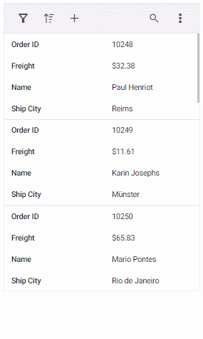
The Angular Data Grid introduces vertical row rendering, which displays row elements in a vertical order. This presentation enhances data visibility in scenarios where a vertical layout is preferable. Set the rowRenderingMode property to Vertical.
The default row rendering mode is
Horizontal.
The following sample demonstrates dynamic switching between Vertical and Horizontal row rendering modes using a DropDownList:
import { NgModule } from '@angular/core'
import { BrowserModule } from '@angular/platform-browser'
import { GridModule } from '@syncfusion/ej2-angular-grids'
import { PageService, SortService, FilterService, EditService, ToolbarService, AggregateService } from '@syncfusion/ej2-angular-grids'
import { DropDownListModule } from '@syncfusion/ej2-angular-dropdowns'
import { Component, OnInit, ViewChild } from '@angular/core';
import { GridComponent, RowRenderingDirection } from '@syncfusion/ej2-angular-grids';
import { data } from './datasource';
import { ChangeEventArgs } from '@syncfusion/ej2-dropdowns';

@Component({
    imports: [GridModule,DropDownListModule],
    providers: [PageService,SortService,FilterService,EditService,ToolbarService,AggregateService],
    standalone: true,
    selector: 'app-root',
    template: `
    <div style="display: flex; padding: 0px 0px 20px 200px">
        <label style="padding: 30px 17px 0 0;"> Select row rendering mode :</label>
        <ejs-dropdownlist #dropdown style="padding: 26px 0 0 0" index="0" width="150" [dataSource]="dropDownData"  (change)="changeAlignment($event)"></ejs-dropdownlist>
    </div>
    <div class="e-adaptive-demo e-bigger">
        <div class="e-mobile-layout">
            <div class="e-mobile-content">
                <ejs-grid #adaptive id="adaptivebrowser" [dataSource]='data' enableAdaptiveUI='true' [rowRenderingMode]="rowMode" height='100%' allowPaging='true' allowFiltering='true' allowSorting='true' [editSettings]='editSettings' [filterSettings]='filterSettings' [toolbar]='toolbar' (load)='onLoad()'>
                <e-columns>
                    <e-column field='SNO' headerText='S NO' width='150' isPrimaryKey='true' [validationRules]='orderidrules'></e-column>
                    <e-column field='Model' headerText='Model' width='200' editType='dropdownedit'[validationRules]='customeridrules'></e-column>
                    <e-column field='Developer' headerText='Developer' width='200' [validationRules]='customeridrules' [filter]='menuFilter'></e-column>
                    <e-column field='ReleaseDate' headerText='Released Date' width='200' type='date' format='yMMM' editType='datepickeredit'>
                    <e-column field='AndroidVersion' headerText='Android Version' width='200' [validationRules]='customeridrules' [filter]='checkboxFilter'></e-column></e-column>
                </e-columns>
                <e-aggregates>
                    <e-aggregate>
                        <e-columns>
                            <e-column type="Count" field="Model" >
                                <ng-template #footerTemplate let-data>Total Models: {{data.Count}}</ng-template>
                            </e-column>
                        </e-columns>
                    </e-aggregate>
                </e-aggregates>
            </ejs-grid>
        </div>
        </div>
        <br />
        <div class="datalink">Source: <a href="https://en.wikipedia.org/wiki/List_of_Android_smartphones"target="_blank">Wikipedia: List of Android smartphones</a></div>
    </div>`
})

export class AppComponent implements OnInit {
    @ViewChild('adaptive')
    public grid?: GridComponent;
    public data?: object[];
    public editSettings?: Object;
    public toolbar?: string[];
    public orderidrules?: Object;
    public customeridrules?: Object;
    public filterSettings?: Object;
    public menuFilter?: Object;
    public checkboxFilter?: Object;
    public rowMode?: string;
    public dropDownData: Object[] = [
        { text: 'Vertical', value: 'Vertical' },
        { text: 'Horizontal', value: 'Horizontal' },
    ];

    ngOnInit(): void {
        this.data = data;
        this.editSettings = { allowEditing: true, allowAdding: true, allowDeleting: true, mode: 'Dialog' };
        this.toolbar = ['Add', 'Edit', 'Delete', 'Update', 'Cancel', 'Search'];
        this.orderidrules = { required: true, number: true };
        this.customeridrules = { required: true };
        this.filterSettings = { type: 'Excel' };
        this.menuFilter = {
            type: 'Menu'
        };
        this.checkboxFilter = {
            type: 'CheckBox'
        };
    }

    public changeAlignment(args: ChangeEventArgs): void {
        (this.grid as GridComponent).rowRenderingMode = (args.value as RowRenderingDirection);
    }

    public onLoad(): void {
        (this.grid as GridComponent).adaptiveDlgTarget = document.getElementsByClassName('e-mobile-content')[0] as HTMLElement;
    }
}
import { bootstrapApplication } from '@angular/platform-browser';
import { AppComponent } from './app.component';
import 'zone.js';
bootstrapApplication(AppComponent).catch((err) => console.error(err));The enableAdaptiveUI property must be enabled for vertical row rendering to function properly.
Supported features by vertical row rendering
Vertical row rendering supports the following grid features:
- Paging, including page size dropdown
- Sorting
- Filtering
- Selection
- Dialog editing
- Aggregates
- Infinite scrolling
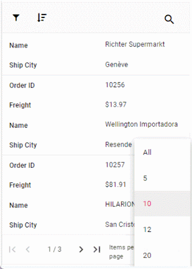
- Toolbar - Options like
Add,Filter,Sort,Edit,Delete,SearchandtoolbarTemplateare available when their respective features are enabled. The toolbar dynamically includes a three-dotted icon, containing additional features likeColumnChooser,Print,PdfExport,ExcelExport, orCsvExport, once these features are enabled. Please refer to the following snapshot.
The following image shows the adaptive grid with enabled paging and pager dropdown:
The Column Menu feature, which includes grouping, sorting, autofit, filter, and column chooser, is exclusively supported for the grid in
HorizontalrowRenderingMode.
Rendering an adaptive layout for smaller screens alone
By default, adaptive UI layout is rendered in both mobile devices and desktop mode too while setting the enableAdaptiveUI property as true. Now the DataGrid component has an option to render an adaptive layout only for mobile screen sizes. This can be achieved by specifying the AdaptiveUIMode property value as Mobile. The default value of the AdaptiveUIMode property is Both.
The rowRenderingMode property behavior depends on the adaptiveUIMode setting.
import { GridModule, PageService, SortService, FilterService, EditService, SelectionService, ExcelExportService, PdfExportService,
ToolbarService, AggregateService, GroupService, GridComponent, ResizeService, ReorderService } from '@syncfusion/ej2-angular-grids';
import { Component, OnInit, ViewChild } from '@angular/core';
import { data } from './datasource';
import { ClickEventArgs } from '@syncfusion/ej2-navigations';

@Component({
    imports: [GridModule],
    providers: [ PageService, GroupService, SortService, FilterService, EditService,ToolbarService, AggregateService, SelectionService, ExcelExportService,PdfExportService, ResizeService, ReorderService],
    standalone: true,
    selector: 'app-root',
    template: `
        <div class="e-adaptive-demo e-bigger">
            <div class="e-mobile-layout">
                <div class="e-mobile-content">
                    <ejs-grid #grid id="Grid" [dataSource]='data' enableAdaptiveUI='true' adaptiveUIMode= 'Mobile'height='100%' allowPaging='true' allowGrouping=true allowFiltering='true' allowSorting='true' allowSelection='true' [selectionSettings]="selectionSettings" showColumnChooser='true' [editSettings]='editSettings' [filterSettings]='filterSettings' [toolbar]='toolbar' allowExcelExport='true' allowPdfExport='true' (load)='onLoad()' (toolbarClick)='toolbarClick($event)'>
                        <e-columns>
                            <e-column field='OrderID' headerText='Order ID' width='120' isPrimaryKey='true' [validationRules]='orderidrules'></e-column>
                            <e-column field='CustomerID' headerText='Customer Name' width='160' minWidth=80 maxWidth=300 [validationRules]='customerIDRules'></e-column>
                            <e-column field='Freight' headerText='Freight' width='150' minWidth=80 maxWidth=300 [validationRules]='freightRules'></e-column>
                            <e-column field='OrderDate' headerText='Order Date' width='200' type='date' [format]='dateFormat' editType='datepickeredit'></e-column>
                            <e-column field='ShipCountry' headerText='Ship Country' width='200'></e-column>
                        </e-columns>
                    </ejs-grid>
                </div>
            </div>
        </div>`
})

export class AppComponent implements OnInit {
    @ViewChild('grid')
    public grid?: GridComponent;
    public data?: object[];
    public editSettings?: Object;
    public toolbar?: string[];
    public orderidrules?: Object;
    public customerIDRules?: Object;
    public freightRules?: Object;
    public filterSettings?: Object;
    public selectionSettings?: Object;
    public dateFormat?: Object;

    ngOnInit(): void {
        this.data = data;
        this.editSettings = { allowEditing: true, allowAdding: true, allowDeleting: true, mode: 'Dialog' };
        this.toolbar = ['Add', 'Edit', 'Delete', 'Update', 'Cancel', 'Search', 'ColumnChooser', 'ExcelExport', 'PdfExport', 'CsvExport'];
        this.orderidrules = { required: true, number: true };
        this.customerIDRules = { required: true };
        this.freightRules = { required: true };
        this.filterSettings = { type: 'Excel' };
        this.selectionSettings = { type: 'Multiple' };
        this.dateFormat = { type: 'dateTime', format: 'M/d/y hh:mm a' };
    }

    public onLoad(): void {
        (this.grid as GridComponent).adaptiveDlgTarget = document.getElementsByClassName('e-mobile-content')[0] as HTMLElement;
    }

    toolbarClick(args: ClickEventArgs): void {
        switch (args.item.id) {
            case 'Grid_pdfexport':
                (this.grid as GridComponent).pdfExport();
                break;
            case 'Grid_excelexport':
                (this.grid as GridComponent).excelExport();
                break;
        }
    }
}
import { bootstrapApplication } from '@angular/platform-browser';
import { AppComponent } from './app.component';
import 'zone.js';
bootstrapApplication(AppComponent).catch((err) => console.error(err));NOTE
Looking for the full responsive Angular Data Grid component overview, features, pricing, and documentation? Visit the Angular Data Grid page.