How can I help you?
Selection in Angular Grid Component
10 Mar 202620 minutes to read
Selection in the Grid component provides interactive selection of specific cells, rows, or columns within the grid. Selection can be performed through mouse clicks, arrow keys (up, down, left, and right), or touch. This functionality highlights and allows manipulation or actions on specific cells, rows, or columns within the grid.
Disabling selection
To disable selection in the grid, set the allowSelection property to false.
Selection types
The Grid supports two selection types, configurable via the selectionSettings.type property:
-
Single: Enables selection of only one row, cell, or column at a time. -
Multiple: Enables selection of multiple rows, cells, or columns.
Multi-selection controls
- CTRL + Click: Select or deselect separate rows, cells or columns.
- SHIFT + Click: Select a range of rows, cells or columns between two points.
import { data } from './datasource';
import { Component, OnInit, ViewChild } from '@angular/core';
import { DropDownListModule } from '@syncfusion/ej2-angular-dropdowns';
import { EditService, FilterService, GridComponent, GridModule, PageService, SelectionSettingsModel, SelectionType, ToolbarService } from '@syncfusion/ej2-angular-grids';
import { ChangeEventArgs } from '@syncfusion/ej2-dropdowns';

@Component({
  imports: [ GridModule, DropDownListModule  ],
  providers: [EditService, ToolbarService, PageService, FilterService],
  standalone: true,
  selector: 'app-root',
  template: `
      <div style="display: flex">
        <label style="padding: 5px 5px 0 0">Choose selection type:</label>
        <ejs-dropdownlist index="0" width="150"
        [dataSource]="dropdownData" (change)="valueChange($event)">
        </ejs-dropdownlist>
      </div>
      <div style="padding: 5px 0px 0px 0px">
        <ejs-grid #grid [dataSource]="data" [selectionSettings]="selectionOptions"
        height="295px">
          <e-columns>
            <e-column field="OrderID" headerText="Order ID" textAlign="Right"
            width="120"></e-column>
            <e-column field="CustomerID" headerText="Customer ID" width="150">
            </e-column>
            <e-column field="ShipCity" headerText="Ship City" width="150"></e-column>
            <e-column field="ShipName" headerText="Ship Name" width="150"></e-column>
          </e-columns>
        </ejs-grid>
      </div>`
})
export class AppComponent implements OnInit {

  public data?: Object[];
  @ViewChild('grid') public grid?: GridComponent;
  public selectionOptions?: SelectionSettingsModel;
  public dropdownData: Object[] = [
    { text: 'Single', value: 'Single' },
    { text: 'Multiple', value: 'Multiple' }
  ];

  ngOnInit(): void {
    this.data = data;
  }

  valueChange(args: ChangeEventArgs): void {
    ((this.grid as GridComponent).selectionSettings.type as SelectionType) = (args.value as SelectionType);
  }
}
import { bootstrapApplication } from '@angular/platform-browser';
import { AppComponent } from './app.component';
import 'zone.js';
bootstrapApplication(AppComponent).catch((err) => console.error(err));By default, the Grid component includes essential selection functionality. The Selection module is automatically available without requiring explicit injection. Refer to the Selection API for complete configuration options.
Selection mode
The selection mode feature allows switching between different modes for selecting rows, cells, or both within the grid based on specific requirements. This feature highlights and manipulates specific rows or cells in the grid.
To configure selection mode, set the selectionSettings.mode property. The Grid component supports three types of selection modes:
-
Row: Enables row selection only (default mode). -
Cell: Enables cell selection only. -
Both: Enables simultaneous row and cell selection.
The following example demonstrates dynamically enabling and changing the selectionSettings.mode using the DropDownList component:
import { data } from './datasource';
import { Component, OnInit, ViewChild } from '@angular/core';
import { DropDownListModule } from '@syncfusion/ej2-angular-dropdowns';
import { EditService, FilterService, GridComponent, GridModule, PageService, SelectionSettingsModel, ToolbarService } from '@syncfusion/ej2-angular-grids';
import { ChangeEventArgs } from '@syncfusion/ej2-dropdowns';

@Component({
  imports: [ GridModule, DropDownListModule ],
  providers: [EditService, ToolbarService, PageService, FilterService],
  standalone: true,
  selector: 'app-root',
  template: `
        <div style="display: flex">
          <label style="padding: 5px 5px 0 0">Choose selection mode:</label>
          <ejs-dropdownlist index="0" width="150"
          [dataSource]="dropdownData" (change)="valueChange($event)">
          </ejs-dropdownlist>
        </div>
        <div style="padding: 5px 0px 0px 0px">
        <ejs-grid #grid [dataSource]="data" height="295px">
          <e-columns>
            <e-column field="OrderID" headerText="Order ID" textAlign="Right"
            width="120"></e-column>
            <e-column field="CustomerID" headerText="Customer ID" width="150">
            </e-column>
            <e-column field="ShipCity" headerText="Ship City" width="150"></e-column>
            <e-column field="ShipName" headerText="Ship Name" width="150"></e-column>
          </e-columns>
        </ejs-grid>
        </div>`
})
export class AppComponent implements OnInit {

  public data?: Object[];
  @ViewChild('grid') public grid?: GridComponent;
  public selectionOptions?: SelectionSettingsModel;
  public dropdownData: Object[] = [
    { text: 'Row', value: 'Row' },
    { text: 'Cell', value: 'Cell' },
    { text: 'Both', value: 'Both' }
  ];

  ngOnInit(): void {
    this.data = data;
  }

  valueChange(args: ChangeEventArgs): void {
    ((this.grid as GridComponent).selectionSettings.mode as SelectionMode) = (args.value as SelectionMode);
  }
}
import { bootstrapApplication } from '@angular/platform-browser';
import { AppComponent } from './app.component';
import 'zone.js';
bootstrapApplication(AppComponent).catch((err) => console.error(err));Touch interaction
The touch interaction feature in grid provides easy interaction with the grid on touch screen devices. This feature improves the experience on mobile devices and tablets, making it easier to navigate and interact with the grid’s content using touch gestures.
Single Row Selection:
Tapping on a row selects it immediately, providing efficient single-row selection on touch interfaces.
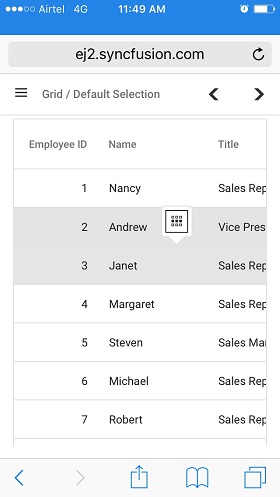
Multi-Row Selection:
Multiple rows can be selected by tapping a row, which triggers a popup as shown in the image. Once the popup is tapped, additional rows can be selected by tapping the required rows, enabling efficient multi-row interaction.

Multi-Row or Cell Selection:
The Grid supports selecting both multiple rows and cells. Tap the popup to switch to multi-row or cell selection mode, then tap desired rows or cells to select them, as shown in the following image:

For multi-selection, it requires the selection type to be
Multiple.
Touch selection example
The following screenshot illustrates how touch selection appears on a device:
Toggle selection
Toggle selection provides efficient selection state switching by enabling single-click selection and deselection. When this feature is enabled, clicking a selected item deselects it, and clicking an unselected item selects it.
To enable the toggle selection feature, set the selectionSettings.enableToggle property to true.
The following example demonstrates the toggle selection for cells and rows using the selectionSettings.enableToggle property:
import { data } from './datasource';
import { Component, OnInit, ViewChild } from '@angular/core';
import { SwitchComponent, SwitchModule } from '@syncfusion/ej2-angular-buttons';
import { DropDownListModule } from '@syncfusion/ej2-angular-dropdowns';
import { EditService, FilterService, GridComponent, GridModule, PageService, SelectionSettingsModel, ToolbarService } from '@syncfusion/ej2-angular-grids';
import { ChangeEventArgs } from '@syncfusion/ej2-dropdowns';

@Component({
  imports: [ GridModule, SwitchModule, DropDownListModule],
  providers: [EditService, ToolbarService, PageService, FilterService],
  standalone: true,
  selector: 'app-root',
  template: `
      <div style="display: flex">
        <label style="padding: 5px 5px 0 0">Choose cell selection mode:</label>
        <ejs-dropdownlist index="0" width="150"
        [dataSource]="dropdownData" (change)="valueChange($event)">
        </ejs-dropdownlist>
      </div>
      <div style="padding: 5px 0px 5px 0px">
      <label>Enable/Disable Toggle selection</label>
      <ejs-switch #switch id="switch" [checked]="true"
      (change)="toggleColumnSelection($event)">
      </ejs-switch>
      </div>
      <div style="padding: 5px 0px 0px 0px">
        <ejs-grid #grid [dataSource]="data" [selectionSettings]="selectionOptions"
        height="270px">
          <e-columns>
            <e-column field="OrderID" headerText="Order ID" textAlign="Right"
            width="120"></e-column>
            <e-column field="CustomerID" headerText="Customer ID" width="150"></e-column>
            <e-column field="ShipCity" headerText="Ship City" width="150"></e-column>
            <e-column field="ShipName" headerText="Ship Name" width="150"></e-column>
          </e-columns>
        </ejs-grid>
      </div>
    `
})
export class AppComponent implements OnInit {

  public data?: object[];
  public enableToggleSelection = true;

  @ViewChild('grid') public grid?: GridComponent;
  @ViewChild('switch') public switch?: SwitchComponent;

  public selectionOptions?: SelectionSettingsModel;
  public dropdownData: Object[] = [
    { text: 'Row', value: 'Row' },
    { text: 'Cell', value: 'Cell' },
    { text: 'Both', value: 'Both' },
  ];

  ngOnInit(): void {
    this.data = data;
    this.selectionOptions = { type: 'Multiple' };
  }
  toggleColumnSelection(args: CustomChangeEventArgs): void {
    (this.grid as GridComponent).selectionSettings.enableToggle = args.checked;
  }
  valueChange(args: ChangeEventArgs): void {
    ((this.grid as GridComponent).selectionSettings.mode as SelectionMode) = (args.value as SelectionMode);
  }
}

interface CustomChangeEventArgs extends ChangeEventArgs {
  checked: boolean;
}
import { bootstrapApplication } from '@angular/platform-browser';
import { AppComponent } from './app.component';
import 'zone.js';
bootstrapApplication(AppComponent).catch((err) => console.error(err));
- If multi selection is enabled, then first click on any selected row (without pressing Ctrl key), it will clear the multi selection and in second click on the same row, it will be unselected.
- Toggle selection is a feature that can be applied to all types of selections. When the checkboxOnly property restricts row or cell selection to only occur through checkbox clicks. When this property is set to
true, users cannot select rows or cells by clicking directly on them; instead, selection is only possible by clicking the corresponding checkboxes. Refer to the Checkbox Selection feature to learn more about implementing checkbox-only selection.
Clear all selection programmatically
Use the clearSelection method to programmatically clear selected rows, cells, or columns.
The following example demonstrates clearing selection by calling the clearSelection method in a button click event:
import { data } from './datasource';
import { Component, OnInit, ViewChild } from '@angular/core';
import { ButtonModule } from '@syncfusion/ej2-angular-buttons';
import { EditService, FilterService, GridComponent, GridModule, PageService, PageSettingsModel, SelectionSettingsModel, ToolbarService } from '@syncfusion/ej2-angular-grids';

@Component({
    imports: [GridModule, ButtonModule ],
    providers: [EditService, ToolbarService, PageService, FilterService],
    standalone: true,
    selector: 'app-root',
    template:
        `<div style="padding: 20px 0px 0px 0px">
        <button ejs-button (click)='click()'>Clear Selection</button>
        </div>
        <div style="padding: 20px 0px 0px 0px">
        <ejs-grid #grid [dataSource]='data' allowPaging=true
        [selectionSettings]='selectionOptions' [pageSettings]='pageOptions'>
            <e-columns>
                <e-column field='OrderID' headerText='Order ID' textAlign='Right'
                width=120></e-column>
                <e-column field='CustomerID' headerText='Customer ID' width=120></e-column>
                <e-column field='ShipCountry' headerText='Ship Country' width=130></e-column>
                <e-column field='Freight' headerText='Freight' format= 'C2' width=100>
                </e-column>
            </e-columns>
        </ejs-grid>
        </div>`
})
export class AppComponent implements OnInit {

    public data?: Object[];
    public selectionOptions?: SelectionSettingsModel;
    public pageOptions?: PageSettingsModel;

    @ViewChild('grid')
    public grid?: GridComponent;

    ngOnInit(): void {
        this.data = data;
        this.selectionOptions = { mode:'Both' ,allowColumnSelection: true,type: 'Multiple' };
        this.pageOptions = { pageSize: 5 };
    }
    click(): void{
        (this.grid as GridComponent).clearSelection();
    }
}
import { bootstrapApplication } from '@angular/platform-browser';
import { AppComponent } from './app.component';
import 'zone.js';
bootstrapApplication(AppComponent).catch((err) => console.error(err));
- In
Bothmode, if calling clearCellSelection first, it will clear cell selections, and then if calling clearRowSelection, it will clear row selections. The order of method calls determines which type of selection is cleared first.- To remove a specific selection in a row, cell, or column, utilize the following methods:
clearRowSelectionfor clearing row selections,clearCellSelectionfor clearing cell selections, and clearColumnSelection for clearing column selections.
Persist selection
Persist selection maintains selected items across data manipulation and grid refresh operations. This functionality maintains tracking of the selected items across different grid operations.
To enable persist selection, set the selectionSettings.persistSelection property to true.
- Persist selection requires at least one “primary key” column in the grid for proper identification and retention of selected items. set the column.isPrimaryKey as
trueto define the “primary key” column.- The
persistSelectionfeature is not supported for cell selections in the Syncfusion® angular Grid component.- The
persistSelectionfeature is only supported for gridMultipletype selections.
The following example demonstrates persist selection for rows and columns using the selectionSettings.persistSelection property:
import { data } from './datasource';
import { Component, OnInit } from '@angular/core';
import { EditService, FilterService, GridModule, PageService, PageSettingsModel, SelectionSettingsModel, ToolbarService } from '@syncfusion/ej2-angular-grids';

@Component({
    imports: [GridModule ],
    providers: [EditService, ToolbarService, PageService, FilterService],
    standalone: true,
    selector: 'app-root',
    template: `<ejs-grid [dataSource]='data' [allowPaging]='true' height='290px'
               [selectionSettings]='selectionOptions'>
                <e-columns>
                    <e-column field='OrderID' headerText='Order ID' isPrimaryKey='true'
                    textAlign='Right' width=120></e-column>
                    <e-column field='CustomerID' headerText='Customer ID' width=150></e-column>
                    <e-column field='ShipCity' headerText='Ship City' width=150></e-column>
                    <e-column field='ShipName' headerText='Ship Name' width=150></e-column>
                </e-columns>
                </ejs-grid>`
})
export class AppComponent implements OnInit {

    public data?: object[];
    public selectionOptions?: SelectionSettingsModel;
    public pageOptions?: PageSettingsModel;

    ngOnInit(): void {
        this.data = data;
        this.selectionOptions = { type: 'Multiple', mode: 'Both', persistSelection: true, allowColumnSelection: true };
        this.pageOptions = { pageSize: 5 };

    }
}
import { bootstrapApplication } from '@angular/platform-browser';
import { AppComponent } from './app.component';
import 'zone.js';
bootstrapApplication(AppComponent).catch((err) => console.error(err));