Connector customization
28 Mar 202524 minutes to read
Diagram allows you to customize the connector appearances. The following topics shows how to customize several properties of the connectors.
Decorator
-
Starting and ending points of a connector can be decorated with some customizable shapes like arrows, circles, diamond, or path. The connection end points can be decorated with the
sourceDecoratorandtargetDecoratorproperties of the connector. -
The
shapeproperty ofsourceDecoratorallows to define the shape of the decorators. Similarly, the shape property oftargetDecoratorallows to define the shape of the decorators. -
To create custom shape for source decorator, use
pathDataproperty. Similarly, to create custom shape for target decorator, usepathDataproperty. -
The following code example illustrates how to create decorators of various shapes.
<template>
    <div id="app">
        <ejs-diagram id="diagram" :width='width' :height='height' :connectors='connectors'></ejs-diagram>
    </div>
</template>
<script setup>
import { DiagramComponent as EjsDiagram } from '@syncfusion/ej2-vue-diagrams';

const connectors = [{
    id: "connector1",
    type: 'Straight',
    // Decorator shape- circle
    sourceDecorator: {
        shape: 'Circle',
        // Defines the style for the sourceDecorator
    },
    // Decorator shape - Diamond
    targetDecorator: {
        // Defines the custom shape for the connector's target decorator
        shape: 'Custom',
        //Defines the  path for the connector's target decorator
        pathData: 'M80.5,12.5 C80.5,19.127417 62.59139,24.5 40.5,24.5 C18.40861,24.5 0.5,19.127417 0.5,12.5' +
            'C0.5,5.872583 18.40861,0.5 40.5,0.5 C62.59139,0.5 80.5,5.872583 80.5,12.5 z',
            //defines the style for the target decorator
    },
    sourcePoint: {
        x: 100,
        y: 100
    },
    targetPoint: {
        x: 200,
        y: 200
    }
},
{
    id: "connectors2",
    type: 'Straight',
    // Decorator shape - IndentedArrow
    sourceDecorator: {
        shape: 'IndentedArrow',

    },
    // Decorator shape - OutdentedArrow
    targetDecorator: {
        shape: 'OutdentedArrow',
    },
    sourcePoint: {
        x: 400,
        y: 100
    },
    targetPoint: {
        x: 300,
        y: 200
    }
}
]
const width = "100%";
const height = "350px";
</script>
<style>
@import "../node_modules/@syncfusion/ej2-vue-diagrams/styles/material.css";
</style><template>
<div id="app">
<ejs-diagram id="diagram" :width='width' :height='height' :connectors='connectors'></ejs-diagram>
</div>
</template>
<script>
import { DiagramComponent } from '@syncfusion/ej2-vue-diagrams';
let connectors = [{
id: "connector1",
type: 'Straight',
// Decorator shape- circle
sourceDecorator: {
shape: 'Circle',
// Defines the style for the sourceDecorator
},
// Decorator shape - Diamond
targetDecorator: {
// Defines the custom shape for the connector's target decorator
shape: 'Custom',
//Defines the path for the connector's target decorator
pathData: 'M80.5,12.5 C80.5,19.127417 62.59139,24.5 40.5,24.5 C18.40861,24.5 0.5,19.127417 0.5,12.5' +
'C0.5,5.872583 18.40861,0.5 40.5,0.5 C62.59139,0.5 80.5,5.872583 80.5,12.5 z',
//defines the style for the target decorator
},
sourcePoint: {
x: 100,
y: 100
},
targetPoint: {
x: 200,
y: 200
}
},
{
id: "connectors2",
type: 'Straight',
// Decorator shape - IndentedArrow
sourceDecorator: {
shape: 'IndentedArrow',
},
// Decorator shape - OutdentedArrow
targetDecorator: {
shape: 'OutdentedArrow',
},
sourcePoint: {
x: 400,
y: 100
},
targetPoint: {
x: 300,
y: 200
}
}
]
export default {
name: "App",
components: {
"ejs-diagram": DiagramComponent
},
data() {
return {
width: "100%",
height: "350px",
connectors: connectors
}
}
}
</script>
<style>
@import "../node_modules/@syncfusion/ej2-vue-diagrams/styles/material.css";
</style>Customize the decorator appearance
-
The source decorator’s
strokeColor,strokeWidth, andstrokeDashArrayproperties are used to customize the color, width, and appearance of the decorator. -
To set the border stroke color, stroke width, and stroke dash array for the target decorator, use
strokeColor,strokeWidth, andstrokeDashArray. -
To set the size for source and target decorator, use width and height property.
The following code example illustrates how to customize the appearance of the decorator.
<template>
    <div id="app">
        <ejs-diagram id="diagram" :width='width' :height='height' :connectors='connectors'></ejs-diagram>
    </div>
</template>
<script setup>
import { DiagramComponent as EjsDiagram } from '@syncfusion/ej2-vue-diagrams';

const connectors = [{
    id: "connector1",
    type: 'Straight',
    // Decorator shape- circle
    sourceDecorator: {
        shape: 'Circle',
        // Defines the style for the sourceDecorator
        style: {
            // Defines the strokeWidth for the sourceDecorator
            strokeWidth: 3,
            // Defines the strokeColor for the sourceDecorator
            strokeColor: 'red'
        },

    },
    // Decorator shape - Diamond
    targetDecorator: {
        // Defines the custom shape for the connector's target decorator
        shape: 'Custom',
        //Defines the  path for the connector's target decorator
        pathData: 'M80.5,12.5 C80.5,19.127417 62.59139,24.5 40.5,24.5 C18.40861,24.5 0.5,19.127417 0.5,12.5' +
            'C0.5,5.872583 18.40861,0.5 40.5,0.5 C62.59139,0.5 80.5,5.872583 80.5,12.5 z',
            //defines the style for the target decorator
            style: {
            // Defines the strokeWidth for the targetDecorator
            strokeWidth: 3,
            // Defines the strokeColor for the sourceDecorator
            strokeColor: 'green',
            // Defines the opacity for the sourceDecorator
            opacity: .8
        },
    },
    sourcePoint: {
        x: 100,
        y: 100
    },
    targetPoint: {
        x: 200,
        y: 200
    }
},
{
    id: "connectors2",
    type: 'Straight',
    // Decorator shape - IndentedArrow
    sourceDecorator: {
        shape: 'IndentedArrow',
        style: {
            strokeWidth: 3,
            strokeColor: 'blue'
        },

    },
    // Decorator shape - OutdentedArrow
    targetDecorator: {
        shape: 'OutdentedArrow',
        style: {
            strokeWidth: 3,
            strokeColor: 'yellow'
        },
    },
    sourcePoint: {
        x: 400,
        y: 100
    },
    targetPoint: {
        x: 300,
        y: 200
    }
}
]

const width = "100%";
const height = "350px";

</script>
<style>
@import "../node_modules/@syncfusion/ej2-vue-diagrams/styles/material.css";
</style><template>
<div id="app">
<ejs-diagram id="diagram" :width='width' :height='height' :connectors='connectors'></ejs-diagram>
</div>
</template>
<script>
import { DiagramComponent } from '@syncfusion/ej2-vue-diagrams';
let connectors = [{
id: "connector1",
type: 'Straight',
// Decorator shape- circle
sourceDecorator: {
shape: 'Circle',
// Defines the style for the sourceDecorator
style: {
// Defines the strokeWidth for the sourceDecorator
strokeWidth: 3,
// Defines the strokeColor for the sourceDecorator
strokeColor: 'red'
},
},
// Decorator shape - Diamond
targetDecorator: {
// Defines the custom shape for the connector's target decorator
shape: 'Custom',
//Defines the path for the connector's target decorator
pathData: 'M80.5,12.5 C80.5,19.127417 62.59139,24.5 40.5,24.5 C18.40861,24.5 0.5,19.127417 0.5,12.5' +
'C0.5,5.872583 18.40861,0.5 40.5,0.5 C62.59139,0.5 80.5,5.872583 80.5,12.5 z',
//defines the style for the target decorator
style: {
// Defines the strokeWidth for the targetDecorator
strokeWidth: 3,
// Defines the strokeColor for the sourceDecorator
strokeColor: 'green',
// Defines the opacity for the sourceDecorator
opacity: .8
},
},
sourcePoint: {
x: 100,
y: 100
},
targetPoint: {
x: 200,
y: 200
}
},
{
id: "connectors2",
type: 'Straight',
// Decorator shape - IndentedArrow
sourceDecorator: {
shape: 'IndentedArrow',
style: {
strokeWidth: 3,
strokeColor: 'blue'
},
},
// Decorator shape - OutdentedArrow
targetDecorator: {
shape: 'OutdentedArrow',
style: {
strokeWidth: 3,
strokeColor: 'yellow'
},
},
sourcePoint: {
x: 400,
y: 100
},
targetPoint: {
x: 300,
y: 200
}
}
]
export default {
name: "App",
components: {
"ejs-diagram": DiagramComponent
},
data() {
return {
width: "100%",
height: "350px",
connectors: connectors
}
}
}
</script>
<style>
@import "../node_modules/@syncfusion/ej2-vue-diagrams/styles/material.css";
</style>Gradient style for decorator.
The gradient property is used to set the gradient color for the decorator. There are two types of gradient.
- Linear
- Radial
The following code example illustrates how to apply gradient for the decorator.
<template>
    <div id="app">
        <ejs-diagram id="diagram" :width='width' :height='height' :connectors='connectors'></ejs-diagram>
    </div>
</template>
<script setup>
import { DiagramComponent as EjsDiagram } from '@syncfusion/ej2-vue-diagrams';
import { onMounted,ref } from "vue";
const diagram = ref(null);
const connectors = [
{
  id: 'connector1',
  type: 'Straight',
  style: {
    strokeColor: '#6BA5D7',
    fill: '#6BA5D7',
    strokeWidth: 2,
  },
  // Cutomize the target decorator
  targetDecorator: {
    style: {
      strokeWidth: 1,
      opacity: 0.5,
      gradient: {
        x1: 20,
        y1: 20,
        x2: 70,
        y2: 70,
        stops: [
          {
            color: 'green',
            offset: 50,
            opacity: 1,
          },
          {
            color: 'yellow',
            offset: 100,
            opacity: 1,
          },
        ],
        type: 'Linear',
      } ,
    },
  },
  sourcePoint: {
    x: 100,
    y: 100,
  },
  targetPoint: {
    x: 200,
    y: 200,
  },
},
 {
    id: 'connector2',
    type: 'Straight',
    style: {
      strokeColor: '#6BA5D7',
      fill: '#6BA5D7',
      strokeWidth: 2,
    },

    // Cutomize the target decorator
    targetDecorator: {
      style: {
        gradient: {
          cx: 50,
          cy: 50,
          fx: 50,
          fy: 50,
          stops: [
            { color: '#00555b', offset: 0 },
            { color: 'yellow', offset: 90 },
          ],
          type: 'Radial',
        },
      },
    },
    sourcePoint: {
      x: 300,
      y: 100,
    },
    targetPoint: {
      x: 400,
      y: 200,
    },
  },
]
onMounted(function () {
    const diagramInstance = diagram.value.ej2Instances;
    diagramInstance.zoomTo({
    type: 'ZoomIn',
    zoomFactor: 2,
    focusPoint: { x: 0, y: 0.5 },
    })
    diagramInstance.fitToPage()
    })
const width = "100%";
const height = "550px";

</script>
<style>
@import "../node_modules/@syncfusion/ej2-vue-diagrams/styles/material.css";
</style><template>
<div id="app">
<ejs-diagram ref="diagram" :width='width' :height='height' :connectors='connectors'></ejs-diagram>
</div>
</template>
<script>
import { DiagramComponent } from '@syncfusion/ej2-vue-diagrams';
let connectors = [
{
id: 'connector1',
type: 'Straight',
style: {
strokeColor: '#6BA5D7',
fill: '#6BA5D7',
strokeWidth: 2,
},
// Cutomize the target decorator
targetDecorator: {
style: {
strokeWidth: 1,
opacity: 0.5,
gradient: {
x1: 20,
y1: 20,
x2: 70,
y2: 70,
stops: [
{
color: 'green',
offset: 50,
opacity: 1,
},
{
color: 'yellow',
offset: 100,
opacity: 1,
},
],
type: 'Linear',
} ,
},
},
sourcePoint: {
x: 100,
y: 100,
},
targetPoint: {
x: 200,
y: 200,
},
}, {
id: 'connector2',
type: 'Straight',
style: {
strokeColor: '#6BA5D7',
fill: '#6BA5D7',
strokeWidth: 2,
},
// Cutomize the target decorator
targetDecorator: {
style: {
gradient: {
cx: 50,
cy: 50,
fx: 50,
fy: 50,
stops: [
{ color: '#00555b', offset: 0 },
{ color: 'yellow', offset: 90 },
],
type: 'Radial',
},
},
},
sourcePoint: {
x: 300,
y: 100,
},
targetPoint: {
x: 400,
y: 200,
},
},
]
export default {
name: "App",
components: {
"ejs-diagram": DiagramComponent
},
data() {
return {
width: "100%",
height: "550px",
connectors: connectors
}
},
mounted: function () {
const diagramInstance = this.$refs.diagram.ej2Instances;
diagramInstance.zoomTo({
type: 'ZoomIn',
zoomFactor: 2,
focusPoint: { x: 0, y: 0.5 },
})
diagramInstance.fitToPage()
}
}
</script>
<style>
@import "../node_modules/@syncfusion/ej2-vue-diagrams/styles/material.css";
</style>Padding
Padding is used to leave the space between the Connector’s end point and the object to where it is connected.
-
The
sourcePaddingproperty of connector defines space between the source point and the source node of the connector. -
The
targetPaddingproperty of connector defines space between the end point and the target node of the connector. -
The following code example illustrates how to leave space between the connection end points and source and target nodes.
<template>
    <div id="app">
        <ejs-diagram id="diagram" :width='width' :height='height' :nodes='nodes' :connectors='connectors'
            :getNodeDefaults='getNodeDefaults'></ejs-diagram>
    </div>
</template>
<script setup>
import { DiagramComponent as EjsDiagram } from '@syncfusion/ej2-vue-diagrams';

const nodes = [{
    id: 'node',
    width: 100,
    height: 100,
    offsetX: 100,
    offsetY: 100,
},
{
    id: 'node1',
    width: 100,
    height: 100,
    offsetX: 300,
    offsetY: 100,
}
];
const connectors = [{
    id: "connector1",
    sourceID: "node",
    targetID: "node1",
    // Set Source Padding value
    sourcePadding: 20,
    // Set Target Padding value
    targetPadding: 20
},]

const width = "100%";
const height = "350px";
const getNodeDefaults = (node) => {
    node.height = 100;
    node.width = 100;
    node.style.fill = '#6BA5D7';
    node.style.strokeColor = 'white';
    return node;
}

</script>
<style>
@import "../node_modules/@syncfusion/ej2-vue-diagrams/styles/material.css";
</style><template>
<div id="app">
<ejs-diagram id="diagram" :width='width' :height='height' :nodes='nodes' :connectors='connectors'
:getNodeDefaults='getNodeDefaults'></ejs-diagram>
</div>
</template>
<script>
import { DiagramComponent } from '@syncfusion/ej2-vue-diagrams';
let nodes = [{
id: 'node',
width: 100,
height: 100,
offsetX: 100,
offsetY: 100,
},
{
id: 'node1',
width: 100,
height: 100,
offsetX: 300,
offsetY: 100,
}
];
let connectors = [{
id: "connector1",
sourceID: "node",
targetID: "node1",
// Set Source Padding value
sourcePadding: 20,
// Set Target Padding value
targetPadding: 20
},]
export default {
name: "App",
components: {
"ejs-diagram": DiagramComponent
},
data() {
return {
width: "100%",
height: "350px",
nodes: nodes,
connectors: connectors,
getNodeDefaults: (node) => {
node.height = 100;
node.width = 100;
node.style.fill = '#6BA5D7';
node.style.strokeColor = 'white';
return node;
},
}
}
}
</script>
<style>
@import "../node_modules/@syncfusion/ej2-vue-diagrams/styles/material.css";
</style>Bridging
Line bridging creates a bridge for lines to smartly cross over the other lines, at points of intersection. By default, bridgeDirection is set to top. Depending upon the direction given bridging direction appears.
Bridging can be enabled/disabled either with the connector.constraints or diagram.constraints. The following code example illustrates how to enable line bridging.
<template>
    <div id="app">
        <ejs-diagram id="diagram" :width='width' :height='height' :nodes='nodes' :connectors='connectors'
            :constraints='constraints' :getNodeDefaults='getNodeDefaults'
            ></ejs-diagram>
    </div>
</template>
<script setup>
import { provide } from "vue";
import { DiagramComponent as EjsDiagram, DiagramConstraints, ConnectorBridging } from '@syncfusion/ej2-vue-diagrams';

const nodes = [{
    id: 'Transaction',
    width: 150,
    height: 60,
    offsetX: 300,
    offsetY: 60,
    shape: {
        type: 'Flow',
        shape: 'Terminator'
    },
    annotations: [{
        id: 'label1',
        content: 'Start Transaction',
        offset: {
            x: 0.5,
            y: 0.5
        }
    }],
},
{
    id: 'Verification',
    width: 150,
    height: 60,
    offsetX: 300,
    offsetY: 250,
    shape: {
        type: 'Flow',
        shape: 'Process'
    },
    annotations: [{
        id: 'label2',
        content: 'Verification',
        offset: {
            x: 0.5,
            y: 0.5
        }
    }]
}
];
const connectors = [{
    id: 'connector1',
    type: 'Straight',
    sourceID: 'Transaction',
    targetID: 'Verification'
}, {
    id: 'connector2',
    type: 'Straight',
    bridgeSpace: 20,
    sourcePoint: {
        x: 200,
        y: 130
    },
    targetPoint: {
        x: 400,
        y: 130
    }
},
{
    id: 'connector3',
    type: 'Straight',
    bridgeSpace: 20,
    sourcePoint: {
        x: 200,
        y: 170
    },
    targetPoint: {
        x: 400,
        y: 170
    }
}
]

const width = "100%";
const height = "350px";
const constraints = DiagramConstraints.Default | DiagramConstraints.Bridging;
const getNodeDefaults = (node) => {
    node.height = 100;
    node.width = 100;
    node.style.fill = '#6BA5D7';
    node.style.strokeColor = 'white';
    return node;
}
provide('diagram', [ConnectorBridging]);
</script>
<style>
@import "../node_modules/@syncfusion/ej2-vue-diagrams/styles/material.css";
</style><template>
<div id="app">
<ejs-diagram id="diagram" :width='width' :height='height' :nodes='nodes' :connectors='connectors'
:constraints='constraints' :getNodeDefaults='getNodeDefaults'
></ejs-diagram>
</div>
</template>
<script>
import { DiagramComponent, DiagramConstraints, ConnectorBridging } from '@syncfusion/ej2-vue-diagrams';
let nodes = [{
id: 'Transaction',
width: 150,
height: 60,
offsetX: 300,
offsetY: 60,
shape: {
type: 'Flow',
shape: 'Terminator'
},
annotations: [{
id: 'label1',
content: 'Start Transaction',
offset: {
x: 0.5,
y: 0.5
}
}],
},
{
id: 'Verification',
width: 150,
height: 60,
offsetX: 300,
offsetY: 250,
shape: {
type: 'Flow',
shape: 'Process'
},
annotations: [{
id: 'label2',
content: 'Verification',
offset: {
x: 0.5,
y: 0.5
}
}]
}
];
let connectors = [{
id: 'connector1',
type: 'Straight',
sourceID: 'Transaction',
targetID: 'Verification'
}, {
id: 'connector2',
type: 'Straight',
bridgeSpace: 20,
sourcePoint: {
x: 200,
y: 130
},
targetPoint: {
x: 400,
y: 130
}
},
{
id: 'connector3',
type: 'Straight',
bridgeSpace: 20,
sourcePoint: {
x: 200,
y: 170
},
targetPoint: {
x: 400,
y: 170
}
}
]
export default {
name: "App",
components: {
"ejs-diagram": DiagramComponent
},
data() {
return {
width: "100%",
height: "350px",
constraints: DiagramConstraints.Default | DiagramConstraints.Bridging,
nodes: nodes,
connectors: connectors,
getNodeDefaults: (node) => {
node.height = 100;
node.width = 100;
node.style.fill = '#6BA5D7';
node.style.strokeColor = 'white';
return node;
},
}
},
provide: {
diagram: [ConnectorBridging]
}
}
</script>
<style>
@import "../node_modules/@syncfusion/ej2-vue-diagrams/styles/material.css";
</style>NOTE
You need to inject connector bridging module into the diagram.
The bridgeSpace property of connectors can be used to define the width for line bridging.
Limitation: Bezier segments do not support bridging.
Hit padding
-
The
hitPaddingproperty enables you to define the clickable area around the connector path.The default value for hitPadding is 10. -
The following code example illustrates how to specify hit padding for connector.
<template>
    <div id="app">
        <ejs-diagram id="diagram" :width='width' :height='height' :connectors='connectors'
            :getConnectorDefaults='getConnectorDefaults'></ejs-diagram>
    </div>
</template>
<script setup>
import { provide } from "vue";
import { DiagramComponent as EjsDiagram, ConnectorEditing, ConnectorConstraints } from '@syncfusion/ej2-vue-diagrams';

const connectors = [{
    // Name of the connector
    id: "connector1",
    type: "Orthogonal",
    //set hit padding
    hitPadding: 50,
    sourcePoint: { x: 100, y: 100 },
    targetPoint: { x: 300, y: 300 }
}]

const width = "100%";
const height = "350px";

const getConnectorDefaults = (connector) => {
    connector.constraints = ConnectorConstraints.Default | ConnectorConstraints.DragSegmentThumb;
    return connector;
}

provide('diagram', [ConnectorEditing]);
</script>
<style>
@import "../node_modules/@syncfusion/ej2-vue-diagrams/styles/material.css";
</style><template>
<div id="app">
<ejs-diagram id="diagram" :width='width' :height='height' :connectors='connectors'
:getConnectorDefaults='getConnectorDefaults'></ejs-diagram>
</div>
</template>
<script>
import { DiagramComponent, ConnectorEditing, ConnectorConstraints } from '@syncfusion/ej2-vue-diagrams';
let connectors = [{
// Name of the connector
id: "connector1",
type: "Orthogonal",
//set hit padding
hitPadding: 50,
sourcePoint: { x: 100, y: 100 },
targetPoint: { x: 300, y: 300 }
}]
export default {
name: "App",
components: {
"ejs-diagram": DiagramComponent
},
data() {
return {
width: "100%",
height: "350px",
connectors: connectors,
getConnectorDefaults: (connector) => {
connector.constraints = ConnectorConstraints.Default | ConnectorConstraints.DragSegmentThumb;
return connector;
},
}
},
provide: {
diagram: [ConnectorEditing]
}
}
</script>
<style>
@import "../node_modules/@syncfusion/ej2-vue-diagrams/styles/material.css";
</style>Corner radius
Corner radius allows to create connectors with rounded corners. The radius of the rounded corner is set with the cornerRadius property.
<template>
    <div id="app">
        <ejs-diagram id="diagram" :width='width' :height='height' :nodes='nodes' :connectors='connectors'
            :getNodeDefaults='getNodeDefaults'></ejs-diagram>
    </div>
</template>
<script setup>
import { DiagramComponent as EjsDiagram } from '@syncfusion/ej2-vue-diagrams';

const nodes = [{
    id: 'node1',
    width: 100,
    height: 100,
    offsetX: 100,
    offsetY: 100,
},
{
    id: 'node2',
    width: 100,
    height: 100,
    offsetX: 100,
    offsetY: 350,
},
];
const connectors = [{
    id: "connector1",
    type: 'Orthogonal',
    // Sets the radius for the rounded corner
    cornerRadius: 10,
    sourceID: 'node1',
    targetID: 'node2',
    segments: [{
        type: 'Orthogonal',
        direction: 'Right',
        length: 50
    }],
}]

const width = "100%";
const height = "350px";
const getNodeDefaults = (node) => {
    node.height = 100;
    node.width = 100;
    node.style.fill = '#6BA5D7';
    node.style.strokeColor = 'white';
    return node;
}
</script>
<style>
@import "../node_modules/@syncfusion/ej2-vue-diagrams/styles/material.css";
</style><template>
<div id="app">
<ejs-diagram id="diagram" :width='width' :height='height' :nodes='nodes' :connectors='connectors'
:getNodeDefaults='getNodeDefaults'></ejs-diagram>
</div>
</template>
<script>
import { DiagramComponent } from '@syncfusion/ej2-vue-diagrams';
let nodes = [{
id: 'node1',
width: 100,
height: 100,
offsetX: 100,
offsetY: 100,
},
{
id: 'node2',
width: 100,
height: 100,
offsetX: 100,
offsetY: 350,
},
];
let connectors = [{
id: "connector1",
type: 'Orthogonal',
// Sets the radius for the rounded corner
cornerRadius: 10,
sourceID: 'node1',
targetID: 'node2',
segments: [{
type: 'Orthogonal',
direction: 'Right',
length: 50
}],
}]
export default {
name: "App",
components: {
"ejs-diagram": DiagramComponent
},
data() {
return {
width: "100%",
height: "350px",
nodes: nodes,
connectors: connectors,
getNodeDefaults: (node) => {
node.height = 100;
node.width = 100;
node.style.fill = '#6BA5D7';
node.style.strokeColor = 'white';
return node;
},
}
}
}
</script>
<style>
@import "../node_modules/@syncfusion/ej2-vue-diagrams/styles/material.css";
</style>Connector Appearance
-
The connector’s
strokeWidth,strokeColor,strokeDashArray, andopacityproperties are used to customize the appearance of the connector segments. -
The
visibleproperty of the connector enables or disables the visibility of connector. -
Default values for all the
connectorscan be set using thegetConnectorDefaultsproperties. For example, if all connectors have the same type or having the same property then such properties can be moved intogetConnectorDefaults.
Segment appearance
The following code example illustrates how to customize the segment appearance.
<template>
    <div id="app">
        <ejs-diagram id="diagram" :width='width' :height='height' :connectors='connectors'
            :getConnectorDefaults='getConnectorDefaults'></ejs-diagram>
    </div>
</template>
<script setup>
import { DiagramComponent as EjsDiagram } from '@syncfusion/ej2-vue-diagrams';

const connectors = [
    {
  id: 'connector1',
  targetDecorator: {
    style: {
      strokeColor: '#6BA5D7',
      fill: '#6BA5D7',
      strokeWidth: 2,
    },
  },
  style: {
    // Stroke color
    strokeColor: '#6BA5D7',
    fill: '#6BA5D7',
    // Stroke width of the line
    strokeWidth: 5,
    // Line style
    strokeDashArray: '2,2',
  },
  sourcePoint: {
    x: 100,
    y: 100,
  },
  targetPoint: {
    x: 200,
    y: 200,
  },
}, {
  id: 'connector2',
  // Set the visibility of the connector to false
  visible: true,
  type: 'Orthogonal',
  targetDecorator: {
    style: {
      strokeColor: '#6BA5D7',
      fill: '#6BA5D7',
      strokeWidth: 2,
    },
  },
  style: {
    // Stroke color
    strokeColor: '#6BA5D7',
    fill: '#6BA5D7',
    // Stroke width of the line
    strokeWidth: 5,
    // Line style
    strokeDashArray: '2,2',
  },
  sourcePoint: {
    x: 300,
    y: 300,
  },
  targetPoint: {
    x: 400,
    y: 400,
  },
  segments: [
    {
      type: 'Orthogonal',
      direction: 'Right',
      length: 50,
    },
  ],
}, {
  id: 'connector3',
  // Set the visibility of the connector to false
  visible: true,
  type: 'Bezier',
  targetDecorator: {
    style: {
      strokeColor: '#6BA5D7',
      fill: '#6BA5D7',
      strokeWidth: 2,
    },
  },
  style: {
    // Stroke color
    strokeColor: '#6BA5D7',
    fill: '#6BA5D7',
    // Stroke width of the line
    strokeWidth: 5,
    // Line style
    strokeDashArray: '2,2',
  },
  sourcePoint: {
    x: 500,
    y: 100,
  },
  targetPoint: {
    x: 600,
    y: 300,
  },
  segments: [
    {
      type: 'Bezier',
    },
  ],
},
]

const width = "100%";
const height = "500px";
const getConnectorDefaults = (obj) => {
    obj.type = 'Orthogonal'
    return obj;
}
</script>
<style>
@import "../node_modules/@syncfusion/ej2-vue-diagrams/styles/material.css";
</style><template>
<div id="app">
<ejs-diagram id="diagram" :width='width' :height='height' :connectors='connectors'
:getConnectorDefaults='getConnectorDefaults'></ejs-diagram>
</div>
</template>
<script>
import { DiagramComponent } from '@syncfusion/ej2-vue-diagrams';
let connectors = [
{
id: 'connector1',
targetDecorator: {
style: {
strokeColor: '#6BA5D7',
fill: '#6BA5D7',
strokeWidth: 2,
},
},
style: {
// Stroke color
strokeColor: '#6BA5D7',
fill: '#6BA5D7',
// Stroke width of the line
strokeWidth: 5,
// Line style
strokeDashArray: '2,2',
},
sourcePoint: {
x: 100,
y: 100,
},
targetPoint: {
x: 200,
y: 200,
},
}, {
id: 'connector2',
// Set the visibility of the connector to false
visible: true,
type: 'Orthogonal',
targetDecorator: {
style: {
strokeColor: '#6BA5D7',
fill: '#6BA5D7',
strokeWidth: 2,
},
},
style: {
// Stroke color
strokeColor: '#6BA5D7',
fill: '#6BA5D7',
// Stroke width of the line
strokeWidth: 5,
// Line style
strokeDashArray: '2,2',
},
sourcePoint: {
x: 300,
y: 300,
},
targetPoint: {
x: 400,
y: 400,
},
segments: [
{
type: 'Orthogonal',
direction: 'Right',
length: 50,
},
],
}, {
id: 'connector3',
// Set the visibility of the connector to false
visible: true,
type: 'Bezier',
targetDecorator: {
style: {
strokeColor: '#6BA5D7',
fill: '#6BA5D7',
strokeWidth: 2,
},
},
style: {
// Stroke color
strokeColor: '#6BA5D7',
fill: '#6BA5D7',
// Stroke width of the line
strokeWidth: 5,
// Line style
strokeDashArray: '2,2',
},
sourcePoint: {
x: 500,
y: 100,
},
targetPoint: {
x: 600,
y: 300,
},
segments: [
{
type: 'Bezier',
},
],
},
]
export default {
name: "App",
components: {
"ejs-diagram": DiagramComponent
},
data() {
return {
width: "100%",
height: "500px",
connectors: connectors,
getConnectorDefaults: (obj) => {
obj.type = 'Orthogonal'
return obj;
},
}
}
}
</script>
<style>
@import "../node_modules/@syncfusion/ej2-vue-diagrams/styles/material.css";
</style>Connector constraints
-
The
constraintsproperty of connector allows to enable/disable certain features of connectors. -
To enable or disable the constraints, refer
constraints.
The following code illustrates how to disable selection.
<template>
    <div id="app">
        <ejs-diagram id="diagram" :width='width' :height='height' :connectors='connectors'></ejs-diagram>
    </div>
</template>
<script setup>
import { DiagramComponent as EjsDiagram, ConnectorConstraints } from '@syncfusion/ej2-vue-diagrams';

const connectors = [{
  id: 'connector1',
  constraints: ConnectorConstraints.Default & ~ConnectorConstraints.Select,
  annotations: [{ content: 'Connector Selection disabled' }],
  type: 'Straight',
  sourcePoint: {
    x: 100,
    y: 100,
  },
  targetPoint: {
    x: 200,
    y: 200,
  },
}, {
  id: 'connector2',
  constraints: ConnectorConstraints.Default & ~ConnectorConstraints.Drag,
  annotations: [{ content: 'Connector Drag disabled' }],
  type: 'Straight',
  sourcePoint: {
    x: 300,
    y: 100,
  },
  targetPoint: {
    x: 400,
    y: 200,
  },
},{
  id: 'connector3',
  constraints:
    ConnectorConstraints.Default & ~ConnectorConstraints.DragSourceEnd,
  annotations: [{ content: 'Connector Source end disabled' }],
  type: 'Straight',
  sourcePoint: {
    x: 500,
    y: 100,
  },
  targetPoint: {
    x: 600,
    y: 200,
  },
}, {
  id: 'connector4',
  constraints:
    ConnectorConstraints.Default & ~ConnectorConstraints.DragTargetEnd,
  annotations: [{ content: 'Connector Target end disabled' }],
  type: 'Straight',
  sourcePoint: {
    x: 700,
    y: 100,
  },
  targetPoint: {
    x: 800,
    y: 200,
  },
},]

const width = "100%";
const height = "350px";

</script>
<style>
@import "../node_modules/@syncfusion/ej2-vue-diagrams/styles/material.css";
</style><template>
<div id="app">
<ejs-diagram id="diagram" :width='width' :height='height' :connectors='connectors'></ejs-diagram>
</div>
</template>
<script>
import { DiagramComponent, ConnectorConstraints } from '@syncfusion/ej2-vue-diagrams';
let connectors = [ {
id: 'connector1',
constraints: ConnectorConstraints.Default & ~ConnectorConstraints.Select,
annotations: [{ content: 'Connector Selection disabled' }],
type: 'Straight',
sourcePoint: {
x: 100,
y: 100,
},
targetPoint: {
x: 200,
y: 200,
},
}, {
id: 'connector2',
constraints: ConnectorConstraints.Default & ~ConnectorConstraints.Drag,
annotations: [{ content: 'Connector Drag disabled' }],
type: 'Straight',
sourcePoint: {
x: 300,
y: 100,
},
targetPoint: {
x: 400,
y: 200,
},
},{
id: 'connector3',
constraints:
ConnectorConstraints.Default & ~ConnectorConstraints.DragSourceEnd,
annotations: [{ content: 'Connector Source end disabled' }],
type: 'Straight',
sourcePoint: {
x: 500,
y: 100,
},
targetPoint: {
x: 600,
y: 200,
},
}, {
id: 'connector4',
constraints:
ConnectorConstraints.Default & ~ConnectorConstraints.DragTargetEnd,
annotations: [{ content: 'Connector Target end disabled' }],
type: 'Straight',
sourcePoint: {
x: 700,
y: 100,
},
targetPoint: {
x: 800,
y: 200,
},
},
]
export default {
name: "App",
components: {
"ejs-diagram": DiagramComponent
},
data() {
return {
width: "100%",
height: "350px",
connectors: connectors
}
}
}
</script>
<style>
@import "../node_modules/@syncfusion/ej2-vue-diagrams/styles/material.css";
</style>Add info for connector
The addInfo property of connectors allow you to maintain additional information to the connectors.
var connectors = {
        id: 'connector1',
        //AddInfo for connector
        addInfo: {type:'connector',id:'connector1'},
        type: 'Straight',
        sourcePoint: {x: 300,y: 100},
        targetPoint: {x: 300,y: 200}
    }
ZIndex for connector
The connectors zIndex property specifies the stack order of the connector. A connector with greater stack order is always in front of a connector with a lower stack order.
The following code illustrates how to render connector based on the stack order.
<template>
    <div id="app">
        <ejs-diagram id="diagram" :width='width' :height='height' :connectors='connectors'
            ></ejs-diagram>
    </div>
</template>
<script setup>
import { DiagramComponent as EjsDiagram } from '@syncfusion/ej2-vue-diagrams';

const connectors = [{
    id: 'connector1',
    // Defines the z-index value for the connector
    zIndex: 2,
    type: 'Straight',
    sourcePoint: {
        x: 300,
        y: 100
    },
    targetPoint: {
        x: 300,
        y: 200
    }
},
{
    id: 'connector2',
    type: 'Straight',
    // Defines the z-index value for the connector
    zIndex: 1,
    sourcePoint: {
        x: 100,
        y: 100
    },
    targetPoint: {
        x: 200,
        y: 200
    }
}
]

const width = "100%";
const height = "350px";
</script>
<style>
@import "../node_modules/@syncfusion/ej2-vue-diagrams/styles/material.css";
</style><template>
<div id="app">
<ejs-diagram id="diagram" :width='width' :height='height' :connectors='connectors'
></ejs-diagram>
</div>
</template>
<script>
import { DiagramComponent } from '@syncfusion/ej2-vue-diagrams';
let connectors = [{
id: 'connector1',
// Defines the z-index value for the connector
zIndex: 2,
type: 'Straight',
sourcePoint: {
x: 300,
y: 100
},
targetPoint: {
x: 300,
y: 200
}
},
{
id: 'connector2',
type: 'Straight',
// Defines the z-index value for the connector
zIndex: 1,
sourcePoint: {
x: 100,
y: 100
},
targetPoint: {
x: 200,
y: 200
}
}
]
export default {
name: "App",
components: {
"ejs-diagram": DiagramComponent
},
data() {
return {
width: "100%",
height: "350px",
connectors: connectors,
}
}
}
</script>
<style>
@import "../node_modules/@syncfusion/ej2-vue-diagrams/styles/material.css";
</style>Connector spacing
- The
connectorSpacingproperty allows you to define the distance between the source node and the connector. It is the minimum distance the connector will re-rout or the new segment will create.
<template>
    <div id="app">
        <ejs-diagram id="diagram" :width='width' :height='height' :nodes='nodes' :connectors='connectors'
            :getNodeDefaults='getNodeDefaults'></ejs-diagram>
    </div>
</template>
<script setup>
import { DiagramComponent as EjsDiagram } from '@syncfusion/ej2-vue-diagrams';

const nodes = [{
  id: 'Start',
  width: 140,
  height: 50,
  offsetX: 300,
  offsetY: 100,
  annotations: [{
      id: 'label1',
      content: 'Start'
  }],
  shape: {
      type: 'Flow',
      shape: 'Terminator'
  }
},
{
  id: 'Init',
  width: 140,
  height: 50,
  offsetX: 300,
  offsetY: 300,
  shape: {
      type: 'Flow',
      shape: 'Process'
  },
  annotations: [{
      content: 'var i = 0;'
  }]
}];
const connectors = [{
id: "connector1",
 // Name of the connector
 id: "connector1",
 // ID of the source and target nodes
 sourceID: "Start",
 targetID: "Init",
 connectorSpacing: 7,
 type: 'Orthogonal'
}]

const width = "100%";
const height = "450px";
const getNodeDefaults = (node) => {
    node.height = 100;
    node.width = 100;
    node.style.fill = '#6BA5D7';
    node.style.strokeColor = 'white';
    return node;
}
</script>
<style>
@import "../node_modules/@syncfusion/ej2-vue-diagrams/styles/material.css";
</style><template>
<div id="app">
<ejs-diagram id="diagram" :width='width' :height='height' :nodes='nodes' :connectors='connectors'
:getNodeDefaults='getNodeDefaults'></ejs-diagram>
</div>
</template>
<script>
import { DiagramComponent } from '@syncfusion/ej2-vue-diagrams';
let nodes = [{
id: 'Start',
width: 140,
height: 50,
offsetX: 300,
offsetY: 100,
annotations: [{
id: 'label1',
content: 'Start'
}],
shape: {
type: 'Flow',
shape: 'Terminator'
}
},
{
id: 'Init',
width: 140,
height: 50,
offsetX: 300,
offsetY: 300,
shape: {
type: 'Flow',
shape: 'Process'
},
annotations: [{
content: 'var i = 0;'
}]
}
];
let connectors = [{
id: "connector1",
// Name of the connector
id: "connector1",
// ID of the source and target nodes
sourceID: "Start",
targetID: "Init",
connectorSpacing: 7,
type: 'Orthogonal'
}]
export default {
name: "App",
components: {
"ejs-diagram": DiagramComponent
},
data() {
return {
width: "100%",
height: "450px",
nodes: nodes,
connectors: connectors,
getNodeDefaults: (node) => {
node.height = 100;
node.width = 100;
node.style.fill = '#6BA5D7';
node.style.strokeColor = 'white';
return node;
},
}
}
}
</script>
<style>
@import "../node_modules/@syncfusion/ej2-vue-diagrams/styles/material.css";
</style>MaxSegment thumb
The property maxSegmentThumb is used to limit the number of segment thumb in the connector.
<template>
    <div id="app">
        <ejs-diagram id="diagram" :width='width' :height='height' :connectors='connectors'></ejs-diagram>
    </div>
</template>
<script setup>
import { DiagramComponent as EjsDiagram, ConnectorConstraints,ConnectorEditing} from '@syncfusion/ej2-vue-diagrams';
import { provide } from "vue";
const connectors = [{id: "connector1",
        // Define the type of the segment
        type: 'Orthogonal',
        segments: [{
            type: 'Orthogonal'
        }],
        sourcePoint: {
            x: 100,
            y: 100
        },
        targetPoint: {
            x: 200,
            y: 200
        },
        maxSegmentThumb: 3,
        constraints:ConnectorConstraints.Default | ConnectorConstraints.DragSegmentThumb,
    },]
provide('diagram', [ConnectorEditing]);
const width = "100%";
const height = "350px";
</script>
<style>
@import "../node_modules/@syncfusion/ej2-vue-diagrams/styles/material.css";
</style><template>
<div id="app">
<ejs-diagram id="diagram" :width='width' :height='height' :connectors='connectors'></ejs-diagram>
</div>
</template>
<script>
import { DiagramComponent,ConnectorConstraints,ConnectorEditing } from '@syncfusion/ej2-vue-diagrams';
let connectors = [
{
id: "connector1",
// Define the type of the segment
type: 'Orthogonal',
segments: [{
type: 'Orthogonal'
}],
sourcePoint: {
x: 100,
y: 100
},
targetPoint: {
x: 200,
y: 200
},
maxSegmentThumb: 3,
constraints:ConnectorConstraints.Default | ConnectorConstraints.DragSegmentThumb,
},
]
export default {
name: "App",
components: {
"ejs-diagram": DiagramComponent
},
data() {
return {
width: "100%",
height: "350px",
connectors: connectors
}
}, provide: {
diagram: [ConnectorEditing]
}
}
</script>
<style>
@import "../node_modules/@syncfusion/ej2-vue-diagrams/styles/material.css";
</style>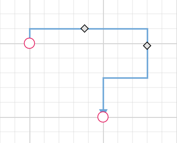
Reset segments
The resetSegments method resets the segments of connectors to their default state based on their connection points. This operation removes any custom segments and restores the connectors to their original configuration. The following example demonstrates how to reset connector segments at runtime.
<template>
    <div id="app">
        <button @click="resetSegments">resetSegments</button>
        <ejs-diagram id="diagram" :width='width' :height='height' :nodes='nodes' :connectors='connectors'
            :getNodeDefaults='getNodeDefaults'></ejs-diagram>
    </div>
</template>
<script setup>
import { DiagramComponent as EjsDiagram ,ConnectorConstraints,HierarchicalTree, ConnectorEditing} from '@syncfusion/ej2-vue-diagrams';
import { provide } from "vue";
const nodes = [
{
  id: 'Start',
  width: 140,
  height: 50,
  offsetX: 300,
  offsetY: 50,
  annotations: [
    {
      content: 'Node1',
    },
  ],
  style: {
    fill: '#6BA5D7',
    strokeColor: 'white',
  },
  expandIcon: {
    shape: 'ArrowDown',
    width: 20,
    height: 15,
  },
  collapseIcon: {
    shape: 'ArrowUp',
    width: 20,
    height: 15,
  },
},
{
  id: 'Init',
  width: 140,
  height: 50,
  offsetX: 200,
  offsetY: 240,
  style: {
    fill: '#6BA5D7',
    strokeColor: 'white',
  },
  annotations: [
    {
      content: 'Node2',
    },
  ],
},
];
const connectors = [ {
  // Unique name for the connector
  id: 'connector1',
  // Source and Target node's name to which connector needs to be connected.
  sourceID: 'Start',
  targetID: 'Init',
  type: 'Orthogonal',
  constraints:
    ConnectorConstraints.Default | ConnectorConstraints.DragSegmentThumb,
},]

const width = "100%";
const height = "350px";
const getNodeDefaults = (node) => {
    node.height = 100;
    node.width = 100;
    node.style.fill = '#6BA5D7';
    node.style.strokeColor = 'white';
    return node;
}
provide: {
    diagram: [ConnectorEditing,HierarchicalTree]
}
const resetSegments = function (){
    diagram.value.ej2Instances.resetSegments();
}
</script>
<style>
@import "../node_modules/@syncfusion/ej2-vue-diagrams/styles/material.css";
</style><template>
<div id="app">
<button @click="resetSegments">resetSegments</button>
<ejs-diagram ref="diagram" :width='width' :height='height' :nodes='nodes' :connectors='connectors'
:getNodeDefaults='getNodeDefaults'></ejs-diagram>
</div>
</template>
<script>
import { DiagramComponent,ConnectorConstraints,HierarchicalTree, ConnectorEditing } from '@syncfusion/ej2-vue-diagrams';
let nodes = [
{
id: 'Start',
width: 140,
height: 50,
offsetX: 300,
offsetY: 50,
annotations: [
{
content: 'Node1',
},
],
style: {
fill: '#6BA5D7',
strokeColor: 'white',
},
expandIcon: {
shape: 'ArrowDown',
width: 20,
height: 15,
},
collapseIcon: {
shape: 'ArrowUp',
width: 20,
height: 15,
},
},
{
id: 'Init',
width: 140,
height: 50,
offsetX: 200,
offsetY: 240,
style: {
fill: '#6BA5D7',
strokeColor: 'white',
},
annotations: [
{
content: 'Node2',
},
],
},
];
let connectors = [ {
// Unique name for the connector
id: 'connector1',
// Source and Target node's name to which connector needs to be connected.
sourceID: 'Start',
targetID: 'Init',
type: 'Orthogonal',
constraints:
ConnectorConstraints.Default | ConnectorConstraints.DragSegmentThumb,
},]
export default {
name: "App",
components: {
"ejs-diagram": DiagramComponent
},
data() {
return {
width: "100%",
height: "350px",
nodes: nodes,
connectors: connectors,
getNodeDefaults: (node) => {
node.height = 100;
node.width = 100;
node.style.fill = '#6BA5D7';
node.style.strokeColor = 'white';
return node;
},
}
},
methods :{
resetSegments() {
this.$refs.diagram.ej2Instances.resetSegments();
}
},
provide: {
diagram: [ConnectorEditing,HierarchicalTree]
}
}
</script>
<style>
@import "../node_modules/@syncfusion/ej2-vue-diagrams/styles/material.css";
</style>Enable Connector Splitting
The connectors are used to create a link between two points, ports, or nodes to represent the relationship between them. Split the connector between two nodes when dropping a new node onto an existing connector and create a connection between the new node and existing nodes by setting the enableConnectorSplit as true. The default value of the enableConnectorSplit is false
The following code illustrates how to split the connector and create a connection with new node.
<template>
    <div id="app">
        <ejs-diagram id="diagram" :width='width' :height='height' :connectors='connectors' :nodes='nodes'
            :enableConnectorSplit='enableConnectorSplit'></ejs-diagram>
    </div>
</template>

<script setup>
import { DiagramComponent as EjsDiagram, ConnectorConstraints } from '@syncfusion/ej2-vue-diagrams';

let nodes = [
    { id: 'node1', offsetX: 150, offsetY: 150, width: 100, height: 100, annotations: [{ content: 'node1' }] },
    { id: 'node2', offsetX: 650, offsetY: 150, width: 100, height: 100, annotations: [{ content: 'node2' }] },
    { id: 'node3', offsetX: 490, offsetY: 290, width: 100, height: 100, annotations: [{ content: 'node3' }] }
];
let connectors = [{
    id: 'connector1', sourceID: "node1", targetID: "node2",
    constraints: ConnectorConstraints.Default | ConnectorConstraints.AllowDrop
}];

const width = "100%";
const height = "450px";
const enableConnectorSplit = true;
</script>
<style>
@import "../node_modules/@syncfusion/ej2-vue-diagrams/styles/material.css";
</style><template>
<div id="app">
<ejs-diagram id="diagram" :width='width' :height='height' :connectors='connectors' :nodes='nodes'
:enableConnectorSplit='enableConnectorSplit'></ejs-diagram>
</div>
</template>
<script>
import { DiagramComponent, ConnectorConstraints } from '@syncfusion/ej2-vue-diagrams';
let nodes = [
{ id: 'node1', offsetX: 150, offsetY: 150, width: 100, height: 100, annotations: [{ content: 'node1' }] },
{ id: 'node2', offsetX: 650, offsetY: 150, width: 100, height: 100, annotations: [{ content: 'node2' }] },
{ id: 'node3', offsetX: 490, offsetY: 290, width: 100, height: 100, annotations: [{ content: 'node3' }] }
];
let connectors = [{
id: 'connector1', sourceID: "node1", targetID: "node2",
constraints: ConnectorConstraints.Default | ConnectorConstraints.AllowDrop
}];
export default {
name: "App",
components: {
"ejs-diagram": DiagramComponent
},
data() {
return {
width: "100%",
height: "450px",
nodes: nodes,
connectors: connectors,
enableConnectorSplit: true
}
}
}
</script>
<style>
@import "../node_modules/@syncfusion/ej2-vue-diagrams/styles/material.css";
</style>
Preserve connector style while connector splitting
When splitting a connector using enableConnectorSplit, the new connector created will be a normal connector without any specific styles. To ensure the new connector has the same style as the original connector, you can use the collectionChange event to apply the styles.
The following example demonstrates how to apply the same style of the original connector to the newly added connector:
<template>
    <div id="app">
         <ejs-diagram ref="diagram" :width='width' :height='height' :connectors='connectors' :nodes='nodes'
        :enableConnectorSplit='enableConnectorSplit' :getNodeDefaults='getNodeDefaults' :collectionChange='collectionChange'></ejs-diagram>
    </div>
</template>

<script setup>
import { DiagramComponent as EjsDiagram, ConnectorConstraints,NodeConstraints,Connector } from '@syncfusion/ej2-vue-diagrams';

let nodes = [
    { id: 'node1', offsetX: 150, offsetY: 150, width: 100, height: 100, annotations: [{ content: 'node1' }] },
    { id: 'node2', offsetX: 650, offsetY: 150, width: 100, height: 100, annotations: [{ content: 'node2' }] },
    { id: 'node3', offsetX: 490, offsetY: 290, width: 100, height: 100, annotations: [{ content: 'node3' }] }
];
let connectors = [{
id: 'connector1', sourceID: "node1", targetID: "node2",
style: { strokeColor: 'red', strokeWidth: 2, strokeDashArray: '3,3' },
constraints: ConnectorConstraints.Default | ConnectorConstraints.AllowDrop
}];
const getNodeDefaults = (obj) => {
 obj.constraints = NodeConstraints.Default | NodeConstraints.AllowDrop;
  return obj;
}
const collectionChange = (args) => {
    const diagramInstance = diagram.value.ej2Instances;
    if (args.state === 'Changed' && args.element instanceof Connector) {
    let sourceNode = diagramInstance.getObject(args.element.sourceID);
    if (sourceNode) {
        sourceNode.inEdges.forEach((edgeId) => {
        let initialConnector = diagramInstance.getObject(edgeId);
        args.element.style = initialConnector.style;
        });
    }
    }
    diagramInstance.dataBind();
}
const width = "100%";
const height = "450px";
const enableConnectorSplit = true;
</script>
<style>
@import "../node_modules/@syncfusion/ej2-vue-diagrams/styles/material.css";
</style>
import Vue from 'vue';
import { DiagramPlugin,ConnectorConstraints,NodeConstraints,Connector } from '@syncfusion/ej2-vue-diagrams';
Vue.use(DiagramPlugin);
let nodes = [
{ id: 'node1', offsetX: 150, offsetY: 150, width: 100, height: 100, annotations: [{ content: 'node1' }] },
{ id: 'node2', offsetX: 650, offsetY: 150, width: 100, height: 100, annotations: [{ content: 'node2' }] },
{ id: 'node3', offsetX: 490, offsetY: 290, width: 100, height: 100, annotations: [{ content: 'node3' }] }
];
let connectors = [{
id: 'connector1',sourceID:"node1",targetID:"node2",
style: { strokeColor: 'red', strokeWidth: 2, strokeDashArray: '3,3' },
constraints: ConnectorConstraints.Default | ConnectorConstraints.AllowDrop
}];
new Vue({
el: '#app',
template: `
<div id="app">
<ejs-diagram id="diagram" :width='width' :height='height' :connectors='connectors' :nodes='nodes'
:enableConnectorSplit='enableConnectorSplit' :getNodeDefaults='getNodeDefaults' :collectionChange='collectionChange'></ejs-diagram>
</div>
`,
name: 'app',
data() {
return {
width: "100%",
height: "450px",
nodes: nodes,
connectors: connectors,
enableConnectorSplit: true,
getNodeDefaults: (obj) => {
obj.constraints = NodeConstraints.Default | NodeConstraints.AllowDrop;
return obj;
},
collectionChange: (args) => {
let diagramInstance;
let diagramObj = document.getElementById("diagram");
diagramInstance = diagramObj.ej2_instances[0];
if (args.state === 'Changed' && args.element instanceof Connector) {
let sourceNode = diagramInstance.getObject(args.element.sourceID);
if (sourceNode) {
sourceNode.inEdges.forEach((edgeId) => {
let initialConnector = diagramInstance.getObject(edgeId);
args.element.style = initialConnector.style;
});
}
}
diagramInstance.dataBind();
},
}
}
});