How can I help you?
Dialog editing in Vue Grid component
7 May 202524 minutes to read
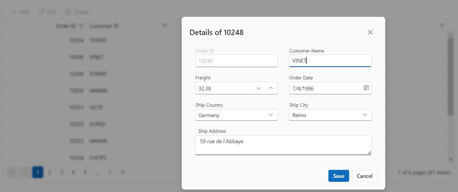
Dialog editing is a feature in the Grid component that allows you to edit the data of the currently selected row using a dialog window. With dialog editing, you can easily modify cell values and save the changes back to the data source.This feature is particularly beneficial in scenarios where you need to quickly modify data without navigating to a separate page or view, and it streamlines the process of editing multiple cells.
To enable dialog editing in grid component, you need to set the editSettings.mode property to Dialog. This property determines the editing mode for the grid, and when set to Dialog, it enables the dialog editing feature.
Here’s an example how to enable dialog editing in the Vue grid component:
<template>
  <div id="app">
      <ejs-grid :dataSource='data' :editSettings='editSettings' :toolbar='toolbar' height='273px'>
        <e-columns>
          <e-column field='OrderID' headerText='Order ID' width='140' textAlign='Right' isPrimaryKey='true' :validationRules='orderIDRules'></e-column>
          <e-column field='CustomerID' headerText='Customer ID' width='140' :validationRules='customerIDRules'></e-column>
          <e-column field='Freight' headerText='Freight' width='140' format='C2' textAlign='Right' editType='numericedit' :validationRules='freightRules' ></e-column>
          <e-column field='OrderDate' headerText='Order Date' type="date" width='120' :validationRules='orderDateRules' editType='datetimepickeredit' format='yMd' textAlign='Right'></e-column>
          <e-column field='ShipCountry' headerText='Ship Country' width='150' :validationRules='shipCountryRules' editType='dropdownedit' ></e-column>
        </e-columns>
      </ejs-grid>
  </div>
</template>
<script setup>
import { provide } from "vue";
import { GridComponent as EjsGrid, ColumnDirective as EColumn, ColumnsDirective as EColumns, Toolbar, Edit } from "@syncfusion/ej2-vue-grids";
import { data } from './datasource.js';
const editSettings = { allowEditing: true, allowAdding: true, allowDeleting: true, mode: 'Dialog' };
const toolbar = ['Add', 'Edit', 'Delete', 'Update', 'Cancel'];
const orderIDRules = { required: true, number: true };
const shipCountryRules = { required: true };
const freightRules = { required: true };
const orderDateRules = { required: true };
const customerIDRules = { required: true };
provide('grid',  [Edit, Toolbar]);
</script>
<style>
@import "../node_modules/@syncfusion/ej2-base/styles/material3.css";
@import "../node_modules/@syncfusion/ej2-buttons/styles/material3.css";
@import "../node_modules/@syncfusion/ej2-calendars/styles/material3.css";
@import "../node_modules/@syncfusion/ej2-dropdowns/styles/material3.css";
@import "../node_modules/@syncfusion/ej2-inputs/styles/material3.css";
@import "../node_modules/@syncfusion/ej2-navigations/styles/material3.css";
@import "../node_modules/@syncfusion/ej2-popups/styles/material3.css";
@import "../node_modules/@syncfusion/ej2-splitbuttons/styles/material3.css";
@import "../node_modules/@syncfusion/ej2-vue-grids/styles/material3.css";
</style><template>
<div id="app">
<ejs-grid :dataSource='data' :editSettings='editSettings' :toolbar='toolbar' height='273px'>
<e-columns>
<e-column field='OrderID' headerText='Order ID' width='140' textAlign='Right' isPrimaryKey='true' :validationRules='orderIDRules'></e-column>
<e-column field='CustomerID' headerText='Customer ID' width='140' :validationRules='customerIDRules'></e-column>
<e-column field='Freight' headerText='Freight' width='140' format='C2' textAlign='Right' editType='numericedit' :validationRules='freightRules' ></e-column>
<e-column field='OrderDate' headerText='Order Date' type="date" width='120' :validationRules='orderDateRules' editType='datetimepickeredit' format='yMd' textAlign='Right'></e-column>
<e-column field='ShipCountry' headerText='Ship Country' width='150' :validationRules='shipCountryRules' editType='dropdownedit' ></e-column>
</e-columns>
</ejs-grid>
</div>
</template>
<script>
import { GridComponent, ColumnsDirective, ColumnDirective, Toolbar, Edit } from "@syncfusion/ej2-vue-grids";
import { data } from './datasource.js';
export default {
name: "App",
components: {
"ejs-grid":GridComponent,
"e-columns":ColumnsDirective,
"e-column":ColumnDirective,
},
data() {
return {
data: data,
editSettings: { allowEditing: true, allowAdding: true, allowDeleting: true, mode: 'Dialog' },
toolbar: ['Add', 'Edit', 'Delete', 'Update', 'Cancel'],
orderIDRules : { required: true, number: true },
customerIDRules : { required: true },
freightRules : { required: true },
shipCountryRules : { required: true },
orderDateRules : { required: true },
};
},
provide: {
grid: [Edit, Toolbar]
}
}
</script>
<style>
@import "../node_modules/@syncfusion/ej2-base/styles/material3.css";
@import "../node_modules/@syncfusion/ej2-buttons/styles/material3.css";
@import "../node_modules/@syncfusion/ej2-calendars/styles/material3.css";
@import "../node_modules/@syncfusion/ej2-dropdowns/styles/material3.css";
@import "../node_modules/@syncfusion/ej2-inputs/styles/material3.css";
@import "../node_modules/@syncfusion/ej2-navigations/styles/material3.css";
@import "../node_modules/@syncfusion/ej2-popups/styles/material3.css";
@import "../node_modules/@syncfusion/ej2-splitbuttons/styles/material3.css";
@import "../node_modules/@syncfusion/ej2-vue-grids/styles/material3.css";
</style>Customize edit dialog
The edit dialog in the Grid component allows you to customize its appearance and behavior based on the type of action being performed, such as editing or adding a record. You can modify properties like header text, showCloseIcon, and height to tailor the edit dialog to your specific requirements. Additionally, you can override default localization strings to provide custom text for buttons or other elements within the dialog.
To customize the edit dialog, you need to handle the actionComplete event of the Grid component and perform the necessary modifications based on the requestType parameter. The requestType parameter identifies the type of action being performed, such as beginEdit for editing a record or add for adding a new record.
You can refer the Grid Default text list for more localization.
The following example that demonstrates how to customize the edit dialog using the actionComplete event:
<template>
  <div id="app">
    <ejs-grid :dataSource='data' :editSettings='editSettings' :toolbar='toolbar' height='273px' :actionComplete="actionComplete">
      <e-columns>
        <e-column field='OrderID' headerText='Order ID' width='140' textAlign='Right' isPrimaryKey='true' :validationRules='orderIDRules'></e-column>
        <e-column field='CustomerID' headerText='Customer ID' width='140' :validationRules='customerIDRules'></e-column>
        <e-column field='Freight' headerText='Freight' width='140' format='C2' textAlign='Right' editType='numericedit' :validationRules='freightRules' ></e-column>
        <e-column field='ShipCountry' headerText='Ship Country' width='150' :validationRules='shipCountryRules' editType='dropdownedit' ></e-column>
      </e-columns>
    </ejs-grid>
  </div>
</template>
<script setup>
import { provide } from "vue";
import { L10n } from '@syncfusion/ej2-base';
import { GridComponent as EjsGrid, ColumnDirective as EColumn, ColumnsDirective as EColumns, Toolbar, Edit } from "@syncfusion/ej2-vue-grids";
import { data } from './datasource.js';
L10n.load({
    'en-US': {
        'grid': {
            'SaveButton': 'Submit',
            'CancelButton': 'Discard'
        }
    }
});
const editSettings = { allowEditing: true, allowAdding: true, allowDeleting: true, mode: 'Dialog' };
const toolbar = ['Add', 'Edit', 'Delete', 'Update', 'Cancel'];
const orderIDRules = { required: true, number: true };
const shipCountryRules = { required: true };
const freightRules = { required: true };
const customerIDRules = { required: true };
const actionComplete = (args) => {
    if ((args.requestType === 'beginEdit' || args.requestType === 'add')) {
        let dialog = args.dialog;
        dialog.showCloseIcon = false;
        dialog.height = 300;
        dialog.width = 300;
        dialog.header = args.requestType === 'beginEdit' ? 'Edit Record of ' + args.rowData['CustomerID'] : 'New Customer';
    }
}
provide('grid', [Edit, Toolbar]);
</script>
<style>
@import "../node_modules/@syncfusion/ej2-base/styles/material3.css";
@import "../node_modules/@syncfusion/ej2-buttons/styles/material3.css";
@import "../node_modules/@syncfusion/ej2-calendars/styles/material3.css";
@import "../node_modules/@syncfusion/ej2-dropdowns/styles/material3.css";
@import "../node_modules/@syncfusion/ej2-inputs/styles/material3.css";
@import "../node_modules/@syncfusion/ej2-navigations/styles/material3.css";
@import "../node_modules/@syncfusion/ej2-popups/styles/material3.css";
@import "../node_modules/@syncfusion/ej2-splitbuttons/styles/material3.css";
@import "../node_modules/@syncfusion/ej2-vue-grids/styles/material3.css";
</style><template>
<div id="app">
<ejs-grid :dataSource='data' :editSettings='editSettings' :toolbar='toolbar' height='273px' :actionComplete="actionComplete">
<e-columns>
<e-column field='OrderID' headerText='Order ID' width='140' textAlign='Right' isPrimaryKey='true' :validationRules='orderIDRules'></e-column>
<e-column field='CustomerID' headerText='Customer ID' width='140' :validationRules='customerIDRules'></e-column>
<e-column field='Freight' headerText='Freight' width='140' format='C2' textAlign='Right' editType='numericedit' :validationRules='freightRules' ></e-column>
<e-column field='ShipCountry' headerText='Ship Country' width='150' :validationRules='shipCountryRules' editType='dropdownedit' ></e-column>
</e-columns>
</ejs-grid>
</div>
</template>
<script>
import { L10n } from '@syncfusion/ej2-base';
import { GridComponent, ColumnsDirective, ColumnDirective,Toolbar, Edit } from "@syncfusion/ej2-vue-grids";
import { data } from './datasource.js';
L10n.load({
'en-US': {
'grid': {
'SaveButton': 'Submit',
'CancelButton': 'Discard'
}
}
});
export default {
name: "App",
components: {
"ejs-grid":GridComponent,
"e-columns":ColumnsDirective,
"e-column":ColumnDirective
},
data() {
return {
data: data,
editSettings: { allowEditing: true, allowAdding: true, allowDeleting: true, mode: 'Dialog' },
toolbar: ['Add', 'Edit', 'Delete', 'Update', 'Cancel'],
orderIDRules : { required: true, number: true },
customerIDRules : { required: true },
freightRules : { required: true },
shipCountryRules : { required: true },
};
},
methods: {
actionComplete(args) {
if ((args.requestType === 'beginEdit' || args.requestType === 'add')) {
let dialog = args.dialog;
dialog.showCloseIcon = false;
dialog.height = 300;
dialog.width = 300;
dialog.header = args.requestType === 'beginEdit' ? 'Edit Record of ' + args.rowData['CustomerID'] : 'New Customer';
}
}
},
provide: {
grid: [Edit, Toolbar]
}
}
</script>
<style>
@import "../node_modules/@syncfusion/ej2-base/styles/material3.css";
@import "../node_modules/@syncfusion/ej2-buttons/styles/material3.css";
@import "../node_modules/@syncfusion/ej2-calendars/styles/material3.css";
@import "../node_modules/@syncfusion/ej2-dropdowns/styles/material3.css";
@import "../node_modules/@syncfusion/ej2-inputs/styles/material3.css";
@import "../node_modules/@syncfusion/ej2-navigations/styles/material3.css";
@import "../node_modules/@syncfusion/ej2-popups/styles/material3.css";
@import "../node_modules/@syncfusion/ej2-splitbuttons/styles/material3.css";
@import "../node_modules/@syncfusion/ej2-vue-grids/styles/material3.css";
</style>The Grid add or edit dialog element has the max-height property, which is calculated based on the available window height. So, in the normal window (1920 x 1080), it is possible to set the dialog’s height up to 658px.
Show or hide columns in dialog editing
The show or hide columns in dialog editing feature in the grid allows you to dynamically control the visibility of columns while editing in the dialog edit mode. This feature is useful when you want to display specific columns based on the type of action being performed, such as editing an existing record or adding a new record. To achieve this, you can utilize the actionBegin event of the Grid.
The actionBegin event is triggered whenever an action is initiated in the grid, such as editing, adding, or deleting a record. Within the event handler, you can check the requestType parameter to determine the type of action being performed. If the requestType is beginEdit or add, you can modify the visibility of columns using the column.visible property. This property is used to determine whether a column should be displayed or hidden. Then, when the requestType is save, you can reset the column visibility to its initial state using the column.visible property.
In the following example, the CustomerID column is rendered as a hidden column, and the ShipCountry column is rendered as a visible column. In the edit mode, the CustomerID column will be changed to a visible state and the ShipCountry column will be changed to a hidden state.
<template>
  <div id="app">
    <ejs-grid ref="grid" :dataSource='data' :editSettings='editSettings' :toolbar='toolbar' height='273px' :actionBegin="actionBegin">
      <e-columns>
        <e-column field='OrderID' headerText='Order ID' width='140' textAlign='Right' isPrimaryKey='true' :validationRules='orderIDRules'></e-column>
        <e-column field='CustomerID' headerText='Customer ID' width='140' :visible='false' :validationRules='customerIDRules'></e-column>
        <e-column field='Freight' headerText='Freight' width='140' format='C2' textAlign='Right' editType='numericedit' :validationRules='freightRules' ></e-column>
        <e-column field='ShipCountry' headerText='Ship Country' width='150' :validationRules='shipCountryRules' editType='dropdownedit' ></e-column>
      </e-columns>
    </ejs-grid>
  </div>
</template>
<script setup>
import { provide, ref } from "vue";
import { GridComponent as EjsGrid, ColumnDirective as EColumn, ColumnsDirective as EColumns, Toolbar, Edit } from "@syncfusion/ej2-vue-grids";
import { data } from './datasource.js';
const grid = ref(null);
const editSettings = { allowEditing: true, allowAdding: true, allowDeleting: true, mode: 'Dialog' };
const toolbar = ['Add', 'Edit', 'Delete', 'Update', 'Cancel'];
const orderIDRules = { required: true, number: true };
const shipCountryRules = { required: true };
const freightRules = { required: true };
const customerIDRules = { required: true };
const actionBegin = (args) => {
    if (args.requestType === 'beginEdit') {
        for (const cols of grid.value.ej2Instances.columns) {
            if (cols.field === 'CustomerID') {
                cols.visible = true;
            } else if (cols.field === 'ShipCountry') {
                cols.visible = false;
            }
        }
    }
    else if (args.requestType === 'add') {
        for (const cols of grid.value.ej2Instances.columns) {
            if (cols.field === 'CustomerID') {
                cols.visible = true;
            }
        }
    }
    else if (args.requestType === 'save') {
        for (const cols of grid.value.ej2Instances.columns) {
            if (cols.field === 'CustomerID') {
                cols.visible = false;
            } else if (cols.field === 'ShipCountry') {
                cols.visible = true;
            }
        }
    }
}
provide('grid', [Edit, Toolbar]);
</script>
<style>
@import "../node_modules/@syncfusion/ej2-base/styles/material3.css";
@import "../node_modules/@syncfusion/ej2-buttons/styles/material3.css";
@import "../node_modules/@syncfusion/ej2-calendars/styles/material3.css";
@import "../node_modules/@syncfusion/ej2-dropdowns/styles/material3.css";
@import "../node_modules/@syncfusion/ej2-inputs/styles/material3.css";
@import "../node_modules/@syncfusion/ej2-navigations/styles/material3.css";
@import "../node_modules/@syncfusion/ej2-popups/styles/material3.css";
@import "../node_modules/@syncfusion/ej2-splitbuttons/styles/material3.css";
@import "../node_modules/@syncfusion/ej2-vue-grids/styles/material3.css";
</style><template>
<div id="app">
<ejs-grid ref="grid" :dataSource='data' :editSettings='editSettings' :toolbar='toolbar' height='273px' :actionBegin="actionBegin">
<e-columns>
<e-column field='OrderID' headerText='Order ID' width='140' textAlign='Right' isPrimaryKey='true' :validationRules='orderIDRules'></e-column>
<e-column field='CustomerID' headerText='Customer ID' width='140' :visible='false' :validationRules='customerIDRules'></e-column>
<e-column field='Freight' headerText='Freight' width='140' format='C2' textAlign='Right' editType='numericedit' :validationRules='freightRules' ></e-column>
<e-column field='ShipCountry' headerText='Ship Country' width='150' :validationRules='shipCountryRules' editType='dropdownedit' ></e-column>
</e-columns>
</ejs-grid>
</div>
</template>
<script>
import { GridComponent, ColumnsDirective, ColumnDirective,Toolbar, Edit } from "@syncfusion/ej2-vue-grids";
import { data } from './datasource.js';
export default {
name: "App",
components: {
"ejs-grid":GridComponent,
"e-columns":ColumnsDirective,
"e-column":ColumnDirective
},
data() {
return {
data: data,
editSettings: { allowEditing: true, allowAdding: true, allowDeleting: true, mode: 'Dialog' },
toolbar: ['Add', 'Edit', 'Delete', 'Update', 'Cancel'],
orderIDRules : { required: true, number: true },
customerIDRules : { required: true },
freightRules : { required: true },
shipCountryRules : { required: true },
};
},
methods: {
actionBegin(args) {
if (args.requestType === 'beginEdit') {
for (const cols of this.$refs.grid.ej2Instances.columns) {
if (cols.field === 'CustomerID') {
cols.visible = true;
} else if (cols.field === 'ShipCountry') {
cols.visible = false;
}
}
}
else if (args.requestType === 'add') {
for (const cols of this.$refs.grid.ej2Instances.columns) {
if (cols.field === 'CustomerID') {
cols.visible = true;
}
}
}
else if (args.requestType === 'save') {
for (const cols of this.$refs.grid.ej2Instances.columns) {
if (cols.field === 'CustomerID') {
cols.visible = false;
} else if (cols.field === 'ShipCountry') {
cols.visible = true;
}
}
}
}
},
provide: {
grid: [Edit, Toolbar]
}
}
</script>
<style>
@import "../node_modules/@syncfusion/ej2-base/styles/material3.css";
@import "../node_modules/@syncfusion/ej2-buttons/styles/material3.css";
@import "../node_modules/@syncfusion/ej2-calendars/styles/material3.css";
@import "../node_modules/@syncfusion/ej2-dropdowns/styles/material3.css";
@import "../node_modules/@syncfusion/ej2-inputs/styles/material3.css";
@import "../node_modules/@syncfusion/ej2-navigations/styles/material3.css";
@import "../node_modules/@syncfusion/ej2-popups/styles/material3.css";
@import "../node_modules/@syncfusion/ej2-splitbuttons/styles/material3.css";
@import "../node_modules/@syncfusion/ej2-vue-grids/styles/material3.css";
</style>Use wizard like dialog editing
Wizard-like dialog editing is a powerful feature in the Grid component that enables the creation of intuitive step-by-step forms. This feature provides a structured approach to form completion or data entry by breaking down the process into manageable steps.This feature is particularly useful when you have complex forms that need to be broken down into smaller sections to guide you through the data entry process.
To achieve wizard-like dialog editing in the grid component, you can use the dialog template feature. This feature allows you to define your own custom editing template using the editSettings.mode property set to Dialog and the editSetting.template property to specify the template variable that defines the editors for each step of the wizard.
The following example demonstrate the wizard like editing in the grid with the unobtrusive validation.
<template>
  <div id="app">
    <ejs-grid ref="grid" :dataSource="dataGrid" allowPaging="true" :editSettings="editSettings" :toolbar="toolbar" @actionComplete="actionComplete">
      <e-columns>
        <e-column field="OrderID" headerText="Order ID" width="120" textAlign="Right" isPrimaryKey="true"></e-column>
        <e-column field="CustomerID" headerText="Customer Name" width="120" :validationRules='customerIDRules'></e-column>
        <e-column field="Freight" headerText="Freight" width="120"></e-column>
        <e-column field="ShipCity" headerText="Ship City" width="120"></e-column>
        <e-column field="ShipCountry" headerText="Ship Country" width="150"></e-column>
        <e-column field="Verified" headerText="Verified" width="100" type="boolean" :displayAsCheckBox="true"></e-column>
      </e-columns>
      <template v-slot:dialogTemplate="{ data }">
    <div>
      <div class="tab" id="tab0" :style="{ display: currentTab === 0 ? 'block' : 'none' }">
            <div class="form-row">
              <div class="form-group col-md-6">
                <div class="e-float-input e-control-wrapper">
                  <input id="OrderID" name="OrderID" type="text" :disabled="!data.isAdd" v-model="data.OrderID" required />
                  <span class="e-float-line"></span>
                  <label class="e-float-text e-label-top">Order ID</label>
                </div>
              </div>
            </div>
            <div class="form-row">
              <div class="form-group col-md-6">
                <div class="e-float-input e-control-wrapper">
                  <input v-model="data.CustomerID" id="CustomerName" name="CustomerID" type="text" required/>
                  <span class="e-float-line"></span>
                  <label class="e-float-text e-label-top">Customer Name</label>
                </div>
              </div>
            </div>
          </div>
          <div class="tab" id="tab1" :style="{ display: currentTab === 1 ? 'block' : 'none' }">
            <div class="form-row">
              <div class="form-group col-md-6">
                <ejs-numerictextbox id="Freight" format="C2" v-model="data.Freight"  placeholder="Freight" floatLabelType="Always" ></ejs-numerictextbox>
              </div>
            </div>
            <div class="form-row">
              <div class="form-group col-md-6">
                <ejs-dropdownlist id="ShipCity" v-model="data.ShipCity" required :dataSource="shipCityDistinctData" :fields="{ text: 'ShipCity', value: 'ShipCity' }" placeholder="Ship City" popupHeight="300px" floatLabelType="Always"></ejs-dropdownlist>
              </div>
            </div>
          </div>
          <div class="tab" id="tab2" :style="{ display: currentTab === 2 ? 'block' : 'none' }">
            <div class="form-row">
              <div class="form-group col-md-6">
                <ejs-dropdownlist id="ShipCountry" v-model="data.ShipCountry" required :dataSource="shipCountryDistinctData" :fields="{ text: 'ShipCountry', value: 'ShipCountry' }" placeholder="Ship Country" popupHeight="300px" floatLabelType="Always"></ejs-dropdownlist>
              </div>
            </div>
            <div class="form-row">
              <div class="form-group col-md-6">
                <ejs-checkbox ref="checkbox" id="Verified" v-model="data.Verified" name="Verified" label="Verified"></ejs-checkbox>
              </div>
            </div>
          </div>
          <div id="footer" style="margin-top: 20px">
            <div style="float: left;">
              <button id="prevBtn" class="e-info e-btn" type="button" @click="previous" :style="{ display: currentTab === 0 ? 'none' : '' }">Previous</button>
            </div>
            <div style="float: right;">
              <button id="saveBtn" class="e-info e-btn" type="button" @click="saveBtn" style="margin-right: 30px">Save</button>
              <button id="nextBtn" class="e-info e-btn" type="button" @click="next" :style="{ display: currentTab === 2 ? 'none' : '' }">Next</button>
            </div>
          </div>
      </div>
      </template>
    </ejs-grid>
  </div>
</template>
<script setup>
import { provide, ref } from "vue";
import { GridComponent as EjsGrid, ColumnDirective as EColumn, ColumnsDirective as EColumns, Page,Toolbar, Edit } from "@syncfusion/ej2-vue-grids";
import { CheckBoxComponent as EjsCheckbox } from "@syncfusion/ej2-vue-buttons";
import { NumericTextBoxComponent as EjsNumerictextbox } from "@syncfusion/ej2-vue-inputs";
import { DropDownListComponent as EjsDropdownlist } from "@syncfusion/ej2-vue-dropdowns";
import { data } from './datasource.js';
import { DataUtil } from '@syncfusion/ej2-data';

const dataGrid = data;
const editSettings = { allowEditing: true, allowAdding: true, allowDeleting: true, mode: 'Dialog', template: "dialogTemplate" };
const toolbar = ['Add', 'Edit', 'Delete', 'Update', 'Cancel'];

const shipCountryDistinctData = DataUtil.distinct(data, 'ShipCountry', true);
const shipCityDistinctData = DataUtil.distinct(data, 'ShipCity', true);
let currentTab = ref(0);
const grid = ref(null);

const actionComplete = function(args) {
  if (args.dialog && args.dialog.element && args.dialog.element.querySelector('.e-footer-content')) {
    args.dialog.element.querySelector('.e-footer-content').classList.add('e-hide');
  }
  if (args.requestType === 'beginEdit' || args.requestType === 'add') {
    args.form.ej2_instances[0].rules = {};
  }
  if (args.requestType === 'beginEdit') {
    args.form.ej2_instances[0].addRules("Freight", { min: 1, max: 500 });
    args.form.ej2_instances[0].addRules("ShipCountry", { required: true });
    args.form.ej2_instances[0].addRules("ShipCity", { required: true });
    args.form.elements.namedItem('CustomerID').focus(); // Set focus on first field
  }
  if (args.requestType === 'add') {
    args.form.elements.namedItem('OrderID').focus();
  }
  currentTab.value = 0; // Reset tab index
};

const saveBtn = function() {
  if (validateCurrentTab()) {
    grid.value.endEdit();
  }
};

const next = function() {
  if (validateCurrentTab()) {
    currentTab.value++;
  }
};

const previous = function() {
  if (validateCurrentTab()) {
    currentTab.value--;
  }
};

const validateCurrentTab = function() {
  let valid = true;
  const elements = document.getElementById('tab' + currentTab.value).querySelectorAll('[name]');

  elements.forEach((element) => {
    element.form.ej2_instances[0].validate(element.name);
    if (element.getAttribute('aria-invalid') === 'true') {
      valid = false;
    }
  });

  return valid;
};

provide('grid', [Toolbar,Page, Edit]);
</script>
<style>
@import "../node_modules/@syncfusion/ej2-base/styles/material3.css";
@import "../node_modules/@syncfusion/ej2-buttons/styles/material3.css";
@import "../node_modules/@syncfusion/ej2-calendars/styles/material3.css";
@import "../node_modules/@syncfusion/ej2-dropdowns/styles/material3.css";
@import "../node_modules/@syncfusion/ej2-inputs/styles/material3.css";
@import "../node_modules/@syncfusion/ej2-navigations/styles/material3.css";
@import "../node_modules/@syncfusion/ej2-popups/styles/material3.css";
@import "../node_modules/@syncfusion/ej2-splitbuttons/styles/material3.css";
@import "../node_modules/@syncfusion/ej2-vue-grids/styles/material3.css";
@import "https://maxcdn.bootstrapcdn.com/bootstrap/3.3.7/css/bootstrap.min.css";
.form-group.col-md-6 {
  width: 250px;
  float: none;
}
</style><template>
<div id="app">
<ejs-grid ref="grid" :dataSource="data" allowPaging="true" :editSettings="editSettings" :toolbar="toolbar" @actionComplete="actionComplete">
<e-columns>
<e-column field="OrderID" headerText="Order ID" width="120" textAlign="Right" isPrimaryKey="true"></e-column>
<e-column field="CustomerID" headerText="Customer Name" width="120" :validationRules='customerIDRules'></e-column>
<e-column field="Freight" headerText="Freight" width="120"></e-column>
<e-column field="ShipCity" headerText="Ship City" width="120"></e-column>
<e-column field="ShipCountry" headerText="Ship Country" width="150"></e-column>
<e-column field="Verified" headerText="Verified" width="100" type="boolean" :displayAsCheckBox="true"></e-column>
</e-columns>
<template v-slot:dialogTemplate="{ data }">
<div>
<div class="tab" id="tab0" :style="{ display: currentTab === 0 ? 'block' : 'none' }">
<div class="form-row">
<div class="form-group col-md-6">
<div class="e-float-input e-control-wrapper">
<input id="OrderID" name="OrderID" type="text" :disabled="!data.isAdd" v-model="data.OrderID" required />
<span class="e-float-line"></span>
<label class="e-float-text e-label-top">Order ID</label>
</div>
</div>
</div>
<div class="form-row">
<div class="form-group col-md-6">
<div class="e-float-input e-control-wrapper">
<input v-model="data.CustomerID" id="CustomerName" name="CustomerID" type="text" required/>
<span class="e-float-line"></span>
<label class="e-float-text e-label-top">Customer Name</label>
</div>
</div>
</div>
</div>
<div class="tab" id="tab1" :style="{ display: currentTab === 1 ? 'block' : 'none' }">
<div class="form-row">
<div class="form-group col-md-6">
<ejs-numerictextbox id="Freight" format="C2" v-model="data.Freight" placeholder="Freight" floatLabelType="Always" ></ejs-numerictextbox>
</div>
</div>
<div class="form-row">
<div class="form-group col-md-6">
<ejs-dropdownlist id="ShipCity" v-model="data.ShipCity" required :dataSource="shipCityDistinctData" :fields="{ text: 'ShipCity', value: 'ShipCity' }" placeholder="Ship City" popupHeight="300px" floatLabelType="Always"></ejs-dropdownlist>
</div>
</div>
</div>
<div class="tab" id="tab2" :style="{ display: currentTab === 2 ? 'block' : 'none' }">
<div class="form-row">
<div class="form-group col-md-6">
<ejs-dropdownlist id="ShipCountry" v-model="data.ShipCountry" required :dataSource="shipCountryDistinctData" :fields="{ text: 'ShipCountry', value: 'ShipCountry' }" placeholder="Ship Country" popupHeight="300px" floatLabelType="Always"></ejs-dropdownlist>
</div>
</div>
<div class="form-row">
<div class="form-group col-md-6">
<ejs-checkbox ref="checkbox" id="Verified" v-model="data.Verified" name="Verified" label="Verified"></ejs-checkbox>
</div>
</div>
</div>
<div id="footer" style="margin-top: 20px">
<div style="float: left;">
<button id="prevBtn" class="e-info e-btn" type="button" @click="previous" :style="{ display: currentTab === 0 ? 'none' : '' }">Previous</button>
</div>
<div style="float: right;">
<button id="saveBtn" class="e-info e-btn" type="button" @click="saveBtn" style="margin-right: 30px">Save</button>
<button id="nextBtn" class="e-info e-btn" type="button" @click="next" :style="{ display: currentTab === 2 ? 'none' : '' }">Next</button>
</div>
</div>
</div>
</template>
</ejs-grid>
</div>
</template>
<script>
import { GridComponent, ColumnsDirective, ColumnDirective, Page, Toolbar, Edit } from "@syncfusion/ej2-vue-grids";
import { NumericTextBoxComponent } from "@syncfusion/ej2-vue-inputs";
import { DropDownListComponent } from "@syncfusion/ej2-vue-dropdowns";
import { CheckBoxComponent } from "@syncfusion/ej2-vue-buttons";
import { data } from './datasource.js';
import { DataUtil } from '@syncfusion/ej2-data';
export default {
name: "App",
components: {
"ejs-grid": GridComponent,
"e-columns": ColumnsDirective,
"e-column": ColumnDirective,
"ejs-numerictextbox": NumericTextBoxComponent,
"ejs-checkbox": CheckBoxComponent,
"ejs-dropdownlist": DropDownListComponent,
},
data() {
return {
data: data,
editSettings: { allowEditing: true, allowAdding: true, allowDeleting: true, mode: 'Dialog', template: "dialogTemplate" },
shipCountryDistinctData: DataUtil.distinct(data, 'ShipCountry', true),
shipCityDistinctData: DataUtil.distinct(data, 'ShipCity', true),
toolbar: ['Add', 'Edit', 'Delete', 'Update', 'Cancel'],
currentTab: 0,
customerIDRules: { required: true }
};
},
methods: {
actionComplete(args) {
if (args.dialog && args.dialog.element && args.dialog.element.querySelector('.e-footer-content')) {
args.dialog.element.querySelector('.e-footer-content').classList.add('e-hide');
}
if (args.requestType === 'beginEdit' || args.requestType === 'add') {
args.form.ej2_instances[0].rules = {};
}
if (args.requestType === 'beginEdit') {
args.form.ej2_instances[0].addRules("Freight", { min: 1, max: 500 });
args.form.ej2_instances[0].addRules("ShipCountry", {required:true});
args.form.ej2_instances[0].addRules("ShipCity", {required:true});
args.form.elements.namedItem('CustomerID').focus(); // Set focus on first field
}
if(args.requestType === 'add')
{
args.form.elements.namedItem('OrderID').focus();
}
this.currentTab = 0;
},
saveBtn() {
if (this.validate()) {
this.$refs.grid.ej2Instances.endEdit();
}
},
next() {
if (this.validate()) {
this.currentTab++;
}
},
previous() {
if (this.validate()) {
this.currentTab--;
}
},
validate() {
let valid = true;
const elements = document.getElementById('tab' + this.currentTab).querySelectorAll('[name]');
elements.forEach((element) => {
element.form.ej2_instances[0].validate(element.name);
if (element.getAttribute('aria-invalid') === 'true') {
valid = false;
}
});
return valid;
},
},
provide: {
grid: [Page, Edit, Toolbar],
},
};
</script>
<style>
@import "../node_modules/@syncfusion/ej2-base/styles/material3.css";
@import "../node_modules/@syncfusion/ej2-buttons/styles/material3.css";
@import "../node_modules/@syncfusion/ej2-calendars/styles/material3.css";
@import "../node_modules/@syncfusion/ej2-dropdowns/styles/material3.css";
@import "../node_modules/@syncfusion/ej2-inputs/styles/material3.css";
@import "../node_modules/@syncfusion/ej2-navigations/styles/material3.css";
@import "../node_modules/@syncfusion/ej2-popups/styles/material3.css";
@import "../node_modules/@syncfusion/ej2-splitbuttons/styles/material3.css";
@import "../node_modules/@syncfusion/ej2-vue-grids/styles/material3.css";
@import "https://maxcdn.bootstrapcdn.com/bootstrap/3.3.7/css/bootstrap.min.css";
.form-group.col-md-6 {
width: 250px;
float: none;
}
</style>Customize add/edit dialog footer
The Customize add/edit dialog footer feature in the grid allows you to modify the footer section of the dialog that appears when editing the currently selected row or adding a new row. By default, the dialog displays two buttons in the footer section: Save and Cancel, which allow you to save or discard the changes made in the dialog. This feature is particularly helpful when you want to add custom buttons to the dialog’s footer, implement specific actions, or customize the appearance of the buttons, such as changing their color or size in the dialog’s footer. This can be achieved using the actionComplete event of the Grid component.
In the following sample, using the dialog argument of the actionComplete event, the action for the custom button can be customized.
<template>
  <div id="app">
    <ejs-grid ref="grid"  :dataSource='data' :editSettings='editSettings' :toolbar='toolbar' height='273px' :actionComplete="actionComplete">
      <e-columns>
        <e-column field='OrderID' headerText='Order ID' width='140' textAlign='Right' isPrimaryKey='true' :validationRules='orderIDRules'></e-column>
        <e-column field='CustomerID' headerText='Customer ID' width='140' :validationRules='customerIDRules'></e-column>
        <e-column field='Freight' headerText='Freight' width='140' format='C2' textAlign='Right' editType='numericedit' :validationRules='freightRules' ></e-column>
        <e-column field='ShipCountry' headerText='Ship Country' width='150' :validationRules='shipCountryRules' editType='dropdownedit' ></e-column>
      </e-columns>
    </ejs-grid>
  </div>
</template>
<script setup>
import { provide,ref } from "vue";
import { GridComponent as EjsGrid, ColumnDirective as EColumn, ColumnsDirective as EColumns, Toolbar, Edit } from "@syncfusion/ej2-vue-grids";
import { data } from './datasource.js';
const grid=ref(null);
const editSettings = { allowEditing: true, allowAdding: true, allowDeleting: true, mode: 'Dialog' };
const toolbar = ['Add', 'Edit', 'Delete', 'Update', 'Cancel'];
const orderIDRules = { required: true, number: true };
const shipCountryRules = { required: true };
const freightRules = { required: true };
const customerIDRules = { required: true };
    const actionComplete = (args) => {
        if (args.requestType === 'beginEdit' || args.requestType === 'add') {
          const dialogInstance = args.dialog;
          dialogInstance.buttons = [
            {
              buttonModel: { content: 'Discard', cssClass: 'e-primary custom-button-style' },
              click: () => {
                grid.value.ej2Instances.editModule.closeEdit();
              }
            },
            {
              buttonModel: { content: 'Submit', cssClass: 'e-success custom-button-style' },
              click: () => {
                grid.value.ej2Instances.editModule.endEdit();
              }
            }
          ];
        }
    }

  provide('grid',  [Edit, Toolbar]);
</script>
<style>
 @import "../node_modules/@syncfusion/ej2-base/styles/material3.css";
@import "../node_modules/@syncfusion/ej2-buttons/styles/material3.css";
@import "../node_modules/@syncfusion/ej2-calendars/styles/material3.css";
@import "../node_modules/@syncfusion/ej2-dropdowns/styles/material3.css";
@import "../node_modules/@syncfusion/ej2-inputs/styles/material3.css";
@import "../node_modules/@syncfusion/ej2-navigations/styles/material3.css";
@import "../node_modules/@syncfusion/ej2-popups/styles/material3.css";
@import "../node_modules/@syncfusion/ej2-splitbuttons/styles/material3.css";
@import "../node_modules/@syncfusion/ej2-vue-grids/styles/material3.css";
.e-footer-content .e-btn.e-primary.custom-button-style {
   border-radius: 4px;
   font-size: 15px;
  }
.e-footer-content .e-btn.e-success.custom-button-style {
   border-radius: 4px;
   font-size: 15px;
   background: #cbf4cb;
  }
</style><template>
<div id="app">
<ejs-grid ref="grid" :dataSource='data' :editSettings='editSettings' :toolbar='toolbar' height='273px' :actionComplete="actionComplete">
<e-columns>
<e-column field='OrderID' headerText='Order ID' width='140' textAlign='Right' isPrimaryKey='true' :validationRules='orderIDRules'></e-column>
<e-column field='CustomerID' headerText='Customer ID' width='140' :validationRules='customerIDRules'></e-column>
<e-column field='Freight' headerText='Freight' width='140' format='C2' textAlign='Right' editType='numericedit' :validationRules='freightRules' ></e-column>
<e-column field='ShipCountry' headerText='Ship Country' width='150' :validationRules='shipCountryRules' editType='dropdownedit' ></e-column>
</e-columns>
</ejs-grid>
</div>
</template>
<script>
import { GridComponent, ColumnsDirective, ColumnDirective,Toolbar, Edit } from "@syncfusion/ej2-vue-grids";
import { data } from './datasource.js';
export default {
name: "App",
components: {
"ejs-grid":GridComponent,
"e-columns":ColumnsDirective,
"e-column":ColumnDirective,
},
data() {
return {
data: data,
editSettings: { allowEditing: true, allowAdding: true, allowDeleting: true, mode: 'Dialog' },
toolbar: ['Add', 'Edit', 'Delete', 'Update', 'Cancel'],
orderIDRules : { required: true, number: true },
customerIDRules : { required: true },
freightRules : { required: true },
shipCountryRules : { required: true },
};
},
methods: {
actionComplete(args) {
if (args.requestType === 'beginEdit' || args.requestType === 'add') {
const dialogInstance = args.dialog;
dialogInstance.buttons = [
{
buttonModel: { content: 'Discard', cssClass: 'e-primary custom-button-style' },
click: () => {
this.$refs.grid.ej2Instances.editModule.closeEdit();
}
},
{
buttonModel: { content: 'Submit', cssClass: 'e-success custom-button-style' },
click: () => {
this.$refs.grid.ej2Instances.editModule.endEdit();
}
}
];
}
}
},
provide: {
grid: [Edit, Toolbar]
}
}
</script>
<style>
@import "../node_modules/@syncfusion/ej2-base/styles/material3.css";
@import "../node_modules/@syncfusion/ej2-buttons/styles/material3.css";
@import "../node_modules/@syncfusion/ej2-calendars/styles/material3.css";
@import "../node_modules/@syncfusion/ej2-dropdowns/styles/material3.css";
@import "../node_modules/@syncfusion/ej2-inputs/styles/material3.css";
@import "../node_modules/@syncfusion/ej2-navigations/styles/material3.css";
@import "../node_modules/@syncfusion/ej2-popups/styles/material3.css";
@import "../node_modules/@syncfusion/ej2-splitbuttons/styles/material3.css";
@import "../node_modules/@syncfusion/ej2-vue-grids/styles/material3.css";
.e-footer-content .e-btn.e-primary.custom-button-style {
border-radius: 4px;
font-size: 15px;
}
.e-footer-content .e-btn.e-success.custom-button-style {
border-radius: 4px;
font-size: 15px;
background: #cbf4cb;
}
</style>Edit dialog template from another vue page
The Syncfusion® Vue Grid allows you to customize the edit dialog by loading a template from another Vue page. This provides flexibility in creating custom forms and layouts for editing data within the grid.
To enable the dialog template from another Vue page, use the editSettings.template property of the Syncfusion® Grid. This property allows you to specify the template for the edit dialog, which can be defined in a separate Vue component or file.
The following example demonstrates how to implement a custom edit dialog template from another Vue page.
<template>
  <div id="app">
    <ejs-grid :dataSource="data" :editSettings="editSettings" :toolbar="toolbar" height="273px">
      <e-columns>
        <e-column field="OrderID" headerText="Order ID" textAlign="Right" :isPrimaryKey="true" width="100"></e-column>
        <e-column field="CustomerID" headerText="Customer ID" width="120"></e-column>
        <e-column field="ShipCountry" headerText="Ship Country" width="150"></e-column>
      </e-columns>
    </ejs-grid>
  </div>
</template>

<script>
import { GridComponent, ColumnsDirective, ColumnDirective, Toolbar, Edit } from '@syncfusion/ej2-vue-grids';
import DialogTemplate from './dialogtemp-edit.vue';
import {orderDetails } from './datasource.js';

export default {
  name: "App",
  components: {
  "ejs-grid":GridComponent,
  "e-columns":ColumnsDirective,
  "e-column":ColumnDirective
  },
  data: () => {
    return {
      data: orderDetails,
      editSettings: {
        allowEditing: true,
        allowAdding: true,
        allowDeleting: true,
        mode: 'Dialog',
        template: function () {
         return { template : createApp({}).component('Dialog',DialogTemplate)}
        }
      },
      toolbar: ['Add', 'Edit', 'Delete', 'Update', 'Cancel'],
    };
  },
  provide: {
    grid: [Toolbar, Edit],
  },
};
</script>
<style>
  @import "../node_modules/@syncfusion/ej2-base/styles/material3.css";
  @import "../node_modules/@syncfusion/ej2-buttons/styles/material3.css";
  @import "../node_modules/@syncfusion/ej2-calendars/styles/material3.css";
  @import "../node_modules/@syncfusion/ej2-dropdowns/styles/material3.css";
  @import "../node_modules/@syncfusion/ej2-inputs/styles/material3.css";
  @import "../node_modules/@syncfusion/ej2-navigations/styles/material3.css";
  @import "../node_modules/@syncfusion/ej2-popups/styles/material3.css";
  @import "../node_modules/@syncfusion/ej2-splitbuttons/styles/material3.css";
  @import "../node_modules/@syncfusion/ej2-vue-grids/styles/material3.css";
  @import "https://stackpath.bootstrapcdn.com/bootstrap/4.1.2/css/bootstrap.min.css";
  .form-group.col-md-6 {
    width: 250px;
}
#ShipAddress{
    resize: vertical;
}
:-ms-fullscreen, .e-dialog.e-edit-dialog
{
    max-width: 552px;
}
</style><template>
<div formGroup="orderForm">
<div class="form-row">
<div class="form-group col-md-6">
<div class="e-float-input e-control-wrapper">
<input ref='OrderID' id="OrderID" name="OrderID" v-model='data.OrderID' type="text" :disabled="!data.isAdd">
<span class="e-float-line"></span>
<label class="e-float-text e-label-top" for="OrderID"> Order ID</label>
</div>
</div>
<div class="form-group col-md-6">
<div class="e-float-input e-control-wrapper">
<input ref='CustomerID' id="CustomerID" name="CustomerID" v-model='data.CustomerID' type="text">
<span class="e-float-line"></span>
<label class="e-float-text e-label-top" for="CustomerID">Customer Name</label>
</div>
</div>
</div>
<div class="form-row">
<div class="form-group col-md-6">
<ejs-numerictextbox id="Freight" placeholder="Freight" v-model='data.Freight' floatLabelType='Always'></ejs-numerictextbox>
</div>
<div class="form-group col-md-6">
<ejs-datepicker id="OrderDate" placeholder="Order Date" v-model='data.OrderDate' floatLabelType='Always'></ejs-datepicker>
</div>
</div>
<div class="form-row">
<div class="form-group col-md-6">
<ejs-dropdownlist id="ShipCountry" v-model='data.ShipCountry' :dataSource='shipCountryDistinctData' :fields="{text: 'ShipCountry', value: 'ShipCountry' }" placeholder="Ship Country" popupHeight='300px' floatLabelType='Always'></ejs-dropdownlist>
</div>
<div class="form-group col-md-6">
<ejs-dropdownlist id="ShipCity" v-model='data.ShipCity' :dataSource='shipCityDistinctData' :fields="{text: 'ShipCity', value: 'ShipCity' }" placeholder="Ship City" popupHeight='300px' floatLabelType='Always'></ejs-dropdownlist>
</div>
</div>
<div class="form-row">
<div class="form-group col-md-12">
<div class="e-float-input e-control-wrapper">
<textarea id="ShipAddress" name="ShipAddress" type="text" v-model='data.ShipAddress'></textarea>
<span class="e-float-line"></span>
<label class="e-float-text e-label-top" for="ShipAddress">Ship Address</label>
</div>
</div>
</div>
</div>
</template>
<script>
import { orderDetails } from "./datasource";
import { DataUtil } from '@syncfusion/ej2-data';
import { DatePickerComponent } from "@syncfusion/ej2-vue-calendars";
import { DropDownListComponent } from "@syncfusion/ej2-vue-dropdowns";
import { NumericTextBoxComponent } from "@syncfusion/ej2-vue-inputs";
export default {
components: {
'ejs-numerictextbox': NumericTextBoxComponent,
'ejs-datepicker': DatePickerComponent,
'ejs-dropdownlist': DropDownListComponent,
},
data () {
data={};
let shipCity = DataUtil.distinct(orderDetails, 'ShipCity', true);
let shipCountry = DataUtil.distinct(orderDetails, 'ShipCity', true);
return {
shipCityDistinctData: shipCity,
shipCountryDistinctData: shipCountry
}
},
mounted() {
if (this.data.isAdd) {
this.$refs.OrderID.focus();
} else {
this.$refs.CustomerID.focus();
}
}
}
</script><template>
<div id="app">
<ejs-grid :dataSource="data" :editSettings="editSettings" :toolbar="toolbar" height="273px">
<e-columns>
<e-column field="OrderID" headerText="Order ID" textAlign="Right" :isPrimaryKey="true" width="100"></e-column>
<e-column field="CustomerID" headerText="Customer ID" width="120"></e-column>
<e-column field="ShipCountry" headerText="Ship Country" width="150"></e-column>
</e-columns>
</ejs-grid>
</div>
</template>
<script setup>
import { provide,createApp } from "vue";
import { ref } from 'vue';
import { GridComponent as EjsGrid, ColumnDirective as EColumn, ColumnsDirective as EColumns, Toolbar, Edit } from "@syncfusion/ej2-vue-grids";
import DialogTemplate from "./dialogtemp-composition.vue";
import { orderDetails } from "./datasource.js";
const data = ref(orderDetails);
const editSettings= { allowEditing: true, allowAdding: true, allowDeleting: true, mode: 'Dialog', template: function () {
return { template : createApp({}).component('Dialog',DialogTemplate)}
} };
const toolbar = ["Add", "Edit", "Delete", "Update", "Cancel"];
provide('grid', [Edit,Toolbar]);
</script>
<style>
@import "../node_modules/@syncfusion/ej2-base/styles/material3.css";
@import "../node_modules/@syncfusion/ej2-buttons/styles/material3.css";
@import "../node_modules/@syncfusion/ej2-calendars/styles/material3.css";
@import "../node_modules/@syncfusion/ej2-dropdowns/styles/material3.css";
@import "../node_modules/@syncfusion/ej2-inputs/styles/material3.css";
@import "../node_modules/@syncfusion/ej2-navigations/styles/material3.css";
@import "../node_modules/@syncfusion/ej2-popups/styles/material3.css";
@import "../node_modules/@syncfusion/ej2-splitbuttons/styles/material3.css";
@import "../node_modules/@syncfusion/ej2-vue-grids/styles/material3.css";
@import "https://stackpath.bootstrapcdn.com/bootstrap/4.1.2/css/bootstrap.min.css";
.form-group.col-md-6 {
width: 250px;
}
#ShipAddress{
resize: vertical;
}
:-ms-fullscreen, .e-dialog.e-edit-dialog
{
max-width: 552px;
}
</style><template>
<div formGroup="orderForm">
<div class="form-row">
<div class="form-group col-md-6">
<div class="e-float-input e-control-wrapper">
<input
ref="OrderID"
id="OrderID"
name="OrderID"
v-model="data.OrderID"
type="text"
:disabled="!data.isAdd"
/>
<span class="e-float-line"></span>
<label class="e-float-text e-label-top" for="OrderID">Order ID</label>
</div>
</div>
<div class="form-group col-md-6">
<div class="e-float-input e-control-wrapper">
<input
ref="CustomerID"
id="CustomerID"
name="CustomerID"
v-model="data.CustomerID"
type="text"
/>
<span class="e-float-line"></span>
<label class="e-float-text e-label-top" for="CustomerID">Customer Name</label>
</div>
</div>
</div>
<div class="form-row">
<div class="form-group col-md-6">
<ejs-numerictextbox
id="Freight"
placeholder="Freight"
v-model="data.Freight"
floatLabelType="Always"
/>
</div>
<div class="form-group col-md-6">
<ejs-datepicker
id="OrderDate"
placeholder="Order Date"
v-model="data.OrderDate"
floatLabelType="Always"
/>
</div>
</div>
<div class="form-row">
<div class="form-group col-md-6">
<ejs-dropdownlist
id="ShipCountry"
v-model="data.ShipCountry"
:dataSource="shipCountryDistinctData"
:fields="{ text: 'ShipCountry', value: 'ShipCountry' }"
placeholder="Ship Country"
popupHeight="300px"
floatLabelType="Always"
/>
</div>
<div class="form-group col-md-6">
<ejs-dropdownlist
id="ShipCity"
v-model="data.ShipCity"
:dataSource="shipCityDistinctData"
:fields="{ text: 'ShipCity', value: 'ShipCity' }"
placeholder="Ship City"
popupHeight="300px"
floatLabelType="Always"
/>
</div>
</div>
<div class="form-row">
<div class="form-group col-md-12">
<div class="e-float-input e-control-wrapper">
<textarea
id="ShipAddress"
name="ShipAddress"
v-model="data.ShipAddress"
></textarea>
<span class="e-float-line"></span>
<label class="e-float-text e-label-top" for="ShipAddress">Ship Address</label>
</div>
</div>
</div>
</div>
</template>
<script setup>
import { ref, onMounted } from 'vue';
import { DataUtil } from '@syncfusion/ej2-data';
import { DropDownListComponent as EjsDropdownlist } from '@syncfusion/ej2-vue-dropdowns';
import { NumericTextBoxComponent as EjsNumerictextbox } from '@syncfusion/ej2-vue-inputs';
import { DatePickerComponent as EjsDatepicker } from '@syncfusion/ej2-vue-calendars';
import { orderDetails } from './datasource.js';
const data = ref({});
const OrderID = ref(null);
const CustomerID = ref(null);
const shipCityDistinctData = DataUtil.distinct(orderDetails, 'ShipCity', true);
const shipCountryDistinctData = DataUtil.distinct(orderDetails, 'ShipCountry', true);
onMounted(() => {
if (data.value.isAdd) {
OrderID.value.focus();
} else {
CustomerID.value.focus();
}
});
</script>