- Rendering modes
- Event actions for editing
- Action on focus out
- Display modes
Contact Support
Configuration
6 Dec 202417 minutes to read
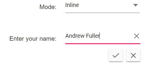
Rendering modes
This section explains the supported rendering modes of the In-place Editor. Possible Rendering modes are as follows.
- Popup
- Inline
NOTE
By default,
Popupmode will be rendered, when opening an editor.
-
For
Popupmode, editable container displays as like tooltip or popover above the element. -
For
Inlinemode, editable container displays as instead of the element. To renderInlinemode while opening the editor, specifymodeasInline.
In the following sample, the In-place Editor renders with Inline mode. You can dynamically switch into another mode by changing the drop-down item value.
<div id='container'>
    <table class="table-section">
        <tr>
            <td> Mode: </td>
            <td>
                <ejs-dropdownlist id="dropdown" dataSource="ViewBag.modeData" change="onChange" value="ViewBag.value" popupHeight="150px"></ejs-dropdownlist>
            </td>
        </tr>
        <tr>
            <td class="sample-td"> Enter your name: </td>
            <td class="sample-td">
                <ejs-inplaceeditor id="element" mode="Inline">
                </ejs-inplaceeditor>
            </td>
        </tr>
    </table>
</div>
<style>
    #container {
        display: flex;
        justify-content: center;
    }

    .table-section {
        margin: 0 auto;
    }

    tr td:first-child {
        text-align: right;
        padding-right: 20px;
    }

    .sample-td {
        padding-top: 10px;
        min-width: 230px;
        height: 100px;
    }
</style>
<script>
    function onChange(e) {
        var editObj = document.getElementById('element').ej2_instances[0];
        editObj.mode = e.value;
        editObj.dataBind();
    }
</script>
public class HomeController : Controller
{
public ActionResult Index()
{
ViewBag.modeData = new string[] { "Inline", "Popup" };
ViewBag.value = "Inline";
ViewBag.modalData = new { placeholder = "Enter some text" };
return View();
}
}The output will be as follows.
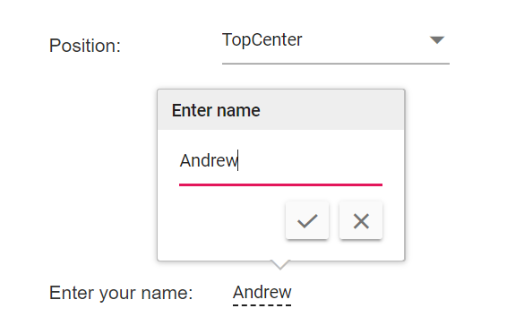
Pop-up customization
In-place Editor popup mode can be customized by using the title and model properties in popupSettings API.
Popup mode rendered by using the Syncfusion® ASP.NET Core Tooltip control, so you can use tooltip properties and events to customize the behavior of popup via the model property of popupSettings API.
NOTE
For more details, refer the tooltip documentation section.
In the following sample, popup title and position customized using the popupSettings property. All possible tooltip position data configured in the drop-down, if we change drop down item, selected value bound to model property and applied it to Tooltip control. Tooltip have following position options.
- TopLeft
- TopCenter
- TopRight
- BottomLeft
- BottomCenter
- BottomRight
- LeftTop
- LeftCenter
- LeftBottom
- RightTop
- RightCenter
- RightBottom
<div id='container'>
    <table class="table-section">
        <tr>
            <td> Position: </td>
            <td>
                <ejs-dropdownlist id="dropDown" width="auto" dataSource="ViewBag.positionData" change="onChange" value="ViewBag.text" placeholder="Select a position" popupHeight="150px"></ejs-dropdownlist>
            </td>
        </tr>
        <tr>
            <td class="edit-heading sample-td"> Enter your name: </td>
            <td class="sample-td">
                <ejs-inplaceeditor id="element" model="ViewBag.modelData" mode="Popup" value="ViewBag.textValue">
                    <e-inplaceeditor-popupsettings title="Enter name" model="ViewBag.model"></e-inplaceeditor-popupsettings>
                </ejs-inplaceeditor>
            </td>
        </tr>
    </table>
</div>

<style>
    #container {
        display: flex;
        justify-content: center;
    }

    .table-section {
        margin: 0 auto;
    }

    .sample-td {
        padding-top: 150px;
    }

    .edit-heading {
        padding-right: 20px;
    }
</style>
<script>
    function onChange(e) {
        var editObj = document.getElementById('element').ej2_instances[0];
        editObj.popupSettings.model.position = e.value;
        editObj.dataBind();
    }
</script>
public class HomeController : Controller
{
public ActionResult Index()
{
ViewBag.positionData = new string[] { "TopLeft", "TopCenter", "TopRight", "BottomLeft", "BottomCenter", "BottomRight", "LeftTop", "LeftCenter", "LeftBottom", "RightTop", "RightCenter", "RightBottom" };
ViewBag.modelData = new { placeholder = "Enter some text" };
ViewBag.text = "BottomCenter";
ViewBag.textValue = "Andrew";
ViewBag.model = new { position = "BottomCenter" };
return View();
}
}The output will be as follows.
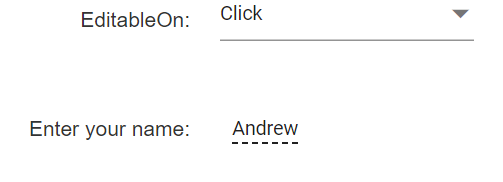
Event actions for editing
The event action of the editor that enable in the edit mode based on the editableOn property, by default Click is assigned, the following options are also supported.
-
Click: The editor will be opened as single click actions. -
DblClick: The editor will be opened as double-click actions and it is not applicable for edit icon. -
EditIconClick: Disables the editing of event action of input and allows user to edit only through edit icon.
NOTE
In-place Editor get focus by pressing the
tabkey from previous focusable DOM element and then by pressingenterkey, the editor will be opened.
In the following sample, when switching drop-down item, the selected value assigned to the editableOn property. If you changed to DblClick, the editor will open when making a double click on the input.
<div id='container'>
    <table class="table-section">
        <tr>
            <td> EditableOn: </td>
            <td>
                <ejs-dropdownlist id="dropDown" width="auto" dataSource="ViewBag.editableOnData" change="onChange" value="ViewBag.text" placeholder="Select edit type"></ejs-dropdownlist>
            </td>
        </tr>
        <tr>
            <td class="sample-td"> Enter your name: </td>
            <td class="sample-td">
                <ejs-inplaceeditor id="element" model="ViewBag.modelData" mode="Inline" value="ViewBag.textValue">
                </ejs-inplaceeditor>
            </td>
        </tr>
    </table>
</div>

<style>
    .table-section {
        margin: 0 auto;
    }

    tr td:first-child {
        text-align: right;
        padding-right: 20px;
    }

    .sample-td {
        padding-top: 10px;
        min-width: 230px;
        height: 100px;
    }
</style>
<script>
    function onChange(e) {
        var editObj = document.getElementById('element').ej2_instances[0];
        var editType = e.itemData.value;
        editObj.editableOn = editType;
        editObj.dataBind();
    }
</script>
public class HomeController : Controller
{
public ActionResult Index()
{
ViewBag.modelData = new { placeholder = "Enter some text" };
ViewBag.editableOnData = new string[] { "Click", "DblClick", "EditIconClick" };
ViewBag.text = "Click";
ViewBag.textValue = "Andrew";
return View();
}
}The output will be as follows.
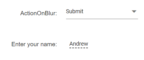
Action on focus out
Action to be performed when the user clicks outside the container, that means focusing out of editable content and it can be handled by the actionOnBlur property, by default Submit assigned. It also has the following options.
-
Cancel: Cancels the editing and resets the old content. -
Submit: Submits the edited content to the server. -
Ignore: No action is performed with this type and allows to edit multiple editors.
In the following sample, when switching drop-down item, the selected value assigned to the actionOnBlur property.
<div id='container'>
    <table class="table-section">
        <tr>
            <td> ActionOnBlur: </td>
            <td>
                <ejs-dropdownlist id="dropDown" width="auto" dataSource="ViewBag.blurActionData" change="onChange" value="ViewBag.text" placeholder="Select blur action"></ejs-dropdownlist>
            </td>
        </tr>
        <tr>
            <td class="sample-td"> Enter your name: </td>
            <td class="sample-td">
                <ejs-inplaceeditor id="element" model="ViewBag.modelData" mode="Inline" value="ViewBag.textValue">
                </ejs-inplaceeditor>
            </td>
        </tr>
    </table>
</div>

<style>

    .table-section {
        margin: 0 auto;
    }

    tr td:first-child {
        text-align: right;
        padding-right: 20px;
    }

    .sample-td {
        padding-top: 10px;
        width: 230px;
        height: 100px;
    }
</style>
<script>
    function onChange(e) {
        var editObj = document.getElementById('element').ej2_instances[0];
        let editType = e.itemData.value;
        editObj.actionOnBlur = editType;
        editObj.dataBind();
    }
</script>
public class HomeController : Controller
{
public ActionResult Index()
{
ViewBag.blurActionData = new string[] { "Submit", "Cancel", "Ignore" };
ViewBag.modelData = new { placeholder = "Enter some text" };
ViewBag.text = "Submit";
ViewBag.textValue = "Andrew";
return View();
}
}The output will be as follows.
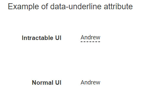
Display modes
By default, In-place Editor input element highlighted with a dotted underline. To remove dotted underline from input element, add data-underline="false" attribute at In-place Editor root element.
In the following sample, denotes to indicate intractable and normal display modes with different samples.
<div id='container'>
    <h4>Example of data-underline attribute</h4>
    <table class="table-section">
        <tr>
            <td class="col-lg-6 control-title"> Intractable UI </td>
            <td class="col-lg-6">
                <ejs-inplaceeditor id="default" model="ViewBag.modelData" mode="Inline" value="ViewBag.textValue">
                </ejs-inplaceeditor>
            </td>
        </tr>
        <tr>
            <td class="col-lg-6 control-title"> Normal UI </td>
            <td class="col-lg-6">
                <ejs-inplaceeditor id="inline" model="ViewBag.modelData" mode="Inline" value="ViewBag.textValue" created="created">
                </ejs-inplaceeditor>
            </td>
        </tr>
    </table>
</div>

<style>

    .table-section {
        margin: 0 auto;
    }

    td {
        padding: 20px 0;
        min-width: 230px;
        height: 100px;
    }

    .control-title {
        font-weight: 600;
        padding-right: 20px;
        text-align: right;
    }

    h4 {
        text-align: center;
    }
</style>

<script>
    function created(e) {
        document.getElementById("inline").setAttribute("data-underline", "false");
    }
</script>
public class HomeController : Controller
{
public ActionResult Index()
{
ViewBag.modelData = new { placeholder = "Enter some text" };
ViewBag.textValue = "Andrew";
return View();
}
}The output will be as follows.