Getting Started with Angular Form Builder component
22 Sep 20265 minutes to read
The Form Builder is an intuitive, visual form designer that lets the user to create and customize forms interactively by dragging and dropping fields—no code required. Users can visually design forms, configure field properties, and preview the generated form in real time. The Form Builder also allows to export the form schema for use with the Form Renderer control.
This guide demonstrates how to set up and configure the Syncfusion® Angular Form Builder component, from initial installation through setting up the form schema in the component.
Note: This guide supports Angular 21 and other recent Angular versions. For detailed compatibility with other Angular versions, please refer to the Angular version support matrix. Starting from Angular 19, standalone components are the default, and this guide reflects that architecture.
Prerequisites
- Install a supported Node.js LTS release and npm (or another Node package manager) before continuing.
- Ensure your environment meets the System Requirements for Syncfusion® Angular UI Components.
- Supported Angular and Syncfusion package combinations are listed in the Version Compatibility guide.
Setup the Angular application
A straightforward approach to getting started with Angular is to create a new application using the Angular CLI. Install Angular CLI globally with the following command:
npm install -g @angular/cliTo install a particular version of Angular CLI, use:
npm install -g @angular/[email protected]Angular 21 Standalone Architecture: Standalone components are the default in Angular 21. This guide uses the modern standalone architecture. If you need more information about the standalone architecture, refer to the Standalone Guide.
Create a new application
With Angular CLI installed, use this command to generate a new application:
ng new syncfusion-angular-app- This command will prompt you to configure settings like enabling Angular routing and choosing a stylesheet format.
? Which stylesheet format would you like to use? (Use arrow keys)
> CSS             [ https://developer.mozilla.org/docs/Web/CSS                     ]
  Sass (SCSS)     [ https://sass-lang.com/documentation/syntax#scss                ]
  Sass (Indented) [ https://sass-lang.com/documentation/syntax#the-indented-syntax ]
Less [ http://lesscss.org ]- By default, a CSS-based application is created. Use SCSS if required:
ng new syncfusion-angular-app --style=scss- During project setup, when prompted for the Server-side rendering (SSR) option, choose the appropriate configuration.

- Select the required AI tool, or choose ‘None’ if you do not need one.
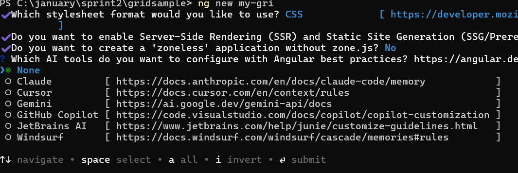
- Navigate to your newly created application directory:
cd syncfusion-angular-appNote: In Angular 19 and earlier, the project uses
app.component.ts,app.component.html, andapp.component.css, and so on. In Angular 20+, the CLI generates a simpler structure withapp.ts,app.html, andapp.css(no.component.suffixes).
Adding the Syncfusion® Angular Form Builder package
To install the Syncfusion® Angular Form Builder package, use the following command:
ng add @syncfusion/ej2-angular-form-builderThe ng add command installs the package, registers it in package.json, and configures the required entries in your workspace automatically.
If ng add is unavailable in your setup, install the package manually with:
npm install @syncfusion/ej2-angular-form-builderAdding CSS reference
Themes for the Syncfusion® Form Builder component can be applied using CSS files provided through npm theme packages. For available themes, refer to the Themes documentation.
Install the Material 3 theme package using the following npm command:
npm install @syncfusion/ej2-material3-themeThen add the following CSS reference to the src/styles.css file. This is the default global stylesheet registered under styles in angular.json:
@import "../node_modules/@syncfusion/ej2-material3-theme/styles/material3.css";Add Syncfusion® Form Builder component
After package and theme setup, update the root component. File and class names can vary by Angular CLI version (src/app/app.ts with export class App, or app.component.ts with AppComponent). Replace the root component content with the sample below, or merge the Form Builder import into your generated file.
import { Component } from '@angular/core';
import { FormBuilderAllModule } from '@syncfusion/ej2-angular-form-builder';

@Component({
  selector: 'app-root',
  standalone: true,
  imports: [FormBuilderAllModule],
  template: `<div ejs-form-builder></div>`
})

export class AppComponent {
}
Running the application
Run the application using the following command:
ng serveWhen the build succeeds, the CLI reports a local URL (default: http://localhost:4200). Open that URL in a browser to view the Form Builder. If the port is already in use, the CLI prompts for another port, or you can run ng serve --port 4201.
The output will appear as follows:
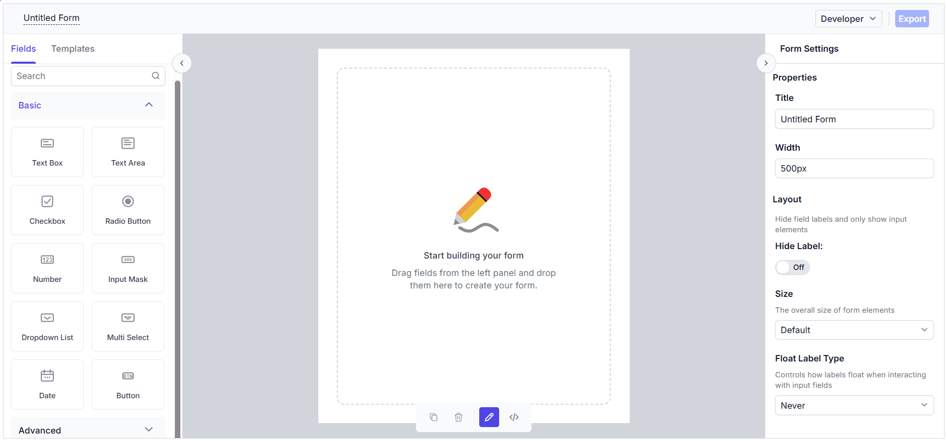
Basic components of the Form Builder
The Form Builder control consists of the following sections:
- Left Pane / Toolbox — Displays all the supported form fields, which can be dragged and dropped.
- Central design canvas — Holds the dropped form fields to construct the form.
- Right Pane — Provides options to customize the form settings as well as the selected form fields.
- Code view — Displays the form schema during the form design process.
- Form Preview — Allows you to preview and interact with the generated form in real time once it is created.
Adding form fields to the design canvas
Form fields can be added to the central design canvas in the following ways:
- Form Components Panel — A toolbox of form fields is available in the left-side pane to drag and drop them onto the design canvas.
- Context Menu in the Design Canvas — After the first form field is dropped, a button at the end of the central canvas can be used to add additional form fields using a context menu that appears when the button is clicked.
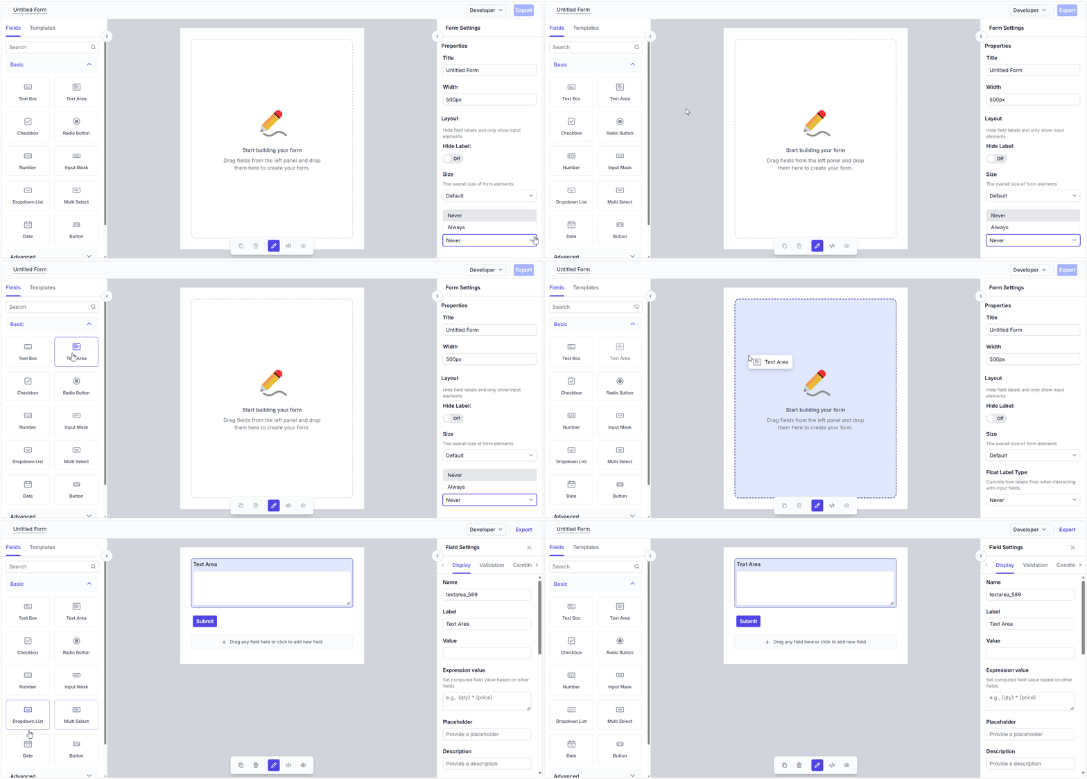
See Also
- Getting Started with Angular Standalone — deeper standalone-focused walkthrough
- Getting Started with ASP.NET Core and Angular using the Project Template
- Getting Started with Angular CLI as frontend in ASP.NET MVC
- Getting Started with Ionic and Angular
- Getting Started with Angular and Electron
- Upgrade Guide