Themes in Syncfusion® Angular Components
25 Jun 202624 minutes to read
Syncfusion® Angular UI components include a comprehensive collection of themes to match popular design systems and provide both light and dark variants. Available themes include:
| Theme | Style Sheet Name |
|---|---|
| Tailwind 3.4 | tailwind3.css |
| Tailwind 3.4 Dark | tailwind3-dark.css |
| Bootstrap 5.3 | bootstrap5.3.css |
| Bootstrap 5.3 Dark | bootstrap5.3-dark.css |
| Fluent 2 | fluent2.css |
| Fluent 2 Dark | fluent2-dark.css |
| Material 3 | material3.css |
| Material 3 Dark | material3-dark.css |
| Bootstrap 5 | bootstrap5.css |
| Bootstrap 5 Dark | bootstrap5-dark.css |
| Fluent | fluent.css |
| Fluent Dark | fluent-dark.css |
| Google’s Material | material.css |
| Google’s Material-Dark | material-dark.css |
| Tailwind CSS | tailwind.css |
| TailwindDark CSS | tailwind-dark.css |
| Microsoft Office Fabric | fabric.css |
| Microsoft Office Fabric Dark | fabric-dark.css |
| High Contrast | highcontrast.css |
Theme packages
Syncfusion built-in themes are distributed as theme packages available on npm. These packages include CSS/SCSS files for all components. The following table lists all available theme packages:
| Theme | Light Package | Dark Package |
|---|---|---|
| Tailwind 3 | @syncfusion/ej2-tailwind3-theme |
@syncfusion/ej2-tailwind3-dark-theme |
| Bootstrap 5.3 | @syncfusion/ej2-bootstrap5.3-theme |
@syncfusion/ej2-bootstrap5.3-dark-theme |
| Fluent 2 | @syncfusion/ej2-fluent2-theme |
@syncfusion/ej2-fluent2-dark-theme |
| Material 3 | @syncfusion/ej2-material3-theme |
@syncfusion/ej2-material3-dark-theme |
| Bootstrap 5 | @syncfusion/ej2-bootstrap5-theme |
@syncfusion/ej2-bootstrap5-dark-theme |
| Bootstrap 4 | @syncfusion/ej2-bootstrap4-theme |
- |
| Bootstrap | @syncfusion/ej2-bootstrap-theme |
@syncfusion/ej2-bootstrap-dark-theme |
| Material | @syncfusion/ej2-material-theme |
@syncfusion/ej2-material-dark-theme |
| Tailwind | @syncfusion/ej2-tailwind-theme |
@syncfusion/ej2-tailwind-dark-theme |
| Fluent | @syncfusion/ej2-fluent-theme |
@syncfusion/ej2-fluent-dark-theme |
| Fabric | @syncfusion/ej2-fabric-theme |
@syncfusion/ej2-fabric-dark-theme |
| High Contrast | @syncfusion/ej2-highcontrast-theme |
- |
Optimized CSS Files
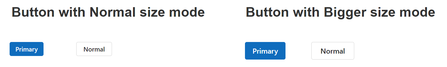
Syncfusion® components provide two size modes for each theme: normal and bigger. By default, the normal size mode is applied, granting a standard look suitable for all devices. The bigger size mode enhances interactions, visibility, and user experience by enlarging UI components.
The bigger size mode is optimal for projects requiring enlarged display, whereas the normal size suits applications maintaining default appearances.
See below for a Button component comparison in both size modes:
Each theme includes both normal and bigger sizes, increasing overall file size. To enhance performance, Syncfusion® offers optimized theme files (e.g., fluent2-lite.css), which contain only normal size mode styles. These reduce file size, improving load times and application performance, especially when the bigger mode is not needed.
Refer to the comparison for theme file sizes:
| Theme Name | Default Theme Size | Optimized Theme Size |
|---|---|---|
| Fluent 2 | 3.97 MB | 2.96 MB |
Reference themes in the Angular application
Syncfusion® Angular UI themes can be included in your application by four different methods:
Install via NPM
Themes are shipped as both combined and individual CSS/SCSS files. Each theme package includes combined and component-specific styles in both CSS and SCSS formats. For a list of available theme packages, refer to the available theme packages section.
To use the combined SCSS/CSS files, install the required theme package.
npm install @syncfusion/ej2-material3-themeCDN Direct Referral
Instead of local resources, use a cloud CDN to reference theme style sheets.
Syncfusion® Angular Themes are available via CDN. Ensure the URL version matches your Syncfusion® Angular Package to avoid compatibility issues.
<head>
    <link href="https://cdn.syncfusion.com/ej2/<version>/<theme_name>.css" rel="stylesheet"/>
</head>
For optimized CSS files, use:
<head>
    <link href="https://cdn.syncfusion.com/ej2/<version>/<theme_name>-lite.css" rel="stylesheet"/>
</head>Using Precompiled CSS and SCSS File
Precompiled CSS
Precompiled signifies minified and optimized CSS.
Syncfusion® Angular UI theme includes a precompiled CSS file encompassing styles for all Syncfusion® components.
Referring all components CSS
@import "@syncfusion/ej2-<theme-name>-theme/styles/<theme-name>.css";Example:
@import "@syncfusion/ej2-material3-theme/styles/material3.css";Referring all components SCSS
@use "@syncfusion/ej2-<theme-name>-theme/styles/<theme-name>.scss" as *;Example:
@use "@syncfusion/ej2-material3-theme/styles/material3.scss" as *;You can reference individual component themes from the unified theme package. In this package, each component includes an index.css/index.scss files that automatically loads all the required dependency styles.
@import "@syncfusion/ej2-<theme-name>-theme/styles/<component-name>/index.css";Example:
@import "@syncfusion/ej2-material3-theme/styles/grid/index.css";Referring All Components Optimized CSS File
To reference optimized (lite) versions of all component styles using theme packages.
@import "@syncfusion/ej2-<theme-name>-theme/styles/<theme-name>-lite.css";
/* or */
@use "@syncfusion/ej2-<theme-name>-theme/styles/<theme-name>-lite.scss" as *;
Example:
@import "@syncfusion/ej2-fluent2-theme/styles/fluent2-lite.css";
/* or */
@use "@syncfusion/ej2-fluent2-theme/styles/fluent2-lite.scss" as *;
Referring Individual Component Optimized CSS File
For individual component’s optimized CSS from theme packages:
@import "@syncfusion/ej2-<theme-name>-theme/styles/<component-name>/index-lite.css";
/* or */
@use "@syncfusion/ej2-<theme-name>-theme/styles/<component-name>/index-lite.scss" as *;
Example:
@import "@syncfusion/ej2-fluent2-theme/styles/grid/index-lite.css";
/* or */
@use "@syncfusion/ej2-fluent2-theme/styles/grid/index-lite.scss" as *;
Advantages of Individual Components Theme
- Reduces page load time
- Decreases bundle size
- Avoids unused CSS
Compiling Themes from SCSS Source File
The Syncfusion® Angular UI theme includes SCSS file compilation. Refer to Compiling SCSS file for more information.
Common Variables
Below is a list of common variables used in Syncfusion® Angular library themes for all UI components. These can be customized to change respective theme properties.
Syncfusion® Tailwind 3.4 theme
| Name | Value (Default Theme) | Value (Dark Theme) |
|---|---|---|
| --color-sf-black | rgb(0,0,0) | rgb(0,0,0) |
| --color-sf-white | rgb(255,255,255) | rgb(255,255,255) |
| --color-sf-primary | rgba(79, 70, 229) | rgba(99, 102, 241) |
| --color-sf-primary-text-color | #fff | #fff |
| --color-sf-primary-light | #3730a3 | #3730a3 |
| --color-sf-primary-lighter | #e0e7ff | #1e1b4b |
| --color-sf-primary-dark | #4338ca | #818cf8 |
| --color-sf-primary-darker | #3730a3 | #4f46e5 |
| --color-sf-success | #15803d | #22c55e |
| --color-sf-info | #0e7490 | #38bdf8 |
| --color-sf-warning | #c2410c | #f97316 |
| --color-sf-danger | #dc2626 | #f87171 |
| --color-sf-success-light | #dcfce7 | #164c37 |
| --color-sf-info-light | #cffafe | #0e485b |
| --color-sf-warning-light | #ffedd5 | #573422 |
| --color-sf-danger-light | #fee2e2 | #54252f |
| --color-sf-success-dark | #166534 | #4ade80 |
| --color-sf-info-dark | #155e75 | #38bdf8 |
| --color-sf-warning-dark | #9a3412 | #fb923c |
| --color-sf-danger-dark | #b91c1c | #ef4444 |
Syncfusion® Bootstrap 5.3 theme
| Name | Value (Default Theme) | Value (Dark Theme) |
|---|---|---|
| --color-sf-black | rgb(0,0,0) | rgb(0,0,0) |
| --color-sf-white | rgb(255,255,255) | rgb(255,255,255) |
| --color-sf-primary | rgba(13,110,253,1) | rgba(13,110,253,1) |
| --color-sf-primary-text-color | #fff | #fff |
| --color-sf-primary-light | #86b7fe | #86b7fe |
| --color-sf-primary-lighter | #cfe2ff | #031633 |
| --color-sf-primary-dark | #3367d1 | #073ba6 |
| --color-sf-primary-darker | #052c65 | #6ea8fe |
| --color-sf-success | rgba(25,135,84,1) | rgba(25,135,84,1) |
| --color-sf-info | rgba(13,202,240,1) | rgba(13,202,240,1) |
| --color-sf-warning | rgba(255,193,7,1) | rgba(255,193,7,1) |
| --color-sf-danger | rgba(220,53,69,1) | rgba(220,53,69,1) |
| --color-sf-success-light | #d1e7dd | #75b798 |
| --color-sf-info-light | #cff4fc | #6edff6 |
| --color-sf-warning-light | #fff3cd | #ffda6a |
| --color-sf-danger-light | #f8d7da | #ea868f |
| --color-sf-success-dark | #0a3622 | #75b798 |
| --color-sf-info-dark | #055160 | #6edff6 |
| --color-sf-warning-dark | #664d03 | #ffda6a |
| --color-sf-danger-dark | #58151c | #ea868f |
| --color-sf-success-light-alt | #d1e7dd | #051b11 |
| --color-sf-info-light-alt | #cff4fc | #032830 |
| --color-sf-warning-light-alt | #fff3cd | #332701 |
| --color-sf-danger-light-alt | #f8d7da | #2c0b0e |
Syncfusion® Fluent 2 theme
| Name | Value (Default Theme) | Value (Dark Theme) |
|---|---|---|
| --color-sf-black | #000 | #000 |
| --color-sf-white | #fff | #fff |
| --color-sf-primary | #0f6cbd | #115ea3 |
| --color-sf-primary-text-color | #fff | #fff |
| --color-sf-primary-light | #b4d6fa | #0e4775 |
| --color-sf-primary-lighter | #ebf3fc | #082338 |
| --color-sf-primary-dark | #0f548c | #62abf5 |
| --color-sf-primary-darker | #0c3b5e | #96c6fa |
| --color-sf-success | #0e700e | #107c10 |
| --color-sf-info | #008aa9 | #0099bc |
| --color-sf-warning | #bc4b09 | #faa06b |
| --color-sf-danger | #d13438 | #dc626d |
| --color-sf-success-light | #54b054 | #094509 |
| --color-sf-info-light | #56bfd7 | #005669 |
| --color-sf-warning-light | #fee5d7 | #4a1e04 |
| --color-sf-danger-light | #eeacb2 | #6e0811 |
| --color-sf-success-dark | #54b054 | #c9eac9 |
| --color-sf-info-dark | #56bfd7 | #cdedf4 |
| --color-sf-warning-dark | #8a3707 | #fee5d7 |
| --color-sf-danger-dark | #6e0811 | #fee5d7 |
| --color-sf-success-light-alt | #f1faf1 | #052505 |
| --color-sf-info-light-alt | #f2fafc | #002e38 |
| --color-sf-warning-light-alt | #fff9f5 | #4a1e04 |
| --color-sf-danger-light-alt | #fdf3f4 | #3b0509 |
| --color-sf-badge-warning | #fde300 | #fde300 |
| --color-sf-badge-warning-text | #847619 | #fde300 |
| --color-sf-primary-label-color | #0f6cbd | #479ef5 |
| --color-sf-primary-cell-selection | #ebf3fc | #ebf3fc |
Syncfusion® Material 3 theme
| Name | Value (Default Theme) | Value (Dark Theme) |
|---|---|---|
| --color-sf-black | rgb(0,0,0) | rgb(0,0,0) |
| --color-sf-white | rgb(255,255,255) | rgb(255,255,255) |
| --color-sf-primary | rgb(103, 80, 164) | rgb(208, 188, 255) |
| --color-sf-primary-container | rgb(234, 221, 255) | rgb(79, 55, 139) |
| --color-sf-on-primary | rgb(255, 255, 255) | rgb(55, 30, 115) |
| --color-sf-on-primary-container | rgb(33, 0, 94) | rgb(234, 221, 255) |
| --color-sf-surface | rgb(255, 255, 255) | rgb(28, 27, 31) |
| --color-sf-surface-variant | rgb(231, 224, 236) | rgb(73, 69, 79) |
| --color-sf-on-surface | rgb(28, 27, 31) | rgb(230, 225, 229) |
| --color-sf-on-surface-variant | rgb(73, 69, 78) | rgb(202, 196, 208) |
| --color-sf-secondary | rgb(98, 91, 113) | rgb(204, 194, 220) |
| --color-sf-secondary-container | rgb(232, 222, 248) | rgb(74, 68, 88) |
| --color-sf-on-secondary | rgb(255, 255, 255) | rgb(51, 45, 65) |
| --color-sf-on-secondary-container | rgb(30, 25, 43) | rgb(232, 222, 248) |
| --color-sf-tertiary | rgb(125, 82, 96) | rgb(239, 184, 200) |
| --color-sf-tertiary-container | rgb(255, 216, 228) | rgb(99, 59, 72) |
| --color-sf-on-tertiary | rgb(255, 255, 255) | rgb(73, 37, 50) |
| --color-sf-on-tertiary-container | rgb(55, 11, 30) | rgb(255, 216, 228) |
| --color-sf-background | rgb(255, 255, 255) | rgb(28, 27, 31) |
| --color-sf-on-background | rgb(28, 27, 31) | rgb(230, 225, 229) |
| --color-sf-outline | rgb(121, 116, 126) | rgb(147, 143, 153) |
| --color-sf-outline-variant | rgb(196, 199, 197) | rgb(68, 71, 70) |
| --color-sf-shadow | rgb(0, 0, 0) | rgb(0, 0, 0) |
| --color-sf-surface-tint-color | rgb(103, 80, 164) | rgb(208, 188, 255) |
| --color-sf-inverse-surface | rgb(49, 48, 51) | rgb(230, 225, 229) |
| --color-sf-inverse-on-surface | rgb(244, 239, 244) | rgb(49, 48, 51) |
| --color-sf-inverse-primary | rgb(208, 188, 255) | rgb(103, 80, 164) |
| --color-sf-scrim | rgb(0, 0, 0) | rgb(0, 0, 0) |
| --color-sf-error | rgb(179, 38, 30) | rgb(242, 184, 181) |
| --color-sf-error-container | rgb(249, 222, 220) | rgb(140, 29, 24) |
| --color-sf-on-error | rgb(255, 250, 250) | rgb(96, 20, 16) |
| --color-sf-on-error-container | rgb(65, 14, 11) | rgb(249, 222, 220) |
| --color-sf-success | rgb(32, 81, 7) | rgb(83, 202, 23) |
| --color-sf-success-container | rgb(209, 255, 186) | rgb(22, 62, 2) |
| --color-sf-on-success | rgb(244, 255, 239) | rgb(13, 39, 0) |
| --color-sf-on-success-container | rgb(13, 39, 0) | rgb(183, 250, 150) |
| --color-sf-info | rgb(1, 87, 155) | rgb(71, 172, 251) |
| --color-sf-info-container | rgb(233, 245, 255) | rgb(0, 67, 120) |
| --color-sf-on-info | rgb(250, 253, 255) | rgb(0, 51, 91) |
| --color-sf-on-info-container | rgb(0, 51, 91) | rgb(173, 219, 255) |
| --color-sf-warning | rgb(145, 76, 0) | rgb(245, 180, 130) |
| --color-sf-warning-container | rgb(254, 236, 222) | rgb(123, 65, 0) |
| --color-sf-on-warning | rgb(255, 255, 255) | rgb(99, 52, 0) |
| --color-sf-on-warning-container | rgb(47, 21, 0) | rgb(255, 220, 193) |
Bootstrap 5 Theme
| Name | Value (Default Theme) | Value (Dark Theme) |
|---|---|---|
| $black | #000 | #000 |
| $white | #fff | #fff |
| $gray-100 | #f8f9fa | #f8f9fa |
| $gray-200 | #e9ecef | #e9ecef |
| $gray-300 | #dee2e6 | #dee2e6 |
| $gray-400 | #ced4da | #ced4da |
| $gray-500 | #adb5bd | #adb5bd |
| $gray-600 | #6c757d | #6c757d |
| $gray-700 | #495057 | #495057 |
| $gray-800 | #343a40 | #343a40 |
| $gray-900 | #212529 | #212529 |
| $blue | #0d6efd | #0d6efd |
| $indigo | #6610f2 | #6610f2 |
| $purple | #6f42c1 | #6f42c1 |
| $pink | #d63384 | #d63384 |
| $red | #dc3545 | #dc3545 |
| $orange | #fd7e14 | #fd7e14 |
| $yellow | #ffc107 | #ffc107 |
| $green | #198754 | #198754 |
| $teal | #20c997 | #20c997 |
| $cyan | #0dcaf0 | #0dcaf0 |
Fluent Theme
| Name | Value (Default Theme) | Value (Dark Theme) |
|---|---|---|
| $black | #000 | #000 |
| $white | #fff | #fff |
| $gray220 | #11100f | #11100f |
| $gray210 | #161514 | #161514 |
| $gray200 | #1b1a19 | #1b1a19 |
| $gray190 | #201f1e | #201f1e |
| $gray180 | #252423 | #252423 |
| $gray170 | #292827 | #292827 |
| $gray160 | #323130 | #323130 |
| $gray150 | #3b3a39 | #3b3a39 |
| $gray140 | #484644 | #484644 |
| $gray130 | #605e5c | #605e5c |
| $gray120 | #797775 | #797775 |
| $gray110 | #8a8886 | #8a8886 |
| $gray100 | #979593 | #979593 |
| $gray90 | #a19f9d | #a19f9d |
| $gray80 | #b3b0ad | #b3b0ad |
| $gray70 | #bebbb8 | #bebbb8 |
| $gray60 | #c8c6c4 | #c8c6c4 |
| $gray50 | #d2d0ce | #d2d0ce |
| $gray40 | #e1dfdd | #e1dfdd |
| $gray30 | #edebe9 | #edebe9 |
| $gray20 | #f3f2f1 | #f3f2f1 |
| $gray10 | #faf9f8 | #faf9f8 |
| $cyanblue10 | #0078d4 | #0078d4 |
| $red10 | #d13438 | #d13438 |
| $orange20 | #ca5010 | #ca5010 |
| $green20 | #0b6a0b | #0b6a0b |
| $cyan20 | #038387 | #038387 |
Material Theme
| Name | Value (Default Theme) | Value (Dark Theme) |
|---|---|---|
| $accent | #e3165b | #ff80ab |
| $accent-font | #fff | #000 |
| $primary | #3f51b5 | #3f51b5 |
| $primary-50 | #e8eaf6 | #e8eaf6 |
| $primary-100 | #c5cae9 | #c5cae9 |
| $primary-200 | #9fa8da | #9fa8da |
| $primary-300 | #7986cb | #7986cb |
| $primary-font | #fff | #fff |
| $primary-50-font | #000 | #000 |
| $primary-100-font | #000 | #000 |
| $primary-200-font | #000 | #000 |
| $primary-300-font | #fff | #fff |
| $grey-white | #fff | #fff |
| $grey-black | #000 | #000 |
| $grey-50 | #fafafa | #fafafa |
| $grey-100 | #f5f5f5 | #f5f5f5 |
| $grey-200 | #eee | #eee |
| $grey-300 | #e0e0e0 | #e0e0e0 |
| $grey-400 | #bdbdbd | #bdbdbd |
| $grey-500 | #9e9e9e | #9e9e9e |
| $grey-600 | #757575 | #757575 |
| $grey-700 | #616161 | #616161 |
| $grey-800 | #424242 | #424242 |
| $grey-900 | #212121 | #212121 |
| $grey-dark | #303030 | #303030 |
| $grey-light-font | #000 | #000 |
| $grey-dark-font | #fff | #fff |
| $base-font | #000 | #000 |
| $error-font | #f44336 | #ff6652 |
| $success-bg | #4caf50 | |
| $error-bg | #ff6652 | |
| $warning-bg | #ff9800 | |
| $info-bg | #03a9f4 | |
| $message-font | #fff | |
| $success-font | #4caf50 | |
| $warning-font | #ff9800 | |
| $info-font | #03a9f4 |
Tailwind CSS Theme
| Name | Value (Default Theme) | Value (Dark Theme) |
|---|---|---|
| $black | #000 | #000 |
| $white | #fff | #fff |
| $transparent | transparent | transparent |
| $cool-gray-50 | #f9fafb | #f9fafb |
| $cool-gray-100 | #f3f4f6 | #f3f4f6 |
| $cool-gray-200 | #e5e7eb | #e5e7eb |
| $cool-gray-300 | #d1d5db | #d1d5db |
| $cool-gray-400 | #9ca3af | #9ca3af |
| $cool-gray-500 | #6b7280 | #6b7280 |
| $cool-gray-600 | #4b5563 | #4b5563 |
| $cool-gray-700 | #374151 | #374151 |
| $cool-gray-800 | #1f2937 | #1f2937 |
| $cool-gray-900 | #111827 | #111827 |
| $red-100 | #fee2e2 | #fee2e2 |
| $red-400 | #f87171 | #f87171 |
| $red-500 | #ef4444 | #ef4444 |
| $red-600 | #dc2626 | #dc2626 |
| $red-800 | #991b1b | #991b1b |
| $green-100 | #dcfce7 | #dcfce7 |
| $green-500 | #22c55e | #22c55e |
| $green-600 | #16a34a | #16a34a |
| $green-700 | #15803d | #15803d |
| $orange-100 | #ffedd5 | #ffedd5 |
| $orange-500 | #f97316 | #f97316 |
| $orange-600 | #ea580c | #ea580c |
| $orange-700 | #c2410c | #c2410c |
| $orange-800 | #9a3412 | #9a3412 |
| $cyan-300 | #67e8f9 | #67e8f9 |
| $cyan-400 | #22d3ee | #22d3ee |
| $cyan-500 | #06b6d4 | #06b6d4 |
| $cyan-600 | #0891b2 | #0891b2 |
| $cyan-800 | #155e75 | #155e75 |
| $indigo-50 | #eef2ff | |
| $indigo-100 | #e0e7ff | |
| $indigo-200 | #c7d2fe | |
| $indigo-300 | #a5b4fc | |
| $indigo-400 | #818cf8 | |
| $indigo-500 | #6366f1 | |
| $indigo-600 | #4f46e5 | |
| $indigo-700 | #4338ca | |
| $indigo-800 | #3730a3 | |
| $indigo-900 | #312e81 | |
| $green-400 | #4ade80 | |
| $light-blue-50 | #f0f9ff | |
| $light-blue-100 | #e0f2fe | |
| $light-blue-400 | #38bdf8 | |
| $light-blue-500 | #0ea5e9 | |
| $light-blue-600 | #0284c7 | |
| $light-blue-700 | #0369a1 | |
| $light-blue-800 | #075985 |
Microsoft Office Fabric Theme
| Name | Value (Default Theme) | Value (Dark Theme) |
|---|---|---|
| $theme-primary | #0078d6 | #0074cc |
| $theme-dark-alt | darken($theme-primary, 3%) | darken($theme-primary, 3%) |
| $theme-dark | darken($theme-primary, 10%) | darken($theme-primary, 6%) |
| $theme-darker | darken($theme-primary, 18%) | darken($theme-primary, 10%) |
| $theme-secondary | lighten($theme-primary, 3%) | lighten($theme-primary, 3%) |
| $theme-tertiary | lighten($theme-primary, 21%) | lighten($theme-primary, 21%) |
| $theme-light | lighten($theme-primary, 44%) | lighten($theme-primary, 44%) |
| $theme-lighter | lighten($theme-primary, 49%) | lighten($theme-primary, 49%) |
| $theme-lighter-alt | lighten($theme-primary, 55%) | lighten($theme-primary, 55%) |
| $neutral-white | #fff | #201f1f |
| $neutral-lighter-alt | #f8f8f8 | #282727 |
| $neutral-lighter | #f4f4f4 | #333232 |
| $neutral-light | #eaeaea | #414040 |
| $neutral-quintenaryalt | #dadada | #4a4848 |
| $neutral-quintenary | #d0d0d0 | #514f4f |
| $neutral-tertiary-alt | #c8c8c8 | #6f6c6c |
| $neutral-tertiary | #a6a6a6 | #9a9a9a |
| $neutral-secondary-alt | #767676 | #c8c8c8 |
| $neutral-secondary | #666 | #dadada |
| $neutral-primary | #333 | #fff |
| $neutral-dark | #212121 | #f4f4f4 |
| $neutral-black | #000 | #f8f8f8 |
| $alert-bg | #deecf9 | #bf7500 |
| $error-bg | #fde7e9 | #cd2a19 |
| $success-bg | #dff6dd | #37844d |
| $theme-dark-font | #fff | #fff |
| $theme-primary-font | #fff | #fff |
| $theme-light-font | #333 | #000 |
| $neutral-light-font | #333 | #dadada |
| $neutral-light-fontalt | #000 | #fff |
| $grey-dark-font | #fff | #000 |
| $base-font | #333 | #dadada |
| $message-font | #333 | #fff |
| $alert-font | #d83b01 | #ff9d48 |
| $error-font | #a80000 | #ff5f5f |
| $success-font | #107c10 | #8eff8d |
| $info-bg | #1e79cb | |
| $info-font | #62cfff |
High Contrast Theme
| Name | Value |
|---|---|
| $selection-bg | #ffd939 |
| $selection-font | #000 |
| $selection-border | #ffd939 |
| $hover-bg | #685708 |
| $hover-font | #fff |
| $hover-border | #fff |
| $border-default | #969696 |
| $border-alt | #757575 |
| $border-fg | #fff |
| $border-fg-alt | #ffd939 |
| $bg-base-0 | #000 |
| $bg-base-5 | #0d0d0d |
| $bg-base-10 | #1a1a1a |
| $bg-base-15 | #262626 |
| $bg-base-20 | #333 |
| $bg-base-75 | #bfbfbf |
| $bg-base-100 | #fff |
| $header-font | #ffd939 |
| $header-font-alt | #fff |
| $content-font | #fff |
| $content-font-alt | #969696 |
| $link | #8a8aff |
| $invert-font | #000 |
| $success-bg | #166600 |
| $error-bg | #b30900 |
| $message-font | #fff |
| $alert-bg | #944000 |
| $info-bg | #0056b3 |
| $success-alt | #2bc700 |
| $error-alt | #ff6161 |
| $alert-alt | #ff7d1a |
| $info-alt | #66b0ff |
| $disable | #757575 |