Getting Started with Angular Standalone Component
25 Jun 20265 minutes to read
Standalone components are a modern approach in Angular that allow you to build applications without extensive NgModule configurations. They enable direct component imports, simplify dependency management, and provide easier integration of libraries like Syncfusion® components into your Angular applications.
This guide demonstrates how to create an Angular application using standalone components and integrate Syncfusion® UI components.
Create a New Application
First, ensure you have the Angular CLI installed. Create a new Angular project by executing the following command:
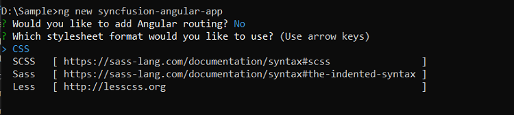
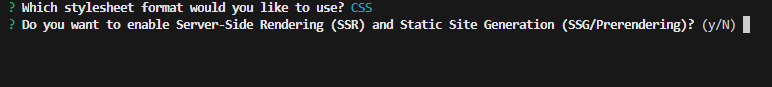
ng new syncfusion-angular-appDuring the setup process, the CLI will prompt you to select configuration options:
By default, the command creates a CSS-based application. To use SCSS instead, specify the style option:
ng new syncfusion-angular-app --style=scssAngular offers server-side rendering (SSR) and static-site generation (SSG) capabilities to enhance performance and SEO. Enable these features during project creation:
For SSR support, use:
ng new syncfusion-angular-app --ssrAfter setup completes, navigate to your project directory:
cd syncfusion-angular-appInstalling Syncfusion® Angular Packages
Syncfusion®’s Angular packages are available on npm under the @syncfusion scope. Obtain these packages by visiting npm.
To add the latest Syncfusion® Angular packages, execute:
ng add @syncfusion/ej2-angular-grids@latestThis command performs the following configurations in your Angular application:
- Adds the
@syncfusion/ej2-angular-gridspackage and its dependencies topackage.json. - Imports
GridModuleinto your application’s default standalone componentapp.ts. - Registers Syncfusion®’s default Material3 theme in
angular.json.
Adding Syncfusion® Angular Components
In standalone components, you directly import the required modules in the component file rather than configuring them in an NgModule.
Modify your src/app/app.ts file to incorporate the Syncfusion® Grid component:
import { Component } from '@angular/core';
import { GridModule, PagerModule } from '@syncfusion/ej2-angular-grids';
@Component({
selector: 'app-root',
standalone: true,
imports: [GridModule, PagerModule],
template: `
<h1>
Syncfusion Angular UI Grid!
</h1>
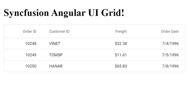
<ejs-grid [dataSource]='data'>
<e-columns>
<e-column field='OrderID' headerText='Order ID' textAlign='Right' width=90></e-column>
<e-column field='CustomerID' headerText='Customer ID' width=120></e-column>
<e-column field='Freight' headerText='Freight' textAlign='Right' format='C2' width=90></e-column>
<e-column field='OrderDate' headerText='Order Date' textAlign='Right' format='yMd' width=120></e-column>
</e-columns>
</ejs-grid>
`,
styleUrls: ['./app.css']
})
export class AppComponent {
public data: Object[] = [
{
OrderID: 10248, CustomerID: 'VINET', EmployeeID: 5, OrderDate: new Date(8364186e5),
ShipName: 'Vins et alcools Chevalier', ShipCity: 'Reims', ShipAddress: '59 rue de l Abbaye',
ShipRegion: 'CJ', ShipPostalCode: '51100', ShipCountry: 'France', Freight: 32.38, Verified: true
},
{
OrderID: 10249, CustomerID: 'TOMSP', EmployeeID: 6, OrderDate: new Date(836505e6),
ShipName: 'Toms Spezialitäten', ShipCity: 'Münster', ShipAddress: 'Luisenstr. 48',
ShipRegion: 'CJ', ShipPostalCode: '44087', ShipCountry: 'Germany', Freight: 11.61, Verified: false
},
{
OrderID: 10250, CustomerID: 'HANAR', EmployeeID: 4, OrderDate: new Date(8367642e5),
ShipName: 'Hanari Carnes', ShipCity: 'Rio de Janeiro', ShipAddress: 'Rua do Paço, 67',
ShipRegion: 'RJ', ShipPostalCode: '05454-876', ShipCountry: 'Brazil', Freight: 65.83, Verified: true
}
];
}Key points about the standalone component configuration:
- The
importsarray in the@Componentdecorator specifies the required Syncfusion® modules. - Each component you want to use must be explicitly imported and included in this array.
- For Grid features like paging, you need to import both the main
GridModuleand feature-specific modules likePagerModule.
Adding CSS References
Syncfusion® Angular component themes can be applied using CSS or SASS from the npm theme packages. Additionally, CDN, CRG, or Theme Studio. For more information, refer to the themes documentation.
This example uses the Material 3 theme for the Grid component from the theme package. To install the Material 3 theme package, use the following command:
npm install @syncfusion/ej2-material3-theme --saveThe following CSS styles are available in the ../node_modules/@syncfusion folder. Reference them in src/styles.css as follows:
@import "../node_modules/@syncfusion/ej2-material3-theme/styles/grid/index.css";Run the Application
Start your Angular application with:
ng serveOnce the compilation completes, open your browser and navigate to http://localhost:4200/ to see your application with the integrated Syncfusion® Grid component:
Note: If a license banner appears when running your application, you need to acquire and register a license key to use Syncfusion® components. Visit our Licensing Overview page for detailed instructions on obtaining and registering your license key.