Getting Started with the Vue ComboBox Component in Vue 3
25 Apr 202513 minutes to read
This article provides a step-by-step guide for setting up a Vite project with a JavaScript environment and integrating the Syncfusion® Vue ComboBox component using the Composition API / Options API.
The Composition API is a new feature introduced in Vue.js 3 that provides an alternative way to organize and reuse component logic. It allows developers to write components as functions that use smaller, reusable functions called composition functions to manage their properties and behavior.
The Options API is the traditional way of writing Vue.js components, where the component logic is organized into a series of options that define the component’s properties and behavior. These options include data, methods, computed properties, watchers, lifecycle hooks, and more.
Prerequisites
System requirements for Syncfusion® Vue UI components
Set up the Vite project
A recommended approach for beginning with Vue is to scaffold a project using Vite. To create a new Vite project, use one of the commands that are specific to either NPM or Yarn.
npm create vite@latestor
yarn create viteUsing one of the above commands will lead you to set up additional configurations for the project as below:
1.Define the project name: We can specify the name of the project directly. Let’s specify the name of the project as my-project for this article.
? Project name: » my-project2.Select Vue as the framework. It will create a Vue 3 project.
? Select a framework: » - Use arrow-keys. Return to submit.
Vanilla
> Vue
  React
  Preact
  Lit
  Svelte
  Others
3.Choose JavaScript as the framework variant to build this Vite project using JavaScript and Vue.
? Select a variant: » - Use arrow-keys. Return to submit.
> JavaScript
  TypeScript
  Customize with create-vue ↗
  Nuxt ↗
4.Upon completing the aforementioned steps to create the my-project, run the following command to install its dependencies:
cd my-project
npm install
or
cd my-project
yarn install
Now that my-project is ready to run with default settings, let’s add Syncfusion® components to the project.
Add Syncfusion® Vue packages
Syncfusion® Vue component packages are available at npmjs.com. To use Syncfusion® Vue components in the project, install the corresponding npm package.
This article uses the Vue ComboBox component as an example. To use the Vue ComboBox component in the project, the @syncfusion/ej2-vue-dropdowns package needs to be installed using the following command:
npm install @syncfusion/ej2-vue-dropdowns --saveor
yarn add @syncfusion/ej2-vue-dropdownsImport Syncfusion® CSS styles
You can import themes for the Syncfusion® Vue component in various ways, such as using CSS or SASS styles from npm packages, CDN, CRG and Theme Studio. Refer to themes topic to know more about built-in themes and different ways to refer to themes in a Vue project.
In this article, Material theme is applied using CSS styles, which are available in installed packages. The necessary Material CSS styles for the ComboBox component and its dependents were imported into the <style> section of src/App.vue file.
<style>
  @import "../node_modules/@syncfusion/ej2-base/styles/material.css";
  @import "../node_modules/@syncfusion/ej2-inputs/styles/material.css";
  @import "../node_modules/@syncfusion/ej2-vue-dropdowns/styles/material.css";
</style>
The order of importing CSS styles should be in line with its dependency graph.
Add Syncfusion® Vue component
Follow the below steps to add the Vue ComboBox component using Composition API or Options API:
1.First, import and register the ComboBox component in the script section of the src/App.vue file. If you are using the Composition API, you should add the setup attribute to the script tag to indicate that Vue will be using the Composition API.
<script setup>
  import { ComboBoxComponent as EjsCombobox } from "@syncfusion/ej2-vue-dropdowns";
</script><script>
import { ComboBoxComponent } from "@syncfusion/ej2-vue-dropdowns";
//Component registeration
export default {
name: "App",
components: {
'ejs-combobox' : ComboBoxComponent,
}
}
</script>2.In the template section, define the ComboBox component with the dataSource property and column definitions.
<template>
    <div class="control_wrapper">
        <ejs-combobox id='combobox' :dataSource='sportsData' placeholder='Select a game'></ejs-combobox>
    </div>
</template>
Here is the summarized code for the above steps in the src/App.vue file:
<template>
    <div class="control_wrapper">
        <ejs-combobox id='combobox' :dataSource='data[0].sportsData' placeholder='Select a game'></ejs-combobox>
    </div>
</template>
<script setup>
    import { ComboBoxComponent as EjsCombobox } from "@syncfusion/ej2-vue-dropdowns";
    const data = [{ waterMark : 'e.g. Basketball',
                sportsData: ['Badminton', 'Cricket', 'Football', 'Golf', 'Tennis'] }]
</script>
<style>
    @import "../node_modules/@syncfusion/ej2-base/styles/material.css";
    @import "../node_modules/@syncfusion/ej2-inputs/styles/material.css";
    @import "../node_modules/@syncfusion/ej2-vue-dropdowns/styles/material.css";
</style><template>
<div class="control_wrapper">
<ejs-combobox id='combobox' :dataSource='sportsData' placeholder='Select a game'></ejs-combobox>
</div>
</template>
<script>
import { ComboBoxComponent } from "@syncfusion/ej2-vue-dropdowns";
//Component registeration
export default {
name: 'App',
components: {
"ejs-combobox": ComboBoxComponent
},
data () {
return {
waterMark : 'e.g. Basketball',
sportsData: ['Badminton', 'Cricket', 'Football', 'Golf', 'Tennis']
}
}
}
</script>
<style>
@import "../node_modules/@syncfusion/ej2-base/styles/material.css";
@import "../node_modules/@syncfusion/ej2-inputs/styles/material.css";
@import "../node_modules/@syncfusion/ej2-vue-dropdowns/styles/material.css";
</style>Run the project
To run the project, use the following command:
npm run devor
yarn run devCustom values
The ComboBox allows the user to give input as custom value which is not required to present in predefined set of values. By default, this support is enabled by allowCustom property. In this case, both text field and value field considered as same.
The custom value will be sent to post back handler when a form is about to be submitted.
<template>
  <div id="app">
    <div id='container' style="margin:50px auto 0; width:250px;">
        <br>
        <ejs-combobox id='combobox' :dataSource='data[0].sportsData' :fields='data[0].fields' :allowCustom='data[0].allowCustom'
        placeholder='Select a game'></ejs-combobox>
    </div>
  </div>
</template>
<script setup>
    import { ComboBoxComponent as EjsCombobox } from "@syncfusion/ej2-vue-dropdowns";
    const data = [{ sportsData: [{ Id: 'game1', Game: 'Badminton' },
                    { Id: 'game2', Game: 'Football' },
                    { Id: 'game3', Game: 'Tennis' }],
                  fields: { text: 'Game', value: 'Id' },
                  allowCustom: true}]
</script>
<style>
    @import "../node_modules/@syncfusion/ej2-base/styles/material.css";
    @import "../node_modules/@syncfusion/ej2-inputs/styles/material.css";
    @import "../node_modules/@syncfusion/ej2-vue-dropdowns/styles/material.css";
</style><template>
<div id="app">
<div id='container' style="margin:50px auto 0; width:250px;">
<br>
<ejs-combobox id='combobox' :dataSource='sportsData' :fields='fields' :allowCustom='allowCustom' placeholder='Select a game'></ejs-combobox>
</div>
</div>
</template>
<script>
import { ComboBoxComponent } from "@syncfusion/ej2-vue-dropdowns";
//Component registeration
export default {
name: 'App',
components: {
"ejs-combobox": ComboBoxComponent
},
data () {
return {
sportsData: [
{ Id: 'game1', Game: 'Badminton' },
{ Id: 'game2', Game: 'Football' },
{ Id: 'game3', Game: 'Tennis' }
],
fields: { text: 'Game', value: 'Id' },
allowCustom: true
}
}
}
</script>
<style>
@import "../node_modules/@syncfusion/ej2-base/styles/material.css";
@import "../node_modules/@syncfusion/ej2-inputs/styles/material.css";
@import "../node_modules/@syncfusion/ej2-vue-dropdowns/styles/material.css";
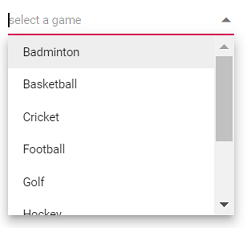
</style>Configure the popup list
By default, the width of the popup list automatically adjusts according to the ComboBox input element’s width, and the height of the popup list has ‘300px’.
The height and width of the popup list can also be customized using the popupHeight and popupWidth property respectively.
In the following sample, popup list’s width and height have configured.
<template>
    <div id="app">
        <div id='container' style="margin:50px auto 0; width:250px;">
            <br>
            <ejs-combobox id='combobox' :dataSource='sportsData' popupHeight="200px" popupWidth="250px"
                placeholder="select a game"></ejs-combobox>
        </div>
    </div>
</template>
<script>
import { ComboBoxComponent } from "@syncfusion/ej2-vue-dropdowns";
//Component registeration
export default {
    name: "App",
    components: {
        "ejs-combobox": ComboBoxComponent
    },
    data() {
        return {
            sportsData: ['Badminton', 'Basketball', 'Cricket', 'Football', 'Golf', 'Hockey', 'Rugby', 'Snooker', 'Tennis']
        }
    }
}
</script>
<style>
@import "../node_modules/@syncfusion/ej2-base/styles/material.css";
@import "../node_modules/@syncfusion/ej2-inputs/styles/material.css";
@import "../node_modules/@syncfusion/ej2-vue-dropdowns/styles/material.css";
</style>
Output be like the below.