Having trouble getting help?
Contact Support
Contact Support
Mobile responsiveness in React Spreadsheet component
18 Nov 20181 minute to read
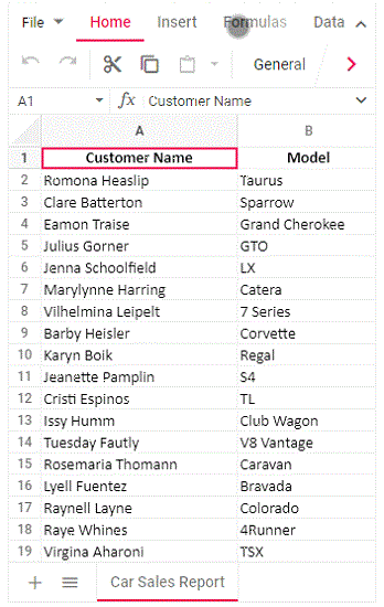
The Spreadsheet control rendered in desktop mode will be adaptive in all mobile devices where the layout gets adjusted based on their parent element’s dimensions to accommodate any resolution.
You can see the overflowed items of ribbon header, ribbon content, and sheet tab using touch and swipe action. The right navigation arrow is added at the end of the ribbon content through which the user can navigate towards overflowed items. Once you reached the rightmost end of the ribbon content, the right navigation arrow will change to left navigation arrow through which you can navigate to the left of the ribbon content.
