Getting Started with ASP.NET Core Tooltip Control
6 Feb 20265 minutes to read
This section briefly explains how to include the ASP.NET Core Tooltip control in an ASP.NET Core application using Visual Studio.
Prerequisites
System requirements for ASP.NET Core controls
Create ASP.NET Core web application with Razor pages
Install ASP.NET Core package in the application
To add ASP.NET Core controls in the application, open the NuGet package manager in Visual Studio (Tools → NuGet Package Manager → Manage NuGet Packages for Solution), search for Syncfusion.EJ2.AspNet.Core and then install it. Alternatively, you can utilize the following package manager command to achieve the same.
Install-Package Syncfusion.EJ2.AspNet.Core -Version 34.1.29NOTE
Syncfusion® ASP.NET Core controls are available in nuget.org. Refer to NuGet packages topic to learn more about installing NuGet packages in various OS environments. The Syncfusion.EJ2.AspNet.Core NuGet package has dependencies, Newtonsoft.Json for JSON serialization and Syncfusion.Licensing for validating Syncfusion® license key.
Add Syncfusion® ASP.NET Core Tag Helper
Open ~/Pages/_ViewImports.cshtml file and import the Syncfusion.EJ2 TagHelper.
@addTagHelper *, Syncfusion.EJ2Add stylesheet and script resources
Here, the theme and script are referenced using CDN inside the <head> of ~/Pages/Shared/_Layout.cshtml file as follows:
<head>
    ...
    <!-- Syncfusion ASP.NET Core controls styles -->
    <link rel="stylesheet" href="https://cdn.syncfusion.com/ej2/34.1.29/fluent.css" />
    <!-- Syncfusion ASP.NET Core controls scripts -->
    <script src="https://cdn.syncfusion.com/ej2/34.1.29/dist/ej2.min.js"></script>
</head>
NOTE
Checkout the Themes topic to learn different ways (CDN, NPM package, and CRG) to refer styles in ASP.NET Core application, and to have the expected appearance for Syncfusion® ASP.NET Core controls.
NOTE
Checkout the Adding Script Reference topic to learn different approaches for adding script references in your ASP.NET Core application.
Register Syncfusion® Script Manager
Also, register the script manager <ejs-script> at the end of <body> in the ASP.NET Core application as follows.
<body>
    ...
    <!-- Syncfusion ASP.NET Core Script Manager -->
    <ejs-scripts></ejs-scripts>
</body>
Add ASP.NET Core Tooltip control
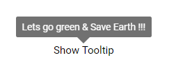
Now, add the Syncfusion® ASP.NET Core Tooltip tag helper in ~/Pages/Index.cshtml page.
<ejs-tooltip id="Tooltip" content="Lets go green & Save Earth !!!" position="TopCenter">
    <e-content-template>
        <span id='target'>Show Tooltip</span>
    </e-content-template>
</ejs-tooltip>

<style>
    #Tooltip {
        position: absolute;
        left: calc( 50% - 60px);
        top: 38%;
    }

</style>
NOTE
In the above sample code,
#targetis theidof the element in a page to which theTooltipis initialized.
Press Ctrl+F5 (Windows) or ⌘+F5 (macOS) to run the app. Then, the Syncfusion® ASP.NET Core Tooltip control will be rendered in the default web browser.
Initialize Tooltip within a container
You can create Tooltips on multiple targets within a container. To do so, you have to define specific target elements to the target property so that the Tooltip is initialized only on matched targets within a container. In this case, the Tooltip content is assigned from the title attribute of the target element.
Refer to the following code example to create a Tooltip on multiple targets within a container.
<ejs-tooltip id="details" position="RightCenter" target=".e-info">
	<e-content-template>
		<form id="details" role="form">
			<table>
				<tr>
					<td class="info"> User Name:</td>
					<td> <input type="text" class="e-info" name="firstname" title="Please enter your name"> </td>
				</tr>
				<tr>
					<td class="info"> Email Address:</td>
					<td> <input type="text" class="e-info" name="email" title="Enter a valid email address"></td>
				</tr>
				<tr>
					<td class="info"> Password:</td>
					<td> <input type="password" class="e-info" name="password" title="Be at least 8 characters length"></td>
				</tr>
				<tr>
					<td class="info"> Confirm Password:</td>
					<td> <input type="password" class="e-info" name="Cpwd" title="Re-enter your password"></td>
				</tr>
			</table>
			<input id="sample" type="submit" value="Submit">
			<input id="clear" type="reset" value="Reset">
		</form>
	</e-content-template>
</ejs-tooltip>

<style>
    #container {
        visibility: hidden;
    }

    #loader {
        color: #008cff;
        height: 40px;
        left: 45%;
        position: absolute;
        top: 45%;
        width: 30%;
    }

    #details table th, #details table td {
        padding: 15px;
        text-align: left;
    }

    #details .info {
        font-weight: bold;
    }

</style>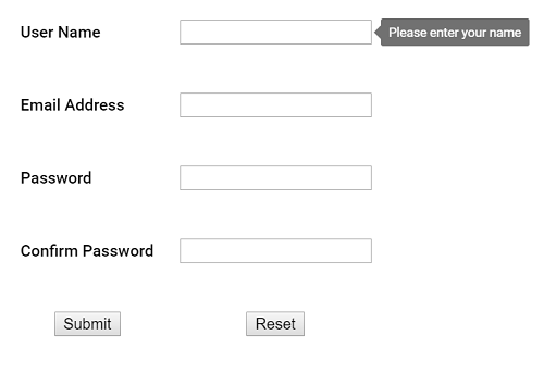
NOTE
In the above sample,
#detailsrefers to the container’s id, and the target.e-inforefers to the target elements available within that container.
NOTE