How can I help you?
Open Mode in Tooltip Control
2 Mar 202511 minutes to read
You can decide the mode on which the Tooltip is to be opened on a page, i.e., on hovering, focusing, or clicking on the target elements.
NOTE
On mobile devices, Tooltips appear when you tap and hold the element, even if the
opensOnoption is assigned withHover.
Tooltips are also displayed as long as you continue to tap and hold the element. On lift, it disappears in the next 1.5 seconds.
If there is another action before that time ends, then the Tooltip disappears.
The opensOn property can take either a single or a combination of multiple values, separated by space from the following options. The table below explains how the Tooltip opens on both desktop and mobile based on the value(s) assigned to the opensOn property. By default, it takes Auto value.
| Values | Desktop | Mobile |
|---|---|---|
Auto |
Tooltip appears when you hover over the target or when the target element receives the focus. | Tooltip opens on tap and hold of the target element. |
Hover |
Tooltip appears when you hover over the target. | Tooltip opens on tap and hold of the target element. |
Click |
Tooltip appears when you click a target element. | Tooltip appears when you single tap the target element. |
Focus |
Tooltip appears when you focus (say through tab key) on a target element. | Tooltip appears with a single tap on the target element. |
Custom |
Tooltip is not triggered by any default action. So, you have to bind your own events and use either open or close public methods. |
Same as Desktop. |
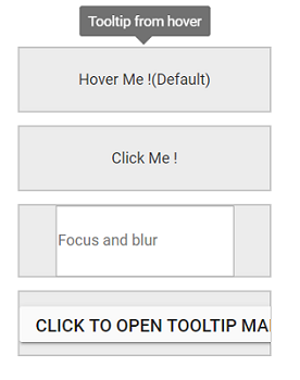
To open the Tooltip for multiple actions, say while hovering over or clicking on a target element, the opensOn property can be assigned with multiple values, separated by space as Hover Click.
NOTE
Autovalue cannot be used with any combination for multiple values.
The following code example shows how to set the open mode for Tooltips.
<ejs-tooltip id="tooltiphover" content=@ViewBag.hover OpensOn="Hover" position="TopCenter">
    <e-content-template>
        <div class="blocks"><span>Hover Me !(Default)</span></div>
    </e-content-template>
</ejs-tooltip>
<ejs-tooltip id="tooltipclick" content=@ViewBag.click OpensOn="Click" position="TopCenter">
    <e-content-template>
        <div class="blocks"><span>Click Me !</span></div>
    </e-content-template>
</ejs-tooltip>
<ejs-tooltip id="tooltipfocus" content=@ViewBag.focus OpensOn="Focus" target=".e-info" position="TopCenter">
    <e-content-template>
        <div class="blocks"><span><input class="e-info" type="text" placeholder="Focus and blur" /></span></div>
    </e-content-template>
</ejs-tooltip>
<ejs-tooltip id="tooltipcustom" content=@ViewBag.custom OpensOn="Custom" position="TopCenter">
    <e-content-template>
        <div class="blocks">
            <input id="tooltipopen" value="Click to open tooltip manually" type="button" />
        </div>
    </e-content-template>
</ejs-tooltip>

<style>
    #tooltiphover {
        width: 200px;
        box-sizing: border-box;
        display: inline-block;
    }

    #tooltipclick {
        width: 200px;
        box-sizing: border-box;
        display: inline-block;
    }

    #tooltipfocus {
        width: 200px;
        box-sizing: border-box;
        display: inline-block;
        line-height: 17px;
    }

    #tooltipcustom {
        width: 200px;
        box-sizing: border-box;
        display: inline-block;
    }

    #tooltipfocus .blocks span {
        line-height: 17px;
    }

    #tooltipcustom .blocks #tooltipopen {
        line-height: 17px;
    }

    .blocks {
        background-color: #ececec;
        border: 1px solid #c8c8c8;
        box-sizing: border-box;
        display: inline-block;
        line-height: 50px;
        margin: 0 10px 10px 0;
        overflow: hidden;
        text-align: center;
        vertical-align: middle;
        width: 200px;
    }
</style>

<script>
    document.getElementById('tooltipopen').addEventListener("click", function () {
        var customTooltip = document.getElementById('tooltipcustom').ej2_instances[0];
        if (this.getAttribute("data-tooltip-id")) {
            customTooltip.close();
        } else {
            customTooltip.open(this);
        }
    });
</script>
public ActionResult OpenMode()
{
ViewBag.hover = "Tooltip from hover";
ViewBag.click = "Tooltip from click";
ViewBag.focus = "Tooltip from focus";
ViewBag.custom = "Tooltip from custom mode";
return View();
}Output be like the below.
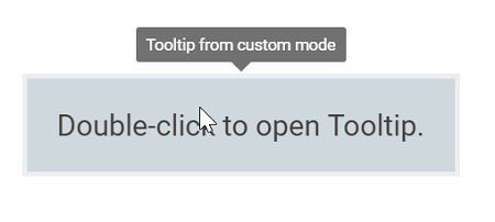
Custom open mode
Other than the above specified options, the Custom mode makes the Tooltip appear on screen for user-defined custom actions such as right-click, double-click, and so on. Here, the Tooltip is not triggered by any default action, and you have to bind your own events and use either open or close public methods to show or hide the Tooltips.
The following code example shows how to define custom open mode for the Tooltip.
<ejs-tooltip id="box" content="Tooltip from custom mode" OpensOn="Custom" created="created" position="TopCenter">
    <e-content-template>
        <div id="content">
            Double-click to open Tooltip.
        </div>
    </e-content-template>
</ejs-tooltip>

<style>
    #box {
        background-color: #ececec;
        border: 1px solid #c8c8c8;
        box-sizing: border-box;
        margin: 50px auto;
        padding: 20px;
        width: 250px;
    }
</style>

<script>
    function created() {
        document.getElementById('box').addEventListener("dblclick", function () {
            var tooltip = document.getElementById('box').ej2_instances[0];
            if (this.getAttribute("data-tooltip-id")) {
                tooltip.close();
            } else {
                tooltip.open(this);
            }
        });
    }
</script>
public ActionResult CustomMode()
{
return View();
}Output be like the below.
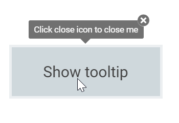
Sticky mode
With this mode set to true, Tooltips can be made to show up on the screen as long as the close icon is pressed. In this mode, close icon is attached to the Tooltip located at the top right corner. This mode can be enabled or disabled using the isSticky property.
<ejs-tooltip id="target" content="Tooltip content" isSticky="true" position="TopCenter">
    <e-content-template>
        <div id="content">
            Show tooltip
        </div>
    </e-content-template>
</ejs-tooltip>

<style>
    #target {
        background-color: #ececec;
        border: 1px solid #c8c8c8;
        box-sizing: border-box;
        margin: 80px auto;
        padding: 20px;
        width: 200px;
    }
</style>
public ActionResult StickyMode()
{
ViewBag.content = "Click close icon to close me";
return View();
}Output be like the below.
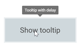
Open/Close Tooltip with delay
The Tooltips can be opened or closed after some delay by using the openDelay and closeDelay properties.
<ejs-tooltip id="target" content="Tooltip content" openDelay="1000" closeDelay="1000" position="TopCenter">
    <e-content-template>
        <div id="content">
            Show tooltip
        </div>
    </e-content-template>
</ejs-tooltip>

<style>
    #target {
        background-color: #ececec;
        border: 1px solid #c8c8c8;
        box-sizing: border-box;
        margin: 80px auto;
        padding: 20px;
        width: 200px;
    }
</style>
public ActionResult DelayMode()
{
ViewBag.content = "Tooltip with delay";
return View();
}Output be like the below.