How can I help you?
Tooltip Positioning in Tooltip Control
2 Mar 202511 minutes to read
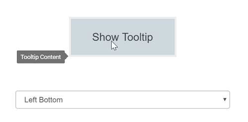
Tooltips can be attached to 12 static locations around the target. On initializing the Tooltip, you can set the position property with any one of the following values:
TopLeftTopCenterTopRightBottomLeftBottomCenterBottomRightLeftTopLeftCenterLeftBottomRightTopRightCenterRightBottom
NOTE
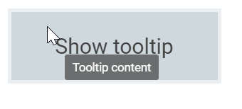
By default, Tooltip is placed at the
TopCenterof the target element.
<div style='display: inline-flex;position:  relative;left:  50%;transform:  translateX(-50%);margin-top:  100px;'>
    <div>
        <ejs-tooltip id="tooltip" position="TopCenter" content="Tooltip content">
            <e-content-template>
                    <ejs-button id='target' content="Show tooltip"></ejs-button>
            </e-content-template>
        </ejs-tooltip>
   </<div>
    <div>
        <select id="positions" class="form-control" onchange="onChange(this)">
            <option value="TopLeft">Top Left</option>
            <option value="TopCenter" selected="">Top Center</option>
            <option value="TopRight">Top Right</option>
            <option value="BottomLeft">Bottom Left</option>
            <option value="BottomCenter">Bottom Center</option>
            <option value="BottomRight">Bottom Right</option>
            <option value="LeftTop">Left Top</option>
            <option value="LeftCenter">Left Center</option>
            <option value="LeftBottom">Left Bottom</option>
            <option value="RightTop">Right Top</option>
            <option value="RightCenter">Right Center</option>
            <option value="RightBottom">Right Bottom</option>
        </select>
    </div>
</div>


<style>
    #tooltip {
        padding: 5px;
        margin-right: 20px;
    }

</style>

<script>
    var tooltip;
    window.onload = function () {
        tooltip = document.getElementById('tooltip').ej2_instances[0];
    }
    function onChange(args) {
        tooltip.position = args.value;
    }
</script>
public ActionResult TooltipAnimation()
{
return View();
}Output be like the below.
Tip pointer positioning
The Tooltip pointer can be attached or detached from the Tooltip by using the showTipPointer property. Pointer positions can be adjusted using the tipPointerPosition property that can be assigned to one of the following values:
autostartmiddleend
The following code example illustrates how to set the pointer to the start position of the Tooltip.
<ejs-tooltip id="tooltip" position="TopCenter" content="Tooltip content" tipPointerPosition="Start">
    <e-content-template>
        <ejs-button id='target' content="Show tooltip"></ejs-button>
    </e-content-template>
</ejs-tooltip>

<style>

    #tooltip {
        position: absolute;
        left: calc( 50% - 60px);
        top: 38%;
    }

</style>
public ActionResult TipPointer()
{
ViewBag.content = "Tooltip Content";
return View();
}Output be like the below.
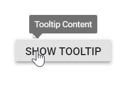
By default, tip pointers are auto adjusted so that the arrow does not point outside the target element.
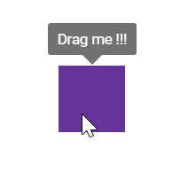
Dynamic positioning
The Tooltip and its tip pointer can be positioned dynamically based on the target’s location. This can be achieved by using the refresh method, which auto adjusts the Tooltip over the target.
@using Syncfusion.EJ2
@using Syncfusion.EJ2.Popups

<div class="control-section">
    <ejs-tooltip id="targetContainer" content="Drag me!" position="TopCenter" offsetX="-15" target="#demoSmart">
        <e-content-template>
            <div id="demoSmart"></div>
        </e-content-template>
    </ejs-tooltip>
</div>


<script type="text/javascript">
    var tooltip, ele;
    window.onload = function () {
        ele = document.getElementById('demoSmart');
        tooltip = document.getElementById("targetContainer").ej2_instances[0];
        var drag = new ej.base.Draggable(ele, {
            clone: false,
            dragArea: '#targetContainer',
            drag: function (args) {
                if (args.element.getAttribute('data-tooltip-id') === null) {
                    tooltip.open(args.element);
                }
                else {
                    tooltip.refresh(args.element);
                }
            },
            dragStart: function (args) {
                if (args.element.getAttribute('data-tooltip-id') !== null) {
                    return;
                }
                tooltip.open(args.element);
            },
            dragStop: function (args) {
                tooltip.close();
            }
        });
    }
</script>

<style type="text/css">
    #demoSmart {
        background: rebeccapurple;
        height: 50px;
        left: 35%;
        position: absolute;
        top: 35%;
        width: 50px;
    }

    #targetContainer {
        margin: 10px;
        min-height: 320px;
        width: 100%;
        float: left;
        border: 1px solid #dddddd;
        border-radius: 3px;
    }

    .control-section {
        padding: 3px;
        margin-right: 20px;
    }
</style>
public ActionResult DynamicPosition()
{
ViewBag.custom = "Drag Me";
return View();
}NOTE
When mouse trailing option is enabled, the tip pointer position gets auto adjusted based on the target, and other position values like start, end, and middle are not applied (to prevent the pointer from moving out of target).
Output be like the below.
Mouse Trailing
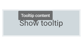
Tooltips can be positioned relative to the mouse pointer. This behavior can be enabled or disabled by using the mouseTrail property. By default, it is set to false.
<ejs-tooltip id="Tooltip" mouseTrail="true" content="Tooltip content">
    <e-content-template>
        <div id="target" style="margin: 50px;">
            Show tooltip
        </div>
    </e-content-template>
</ejs-tooltip>

<style>
    #target {
        background-color: #ececec;
        border: 1px solid #c8c8c8;
        box-sizing: border-box;
        margin: 80px auto;
        padding: 20px;
        width: 200px;
    }
</style>
public ActionResult MouseTrailing()
{
return View();
}Output be like the below.
NOTE
When mouse trailing option is enabled, the tip pointer position gets auto adjusted based on the target, and other position values like start, end, and middle are not applied (to prevent the pointer from moving out of target).
Setting offset values
Offset values are set to specify the distance between the target and Tooltip element. The offsetX and offsetY properties are used to specify the offset left and top values.
-
offsetXspecifies the distance between the target and Tooltip element in X axis. -
offsetYspecifies the distance between the target and Tooltip element in Y axis.
The following code example illustrates how to set offset values.
<ejs-tooltip id="Tooltip" mouseTrail="true" showTipPointer="false" content="Tooltip content" offsetX="30" offsetY="30">
    <e-content-template>
        <div id="target">Show tooltip</div>
    </e-content-template>
</ejs-tooltip>

<style>
    #target {
        background-color: #ececec;
        border: 1px solid #c8c8c8;
        box-sizing: border-box;
        margin: 80px auto;
        padding: 20px;
        width: 200px;
    }
</style>
public ActionResult offsetvalues()
{
ViewBag.content = "Tooltip Content";
return View();
}Output be like the below.
NOTE
By default, collision is handled automatically and therefore when collision is detected the Tooltip fits horizontally and flips vertically.