Getting Started with ASP.NET CORE Dialog
26 Aug 202615 minutes to read
This section briefly explains how to include the ASP.NET Core Dialog control in an ASP.NET Core application using Visual Studio.
Create ASP.NET Core web application with Razor pages
Create an ASP.NET Core Web App using Visual Studio via Microsoft Templates or the ASP.NET Core Extension. For detailed instructions, refer to the ASP.NET Core Web App Getting Started documentation.
Install ASP.NET Core package in the application
To add ASP.NET Core Dialog control in the app, open the NuGet package manager in Visual Studio (Tools → NuGet Package Manager → Manage NuGet Packages for Solution), search and install the Syncfusion.AspNetCore.Popups and Syncfusion.AspNetCore.Themes packages. All Syncfusion ASP.NET Core packages are available in nuget.org. See the NuGet packages topic for details.
Alternatively, you can install the same package using the Package Manager Console with the following command.
Install-Package Syncfusion.AspNetCore.Popups -Version 35.1.37
Install-Package Syncfusion.AspNetCore.Themes -Version 35.1.37
Add the ASP.NET Core Tag Helper
After the packages are installed, open the ~/Pages/_ViewImports.cshtml file and import the Syncfusion.AspNetCore.Base and Syncfusion.AspNetCore.Popups Tag Helpers.
@addTagHelper *, Syncfusion.AspNetCore.Base
@addTagHelper *, Syncfusion.AspNetCore.Popups
Add stylesheet and script resources
The theme stylesheet and script can be referenced from NuGet through Static Web Assets. Include the stylesheet and script references inside the <head> of ~/Pages/Shared/_Layout.cshtml file.
<head>
    ...
    <link rel="stylesheet" href="_content/Syncfusion.AspNetCore.Themes/styles/fluent2.css" />
   <script src="_content/Syncfusion.AspNetCore.Popups/scripts/sf-dialog.min.js"></script>
</head>
Register the Script Manager
Open the ~/Pages/Shared/_Layout.cshtml file and register the script manager <ejs-scripts> at the end of the <body> element as follows.
<body>
    ...
    <!-- Syncfusion ASP.NET Core Script Manager -->
    <ejs-scripts></ejs-scripts>
</body>
Add ASP.NET Core Dialog control
Add the ASP.NET Core Dialog control in ~/Pages/Index.cshtml page.
<div id="container" style="height:400px;">
    <ejs-button id="targetButton" content="Open Dialog"></ejs-button>
    <ejs-dialog id="dialog" header="Dialog" content="This is a Dialog with content" target="#container" width="250px"></ejs-dialog>
</div>
<script>
    window.onload = function () {
        document.getElementById('targetButton').onclick = function () {
            var dialog = document.getElementById("dialog").ej2_instances[0]
            dialog.show();
        }
    }
</script>
Run the application
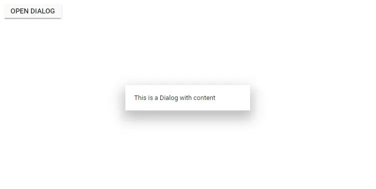
Press Ctrl+F5 (Windows) or ⌘+F5 (macOS) to launch the application. The ASP.NET Core Dialog will render in your default web browser.
Display content using ContentTemplate
You can also pass the Dialog body content as a template by using the ContentTemplate property. This is useful when the dialog content includes multiple HTML elements or Razor markup.
<div id="container" style="height:400px;">
    <ejs-button id="normalbtn" content="Open"></ejs-button>
    <ejs-dialog id="default_dialog" width="500px" target="#container" showCloseIcon="true" header="About SYNCFUSION succintly series">
        <e-content-template>
            <p>
                In the Succinctly series, Syncfusion created a robust, free library of more than 130 technical e - books formatted for PDF,
                Kindle, and EPUB.The Succinctly series was born in 2012 out of a desire to provide concise technical e-books for software developers.Each title in the Succinctly series is written by a carefully chosen expert and provides essential content in about 100 pages.
            </p>
        </e-content-template>
    </ejs-dialog>
</div>
<script>
    window.onload = function () {
        document.getElementById('normalbtn').onclick = function () {
            var dialog = document.getElementById("default_dialog").ej2_instances[0];
            dialog.show();
        }
    }
</script>
In the dialog control, max-height is calculated based on the dialog target element height. If the target property is not configured, the document body is considered as a target. Therefore, to show a dialog in proper height, you need to add min-height to the target element.
Modal Dialog
Setting IsModal to true shows an overlay behind the Dialog. So, the user must interact with the Dialog before interacting with other content.
When the user clicks the overlay, the action can be handled through the overlayClick event.
When the modal dialog is opened, scrolling within the Dialog’s target element is disabled. The scrolling will be enabled again once the Dialog is closed.
<div id='container' style="height:400px;">
    <ejs-button id="targetButton" content="Open Modal Dialog"></ejs-button>
    <ejs-dialog id='dialog' isModal="true" width="300px" overlayClick="onOverlayClick" content="This is a modal dialog" target="#container"></ejs-dialog>
</div>

<script>
    window.onload = function () {
        document.getElementById('targetButton').onclick = function () {
            var dialog = document.getElementById("dialog").ej2_instances[0];
            dialog.show();
        }
    }
    function onOverlayClick() {
        var dialog = document.getElementById("dialog").ej2_instances[0];
        dialog.hide();
    }
</script>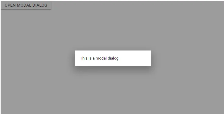
In the dialog control, if the dialog is rendered based on the body, then the dialog gets its height based on its body element height. If the height of the dialog is larger than the body height, then the dialog’s height will not be set. For this scenario, the CSS style for the html and body can be set to get the dialog height.
html, body {
   height: 100%;
}
Enable header
The Dialog header can be enabled by adding the header content as text or HTML content through the header property.
<div id='container' style="height:400px;">
    <ejs-button id="targetButton" content="Open Dialog"></ejs-button>
    <ejs-dialog id='dialog' header="Dialog" showCloseIcon="true" content="This is a dialog with header" target="#container" width="250px"></ejs-dialog>
</div>
<script>
    window.onload = function () {
        document.getElementById('targetButton').onclick = function () {
            var dialog = document.getElementById("dialog").ej2_instances[0];
            dialog.show();
        }
    }
</script>
Enable footer
The Dialog provides built-in support to render the buttons on the footer (for ex: OK or Cancel buttons). Each Dialog button can perform an action when clicked.
The primary button is focused automatically when the Dialog is opened. Use the click event to handle the button actions.
When the Dialog initializes with more than one primary button, the first primary button gets focus when opening the Dialog.
@{

    var DialogButtons1 = new ButtonModel() { isPrimary = true, cssClass = "e-flat", content = "OK" };
    var DialogButtons2 = new ButtonModel() { content = "Cancel", cssClass = "e-flat" };
}

<div id='container' style="height:400px;">
    <ejs-button id="targetButton" content="Open Dialog"></ejs-button>
    <ejs-dialog id="dialog" header="Dialog" content="This is a Dialog with button and primary button" target="#container" width="250px">
        <e-dialog-buttons>
            <e-dialog-dialogbutton buttonModel="DialogButtons1" click="dlgButtonClick"></e-dialog-dialogbutton>
            <e-dialog-dialogbutton buttonModel="DialogButtons2" click="dlgButtonClick"></e-dialog-dialogbutton>
        </e-dialog-buttons>
    </ejs-dialog>
</div>
<script>
    window.onload = function () {
        document.getElementById('targetButton').onclick = function () {
            var dialog = document.getElementById("dialog").ej2_instances[0];
            dialog.show();
        }
    }
    function dlgButtonClick() {
        var dialogObj = document.getElementById('dialog').ej2_instances[0];
        dialogObj.hide();
    }
</script>
public class ButtonModel
{
public string content { get; set; }
public bool isPrimary { get; set; }
public string cssClass { get; set; }
}Draggable
The Dialog supports dragging within its target container by holding the Dialog header, which allows the user to reposition the Dialog dynamically.
The Dialog can be draggable only when the Dialog header is enabled. From
16.2.xversion, Draggable support for modal dialogs was also enabled.
@{
    ViewData["Title"] = "Home page";
    var DialogButtons1 = new ButtonModel() { cssClass = "e-flat", content = "OK" };
    var DialogButtons2 = new ButtonModel() { content = "Cancel", cssClass = "e-flat" };
}

<div id='container' style="height:400px;">
    <ejs-button id="targetButton" content="Open Dialog"></ejs-button>
    <ejs-dialog id='dialog' header='Dialog' allowDragging="true" content='This is a Dialog with drag enable' width="250px">
        <e-dialog-buttons>
            <e-dialog-dialogbutton buttonModel="DialogButtons1" click="dlgButtonClick"></e-dialog-dialogbutton>
            <e-dialog-dialogbutton buttonModel="DialogButtons2" click="dlgButtonClick"></e-dialog-dialogbutton>
        </e-dialog-buttons>
    </ejs-dialog>
</div>

<script>
    window.onload = function () {
        document.getElementById('targetButton').onclick = function () {
            var dialog = document.getElementById("dialog").ej2_instances[0];
            dialog.show();
        }
    }
    function dlgButtonClick() {
        var dialogObj = document.getElementById('dialog').ej2_instances[0];
        dialogObj.hide();
    }
</script>
public class ButtonModel
{
public string content { get; set; }
public string cssClass { get; set; }
}Positioning
The Dialog can be positioned using the position property by providing the X and Y coordinates. It can be positioned inside the target container or <body> of the element based on the given X and Y values.
For X: left, center, right (or) any offset value.
For Y: top, center, bottom (or) any offset value.
<div id='container' style="height:400px;">
    <ejs-button id="targetButton" content="Open Modal Dialog"></ejs-button>
    <ejs-dialog id='dialog' header='Dialog Positions' target='#container' width='350px' footerTemplate="<span id='posvalue' style='float:left; padding-left:10px;font-weight: bold;'>Position: {X: 'left', Y: 'top'}</span>">
   <e-content-template>
       <table style='width: 320px;'>
           <tr> <td><input type='radio' name='xy' onclick='changePosition(event)' value='left top' checked='true'>left top</td> <td><input type='radio' name='xy' onclick='changePosition(event)' value='center top'>center top</td> <td><input type='radio' name='xy' onclick='changePosition(event)' value='right top'>right top</td> </tr>
           <tr> <td><input type='radio' name='xy' onclick='changePosition(event)' value='left center'>left center</td> <td><input type='radio' name='xy' onclick='changePosition(event)' value='center center'>center center</td> <td><input type='radio' name='xy' onclick='changePosition(event)' value='right center'>right center</td> </tr>
           <tr> <td><input type='radio' name='xy' onclick='changePosition(event)' value='left bottom'>left bottom</td> <td><input type='radio' name='xy' onclick='changePosition(event)' value='center bottom'>center bottom</td> <td><input type='radio' name='xy' onclick='changePosition(event)' value='right bottom'>right bottom</td> </tr>
       </table>
</e-content-template>
    </ejs-dialog>
</div>
<script>
    function changePosition(event) {
        var dialog = document.getElementById("dialog").ej2_instances[0];
        dialog.position = { X: event.currentTarget.value.split(" ")[0], Y: event.currentTarget.value.split(" ")[1] };
        document.getElementById("posvalue").innerHTML = 'Position: {X: "' + event.currentTarget.value.split(" ")[0] + '", Y: "' + event.currentTarget.value.split(" ")[1] + '"}';
    }
</script>
See also
- Getting Started with ASP.NET Core using Razor Pages
- Getting Started with ASP.NET Core MVC using Tag Helper
- Load Dialog content using AJAX
- How to position the Dialog on center of the page on scrolling
- Prevent closing of modal Dialog
- Close Dialog while click on outside of Dialog
- How to make a reusable alert and confirm Dialog