Table in Angular Rich Text Editor Component
7 Jul 202624 minutes to read
The Syncfusion Angular Rich Text Editor allows inserting table in the edit panel, providing options to add, edit, format, and remove tables as well as perform other table related action. For inserting the table to the Rich Text Editor, the following list of options have been provided in the tableSettings
Configuring the table tool in toolbar
You can add an CreateTable tool in the Rich Text Editor toolbar using the toolbarSettings.items property.
Select the number of rows and columns on the table grid to insert the table.
Tables can also be inserted through the Insert Table option in the pop-up where the number of rows and columns can be provided manually, and this is the default way in devices.
To use the Table feature, configure
TableServicein the provider section.
In the following sample, the table feature has been provided from table module.
import { Component } from '@angular/core';
import { RichTextEditorModule, ToolbarService, LinkService, ImageService, HtmlEditorService, QuickToolbarService, PasteCleanupService, TableService, ToolbarSettingsModel } from '@syncfusion/ej2-angular-richtexteditor';
@Component({
imports: [
RichTextEditorModule
],
standalone: true,
selector: 'app-root',
template: `<ejs-richtexteditor id='editor' [toolbarSettings]='tools' [(value)]='value'></ejs-richtexteditor>`,
providers: [ToolbarService, LinkService, ImageService, HtmlEditorService, QuickToolbarService, PasteCleanupService, TableService]
})
export class AppComponent {
public value: string = "<p>The Rich Text Editor component is a WYSIWYG (\"what you see is what you get\") editor that provides the best user experience to create and update the content. Users can format their content using standard toolbar commands.</p><p><b>Key features:</b></p><ul><li><p>Provides <IFRAME> and <DIV> modes</p></li><li><p>Capable of handling markdown editing.</p></li><li><p>Contains a modular library to load the necessary functionality on demand.</p></li><li><p>Provides a fully customizable toolbar.</p></li><li><p>Provides HTML view to edit the source directly for developers.</p></li><li><p>Supports third-party library integration.</p></li><li><p>Allows a preview of modified content before saving it.</p></li><li><p>Handles images, hyperlinks, video, hyperlinks, uploads, etc.</p></li><li><p>Contains undo/redo manager.</p></li><li><p>Creates bulleted and numbered lists.</p></li></ul>";
public tools: ToolbarSettingsModel = {
items: ['CreateTable']
};
}import { bootstrapApplication } from '@angular/platform-browser';
import { AppComponent } from './app.component';
import 'zone.js';
bootstrapApplication(AppComponent).catch((err) => console.error(err));Table headers
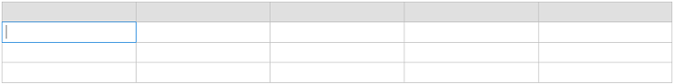
The TableHeader command is available in the quick toolbar, allowing you to add or remove the header row from the inserted table. The following image illustrates the table header.
Inserting rows
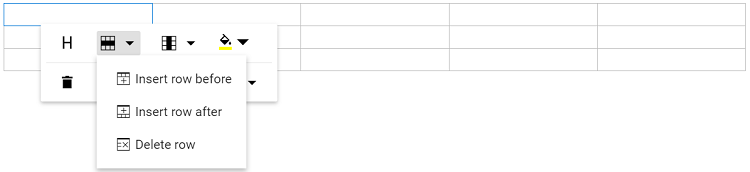
You can insert Rows above or below the selected table cell using the quick toolbar. The focused row can also be deleted. The following screenshot shows the available options of the row item.
Inserting columns
Columns can be inserted to the left or right of the selected table cell using the quick toolbar. The focused column can also be deleted. The following screenshot shows the available options in inserting column item.
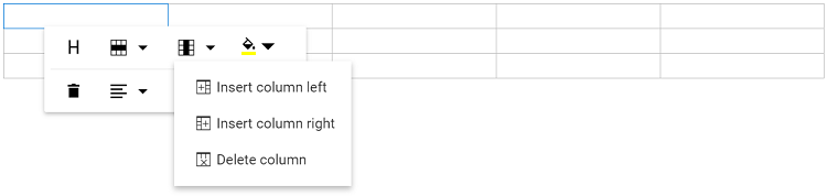
Table column resizing
The Rich Text Editor supports resizing of table columns, allowing users to adjust the size of individual columns to better fit their content. To resize a column, hover the pointer near the edge of a table cell until the resize cursor appears. Then, click and drag the cell border to modify the column size as needed.
This feature provides flexibility in organizing tabular data and ensures that tables remain clear, structured, and easy to read, especially when working with varying content lengths or complex layouts.
Nesting tables
The Rich Text Editor allows users to insert tables within other table cells, enabling the creation of nested tables. This feature is useful for building complex layouts such as structured forms, hierarchical data views, or detailed reports. Users can manually insert a nested table by placing the cursor inside a cell and using the table toolbar option or HTML source editing.
import { Component } from '@angular/core';
import { RichTextEditorModule, ToolbarSettingsModel, ToolbarService, HtmlEditorService, QuickToolbarService, ImageService, LinkService, TableService, PasteCleanupService } from '@syncfusion/ej2-angular-richtexteditor';

@Component({
  selector: 'app-root',
  standalone: true,
  imports: [RichTextEditorModule],
  template: `
    <ejs-richtexteditor id="editor" [toolbarSettings]="tools" [value]="value">
    </ejs-richtexteditor>
  `,
  providers: [ToolbarService, HtmlEditorService, QuickToolbarService, ImageService, LinkService, TableService, PasteCleanupService]
})

export class AppComponent {
  public value: string = `
    <table border="1" style="width:100%; border-collapse: collapse;">
      <tr>
        <th>Department</th>
        <th>Details</th>
      </tr>
      <tr>
        <td>Sales</td>
        <td>
          <table border="1" style="width:100%; border-collapse: collapse;">
            <tr>
              <th>Employee</th>
              <th>Target</th>
            </tr>
            <tr>
              <td>John Doe</td>
              <td>$50,000</td>
            </tr>
            <tr>
              <td>Jane Smith</td>
              <td>$60,000</td>
            </tr>
          </table>
        </td>
      </tr>
      <tr>
        <td>Marketing</td>
        <td>Campaign planning in progress</td>
      </tr>
    </table>
  `;

  public tools: ToolbarSettingsModel = {
    items: [
      'Undo',
      'Redo',
      '|',
      'Bold',
      'Italic',
      'Underline',
      'StrikeThrough',
      '|',
      'Formats',
      'Alignments',
      '|',
      'NumberFormatList',
      'BulletFormatList',
      '|',
      'CreateLink',
      'Image',
      'CreateTable',
      '|',
      'SourceCode'
    ]
  };
}
import { bootstrapApplication } from '@angular/platform-browser';
import { AppComponent } from './app.component';
import 'zone.js';
bootstrapApplication(AppComponent).catch((err) => console.error(err));Quick insert for table rows and columns
The Rich Text Editor offers a simple and intuitive way to add rows and columns to your tables without interrupting your workflow. You can expand tables directly from the interface, no need to use toolbar buttons.
Insert columns instantly
- Where to hover: Place your cursor over any cell in the first row of your table.
- What you’ll see: A small dot icon (●) will appear at the top edge of the cell.
- How to add: Hover over the dot to reveal a plus icon (+). Click it to insert a new column to the left.
Insert rows instantly
- Where to hover: Place your cursor over any cell in the first column of your table.
- What you’ll see: A small dot icon (●) will appear at the left edge of the cell.
- How to add: Hover over the dot to reveal a plus icon (+). Click it to insert a new row above.
Table, row, and column selection
The Rich Text Editor provides a simple and intuitive way to select table rows, columns, and entire table. Users can now select table rows and columns without dragging the mouse between cells.
Selecting an Entire Row
Entire rows can be selected using the icons that appears on hover.
To select a row:
- Where to hover: Move the mouse pointer over the first column of the table..
- What you’ll see: A selection handle appears on the left side of the corresponding row.
- How to select: Click the handle to select the entire row.
Selecting an Entire Column
Entire columns can be selected using the icons that appears on hover.
To select a column:
- Where to hover: Move the mouse pointer over the first row of the table.
- What you’ll see: A selection handle appears at the top of the corresponding column.
- How to select: Click the handle to select the entire column.
Selecting the Entire Table
The entire table can be selected using the table selection icon that appears on hover.
To select the entire table:
- Where to hover: Move the mouse pointer anywhere over the table.
- What you’ll see: A selection handle appears at the top-left corner of the table.
- How to select: Click the handle to select the entire table.
Keyboard Shortcuts
The Ctrl + A shortcut provides progressive selection behavior when used inside a table.
- First press: Selects the current cell
- Second press: Selects the row containing the current cell
- Third press: Selects the entire table
- Fourth press: Selects all content in the Rich Text Editor
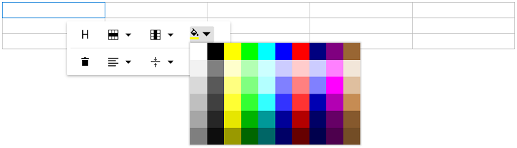
Setting cell background color
Set the background color for each table cell using the BackgroundColor command in the quick toolbar.
Deleting table
Delete the entire table using the delete item in the quick toolbar.
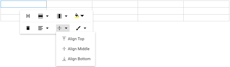
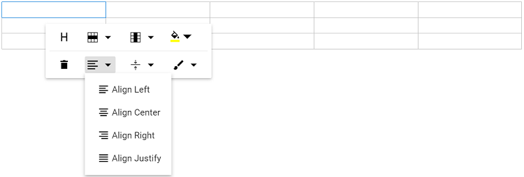
Table cell alignment
Vertical alignment
Align text inside table cells to the top, middle, or bottom using the TableCellVerticalAlign tool in the quick toolbar.
Horizontal alignment
Align text inside table cells to the left, right, or center using the TableCellHorizontalAlign tool in the quick toolbar.
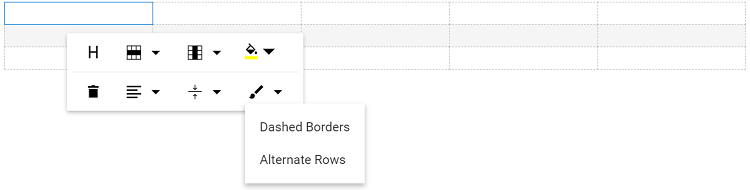
Applying table styles
Table styles provided for class name should be appended to a table element. It helps to design the table in specific CSS styles when inserting in the editor.
By Default, provides Dashed border and Alternate rows.
Dashed border: Applies a dashed border to the table.
Alternate border: Applies an alternating background to table rows.
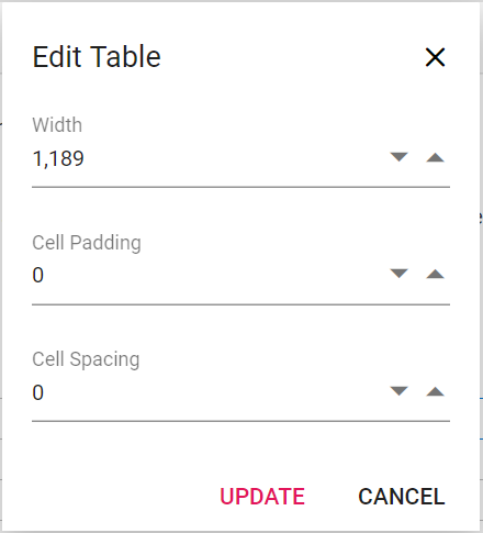
Setting table and cell dimensions
Sets the default width of the table when it is inserted in the Rich Text Editor using the width of tableSettings.
Users can modify the table width, cell padding, cell spacing, background color, border color, border style, and border width through the TableEditProperties option in the quick toolbar. By default, the border style is double and the border width is 1px. When users change these values in the dialog, the updates are instantly reflected in the editor as a live preview.
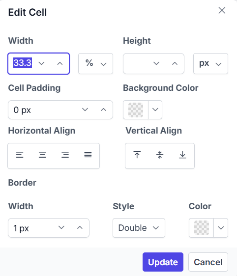
Setting individual cell dimensions and borders
The Rich Text Editor provides advanced options to customize individual table cell dimensions and borders. This feature enables fine-grained control over cell sizes, spacing, alignment, and border styling for both single and multiple cell selections.
Configuring the table cell properties in quick toolbar
To enable individual cell dimension and border customization, configure the TableCellProperties item in the Table quickToolbarSettings property:
quickToolbarSettings: { table: ['TableCellProperties'] }Individual cell properties dialog
Clicking on the TableCellProperties item in the quick toolbar opens a comprehensive dialog with the following customization options:
Dimension settings:
-
Width: Set custom cell width with flexible unit selection (px, %, auto). The width is calculated based on the col group element’s percentage of the selected cell. This setting applies to both single and multiple cell selections.
-
Height: Define custom cell height with unit options (px, %, auto). When the cell height value is applied, it appears in the UI only when the table has an explicitly defined height. Provides granular control over vertical cell dimensions.
-
Cell padding: Adjust the internal spacing inside cells to improve readability and visual appearance.
Alignment options:
-
Horizontal alignment: Four alignment options are available:
- Align left
- Align center
- Align right
- Align justify
-
Vertical alignment: Position cell content vertically with the following options:
- Align top
- Align middle
- Align bottom
Border customization:
- Border Style: Select the desired border line style (default is double).
- Border Width: Specify the border thickness in pixels (default is 1px).
- Border Color: Apply custom colors for cell borders to match design requirements.
Cell appearance:
- Background color: Apply individual cell background colors to highlight important data or improve visual organization.
Applying properties to cells
The TableCellProperties enables modification of properties for both single and multiple selected cells. When multiple cells are selected, property changes apply uniformly to all selected cells, maintaining consistency across the table layout.
Live preview
All changes made in the Table Cell Properties dialog are instantly reflected in the editor as a live preview, providing real-time visual feedback before finalizing the modifications.
In the following sample, the table cell properties feature has been provided from table module.
import { Component, ViewChild } from '@angular/core';
import { RichTextEditorModule, ToolbarService, LinkService, ImageService, HtmlEditorService, QuickToolbarService, PasteCleanupService, RichTextEditorComponent, QuickToolbarSettingsModel } from '@syncfusion/ej2-angular-richtexteditor';

@Component({
    imports: [
        RichTextEditorModule
    ],
    standalone: true,
    selector: 'app-root',
    template: `<ejs-richtexteditor #editor id='editor' [quickToolbarSettings]='quickToolbarSettings' [(value)]='value' width='250px'></ejs-richtexteditor>`,
    providers: [ToolbarService, LinkService, ImageService, HtmlEditorService, QuickToolbarService, PasteCleanupService]
})

export class AppComponent {
    @ViewChild('editor') editorObj: RichTextEditorComponent | undefined;
     public value: string = `<table class="e-rte-table" style="width: 100%; min-width: 0px; border-collapse: collapse;">
    <colgroup>
        <col style="width: 40%;">
        <col style="width: 60%;">
    </colgroup>
    <thead>
        <tr>
            <th style="text-align: left; padding: 8px; border: 1px solid #dcdcdc;">Property</th>
            <th style="text-align: left; padding: 8px; border: 1px solid #dcdcdc;">Details</th>
        </tr>
    </thead>
    <tbody>
        <tr>
            <td style="padding: 8px; border: 1px solid #dcdcdc;">Cell Width</td>
            <td style="padding: 8px; border: 1px solid #dcdcdc;">Specifies the width of the selected cell. Supports units such as <code>px</code>, <code>%</code>, or <code>auto</code>.</td>
        </tr>
        <tr>
            <td style="padding: 8px; border: 1px solid #dcdcdc;">Border</td>
            <td style="padding: 8px; border: 1px solid #dcdcdc;">Controls border style, color, and thickness for the cell to match design requirements.</td>
        </tr>
        <tr>
            <td style="padding: 8px; border: 1px solid #dcdcdc;">Cell Padding</td>
            <td style="padding: 8px; border: 1px solid #dcdcdc;">Adjusts internal spacing to improve readability and layout consistency.</td>
        </tr>
        <tr>
            <td style="padding: 8px; border: 1px solid #dcdcdc;">Alignment</td>
            <td style="padding: 8px; border: 1px solid #dcdcdc;">Horizontal and vertical alignment options to position content within the cell.</td>
        </tr>
    </tbody>
</table>
<p><br/></p>`;
    public quickToolbarSettings: QuickToolbarSettingsModel = {
        table: ['TableCellProperties']
    };
}
import { bootstrapApplication } from '@angular/platform-browser';
import { AppComponent } from './app.component';
import 'zone.js';
bootstrapApplication(AppComponent).catch((err) => console.error(err));@import 'node_modules/@syncfusion/ej2-base/styles/tailwind3.css';
@import 'node_modules/@syncfusion/ej2-icons/styles/tailwind3.css';
@import 'node_modules/@syncfusion/ej2-buttons/styles/tailwind3.css';
@import 'node_modules/@syncfusion/ej2-splitbuttons/styles/tailwind3.css';
@import 'node_modules/@syncfusion/ej2-inputs/styles/tailwind3.css';
@import 'node_modules/@syncfusion/ej2-lists/styles/tailwind3.css';
@import 'node_modules/@syncfusion/ej2-navigations/styles/tailwind3.css';
@import 'node_modules/@syncfusion/ej2-popups/styles/tailwind3.css';
@import 'node_modules/@syncfusion/ej2-richtexteditor/styles/tailwind3.css';Table cell selection and formatting
The table cell selection feature in our editor allows for intuitive and efficient table manipulation using both mouse and keyboard interactions.
Mouse interaction:
- Click and drag to select multiple cells, rows or columns.
- Selected cells are highlighted with a distinct background color for better visibility.
Keyboard interaction:
- Use Shift + Arrow keys to extend the selection of cells, rows or columns.
- Background color highlights selected cells for better visibility.
Table selection with backspace and delete keys:
- Press the Backspace key immediately after the table to select the entire table.
- Press the Delete key immediately before the table to select the entire table.
Table content text formatting:
The text formatting feature in tables allows users to apply various styles to selected cells, enhancing the appearance and readability of data. This includes the application of headings, paragraphs, lists, and inline styles such as bold, italic, and strikethrough. Users can efficiently format multiple cells simultaneously by selecting entire rows or columns.
import { Component } from '@angular/core';
import { RichTextEditorModule, ToolbarService, LinkService, ImageService, HtmlEditorService, QuickToolbarService, PasteCleanupService, TableService, ToolbarSettingsModel, QuickToolbarSettingsModel } from '@syncfusion/ej2-angular-richtexteditor';
@Component({
imports: [
RichTextEditorModule
],
standalone: true,
selector: 'app-root',
template: `<ejs-richtexteditor id='editor' [toolbarSettings]='tools' [quickToolbarSettings]='quickToolbarSettings' [(value)]='value'></ejs-richtexteditor>`,
providers: [ToolbarService, LinkService, ImageService, HtmlEditorService, QuickToolbarService, PasteCleanupService, TableService]
})
export class AppComponent {
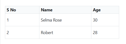
public value: string = "<h2>Discover the Table's Powerful Features</h2><p>A table can be created in the editor using either a keyboard shortcut or the toolbar. With the quick toolbar, you can perform table cell insert, delete, split, and merge operations. You can style the table cells using background colours and borders.</p><table class=\"e-rte-table\" style=\"width: 100%; min-width: 0px; height: 151px\"><thead><tr><th><span>Name</span><br/></th><th><span>Age</span><br/></th><th><span>Gender</span><br/></th><th><span>Occupation</span><br/></th></tr></thead><tbody><tr><td>Selma Rose</td><td>30</td><td>Female</td><td><span>Engineer</span><br/></td></tr><tr><td><span>Robert</span><br/></td><td>28</td><td>Male</td><td><span>Graphic Designer</span></td></tr><tr><td><span>William</span><br/></td><td>35</td><td>Male</td><td>Teacher</td></tr></tbody></table>";
public tools: ToolbarSettingsModel = {
items: ['CreateTable']
};
public quickToolbarSettings: QuickToolbarSettingsModel = {
table: ['TableHeader', 'TableRows', 'TableColumns', 'TableCell', '-', 'BackgroundColor', 'TableRemove', 'TableCellVerticalAlign', 'Styles']
};
}import { bootstrapApplication } from '@angular/platform-browser';
import { AppComponent } from './app.component';
import 'zone.js';
bootstrapApplication(AppComponent).catch((err) => console.error(err));Copy, cut, and paste table content
The Rich Text Editor supports copying, cutting, and pasting table content, significantly improving the efficiency of table data manipulation. This feature is ideal for applications that require dynamic table content management, allowing users to easily modify and manage table data within the editor.
Users can select multiple table cells by dragging the mouse or by holding the Shift key and using the Arrow keys. After selecting the desired cells, the following standard keyboard shortcuts can be used:
| Action | Windows | Mac |
|---|---|---|
| Copy | Ctrl + C | ⌘ + C |
| Cut | Ctrl + X | ⌘ + X |
| Paste | Ctrl + V | ⌘ + V |
Paste behavior and supported scenarios:
- Table structure, formatting, and cell properties are automatically preserved during the paste operation.
- The editor intelligently handles cell merging and splitting based on the destination context.
- Supports cross-table operations. Users can copy content from one table and paste it into another.
- Allows pasting partial table content as new tables or into existing table cells.
- Compatible with content from external applications like Excel, Word, and other editors.
- Maintains formatting consistency during both internal and external paste operations.
- Supports pasting into a single clicked cell or a selected range of multiple cells.
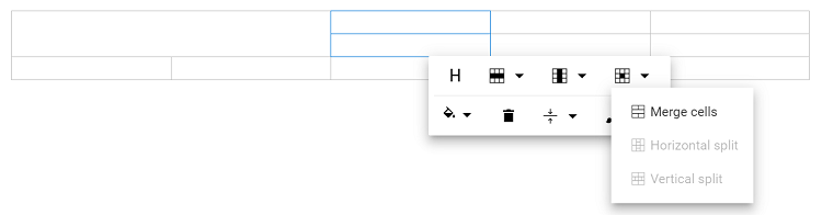
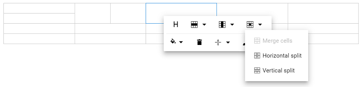
Merging and splitting cells
The Rich Text Editor allows users to modify table appearance by merging or splitting cells.
Configure the TableCell item in the Table quickToolbarSettings property to display merge/split icons when selecting table cells.
Merging table cells
The table cell merge feature allows you to merge two or more row and column cells into a single cell, combining their contents.
The following image explains the table merge action.
Splitting table cells
The table cell split feature allows you to a selected cell can be split both horizontally and vertically.
The following image explains the table split action.
import { Component } from '@angular/core';
import { RichTextEditorModule, ToolbarService, LinkService, ImageService, HtmlEditorService, QuickToolbarService, PasteCleanupService, TableService, ToolbarSettingsModel, QuickToolbarSettingsModel } from '@syncfusion/ej2-angular-richtexteditor';
@Component({
imports: [
RichTextEditorModule
],
standalone: true,
selector: 'app-root',
template: `<ejs-richtexteditor id='editor' [toolbarSettings]='tools' [quickToolbarSettings]='quickToolbarSettings' [(value)]='value'></ejs-richtexteditor>`,
providers: [ToolbarService, LinkService, ImageService, HtmlEditorService, QuickToolbarService, PasteCleanupService, TableService]
})
export class AppComponent {
public value: string = "<p>The Rich Text Editor component is a WYSIWYG (\"what you see is what you get\") editor that provides the best user experience to create and update the content. Users can format their content using standard toolbar commands.</p><p><b>Key features:</b></p><ul><li><p>Provides <IFRAME> and <DIV> modes</p></li><li><p>Capable of handling markdown editing.</p></li><li><p>Contains a modular library to load the necessary functionality on demand.</p></li><li><p>Provides a fully customizable toolbar.</p></li><li><p>Provides HTML view to edit the source directly for developers.</p></li><li><p>Supports third-party library integration.</p></li><li><p>Allows a preview of modified content before saving it.</p></li><li><p>Handles images, hyperlinks, video, hyperlinks, uploads, etc.</p></li><li><p>Contains undo/redo manager.</p></li><li><p>Creates bulleted and numbered lists.</p></li></ul>";
public tools: ToolbarSettingsModel = {
items: ['CreateTable'],
};
public quickToolbarSettings: QuickToolbarSettingsModel = {
table: ['TableHeader', 'TableRows', 'TableColumns', 'TableCell', '-', 'BackgroundColor', 'TableRemove', 'TableCellVerticalAlign', 'Styles']
};
}import { bootstrapApplication } from '@angular/platform-browser';
import { AppComponent } from './app.component';
import 'zone.js';
bootstrapApplication(AppComponent).catch((err) => console.error(err));