Theme Studio in Angular Appearance Component
2 Feb 20263 minutes to read
The Theme Studio for Syncfusion® Angular UI Components offers the ability to customize existing themes.
Key Benefits of Theme Studio
- Visual Customization: Modify theme colors using an intuitive interface with real-time component preview
- Component-Specific Styling: Customize all components or focus on specific components to reduce output file size
- Simplified Workflow: Export ready-to-use CSS/SCSS files without writing code
- Design Consistency: Maintain uniform styling across your entire application
-
Reusable Settings: Save customization settings to
settings.jsonfor future updates and adjustments
Note: Theme Studio currently does not support customization for Data Visualization components like Charts, Diagrams, Gauges, Range Navigators, or Maps.
Customizing Theme Color in Theme Studio
Syncfusion® Angular UI Components are created using SCSS, with each theme containing unique common variables. By altering these variable color codes, styles across all Syncfusion® Angular UI Components can be modified. These styles are influenced by these theme-based common variables, which are managed within the Theme Studio application.
Step 1: Visit the Theme Studio at https://ej2.syncfusion.com/themestudio/.
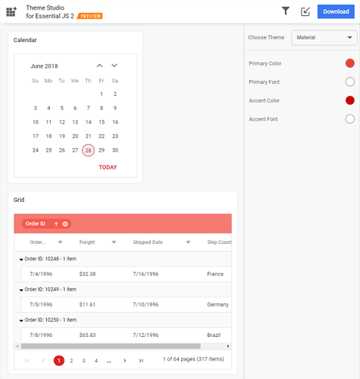
Step 2: The Theme Studio is divided into two sections: the components preview on the left, and the theme customization on the right.
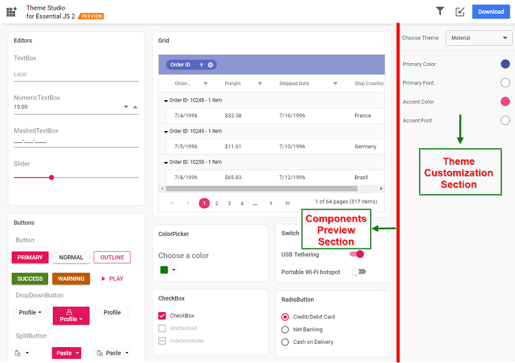
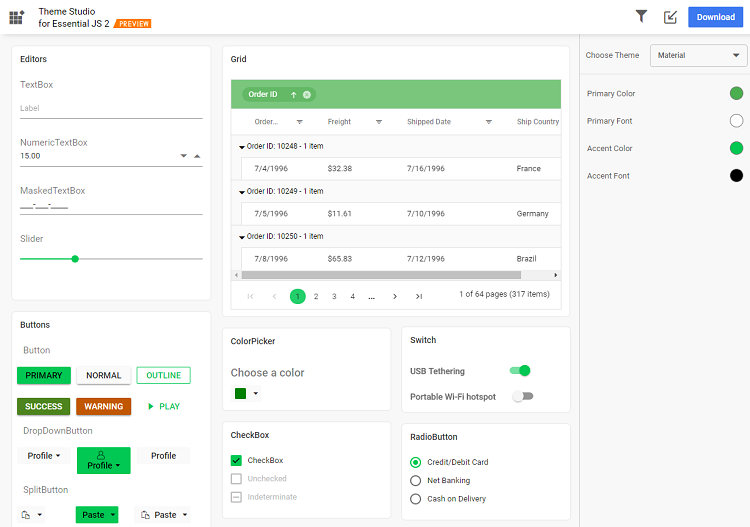
Step 3: Use the color pickers in the customization section to choose your desired colors.
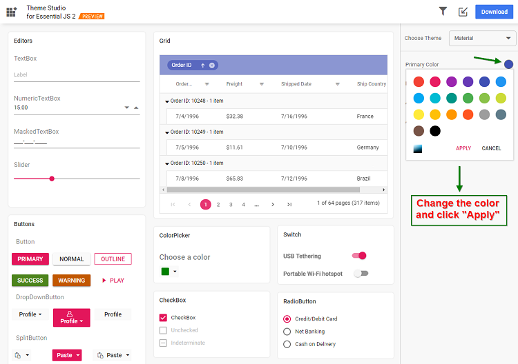
Step 4: Once colors are selected, the Essential® JS 2 components in the preview section will reflect the changes.
Filtering a Specific List of Components
With Theme Studio, you can customize selected components. This is beneficial when focusing on a specific suite of Syncfusion® Angular UI Components in your application. The Studio filters these components to customize and decrease final output file size.
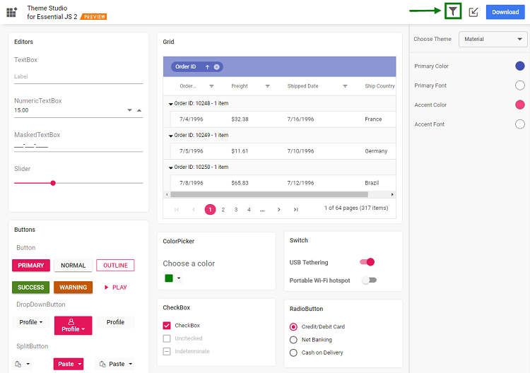
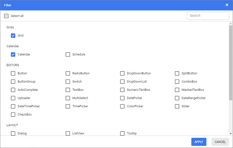
Step 1: Click the Filter icon in the top right, then choose components for theme customization.
Step 2: In the Filter dialog, click Apply. Only the chosen components will now appear in the preview section.
Step 3: Customize colors for the chosen components in the theme customization section.
Download the Customized Theme
After customizing, you can download your theme styles.
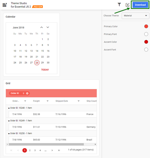
Step 1: Click the Download button in the upper right. This opens the Download dialog.
Step 2: Enter a theme name in File Name and click Download. If using both Essential® JS 1 and Essential® JS 2 components, check “Include compatibility CSS” to ensure compatibility with Essential® JS 1 styles. More details are available here.
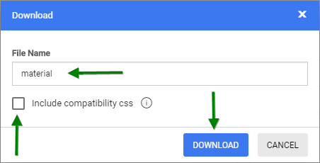
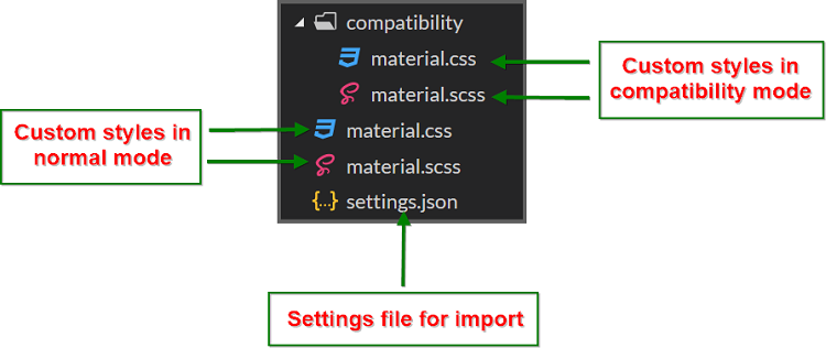
Step 3: The styles download as a zip containing SCSS and CSS files for selected Syncfusion® Angular UI Components. Current settings are stored in settings.json.
Using Customized Theme in a Web Application
Incorporate the customized CSS file directly into your web application.
Step 1: Copy the customized CSS file from your download folder to your application directory (e.g., styles/{file-name}.css).
Step 2: Link the customized CSS file in index.html or shared/_layout.cshtml in the head section.
<head>
    <link href="styles/{file-name}.css" rel="stylesheet"/>
</head>
For applications using both Essential® JS 1 and Essential® JS 2, copy the customized CSS file from the
compatibilityfolder from the downloaded location.
Import Previously Changed Settings into Theme Studio
If you need to adjust your application theme and UI design later, you don’t have to start from scratch. Simply import your previous settings.json into Theme Studio.
Step 1: Click the Import icon in the top right corner.
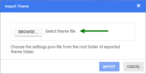
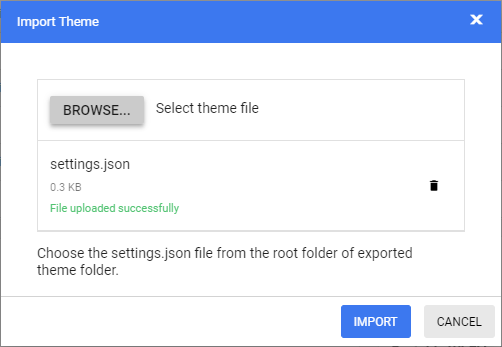
Step 2: In the Import Theme dialog, click Browse to select your previously exported settings.json.
Step 3: Click Import.
Step 4: The stored settings will appear in the Theme Studio, allowing you to adjust theme colors per your latest design and export anew.
Step 5: The exported file will encompass your new changes. Replace the older style with this new version to update your application.
Tailwind Theme
Syncfusion® Angular UI Components provide Tailwind CSS theme support, delivering a modern, clean UI appearance that follows Tailwind design principles. This theme offers seamless integration with Tailwind CSS-based applications.