Overview of CSS Variables in Themes
2 Feb 202613 minutes to read
CSS variables (also known as CSS custom properties) are custom values defined once and reused throughout stylesheets. They start with a double hyphen (–) and are accessed using the var() function.
Syncfusion® Essential JS 2 (EJ2) Angular components rely heavily on CSS variables to enable flexible, consistent, and maintainable theming. Key benefits include:
- Easy theme customization without altering core component files
- Seamless light/dark mode toggling via class application
- Uniform appearance across all components
- Runtime dynamic style updates without page reloads
- Improved maintainability and scalability for large applications
CSS Themes for Syncfusion® Angular Controls
Syncfusion® provides the following modern themes, each available in light and dark variants:
- Material 3 Theme
- Fluent 2 Theme
- Bootstrap 5.3 Theme
- Tailwind 3.4 Theme
These themes define appearance through CSS variables, enabling straightforward color adjustments and automatic light/dark mode support.
Note: Material 3 uses rgb() values (e.g., –color-sf-primary: 98, 0, 238;) rather than hex codes. This format supports better opacity handling and color manipulation. Using hex values directly may lead to inconsistent rendering.
Obtaining Themes
Syncfusion® themes are available via npm packages or CDN links. Use a recent version for the latest features and fixes.
| Theme | Light Package / CDN | Dark Package / CDN |
|---|---|---|
| Material 3 |
@syncfusion/ej2-material3-theme https://cdn.syncfusion.com/ej2/32.1.19/material3.css |
@syncfusion/ej2-material3-dark-theme https://cdn.syncfusion.com/ej2/32.1.19/material3-dark.css |
| Fluent 2 |
@syncfusion/ej2-fluent2-theme https://cdn.syncfusion.com/ej2/32.1.19/fluent2.css |
@syncfusion/ej2-fluent2-dark-theme https://cdn.syncfusion.com/ej2/32.1.19/fluent2-dark.css |
| Bootstrap 5.3 |
@syncfusion/ej2-bootstrap5.3-theme https://cdn.syncfusion.com/ej2/32.1.19/bootstrap5.3.css |
@syncfusion/ej2-bootstrap5.3-dark-theme https://cdn.syncfusion.com/ej2/32.1.19/bootstrap5.3-dark.css |
| Tailwind 3 |
@syncfusion/ej2-tailwind3-theme https://cdn.syncfusion.com/ej2/32.1.19/tailwind3.css |
@syncfusion/ej2-tailwind3-dark-theme https://cdn.syncfusion.com/ej2/32.1.19/tailwind3-dark.css |
Using npm packages
- Install the desired theme:
npm install @syncfusion/ej2-material3-theme - Import it in your global styles file (src/styles.scss or src/styles.css):
@import '@syncfusion/ej2-material3-theme/styles/material3.css';
Using CDN
Include the stylesheet in the <head> of your index.html:
<link href="https://cdn.syncfusion.com/ej2/32.1.19/material3.css" rel="stylesheet" />Using CSS Variables in Modern Themes
Each Syncfusion® theme defines a set of CSS variables that control various aspects of component appearance. These variables follow a consistent naming pattern:
- Primary Colors: –color-sf-primary, –color-sf-secondary, –color-sf-tertiary
- Surface Colors: –color-sf-surface, –color-sf-surface-variant, –color-sf-on-surface
- Semantic Colors: –color-sf-error, –color-sf-warning, –color-sf-success
- Neutral Colors: –color-sf-white, –color-sf-black, –color-sf-content-bg-color
Below are examples of CSS variable definitions for each theme:
/* rgb() values of material3 theme */
:root {
--color-sf-black: 0, 0, 0;
--color-sf-white: 255, 255, 255;
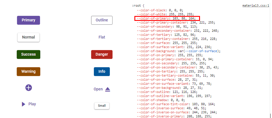
--color-sf-primary: 103, 80, 164;
--color-sf-primary-container: 234, 221, 255;
--color-sf-secondary: 98, 91, 113;
--color-sf-secondary-container: 232, 222, 248;
--color-sf-tertiary: 125, 82, 96;
--color-sf-tertiary-container: 255, 216, 228;
--color-sf-surface: 255, 255, 255;
--color-sf-surface-variant: 231, 224, 236;
--color-sf-background: var(--color-sf-surface);
--color-sf-on-primary: 255, 255, 255;
--color-sf-on-primary-container: 33, 0, 94;
--color-sf-on-secondary: 255, 255, 255;
--color-sf-on-secondary-container: 30, 25, 43;
--color-sf-on-tertiary: 255, 255, 255;
}/* Hex values of fluent2 theme */
:root {
--color-sf-black: #000;
--color-sf-white: #fff;
--color-sf-primary: #0f6cbd;
--color-sf-primary-text-color: #fff;
--color-sf-primary-light: #b4d6fa;
--color-sf-primary-lighter: #ebf3fc;
--color-sf-primary-dark: #0f548c;
--color-sf-primary-darker: #0c3b5e;
--color-sf-success: #0e700e;
--color-sf-info: #008aa9;
--color-sf-warning: #bc4b09;
--color-sf-danger: #d13438;
--color-sf-success-light: #54b054;
--color-sf-info-light: #56bfd7;
--color-sf-warning-light: #fee5d7;
--color-sf-danger-light: #eeacb2;
--color-sf-success-dark: #54b054;
--color-sf-info-dark: #56bfd7;
--color-sf-warning-dark: #8a3707;
--color-sf-danger-dark: #6e0811;
}:root {
--color-sf-black: 0, 0, 0;
--color-sf-white: 255, 255, 255;
--color-sf-content-bg-color: #fff;
--color-sf-content-bg-color-alt1: #f8f9fa;
--color-sf-content-bg-color-alt2: #e9ecef;
--color-sf-content-bg-color-alt3: #dee2e6;
--color-sf-content-bg-color-alt4: #ced4da;
--color-sf-content-bg-color-alt5: #adb5bd;
--color-sf-content-bg-color-hover: #f8f9fa;
--color-sf-content-bg-color-pressed: #e9ecef;
--color-sf-content-bg-color-focus: #e9ecef;
--color-sf-content-bg-color-selected: #0d6efd;
--color-sf-content-bg-color-dragged: #ced4da;
--color-sf-content-bg-color-disabled: #e9ecef;
--color-sf-flyout-bg-color: #fff;
--color-sf-flyout-bg-color-hover: #f8f9fa;
--color-sf-flyout-bg-color-pressed: #0d6efd;
--color-sf-flyout-bg-color-focus: #f8f9fa;
--color-sf-overlay-bg-color: 0, 0, 0;
--color-sf-table-bg-color-hover: rgba(0, 0, 0, .07);
}:root{
--color-sf-content-bg-color: rgba(255, 255, 255);
--color-sf-content-bg-color-alt1: #f9fafb;
--color-sf-content-bg-color-alt2: #f3f4f6;
--color-sf-content-bg-color-alt3: #e5e7eb;
--color-sf-content-bg-color-alt4: #9ca3af;
--color-sf-content-bg-color-alt5: #6b7280;
--color-sf-content-bg-color-hover: #f9fafb;
--color-sf-content-bg-color-pressed: #f3f4f6;
--color-sf-content-bg-color-focus: #f9fafb;
--color-sf-content-bg-color-selected: #e5e7eb;
--color-sf-content-bg-color-dragged: #f3f4f6;
--color-sf-content-bg-color-disabled: #ffffff;
--color-sf-flyout-bg-color: #ffffff;
--color-sf-flyout-bg-color-hover: #f3f4f6;
--color-sf-flyout-bg-color-pressed: #e5e7eb;
--color-sf-flyout-bg-color-focus: #f3f4f6;
--color-sf-flyout-bg-color-selected: #e5e7eb;
--color-sf-flyout-bg-color-disabled: #fff;
--color-sf-overlay-bg-color: rgba(107, 114, 128, 74.9);
--color-sf-table-bg-color-hover: #f9fafb;
--color-sf-table-bg-color-pressed: #f3f4f6;
--color-sf-table-bg-color-selected: #e5e7eb;
--color-sf-text-input-bg-color: #ffffff;
--color-sf-treeview-item-active-hover-bg: #e5e7eb;
}Customizing Themes with CSS Variables
Override variables in your application styles after the theme import to customize appearance while preserving consistency.
Material 3 primary color customization example:
import { NgModule } from '@angular/core'
import { BrowserModule } from '@angular/platform-browser'
import { ButtonModule } from '@syncfusion/ej2-angular-buttons'
import { enableRipple } from '@syncfusion/ej2-base'
import { FormsModule } from '@angular/forms'

import { Component } from '@angular/core';

@Component({
imports: [

        ButtonModule,
        FormsModule
    ],


standalone: true,
    selector: 'app-root',
    styleUrls:['./styles.css'],
    template:`<div>
     <!-- Primary Button - Used to represent a primary action. -->
     <button ejs-button cssClass="e-primary">Button</button>
     </div>`
})

export class AppComponent {
}
import { bootstrapApplication } from '@angular/platform-browser';
import { AppComponent } from './app.component';
import 'zone.js';
bootstrapApplication(AppComponent).catch((err) => console.error(err));Default Material 3 Primary
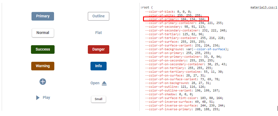
Customized Material 3 Primary
Bootstrap 5.3 theme customization
import { NgModule } from '@angular/core'
import { BrowserModule } from '@angular/platform-browser'
import { ButtonModule } from '@syncfusion/ej2-angular-buttons'
import { enableRipple } from '@syncfusion/ej2-base'
import { FormsModule } from '@angular/forms'
import { Component } from '@angular/core';

@Component({
imports: [
        ButtonModule,
        FormsModule
    ],
    standalone: true,
    selector: 'app-root',
    styleUrls:['./styles.css'],
    template:`<div>
     <!-- Primary Button - Used to represent a primary action. -->
     <button ejs-button cssClass="e-primary">Button</button>
     </div>`
})

export class AppComponent {
}
import { bootstrapApplication } from '@angular/platform-browser';
import { AppComponent } from './app.component';
import 'zone.js';
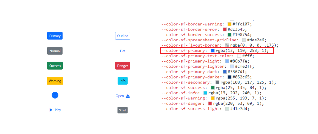
bootstrapApplication(AppComponent).catch((err) => console.error(err));Default Bootstrap 5.3 Primary Value
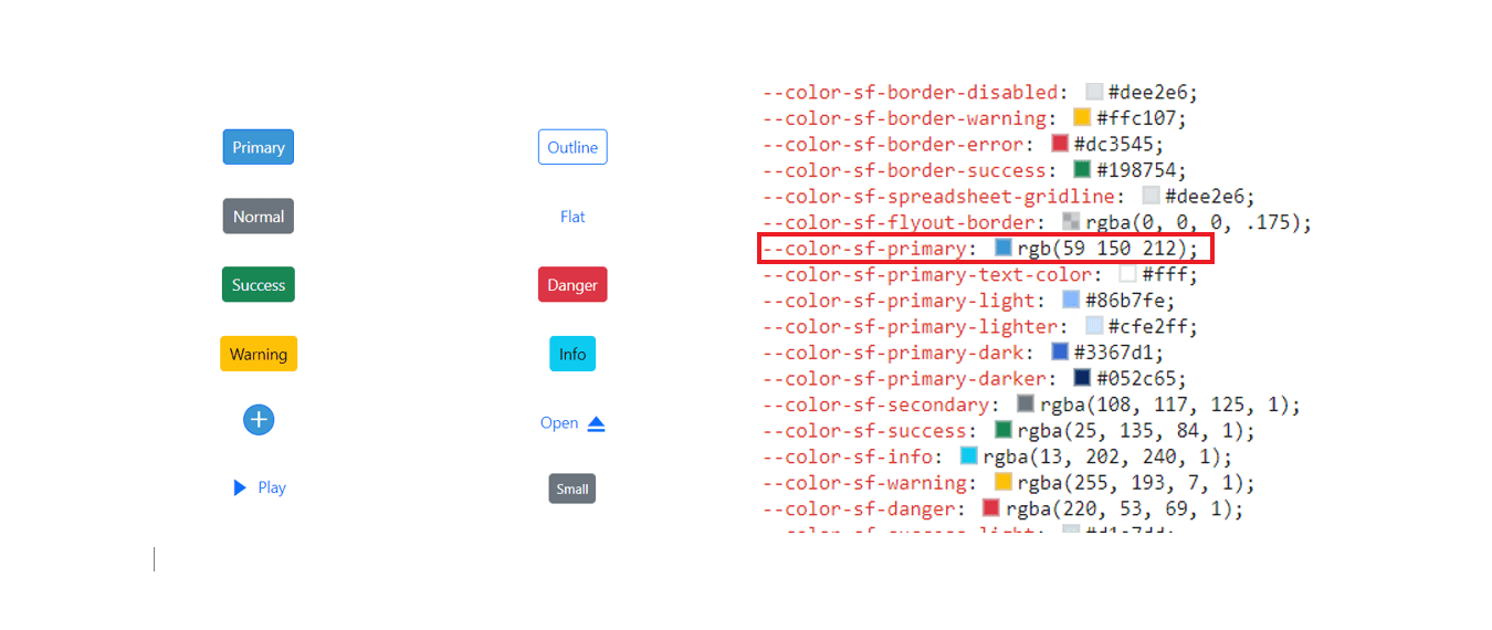
Customized Bootstrap 5.3 Primary Value
Similar overrides work for other themes.Some themes like Fluent 2, Bootstrap 5.3, etc., require updating multiple related variables (e.g., hover and pressed states) for consistency. For comprehensive customizations requiring coordinated changes (e.g., hover, active states), use the Theme Studio to generate consistent values.
Light and Dark Mode Switching
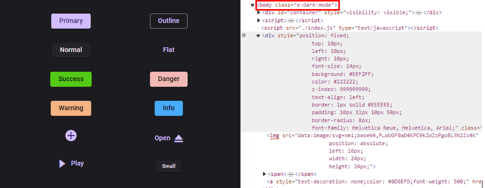
All themes support light/dark variants. To enable dark mode, add the e-dark-mode class to the <body> tag.
Example toggle implementation (Material 3):
import { NgModule } from '@angular/core'
import { BrowserModule } from '@angular/platform-browser'
import { ButtonModule, CheckBoxModule } from '@syncfusion/ej2-angular-buttons'
import { enableRipple } from '@syncfusion/ej2-base'
import { SwitchModule} from '@syncfusion/ej2-angular-buttons'
import { FormsModule } from '@angular/forms'
import { CommonModule } from '@angular/common';
import { Component } from '@angular/core';

@Component({
imports: [

        ButtonModule,
        CheckBoxModule,
        SwitchModule,
        FormsModule,
        CommonModule
    ],


standalone: true,
    selector: 'app-root',
    styleUrls:['./styles.css'],
    template:`<div [ngClass]="{'e-dark-mode': isChecked, 'dark': isChecked}">
    <ejs-checkbox label="Enable Darkmode" (change)="toggleCheckbox()"></ejs-checkbox><br/>

     <!-- Primary Button - Used to represent a primary action. -->
     <button ejs-button cssClass="e-primary">Button</button>

     <!-- Success Button - Used to represent a positive action. -->
     <button ejs-button cssClass="e-success">Button</button>

     <!-- Info Button - Used to represent an informative action -->
     <button ejs-button cssClass="e-info">Button</button>

     <!-- Warning Button - Used to represent an action with caution. -->
     <button ejs-button cssClass="e-warning">Button</button>

     <!-- Danger Button - Used to represent a negative action. -->
     <button ejs-button cssClass="e-danger">Button</button>
     </div>`
})

export class AppComponent {
  public className:string="";
  public checked:boolean=true;

  public isChecked = false;

  toggleCheckbox() {
    this.isChecked = !this.isChecked;
    if (this.isChecked) {
      document.body.classList.add('dark');
    }
    else{
      document.body.classList.remove('dark');
    }
  }

}
import { bootstrapApplication } from '@angular/platform-browser';
import { AppComponent } from './app.component';
import 'zone.js';
bootstrapApplication(AppComponent).catch((err) => console.error(err));Dark Mode Example
The same e-dark-mode class activates dark variants in Fluent 2, Bootstrap 5.3, and Tailwind 3 themes, adjusting backgrounds, text, and accents for readability and contrast.
Theme Studio Application
For advanced customization, use the web-based Syncfusion® Theme Studio. It allows you to:
- Interactively customize colors
- Preview changes across components in real time
- Toggle between light and dark modes
- Generate and export custom theme CSS files