How can I help you?
Getting Started with the Vue Sidebar Component in Vue 3
18 Mar 202624 minutes to read
This article provides a step-by-step guide for setting up a Vite project with a JavaScript environment and integrating the Syncfusion® Vue Sidebar component using the Composition API / Options API.
The Composition API is a new feature introduced in Vue.js 3 that provides an alternative way to organize and reuse component logic. It allows developers to write components as functions that use smaller, reusable functions called composition functions to manage their properties and behavior.
The Options API is the traditional way of writing Vue.js components, where the component logic is organized into a series of options that define the component’s properties and behavior. These options include data, methods, computed properties, watchers, lifecycle hooks, and more.
Prerequisites
System requirements for Syncfusion® Vue UI components
Set up the Vite project
A recommended approach for beginning with Vue is to scaffold a project using Vite. To create a new Vite project, use one of the commands that are specific to either NPM or Yarn.
npm create vite@latestor
yarn create viteUsing one of the above commands will lead you to set up additional configurations for the project as below:
1.Define the project name: We can specify the name of the project directly. Let’s specify the name of the project as my-project for this article.
? Project name: » my-project2.Select Vue as the framework. It will create a Vue 3 project.
? Select a framework: » - Use arrow-keys. Return to submit.
Vanilla
> Vue
  React
  Preact
  Lit
  Svelte
  Others
3.Choose JavaScript as the framework variant to build this Vite project using JavaScript and Vue.
? Select a variant: » - Use arrow-keys. Return to submit.
> JavaScript
  TypeScript
  Customize with create-vue ↗
  Nuxt ↗
4.Upon completing the aforementioned steps to create the my-project, run the following command to install its dependencies:
cd my-project
npm install
or
cd my-project
yarn install
Now that my-project is ready to run with default settings, let’s add Syncfusion® components to the project.
Add Syncfusion® Vue packages
Syncfusion® Vue component packages are available at npmjs.com. To use Syncfusion® Vue components in the project, install the corresponding npm package.
This article uses the Vue Sidebar component as an example. To use the Vue Sidebar component in the project, the @syncfusion/ej2-vue-navigations package needs to be installed using the following command:
npm install @syncfusion/ej2-vue-navigations --saveor
yarn add @syncfusion/ej2-vue-navigationsImport Syncfusion® CSS styles
You can import themes for the Syncfusion® Vue component in various ways, such as using CSS or SASS styles from npm packages, CDN, CRG and Theme Studio. Refer to themes topic to know more about built-in themes and different ways to refer to themes in a Vue project.
In this article, Material theme is applied using CSS styles, which are available in installed packages. The necessary Material CSS styles for the Sidebar component and its dependents were imported into the <style> section of src/App.vue file.
<style>
  @import "../node_modules/@syncfusion/ej2-base/styles/material.css";
  @import "../node_modules/@syncfusion/ej2-vue-navigations/styles/material.css";
</style>
Add Syncfusion® Vue component
Follow the below steps to add the Vue Sidebar component using Composition API or Options API:
1.First, import and register the Sidebar component in the script section of the src/App.vue file. If you are using the Composition API, you should add the setup attribute to the script tag to indicate that Vue will be using the Composition API.
<script setup>
  import { SidebarComponent as EjsSidebar } from '@syncfusion/ej2-vue-navigations';
</script><script>
import { SidebarComponent } from '@syncfusion/ej2-vue-navigations';
//Component registration
export default {
name: "App",
components: {
"ejs-sidebar": SidebarComponent
}
}
</script>2.Add the component definition in template section.
<template>
<div id="app">
<ejs-sidebar id="default-sidebar">
<div class="title"> Sidebar content</div>
</ejs-sidebar>
<div>
<div class="title">Main content</div>
<div class="sub-title">Content goes here.</div>
</div>
</div>
</template>Here is the summarized code for the above steps in the src/App.vue file:
<template>
<div id="app">
<ejs-sidebar id="default-sidebar">
<div class="title"> Sidebar content</div>
</ejs-sidebar>
<div>
<div class="title">Main content</div>
<div class="sub-title">Content goes here.</div>
</div>
</div>
</template>
<script setup>
import { SidebarComponent as EjsSidebar } from '@syncfusion/ej2-vue-navigations';
</script>
<style>
@import "../node_modules/@syncfusion/ej2-base/styles/material.css";
@import "../node_modules/@syncfusion/ej2-vue-navigations/styles/material.css";
#default-sidebar {
background-color: rgb(25, 118, 210);
color: #ffffff;
}
.title {
text-align: center;
font-size: 20px;
padding: 15px;
}
.sub-title {
text-align: center;
font-size: 16px;
padding: 10px;
}
</style><template>
<div id="app">
<ejs-sidebar id="default-sidebar">
<div class="title"> Sidebar content</div>
</ejs-sidebar>
<div>
<div class="title">Main content</div>
<div class="sub-title">Content goes here.</div>
</div>
</div>
</template>
<script>
import { SidebarComponent } from '@syncfusion/ej2-vue-navigations';
//Component registration
export default {
  name: "App",
  components: {
    "ejs-sidebar": SidebarComponent
  }
}
</script>
<style>
@import "../node_modules/@syncfusion/ej2-base/styles/material.css";
@import "../node_modules/@syncfusion/ej2-vue-navigations/styles/material.css";
#default-sidebar {
background-color: rgb(25, 118, 210);
color: #ffffff;
}
.title {
text-align: center;
font-size: 20px;
padding: 15px;
}
.sub-title {
text-align: center;
font-size: 16px;
padding: 10px;
}
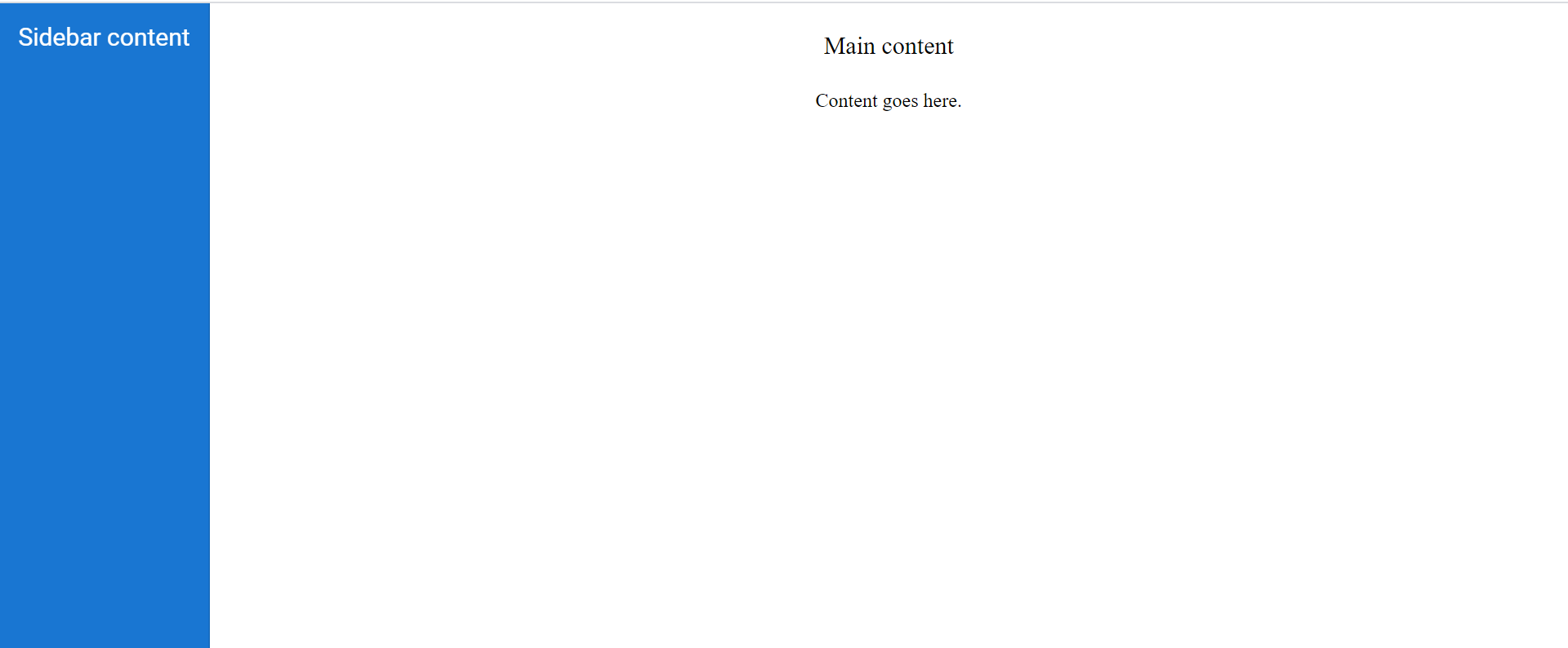
</style>Run the project
To run the project, use the following command:
npm run devor
yarn run devThe output will appear as follows:
Enable backdrop
Enabling the showBackdrop in the Sidebar component will prevent the main content from user interactions, when it is in expanded state. Here, the DOM elements will not get changed. It only closes the main content by covering with a black backdrop overlay and focuses the Sidebar in the screen. Sidebar can be rendered with specific width by setting width property.
NOTE
To achieve a proper backdrop, we suggest that you create a wrapper parent container for the div block in which you intend to enable the backdrop. Set the class name of this parent container as the target for the Sidebar. Alternatively, you can place an empty div container after the target container.
In the following example, the showBackdrop and closeOnDocumentClick properties are enabled.
<template>
  <div id="app">
    <div class="wrapper">
        <ejs-sidebar id="default-sidebar" :showBackdrop="showBackdrop" :closeOnDocumentClick="closeOnDocumentClick">
          <div class="title"> Sidebar content</div>
        </ejs-sidebar>
        <div>
            <div class="title">Main content</div>
        </div>
    </div>
  </div>
</template>

<script setup>
  import { SidebarComponent as EjsSidebar } from '@syncfusion/ej2-vue-navigations';

  const showBackdrop= true;
  const closeOnDocumentClick= true;
</script>

<style>
  @import "../node_modules/@syncfusion/ej2-base/styles/material.css";
  @import "../node_modules/@syncfusion/ej2-vue-navigations/styles/material.css";

  .title {
    text-align: center;
    font-size: 20px;
    padding: 15px;
  }

  #default-sidebar {
    background-color: rgb(25, 118, 210);
    color: #ffffff;
  }
</style><template>
<div id="app">
<div class="wrapper">
<ejs-sidebar id="default-sidebar" :showBackdrop="showBackdrop" :closeOnDocumentClick="closeOnDocumentClick">
<div class="title"> Sidebar content</div>
</ejs-sidebar>
<div>
<div class="title">Main content</div>
</div>
</div>
</div>
</template>
<script>
import { SidebarComponent } from '@syncfusion/ej2-vue-navigations';
//Component registration
export default {
name: "App",
components: {
"ejs-sidebar": SidebarComponent
},
data() {
return {
showBackdrop: true,
closeOnDocumentClick: true,
}
}
}
</script>
<style>
@import "../node_modules/@syncfusion/ej2-base/styles/material.css";
@import "../node_modules/@syncfusion/ej2-vue-navigations/styles/material.css";
.title {
text-align: center;
font-size: 20px;
padding: 15px;
}
#default-sidebar {
background-color: rgb(25, 118, 210);
color: #ffffff;
}
</style>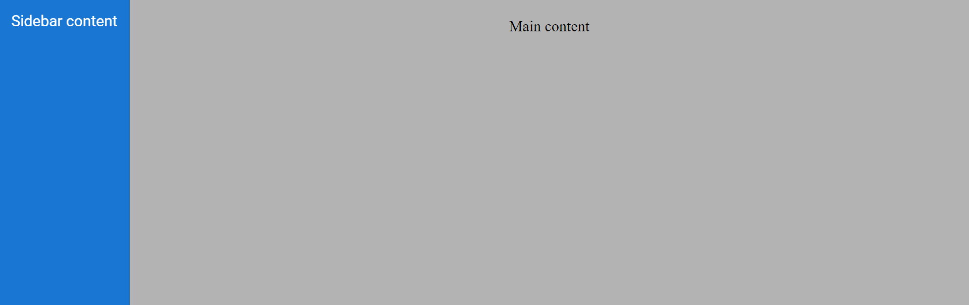
Position
Positioning the Sidebar to the right or left of the main content can be achieved by using the position property. If the position is not set, the Sidebar will expand from the left to the body element. enablePersistence will persist the component’s state between page reloads. change event will be triggered when the state(expand/collapse) of the component is changed.
In the following example, the position property is set as Right.
<template>
  <div id="app">
    <div class="wrapper">
        <ejs-sidebar id="default-sidebar" :position="position">
          <div class="title"> Sidebar content</div>
        </ejs-sidebar>
        <div>
          <div class="title">Main content</div>
        </div>
    </div>
  </div>
</template>

<script setup>
  import { SidebarComponent as EjsSidebar } from '@syncfusion/ej2-vue-navigations';

  const position= 'Right';
</script>

<style>
  @import "../node_modules/@syncfusion/ej2-base/styles/material.css";
  @import "../node_modules/@syncfusion/ej2-vue-navigations/styles/material.css";

  .title {
    text-align: center;
    font-size: 20px;
    padding: 15px;
  }

  #default-sidebar {
    background-color: rgb(25, 118, 210);
    color: #ffffff;
  }
</style><template>
<div id="app">
<div class="wrapper">
<ejs-sidebar id="default-sidebar" :position="position">
<div class="title"> Sidebar content</div>
</ejs-sidebar>
<div>
<div class="title">Main content</div>
</div>
</div>
</div>
</template>
<script>
import { SidebarComponent } from '@syncfusion/ej2-vue-navigations';
//Component registration
export default {
name: "App",
components: {
"ejs-sidebar": SidebarComponent
},
data() {
return {
position: 'Right',
}
}
}
</script>
<style>
@import "../node_modules/@syncfusion/ej2-base/styles/material.css";
@import "../node_modules/@syncfusion/ej2-vue-navigations/styles/material.css";
.title {
text-align: center;
font-size: 20px;
padding: 15px;
}
#default-sidebar {
background-color: rgb(25, 118, 210);
color: #ffffff;
}
</style>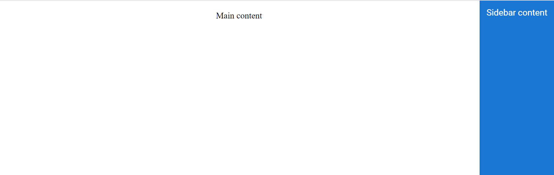
Animate
Animation transitions can be set while expanding or collapsing the Sidebar using the animate property. By default, animate property is set to true. enableRTL will display the sidebar in the right-to-left direction.
In the following example, the animate property is disabled.
<template>
  <div id="app">
    <div class="wrapper">
      <ejs-sidebar id="default-sidebar" ref="sidebar" :type="type" :width="width" :animate="animate" :enableRtl="enableRtl">
        <div class="title"> Sidebar content</div>
          <div class="sub-title">
            Click the button to close the Sidebar
          </div>
          <div class="center-align">
            <ejs-button  id="close" v-on:click="closeClick"  class="e-btn close-btn">Close Sidebar</ejs-button>
          </div>
      </ejs-sidebar>
      <div>
          <div class="title">Main content</div>
          <div class="sub-title"> Click the button to open/close the Sidebar.</div>
          <div style="padding:20px" class="center-align">
            <ejs-button id="toggle"  class="e-btn e-info" v-on:click="toggleClick" >Toggle Sidebar</ejs-button>
          </div>
      </div>
  </div>
  </div>
</template>

<script setup>
  import { SidebarComponent as EjsSidebar } from '@syncfusion/ej2-vue-navigations';
  import { ButtonComponent as EjsButton } from '@syncfusion/ej2-vue-buttons';
  import { ref } from "vue";

  const type = 'Push';
  const width = '280px';
  const animate = false;
  const enableRtl = true;
  const sidebar = ref(null);

  const closeClick = () => {
    sidebar.value.hide();
  }
  const toggleClick = () => {
    sidebar.value.toggle();
  }
</script>

<style>
  @import "../node_modules/@syncfusion/ej2-base/styles/material.css";
  @import "../node_modules/@syncfusion/ej2-vue-navigations/styles/material.css";
  @import "../node_modules/@syncfusion/ej2-buttons/styles/material.css";

  .center-align {
    text-align: center;
    padding: 20px;
  }

  .title {
    text-align: center;
    font-size: 20px;
    padding: 15px;
  }

  .sub-title {
    text-align: center;
    font-size: 16px;
    padding: 10px;
  }

  .center {
    text-align: center;
    display: none;
    font-size: 13px;
    font-weight: 400;
    margin-top: 20px;
  }

  #default-sidebar {
    background-color: rgb(25, 118, 210);
    color: #ffffff;
  }

  .close-btn:hover {
    color: #fafafa;
  }
</style><template>
<div id="app">
<div class="wrapper">
<ejs-sidebar id="default-sidebar" ref="sidebar" :type="type" :width="width" :animate="animate" :enableRtl="enableRtl">
<div class="title"> Sidebar content</div>
<div class="sub-title">
Click the button to close the Sidebar
</div>
<div class="center-align">
<ejs-button id="close" v-on:click="closeClick" class="e-btn close-btn">Close Sidebar</ejs-button>
</div>
</ejs-sidebar>
<div>
<div class="title">Main content</div>
<div class="sub-title"> Click the button to open/close the Sidebar.</div>
<div style="padding:20px" class="center-align">
<ejs-button id="toggle" class="e-btn e-info" v-on:click="toggleClick" >Toggle Sidebar</ejs-button>
</div>
</div>
</div>
</div>
</template>
<script>
import { SidebarComponent } from '@syncfusion/ej2-vue-navigations';
import { ButtonComponent } from '@syncfusion/ej2-vue-buttons';
//Component registration
export default {
name: "App",
components: {
"ejs-sidebar": SidebarComponent,
"ejs-button": ButtonComponent
},
data() {
return {
type: 'Push',
width: '280px',
animate: false,
enableRtl: true,
}
},
methods: {
toggleClick: function () {
this.$refs.sidebar.toggle();
},
closeClick: function () {
this.$refs.sidebar.hide();
}
}
}
</script>
<style>
@import "../node_modules/@syncfusion/ej2-base/styles/material.css";
@import "../node_modules/@syncfusion/ej2-vue-navigations/styles/material.css";
@import "../node_modules/@syncfusion/ej2-buttons/styles/material.css";
.center-align {
text-align: center;
padding: 20px;
}
.title {
text-align: center;
font-size: 20px;
padding: 15px;
}
.sub-title {
text-align: center;
font-size: 16px;
padding: 10px;
}
.center {
text-align: center;
display: none;
font-size: 13px;
font-weight: 400;
margin-top: 20px;
}
#default-sidebar {
background-color: rgb(25, 118, 210);
color: #ffffff;
}
.close-btn:hover {
color: #fafafa;
}
</style>
Close on document click
Sidebar can be closed on document click by setting closeOnDocumentClick to true. If this property is not set, the Sidebar will not close on document click since its default value is false. Sidebar can be kept opened during rendering using isOpen property.
In the following example, the closeOnDocumentClick property is enabled..
<template>
  <div id="app">
    <div class="wrapper">
      <ejs-sidebar id="default-sidebar" ref="sidebar" :width="width" :type="type" :isOpen="isOpen" :closeOnDocumentClick="closeOnDocumentClick">
      <div class="title"> Sidebar content</div>
      </ejs-sidebar>
      <div>
        <div class="title">Main content</div>
        <div class="sub-title"> Click the button to open the Sidebar.</div>
        <div style="padding:20px" class="center-align">
          <ejs-button id="toggle"  class="e-btn e-info" v-on:click="toggleClick" >Open Sidebar</ejs-button>
        </div>
      </div>
  </div>
  </div>
</template>

<script setup>
  import { SidebarComponent as EjsSidebar } from '@syncfusion/ej2-vue-navigations';
  import { ButtonComponent as EjsButton } from '@syncfusion/ej2-vue-buttons';
  import { ref } from "vue";

  const type = 'Push';
  const width = '280px';
  const closeOnDocumentClick = true;
  const isOpen = true;
  const sidebar = ref(null);

  const toggleClick = () => {
    sidebar.value.toggle();
  }
</script>

<style>
  @import "../node_modules/@syncfusion/ej2-base/styles/material.css";
  @import "../node_modules/@syncfusion/ej2-vue-navigations/styles/material.css";
  @import "../node_modules/@syncfusion/ej2-buttons/styles/material.css";

  .center-align {
    text-align: center;
    padding: 20px;
  }

  .title {
    text-align: center;
    font-size: 20px;
    padding: 15px;
  }

  .sub-title {
    text-align: center;
    font-size: 16px;
    padding: 10px;
  }

  .center {
    text-align: center;
    display: none;
    font-size: 13px;
    font-weight: 400;
    margin-top: 20px;
  }

  #default-sidebar {
    background-color: rgb(25, 118, 210);
    color: #ffffff;
  }

  .close-btn:hover {
        color: #fafafa;
  }
</style><template>
<div id="app">
<div class="wrapper">
<ejs-sidebar id="default-sidebar" ref="sidebar" :width="width" :type="type" :isOpen="isOpen" :closeOnDocumentClick="closeOnDocumentClick">
<div class="title"> Sidebar content</div>
</ejs-sidebar>
<div>
<div class="title">Main content</div>
<div class="sub-title"> Click the button to open the Sidebar.</div>
<div style="padding:20px" class="center-align">
<ejs-button id="toggle" class="e-btn e-info" v-on:click="toggleClick" >Open Sidebar</ejs-button>
</div>
</div>
</div>
</div>
</template>
<script>
import { SidebarComponent } from '@syncfusion/ej2-vue-navigations';
import { ButtonComponent } from '@syncfusion/ej2-vue-buttons';
//Component registration
export default {
name: "App",
components: {
"ejs-sidebar": SidebarComponent,
"ejs-button": ButtonComponent
},
data() {
return {
type: 'Push',
width: '280px',
isOpen: false,
closeOnDocumentClick: true,
}
},
methods: {
toggleClick: function () {
this.$refs.sidebar.toggle();
}
}
}
</script>
<style>
@import "../node_modules/@syncfusion/ej2-base/styles/material.css";
@import "../node_modules/@syncfusion/ej2-vue-navigations/styles/material.css";
@import "../node_modules/@syncfusion/ej2-buttons/styles/material.css";
.center-align {
text-align: center;
padding: 20px;
}
.title {
text-align: center;
font-size: 20px;
padding: 15px;
}
.sub-title {
text-align: center;
font-size: 16px;
padding: 10px;
}
.center {
text-align: center;
display: none;
font-size: 13px;
font-weight: 400;
margin-top: 20px;
}
#default-sidebar {
background-color: rgb(25, 118, 210);
color: #ffffff;
}
.close-btn:hover {
color: #fafafa;
}
</style>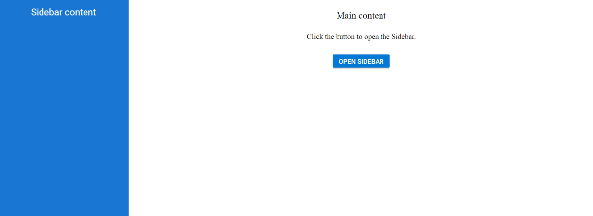
Enable gestures
Expand or collapse the Sidebar while swiping in touch devices using enableGestures property. By default, enableGestures is set to true.
In the following example, the enableGestures property is enabled.
<template>
  <div id="app">
    <div class="wrapper">
      <ejs-sidebar id="default-sidebar" ref="sidebar" :width="width" :type="type" :enableGestures="enableGestures">
        <div class="title"> Sidebar content</div>
          <div class="sub-title">
            Click the button to close the Sidebar.
          </div>
          <div class="center-align">
            <ejs-button  id="close" v-on:click="closeClick"  class="e-btn close-btn">Close Sidebar</ejs-button>
          </div>
      </ejs-sidebar>
      <div>
          <div class="title">Main content</div>
          <div class="sub-title"> Click the button to open/close the Sidebar.</div>
          <div style="padding:20px" class="center-align">
            <ejs-button ejs-button id="toggle"  class="e-btn e-info" v-on:click="toggleClick" >Toggle Sidebar</ejs-button>
          </div>
      </div>
  </div>
  </div>
</template>

<script setup>
  import { SidebarComponent as EjsSidebar } from '@syncfusion/ej2-vue-navigations';
  import { ButtonComponent as EjsButton } from '@syncfusion/ej2-vue-buttons';
  import { ref } from "vue";

  const type = 'Push';
  const width = '280px';
  const enableGestures = false;
  const sidebar = ref(null);

  const closeClick = () => {
    sidebar.value.hide();
  }
  const toggleClick = () => {
    sidebar.value.toggle();
  }
</script>

<style>
  @import "../node_modules/@syncfusion/ej2-base/styles/material.css";
  @import "../node_modules/@syncfusion/ej2-vue-navigations/styles/material.css";
  @import "../node_modules/@syncfusion/ej2-buttons/styles/material.css";

    .center-align {
    text-align: center;
    padding: 20px;
  }

  .title {
    text-align: center;
    font-size: 20px;
    padding: 15px;
  }

  .sub-title {
    text-align: center;
    font-size: 16px;
    padding: 10px;
  }

  .center {
    text-align: center;
    display: none;
    font-size: 13px;
    font-weight: 400;
    margin-top: 20px;
  }

  #default-sidebar {
    background-color: rgb(25, 118, 210);
    color: #ffffff;
  }

  .close-btn:hover {
    color: #fafafa;
  }
</style><template>
<div id="app">
<div class="wrapper">
<ejs-sidebar id="default-sidebar" ref="sidebar" :width="width" :type="type" :enableGestures="enableGestures">
<div class="title"> Sidebar content</div>
<div class="sub-title">
Click the button to close the Sidebar.
</div>
<div class="center-align">
<ejs-button id="close" v-on:click="closeClick" class="e-btn close-btn">Close Sidebar</ejs-button>
</div>
</ejs-sidebar>
<div>
<div class="title">Main content</div>
<div class="sub-title"> Click the button to open/close the Sidebar.</div>
<div style="padding:20px" class="center-align">
<ejs-button ejs-button id="toggle" class="e-btn e-info" v-on:click="toggleClick" >Toggle Sidebar</ejs-button>
</div>
</div>
</div>
</div>
</template>
<script>
import { SidebarComponent } from '@syncfusion/ej2-vue-navigations';
import { ButtonComponent } from '@syncfusion/ej2-vue-buttons';
//Component registration
export default {
name: "App",
components: {
"ejs-sidebar": SidebarComponent,
"ejs-button": ButtonComponent
},
data() {
return {
type: 'Push',
width: '280px',
enableGestures: false,
}
},
methods: {
toggleClick: function () {
this.$refs.sidebar.toggle();
},
closeClick: function () {
this.$refs.sidebar.hide();;
},
}
}
</script>
<style>
@import "../node_modules/@syncfusion/ej2-base/styles/material.css";
@import "../node_modules/@syncfusion/ej2-vue-navigations/styles/material.css";
@import "../node_modules/@syncfusion/ej2-buttons/styles/material.css";
.center-align {
text-align: center;
padding: 20px;
}
.title {
text-align: center;
font-size: 20px;
padding: 15px;
}
.sub-title {
text-align: center;
font-size: 16px;
padding: 10px;
}
.center {
text-align: center;
display: none;
font-size: 13px;
font-weight: 400;
margin-top: 20px;
}
#default-sidebar {
background-color: rgb(25, 118, 210);
color: #ffffff;
}
.close-btn:hover {
color: #fafafa;
}
</style>
For migrating from Vue 2 to Vue 3, refer to the migration documentation.