How can I help you?
Getting Started with the Vue Sidebar Component in Vue 2
18 Mar 202624 minutes to read
This article provides a step-by-step guide for setting up a Vue 2 project using Vue-CLI and integrating the Syncfusion® Vue Sidebar component using the Composition API / Options API.
To get start quickly with Vue Sidebar, you can check on this video:
Prerequisites
System requirements for Syncfusion® Vue UI components
Dependencies
The following list of dependencies are required to use the Sidebar component in your application.
|-- @syncfusion/ej2-vue-navigations
    |-- @syncfusion/ej2-base
    |-- @syncfusion/ej2-data
    |-- @syncfusion/ej2-vue-base
    |-- @syncfusion/ej2-navigations
        |-- @syncfusion/ej2-inputs
            |-- @syncfusion/ej2-splitbuttons
        |-- @syncfusion/ej2-lists
        |-- @syncfusion/ej2-popups
            |-- @syncfusion/ej2-buttons
Setting up the Vue 2 project
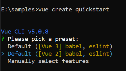
To generate a Vue 2 project using Vue-CLI, use the vue create command. Follow these steps to install Vue CLI and create a new project:
npm install -g @vue/cli
vue create quickstart
cd quickstart
npm run serve
or
yarn global add @vue/cli
vue create quickstart
cd quickstart
yarn run serve
When creating a new project, choose the option Default ([Vue 2] babel, eslint) from the menu.
Once the quickstart project is set up with default settings, proceed to add Syncfusion® components to the project.
Add Syncfusion® Vue packages
Syncfusion® packages are available at npmjs.com. To use Vue components, install the required npm package.
This article uses the Vue Sidebar component as an example. Install the @syncfusion/ej2-vue-navigations package by running the following command:
npm install @syncfusion/ej2-vue-navigations --saveor
yarn add @syncfusion/ej2-vue-navigationsImport Syncfusion® CSS styles
You can import themes for the Syncfusion® Vue component in various ways, such as using CSS or SASS styles from npm packages, CDN, CRG and Theme Studio. Refer to themes topic to know more about built-in themes and different ways to refer to themes in a Vue project.
In this article, the Material theme is applied using CSS styles, which are available in installed packages. The necessary Material CSS styles for the Sidebar component and its dependents were imported into the <style> section of src/App.vue file.
<style>
@import "../node_modules/@syncfusion/ej2-base/styles/material.css";
@import "../node_modules/@syncfusion/ej2-vue-navigations/styles/material.css";
</style>
Note: If you want to refer the combined component styles, please make use of our
CRG(Custom Resource Generator) in your application.
Add Syncfusion® Vue component
Follow the below steps to add the Vue Sidebar component using Composition API or Options API:
1. First, import and register the Sidebar component in the script section of the src/App.vue file. If you are using the Composition API, you should add the setup attribute to the script tag to indicate that Vue will be using the Composition API.
<script setup>
import { SidebarComponent as EjsSidebar } from '@syncfusion/ej2-vue-navigations';
</script><script>
import { SidebarComponent } from '@syncfusion/ej2-vue-navigations';
export default {
components: {
'ejs-sidebar': SidebarComponent
}
}
</script>2. In the template section, define the Sidebar component.
<template>
    <div id="app">
        <ejs-sidebar>
              <div class="title"> Sidebar content</div>
        </ejs-sidebar>
  </div>
</template>
Here is the summarized code for the above steps in the src/App.vue file:
<template>
    <div id="app">
        <div class="wrapper">
            <ejs-sidebar id="default-sidebar">
                <div class="title"> Sidebar content</div>
            </ejs-sidebar>
            <div>
                <div class="title">Main content</div>
                <div class="sub-title">Content goes here.</div>
            </div>
        </div>
    </div>
</template>

<script setup>

    import { SidebarComponent as EjsSidebar } from '@syncfusion/ej2-vue-navigations';

</script>
<style>
    @import "../node_modules/@syncfusion/ej2-base/styles/material.css";
    @import "../node_modules/@syncfusion/ej2-buttons/styles/material.css";
    @import "../node_modules/@syncfusion/ej2-vue-navigations/styles/material.css";

    .title {
        text-align: center;
        font-size: 20px;
        padding: 15px;
    }

    .sub-title {
        text-align: center;
        font-size: 16px;
        padding: 10px;
    }

    #default-sidebar {
        background-color: rgb(25, 118, 210);
        color: #ffffff;
    }
</style><template>
<div id="app">
<div class="wrapper">
<ejs-sidebar id="default-sidebar">
<div class="title"> Sidebar content</div>
</ejs-sidebar>
<div>
<div class="title">Main content</div>
<div class="sub-title">Content goes here.</div>
</div>
</div>
</div>
</template>
<script>
import { SidebarComponent } from '@syncfusion/ej2-vue-navigations';
export default {
name: "App",
components: {
'ejs-sidebar': SidebarComponent
}
}
</script>
<style>
@import "../node_modules/@syncfusion/ej2-base/styles/material.css";
@import "../node_modules/@syncfusion/ej2-buttons/styles/material.css";
@import "../node_modules/@syncfusion/ej2-vue-navigations/styles/material.css";
.title {
text-align: center;
font-size: 20px;
padding: 15px;
}
.sub-title {
text-align: center;
font-size: 16px;
padding: 10px;
}
#default-sidebar {
background-color: rgb(25, 118, 210);
color: #ffffff;
}
</style>Run the project
To run the project, use the following command:
npm run serveor
yarn run serveEnable backdrop
Enabling the showBackdrop in the Sidebar component will prevent the main content from user interactions, when it is in expanded state. Here, the DOM elements will not get changed. It only closes the main content by covering with a black backdrop overlay and focuses the Sidebar in the screen. Sidebar can be rendered with specific width by setting width property.
NOTE
To achieve a proper backdrop, we suggest that you create a wrapper parent container for the div block in which you intend to enable the backdrop. Set the class name of this parent container as the target for the Sidebar. Alternatively, you can place an empty div container after the target container.
<template>
    <div id="app">
        <div class="wrapper">
            <ejs-sidebar id="default-sidebar" ref="sidebar" :showBackdrop="showBackdrop"
                :closeOnDocumentClick="closeOnDocumentClick">
                <div class="title"> Sidebar content</div>
                <div class="sub-title">
                    Click the button to close the Sidebar.
                </div>
                <div class="center-align">
                    <button ejs-button id="close" v-on:click="closeClick" class="e-btn close-btn">Close Sidebar</button>
                </div>
            </ejs-sidebar>
            <div>
                <div class="title">Main content</div>
                <div class="sub-title"> Click the button to open/close the Sidebar.</div>
                <div style="padding:20px" class="center-align">
                    <button ejs-button id="toggle" class="e-btn e-info" v-on:click="toggleClick">Toggle Sidebar</button>
                </div>
            </div>
        </div>
    </div>
</template>

<script setup>

    import { SidebarComponent as EjsSidebar } from '@syncfusion/ej2-vue-navigations';
    import { ref } from 'vue';

    const sidebar = ref(null);

    const showBackdrop = true;
    const closeOnDocumentClick = true;

    const toggleClick = function () {
        sidebar.value.toggle();
    };
    const closeClick = function () {
        sidebar.value.hide();
    };

</script>

<style>
    @import "../node_modules/@syncfusion/ej2-base/styles/material.css";
    @import "../node_modules/@syncfusion/ej2-buttons/styles/material.css";
    @import "../node_modules/@syncfusion/ej2-vue-navigations/styles/material.css";

    .center-align {
        text-align: center;
        padding: 20px;
    }

    .title {
        text-align: center;
        font-size: 20px;
        padding: 15px;
    }

    .sub-title {
        text-align: center;
        font-size: 16px;
        padding: 10px;
    }

    .center {
        text-align: center;
        display: none;
        font-size: 13px;
        font-weight: 400;
        margin-top: 20px;
    }

    #default-sidebar {
        background-color: rgb(25, 118, 210);
        color: #ffffff;
    }

    .close-btn:hover {
        color: #fafafa;
    }
</style><template>
<div id="app">
<div class="wrapper">
<ejs-sidebar id="default-sidebar" ref="sidebar" :showBackdrop="showBackdrop"
:closeOnDocumentClick="closeOnDocumentClick">
<div class="title"> Sidebar content</div>
<div class="sub-title">
Click the button to close the Sidebar.
</div>
<div class="center-align">
<button ejs-button id="close" v-on:click="closeClick" class="e-btn close-btn">Close Sidebar</button>
</div>
</ejs-sidebar>
<div>
<div class="title">Main content</div>
<div class="sub-title"> Click the button to open/close the Sidebar.</div>
<div style="padding:20px" class="center-align">
<button ejs-button id="toggle" class="e-btn e-info" v-on:click="toggleClick">Toggle Sidebar</button>
</div>
</div>
</div>
</div>
</template>
<script>
import { SidebarComponent } from '@syncfusion/ej2-vue-navigations';
export default {
name: "App",
components: {
'ejs-sidebar': SidebarComponent
},
data() {
return {
showBackdrop: true,
closeOnDocumentClick: true,
}
},
methods: {
toggleClick: function () {
this.$refs.sidebar.toggle();
},
closeClick: function () {
this.$refs.sidebar.hide();
}
}
}
</script>
<style>
@import "../node_modules/@syncfusion/ej2-base/styles/material.css";
@import "../node_modules/@syncfusion/ej2-buttons/styles/material.css";
@import "../node_modules/@syncfusion/ej2-vue-navigations/styles/material.css";
.center-align {
text-align: center;
padding: 20px;
}
.title {
text-align: center;
font-size: 20px;
padding: 15px;
}
.sub-title {
text-align: center;
font-size: 16px;
padding: 10px;
}
.center {
text-align: center;
display: none;
font-size: 13px;
font-weight: 400;
margin-top: 20px;
}
#default-sidebar {
background-color: rgb(25, 118, 210);
color: #ffffff;
}
.close-btn:hover {
color: #fafafa;
}
</style>Position
Positioning the Sidebar to the right or left of the main content can be achieved by using the position property. If the position is not set, the Sidebar will expand from the left to the body element. enablePersistence will persist the component’s state between page reloads. change event will be triggered when the state(expand/collapse) of the component is changed.
<template>
    <div id="app">
        <ejs-sidebar id="default-sidebar" ref="sidebar" :type="type" :target="target" :position="position"
            :enablePersistence="enablePersistence">
            <div class="title"> Sidebar content</div>
            <div class="sub-title">
                Click the button to close the Sidebar.
            </div>
            <div class="center-align">
                <button ejs-button id="close" v-on:click="closeClick" class="e-btn close-btn">Close Sidebar</button>
            </div>
        </ejs-sidebar>
        <div id="head">
            <ejs-button id="toggle" ref="togglebtn" class="e-btn e-info" cssClass="e-flat" iconCss="e-icons e-menu"
                isToggle="true" v-on:click="btnClick">Open</ejs-button>
        </div>
        <div>
            <div id="maincontent" class="content">
                <div>
                    <div class="title">Main content</div>
                    <div class="rows">
                        <div class="row">
                            <ejs-radiobutton id="left" label='Left' name='state' checked='true'
                                :change="positionChange"></ejs-radiobutton>
                        </div>
                        <div class="row">
                            <ejs-radiobutton id="right" label='Right' name='state'
                                :change="positionChange"></ejs-radiobutton>
                        </div>
                    </div>
                </div>
            </div>
        </div>
    </div>
</template>

<script setup>
    import { SidebarComponent as EjsSidebar } from '@syncfusion/ej2-vue-navigations';
    import { ButtonComponent as EjsButton, RadioButtonComponent as EjsRadiobutton } from '@syncfusion/ej2-vue-buttons';
    import { ref } from 'vue';

    const sidebar = ref(null);
    const togglebtn = ref(null);
    const type = 'Push';
    const target = '.content';
    let position = 'Left';
    const enablePersistence = true;
    l
    const positionChange = (args) => {
        position = args.event.target.id == "left" ? "Left" : "Right";
    };
    const btnClick = () => {
        if (togglebtn.value.$el.classList.contains('e-active')) {
            togglebtn.value.content = 'Open';
            sidebar.value.hide();
        }
        else {
            togglebtn.value.content = 'Close';
            sidebar.value.show();
        }
    };
    const closeClick = () => {
        sidebar.value.hide();
        togglebtn.value.$el.classList.remove('e-active');
        togglebtn.value.content = 'Open';
    };
</script>

<style>
    @import "../node_modules/@syncfusion/ej2-base/styles/material.css";
    @import "../node_modules/@syncfusion/ej2-buttons/styles/material.css";
    @import "../node_modules/@syncfusion/ej2-vue-navigations/styles/material.css";

    .rows {
        margin: auto;
        text-align: center;
    }

    .row {
        display: inline-block;
        padding: 10px;
        margin: auto;
    }

    .center-align {
        text-align: center;
        padding: 20px;
    }

    .title {
        text-align: center;
        font-size: 20px;
        padding: 15px;
    }

    #head {
        border: 1px solid #424242;
        border-bottom-color: transparent;
        background: #00897B;
    }

    #toggle,
    #container .e-btn.e-info:hover,
    #toggle:focus {
        /* csslint allow: adjoining-classes*/
        background: #00695C;
        box-shadow: none;
        border-radius: 0;
        height: 39px;
        width: 100px;
    }

    #close,
    #close:hover,
    #close:active,
    #close:focus {
        /* csslint allow: adjoining-classes*/
        background: #fafafa;
        color: black
    }

    .sub-title {
        text-align: center;
        font-size: 16px;
        padding: 10px;
    }

    .radiobutton {
        display: inline-block;
        padding: 10px;
    }

    .center {
        text-align: center;
        display: none;
        font-size: 13px;
        font-weight: 400;
        margin-top: 20px;
    }

    #default-sidebar {
        background-color: #26A69A;
        color: #ffffff;
    }

    .close-btn:hover {
        color: #fafafa;
    }

    #toggle {
        color: white;
    }

    .content {
        height: 305px;
        border: 1px solid grey;
    }
</style><template>
<div id="app">
<ejs-sidebar id="default-sidebar" ref="sidebar" :type="type" :target="target" :position="position"
:enablePersistence="enablePersistence">
<div class="title"> Sidebar content</div>
<div class="sub-title">
Click the button to close the Sidebar.
</div>
<div class="center-align">
<button ejs-button id="close" v-on:click="closeClick" class="e-btn close-btn">Close Sidebar</button>
</div>
</ejs-sidebar>
<div id="head">
<ejs-button id="toggle" ref="togglebtn" class="e-btn e-info" cssClass="e-flat" iconCss="e-icons e-menu"
isToggle="true" v-on:click.native="btnClick" :content ="contentValue">Open</ejs-button>
</div>
<div>
<div id="maincontent" class="content">
<div>
<div class="title">Main content</div>
<div class="rows">
<div class="row">
<ejs-radiobutton id="left" label='Left' name='state' checked='true'
:change="positionChange"></ejs-radiobutton>
</div>
<div class="row">
<ejs-radiobutton id="right" label='Right' name='state'
:change="positionChange"></ejs-radiobutton>
</div>
</div>
</div>
</div>
</div>
</div>
</template>
<script>
import { SidebarComponent } from '@syncfusion/ej2-vue-navigations';
import { ButtonComponent, RadioButtonComponent } from '@syncfusion/ej2-vue-buttons';
export default {
name: "App",
components: {
'ejs-sidebar': SidebarComponent,
'ejs-button': ButtonComponent,
'ejs-radiobutton': RadioButtonComponent
},
data() {
return {
type: 'Push',
target: '.content',
position: 'Left',
enablePersistence: true,
content: "Open",
}
},
computed: {
contentValue: {
get: function () {
return this.content;
},
set: function (content) {
this.content = content
}
}
},
methods: {
positionChange: function (args) {
this.position = args.event.target.id == "left" ? "Left" : "Right";
},
btnClick: function () {
if (this.$refs.togglebtn.$el.classList.contains('e-active')) {
this.contentValue='Open';
this.$refs.sidebar.hide();
}
else {
this.contentValue='Close';
this.$refs.sidebar.show();
}
},
closeClick: function () {
this.$refs.sidebar.hide();
this.$refs.togglebtn.$el.classList.remove('e-active');
this.contentValue='Open';
}
}
}
</script>
<style>
@import "../node_modules/@syncfusion/ej2-base/styles/material.css";
@import "../node_modules/@syncfusion/ej2-buttons/styles/material.css";
@import "../node_modules/@syncfusion/ej2-vue-navigations/styles/material.css";
.rows {
margin: auto;
text-align: center;
}
.row {
display: inline-block;
padding: 10px;
margin: auto;
}
.center-align {
text-align: center;
padding: 20px;
}
.title {
text-align: center;
font-size: 20px;
padding: 15px;
}
#head {
border: 1px solid #424242;
border-bottom-color: transparent;
background: #00897B;
}
#toggle,
#container .e-btn.e-info:hover,
#toggle:focus {
/* csslint allow: adjoining-classes*/
background: #00695C;
box-shadow: none;
border-radius: 0;
height: 39px;
width: 100px;
}
#close,
#close:hover,
#close:active,
#close:focus {
/* csslint allow: adjoining-classes*/
background: #fafafa;
color: black
}
.sub-title {
text-align: center;
font-size: 16px;
padding: 10px;
}
.radiobutton {
display: inline-block;
padding: 10px;
}
.center {
text-align: center;
display: none;
font-size: 13px;
font-weight: 400;
margin-top: 20px;
}
#default-sidebar {
background-color: #26A69A;
color: #ffffff;
}
.close-btn:hover {
color: #fafafa;
}
#toggle {
color: white;
}
.content {
height: 305px;
border: 1px solid grey;
}
</style>Animate
Animation transitions can be set while expanding or collapsing the Sidebar using the animate property. By default , animate property is set to true. enableRTL will display the sidebar in the right-to-left direction.
<template>
    <div id="app">
        <div class="wrapper">
            <ejs-sidebar id="default-sidebar" ref="sidebar" :type="type" :width="width" :animate="animate"
                :enableRtl="enableRtl">
                <div class="title"> Sidebar content</div>
                <div class="sub-title">
                    Click the button to close the Sidebar
                </div>
                <div class="center-align">
                    <button ejs-button id="close" v-on:click="closeClick" class="e-btn close-btn">Close Sidebar</button>
                </div>
            </ejs-sidebar>
            <div>
                <div class="title">Main content</div>
                <div class="sub-title"> Click the button to open/close the Sidebar.</div>
                <div style="padding:20px" class="center-align">
                    <button ejs-button id="toggle" class="e-btn e-info" v-on:click="toggleClick">Toggle Sidebar</button>
                </div>
            </div>
        </div>
    </div>
</template>

<script setup>
    import { SidebarComponent as EjsSidebar } from '@syncfusion/ej2-vue-navigations';
    import { ref } from 'vue';

    const sidebar = ref(null);

    const animate = false;
    const enableRtl = true;
    const width = '280px';
    const type = 'Push';

    const toggleClick = () => {
        sidebar.value.toggle();
    };
    const closeClick = () => {
        sidebar.value.hide();
    };

</script>
<style>
    @import "../node_modules/@syncfusion/ej2-base/styles/material.css";
    @import "../node_modules/@syncfusion/ej2-buttons/styles/material.css";
    @import "../node_modules/@syncfusion/ej2-vue-navigations/styles/material.css";

    .center-align {
        text-align: center;
        padding: 20px;
    }

    .title {
        text-align: center;
        font-size: 20px;
        padding: 15px;
    }

    .sub-title {
        text-align: center;
        font-size: 16px;
        padding: 10px;
    }

    .center {
        text-align: center;
        display: none;
        font-size: 13px;
        font-weight: 400;
        margin-top: 20px;
    }

    #default-sidebar {
        background-color: rgb(25, 118, 210);
        color: #ffffff;
    }

    .close-btn:hover {
        color: #fafafa;
    }
</style><template>
<div id="app">
<div class="wrapper">
<ejs-sidebar id="default-sidebar" ref="sidebar" :type="type" :width="width" :animate="animate"
:enableRtl="enableRtl">
<div class="title"> Sidebar content</div>
<div class="sub-title">
Click the button to close the Sidebar
</div>
<div class="center-align">
<button ejs-button id="close" v-on:click="closeClick" class="e-btn close-btn">Close Sidebar</button>
</div>
</ejs-sidebar>
<div>
<div class="title">Main content</div>
<div class="sub-title"> Click the button to open/close the Sidebar.</div>
<div style="padding:20px" class="center-align">
<button ejs-button id="toggle" class="e-btn e-info" v-on:click="toggleClick">Toggle Sidebar</button>
</div>
</div>
</div>
</div>
</template>
<script>
import { SidebarComponent } from '@syncfusion/ej2-vue-navigations';
export default {
name: "App",
components: {
'ejs-sidebar': SidebarComponent
},
data() {
return {
animate: false,
enableRtl: true,
width: '280px',
type: 'Push'
}
},
methods: {
toggleClick: function () {
this.$refs.sidebar.toggle();
},
closeClick: function () {
this.$refs.sidebar.hide();
}
}
}
</script>
<style>
@import "../node_modules/@syncfusion/ej2-base/styles/material.css";
@import "../node_modules/@syncfusion/ej2-buttons/styles/material.css";
@import "../node_modules/@syncfusion/ej2-vue-navigations/styles/material.css";
.center-align {
text-align: center;
padding: 20px;
}
.title {
text-align: center;
font-size: 20px;
padding: 15px;
}
.sub-title {
text-align: center;
font-size: 16px;
padding: 10px;
}
.center {
text-align: center;
display: none;
font-size: 13px;
font-weight: 400;
margin-top: 20px;
}
#default-sidebar {
background-color: rgb(25, 118, 210);
color: #ffffff;
}
.close-btn:hover {
color: #fafafa;
}
</style>Close on document click
Sidebar can be closed on document click by setting closeOnDocumentClick to true. If this property is not set, the Sidebar will not close on document click since its default value is false. Sidebar can be kept opened during rendering using isOpen property.
<template>
    <div id="app">
        <div class="wrapper">
            <ejs-sidebar id="default-sidebar" ref="sidebar" :width="width" :type="type" :isOpen="isOpen"
                :closeOnDocumentClick="closeOnDocumentClick">
                <div class="title"> Sidebar content</div>
            </ejs-sidebar>
            <div>
                <div class="title">Main content</div>
                <div class="sub-title"> Click the button to open the Sidebar.</div>
                <div style="padding:20px" class="center-align">
                    <button ejs-button id="toggle" class="e-btn e-info" v-on:click="toggleClick">Open Sidebar</button>
                </div>
            </div>
        </div>
    </div>
</template>

<script setup>

    import { SidebarComponent as EjsSidebar } from '@syncfusion/ej2-vue-navigations';
    import { ref } from 'vue';

    const sidebar = ref(null);

    const closeOnDocumentClick = true;
    const isOpen = true;
    const type = 'Push';
    const width = '280px';

    const toggleClick = () => {
        sidebar.value.toggle();
    };

</script>

<style>
    @import "../node_modules/@syncfusion/ej2-base/styles/material.css";
    @import "../node_modules/@syncfusion/ej2-buttons/styles/material.css";
    @import "../node_modules/@syncfusion/ej2-vue-navigations/styles/material.css";

    .center-align {
        text-align: center;
        padding: 20px;
    }

    .title {
        text-align: center;
        font-size: 20px;
        padding: 15px;
    }

    .sub-title {
        text-align: center;
        font-size: 16px;
        padding: 10px;
    }

    .center {
        text-align: center;
        display: none;
        font-size: 13px;
        font-weight: 400;
        margin-top: 20px;
    }

    #default-sidebar {
        background-color: rgb(25, 118, 210);
        color: #ffffff;
    }

    .close-btn:hover {
        color: #fafafa;
    }
</style><template>
<div id="app">
<div class="wrapper">
<ejs-sidebar id="default-sidebar" ref="sidebar" :width="width" :type="type" :isOpen="isOpen"
:closeOnDocumentClick="closeOnDocumentClick">
<div class="title"> Sidebar content</div>
</ejs-sidebar>
<div>
<div class="title">Main content</div>
<div class="sub-title"> Click the button to open the Sidebar.</div>
<div style="padding:20px" class="center-align">
<button ejs-button id="toggle" class="e-btn e-info" v-on:click="toggleClick">Open Sidebar</button>
</div>
</div>
</div>
</div>
</template>
<script>
import { SidebarComponent } from '@syncfusion/ej2-vue-navigations';
export default {
name: "App",
components: {
'ejs-sidebar': SidebarComponent
},
data() {
return {
closeOnDocumentClick: true,
isOpen: true,
type: 'Push',
width: '280px'
}
},
methods: {
toggleClick: function () {
this.$refs.sidebar.toggle();
},
}
}
</script>
<style>
@import "../node_modules/@syncfusion/ej2-base/styles/material.css";
@import "../node_modules/@syncfusion/ej2-buttons/styles/material.css";
@import "../node_modules/@syncfusion/ej2-vue-navigations/styles/material.css";
.center-align {
text-align: center;
padding: 20px;
}
.title {
text-align: center;
font-size: 20px;
padding: 15px;
}
.sub-title {
text-align: center;
font-size: 16px;
padding: 10px;
}
.center {
text-align: center;
display: none;
font-size: 13px;
font-weight: 400;
margin-top: 20px;
}
#default-sidebar {
background-color: rgb(25, 118, 210);
color: #ffffff;
}
.close-btn:hover {
color: #fafafa;
}
</style>Enable gestures
Expand or collapse the Sidebar while swiping in touch devices using enableGestures property. By default, enableGestures is set to true.
<template>
    <div id="app">
        <div class="wrapper">
            <ejs-sidebar id="default-sidebar" ref="sidebar" :width="width" :type="type"
                :enableGestures="enableGestures">
                <div class="title"> Sidebar content</div>
                <div class="sub-title">
                    Click the button to close the Sidebar.
                </div>
                <div class="center-align">
                    <button ejs-button id="close" v-on:click="closeClick" class="e-btn close-btn">Close Sidebar</button>
                </div>
            </ejs-sidebar>
            <div>
                <div class="title">Main content</div>
                <div class="sub-title"> Click the button to open/close the Sidebar.</div>
                <div style="padding:20px" class="center-align">
                    <button ejs-button id="toggle" class="e-btn e-info" v-on:click="toggleClick">Toggle Sidebar</button>
                </div>
            </div>
        </div>
    </div>
</template>

<script setup>
    import { SidebarComponent as EjsSidebar } from '@syncfusion/ej2-vue-navigations';
    import { ref } from 'vue';

    const sidebar = ref(null);

    const enableGestures = false;
    const type = 'Push';
    const width = '280px';

    const toggleClick = () => {
        sidebar.value.toggle();
    };
    const closeClick = () => {
        sidebar.value.hide();
    };
</script>

<style>
    @import "../node_modules/@syncfusion/ej2-base/styles/material.css";
    @import "../node_modules/@syncfusion/ej2-buttons/styles/material.css";
    @import "../node_modules/@syncfusion/ej2-vue-navigations/styles/material.css";

    .center-align {
        text-align: center;
        padding: 20px;
    }

    .title {
        text-align: center;
        font-size: 20px;
        padding: 15px;
    }

    .sub-title {
        text-align: center;
        font-size: 16px;
        padding: 10px;
    }

    .center {
        text-align: center;
        display: none;
        font-size: 13px;
        font-weight: 400;
        margin-top: 20px;
    }

    #default-sidebar {
        background-color: rgb(25, 118, 210);
        color: #ffffff;
    }

    .close-btn:hover {
        color: #fafafa;
    }
</style><template>
<div id="app">
<div class="wrapper">
<ejs-sidebar id="default-sidebar" ref="sidebar" :width="width" :type="type"
:enableGestures="enableGestures">
<div class="title"> Sidebar content</div>
<div class="sub-title">
Click the button to close the Sidebar.
</div>
<div class="center-align">
<button ejs-button id="close" v-on:click="closeClick" class="e-btn close-btn">Close Sidebar</button>
</div>
</ejs-sidebar>
<div>
<div class="title">Main content</div>
<div class="sub-title"> Click the button to open/close the Sidebar.</div>
<div style="padding:20px" class="center-align">
<button ejs-button id="toggle" class="e-btn e-info" v-on:click="toggleClick">Toggle Sidebar</button>
</div>
</div>
</div>
</div>
</template>
<script>
import { SidebarComponent } from '@syncfusion/ej2-vue-navigations';
export default {
name: "App",
components: {
'ejs-sidebar': SidebarComponent
},
data() {
return {
enableGestures: false,
type: 'Push',
width: '280px'
}
},
methods: {
toggleClick: function () {
this.$refs.sidebar.toggle();
},
closeClick: function () {
this.$refs.sidebar.hide();
}
}
}
</script>
<style>
@import "../node_modules/@syncfusion/ej2-base/styles/material.css";
@import "../node_modules/@syncfusion/ej2-buttons/styles/material.css";
@import "../node_modules/@syncfusion/ej2-vue-navigations/styles/material.css";
.center-align {
text-align: center;
padding: 20px;
}
.title {
text-align: center;
font-size: 20px;
padding: 15px;
}
.sub-title {
text-align: center;
font-size: 16px;
padding: 10px;
}
.center {
text-align: center;
display: none;
font-size: 13px;
font-weight: 400;
margin-top: 20px;
}
#default-sidebar {
background-color: rgb(25, 118, 210);
color: #ffffff;
}
.close-btn:hover {
color: #fafafa;
}
</style>