Theme in Vue Appearance component
25 Jun 202624 minutes to read
The Syncfusion® Vue library has provided the below list of in-built themes,
| Theme | Style Sheet Name |
|---|---|
| Tailwind 3.4 | tailwind3.css |
| Tailwind 3.4 Dark | tailwind3-dark.css |
| Bootstrap 5.3 | bootstrap5.3.css |
| Bootstrap 5.3 Dark | bootstrap5.3-dark.css |
| Fluent 2 | fluent2.css |
| Fluent 2 Dark | fluent2-dark.css |
| Material 3 | material3.css |
| Material 3 Dark | material3-dark.css |
| Bootstrap 5 | bootstrap5.css |
| Bootstrap 5 Dark | bootstrap5-dark.css |
| Fluent | fluent.css |
| Fluent Dark | fluent-dark.css |
| Google’s Material | material.css |
| Google’s Material-Dark | material-dark.css |
| Tailwind CSS | tailwind.css |
| TailwindDark CSS | tailwind-dark.css |
| Microsoft Office Fabric | fabric.css |
| Microsoft Office Fabric Dark | fabric-dark.css |
| High Contrast | highcontrast.css |
The Syncfusion® Bootstrap theme is designed based on
Bootstrap v3, however, it can be compatible withBootstrap v4applications. In addition to these four built-in themes, ThemeStudio provides support for the Fusion Theme that can only be downloaded from ThemeStudio.
Theme packages
Syncfusion built-in themes are distributed as theme packages available on npm. These packages include CSS/SCSS files for all components. The following table lists all available theme packages:
| Theme | Light Package | Dark Package |
|---|---|---|
| Tailwind 3 | @syncfusion/ej2-tailwind3-theme |
@syncfusion/ej2-tailwind3-dark-theme |
| Bootstrap 5.3 | @syncfusion/ej2-bootstrap5.3-theme |
@syncfusion/ej2-bootstrap5.3-dark-theme |
| Fluent 2 | @syncfusion/ej2-fluent2-theme |
@syncfusion/ej2-fluent2-dark-theme |
| Material 3 | @syncfusion/ej2-material3-theme |
@syncfusion/ej2-material3-dark-theme |
| Bootstrap 5 | @syncfusion/ej2-bootstrap5-theme |
@syncfusion/ej2-bootstrap5-dark-theme |
| Bootstrap 4 | @syncfusion/ej2-bootstrap4-theme |
- |
| Bootstrap | @syncfusion/ej2-bootstrap-theme |
@syncfusion/ej2-bootstrap-dark-theme |
| Material | @syncfusion/ej2-material-theme |
@syncfusion/ej2-material-dark-theme |
| Tailwind | @syncfusion/ej2-tailwind-theme |
@syncfusion/ej2-tailwind-dark-theme |
| Fluent | @syncfusion/ej2-fluent-theme |
@syncfusion/ej2-fluent-dark-theme |
| Fabric | @syncfusion/ej2-fabric-theme |
@syncfusion/ej2-fabric-dark-theme |
| High Contrast | @syncfusion/ej2-highcontrast-theme |
- |
Optimized CSS files
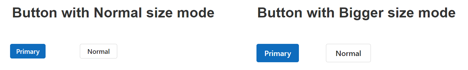
Syncfusion® components provide two size modes for each theme: normal and bigger.
- Normal size mode (default): Provides standard sizing suitable for desktop and general-purpose applications
- Bigger size mode: Increases element sizes, spacing, and touch targets for enhanced touch interactions and accessibility
By default, theme files include styles for both modes, which increases file size. To optimize performance, Syncfusion® offers lite theme files containing only normal mode styles.
Below is a comparison of the Button component in normal and bigger size modes:
Each theme includes both normal and bigger size modes, which increases the overall file size. To optimize performance, Syncfusion® offers additional theme files (e.g., fluent2-lite.css), which only include the normal size mode styles. This results in a significant reduction in file size, improving load times and overall application performance, especially when the bigger size mode is unnecessary.
Refer to the comparison below for the default and optimized theme file sizes:
| Theme Name | Default Theme Size | Optimized Theme Size |
|---|---|---|
| Fluent 2 | 3.97 MB | 2.96 MB |
Refer themes through npm packages
Themes are shipped as both combined and individual CSS/SCSS files. Each theme package includes combined and component-specific styles in both CSS and SCSS formats. For a list of available theme packages, refer to the available theme packages section.
To use the combined SCSS/CSS files, install the required theme package.
npm install @syncfusion/ej2-material3-theme --saveReferring all components CSS
@import "@syncfusion/ej2-<theme-name>-theme/styles/<theme-name>.css";Example:
@import "@syncfusion/ej2-material3-theme/styles/material3.css";Referring all components SCSS
@use "@syncfusion/ej2-<theme-name>-theme/styles/<theme-name>.scss" as *;Example:
@use "@syncfusion/ej2-material3-theme/styles/material3.scss" as *;Referring individual component theme
You can reference individual component themes from the unified theme package. In this package, each component includes an index.css/index.scss files that automatically loads all the required dependency styles.
@import "@syncfusion/ej2-<theme-name>-theme/styles/<component-name>/index.css";Example:
@import "@syncfusion/ej2-material3-theme/styles/grid/index.css";Referring all components optimized CSS file
To refer to all component’s optimized CSS files from the theme package, follow the below syntax:
@import "@syncfusion/ej2-<theme-name>-theme/styles/<theme-name>-lite.css";
/* or */
@use "@syncfusion/ej2-<theme-name>-theme/styles/<theme-name>-lite.scss" as *;
Example:
@import "@syncfusion/ej2-fluent2-theme/styles/fluent2-lite.css";
/* or */
@use "@syncfusion/ej2-fluent2-theme/styles/fluent2-lite.scss" as *;
Referring individual component optimized CSS file
To refer to individual component’s optimized CSS files from an theme packages, follow the below syntax:
@import "@syncfusion/ej2-<theme-name>-theme/styles/<component-name>/index-lite.css";
/* or */
@use "@syncfusion/ej2-<theme-name>-theme/styles/<component-name>/index-lite.scss" as *;
Example:
@import "@syncfusion/ej2-fluent2-theme/styles/grid/index-lite.css";
/* or */
@use "@syncfusion/ej2-fluent2-theme/styles/grid/index-lite.scss" as *;
Advantages of using the individual components theme
- Reducing the page load time of the application.
- Reducing the bundle size of the application.
- Avoids using the unused components CSS.
Common variables
The below list of common variables used in the Syncfusion® Vue library themes for all components. You can change these variables to customize the corresponding theme.
Syncfusion® Tailwind 3.4 theme
| Name | Value (Default Theme) | Value (Dark Theme) |
|---|---|---|
| --color-sf-black | rgb(0,0,0) | rgb(0,0,0) |
| --color-sf-white | rgb(255,255,255) | rgb(255,255,255) |
| --color-sf-primary | rgba(79, 70, 229) | rgba(99, 102, 241) |
| --color-sf-primary-text-color | #fff | #fff |
| --color-sf-primary-light | #3730a3 | #3730a3 |
| --color-sf-primary-lighter | #e0e7ff | #1e1b4b |
| --color-sf-primary-dark | #4338ca | #818cf8 |
| --color-sf-primary-darker | #3730a3 | #4f46e5 |
| --color-sf-success | #15803d | #22c55e |
| --color-sf-info | #0e7490 | #38bdf8 |
| --color-sf-warning | #c2410c | #f97316 |
| --color-sf-danger | #dc2626 | #f87171 |
| --color-sf-success-light | #dcfce7 | #164c37 |
| --color-sf-info-light | #cffafe | #0e485b |
| --color-sf-warning-light | #ffedd5 | #573422 |
| --color-sf-danger-light | #fee2e2 | #54252f |
| --color-sf-success-dark | #166534 | #4ade80 |
| --color-sf-info-dark | #155e75 | #38bdf8 |
| --color-sf-warning-dark | #9a3412 | #fb923c |
| --color-sf-danger-dark | #b91c1c | #ef4444 |
Syncfusion® Bootstrap 5.3 theme
| Name | Value (Default Theme) | Value (Dark Theme) |
|---|---|---|
| --color-sf-black | rgb(0,0,0) | rgb(0,0,0) |
| --color-sf-white | rgb(255,255,255) | rgb(255,255,255) |
| --color-sf-primary | rgba(13,110,253,1) | rgba(13,110,253,1) |
| --color-sf-primary-text-color | #fff | #fff |
| --color-sf-primary-light | #86b7fe | #86b7fe |
| --color-sf-primary-lighter | #cfe2ff | #031633 |
| --color-sf-primary-dark | #3367d1 | #073ba6 |
| --color-sf-primary-darker | #052c65 | #6ea8fe |
| --color-sf-success | rgba(25,135,84,1) | rgba(25,135,84,1) |
| --color-sf-info | rgba(13,202,240,1) | rgba(13,202,240,1) |
| --color-sf-warning | rgba(255,193,7,1) | rgba(255,193,7,1) |
| --color-sf-danger | rgba(220,53,69,1) | rgba(220,53,69,1) |
| --color-sf-success-light | #d1e7dd | #75b798 |
| --color-sf-info-light | #cff4fc | #6edff6 |
| --color-sf-warning-light | #fff3cd | #ffda6a |
| --color-sf-danger-light | #f8d7da | #ea868f |
| --color-sf-success-dark | #0a3622 | #75b798 |
| --color-sf-info-dark | #055160 | #6edff6 |
| --color-sf-warning-dark | #664d03 | #ffda6a |
| --color-sf-danger-dark | #58151c | #ea868f |
| --color-sf-success-light-alt | #d1e7dd | #051b11 |
| --color-sf-info-light-alt | #cff4fc | #032830 |
| --color-sf-warning-light-alt | #fff3cd | #332701 |
| --color-sf-danger-light-alt | #f8d7da | #2c0b0e |
Syncfusion® Fluent 2 theme
| Name | Value (Default Theme) | Value (Dark Theme) |
|---|---|---|
| --color-sf-black | #000 | #000 |
| --color-sf-white: | #fff | #fff |
| --color-sf-primary | #0f6cbd | #115ea3 |
| --color-sf-primary-text-color | #fff | #fff |
| --color-sf-primary-light | #b4d6fa | #0e4775 |
| --color-sf-primary-lighter | #ebf3fc | #082338 |
| --color-sf-primary-dark | #0f548c | #62abf5 |
| --color-sf-primary-darker | #0c3b5e | #96c6fa |
| --color-sf-success | #0e700e | #107c10 |
| --color-sf-info | #008aa9 | #0099bc |
| --color-sf-warning | #bc4b09 | #faa06b |
| --color-sf-danger | #d13438 | #dc626d |
| --color-sf-success-light | #54b054 | #094509 |
| --color-sf-info-light | #56bfd7 | #005669 |
| --color-sf-warning-light | #fee5d7 | #4a1e04 |
| --color-sf-danger-light | #eeacb2 | #6e0811 |
| --color-sf-success-dark | #54b054 | #c9eac9 |
| --color-sf-info-dark | #56bfd7 | #cdedf4 |
| --color-sf-warning-dark | #8a3707 | #fee5d7 |
| --color-sf-danger-dark | #6e0811 | #fee5d7 |
| --color-sf-success-light-alt | #f1faf1 | #052505 |
| --color-sf-info-light-alt | #f2fafc | #002e38 |
| --color-sf-warning-light-alt | #fff9f5 | #4a1e04 |
| --color-sf-danger-light-alt | #fdf3f4 | #3b0509 |
| --color-sf-badge-warning | #fde300 | #fde300 |
| --color-sf-badge-warning-text | #847619 | #fde300 |
| --color-sf-primary-label-color | #0f6cbd | #479ef5 |
| --color-sf-primary-cell-selection | #ebf3fc | #ebf3fc |
Syncfusion® Material 3 theme
| Name | Value (Default Theme) | Value (Dark Theme) |
|---|---|---|
| --color-sf-black | rgb(0,0,0) | rgb(0,0,0) |
| --color-sf-white | rgb(255,255,255) | rgb(255,255,255) |
| --color-sf-primary | rgb(103, 80, 164) | rgb(208, 188, 255) |
| --color-sf-primary-container | rgb(234, 221, 255) | rgb(79, 55, 139) |
| --color-sf-on-primary | rgb(255, 255, 255) | rgb(55, 30, 115) |
| --color-sf-on-primary-container | rgb(33, 0, 94) | rgb(234, 221, 255) |
| --color-sf-surface | rgb(255, 255, 255) | rgb(28, 27, 31) |
| --color-sf-surface-variant | rgb(231, 224, 236) | rgb(73, 69, 79) |
| --color-sf-on-surface | rgb(28, 27, 31) | rgb(230, 225, 229) |
| --color-sf-on-surface-variant | rgb(73, 69, 78) | rgb(202, 196, 208) |
| --color-sf-secondary | rgb(98, 91, 113) | rgb(204, 194, 220) |
| --color-sf-secondary-container | rgb(232, 222, 248) | rgb(74, 68, 88) |
| --color-sf-on-secondary | rgb(255, 255, 255) | rgb(51, 45, 65) |
| --color-sf-on-secondary-container | rgb(30, 25, 43) | rgb(232, 222, 248) |
| --color-sf-tertiary | rgb(125, 82, 96) | rgb(239, 184, 200) |
| --color-sf-tertiary-container | rgb(255, 216, 228) | rgb(99, 59, 72) |
| --color-sf-on-tertiary | rgb(255, 255, 255) | rgb(73, 37, 50) |
| --color-sf-on-tertiary-containe | rgb(55, 11, 30) | rgb(255, 216, 228) |
| --color-sf-background | rgb(255, 255, 255) | rgb(28, 27, 31) |
| --color-sf-on-background | rgb(28, 27, 31) | rgb(230, 225, 229) |
| --color-sf-outline | rgb(121, 116, 126) | rgb(147, 143, 153) |
| --color-sf-outline-variant | rgb(196, 199, 197) | rgb(68, 71, 70) |
| --color-sf-shadow | rgb(0, 0, 0) | rgb(0, 0, 0) |
| --color-sf-surface-tint-color | rgb(103, 80, 164) | rgb(208, 188, 255) |
| --color-sf-inverse-surface | rgb(49, 48, 51) | rgb(230, 225, 229) |
| --color-sf-inverse-on-surface | rgb(244, 239, 244) | rgb(49, 48, 51) |
| --color-sf-inverse-primary | rgb(208, 188, 255) | rgb(103, 80, 164) |
| --color-sf-scrim | rgb(0, 0, 0) | rgb(0, 0, 0) |
| --color-sf-error | rgb(179, 38, 30) | rgb(242, 184, 181) |
| --color-sf-error-container | rgb(249, 222, 220) | rgb(140, 29, 24) |
| --color-sf-on-error | rgb(255, 250, 250) | rgb(96, 20, 16) |
| --color-sf-on-error-container | rgb(65, 14, 11) | rgb(249, 222, 220) |
| --color-sf-success | rgb(32, 81, 7) | rgb(83, 202, 23) |
| --color-sf-success-container | rgb(209, 255, 186) | rgb(22, 62, 2) |
| --color-sf-on-success | rgb(244, 255, 239) | rgb(13, 39, 0) |
| --color-sf-on-success-container | rgb(13, 39, 0) | rgb(183, 250, 150) |
| --color-sf-info | rgb(1, 87, 155) | rgb(71, 172, 251) |
| --color-sf-info-container | rgb(233, 245, 255) | rgb(0, 67, 120) |
| --color-sf-on-info | rgb(250, 253, 255) | rgb(0, 51, 91) |
| --color-sf-on-info-container | rgb(0, 51, 91) | rgb(173, 219, 255) |
| --color-sf-warning | rgb(145, 76, 0) | rgb(245, 180, 130) |
| --color-sf-warning-container | rgb(254, 236, 222) | rgb(123, 65, 0) |
| --color-sf-on-warning | rgb(255, 255, 255) | rgb(99, 52, 0) |
| --color-sf-on-warning-container | rgb(47, 21, 0) | rgb(255, 220, 193) |
Bootstrap 5 theme
| Name | Value (Default Theme) | Value (Dark Theme) |
|---|---|---|
| $black | #000 | #000 |
| $white | #fff | #fff |
| $gray-100 | #f8f9fa | #f8f9fa |
| $gray-200 | #e9ecef | #e9ecef |
| $gray-300 | #dee2e6 | #dee2e6 |
| $gray-400 | #ced4da | #ced4da |
| $gray-500 | #adb5bd | #adb5bd |
| $gray-600 | #6c757d | #6c757d |
| $gray-700 | #495057 | #495057 |
| $gray-800 | #343a40 | #343a40 |
| $gray-900 | #212529 | #212529 |
| $blue | #0d6efd | #0d6efd |
| $indigo | #6610f2 | #6610f2 |
| $purple | #6f42c1 | #6f42c1 |
| $pink | #d63384 | #d63384 |
| $red | #dc3545 | #dc3545 |
| $orange | #fd7e14 | #fd7e14 |
| $yellow | #ffc107 | #ffc107 |
| $green | #198754 | #198754 |
| $teal | #20c997 | #20c997 |
| $cyan | #0dcaf0 | #0dcaf0 |
Fluent theme
| Name | Value (Default Theme) | Value (Dark Theme) |
|---|---|---|
| $black | #000 | #000 |
| $white | #fff | #fff |
| $gray220 | #11100f | #11100f |
| $gray210 | #161514 | #161514 |
| $gray200 | #1b1a19 | #1b1a19 |
| $gray190 | #201f1e | #201f1e |
| $gray180 | #252423 | #252423 |
| $gray170 | #292827 | #292827 |
| $gray160 | #323130 | #323130 |
| $gray150 | #3b3a39 | #3b3a39 |
| $gray140 | #484644 | #484644 |
| $gray130 | #605e5c | #605e5c |
| $gray120 | #797775 | #797775 |
| $gray110 | #8a8886 | #8a8886 |
| $gray100 | #979593 | #979593 |
| $gray90 | #a19f9d | #a19f9d |
| $gray80 | #b3b0ad | #b3b0ad |
| $gray70 | #bebbb8 | #bebbb8 |
| $gray60 | #c8c6c4 | #c8c6c4 |
| $gray50 | #d2d0ce | #d2d0ce |
| $gray40 | #e1dfdd | #e1dfdd |
| $gray30 | #edebe9 | #edebe9 |
| $gray20 | #f3f2f1 | #f3f2f1 |
| $gray10 | #faf9f8 | #faf9f8 |
| $cyanblue10 | #0078d4 | #0078d4 |
| $red10 | #d13438 | #d13438 |
| $orange20 | #ca5010 | #ca5010 |
| $green20 | #0b6a0b | #0b6a0b |
| $cyan20 | #038387 | #038387 |
Material theme
| Name | Value (Default Theme) | Value (Dark Theme) |
|---|---|---|
| $accent | #e3165b | #ff80ab |
| $accent-font | #fff | #000 |
| $primary | #3f51b5 | #3f51b5 |
| $primary-50 | #e8eaf6 | #e8eaf6 |
| $primary-100 | #c5cae9 | #c5cae9 |
| $primary-200 | #9fa8da | #9fa8da |
| $primary-300 | #7986cb | #7986cb |
| $primary-font | #fff | #fff |
| $primary-50-font | #000 | #000 |
| $primary-100-font | #000 | #000 |
| $primary-200-font | #000 | #000 |
| $primary-300-font | #fff | #fff |
| $grey-white | #fff | #fff |
| $grey-black | #000 | #000 |
| $grey-50 | #fafafa | #fafafa |
| $grey-100 | #f5f5f5 | #f5f5f5 |
| $grey-200 | #eee | #eee |
| $grey-300 | #e0e0e0 | #e0e0e0 |
| $grey-400 | #bdbdbd | #bdbdbd |
| $grey-500 | #9e9e9e | #9e9e9e |
| $grey-600 | #757575 | #757575 |
| $grey-700 | #616161 | #616161 |
| $grey-800 | #424242 | #424242 |
| $grey-900 | #212121 | #212121 |
| $grey-dark | #303030 | #303030 |
| $grey-light-font | #000 | #000 |
| $grey-dark-font | #fff | #fff |
| $base-font | #000 | #000 |
| $error-font | #f44336 | #ff6652 |
| $success-bg | #4caf50 | |
| $error-bg | #ff6652 | |
| $warning-bg | #ff9800 | |
| $info-bg | #03a9f4 | |
| $message-font | #fff | |
| $success-font | #4caf50 | |
| $warning-font | #ff9800 | |
| $info-font | #03a9f4 |
Tailwind CSS theme
| Name | Value (Default Theme) | Value (Dark Theme) |
|---|---|---|
| $black | #000 | #000 |
| $white | #fff | #fff |
| $transparent | transparent | transparent |
| $cool-gray-50 | #f9fafb | #f9fafb |
| $cool-gray-100 | #f3f4f6 | #f3f4f6 |
| $cool-gray-200 | #e5e7eb | #e5e7eb |
| $cool-gray-300 | #d1d5db | #d1d5db |
| $cool-gray-400 | #9ca3af | #9ca3af |
| $cool-gray-500 | #6b7280 | #6b7280 |
| $cool-gray-600 | #4b5563 | #4b5563 |
| $cool-gray-700 | #374151 | #374151 |
| $cool-gray-800 | #1f2937 | #1f2937 |
| $cool-gray-900 | #111827 | #111827 |
| $red-100 | #fee2e2 | #fee2e2 |
| $red-400 | #f87171 | #f87171 |
| $red-500 | #ef4444 | #ef4444 |
| $red-600 | #dc2626 | #dc2626 |
| $red-800 | #991b1b | #991b1b |
| $green-100 | #dcfce7 | #dcfce7 |
| $green-500 | #22c55e | #22c55e |
| $green-600 | #16a34a | #16a34a |
| $green-700 | #15803d | #15803d |
| $orange-100 | #ffedd5 | #ffedd5 |
| $orange-500 | #f97316 | #f97316 |
| $orange-600 | #ea580c | #ea580c |
| $orange-700 | #c2410c | #c2410c |
| $orange-800 | #9a3412 | #9a3412 |
| $cyan-300 | #67e8f9 | #67e8f9 |
| $cyan-400 | #22d3ee | #22d3ee |
| $cyan-500 | #06b6d4 | #06b6d4 |
| $cyan-600 | #0891b2 | #0891b2 |
| $cyan-800 | #155e75 | #155e75 |
| $indigo-50 | #eef2ff | |
| $indigo-100 | #e0e7ff | |
| $indigo-200 | #c7d2fe | |
| $indigo-300 | #a5b4fc | |
| $indigo-400 | #818cf8 | |
| $indigo-500 | #6366f1 | |
| $indigo-600 | #4f46e5 | |
| $indigo-700 | #4338ca | |
| $indigo-800 | #3730a3 | |
| $indigo-900 | #312e81 | |
| $green-400 | #4ade80 | |
| $light-blue-50 | #f0f9ff | |
| $light-blue-100 | #e0f2fe | |
| $light-blue-400 | #38bdf8 | |
| $light-blue-500 | #0ea5e9 | |
| $light-blue-600 | #0284c7 | |
| $light-blue-700 | #0369a1 | |
| $light-blue-800 | #075985 |
Microsoft Office Fabric theme
| Name | Value (Default Theme) | Value (Dark Theme) |
|---|---|---|
| $theme-primary | #0078d6 | #0074cc |
| $theme-dark-alt | darken($theme-primary, 3%) | darken($theme-primary, 3%) |
| $theme-dark | darken($theme-primary, 10%) | darken($theme-primary, 6%) |
| $theme-darker | darken($theme-primary, 18%) | darken($theme-primary, 10%) |
| $theme-secondary | lighten($theme-primary, 3%) | lighten($theme-primary, 3%) |
| $theme-tertiary | lighten($theme-primary, 21%) | lighten($theme-primary, 21%) |
| $theme-light | lighten($theme-primary, 44%) | lighten($theme-primary, 44%) |
| $theme-lighter | lighten($theme-primary, 49%) | lighten($theme-primary, 49%) |
| $theme-lighter-alt | lighten($theme-primary, 55%) | lighten($theme-primary, 55%) |
| $neutral-white | #fff | #201f1f |
| $neutral-lighter-alt | #f8f8f8 | #282727 |
| $neutral-lighter | #f4f4f4 | #333232 |
| $neutral-light | #eaeaea | #414040 |
| $neutral-quintenaryalt | #dadada | #4a4848 |
| $neutral-quintenary | #d0d0d0 | #514f4f |
| $neutral-tertiary-alt | #c8c8c8 | #6f6c6c |
| $neutral-tertiary | #a6a6a6 | #9a9a9a |
| $neutral-secondary-alt | #767676 | #c8c8c8 |
| $neutral-secondary | #666 | #dadada |
| $neutral-primary | #333 | #fff |
| $neutral-dark | #212121 | #f4f4f4 |
| $neutral-black | #000 | #f8f8f8 |
| $alert-bg | #deecf9 | #bf7500 |
| $error-bg | #fde7e9 | #cd2a19 |
| $success-bg | #dff6dd | #37844d |
| $theme-dark-font | #fff | #fff |
| $theme-primary-font | #fff | #fff |
| $theme-light-font | #333 | #000 |
| $neutral-light-font | #333 | #dadada |
| $neutral-light-fontalt | #000 | #fff |
| $grey-dark-font | #fff | #000 |
| $base-font | #333 | #dadada |
| $message-font | #333 | #fff |
| $alert-font | #d83b01 | #ff9d48 |
| $error-font | #a80000 | #ff5f5f |
| $success-font | #107c10 | #8eff8d |
| $info-bg | #1e79cb | |
| $info-font | #62cfff |
High Contrast theme
| Name | Value |
|---|---|
| $selection-bg | #ffd939 |
| $selection-font | #000 |
| $selection-border | #ffd939 |
| $hover-bg | #685708 |
| $hover-font | #fff |
| $hover-border | #fff |
| $border-default | #969696 |
| $border-alt | #757575 |
| $border-fg | #fff |
| $border-fg-alt | #ffd939 |
| $bg-base-0 | #000 |
| $bg-base-5 | #0d0d0d |
| $bg-base-10 | #1a1a1a |
| $bg-base-15 | #262626 |
| $bg-base-20 | #333 |
| $bg-base-75 | #bfbfbf |
| $bg-base-100 | #fff |
| $header-font | #ffd939 |
| $header-font-alt | #fff |
| $content-font | #fff |
| $content-font-alt | #969696 |
| $link | #8a8aff |
| $invert-font | #000 |
| $success-bg | #166600 |
| $error-bg | #b30900 |
| $message-font | #fff |
| $alert-bg | #944000 |
| $info-bg | #0056b3 |
| $success-alt | #2bc700 |
| $error-alt | #ff6161 |
| $alert-alt | #ff7d1a |
| $info-alt | #66b0ff |
| $disable | #757575 |