Types in RangeSlider Control
30 Jan 20252 minutes to read
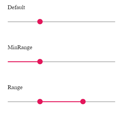
The types of Slider are as follows:
| Types | Usage |
|---|---|
| Default | Shows a default Slider to select a single value. |
| MinRange | Displays the shadow from the start value to the current selected value. |
| Range | Selects a range of values. It also displays the shadow in-between the selection range. |
NOTE
Both the Default Slider and Min-Range Slider have same behavior that is used to select a single value. In Min-Range Slider, a shadow is considered from the start value to current handle position. But the Range Slider contains two handles that is used to select a range of values and a shadow is considered in between the two handles.
<div class="content-wrapper">
    <div class="sliderwrap">
        <label class="labeltext userselect">Default Slider</label>
        <ejs-slider id="default" value="30"></ejs-slider>
    </div>
    <div class="sliderwrap">
        <label class="labeltext userselect">MinRange Slider</label>
        <ejs-slider id="minrange" value="30" type=MinRange></ejs-slider>
    </div>
    <div class="sliderwrap">
        <label class="labeltext userselect">Range Slider</label>
        <ejs-slider id="range" value="ViewBag.range" type=Range></ejs-slider>
    </div>
</div>
<style>

    .content-wrapper {
        width: 40%;
        margin: 0 auto;
        min-width: 185px;
    }

    .sliderwrap {
        margin-top: 40px;
    }

    .sliderwrap label {
        padding-bottom: 26px;
        font-size: 13px;
        font-weight: 500;
        margin-top: 15px;
    }
</style>
public IActionResult Types()
{
ViewBag.range = new int[] { 30, 70 };
return View();
}