How can I help you?
Accessibility
30 Jan 20254 minutes to read
The Slider is characterized with complete ARIA Accessibility support that helps to access by on-screen readers and other assistive technology devices. This control is designed with the reference of guidelines document given in the WAI ARAI Accessibility Practices.
The Slider control uses the Slider role and the following ARIA properties for its element based on the state.
| Properties | Functionalities |
|---|---|
aria-valuenow |
It Indicates the current value of the slider. |
aria-valuetext |
Returns the current text of the slider. |
aria-valuemin |
It Indicates the Minimum value of the slider. |
aria-valuemax |
It Indicates the Maximum value of the slider. |
aria-orientation |
It Indicates the Slider Orientation. |
aria-label |
Slider left and right button label text (increment and decrement). |
aria-labelledby |
It indicates the name of the Slider. |
Keyboard interaction
The Keyboard interaction of the Slider control is designed based on the WAI-ARIA Practices described for Slider. Users can use the following shortcut keys to interact with the Slider.
| Keyboard shortcuts | Actions |
|---|---|
| Right Arrow Up Arrow | Increase the Slider value. |
| Left Arrow Down Arrow | Decrease the Slider value. |
| Home | Moves to the start value (for Range Slider when the second thumb is focused and the Home key is pressed, it moves to the first thumb value). |
| End | Moves to the end value (for Range Slider when the first thumb is focused and the End key is pressed, it moves to the second thumb value). |
| Page Up | Increases the Slider by largeStep value. |
| Page Down | Decreases the Slider by largeStep value. |
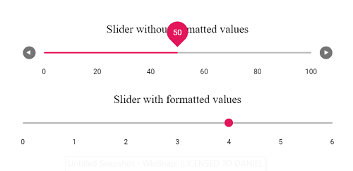
<ejs-slider id="minRangeObj" value="30" step="10" showButtons="true" type="MinRange">
        <e-slider-tooltipdata isVisible="true" placement="Before" showOn="Always"> </e-slider-tooltipdata>
        <e-slider-ticksdata placement="After" largeStep="20" smallStep="10" showSmallTicks="true"></e-slider-ticksdata>
    </ejs-slider>

    <ejs-slider id="weekdaysObj" step="1" min="0" max="6">
        <e-slider-tooltipdata isVisible="true" placement="Before" showOn="Always" change="change"> </e-slider-tooltipdata>
        <e-slider-ticksdata placement="After" largeStep="1" renderingTicks="renderingTicksHandler"></e-slider-ticksdata>
    </ejs-slider>

<script>
    function renderingTicksHandler(args) {
        // Weekdays Array
        var daysArr = ['Sunday', 'Monday', 'Tuesday', 'Wednesday', 'Thrusday', 'Friday', 'Saturday'];
        // Customizing each ticks text into weeksdays
        args.value = daysArr[parseFloat(args.value)];
    }

    function change(args) {
        // Customizing tooltip to display the Day (in numeric) of the week
        args.tooltipText = 'Day ' + (Number(args.tooltipText) + 1).toString();
    }
</script>
public ActionResult Accessbility()
{
return View();
}