Build your first Angular app with our blocks
27 Apr 202611 minutes to read
This tutorial guides you through building an Angular application using Syncfusion®’s UI Kit blocks. It demonstrates how to set up a new Angular project, choose between Tailwind CSS or Bootstrap 5.3 themes, and add a sign-in block in your application. The goal is to help developers quickly build responsive, modern web apps using a variety of prebuilt blocks with minimal effort.
Before You Start: Real-Life Use Case
Before diving into the setup, let’s explore a real-life use case — building a Customer Support Portal using our Angular UI Kit. This video tutorial walks you through the process step by step.
Once you’ve seen this use case in action, the next step is to set up an Angular app and integrate Syncfusion® UI Kit blocks.
Create a new Angular app
To create a new Angular app, refer to the official Angular setup guide here to get started. In this example, I have created a new Angular app named my-angular-app and will walk you through the step-by-step process of adding a simple sign-in block.
Setting up Tailwind CSS or Bootstrap 5.3 theme in the app
After creating the new Angular app named my-angular-app, open it in Visual Studio Code (which will be used throughout this walkthrough). Once the app is open, before proceeding further, navigate to the src -> app -> app.component.html file and remove the template HTML code. Remember, only remove the template HTML code and not the <router-outlet /> code.
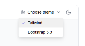
The next step is to choose a theme, either Tailwind CSS or Bootstrap 5.3, in either light or dark mode, and configure the app accordingly.
Tailwind CSS configuration
If you choose Tailwind CSS theme, follow these steps to configure it.
-
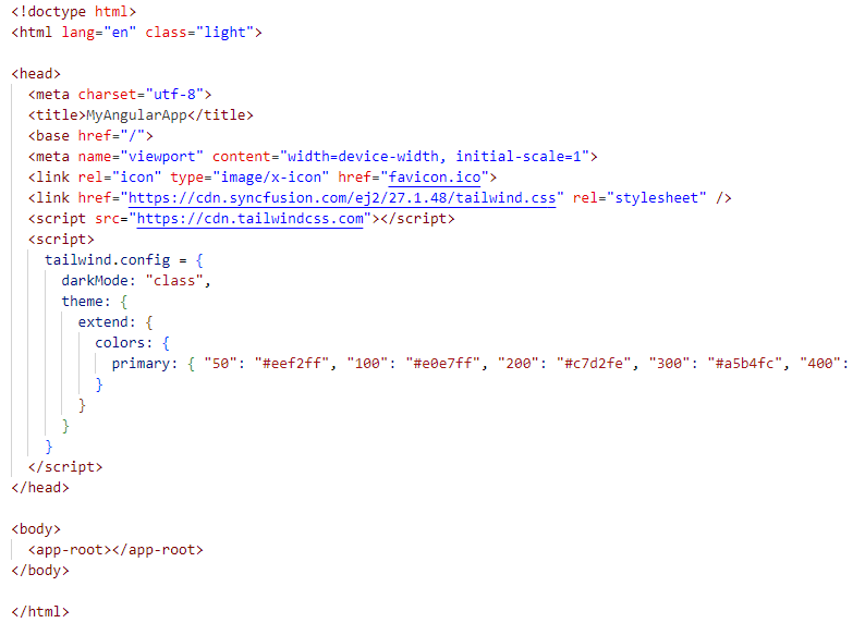
In src -> index.html file, add the following code for light mode (
class="light") and dark mode (class="dark") in the<html>tag.- For light mode:
<html lang="en" class="light">- For dark mode:
<html lang="en" class="dark"> -
In src -> index.html file, add the following scripts in the
<head>tag. The main purpose of these scripts is to dynamically generate the appropriate Tailwind CSS classes at runtime based on the styles used in the application, and to replace the primary (highlight) color in the CSS with a custom indigo color palette.<script src="https://cdn.tailwindcss.com"></script> <script> tailwind.config = { darkMode: "class", theme: { extend: { colors: { // NOTE: In this demo, different shades of "Indigo" are used as primary colors. primary: { "50": "#eef2ff", "100": "#e0e7ff", "200": "#c7d2fe", "300": "#a5b4fc", "400": "#818cf8", "500": "#6366f1", "600": "#4f46e5", "700": "#4338ca", "800": "#3730a3", "900": "#312e81", "950": "#1e1b4b" } } } } } </script>The Syncfusion® Angular components uses Indigo for light mode and Cyan for dark mode. To maintain a uniform appearance, change the primary color accordingly.
-
In src -> index.html file, add the style oriented CDN link for Syncfusion® Angular components in the
<head>tag.-
For light mode:
<link href="https://cdn.syncfusion.com/ej2/27.1.48/tailwind.css" rel="stylesheet" /> -
For dark mode:
<link href="https://cdn.syncfusion.com/ej2/27.1.48/tailwind-dark.css" rel="stylesheet" />
-
-
OPTIONAL: If you wish to use our font icons prepared for Tailwind CSS, you can include the following CDN link:
<link href="https://cdn.syncfusion.com/ej2/angular/ui-kit/font-icons/tailwind-icons.css" rel="stylesheet" />
You can refer to the consolidated screenshot below for more details.
Now that the Tailwind CSS theme is configured for either light or dark mode of your choice, the app is ready for the next set of processes.
Bootstrap 5.3 configuration
If you choose Bootstrap 5.3 theme, follow these steps to configure it.
-
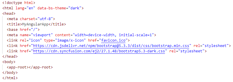
In src -> index.html file, add the following code for light mode (
data-bs-theme="light") and dark mode (data-bs-theme="dark") in the<html>tag.- For light mode:
<html lang="en" data-bs-theme="light">- For dark mode:
<html lang="en" data-bs-theme="dark"> -
In src -> index.html file, add the style oriented CDN link for Bootstrap 5.3 theme in the
<head>tag.<link href="https://cdn.jsdelivr.net/npm/[email protected]/dist/css/bootstrap.min.css" rel="stylesheet" /> -
In src -> index.html file, add the style oriented CDN link for Syncfusion® Angular components in the
<head>tag.-
For light mode:
<link href="https://cdn.syncfusion.com/ej2/27.1.48/bootstrap5.3.css" rel="stylesheet"> -
For dark mode:
<link href="https://cdn.syncfusion.com/ej2/27.1.48/bootstrap5.3-dark.css" rel="stylesheet" />
-
-
OPTIONAL: If you wish to use our font icons prepared for Bootstrap 5.3, you can include the following CDN link:
<link href="https://cdn.syncfusion.com/ej2/angular/ui-kit/font-icons/bootstrap5.3-icons.css" rel="stylesheet" />
You can refer to the consolidated screenshot below for more details.
Now that the Bootstrap 5.3 theme is configured for either light or dark mode of your choice, the app is ready for the next set of processes.
Steps to explore and copy block code snippets
Now that my-angular-app is set up with the desired theme configuration, the next step is to copy and paste the pre-built simple sign-in block code into the Angular app for quick development. Here are a couple of ways to achieve this.
Steps to explore and copy block code snippets from the online demo
-
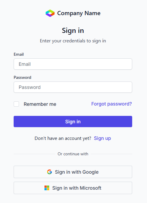
In the online demo, navigate to the “Authentication” category and select the “Sign In” block. This will direct you to the appropriate demo page.
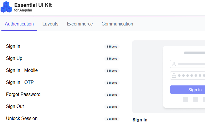
-
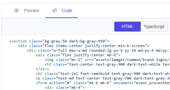
On the demo page, go to the first demo, which showcases a simple sign-in block. Choose the desired theme, then switch from the “Preview” tab to the “Code” tab.
-
In the “Code” tab, copy the HTML code using the “Copy to clipboard” option and paste it into the src -> app -> app.component.html file.
-
If CSS is provided, copy the CSS code and paste it into the src -> app -> app.component.css file; otherwise, ignore it.
Steps to explore and copy block code snippets from the GitHub source
-
On downloading and opening the GitHub source in Visual Studio Code, navigate to the following folder: src -> blocks-section.
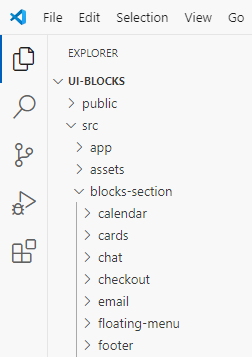
-
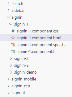
Inside, you’ll find a list of folders, each corresponding to a specific block. Open the “signin” block folder, where you’ll see the demo arranged sequentially.
-
Go to the first folder, src/blocks-section/signin/signin-1, where you’ll find the HTML, CSS, and TS files of the simple sign-in block. You can copy the code directly from these files.
Note:
- In the HTML, the Tailwind CSS design code is placed within the “if” block, while the Bootstrap 5.3 design code is placed in the “else” block.
- Ignore the code within the “SB Code - Start” and “SB Code - End” comments, as it is intended solely for sample browser purposes.
Steps to install and configure Syncfusion® Angular components
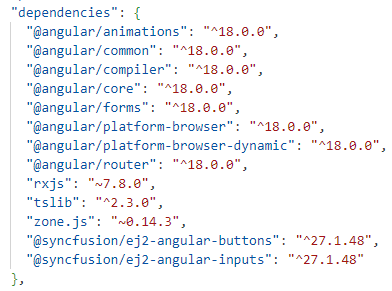
While copying and pasting the HTML code, you’ll notice that Syncfusion® Angular components are used. To incorporate them into my-angular-app, install the necessary packages and add the corresponding modules to the src -> app -> app.component.ts file for the app to run.
In the simple sign-in block, components such as textbox, checkbox and button are used. After copying and pasting the code into the HTML file, open the package.json file and add the required packages: @syncfusion/ej2-angular-buttons and @syncfusion/ej2-angular-inputs. For more details about other Syncfusion® Angular component packages, refer to this link.
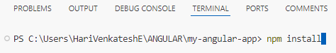
Once the necessary packages are added, run the npm install command via the terminal to install those packages in the node_modules folder.
Finally, go to the online demo or the GitHub repository and copy the required TypeScript code into your app. This typically includes the import module to run Syncfusion® Angular components and any basic code required for the component to function.
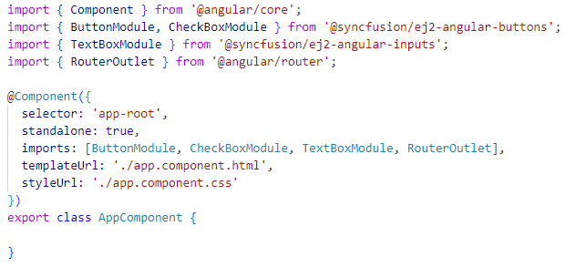
Ignore the code within the “SB Code - Start” and “SB Code - End” comments, as it is intended solely for sample browser purposes.
Steps to download and add assets to the app
If you want to view and experience the images used in our design, you can download the assets folder from the following GitHub repository, place it inside the src folder of my-angular-app, and modify the image URLs in the HTML if necessary.
Steps to run the app
Now that everything is set up in my-angular-app — the HTML, TS, CSS (if applicable), and assets (optional) — you are ready to build and launch the app. Type the ng serve command in the terminal, and you will see a localhost URL provided by the Angular development server.
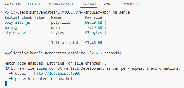
To view the app in your browser, simply Ctrl + Click (or Cmd + Click on macOS) on the localhost URL displayed in the terminal. This will open the app in your default browser, allowing you to view and experience the simple sign-in block.