How can I help you?
Getting started with Angular TextBox component
10 Mar 202612 minutes to read
The Angular TextBox component is an enhanced HTML input element that provides features such as floating labels, input validation, icons, and customizable styling. This guide describes how to create a simple TextBox in an Angular application.
Note: This guide supports Angular 21 and other recent Angular versions. For detailed compatibility with other Angular versions, please refer to the Angular version support matrix. Starting from Angular 19, standalone components are the default, and this guide reflects that architecture.
Ready to streamline your Syncfusion® Angular development? Discover the full potential of Syncfusion® Angular components with Syncfusion® AI Coding Assistant. Effortlessly integrate, configure, and enhance your projects with intelligent, context-aware code suggestions, streamlined setups, and real-time insights—all seamlessly integrated into your preferred AI-powered IDEs like VS Code, Cursor, Syncfusion® CodeStudio and more. Explore Syncfusion® AI Coding Assistant
A quick introduction video is available:
Prerequisites
Ensure your development environment meets the System Requirements for Syncfusion Angular UI Components.
Dependencies
The TextBox component requires the following dependencies in your application:
|-- @syncfusion/ej2-angular-inputs
    |-- @syncfusion/ej2-angular-base
    |-- @syncfusion/ej2-inputs
        |-- @syncfusion/ej2-base
		|-- @syncfusion/ej2-buttons
		|-- @syncfusion/ej2-popups
		|-- @syncfusion/ej2-splitbuttons
SetUp the Angular application
A straightforward approach to beginning with Angular is to create a new application using the Angular CLI. Install Angular CLI globally with the following command:
npm install -g @angular/cliAngular 21 Standalone Architecture: Standalone components are the default in Angular 21. This guide uses the modern standalone architecture. If you need more information about the standalone architecture, refer to the Standalone Guide.
Installing a specific version
To install a particular version of Angular CLI, use:
npm install -g @angular/[email protected]Create a new application
With Angular CLI installed, execute this command to generate a new application:
ng new syncfusion-angular-app- This command will prompt you to configure settings like enabling Angular routing and choosing a stylesheet format.
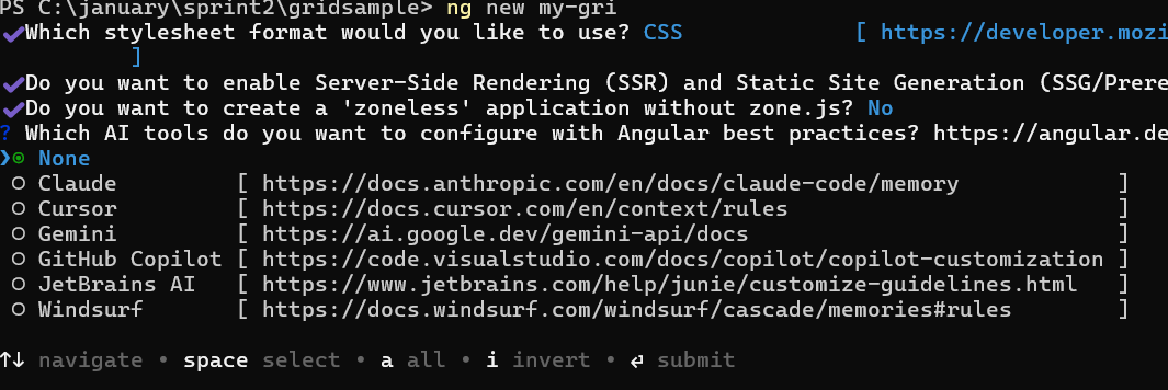
? Which stylesheet format would you like to use? (Use arrow keys)
> CSS             [ https://developer.mozilla.org/docs/Web/CSS                     ]
  Sass (SCSS)     [ https://sass-lang.com/documentation/syntax#scss                ]
  Sass (Indented) [ https://sass-lang.com/documentation/syntax#the-indented-syntax ]
Less [ http://lesscss.org ]- By default, a CSS-based application is created. Use SCSS if required:
ng new syncfusion-angular-app --style=scss- During project setup, when prompted for the Server-side rendering (SSR) option, choose the appropriate configuration.

- Select the required AI tool or ‘none’ if you do not need any AI tool.
- Navigate to your newly created application directory:
cd syncfusion-angular-appNote: In Angular 19 and below, it uses
app.component.ts,app.component.html,app.component.cssetc. In Angular 20+, the CLI generates a simpler structure withsrc/app/app.ts,app.html, andapp.css(no.component.suffixes).
Installing syncfusion® TextBox package
Syncfusion®’s Angular component packages are available on npmjs.com. To use Syncfusion® Angular components, install the necessary package.
This guide uses the Angular TextBox component for demonstration. Add the Angular TextBox component component with:
ng add @syncfusion/ej2-angular-inputsThis command will perform the following configurations:
- Add the
@syncfusion/ej2-angular-inputspackage and peer dependencies to yourpackage.json. - Import the TextBox component component in your application.
- Register the default Syncfusion® material theme in
angular.json.
For more details on version compatibility, refer to the Version Compatibility section.
Syncfusion® offers two package structures for Angular components:
- Ivy library distribution package format
- Angular compatibility compiler (ngcc), which is Angular’s legacy compilation pipeline.
Syncfusion®’s latest Angular packages are provided as Ivy-compatible and suited for Angular 12 and above. To install the package, execute:ng add @syncfusion/ej2-angular-inputsFor applications not compiled with Ivy, use the
ngcctagged packages:The ngcc packages are still compatible with Angular CLI versions 15 and below. However, they may generate warnings suggesting the use of IVY compiled packages. Starting from Angular 16, support for the ngcc package has been completely removed. If you have further questions regarding ngcc compatibility, please refer to the following FAQ.
npm add @syncfusion/[email protected]
Add CSS references
Syncfusion® Angular component themes can be added in various ways: via CSS or SCSS styles from npm packages, CDN, CRG, or Theme Studio.
The Material theme is added to your styles.css when you run ng add (this happens automatically by default).
To stylize only specific Syncfusion® components, import the necessary styles. For example, to style only the TextBox component:
@import '../node_modules/@syncfusion/ej2-base/styles/material3.css';
@import '../node_modules/@syncfusion/ej2-inputs/styles/material3.css';
@import '../node_modules/@syncfusion/ej2-angular-inputs/styles/material3.css';
Ensure that the import order aligns with the component’s dependency sequence.
For using SCSS styles, refer to this guide.
Add TextBox to the application
Use the following snippet in the src/app/app.ts file to import the TextBox component.
import { Component } from '@angular/core';
import { TextBoxModule } from '@syncfusion/ej2-angular-inputs';

@Component({
  imports: [TextBoxModule],
  standalone: true,
  selector: 'app-root',
  template: `<ejs-textbox placeholder="Enter Name"></ejs-textbox>`
})
export class App { }
Add icons to TextBox
Icons can be added using the addIcon method within the created event:
| Parameter | Type | Description |
|---|---|---|
| position | string | Specifies the icon placement. Possible values: append, prepend. |
| icons | string or string[] | CSS class or array of CSS classes for the icon(s). These classes are applied to a span element that renders the icon or button. |
import { Component, ViewChild } from '@angular/core';
import { TextBoxComponent, TextBoxModule } from '@syncfusion/ej2-angular-inputs';

@Component({
  imports: [TextBoxModule],
  standalone: true,
  selector: 'app-root',
  template: `<ejs-textbox #textbox placeholder="Enter Date" (created)="onCreate($event)"></ejs-textbox>`
})
export class App {
  @ViewChild('textbox')
  public textboxObj!: TextBoxComponent;

  public onCreate(args: any) {
    (this.textboxObj as any).addIcon('append', 'e-icons e-input-group-icon e-input-popup-date');
  }
}.e-input-group-icon.e-input-popup-date::before {
content: "\e901";
}Run the application
Start the development server to view the TextBox component:
ng serve
# or open automatically
ng serve --open
The application starts on the development server and the TextBox component is available in the browser.
import { FormsModule } from '@angular/forms';
import { TextBoxComponent, TextBoxModule } from '@syncfusion/ej2-angular-inputs';
import { Component, ViewChild } from '@angular/core';

@Component({
    imports: [TextBoxModule, FormsModule],
    standalone: true,
    selector: 'app-root',
    template: `<div class="wrap">
        <h4> TextBox with icons </h4>
        <ejs-textbox #textbox placeholder = "Enter Date" (created)="onCreate($event)"></ejs-textbox>
        <ejs-textbox #textbox1 placeholder = "Enter Date" (created)="onCreate1($event)"></ejs-textbox>
        <ejs-textbox #textbox2 placeholder = "Enter Date" (created)="onCreate2($event)"></ejs-textbox>

        <h4> Floating label with icons </h4>
        <ejs-textbox #textbox3 placeholder = "Enter Date" floatLabelType="Auto" (created)="onCreate3($event)"></ejs-textbox>
        <ejs-textbox #textbox4 placeholder = "Enter Date" floatLabelType="Auto" (created)="onCreate4($event)"></ejs-textbox>
        <ejs-textbox #textbox5 placeholder = "Enter Date" floatLabelType="Auto" (created)="onCreate5($event)"></ejs-textbox>
    </div>`
})

export class AppComponent {
    @ViewChild('textbox')
    public textboxObj!: TextBoxComponent;
    @ViewChild('textbox1')
    public textboxObj1!: TextBoxComponent;
    @ViewChild('textbox2')
    public textboxObj2!: TextBoxComponent;
    @ViewChild('textbox3')
    public textboxObj3!: TextBoxComponent;
    @ViewChild('textbox4')
    public textboxObj4!: TextBoxComponent;
    @ViewChild('textbox5')
    public textboxObj5!: TextBoxComponent;

    public onCreate(args: any) {
        (this.textboxObj as any).addIcon('append', 'e-icons e-input-popup-date');
    }
    public onCreate1(args: any) {
        (this.textboxObj1 as any).addIcon('prepend', 'e-icons e-input-popup-date');
    }
    public onCreate2(args: any) {
        (this.textboxObj2 as any).addIcon('prepend', 'e-icons e-input-down');
    }
    public onCreate3(args: any) {
        (this.textboxObj3 as any).addIcon('append', 'e-icons e-input-popup-date');
    }
    public onCreate4(args: any) {
        (this.textboxObj4 as any).addIcon('prepend', 'e-icons e-input-popup-date');
    }
    public onCreate5(args: any) {
        (this.textboxObj5 as any).addIcon('prepend', 'e-icons e-input-down');
    }
}
import { bootstrapApplication } from '@angular/platform-browser';
import { AppComponent } from './app.component';
import 'zone.js';
bootstrapApplication(AppComponent).catch((err) => console.error(err));Floating label
The floating label feature displays the label above the TextBox when focused or when the input contains a value. Configure floating labels using the FloatLabelType property:
Available FloatLabelType values:
- Never — Placeholder text remains static and does not float above the TextBox.
- Always — Placeholder text permanently floats above the TextBox regardless of focus or input state.
- Auto — Placeholder text floats above the TextBox when the field receives focus or contains a value.
import { NgModule } from '@angular/core'
import { BrowserModule } from '@angular/platform-browser'
import { TextBoxModule } from '@syncfusion/ej2-angular-inputs'
import { Component } from '@angular/core';

@Component({
  imports: [TextBoxModule],
  standalone: true,
  selector: 'app-root',
  template: `<div class="wrap">
    <h4>Floating label as auto</h4>
    <div class='textboxes'>
      <ejs-textbox placeholder="First Name" floatLabelType="Auto"></ejs-textbox>
    </div>

    <h4>Floating label as always</h4>
    <div class='textboxes'>
      <ejs-textbox placeholder="First Name" floatLabelType="Always"></ejs-textbox>
    </div>
  </div>`
})

export class AppComponent { }
import { bootstrapApplication } from '@angular/platform-browser';
import { AppComponent } from './app.component';
import 'zone.js';
bootstrapApplication(AppComponent).catch((err) => console.error(err));Troubleshooting
Package installation issues: Verify the package version used for the Angular version (Ivy for Angular 12+ or the ngcc distribution for earlier versions).
Styling not applied: Verify that the CSS imports are present in src/styles.css or src/styles.scss, or included in the angular.json styles array, and that the import paths match the node_modules layout.
Component not rendering: Confirm that TextBoxModule is imported in the component or NgModule where the ejs-textbox selector is used.