Getting started with Angular Mention component
3 Jul 202612 minutes to read
This guide demonstrates how to set up and configure the Syncfusion Angular Mention component, from initial installation through implementing user mentions with custom characters. The Mention component allows users to mention people or tags in text input with autocomplete suggestions, keyboard navigation, and customizable mention characters.
Note: This guide supports Angular 21 and other recent Angular versions. For detailed compatibility with other Angular versions, please refer to the Angular version support matrix. Starting from Angular 19, standalone components are the default, and this guide reflects that architecture.
Ready to streamline your Syncfusion® Angular development? Discover the full potential of Syncfusion® Angular components with Syncfusion® AI Coding Assistant. Effortlessly integrate, configure, and enhance your projects with intelligent, context-aware code suggestions, streamlined setups, and real-time insights—all seamlessly integrated into your preferred AI-powered IDEs like VS Code, Cursor, Syncfusion® CodeStudio and more. Explore Syncfusion® AI Coding Assistant
To get started quickly with Angular Mention component using CLI and Schematics, you can check this video:
Prerequisites
Ensure your development environment meets the System Requirements for Syncfusion Angular UI Components.
Dependencies
The list of dependencies required to use the Mention component in your application is given below:
|-- @syncfusion/ej2-angular-dropdowns
    |-- @syncfusion/ej2-base
    |-- @syncfusion/ej2-data
    |-- @syncfusion/ej2-angular-base
    |-- @syncfusion/ej2-dropdowns
        |-- @syncfusion/ej2-lists
        |-- @syncfusion/ej2-inputs
        |-- @syncfusion/ej2-navigations
        |-- @syncfusion/ej2-notifications
        |-- @syncfusion/ej2-popups
            |-- @syncfusion/ej2-buttons
SetUp the Angular application
A straightforward approach to beginning with Angular is to create a new application using the Angular CLI. Install Angular CLI globally with the following command:
npm install -g @angular/cliAngular 21 Standalone Architecture: Standalone components are the default in Angular 21. This guide uses the modern standalone architecture. If you need more information about the standalone architecture, refer to the Standalone Guide.
Installing a specific version
To install a particular version of Angular CLI, use:
npm install -g @angular/[email protected]Create a new application
With Angular CLI installed, execute this command to generate a new application:
ng new syncfusion-angular-app- This command will prompt you to configure settings like enabling Angular routing and choosing a stylesheet format.
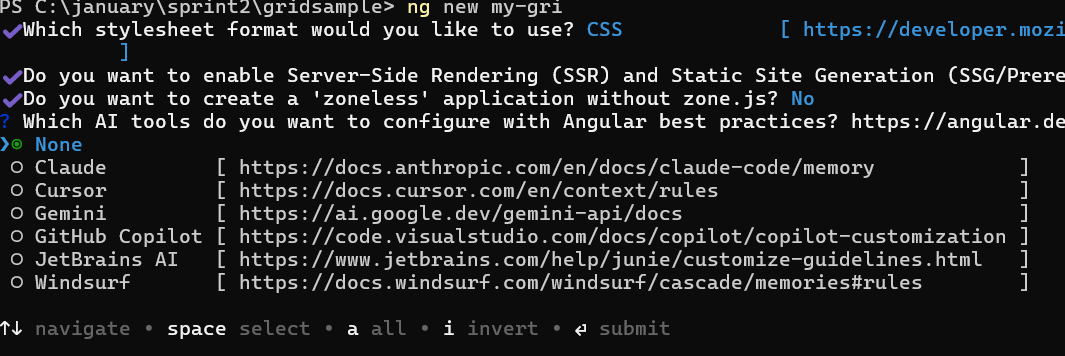
? Which stylesheet format would you like to use? (Use arrow keys)
> CSS             [ https://developer.mozilla.org/docs/Web/CSS                     ]
  Sass (SCSS)     [ https://sass-lang.com/documentation/syntax#scss                ]
  Sass (Indented) [ https://sass-lang.com/documentation/syntax#the-indented-syntax ]
Less [ http://lesscss.org ]- By default, a CSS-based application is created. Use SCSS if required:
ng new syncfusion-angular-app --style=scss- During project setup, when prompted for the Server-side rendering (SSR) option, choose the appropriate configuration.

- Select the required AI tool or ‘none’ if you do not need any AI tool.
- Navigate to your newly created application directory:
cd syncfusion-angular-appNote: In Angular 19 and below, it uses
app.component.ts,app.component.html,app.component.cssetc. In Angular 20+, the CLI generates a simpler structure withsrc/app/app.ts,app.html, andapp.css(no.component.suffixes).
Installing Syncfusion® Mention package
Syncfusion®’s Angular component packages are available on npmjs.com. To use Syncfusion® Angular components, install the necessary package.
This guide uses the Angular Mention component for demonstration. Add the Angular Mention component with:
ng add @syncfusion/ej2-angular-dropdownsThis command will perform the following configurations:
- Add the
@syncfusion/ej2-angular-dropdownspackage and peer dependencies to yourpackage.json. - Import the Mention component in your application.
- Register the default Syncfusion® bootstrap5 theme in
angular.json.
For more details on version compatibility, refer to the Version Compatibility section.
Syncfusion® offers two package structures for Angular components:
- Ivy library distribution package format
- Angular compatibility compiler (ngcc), which is Angular’s legacy compilation pipeline.
Syncfusion®’s latest Angular packages are provided as Ivy-compatible and suited for Angular 12 and above. To install the package, execute:ng add @syncfusion/ej2-angular-dropdownsFor applications not compiled with Ivy, use the
ngcctagged packages:The ngcc packages are still compatible with Angular CLI versions 15 and below. However, they may generate warnings suggesting the use of IVY compiled packages. Starting from Angular 16, support for the ngcc package has been completely removed. If you have further questions regarding ngcc compatibility, please refer to the following FAQ.
npm add @syncfusion/[email protected]
Import Syncfusion CSS styles
Syncfusion® Angular component themes can be added in various ways: via CSS or SCSS styles from npm packages, CDN, CRG, or Theme Studio.
The material3 theme is added to your styles.css when you run ng add (this happens automatically by default).
To stylize only specific Syncfusion® components, import the necessary styles. For example, to style only the Mention component:
@import '../node_modules/@syncfusion/ej2-base/styles/material3.css';
@import '../node_modules/@syncfusion/ej2-buttons/styles/material3.css';
@import '../node_modules/@syncfusion/ej2-popups/styles/material3.css';
@import '../node_modules/@syncfusion/ej2-lists/styles/material3.css';
@import '../node_modules/@syncfusion/ej2-angular-dropdowns/styles/material3.css';
Ensure that the import order aligns with the component’s dependency sequence.
For using SCSS styles, refer to this guide.
Import Mention in your component
For Angular 19+ standalone applications, import the MentionModule directly in your component. Modify the src/app/app.ts file:
import { Component, OnInit } from '@angular/core';
import { MentionModule } from '@syncfusion/ej2-angular-dropdowns';

@Component({
  imports: [MentionModule],
  standalone: true,
  selector: 'app-root',
  template: `<!-- Render Mention component -->`
})
export class AppComponent implements OnInit {
  ngOnInit(): void {
  }
}
For Angular 18 and below (NgModule approach):
If using NgModule pattern, import MentionModule in your app.module.ts:
import { NgModule } from '@angular/core';
import { BrowserModule } from '@angular/platform-browser';
import { MentionModule } from '@syncfusion/ej2-angular-dropdowns';
import { AppComponent } from './app.component';

@NgModule({
  imports: [BrowserModule, MentionModule],
  declarations: [AppComponent],
  bootstrap: [AppComponent]
})
export class AppModule { }
Add Mention component
Now, modify the src/app/app.ts file to render the Mention component using the <ejs-mention> selector. The target property should be configured to render the Mention component in the target element.
import { Component, OnInit } from '@angular/core';
import { MentionModule } from '@syncfusion/ej2-angular-dropdowns';

@Component({
  imports: [MentionModule],
  standalone: true,
  selector: 'app-root',
  template: `
    <label style="font-size: 15px; font-weight: 600;">Comments</label>
    <!-- Target element where Mention component renders suggestions -->
    <div id="mentionElement" style="min-height: 100px; border: 1px solid #D7D7D7; border-radius: 4px; padding: 8px; font-size: 14px; width: 600px;"></div>
    <ejs-mention [target]='mentionTarget'></ejs-mention>`
})
export class AppComponent implements OnInit {
  // Defines the target element for Mention component
  public mentionTarget: string = '#mentionElement';

  ngOnInit(): void {
  }
}
Binding data source
After initializing, populate the data in the Mention component using the dataSource property. You can pass an array of string values or objects to the component:
import { Component, OnInit } from '@angular/core';
import { MentionModule } from '@syncfusion/ej2-angular-dropdowns';

@Component({
  imports: [MentionModule],
  standalone: true,
  selector: 'app-root',
  template: `
    <label>Comments</label>
    <!-- Target element where Mention component renders suggestions -->
    <div id="mentionElement" placeholder="Type @ and tag user" style="min-height: 100px; border: 1px solid #D7D7D7; border-radius: 4px; padding: 8px;"></div>
    <ejs-mention [dataSource]='userData' [target]='mentionTarget'></ejs-mention>`
})
export class AppComponent implements OnInit {
  // Array of user data for suggestions
  public userData: string[] = ['Selma Rose', 'Garth', 'Robert', 'William', 'Joseph'];
  // Target element for Mention component
  public mentionTarget: string = '#mentionElement';

  ngOnInit(): void {
  }
}
Run the application
After completing the configuration required to render a Mention component, run the following command to display the output in your default browser:
ng serve --openThe Mention component will be rendered in your browser with default settings.
The following example shows a basic Mention component with user mention suggestions:
import { NgModule } from '@angular/core'
import { BrowserModule } from '@angular/platform-browser'
import { FormsModule, ReactiveFormsModule } from '@angular/forms'
import { MentionModule } from '@syncfusion/ej2-angular-dropdowns'


import { Component } from '@angular/core';

@Component({
imports: [
        FormsModule, ReactiveFormsModule, MentionModule
    ],


standalone: true,
    selector: 'app-root',
    // Specifies the template string for the Mention component
    template: `
    <label id="comment" >Comments</label>
    <!--Element which is the Mention component's target to list the suggestions-->
    <div id="mentionElement" placeholder = "Type @ and tag user"></div>
    <ejs-mention [dataSource]='userData' [target]='mentionTarget'></ejs-mention>`,

})
export class AppComponent {
    constructor() {
    }
    // Defines the array of data.
    public userData: string[] = ['Selma Rose', 'Garth', 'Robert', 'William', 'Joseph'];
    // Defines the target in which the mention component is rendered.
    public mentionTarget:string = "#mentionElement";
}
import { bootstrapApplication } from '@angular/platform-browser';
import { AppComponent } from './app.component';
import 'zone.js';
bootstrapApplication(AppComponent).catch((err) => console.error(err));Display Mention character
By using the showMentionChar property, the text content can be displayed along with the mention character. You can customize the mention character using the mentionChar property.
By default, the mentionChar is
@and the showMentionChar property is disabled.
The following example displays the text content along with the mention character configured as #:
import { NgModule } from '@angular/core'
import { BrowserModule } from '@angular/platform-browser'
import { FormsModule, ReactiveFormsModule } from '@angular/forms'
import { MentionModule } from '@syncfusion/ej2-angular-dropdowns'


import { Component } from '@angular/core';

@Component({
imports: [
        FormsModule, ReactiveFormsModule, MentionModule
    ],


standalone: true,
    selector: 'app-root',
    // Specifies the template string for the Mention component
    template: `
    <label id="comment" >Comments</label>
    <!--Element which is the Mention component's target to list the suggestions-->
    <div id="mentionElement" placeholder = "Type @ and select your comments"></div>
    <ejs-mention [dataSource]='userData' [target]='mentionTarget' [showMentionChar]="true" [mentionChar]="mentionCharacter"></ejs-mention>`,

})
export class AppComponent {
    constructor() {
    }
    // Defines the array of data.
    public userData: string[] = ['Selma Rose', 'Garth', 'Robert', 'William', 'Joseph'];
    // Defines the target in which the mention component is rendered.
    public mentionTarget: string = "#mentionElement";
    public mentionCharacter: string = "#";
}
import { bootstrapApplication } from '@angular/platform-browser';
import { AppComponent } from './app.component';
import 'zone.js';
bootstrapApplication(AppComponent).catch((err) => console.error(err));