Getting Started with Angular DateTime Picker
30 Sep 20265 minutes to read
The Angular DateTime Picker component enables users to select both a date and time through an interactive calendar and time selection interface, providing a convenient way to capture precise date-time values for scheduling, planning, and event management.
This guide provides step-by-step instructions for setting up an Angular project with TypeScript using Angular CLI, and integrating Syncfusion® Angular Angular DateTime Picker component. The recommended setup below targets modern Angular (CLI ng add). For module-based or framework host setups, see See Also.
The Angular CLI simplifies creating, managing, and building Angular applications so you can start development quickly.
Prerequisites
Ensure your development environment meets the System Requirements for Syncfusion® Angular UI Components.
Setup the Angular application
A straightforward approach to beginning with Angular is to create a new application using the Angular CLI. Install Angular CLI globally with the following command:
npm install -g @angular/cliAngular 21 Standalone Architecture: Standalone components are the default in Angular 21. This guide uses the modern standalone architecture. If you need more information about the standalone architecture, refer to the Standalone Guide.
Create a new application
With Angular CLI installed, execute this command to generate a new application:
ng new syncfusion-angular-app- This command will prompt you to configure settings like enabling Angular routing and choosing a stylesheet format.
? Which stylesheet format would you like to use? (Use arrow keys)
> CSS             [ https://developer.mozilla.org/docs/Web/CSS                     ]
  Sass (SCSS)     [ https://sass-lang.com/documentation/syntax#scss                ]
  Sass (Indented) [ https://sass-lang.com/documentation/syntax#the-indented-syntax ]
Less [ http://lesscss.org ]- By default, a CSS-based application is created. Use SCSS if required:
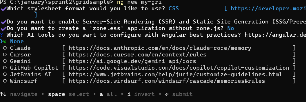
ng new syncfusion-angular-app --style=scss- During project setup, when prompted for the Server-side rendering (SSR) option, choose the appropriate configuration.

- Select the required AI tool or ‘none’ if you do not need any AI tool.
- Navigate to your newly created application directory:
cd syncfusion-angular-appNote: In Angular 19 and below, it uses
app.component.ts,app.component.html,app.component.cssetc. In Angular 20+, the CLI generates a simpler structure withsrc/app/app.ts,app.html, andapp.css(no.component.suffixes).
Adding the Syncfusion® Angular DateTime Picker package
To install the Syncfusion® Angular DateTime Picker package, use the following command:
ng add @syncfusion/ej2-angular-calendarsThe ng add command installs the package, registers it in package.json, and configures the required entries in your workspace automatically.
If ng add is unavailable in your setup, install the package manually with:
npm install @syncfusion/ej2-angular-calendarsAdding CSS reference
Themes for the Syncfusion® Angular DateTime Picker component can be applied using CSS files provided through npm theme packages. For available themes, refer to the Themes documentation.
Install the Material 3 theme package using the following npm command:
npm install @syncfusion/ej2-material3-themeThen add the following CSS reference to the src/styles.css file. This is the default global stylesheet registered under styles in angular.json:
@import "../node_modules/@syncfusion/ej2-material3-theme/styles/datetimepicker/index.css";Add Syncfusion® Angular DateTime Picker component
After package and theme setup, update the root component. File name and class name can vary by Angular CLI version (src/app/app.ts with export class App, or app.component.ts with AppComponent). Replace the root component content with the sample below, or merge the Angular DateTime Picker import, template, and data into your generated file.
For the full property list, see the Angular DateTime Picker API reference.
import { DateTimePickerModule } from '@syncfusion/ej2-angular-calendars';
import { Component} from '@angular/core';

@Component({
  selector: 'app-root',
  imports: [DateTimePickerModule],
  templateUrl: './app.html',
  styleUrl: './app.css'
})

export class App  { }
Place the following markup in the component template file referenced by templateUrl (for example, src/app/app.html):
<div id="container">
      <ejs-datetimepicker></ejs-datetimepicker>
</div>
Running the application
From the project root:
ng serveWhen the build succeeds, the CLI reports a local URL (default: http://localhost:4200). Open that URL in a browser to view the Angular DateTime Picker. If the port is already in use, the CLI prompts for another port, or you can run ng serve --port 4201.
Stop the server with Ctrl+C in the terminal.
The following example illustrates the output in your browser.
Setting the min and max
The minimum and maximum date time can be defined with the help of min and max property. The following example demonstrates to set the min and max on initializing the Angular DateTime Picker. To know more about range restriction in Angular DateTime Picker, please refer this page.
The DateTime Picker component follows a commit-on-Enter/focus-out scenario. The underlying
valueis updated only when the user commits the edit by pressing Enter or moving focus away (blur). Therefreshmethod rebuilds the component using the last committed value. Ifrefresh()is invoked—either directly or indirectly via ResizeObserver callbacks, layout shifts, or dynamic validation updates—while the user is actively typing, uncommitted input is discarded and restored to the previous committed value.