Getting Started with Syncfusion® React Components in a Vite Project
6 Jul 20264 minutes to read
This article provides a step-by-step guide for setting up a Vite project with JavaScript and integrating Syncfusion® React components.
Vite is a fast, modern build tool and development server optimized for projects using technologies such as ES modules, TypeScript, JSX, and CSS modules. Its development server leverages native ES modules in modern browsers, providing rapid project startup and efficient feedback during development.
Prerequisites
System requirements for Syncfusion® React UI components
Set up the Vite project
To create a new Vite project, use one of the commands that are specific to either NPM or Yarn.
Tip: When you run the command below, you will be prompted with “Install dependencies and start now? (yes/no)”. Type
yesto proceed with the installation and automatically start your development server, ornoif you prefer to install dependencies manually later.
npm create vite@latest my-project -- --template reactyarn create vite my-project --template reactAdd Syncfusion® React packages
Syncfusion® React component packages are available at npmjs.com. To use Syncfusion® React components in the project, install the corresponding npm package.
This guide uses the React Grid component as an example. To install the React Grid component package, use the following command:
npm install @syncfusion/ej2-react-grids --saveyarn add @syncfusion/ej2-react-gridsImport Syncfusion® CSS styles
Themes for Syncfusion® React components can be applied using CSS or SASS files from the npm theme packages, CDN, CRG, or Theme Studio. For more information, see the themes documentation.
This guide uses the Tailwind 3 theme as an example, sourced from the theme package. In this package, each component includes an index.css file that automatically loads all the required dependency styles. To install the Tailwind 3 theme package, use the following command:
npm install @syncfusion/ej2-tailwind3-theme --saveyarn add @syncfusion/@syncfusion/ej2-tailwind3-themeBy default, Vite projects include a index.css file with default styles. These default styles may conflict with Syncfusion component styles. Clear all content from the index.css file to prevent style conflicts.
The required styles for the Grid component are imported in the src/App.css file:
@import "../node_modules/@syncfusion/ej2-tailwind3-theme/styles/grid/index.css";Add Syncfusion® React component
Now, you can add the React Grid component to your src/App.jsx file by importing it and defining it with the dataSource property and column definitions. Use the following code:
import './App.css'
import { ColumnDirective, ColumnsDirective, GridComponent } from '@syncfusion/ej2-react-grids';
function App() {
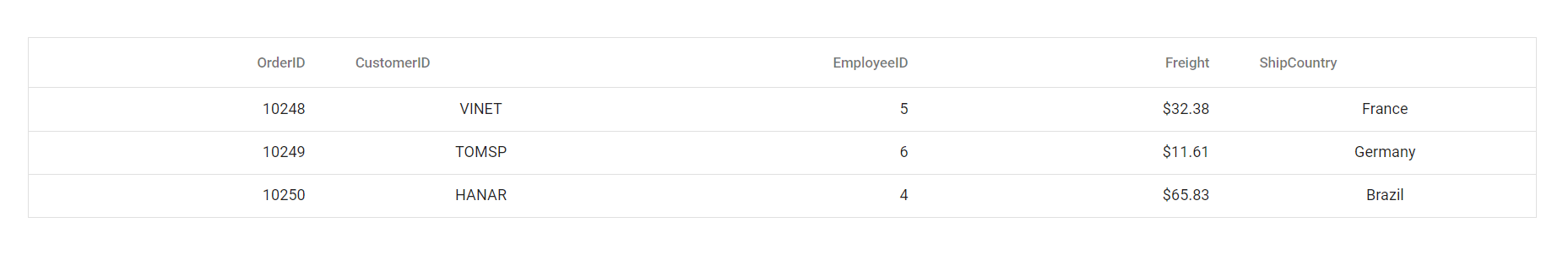
const data = [
{
OrderID: 10248, CustomerID: 'VINET', EmployeeID: 5, ShipCountry: 'France', Freight: 32.38
},
{
OrderID: 10249, CustomerID: 'TOMSP', EmployeeID: 6, ShipCountry: 'Germany', Freight: 11.61
},
{
OrderID: 10250, CustomerID: 'HANAR', EmployeeID: 4, ShipCountry: 'Brazil', Freight: 65.83
}
];
return (
<GridComponent dataSource={data}>
<ColumnsDirective>
<ColumnDirective field='OrderID' width='100' textAlign="Right"/>
<ColumnDirective field='CustomerID' width='100'/>
<ColumnDirective field='EmployeeID' width='100' textAlign="Right"/>
<ColumnDirective field='Freight' width='100' format="C2" textAlign="Right"/>
<ColumnDirective field='ShipCountry' width='100'/>
</ColumnsDirective>
</GridComponent>
);
}
export default App;Run the project
To run the project, use the following command:
npm run devyarn run devThe output will appear as follows: