React Themes in Syncfusion® Components
11 Jun 202624 minutes to read
Syncfusion® React UI components provide a comprehensive set of built-in themes to deliver a consistent, modern, and visually appealing appearance across applications. The following table lists all currently supported themes in the Syncfusion® React components library:
| Theme | Style Sheet Name |
|---|---|
| Tailwind 3.4 | tailwind3.css |
| Tailwind 3.4 Dark | tailwind3-dark.css |
| Bootstrap 5.3 | bootstrap5.3.css |
| Bootstrap 5.3 Dark | bootstrap5.3-dark.css |
| Fluent 2 | fluent2.css |
| Fluent 2 Dark | fluent2-dark.css |
| Material 3 | material3.css |
| Material 3 Dark | material3-dark.css |
| Bootstrap 5 | bootstrap5.css |
| Bootstrap 5 Dark | bootstrap5-dark.css |
| Bootstrap 4 | bootstrap4.css |
| Bootstrap 3 | bootstrap.css |
| Bootstrap 3 Dark | bootstrap-dark.css |
| Material | material.css |
| Material Dark | material-dark.css |
| Tailwind CSS | tailwind.css |
| Tailwind CSS Dark | tailwind-dark.css |
| Fluent | fluent.css |
| Fluent Dark | fluent-dark.css |
| Microsoft Office Fabric | fabric.css |
| Microsoft Office Fabric Dark | fabric-dark.css |
| High Contrast | highcontrast.css |
The Syncfusion® React Bootstrap theme is based on Bootstrap v3, while the Bootstrap 4, Bootstrap 5, and Bootstrap 5.3 themes are aligned with their respective Bootstrap framework versions. In addition to these built-in themes, the ThemeStudio supports the Fusion theme, which can be customized and downloaded exclusively from Theme Studio.
Theme packages
Syncfusion built-in themes are distributed as theme packages available on npm. These packages include CSS/SCSS files for all components. The following table lists all available theme packages:
| Theme | Light Package | Dark Package |
|---|---|---|
| Tailwind 3 | @syncfusion/ej2-tailwind3-theme |
@syncfusion/ej2-tailwind3-dark-theme |
| Bootstrap 5.3 | @syncfusion/ej2-bootstrap5.3-theme |
@syncfusion/ej2-bootstrap5.3-dark-theme |
| Fluent 2 | @syncfusion/ej2-fluent2-theme |
@syncfusion/ej2-fluent2-dark-theme |
| Material 3 | @syncfusion/ej2-material3-theme |
@syncfusion/ej2-material3-dark-theme |
| Bootstrap 5 | @syncfusion/ej2-bootstrap5-theme |
@syncfusion/ej2-bootstrap5-dark-theme |
| Bootstrap 4 | @syncfusion/ej2-bootstrap4-theme |
- |
| Bootstrap | @syncfusion/ej2-bootstrap-theme |
@syncfusion/ej2-bootstrap-dark-theme |
| Material | @syncfusion/ej2-material-theme |
@syncfusion/ej2-material-dark-theme |
| Tailwind | @syncfusion/ej2-tailwind-theme |
@syncfusion/ej2-tailwind-dark-theme |
| Fluent | @syncfusion/ej2-fluent-theme |
@syncfusion/ej2-fluent-dark-theme |
| Fabric | @syncfusion/ej2-fabric-theme |
@syncfusion/ej2-fabric-dark-theme |
| High Contrast | @syncfusion/ej2-highcontrast-theme |
- |
Optimized CSS files
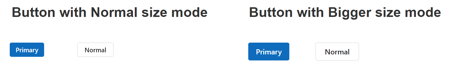
Syncfusion® components support two size modes in each theme: normal (default) and bigger. The normal size mode provides the standard appearance suitable for most devices and scenarios. The bigger size mode increases the size of UI elements to enhance readability, touch interaction, and accessibility — particularly useful for high-resolution displays or touch-based applications.
Below is a comparison of the Button component in normal and bigger size modes:
Each complete theme stylesheet includes styles for both size modes, which increases the file size. To optimize performance in applications that do not need the bigger size mode, Syncfusion provides optimized (lite) theme variants that include only normal size styles. These lite files significantly reduce CSS size and improve application load times.
Refer to the comparison below for default and optimized theme file sizes (example shown for Fluent 2):
| Theme Name | Default Theme Size | Optimized Theme Size |
|---|---|---|
| Fluent 2 | 3.97 MB | 2.96 MB |
Reference themes in the React application
Themes can be included in a React application using one of the following approaches:
- npm packages — Recommended for most projects; supports customization and bundling.
- CDN — Suitable for static sites or rapid prototyping.
- CRG — Generates resources only for the components actually used in the application.
- Theme Studio — Allows deep customization and generation of component-specific themes.
For better maintainability, customization, and bundle optimization, prefer the npm packages method over CDN references in production applications.
Refer themes through npm packages
Themes are shipped as both combined and individual CSS/SCSS files. Each theme package includes Combined and component-specific styles in both CSS and SCSS formats. For a list of available theme packages, refer to the available theme packages section.
To use the combined SCSS/CSS files, install the required theme package.
npm install @syncfusion/ej2-material3-themeReferring all components CSS
@import "@syncfusion/ej2-<theme-name>-theme/styles/<theme-name>.css";Example:
@import "@syncfusion/ej2-material3-theme/styles/material3.css";Referring all components SCSS
@use "@syncfusion/ej2-<theme-name>-theme/styles/<theme-name>.scss" as *;Example:
@use "@syncfusion/ej2-material3-theme/styles/material3.scss" as *;Referring to individual component theme
You can reference individual component themes from the unified theme package. In this package, each component includes an index.css/index.scss files that automatically loads all the required dependency styles.
@import "@syncfusion/ej2-<theme-name>-theme/styles/<component-name>/index.css";Example:
@import "@syncfusion/ej2-material3-theme/styles/grid/index.css";Referring all components optimized CSS file
To reference optimized (lite) versions of all component styles using theme packages.
@import "@syncfusion/ej2-<theme-name>-theme/styles/<theme-name>-lite.css";
/* or */
@use "@syncfusion/ej2-<theme-name>-theme/styles/<theme-name>-lite.scss" as *;
Example:
@import "@syncfusion/ej2-fluent2-theme/styles/fluent2-lite.css";
/* or */
@use "@syncfusion/ej2-fluent2-theme/styles/fluent2-lite.scss" as *;
Referring individual component optimized CSS file
From individual component styles:
@import "@syncfusion/ej2-<theme-name>-theme/styles/<component-name>/index-lite.css";
/* or */
@use "@syncfusion/ej2-<theme-name>-theme/styles/<component-name>/index-lite.scss" as *;
Example:
@import "@syncfusion/ej2-fluent2-theme/styles/grid/index-lite.css";
/* or */
@use "@syncfusion/ej2-fluent2-theme/styles/grid/index-lite.scss" as *;
Advantages of individual components theme
- Reduces page load time of the application
- Decreases overall bundle size
- Eliminates unused CSS rules
Refer themes through CDN reference
Instead of hosting files locally, you can reference themes directly from the Syncfusion CDN. Always ensure the version number in the URL matches the version of the Syncfusion® React package installed in your project (e.g., 32.1.19 for the latest major release as of December 2025).
<head>
    <link href="https://cdn.syncfusion.com/ej2/<version>/<theme_name>.css" rel="stylesheet"/>
</head>
Optimized (lite) version:
<head>
    <link href="https://cdn.syncfusion.com/ej2/<version>/<theme_name>-lite.css" rel="stylesheet"/>
</head>| Theme Name | CDN Reference (example – replace |
|---|---|
| Tailwind 3.4 | https://cdn.syncfusion.com/ej2/32.1.19/tailwind3.css |
| Tailwind 3.4 Dark | https://cdn.syncfusion.com/ej2/32.1.19/tailwind3-dark.css |
| Bootstrap 5.3 | https://cdn.syncfusion.com/ej2/32.1.19/bootstrap5.3.css |
| Bootstrap 5.3 Dark | https://cdn.syncfusion.com/ej2/32.1.19/bootstrap5.3-dark.css |
| Fluent 2 | https://cdn.syncfusion.com/ej2/32.1.19/fluent2.css |
| Fluent 2 Dark | https://cdn.syncfusion.com/ej2/32.1.19/fluent2-dark.css |
| Material 3 | https://cdn.syncfusion.com/ej2/32.1.19/material3.css |
| Material 3 Dark | https://cdn.syncfusion.com/ej2/32.1.19/material3-dark.css |
| Fluent | https://cdn.syncfusion.com/ej2/32.1.19/fluent.css |
| Fluent Dark | https://cdn.syncfusion.com/ej2/32.1.19/fluent-dark.css |
| Bootstrap 5 | https://cdn.syncfusion.com/ej2/32.1.19/bootstrap5.css |
| Bootstrap 5 Dark | https://cdn.syncfusion.com/ej2/32.1.19/bootstrap5-dark.css |
| Bootstrap 4 | https://cdn.syncfusion.com/ej2/32.1.19/bootstrap4.css |
| Bootstrap 3 | https://cdn.syncfusion.com/ej2/32.1.19/bootstrap.css |
| Bootstrap 3 Dark | https://cdn.syncfusion.com/ej2/32.1.19/bootstrap-dark.css |
| Material | https://cdn.syncfusion.com/ej2/32.1.19/material.css |
| Material Dark | https://cdn.syncfusion.com/ej2/32.1.19/material-dark.css |
| Tailwind CSS | https://cdn.syncfusion.com/ej2/32.1.19/tailwind.css |
| Tailwind CSS Dark | https://cdn.syncfusion.com/ej2/32.1.19/tailwind-dark.css |
| Microsoft Office Fabric | https://cdn.syncfusion.com/ej2/32.1.19/fabric.css |
| Microsoft Office Fabric Dark | https://cdn.syncfusion.com/ej2/32.1.19/fabric-dark.css |
| High Contrast | https://cdn.syncfusion.com/ej2/32.1.19/highcontrast.css |
Common variables
The following list of common variables are used in the Syncfusion® JavaScript library themes for all UI controls. You can change these variables to customize the corresponding theme.
Syncfusion® Tailwind 3.4 theme
| Name | Value (Default Theme) | Value (Dark Theme) |
|---|---|---|
| --color-sf-black | rgb(0,0,0) | rgb(0,0,0) |
| --color-sf-white | rgb(255,255,255) | rgb(255,255,255) |
| --color-sf-primary | rgba(79, 70, 229) | rgba(99, 102, 241) |
| --color-sf-primary-text-color | #fff | #fff |
| --color-sf-primary-light | #3730a3 | #3730a3 |
| --color-sf-primary-lighter | #e0e7ff | #1e1b4b |
| --color-sf-primary-dark | #4338ca | #818cf8 |
| --color-sf-primary-darker | #3730a3 | #4f46e5 |
| --color-sf-success | #15803d | #22c55e |
| --color-sf-info | #0e7490 | #38bdf8 |
| --color-sf-warning | #c2410c | #f97316 |
| --color-sf-danger | #dc2626 | #f87171 |
| --color-sf-success-light | #dcfce7 | #164c37 |
| --color-sf-info-light | #cffafe | #0e485b |
| --color-sf-warning-light | #ffedd5 | #573422 |
| --color-sf-danger-light | #fee2e2 | #54252f |
| --color-sf-success-dark | #166534 | #4ade80 |
| --color-sf-info-dark | #155e75 | #38bdf8 |
| --color-sf-warning-dark | #9a3412 | #fb923c |
| --color-sf-danger-dark | #b91c1c | #ef4444 |
Syncfusion® Bootstrap 5.3 theme
| Name | Value (Default Theme) | Value (Dark Theme) |
|---|---|---|
| --color-sf-black | rgb(0,0,0) | rgb(0,0,0) |
| --color-sf-white | rgb(255,255,255) | rgb(255,255,255) |
| --color-sf-primary | rgba(13,110,253,1) | rgba(13,110,253,1) |
| --color-sf-primary-text-color | #fff | #fff |
| --color-sf-primary-light | #86b7fe | #86b7fe |
| --color-sf-primary-lighter | #cfe2ff | #031633 |
| --color-sf-primary-dark | #3367d1 | #073ba6 |
| --color-sf-primary-darker | #052c65 | #6ea8fe |
| --color-sf-success | rgba(25,135,84,1) | rgba(25,135,84,1) |
| --color-sf-info | rgba(13,202,240,1) | rgba(13,202,240,1) |
| --color-sf-warning | rgba(255,193,7,1) | rgba(255,193,7,1) |
| --color-sf-danger | rgba(220,53,69,1) | rgba(220,53,69,1) |
| --color-sf-success-light | #d1e7dd | #75b798 |
| --color-sf-info-light | #cff4fc | #6edff6 |
| --color-sf-warning-light | #fff3cd | #ffda6a |
| --color-sf-danger-light | #f8d7da | #ea868f |
| --color-sf-success-dark | #0a3622 | #75b798 |
| --color-sf-info-dark | #055160 | #6edff6 |
| --color-sf-warning-dark | #664d03 | #ffda6a |
| --color-sf-danger-dark | #58151c | #ea868f |
| --color-sf-success-light-alt | #d1e7dd | #051b11 |
| --color-sf-info-light-alt | #cff4fc | #032830 |
| --color-sf-warning-light-alt | #fff3cd | #332701 |
| --color-sf-danger-light-alt | #f8d7da | #2c0b0e |
Syncfusion® Fluent 2 theme
| Name | Value (Default Theme) | Value (Dark Theme) |
|---|---|---|
| --color-sf-black | #000 | #000 |
| --color-sf-white | #fff | #fff |
| --color-sf-primary | #0f6cbd | #115ea3 |
| --color-sf-primary-text-color | #fff | #fff |
| --color-sf-primary-light | #b4d6fa | #0e4775 |
| --color-sf-primary-lighter | #ebf3fc | #082338 |
| --color-sf-primary-dark | #0f548c | #62abf5 |
| --color-sf-primary-darker | #0c3b5e | #96c6fa |
| --color-sf-success | #0e700e | #107c10 |
| --color-sf-info | #008aa9 | #0099bc |
| --color-sf-warning | #bc4b09 | #faa06b |
| --color-sf-danger | #d13438 | #dc626d |
| --color-sf-success-light | #54b054 | #094509 |
| --color-sf-info-light | #56bfd7 | #005669 |
| --color-sf-warning-light | #fee5d7 | #4a1e04 |
| --color-sf-danger-light | #eeacb2 | #6e0811 |
| --color-sf-success-dark | #54b054 | #c9eac9 |
| --color-sf-info-dark | #56bfd7 | #cdedf4 |
| --color-sf-warning-dark | #8a3707 | #fee5d7 |
| --color-sf-danger-dark | #6e0811 | #fee5d7 |
| --color-sf-success-light-alt | #f1faf1 | #052505 |
| --color-sf-info-light-alt | #f2fafc | #002e38 |
| --color-sf-warning-light-alt | #fff9f5 | #4a1e04 |
| --color-sf-danger-light-alt | #fdf3f4 | #3b0509 |
| --color-sf-badge-warning | #fde300 | #fde300 |
| --color-sf-badge-warning-text | #847619 | #fde300 |
| --color-sf-primary-label-color | #0f6cbd | #479ef5 |
| --color-sf-primary-cell-selection | #ebf3fc | #ebf3fc |
Syncfusion® Material 3 theme
| Name | Value (Default Theme) | Value (Dark Theme) |
|---|---|---|
| --color-sf-black | rgb(0,0,0) | rgb(0,0,0) |
| --color-sf-white | rgb(255,255,255) | rgb(255,255,255) |
| --color-sf-primary | rgb(103, 80, 164) | rgb(208, 188, 255) |
| --color-sf-primary-container | rgb(234, 221, 255) | rgb(79, 55, 139) |
| --color-sf-on-primary | rgb(255, 255, 255) | rgb(55, 30, 115) |
| --color-sf-on-primary-container | rgb(33, 0, 94) | rgb(234, 221, 255) |
| --color-sf-surface | rgb(255, 255, 255) | rgb(28, 27, 31) |
| --color-sf-surface-variant | rgb(231, 224, 236) | rgb(73, 69, 79) |
| --color-sf-on-surface | rgb(28, 27, 31) | rgb(230, 225, 229) |
| --color-sf-on-surface-variant | rgb(73, 69, 78) | rgb(202, 196, 208) |
| --color-sf-secondary | rgb(98, 91, 113) | rgb(204, 194, 220) |
| --color-sf-secondary-container | rgb(232, 222, 248) | rgb(74, 68, 88) |
| --color-sf-on-secondary | rgb(255, 255, 255) | rgb(51, 45, 65) |
| --color-sf-on-secondary-container | rgb(30, 25, 43) | rgb(232, 222, 248) |
| --color-sf-tertiary | rgb(125, 82, 96) | rgb(239, 184, 200) |
| --color-sf-tertiary-container | rgb(255, 216, 228) | rgb(99, 59, 72) |
| --color-sf-on-tertiary | rgb(255, 255, 255) | rgb(73, 37, 50) |
| --color-sf-on-tertiary-container | rgb(55, 11, 30) | rgb(255, 216, 228) |
| --color-sf-background | rgb(255, 255, 255) | rgb(28, 27, 31) |
| --color-sf-on-background | rgb(28, 27, 31) | rgb(230, 225, 229) |
| --color-sf-outline | rgb(121, 116, 126) | rgb(147, 143, 153) |
| --color-sf-outline-variant | rgb(196, 199, 197) | rgb(68, 71, 70) |
| --color-sf-shadow | rgb(0, 0, 0) | rgb(0, 0, 0) |
| --color-sf-surface-tint-color | rgb(103, 80, 164) | rgb(208, 188, 255) |
| --color-sf-inverse-surface | rgb(49, 48, 51) | rgb(230, 225, 229) |
| --color-sf-inverse-on-surface | rgb(244, 239, 244) | rgb(49, 48, 51) |
| --color-sf-inverse-primary | rgb(208, 188, 255) | rgb(103, 80, 164) |
| --color-sf-scrim | rgb(0, 0, 0) | rgb(0, 0, 0) |
| --color-sf-error | rgb(179, 38, 30) | rgb(242, 184, 181) |
| --color-sf-error-container | rgb(249, 222, 220) | rgb(140, 29, 24) |
| --color-sf-on-error | rgb(255, 250, 250) | rgb(96, 20, 16) |
| --color-sf-on-error-container | rgb(65, 14, 11) | rgb(249, 222, 220) |
| --color-sf-success | rgb(32, 81, 7) | rgb(83, 202, 23) |
| --color-sf-success-container | rgb(209, 255, 186) | rgb(22, 62, 2) |
| --color-sf-on-success | rgb(244, 255, 239) | rgb(13, 39, 0) |
| --color-sf-on-success-container | rgb(13, 39, 0) | rgb(183, 250, 150) |
| --color-sf-info | rgb(1, 87, 155) | rgb(71, 172, 251) |
| --color-sf-info-container | rgb(233, 245, 255) | rgb(0, 67, 120) |
| --color-sf-on-info | rgb(250, 253, 255) | rgb(0, 51, 91) |
| --color-sf-on-info-container | rgb(0, 51, 91) | rgb(173, 219, 255) |
| --color-sf-warning | rgb(145, 76, 0) | rgb(245, 180, 130) |
| --color-sf-warning-container | rgb(254, 236, 222) | rgb(123, 65, 0) |
| --color-sf-on-warning | rgb(255, 255, 255) | rgb(99, 52, 0) |
| --color-sf-on-warning-container | rgb(47, 21, 0) | rgb(255, 220, 193) |
Syncfusion® Bootstrap 5 theme
| Name | Value (Default Theme) | Value (Dark Theme) |
|---|---|---|
| $black | #000 | #000 |
| $white | #fff | #fff |
| $gray-100 | #f8f9fa | #f8f9fa |
| $gray-200 | #e9ecef | #e9ecef |
| $gray-300 | #dee2e6 | #dee2e6 |
| $gray-400 | #ced4da | #ced4da |
| $gray-500 | #adb5bd | #adb5bd |
| $gray-600 | #6c757d | #6c757d |
| $gray-700 | #495057 | #495057 |
| $gray-800 | #343a40 | #343a40 |
| $gray-900 | #212529 | #212529 |
| $blue | #0d6efd | #0d6efd |
| $indigo | #6610f2 | #6610f2 |
| $purple | #6f42c1 | #6f42c1 |
| $pink | #d63384 | #d63384 |
| $red | #dc3545 | #dc3545 |
| $orange | #fd7e14 | #fd7e14 |
| $yellow | #ffc107 | #ffc107 |
| $green | #198754 | #198754 |
| $teal | #20c997 | #20c997 |
| $cyan | #0dcaf0 | #0dcaf0 |
Syncfusion® Fluent theme
| Name | Value (Default Theme) | Value (Dark Theme) |
|---|---|---|
| $black | #000 | #000 |
| $white | #fff | #fff |
| $gray220 | #11100f | #11100f |
| $gray210 | #161514 | #161514 |
| $gray200 | #1b1a19 | #1b1a19 |
| $gray190 | #201f1e | #201f1e |
| $gray180 | #252423 | #252423 |
| $gray170 | #292827 | #292827 |
| $gray160 | #323130 | #323130 |
| $gray150 | #3b3a39 | #3b3a39 |
| $gray140 | #484644 | #484644 |
| $gray130 | #605e5c | #605e5c |
| $gray120 | #797775 | #797775 |
| $gray110 | #8a8886 | #8a8886 |
| $gray100 | #979593 | #979593 |
| $gray90 | #a19f9d | #a19f9d |
| $gray80 | #b3b0ad | #b3b0ad |
| $gray70 | #bebbb8 | #bebbb8 |
| $gray60 | #c8c6c4 | #c8c6c4 |
| $gray50 | #d2d0ce | #d2d0ce |
| $gray40 | #e1dfdd | #e1dfdd |
| $gray30 | #edebe9 | #edebe9 |
| $gray20 | #f3f2f1 | #f3f2f1 |
| $gray10 | #faf9f8 | #faf9f8 |
| $cyanblue10 | #0078d4 | #0078d4 |
| $red10 | #d13438 | #d13438 |
| $orange20 | #ca5010 | #ca5010 |
| $green20 | #0b6a0b | #0b6a0b |
| $cyan20 | #038387 | #038387 |
Syncfusion® Bootstrap 4 theme
| Name | Value |
|---|---|
| $white | #fff |
| $gray-100 | #f8f9fa |
| $gray-200 | #e9ecef |
| $gray-300 | #dee2e6 |
| $gray-400 | #ced4da |
| $gray-500 | #adb5bd |
| $gray-600 | #6c757d |
| $gray-700 | #495057 |
| $gray-800 | #343a40 |
| $gray-900 | #212529 |
| $black | #000 |
| $blue | #007bff |
| $indigo | #6610f2 |
| $purple | #6f42c1 |
| $pink | #e83e8c |
| $red | #dc3545 |
| $orange | #fd7e14 |
| $yellow | #ffc107 |
| $green | #28a745 |
| $teal | #20c997 |
| $cyan | #17a2b8 |
Syncfusion® Bootstrap theme
| Name | Value (Default Theme) | Value (Dark Theme) |
|---|---|---|
| $brand-primary | #317ab9 | #0070f0 |
| $brand-primary-darken-10 | #3071a9 | darken($brand-primary, 10%) |
| $brand-primary-darken-15 | #2a6496 | darken($brand-primary, 20%) |
| $brand-primary-darken-25 | #1f496e | darken($brand-primary, 30%) |
| $brand-primary-darken-35 | #142f46 | darken($brand-primary, 40%) |
| $brand-primary-font | #fff | #fff |
| $gray-base | #000 | #1a1a1a |
| $gray-darker | #222 | #131313 |
| $gray-dark | #333 | #2a2a2a |
| $gray | #555 | #313131 |
| $gray-light | #777 | #393939 |
| $grey-44 | #444 | #414141 |
| $grey-88 | #888 | #484848 |
| $grey-99 | #999 | #505050 |
| $grey-8c | #8c8c8c | #585858 |
| $grey-ad | #adadad | #676767 |
| $grey-dark-font | #fff | #f0f0f0 |
| $grey-white | #fff | #6e6e6e |
| $grey-lighter | #eee | #767676 |
| $grey-f9 | #f9f9f9 | #7e7e7e |
| $grey-f8 | #f8f8f8 | #858585 |
| $grey-f5 | #f5f5f5 | #8d8d8d |
| $grey-e6 | #e6e6e6 | #959595 |
| $grey-dd | #ddd | #9c9c9c |
| $grey-d4 | #d4d4d4 | #a4a4a4 |
| $grey-cc | #ccc | #acacac |
| $grey-light-font | #333 | #fff |
| $brand-success | #5cb85c | #48b14c |
| $brand-success-dark | #3c763d | #358238 |
| $brand-info | #5bc0de | #2aaac0 |
| $brand-info-dark | #31708f | #208090 |
| $brand-warning | #f0ad4e | #fac168 |
| $brand-warning-dark | #8a6d3b | #f9ad37 |
| $brand-danger | #d9534f | #d44f4f |
| $brand-danger-dark | #a94442 | #c12f2f |
| $brand-success-light | #dff0d8 | #dff0d8 |
| $brand-info-light | #d9edf7 | #d9edf7 |
| $brand-warning-light | #fcf8e3 | #fcf8e3 |
| $brand-danger-light | #f2dede | #f2dede |
| $input-border-focus | #66afe9 | #104888 |
| $brand-success-font | #3c763d | #2f7432 |
| $brand-info-font | #31708f | #1a6c7a |
| $brand-warning-font | #8a6d3b | #9d6106 |
| $brand-danger-font | #a94442 | #ac2a2a |
| $base-font | #000 | #000 |
| $brand-primary-lighten-10 | lighten($brand-primary, 10%) | |
| $brand-primary-lighten-15 | lighten($brand-primary, 15%) | |
| $brand-primary-lighten-20 | lighten($brand-primary, 20%) | |
| $brand-primary-lighten-30 | lighten($brand-primary, 30%) | |
| $brand-primary-lighten-40 | lighten($brand-primary, 40%) |
Syncfusion® Material theme
| Name | Value (Default Theme) | Value (Dark Theme) |
|---|---|---|
| $accent | #e3165b | #ff80ab |
| $accent-font | #fff | #000 |
| $primary | #3f51b5 | #3f51b5 |
| $primary-50 | #e8eaf6 | #e8eaf6 |
| $primary-100 | #c5cae9 | #c5cae9 |
| $primary-200 | #9fa8da | #9fa8da |
| $primary-300 | #7986cb | #7986cb |
| $primary-font | #fff | #fff |
| $primary-50-font | #000 | #000 |
| $primary-100-font | #000 | #000 |
| $primary-200-font | #000 | #000 |
| $primary-300-font | #fff | #fff |
| $grey-white | #fff | #fff |
| $grey-black | #000 | #000 |
| $grey-50 | #fafafa | #fafafa |
| $grey-100 | #f5f5f5 | #f5f5f5 |
| $grey-200 | #eee | #eee |
| $grey-300 | #e0e0e0 | #e0e0e0 |
| $grey-400 | #bdbdbd | #bdbdbd |
| $grey-500 | #9e9e9e | #9e9e9e |
| $grey-600 | #757575 | #757575 |
| $grey-700 | #616161 | #616161 |
| $grey-800 | #424242 | #424242 |
| $grey-900 | #212121 | #212121 |
| $grey-dark | #303030 | #303030 |
| $grey-light-font | #000 | #000 |
| $grey-dark-font | #fff | #fff |
| $base-font | #000 | #000 |
| $error-font | #f44336 | #ff6652 |
| $success-bg | #4caf50 | |
| $error-bg | #ff6652 | |
| $warning-bg | #ff9800 | |
| $info-bg | #03a9f4 | |
| $message-font | #fff | |
| $success-font | #4caf50 | |
| $warning-font | #ff9800 | |
| $info-font | #03a9f4 |
Syncfusion® Microsoft Office Fabric theme
| Name | Value (Default Theme) | Value (Dark Theme) |
|---|---|---|
| $theme-primary | #0078d6 | #0074cc |
| $theme-dark-alt | darken($theme-primary, 3%) | darken($theme-primary, 3%) |
| $theme-dark | darken($theme-primary, 10%) | darken($theme-primary, 6%) |
| $theme-darker | darken($theme-primary, 18%) | darken($theme-primary, 10%) |
| $theme-secondary | lighten($theme-primary, 3%) | lighten($theme-primary, 3%) |
| $theme-tertiary | lighten($theme-primary, 21%) | lighten($theme-primary, 21%) |
| $theme-light | lighten($theme-primary, 44%) | lighten($theme-primary, 44%) |
| $theme-lighter | lighten($theme-primary, 49%) | lighten($theme-primary, 49%) |
| $theme-lighter-alt | lighten($theme-primary, 55%) | lighten($theme-primary, 55%) |
| $neutral-white | #fff | #201f1f |
| $neutral-lighter-alt | #f8f8f8 | #282727 |
| $neutral-lighter | #f4f4f4 | #333232 |
| $neutral-light | #eaeaea | #414040 |
| $neutral-quintenaryalt | #dadada | #4a4848 |
| $neutral-quintenary | #d0d0d0 | #514f4f |
| $neutral-tertiary-alt | #c8c8c8 | #6f6c6c |
| $neutral-tertiary | #a6a6a6 | #9a9a9a |
| $neutral-secondary-alt | #767676 | #c8c8c8 |
| $neutral-secondary | #666 | #dadada |
| $neutral-primary | #333 | #fff |
| $neutral-dark | #212121 | #f4f4f4 |
| $neutral-black | #000 | #f8f8f8 |
| $alert-bg | #deecf9 | #bf7500 |
| $error-bg | #fde7e9 | #cd2a19 |
| $success-bg | #dff6dd | #37844d |
| $theme-dark-font | #fff | #fff |
| $theme-primary-font | #fff | #fff |
| $theme-light-font | #333 | #000 |
| $neutral-light-font | #333 | #dadada |
| $neutral-light-fontalt | #000 | #fff |
| $grey-dark-font | #fff | #000 |
| $base-font | #333 | #dadada |
| $message-font | #333 | #fff |
| $alert-font | #d83b01 | #ff9d48 |
| $error-font | #a80000 | #ff5f5f |
| $success-font | #107c10 | #8eff8d |
| $info-bg | #1e79cb | |
| $info-font | #62cfff |
Syncfusion® High Contrast theme
| Name | Value |
|---|---|
| $selection-bg | #ffd939 |
| $selection-font | #000 |
| $selection-border | #ffd939 |
| $hover-bg | #685708 |
| $hover-font | #fff |
| $hover-border | #fff |
| $border-default | #969696 |
| $border-alt | #757575 |
| $border-fg | #fff |
| $border-fg-alt | #ffd939 |
| $bg-base-0 | #000 |
| $bg-base-5 | #0d0d0d |
| $bg-base-10 | #1a1a1a |
| $bg-base-15 | #262626 |
| $bg-base-20 | #333 |
| $bg-base-75 | #bfbfbf |
| $bg-base-100 | #fff |
| $header-font | #ffd939 |
| $header-font-alt | #fff |
| $content-font | #fff |
| $content-font-alt | #969696 |
| $link | #8a8aff |
| $invert-font | #000 |
| $success-bg | #166600 |
| $error-bg | #b30900 |
| $message-font | #fff |
| $alert-bg | #944000 |
| $info-bg | #0056b3 |
| $success-alt | #2bc700 |
| $error-alt | #ff6161 |
| $alert-alt | #ff7d1a |
| $info-alt | #66b0ff |
| $disable | #757575 |
Syncfusion® Tailwind CSS theme
| Name | Value (Default Theme) | Value (Dark Theme) |
|---|---|---|
| $black | #000 | #000 |
| $white | #fff | #fff |
| $transparent | transparent | transparent |
| $cool-gray-50 | #f9fafb | #f9fafb |
| $cool-gray-100 | #f3f4f6 | #f3f4f6 |
| $cool-gray-200 | #e5e7eb | #e5e7eb |
| $cool-gray-300 | #d1d5db | #d1d5db |
| $cool-gray-400 | #9ca3af | #9ca3af |
| $cool-gray-500 | #6b7280 | #6b7280 |
| $cool-gray-600 | #4b5563 | #4b5563 |
| $cool-gray-700 | #374151 | #374151 |
| $cool-gray-800 | #1f2937 | #1f2937 |
| $cool-gray-900 | #111827 | #111827 |
| $red-100 | #fee2e2 | #fee2e2 |
| $red-400 | #f87171 | #f87171 |
| $red-500 | #ef4444 | #ef4444 |
| $red-600 | #dc2626 | #dc2626 |
| $red-800 | #991b1b | #991b1b |
| $green-100 | #dcfce7 | #dcfce7 |
| $green-500 | #22c55e | #22c55e |
| $green-600 | #16a34a | #16a34a |
| $green-700 | #15803d | #15803d |
| $orange-100 | #ffedd5 | #ffedd5 |
| $orange-500 | #f97316 | #f97316 |
| $orange-600 | #ea580c | #ea580c |
| $orange-700 | #c2410c | #c2410c |
| $orange-800 | #9a3412 | #9a3412 |
| $cyan-300 | #67e8f9 | #67e8f9 |
| $cyan-400 | #22d3ee | #22d3ee |
| $cyan-500 | #06b6d4 | #06b6d4 |
| $cyan-600 | #0891b2 | #0891b2 |
| $cyan-800 | #155e75 | #155e75 |
| $indigo-50 | #eef2ff | |
| $indigo-100 | #e0e7ff | |
| $indigo-200 | #c7d2fe | |
| $indigo-300 | #a5b4fc | |
| $indigo-400 | #818cf8 | |
| $indigo-500 | #6366f1 | |
| $indigo-600 | #4f46e5 | |
| $indigo-700 | #4338ca | |
| $indigo-800 | #3730a3 | |
| $indigo-900 | #312e81 | |
| $green-400 | #4ade80 | |
| $light-blue-50 | #f0f9ff | |
| $light-blue-100 | #e0f2fe | |
| $light-blue-400 | #38bdf8 | |
| $light-blue-500 | #0ea5e9 | |
| $light-blue-600 | #0284c7 | |
| $light-blue-700 | #0369a1 | |
| $light-blue-800 | #075985 |