Theme Studio Overview
2 Feb 202624 minutes to read
Theme Studio for Syncfusion® Essential JS 2 enables customization of a new theme based on an existing one. It does not support data visualization components such as Chart, Diagram, Gauge, Range Navigator, and Maps.
Customizing theme color in Theme Studio
Syncfusion EJ2 themes are built using SCSS and expose a set of common variables. Modifying a common variable color value updates styles across all Syncfusion® React components that derive from that theme.
All Syncfusion React component styles are derived from these theme-based common variables. Theme Studio exposes and manages this common variable list for color customization.
-
Navigate to the Theme Studio application at https://ej2.syncfusion.com/themestudio/?theme=tailwind3.
-
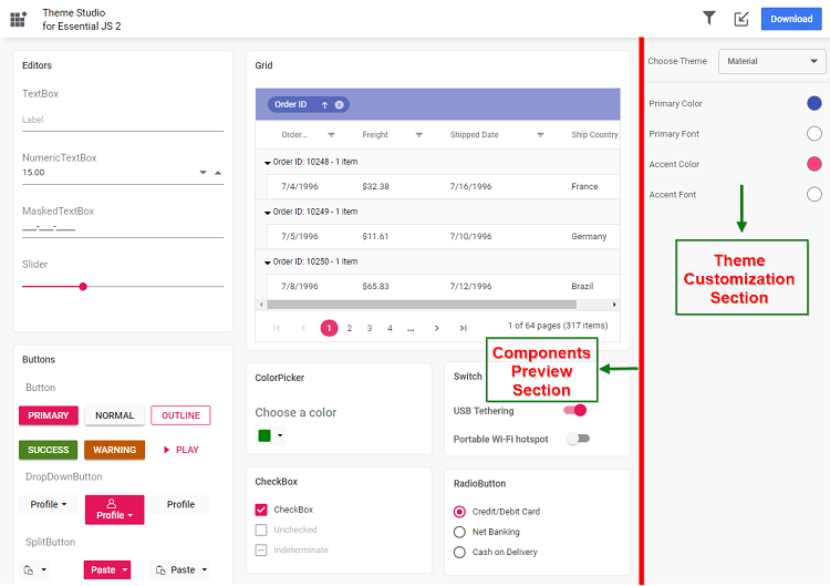
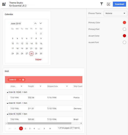
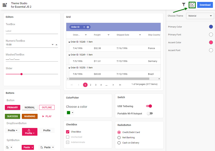
The Theme Studio application page is divided into two sections: the component preview section on the left and the theme customization section on the right.
-
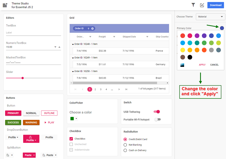
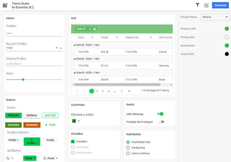
Click the color pickers in the theme customization section to select your desired colors.
-
The Syncfusion® React components in the preview section update automatically to reflect the newly selected colors.
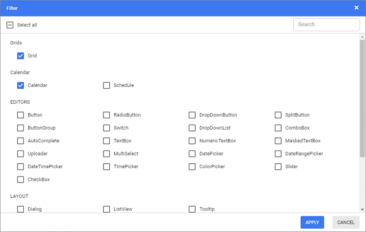
Filtering a specific list of components
You can apply a custom theme to a selected set of components to reduce the final output size:
-
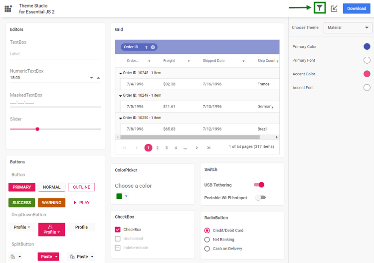
Click the Filter icon and select the components to include.
-
Click Apply — the preview will display only the selected components.
-
Customize colors for the selected components.
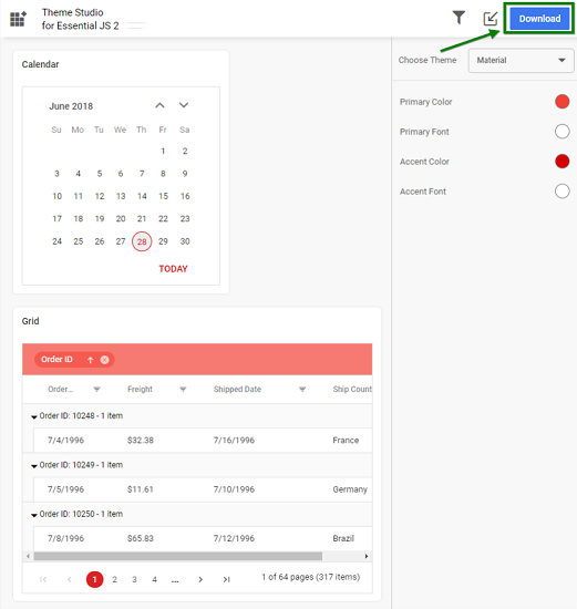
Download the customized theme
After customization, download the theme as follows:
-
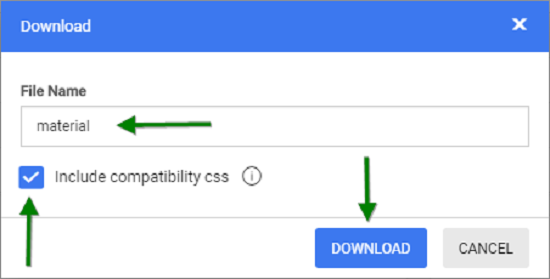
Click the Download button. The Download dialog opens.
-
Optionally specify a custom file name, then click Download.
-
Include compatibility CSS — If your application uses both Syncfusion® Essential JS 1 and Essential JS 2 React components, select the Include compatibility CSS check box before downloading. This option generates custom theme compatibility styles for EJ2 that align with EJ1 styling.
-
The downloaded ZIP file contains SCSS files, CSS files, and a
settings.jsonfile with the current Theme Studio settings.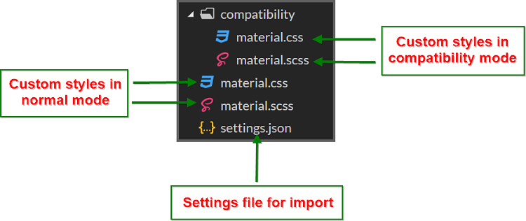
Using the customized theme in a web application
-
Copy the customized CSS file from the downloaded folder into your application (for example,
styles/{file-name}.css). -
Reference the customized CSS file in the
<head>section of yourindex.htmlor main layout file.
<head>
  <link href="styles/{file-name}.css" rel="stylesheet"/>
</head>
If your application uses both EJ1 and EJ2 components, use the contents from the
compatibilityfolder in the downloaded ZIP.
Import previously changed settings into Theme Studio
When you need to update your application theme and UI design later, you can import the previously exported settings.json or <theme-name>-tokens.json file (from Figma using the Syncfusion® Design Tokens plugin) instead of starting from scratch.
-
Click the Import icon in the top right corner.
-
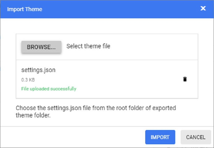
In the Import Theme dialog, click Browse and select your previously exported
settings.jsonor<theme-name>-tokens.jsonfile.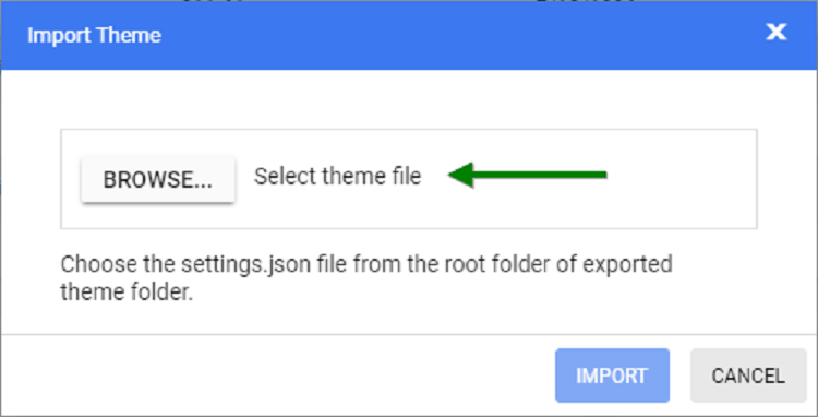
-
Click Import.
-
The imported settings are applied in the Theme Studio application. You can now modify the theme colors according to your updated design requirements and export the theme again.
-
The new exported file includes your latest changes. Replace the older custom style file in your application with this updated version to refresh the UI.
Common variables
The following list of common variables is used in the Syncfusion® React library themes for all UI components. You can modify these variables to customize the corresponding theme.
Bootstrap 5 theme
| Name | Value (Default Theme) | Value (Dark Theme) |
|---|---|---|
| $black | #000 | #000 |
| $white | #fff | #fff |
| $gray-100 | #f8f9fa | #f8f9fa |
| $gray-200 | #e9ecef | #e9ecef |
| $gray-300 | #dee2e6 | #dee2e6 |
| $gray-400 | #ced4da | #ced4da |
| $gray-500 | #adb5bd | #adb5bd |
| $gray-600 | #6c757d | #6c757d |
| $gray-700 | #495057 | #495057 |
| $gray-800 | #343a40 | #343a40 |
| $gray-900 | #212529 | #212529 |
| $blue | #0d6efd | #0d6efd |
| $indigo | #6610f2 | #6610f2 |
| $purple | #6f42c1 | #6f42c1 |
| $pink | #d63384 | #d63384 |
| $red | #dc3545 | #dc3545 |
| $orange | #fd7e14 | #fd7e14 |
| $yellow | #ffc107 | #ffc107 |
| $green | #198754 | #198754 |
| $teal | #20c997 | #20c997 |
| $cyan | #0dcaf0 | #0dcaf0 |
Bootstrap 4 theme
| Name | Value |
|---|---|
| $white | #fff |
| $gray-100 | #f8f9fa |
| $gray-200 | #e9ecef |
| $gray-300 | #dee2e6 |
| $gray-400 | #ced4da |
| $gray-500 | #adb5bd |
| $gray-600 | #6c757d |
| $gray-700 | #495057 |
| $gray-800 | #343a40 |
| $gray-900 | #212529 |
| $black | #000 |
| $blue | #007bff |
| $indigo | #6610f2 |
| $purple | #6f42c1 |
| $pink | #e83e8c |
| $red | #dc3545 |
| $orange | #fd7e14 |
| $yellow | #ffc107 |
| $green | #28a745 |
| $teal | #20c997 |
| $cyan | #17a2b8 |
Bootstrap theme
Design based on bootstrap 3 theme.
| Name | Value (Default Theme) | Value (Dark Theme) |
|---|---|---|
| $brand-primary | #317ab9 | #0070f0 |
| $brand-primary-darken-10 | #3071a9 | darken($brand-primary, 10%) |
| $brand-primary-darken-15 | #2a6496 | darken($brand-primary, 20%) |
| $brand-primary-darken-25 | #1f496e | darken($brand-primary, 30%) |
| $brand-primary-darken-35 | #142f46 | darken($brand-primary, 40%) |
| $brand-primary-font | #fff | #fff |
| $gray-base | #000 | #1a1a1a |
| $gray-darker | #222 | #131313 |
| $gray-dark | #333 | #2a2a2a |
| $gray | #555 | #313131 |
| $gray-light | #777 | #393939 |
| $grey-44 | #444 | #414141 |
| $grey-88 | #888 | #484848 |
| $grey-99 | #999 | #505050 |
| $grey-8c | #8c8c8c | #585858 |
| $grey-ad | #adadad | #676767 |
| $grey-dark-font | #fff | #f0f0f0 |
| $grey-white | #fff | #6e6e6e |
| $grey-lighter | #eee | #767676 |
| $grey-f9 | #f9f9f9 | #7e7e7e |
| $grey-f8 | #f8f8f8 | #858585 |
| $grey-f5 | #f5f5f5 | #8d8d8d |
| $grey-e6 | #e6e6e6 | #959595 |
| $grey-dd | #ddd | #9c9c9c |
| $grey-d4 | #d4d4d4 | #a4a4a4 |
| $grey-cc | #ccc | #acacac |
| $grey-light-font | #333 | #fff |
| $brand-success | #5cb85c | #48b14c |
| $brand-success-dark | #3c763d | #358238 |
| $brand-info | #5bc0de | #2aaac0 |
| $brand-info-dark | #31708f | #208090 |
| $brand-warning | #f0ad4e | #fac168 |
| $brand-warning-dark | #8a6d3b | #f9ad37 |
| $brand-danger | #d9534f | #d44f4f |
| $brand-danger-dark | #a94442 | #c12f2f |
| $brand-success-light | #dff0d8 | #dff0d8 |
| $brand-info-light | #d9edf7 | #d9edf7 |
| $brand-warning-light | #fcf8e3 | #fcf8e3 |
| $brand-danger-light | #f2dede | #f2dede |
| $input-border-focus | #66afe9 | #104888 |
| $brand-success-font | #3c763d | #2f7432 |
| $brand-info-font | #31708f | #1a6c7a |
| $brand-warning-font | #8a6d3b | #9d6106 |
| $brand-danger-font | #a94442 | #ac2a2a |
| $base-font | #000 | #000 |
| $brand-primary-lighten-10 | lighten($brand-primary, 10%) | |
| $brand-primary-lighten-15 | lighten($brand-primary, 15%) | |
| $brand-primary-lighten-20 | lighten($brand-primary, 20%) | |
| $brand-primary-lighten-30 | lighten($brand-primary, 30%) | |
| $brand-primary-lighten-40 | lighten($brand-primary, 40%) |
Material theme
| Name | Value (Default Theme) | Value (Dark Theme) |
|---|---|---|
| $accent | #e3165b | #ff80ab |
| $accent-font | #fff | #000 |
| $primary | #3f51b5 | #3f51b5 |
| $primary-50 | #e8eaf6 | #e8eaf6 |
| $primary-100 | #c5cae9 | #c5cae9 |
| $primary-200 | #9fa8da | #9fa8da |
| $primary-300 | #7986cb | #7986cb |
| $primary-font | #fff | #fff |
| $primary-50-font | #000 | #000 |
| $primary-100-font | #000 | #000 |
| $primary-200-font | #000 | #000 |
| $primary-300-font | #fff | #fff |
| $grey-white | #fff | #fff |
| $grey-black | #000 | #000 |
| $grey-50 | #fafafa | #fafafa |
| $grey-100 | #f5f5f5 | #f5f5f5 |
| $grey-200 | #eee | #eee |
| $grey-300 | #e0e0e0 | #e0e0e0 |
| $grey-400 | #bdbdbd | #bdbdbd |
| $grey-500 | #9e9e9e | #9e9e9e |
| $grey-600 | #757575 | #757575 |
| $grey-700 | #616161 | #616161 |
| $grey-800 | #424242 | #424242 |
| $grey-900 | #212121 | #212121 |
| $grey-dark | #303030 | #303030 |
| $grey-light-font | #000 | #000 |
| $grey-dark-font | #fff | #fff |
| $base-font | #000 | #000 |
| $error-font | #f44336 | #ff6652 |
| $success-bg | #4caf50 | |
| $error-bg | #ff6652 | |
| $warning-bg | #ff9800 | |
| $info-bg | #03a9f4 | |
| $message-font | #fff | |
| $success-font | #4caf50 | |
| $warning-font | #ff9800 | |
| $info-font | #03a9f4 |
Tailwind CSS theme
| Name | Value (Default Theme) | Value (Dark Theme) |
|---|---|---|
| $black | #000 | #000 |
| $white | #fff | #fff |
| $transparent | transparent | transparent |
| $cool-gray-50 | #f9fafb | #f9fafb |
| $cool-gray-100 | #f3f4f6 | #f3f4f6 |
| $cool-gray-200 | #e5e7eb | #e5e7eb |
| $cool-gray-300 | #d1d5db | #d1d5db |
| $cool-gray-400 | #9ca3af | #9ca3af |
| $cool-gray-500 | #6b7280 | #6b7280 |
| $cool-gray-600 | #4b5563 | #4b5563 |
| $cool-gray-700 | #374151 | #374151 |
| $cool-gray-800 | #1f2937 | #1f2937 |
| $cool-gray-900 | #111827 | #111827 |
| $red-100 | #fee2e2 | #fee2e2 |
| $red-400 | #f87171 | #f87171 |
| $red-500 | #ef4444 | #ef4444 |
| $red-600 | #dc2626 | #dc2626 |
| $red-800 | #991b1b | #991b1b |
| $green-100 | #dcfce7 | #dcfce7 |
| $green-500 | #22c55e | #22c55e |
| $green-600 | #16a34a | #16a34a |
| $green-700 | #15803d | #15803d |
| $orange-100 | #ffedd5 | #ffedd5 |
| $orange-500 | #f97316 | #f97316 |
| $orange-600 | #ea580c | #ea580c |
| $orange-700 | #c2410c | #c2410c |
| $orange-800 | #9a3412 | #9a3412 |
| $cyan-300 | #67e8f9 | #67e8f9 |
| $cyan-400 | #22d3ee | #22d3ee |
| $cyan-500 | #06b6d4 | #06b6d4 |
| $cyan-600 | #0891b2 | #0891b2 |
| $cyan-800 | #155e75 | #155e75 |
| $indigo-50 | #eef2ff | |
| $indigo-100 | #e0e7ff | |
| $indigo-200 | #c7d2fe | |
| $indigo-300 | #a5b4fc | |
| $indigo-400 | #818cf8 | |
| $indigo-500 | #6366f1 | |
| $indigo-600 | #4f46e5 | |
| $indigo-700 | #4338ca | |
| $indigo-800 | #3730a3 | |
| $indigo-900 | #312e81 | |
| $green-400 | #4ade80 | |
| $light-blue-50 | #f0f9ff | |
| $light-blue-100 | #e0f2fe | |
| $light-blue-400 | #38bdf8 | |
| $light-blue-500 | #0ea5e9 | |
| $light-blue-600 | #0284c7 | |
| $light-blue-700 | #0369a1 | |
| $light-blue-800 | #075985 |
Microsoft Office Fabric theme
| Name | Value (Default Theme) | Value (Dark Theme) |
|---|---|---|
| $theme-primary | #0078d6 | #0074cc |
| $theme-dark-alt | darken($theme-primary, 3%) | darken($theme-primary, 3%) |
| $theme-dark | darken($theme-primary, 10%) | darken($theme-primary, 6%) |
| $theme-darker | darken($theme-primary, 18%) | darken($theme-primary, 10%) |
| $theme-secondary | lighten($theme-primary, 3%) | lighten($theme-primary, 3%) |
| $theme-tertiary | lighten($theme-primary, 21%) | lighten($theme-primary, 21%) |
| $theme-light | lighten($theme-primary, 44%) | lighten($theme-primary, 44%) |
| $theme-lighter | lighten($theme-primary, 49%) | lighten($theme-primary, 49%) |
| $theme-lighter-alt | lighten($theme-primary, 55%) | lighten($theme-primary, 55%) |
| $neutral-white | #fff | #201f1f |
| $neutral-lighter-alt | #f8f8f8 | #282727 |
| $neutral-lighter | #f4f4f4 | #333232 |
| $neutral-light | #eaeaea | #414040 |
| $neutral-quintenaryalt | #dadada | #4a4848 |
| $neutral-quintenary | #d0d0d0 | #514f4f |
| $neutral-tertiary-alt | #c8c8c8 | #6f6c6c |
| $neutral-tertiary | #a6a6a6 | #9a9a9a |
| $neutral-secondary-alt | #767676 | #c8c8c8 |
| $neutral-secondary | #666 | #dadada |
| $neutral-primary | #333 | #fff |
| $neutral-dark | #212121 | #f4f4f4 |
| $neutral-black | #000 | #f8f8f8 |
| $alert-bg | #deecf9 | #bf7500 |
| $error-bg | #fde7e9 | #cd2a19 |
| $success-bg | #dff6dd | #37844d |
| $theme-dark-font | #fff | #fff |
| $theme-primary-font | #fff | #fff |
| $theme-light-font | #333 | #000 |
| $neutral-light-font | #333 | #dadada |
| $neutral-light-fontalt | #000 | #fff |
| $grey-dark-font | #fff | #000 |
| $base-font | #333 | #dadada |
| $message-font | #333 | #fff |
| $alert-font | #d83b01 | #ff9d48 |
| $error-font | #a80000 | #ff5f5f |
| $success-font | #107c10 | #8eff8d |
| $info-bg | #1e79cb | |
| $info-font | #62cfff |
High Contrast theme
| Name | Value |
|---|---|
| $selection-bg | #ffd939 |
| $selection-font | #000 |
| $selection-border | #ffd939 |
| $hover-bg | #685708 |
| $hover-font | #fff |
| $hover-border | #fff |
| $border-default | #969696 |
| $border-alt | #757575 |
| $border-fg | #fff |
| $border-fg-alt | #ffd939 |
| $bg-base-0 | #000 |
| $bg-base-5 | #0d0d0d |
| $bg-base-10 | #1a1a1a |
| $bg-base-15 | #262626 |
| $bg-base-20 | #333 |
| $bg-base-75 | #bfbfbf |
| $bg-base-100 | #fff |
| $header-font | #ffd939 |
| $header-font-alt | #fff |
| $content-font | #fff |
| $content-font-alt | #969696 |
| $link | #8a8aff |
| $invert-font | #000 |
| $success-bg | #166600 |
| $error-bg | #b30900 |
| $message-font | #fff |
| $alert-bg | #944000 |
| $info-bg | #0056b3 |
| $success-alt | #2bc700 |
| $error-alt | #ff6161 |
| $alert-alt | #ff7d1a |
| $info-alt | #66b0ff |
| $disable | #757575 |
Fluent theme
| Name | Value (Default Theme) | Value (Dark Theme) |
|---|---|---|
| $black | #000 | #000 |
| $white | #fff | #fff |
| $gray220 | #11100f | #11100f |
| $gray210 | #161514 | #161514 |
| $gray200 | #1b1a19 | #1b1a19 |
| $gray190 | #201f1e | #201f1e |
| $gray180 | #252423 | #252423 |
| $gray170 | #292827 | #292827 |
| $gray160 | #323130 | #323130 |
| $gray150 | #3b3a39 | #3b3a39 |
| $gray140 | #484644 | #484644 |
| $gray130 | #605e5c | #605e5c |
| $gray120 | #797775 | #797775 |
| $gray110 | #8a8886 | #8a8886 |
| $gray100 | #979593 | #979593 |
| $gray90 | #a19f9d | #a19f9d |
| $gray80 | #b3b0ad | #b3b0ad |
| $gray70 | #bebbb8 | #bebbb8 |
| $gray60 | #c8c6c4 | #c8c6c4 |
| $gray50 | #d2d0ce | #d2d0ce |
| $gray40 | #e1dfdd | #e1dfdd |
| $gray30 | #edebe9 | #edebe9 |
| $gray20 | #f3f2f1 | #f3f2f1 |
| $gray10 | #faf9f8 | #faf9f8 |
| $cyanblue10 | #0078d4 | #0078d4 |
| $red10 | #d13438 | #d13438 |
| $orange20 | #ca5010 | #ca5010 |
| $green20 | #0b6a0b | #0b6a0b |
| $cyan20 | #038387 | #038387 |