Getting Started with Syncfusion® React Components in a Gatsby
6 Jul 20265 minutes to read
This article provides a step-by-step guide for creating a Gatsby application and integrating Syncfusion® React UI components.
Gatsby is an open-source React-based framework for building high-performance, modern web applications and static websites. It includes out-of-the-box optimizations and integrates React, GraphQL, and the modern JavaScript ecosystem.
Prerequisites
System requirements for Syncfusion® React UI components
Set up the Gatsby project
To create a new Gatsby project, use one of the commands that are specific to either NPM or Yarn.
npm create gatsby@latestyarn create gatsbyUsing one of the above commands will lead you to set up additional configurations for the project, as below:
Define the project name: You can specify the name of the project directly. Let’s specify the name of the project as my-project for this article.
What would you like to call your site?
√ · my-project
What would you like to name the folder where your site will be created?
√ / my-project
√ Will you be using JavaScript or TypeScript?
· TypeScript
√ Will you be using a CMS?
· No (or I'll add it later)
√ Would you like to install a styling system?
· No (or I'll add it later)
√ Would you like to install additional features with other plugins?No items were selected

Thanks! Here's what we'll now do:
Create a new Gatsby site in the folder my-project?
Shall we do this? (Y/n) » Yes
Upon completing the aforementioned steps to create my-project, run the following command to jump into the project directory:
cd my-projectNow that my-project is ready to run with default settings, let’s add Syncfusion® components to the project.
Install Syncfusion® React packages
Syncfusion® React component packages are available at npmjs.com. Install the required component package using the following command:
npm install @syncfusion/ej2-react-grids --saveyarn add @syncfusion/ej2-react-gridsThis guide uses the React Grid component as an example.
Import Syncfusion® CSS styles
Themes for Syncfusion® React components can be applied using CSS or SASS from the npm theme packages. Additionally, themes can be loaded via CDN or customized using the Theme Studio. For more information, refer to the themes documentation.
This example uses the Tailwind 3 theme for the Grid component from the theme package. To install the Tailwind 3 theme package, use the following command:
npm install @syncfusion/ej2-tailwind3-theme --saveyarn add @syncfusion/@syncfusion/ej2-tailwind3-themeStep 1: Create the style.css file - Create a new file named style.css in the src/pages/ directory.
Step 2: Import Syncfusion CSS styles - Add the Tailwind 3 theme imports to the src/pages/style.css file to style the Grid component and its dependencies.
@import "../../node_modules/@syncfusion/ej2-tailwind3-theme/styles/grid/index.css";Add a Syncfusion® React component
Follow the below steps to add the React Grid component to the Gatsby project:
Step 1: Import the Grid component and its required directives in the src/pages/index.tsx file.
import { GridComponent, ColumnsDirective, ColumnDirective } from '@syncfusion/ej2-react-grids';Step 2: Define the Grid component with the dataSource property and column definitions. Declare the values for the dataSource property.
import * as React from 'react';
import { GridComponent, ColumnsDirective, ColumnDirective } from '@syncfusion/ej2-react-grids';
import './style.css';
export function App() {
const data = [
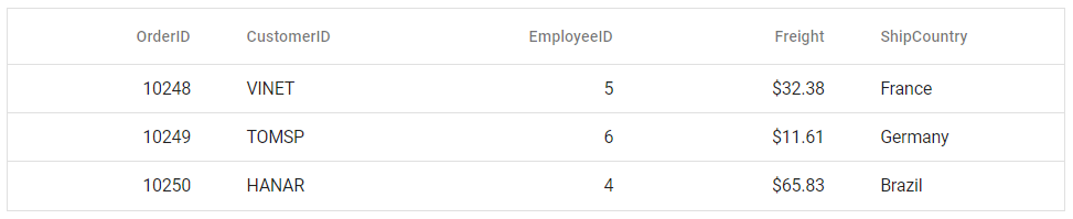
{
OrderID: 10248, CustomerID: 'VINET', EmployeeID: 5, ShipCountry: 'France', Freight: 32.38
},
{
OrderID: 10249, CustomerID: 'TOMSP', EmployeeID: 6, ShipCountry: 'Germany', Freight: 11.61
},
{
OrderID: 10250, CustomerID: 'HANAR', EmployeeID: 4, ShipCountry: 'Brazil', Freight: 65.83
}
];
return (
<GridComponent dataSource={data}>
<ColumnsDirective>
<ColumnDirective field='OrderID' width='100' textAlign="Right" />
<ColumnDirective field='CustomerID' width='100' />
<ColumnDirective field='EmployeeID' width='100' textAlign="Right" />
<ColumnDirective field='Freight' width='100' format="C2" textAlign="Right" />
<ColumnDirective field='ShipCountry' width='100' />
</ColumnsDirective>
</GridComponent>
);
}
export default App;Run the project
To run the project, use the following command:
npm run developyarn run developThe output will appear as follows: