Getting started with TypeScript Form Builder control
21 Oct 20264 minutes to read
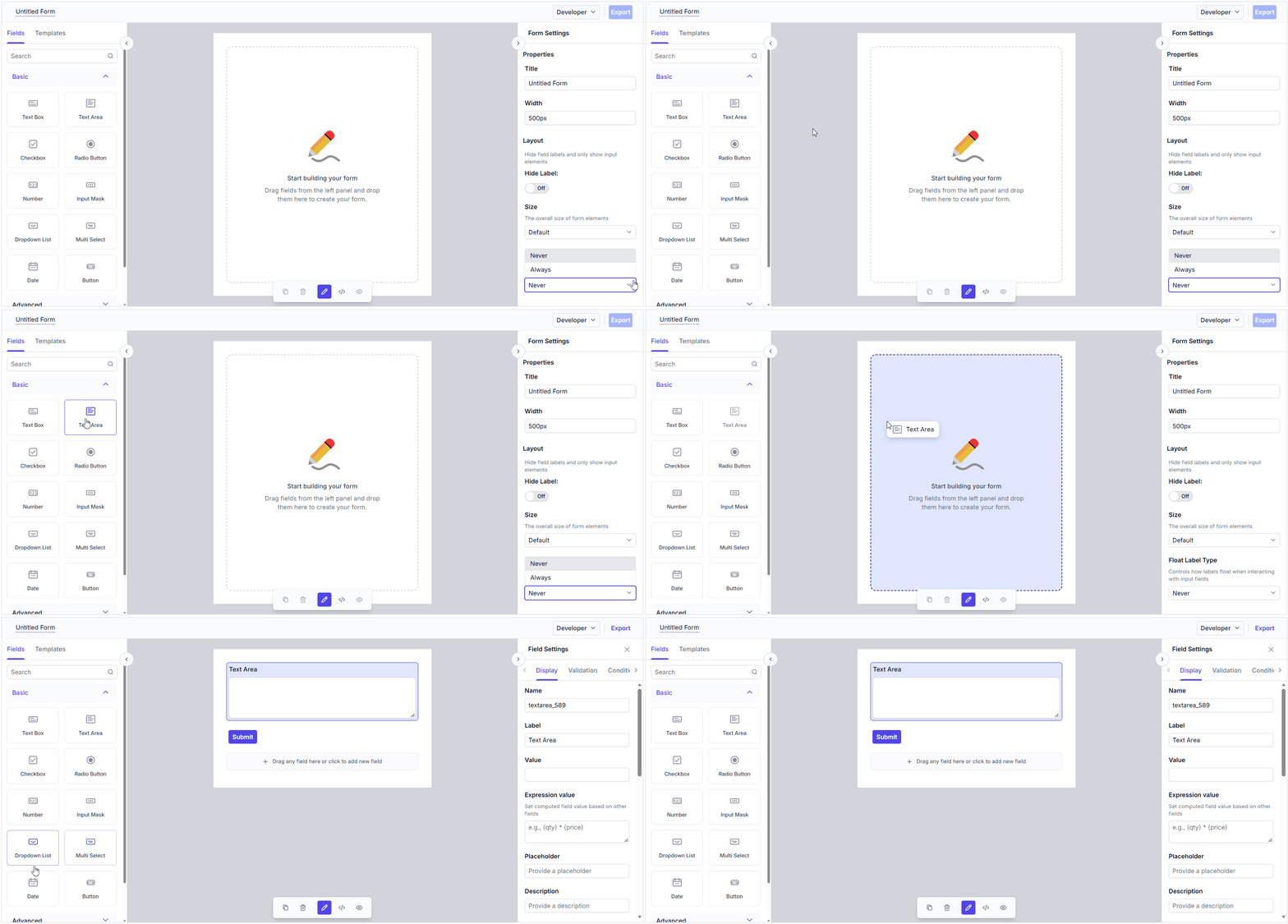
The Form Builder is an intuitive, visual form designer that lets you create and customize forms interactively by dragging and dropping fields — no code required. You can visually design forms, configure field properties, and preview the generated form in real time. The Form Builder also allows you to export the form schema for use with the Form Renderer control.
This section explains the steps required to create the Form Builder control in TypeScript and configure its properties using the Essential® JS 2 quickstart seed repository. This seed repository is pre-configured with the Essential® JS 2 package.
This application is integrated with the
webpack.config.jsconfiguration and uses the latest version of the webpack-cli. It requires Node.jsv14.15.0or higher. For more information about webpack and its features, refer to the webpack documentation.
Prerequisites
Ensure the following tools are installed on your machine:
Set up the development environment
Clone the Syncfusion® Essential JS 2 quickstart application project from GitHub using the following command in the command prompt.
git clone https://github.com/SyncfusionExamples/ej2-quickstart-webpack ej2-quickstart
Navigate to the project folder in the command prompt:
cd ej2-quickstart
Adding Syncfusion® TypeScript Form Builder package
Syncfusion® TypeScript (Essential® JS 2) packages are available on the npmjs.com public registry. You can install all Syncfusion® TypeScript (Essential® JS 2) controls in a single @syncfusion/ej2 package or individual packages for each control.
Use the following command to install the @syncfusion/ej2-form-builder package:
npm install @syncfusion/ej2-form-builder --save
Then, install the remaining dependent npm packages using the following command:
npm install
For more information about individual packages and alternative installation methods, see the installation guide.
Adding Form Builder CSS reference
Themes for Syncfusion® TypeScript components can be applied using CSS files provided through npm theme packages. For more information, refer to the themes documentation.
To install the Material3 theme package, use the following command:
npm install @syncfusion/ej2-material3-theme --saveThen add the following CSS reference to the src/styles/styles.css file:
@import "../../node_modules/@syncfusion/ej2-material3-theme/styles/material3.css";Adding Syncfusion® Form Builder control to the application
Add an HTML <div> element to the ~/src/index.html file to act as the root element of the Form Builder control.
<!DOCTYPE html>
<html lang="en">

<head>
    <title>Essential JS 2</title>
    <meta charset="utf-8" />
    <meta name="viewport" content="width=device-width, initial-scale=1.0, user-scalable=no" />
    <meta name="description" content="Essential JS 2" />
    <meta name="author" content="Syncfusion" />
    <link rel="shortcut icon" href="resources/favicon.ico" />
    <link href="https://maxcdn.bootstrapcdn.com/bootstrap/3.3.7/css/bootstrap.min.css" rel="stylesheet" />
</head>

<body>
    <div>
        <!--Element where the Form Builder will be rendered-->
        <div id="formbuilder"></div>
    </div>
</body>

</html>
To render the Form Builder control, add the following TypeScript code to the ~/src/app/app.ts file.
import { FormBuilder } from '@syncfusion/ej2-form-builder';

// Initialize Form Builder control.
let formBuilder: FormBuilder = new FormBuilder();

// Render the initialized Form Builder.
formBuilder.appendTo('#formbuilder');
Run the application
Now, run the application in the browser using the following command.
npm run start
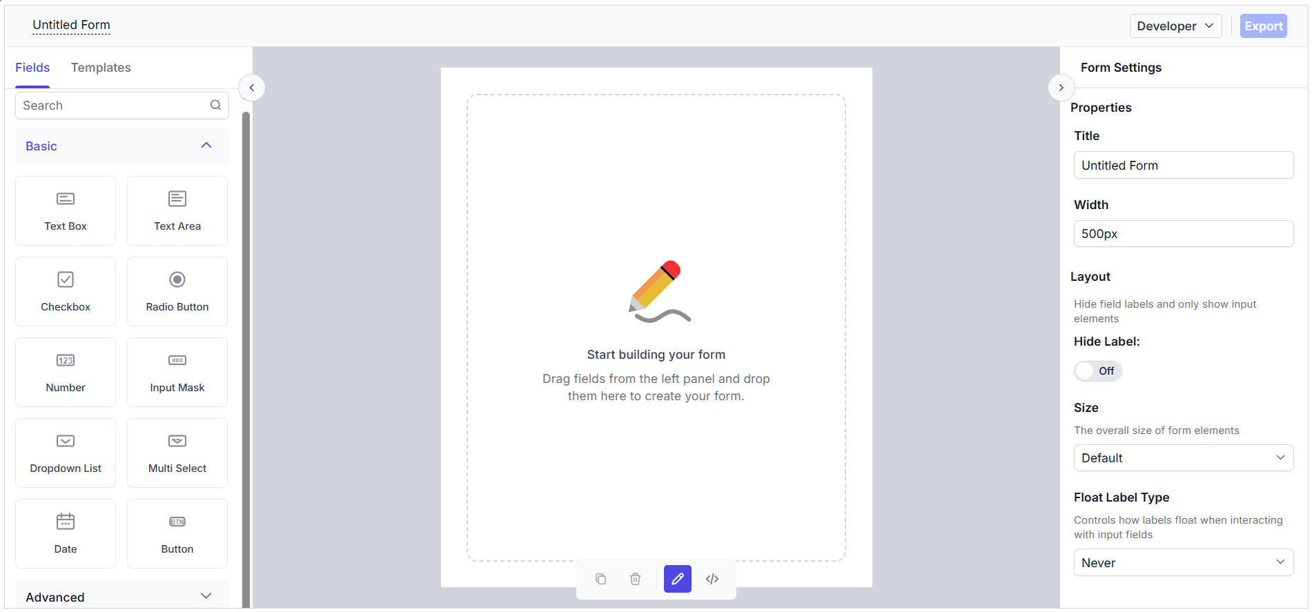
The output will appear as follows:
Registering Syncfusion license
The Syncfusion® Form Builder requires a valid license key to be registered in the application. To prevent license validation warnings, refer to the Syncfusion licensing documentation.
Basic components of the Form Builder
The Form Builder control consists of the following sections:
- Left Pane / Toolbox — Displays all the supported form fields, which can be dragged and dropped.
- Central design canvas — Holds the dropped form fields to construct the form.
- Right Pane — Provides options to customize the form settings as well as the selected form fields.
- Code view — Displays the form schema during the form design process.
- Form Preview — Allows you to preview and interact with the generated form in real time once it is created.
Adding form fields to the design canvas
Form fields can be added to the central design canvas in the following ways:
- Form Components Panel — A toolbox of form fields is available in the left-side pane to drag and drop them onto the design canvas.
- Context Menu in the Design Canvas — After the first form field is dropped, a button at the end of the central canvas can be used to add additional form fields using a context menu that appears when the button is clicked.