Theme in EJ2 TypeScript controls
24 Jun 202624 minutes to read
The Syncfusion® JavaScript library provides the following list of built-in themes:
| Theme | Style Sheet Name |
|---|---|
| Tailwind 3.4 | tailwind3.css |
| Tailwind 3.4 Dark | tailwind3-dark.css |
| Bootstrap 5.3 | bootstrap5.3.css |
| Bootstrap 5.3 Dark | bootstrap5.3-dark.css |
| Fluent 2 | fluent2.css |
| Fluent 2 Dark | fluent2-dark.css |
| Material 3 | material3.css |
| Material 3 Dark | material3-dark.css |
| Fluent | fluent.css |
| Fluent Dark | fluent-dark.css |
| Bootstrap 5 | bootstrap5.css |
| Bootstrap 5 Dark | bootstrap5-dark.css |
| Bootstrap 4 | bootstrap4.css |
| Bootstrap 3 | bootstrap.css |
| Bootstrap 3 Dark | bootstrap-dark.css |
| Google’s Material | material.css |
| Google’s Material-Dark | material-dark.css |
| Tailwind CSS | tailwind.css |
| Tailwind Dark CSS | tailwind-dark.css |
| Microsoft Office Fabric | fabric.css |
| Microsoft Office Fabric Dark | fabric-dark.css |
| High Contrast | highcontrast.css |
The Syncfusion® Bootstrap theme is designed based on
Bootstrap v3, but it is compatible withBootstrap v4applications. In addition to these built-in themes, ThemeStudio also provides support for the Fusion theme, which can only be downloaded from ThemeStudio.
Theme packages
Syncfusion built-in themes are distributed as theme packages available on npm. These packages include CSS/SCSS files for all controls. The following table lists all available theme packages:
| Theme | Light Package | Dark Package |
|---|---|---|
| Tailwind 3 | @syncfusion/ej2-tailwind3-theme |
@syncfusion/ej2-tailwind3-dark-theme |
| Bootstrap 5.3 | @syncfusion/ej2-bootstrap5.3-theme |
@syncfusion/ej2-bootstrap5.3-dark-theme |
| Fluent 2 | @syncfusion/ej2-fluent2-theme |
@syncfusion/ej2-fluent2-dark-theme |
| Material 3 | @syncfusion/ej2-material3-theme |
@syncfusion/ej2-material3-dark-theme |
| Bootstrap 5 | @syncfusion/ej2-bootstrap5-theme |
@syncfusion/ej2-bootstrap5-dark-theme |
| Bootstrap 4 | @syncfusion/ej2-bootstrap4-theme |
- |
| Bootstrap | @syncfusion/ej2-bootstrap-theme |
@syncfusion/ej2-bootstrap-dark-theme |
| Material | @syncfusion/ej2-material-theme |
@syncfusion/ej2-material-dark-theme |
| Tailwind | @syncfusion/ej2-tailwind-theme |
@syncfusion/ej2-tailwind-dark-theme |
| Fluent | @syncfusion/ej2-fluent-theme |
@syncfusion/ej2-fluent-dark-theme |
| Fabric | @syncfusion/ej2-fabric-theme |
@syncfusion/ej2-fabric-dark-theme |
| High Contrast | @syncfusion/ej2-highcontrast-theme |
- |
Optimized CSS files
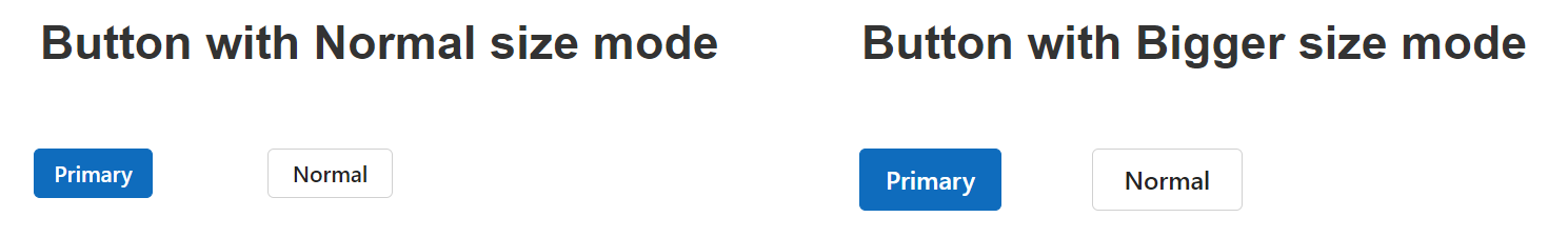
Syncfusion® controls provide two size modes for each theme: normal and bigger. By default, the normal size mode is applied, offering a standard appearance suitable for all devices. The bigger size mode provides an enlarged interface for enhanced interactions, improved visibility, and a better overall user experience by increasing the size of UI controls. This mode is particularly useful for touch-based interactions and accessibility requirements.
The bigger size mode is ideal when an enlarged appearance is needed, while the normal size mode works best for maintaining the default appearance of controls.
Below is a comparison of the Button control in normal and bigger size modes:
Each theme includes both normal and bigger size modes, which increases the overall file size. To optimize performance, Syncfusion® offers additional theme files (e.g., fluent2-lite.css), which only include the normal size mode styles. This results in a significant reduction in file size, improving load times and overall application performance, especially when the bigger size mode is unnecessary.
When to use optimized CSS files:
- Use default theme files when the application requires both normal and bigger size modes for touch-optimized or accessibility-enhanced interfaces.
- Use optimized theme files (with
-litesuffix) when the application only needs standard-sized controls, reducing bundle size and improving performance.
Refer to the comparison below for the default and optimized theme file sizes:
| Theme Name | Default Theme Size | Optimized Theme Size |
|---|---|---|
| Fluent 2 | 3.97 MB | 2.96 MB |
Reference themes in the application
Syncfusion® JavaScript control themes can be used in the application by referencing the style sheet. The following approaches can be used to reference themes in the application:
- NPM Packages - Used to customize existing themes and bundle stylesheets in an application.
- Content Delivery Network (CDN) - Used to reference complete CSS via static web assets.
- Theme Studio - Used to customize and generate themes only for selected components.
NPM packages
All Syncfusion® JavaScript (Essential® JS 2) packages are available on the npmjs.com public registry. Themes are shipped as both combined and individual CSS/SCSS files. Each theme package includes Combined and control-specific styles in both CSS and SCSS formats. For a list of available theme packages, refer to the available theme packages section.
To use the combined SCSS/CSS files, install the required theme package.
npm install @syncfusion/ej2-material3-themeReferring all controls theme
Referring all control CSS theme from theme package
@import "@syncfusion/ej2-<theme-name>-theme/styles/<theme-name>.css";Example:
@import "@syncfusion/ej2-material3-theme/styles/material3.css";Referring all control SCSS theme from theme package
@use "@syncfusion/ej2-<theme-name>-theme/styles/<theme-name>.scss" as *;Example:
@use "@syncfusion/ej2-material3-theme/styles/material3.scss" as *;Referring individual control theme
The individual control theme can be referred from the unified theme package. In this package, each control includes an index.css/index.scss file that automatically loads all the required dependency styles.
Referring individual control CSS theme from an theme package.
@import "@syncfusion/ej2-<theme-name>-theme/styles/<component-name>/index.css";Example:
@import "@syncfusion/ej2-material3-theme/styles/grid/index.css";
### Referring all controls optimized CSS file

To refer to all control's optimized CSS files from the theme package, follow the below syntax:

```css
@import "@syncfusion/ej2-<theme-name>-theme/styles/<theme-name>-lite.css";
/* or */
@use "@syncfusion/ej2-<theme-name>-theme/styles/<theme-name>-lite.scss" as *;
Example:
@import "@syncfusion/ej2-fluent2-theme/styles/fluent2-lite.css";
/* or */
@use "@syncfusion/ej2-fluent2-theme/styles/fluent2-lite.scss" as *;
Referring individual control optimized CSS file
To refer to individual control’s optimized CSS files from an theme package, follow the below syntax:
@import "@syncfusion/ej2-<theme-name>-theme/styles/<component-name>/index-lite.css";
/* or */
@use "@syncfusion/ej2-<theme-name>-theme/styles/<component-name>/index-lite.scss" as *;
Example:
@import "@syncfusion/ej2-fluent2-theme/styles/grid/index-lite.css";
/* or */
@use "@syncfusion/ej2-fluent2-theme/styles/grid/index-lite.scss" as *;
CDN reference
Syncfusion® hosts every Syncfusion® JavaScript control as a separate package on the CDN. This allows scripts and styles to be loaded for each individual package. Syncfusion® also provides a single package that includes all Syncfusion® JavaScript controls, allowing scripts and styles to be loaded for all controls as a single script and style file.
Single CDN theme reference for all controls
Refer to a single CDN link that contains all Syncfusion® JavaScript control styles as follows:
https://cdn.syncfusion.com/ej2/<version>/<theme_name>.css
To reference optimized CSS files, use the following syntax:
https://cdn.syncfusion.com/ej2/<version>/<theme_name>-lite.css
Individual control theme CDN reference
The primary goal of individual CDN control is to optimize the loading time and memory of the website or app in the production stage. Individual control package loading should be done in the order indicated by its dependency graph. The CDN of the dependency packages should be manually included before the intended individual control package CDN.
Dependency style:
https://cdn.syncfusion.com/ej2/32.1.19/{DEPENDENCY_PACKAGE_NAME}/styles/material.cssControl style:
https://cdn.syncfusion.com/ej2/32.1.19/{PACKAGE_NAME}/styles/material.css
Example:
Button’s control style:
https://cdn.syncfusion.com/ej2/32.1.19/ej2-buttons/styles/material.css
Button’s dependency style:
https://cdn.syncfusion.com/ej2/32.1.19/ej2-base/styles/material.css
Change theme dynamically
In the application, Syncfusion® themes can be changed dynamically by changing their style reference as follows.
- Add the theme CDN link and DropDownList element to the HTML file using the following code.
<!DOCTYPE html>
<html lang="en">

<head>
    <meta charset="utf-8" />
    <meta name="viewport" content="width=device-width, initial-scale=1.0" />
    <meta name="author" content="Syncfusion JavaScript Grid control" />
    <!-- Syncfusion JavaScript controls styles -->
    <link id="css-link" href="https://cdn.syncfusion.com/ej2/32.1.19/bootstrap5.css" rel="stylesheet" />
    ---
</head>

<body>
    <div id='container' style="margin: 50px;">
        <div id='dropdown' style="margin:0 auto auto 0; width:300px; padding-bottom: 20px;">
            <!--element which is going to render the DropDownList-->
            <input type="text" tabindex="1" id='themes-dropdown' />
        </div>
        ---
    </div>
</body>

</html>- The following code example demonstrates how to change the theme dynamically in the application using Syncfusion® JavaScript DropDownList control.
import { DropDownList, ChangeEventArgs } from '@syncfusion/ej2-dropdowns';

// define the array of themes data
let themesData: string[] = ['material3', 'material3-dark','bootstrap5', 'bootstrap5-dark', 'fluent', 'fluent-dark', 'material', 'tailwind', 'tailwind-dark', 'fabric', 'fabric-dark'];

// initialize DropDownList component
let dropDownListObject: DropDownList = new DropDownList({
    //set the data to dataSource property
    dataSource: themesData,
    placeholder: "Choose a theme",
    change: (args: ChangeEventArgs) => {
       let themeName = args.value as string;
       document.getElementsByTagName('body')[0].style.display = 'none';
       let styleLink: any = document.getElementById('css-link');
       styleLink.href = 'https://cdn.syncfusion.com/ej2/32.1.19/' + themeName + '.css';
       setTimeout(function () { document.getElementsByTagName('body')[0].style.display = 'block'; }, 250);
    }
});

// render initialized DropDownList
dropDownListObject.appendTo('#themes-dropdown');<!DOCTYPE html>
<html lang="en">
<head>
<title>Grid</title>
<meta charset="utf-8" />
<meta name="viewport" content="width=device-width, initial-scale=1.0" />
<meta name="author" content="Syncfusion JavaScript Grid control" />
<!-- Syncfusion JavaScript controls styles -->
<link id="css-link" href="https://cdn.syncfusion.com/ej2/34.1.29/bootstrap5.css" rel="stylesheet" />
<script src="https://cdnjs.cloudflare.com/ajax/libs/systemjs/0.19.38/system.js"></script>
<script src="systemjs.config.js"></script>
</head>
<body>
<div id='loader'>LOADING....</div>
<div id='container' style="margin: 50px;">
<div id='dropdown' style="margin:0 auto auto 0; width:300px; padding-bottom: 20px;">
<!--element which is going to render the DropDownList-->
<input type="text" tabindex="1" id='themes-dropdown' />
</div>
<!--element which is going to render-->
<div id="Grid"></div>
</div>
</body>
</html>Common variables
The following list of common variables are used in the Syncfusion® JavaScript library themes for all UI controls. You can change these variables to customize the corresponding theme.
Syncfusion® Tailwind 3.4 theme
| Name | Value (Default Theme) | Value (Dark Theme) |
|---|---|---|
| --color-sf-black | rgb(0,0,0) | rgb(0,0,0) |
| --color-sf-white | rgb(255,255,255) | rgb(255,255,255) |
| --color-sf-primary | rgba(79, 70, 229) | rgba(99, 102, 241) |
| --color-sf-primary-text-color | #fff | #fff |
| --color-sf-primary-light | #3730a3 | #3730a3 |
| --color-sf-primary-lighter | #e0e7ff | #1e1b4b |
| --color-sf-primary-dark | #4338ca | #818cf8 |
| --color-sf-primary-darker | #3730a3 | #4f46e5 |
| --color-sf-success | #15803d | #22c55e |
| --color-sf-info | #0e7490 | #38bdf8 |
| --color-sf-warning | #c2410c | #f97316 |
| --color-sf-danger | #dc2626 | #f87171 |
| --color-sf-success-light | #dcfce7 | #164c37 |
| --color-sf-info-light | #cffafe | #0e485b |
| --color-sf-warning-light | #ffedd5 | #573422 |
| --color-sf-danger-light | #fee2e2 | #54252f |
| --color-sf-success-dark | #166534 | #4ade80 |
| --color-sf-info-dark | #155e75 | #38bdf8 |
| --color-sf-warning-dark | #9a3412 | #fb923c |
| --color-sf-danger-dark | #b91c1c | #ef4444 |
Syncfusion® Bootstrap 5.3 theme
| Name | Value (Default Theme) | Value (Dark Theme) |
|---|---|---|
| --color-sf-black | rgb(0,0,0) | rgb(0,0,0) |
| --color-sf-white | rgb(255,255,255) | rgb(255,255,255) |
| --color-sf-primary | rgba(13,110,253,1) | rgba(13,110,253,1) |
| --color-sf-primary-text-color | #fff | #fff |
| --color-sf-primary-light | #86b7fe | #86b7fe |
| --color-sf-primary-lighter | #cfe2ff | #031633 |
| --color-sf-primary-dark | #3367d1 | #073ba6 |
| --color-sf-primary-darker | #052c65 | #6ea8fe |
| --color-sf-success | rgba(25,135,84,1) | rgba(25,135,84,1) |
| --color-sf-info | rgba(13,202,240,1) | rgba(13,202,240,1) |
| --color-sf-warning | rgba(255,193,7,1) | rgba(255,193,7,1) |
| --color-sf-danger | rgba(220,53,69,1) | rgba(220,53,69,1) |
| --color-sf-success-light | #d1e7dd | #75b798 |
| --color-sf-info-light | #cff4fc | #6edff6 |
| --color-sf-warning-light | #fff3cd | #ffda6a |
| --color-sf-danger-light | #f8d7da | #ea868f |
| --color-sf-success-dark | #0a3622 | #75b798 |
| --color-sf-info-dark | #055160 | #6edff6 |
| --color-sf-warning-dark | #664d03 | #ffda6a |
| --color-sf-danger-dark | #58151c | #ea868f |
| --color-sf-success-light-alt | #d1e7dd | #051b11 |
| --color-sf-info-light-alt | #cff4fc | #032830 |
| --color-sf-warning-light-alt | #fff3cd | #332701 |
| --color-sf-danger-light-alt | #f8d7da | #2c0b0e |
Syncfusion® Fluent 2 theme
| Name | Value (Default Theme) | Value (Dark Theme) |
|---|---|---|
| --color-sf-black | #000 | #000 |
| --color-sf-white: | #fff | #fff |
| --color-sf-primary | #0f6cbd | #115ea3 |
| --color-sf-primary-text-color | #fff | #fff |
| --color-sf-primary-light | #b4d6fa | #0e4775 |
| --color-sf-primary-lighter | #ebf3fc | #082338 |
| --color-sf-primary-dark | #0f548c | #62abf5 |
| --color-sf-primary-darker | #0c3b5e | #96c6fa |
| --color-sf-success | #0e700e | #107c10 |
| --color-sf-info | #008aa9 | #0099bc |
| --color-sf-warning | #bc4b09 | #faa06b |
| --color-sf-danger | #d13438 | #dc626d |
| --color-sf-success-light | #54b054 | #094509 |
| --color-sf-info-light | #56bfd7 | #005669 |
| --color-sf-warning-light | #fee5d7 | #4a1e04 |
| --color-sf-danger-light | #eeacb2 | #6e0811 |
| --color-sf-success-dark | #54b054 | #c9eac9 |
| --color-sf-info-dark | #56bfd7 | #cdedf4 |
| --color-sf-warning-dark | #8a3707 | #fee5d7 |
| --color-sf-danger-dark | #6e0811 | #fee5d7 |
| --color-sf-success-light-alt | #f1faf1 | #052505 |
| --color-sf-info-light-alt | #f2fafc | #002e38 |
| --color-sf-warning-light-alt | #fff9f5 | #4a1e04 |
| --color-sf-danger-light-alt | #fdf3f4 | #3b0509 |
| --color-sf-badge-warning | #fde300 | #fde300 |
| --color-sf-badge-warning-text | #847619 | #fde300 |
| --color-sf-primary-label-color | #0f6cbd | #479ef5 |
| --color-sf-primary-cell-selection | #ebf3fc | #ebf3fc |
Syncfusion® Material 3 theme
| Name | Value (Default Theme) | Value (Dark Theme) |
|---|---|---|
| --color-sf-black | rgb(0,0,0) | rgb(0,0,0) |
| --color-sf-white | rgb(255,255,255) | rgb(255,255,255) |
| --color-sf-primary | rgb(103, 80, 164) | rgb(208, 188, 255) |
| --color-sf-primary-container | rgb(234, 221, 255) | rgb(79, 55, 139) |
| --color-sf-on-primary | rgb(255, 255, 255) | rgb(55, 30, 115) |
| --color-sf-on-primary-container | rgb(33, 0, 94) | rgb(234, 221, 255) |
| --color-sf-surface | rgb(255, 255, 255) | rgb(28, 27, 31) |
| --color-sf-surface-variant | rgb(231, 224, 236) | rgb(73, 69, 79) |
| --color-sf-on-surface | rgb(28, 27, 31) | rgb(230, 225, 229) |
| --color-sf-on-surface-variant | rgb(73, 69, 78) | rgb(202, 196, 208) |
| --color-sf-secondary | rgb(98, 91, 113) | rgb(204, 194, 220) |
| --color-sf-secondary-container | rgb(232, 222, 248) | rgb(74, 68, 88) |
| --color-sf-on-secondary | rgb(255, 255, 255) | rgb(51, 45, 65) |
| --color-sf-on-secondary-container | rgb(30, 25, 43) | rgb(232, 222, 248) |
| --color-sf-tertiary | rgb(125, 82, 96) | rgb(239, 184, 200) |
| --color-sf-tertiary-container | rgb(255, 216, 228) | rgb(99, 59, 72) |
| --color-sf-on-tertiary | rgb(255, 255, 255) | rgb(73, 37, 50) |
| --color-sf-on-tertiary-container | rgb(55, 11, 30) | rgb(255, 216, 228) |
| --color-sf-background | rgb(255, 255, 255) | rgb(28, 27, 31) |
| --color-sf-on-background | rgb(28, 27, 31) | rgb(230, 225, 229) |
| --color-sf-outline | rgb(121, 116, 126) | rgb(147, 143, 153) |
| --color-sf-outline-variant | rgb(196, 199, 197) | rgb(68, 71, 70) |
| --color-sf-shadow | rgb(0, 0, 0) | rgb(0, 0, 0) |
| --color-sf-surface-tint-color | rgb(103, 80, 164) | rgb(208, 188, 255) |
| --color-sf-inverse-surface | rgb(49, 48, 51) | rgb(230, 225, 229) |
| --color-sf-inverse-on-surface | rgb(244, 239, 244) | rgb(49, 48, 51) |
| --color-sf-inverse-primary | rgb(208, 188, 255) | rgb(103, 80, 164) |
| --color-sf-scrim | rgb(0, 0, 0) | rgb(0, 0, 0) |
| --color-sf-error | rgb(179, 38, 30) | rgb(242, 184, 181) |
| --color-sf-error-container | rgb(249, 222, 220) | rgb(140, 29, 24) |
| --color-sf-on-error | rgb(255, 250, 250) | rgb(96, 20, 16) |
| --color-sf-on-error-container | rgb(65, 14, 11) | rgb(249, 222, 220) |
| --color-sf-success | rgb(32, 81, 7) | rgb(83, 202, 23) |
| --color-sf-success-container | rgb(209, 255, 186) | rgb(22, 62, 2) |
| --color-sf-on-success | rgb(244, 255, 239) | rgb(13, 39, 0) |
| --color-sf-on-success-container | rgb(13, 39, 0) | rgb(183, 250, 150) |
| --color-sf-info | rgb(1, 87, 155) | rgb(71, 172, 251) |
| --color-sf-info-container | rgb(233, 245, 255) | rgb(0, 67, 120) |
| --color-sf-on-info | rgb(250, 253, 255) | rgb(0, 51, 91) |
| --color-sf-on-info-container | rgb(0, 51, 91) | rgb(173, 219, 255) |
| --color-sf-warning | rgb(145, 76, 0) | rgb(245, 180, 130) |
| --color-sf-warning-container | rgb(254, 236, 222) | rgb(123, 65, 0) |
| --color-sf-on-warning | rgb(255, 255, 255) | rgb(99, 52, 0) |
| --color-sf-on-warning-container | rgb(47, 21, 0) | rgb(255, 220, 193) |
Syncfusion® Bootstrap 5 theme
| Name | Value (Default Theme) | Value (Dark Theme) |
|---|---|---|
| $black | #000 | #000 |
| $white | #fff | #fff |
| $gray-100 | #f8f9fa | #f8f9fa |
| $gray-200 | #e9ecef | #e9ecef |
| $gray-300 | #dee2e6 | #dee2e6 |
| $gray-400 | #ced4da | #ced4da |
| $gray-500 | #adb5bd | #adb5bd |
| $gray-600 | #6c757d | #6c757d |
| $gray-700 | #495057 | #495057 |
| $gray-800 | #343a40 | #343a40 |
| $gray-900 | #212529 | #212529 |
| $blue | #0d6efd | #0d6efd |
| $indigo | #6610f2 | #6610f2 |
| $purple | #6f42c1 | #6f42c1 |
| $pink | #d63384 | #d63384 |
| $red | #dc3545 | #dc3545 |
| $orange | #fd7e14 | #fd7e14 |
| $yellow | #ffc107 | #ffc107 |
| $green | #198754 | #198754 |
| $teal | #20c997 | #20c997 |
| $cyan | #0dcaf0 | #0dcaf0 |
Syncfusion® Fluent theme
| Name | Value (Default Theme) | Value (Dark Theme) |
|---|---|---|
| $black | #000 | #000 |
| $white | #fff | #fff |
| $gray220 | #11100f | #11100f |
| $gray210 | #161514 | #161514 |
| $gray200 | #1b1a19 | #1b1a19 |
| $gray190 | #201f1e | #201f1e |
| $gray180 | #252423 | #252423 |
| $gray170 | #292827 | #292827 |
| $gray160 | #323130 | #323130 |
| $gray150 | #3b3a39 | #3b3a39 |
| $gray140 | #484644 | #484644 |
| $gray130 | #605e5c | #605e5c |
| $gray120 | #797775 | #797775 |
| $gray110 | #8a8886 | #8a8886 |
| $gray100 | #979593 | #979593 |
| $gray90 | #a19f9d | #a19f9d |
| $gray80 | #b3b0ad | #b3b0ad |
| $gray70 | #bebbb8 | #bebbb8 |
| $gray60 | #c8c6c4 | #c8c6c4 |
| $gray50 | #d2d0ce | #d2d0ce |
| $gray40 | #e1dfdd | #e1dfdd |
| $gray30 | #edebe9 | #edebe9 |
| $gray20 | #f3f2f1 | #f3f2f1 |
| $gray10 | #faf9f8 | #faf9f8 |
| $cyanblue10 | #0078d4 | #0078d4 |
| $red10 | #d13438 | #d13438 |
| $orange20 | #ca5010 | #ca5010 |
| $green20 | #0b6a0b | #0b6a0b |
| $cyan20 | #038387 | #038387 |
Syncfusion® Bootstrap 4 theme
| Name | Value |
|---|---|
| $white | #fff |
| $gray-100 | #f8f9fa |
| $gray-200 | #e9ecef |
| $gray-300 | #dee2e6 |
| $gray-400 | #ced4da |
| $gray-500 | #adb5bd |
| $gray-600 | #6c757d |
| $gray-700 | #495057 |
| $gray-800 | #343a40 |
| $gray-900 | #212529 |
| $black | #000 |
| $blue | #007bff |
| $indigo | #6610f2 |
| $purple | #6f42c1 |
| $pink | #e83e8c |
| $red | #dc3545 |
| $orange | #fd7e14 |
| $yellow | #ffc107 |
| $green | #28a745 |
| $teal | #20c997 |
| $cyan | #17a2b8 |
Syncfusion® Bootstrap theme
| Name | Value (Default Theme) | Value (Dark Theme) |
|---|---|---|
| $brand-primary | #317ab9 | #0070f0 |
| $brand-primary-darken-10 | #3071a9 | darken($brand-primary, 10%) |
| $brand-primary-darken-15 | #2a6496 | darken($brand-primary, 20%) |
| $brand-primary-darken-25 | #1f496e | darken($brand-primary, 30%) |
| $brand-primary-darken-35 | #142f46 | darken($brand-primary, 40%) |
| $brand-primary-font | #fff | #fff |
| $gray-base | #000 | #1a1a1a |
| $gray-darker | #222 | #131313 |
| $gray-dark | #333 | #2a2a2a |
| $gray | #555 | #313131 |
| $gray-light | #777 | #393939 |
| $grey-44 | #444 | #414141 |
| $grey-88 | #888 | #484848 |
| $grey-99 | #999 | #505050 |
| $grey-8c | #8c8c8c | #585858 |
| $grey-ad | #adadad | #676767 |
| $grey-dark-font | #fff | #f0f0f0 |
| $grey-white | #fff | #6e6e6e |
| $grey-lighter | #eee | #767676 |
| $grey-f9 | #f9f9f9 | #7e7e7e |
| $grey-f8 | #f8f8f8 | #858585 |
| $grey-f5 | #f5f5f5 | #8d8d8d |
| $grey-e6 | #e6e6e6 | #959595 |
| $grey-dd | #ddd | #9c9c9c |
| $grey-d4 | #d4d4d4 | #a4a4a4 |
| $grey-cc | #ccc | #acacac |
| $grey-light-font | #333 | #fff |
| $brand-success | #5cb85c | #48b14c |
| $brand-success-dark | #3c763d | #358238 |
| $brand-info | #5bc0de | #2aaac0 |
| $brand-info-dark | #31708f | #208090 |
| $brand-warning | #f0ad4e | #fac168 |
| $brand-warning-dark | #8a6d3b | #f9ad37 |
| $brand-danger | #d9534f | #d44f4f |
| $brand-danger-dark | #a94442 | #c12f2f |
| $brand-success-light | #dff0d8 | #dff0d8 |
| $brand-info-light | #d9edf7 | #d9edf7 |
| $brand-warning-light | #fcf8e3 | #fcf8e3 |
| $brand-danger-light | #f2dede | #f2dede |
| $input-border-focus | #66afe9 | #104888 |
| $brand-success-font | #3c763d | #2f7432 |
| $brand-info-font | #31708f | #1a6c7a |
| $brand-warning-font | #8a6d3b | #9d6106 |
| $brand-danger-font | #a94442 | #ac2a2a |
| $base-font | #000 | #000 |
| $brand-primary-lighten-10 | lighten($brand-primary, 10%) | |
| $brand-primary-lighten-15 | lighten($brand-primary, 15%) | |
| $brand-primary-lighten-20 | lighten($brand-primary, 20%) | |
| $brand-primary-lighten-30 | lighten($brand-primary, 30%) | |
| $brand-primary-lighten-40 | lighten($brand-primary, 40%) |
Syncfusion® Material theme
| Name | Value (Default Theme) | Value (Dark Theme) |
|---|---|---|
| $accent | #e3165b | #ff80ab |
| $accent-font | #fff | #000 |
| $primary | #3f51b5 | #3f51b5 |
| $primary-50 | #e8eaf6 | #e8eaf6 |
| $primary-100 | #c5cae9 | #c5cae9 |
| $primary-200 | #9fa8da | #9fa8da |
| $primary-300 | #7986cb | #7986cb |
| $primary-font | #fff | #fff |
| $primary-50-font | #000 | #000 |
| $primary-100-font | #000 | #000 |
| $primary-200-font | #000 | #000 |
| $primary-300-font | #fff | #fff |
| $grey-white | #fff | #fff |
| $grey-black | #000 | #000 |
| $grey-50 | #fafafa | #fafafa |
| $grey-100 | #f5f5f5 | #f5f5f5 |
| $grey-200 | #eee | #eee |
| $grey-300 | #e0e0e0 | #e0e0e0 |
| $grey-400 | #bdbdbd | #bdbdbd |
| $grey-500 | #9e9e9e | #9e9e9e |
| $grey-600 | #757575 | #757575 |
| $grey-700 | #616161 | #616161 |
| $grey-800 | #424242 | #424242 |
| $grey-900 | #212121 | #212121 |
| $grey-dark | #303030 | #303030 |
| $grey-light-font | #000 | #000 |
| $grey-dark-font | #fff | #fff |
| $base-font | #000 | #000 |
| $error-font | #f44336 | #ff6652 |
| $success-bg | #4caf50 | |
| $error-bg | #ff6652 | |
| $warning-bg | #ff9800 | |
| $info-bg | #03a9f4 | |
| $message-font | #fff | |
| $success-font | #4caf50 | |
| $warning-font | #ff9800 | |
| $info-font | #03a9f4 |
Syncfusion® Microsoft Office Fabric theme
| Name | Value (Default Theme) | Value (Dark Theme) |
|---|---|---|
| $theme-primary | #0078d6 | #0074cc |
| $theme-dark-alt | darken($theme-primary, 3%) | darken($theme-primary, 3%) |
| $theme-dark | darken($theme-primary, 10%) | darken($theme-primary, 6%) |
| $theme-darker | darken($theme-primary, 18%) | darken($theme-primary, 10%) |
| $theme-secondary | lighten($theme-primary, 3%) | lighten($theme-primary, 3%) |
| $theme-tertiary | lighten($theme-primary, 21%) | lighten($theme-primary, 21%) |
| $theme-light | lighten($theme-primary, 44%) | lighten($theme-primary, 44%) |
| $theme-lighter | lighten($theme-primary, 49%) | lighten($theme-primary, 49%) |
| $theme-lighter-alt | lighten($theme-primary, 55%) | lighten($theme-primary, 55%) |
| $neutral-white | #fff | #201f1f |
| $neutral-lighter-alt | #f8f8f8 | #282727 |
| $neutral-lighter | #f4f4f4 | #333232 |
| $neutral-light | #eaeaea | #414040 |
| $neutral-quintenaryalt | #dadada | #4a4848 |
| $neutral-quintenary | #d0d0d0 | #514f4f |
| $neutral-tertiary-alt | #c8c8c8 | #6f6c6c |
| $neutral-tertiary | #a6a6a6 | #9a9a9a |
| $neutral-secondary-alt | #767676 | #c8c8c8 |
| $neutral-secondary | #666 | #dadada |
| $neutral-primary | #333 | #fff |
| $neutral-dark | #212121 | #f4f4f4 |
| $neutral-black | #000 | #f8f8f8 |
| $alert-bg | #deecf9 | #bf7500 |
| $error-bg | #fde7e9 | #cd2a19 |
| $success-bg | #dff6dd | #37844d |
| $theme-dark-font | #fff | #fff |
| $theme-primary-font | #fff | #fff |
| $theme-light-font | #333 | #000 |
| $neutral-light-font | #333 | #dadada |
| $neutral-light-fontalt | #000 | #fff |
| $grey-dark-font | #fff | #000 |
| $base-font | #333 | #dadada |
| $message-font | #333 | #fff |
| $alert-font | #d83b01 | #ff9d48 |
| $error-font | #a80000 | #ff5f5f |
| $success-font | #107c10 | #8eff8d |
| $info-bg | #1e79cb | |
| $info-font | #62cfff |
Syncfusion® High Contrast theme
| Name | Value |
|---|---|
| $selection-bg | #ffd939 |
| $selection-font | #000 |
| $selection-border | #ffd939 |
| $hover-bg | #685708 |
| $hover-font | #fff |
| $hover-border | #fff |
| $border-default | #969696 |
| $border-alt | #757575 |
| $border-fg | #fff |
| $border-fg-alt | #ffd939 |
| $bg-base-0 | #000 |
| $bg-base-5 | #0d0d0d |
| $bg-base-10 | #1a1a1a |
| $bg-base-15 | #262626 |
| $bg-base-20 | #333 |
| $bg-base-75 | #bfbfbf |
| $bg-base-100 | #fff |
| $header-font | #ffd939 |
| $header-font-alt | #fff |
| $content-font | #fff |
| $content-font-alt | #969696 |
| $link | #8a8aff |
| $invert-font | #000 |
| $success-bg | #166600 |
| $error-bg | #b30900 |
| $message-font | #fff |
| $alert-bg | #944000 |
| $info-bg | #0056b3 |
| $success-alt | #2bc700 |
| $error-alt | #ff6161 |
| $alert-alt | #ff7d1a |
| $info-alt | #66b0ff |
| $disable | #757575 |
Syncfusion® Tailwind CSS theme
| Name | Value (Default Theme) | Value (Dark Theme) |
|---|---|---|
| $black | #000 | #000 |
| $white | #fff | #fff |
| $transparent | transparent | transparent |
| $cool-gray-50 | #f9fafb | #f9fafb |
| $cool-gray-100 | #f3f4f6 | #f3f4f6 |
| $cool-gray-200 | #e5e7eb | #e5e7eb |
| $cool-gray-300 | #d1d5db | #d1d5db |
| $cool-gray-400 | #9ca3af | #9ca3af |
| $cool-gray-500 | #6b7280 | #6b7280 |
| $cool-gray-600 | #4b5563 | #4b5563 |
| $cool-gray-700 | #374151 | #374151 |
| $cool-gray-800 | #1f2937 | #1f2937 |
| $cool-gray-900 | #111827 | #111827 |
| $red-100 | #fee2e2 | #fee2e2 |
| $red-400 | #f87171 | #f87171 |
| $red-500 | #ef4444 | #ef4444 |
| $red-600 | #dc2626 | #dc2626 |
| $red-800 | #991b1b | #991b1b |
| $green-100 | #dcfce7 | #dcfce7 |
| $green-500 | #22c55e | #22c55e |
| $green-600 | #16a34a | #16a34a |
| $green-700 | #15803d | #15803d |
| $orange-100 | #ffedd5 | #ffedd5 |
| $orange-500 | #f97316 | #f97316 |
| $orange-600 | #ea580c | #ea580c |
| $orange-700 | #c2410c | #c2410c |
| $orange-800 | #9a3412 | #9a3412 |
| $cyan-300 | #67e8f9 | #67e8f9 |
| $cyan-400 | #22d3ee | #22d3ee |
| $cyan-500 | #06b6d4 | #06b6d4 |
| $cyan-600 | #0891b2 | #0891b2 |
| $cyan-800 | #155e75 | #155e75 |
| $indigo-50 | #eef2ff | |
| $indigo-100 | #e0e7ff | |
| $indigo-200 | #c7d2fe | |
| $indigo-300 | #a5b4fc | |
| $indigo-400 | #818cf8 | |
| $indigo-500 | #6366f1 | |
| $indigo-600 | #4f46e5 | |
| $indigo-700 | #4338ca | |
| $indigo-800 | #3730a3 | |
| $indigo-900 | #312e81 | |
| $green-400 | #4ade80 | |
| $light-blue-50 | #f0f9ff | |
| $light-blue-100 | #e0f2fe | |
| $light-blue-400 | #38bdf8 | |
| $light-blue-500 | #0ea5e9 | |
| $light-blue-600 | #0284c7 | |
| $light-blue-700 | #0369a1 | |
| $light-blue-800 | #075985 |