Figma UI Kits for Syncfusion® EJ2 TypeScript Controls
6 Feb 20265 minutes to read
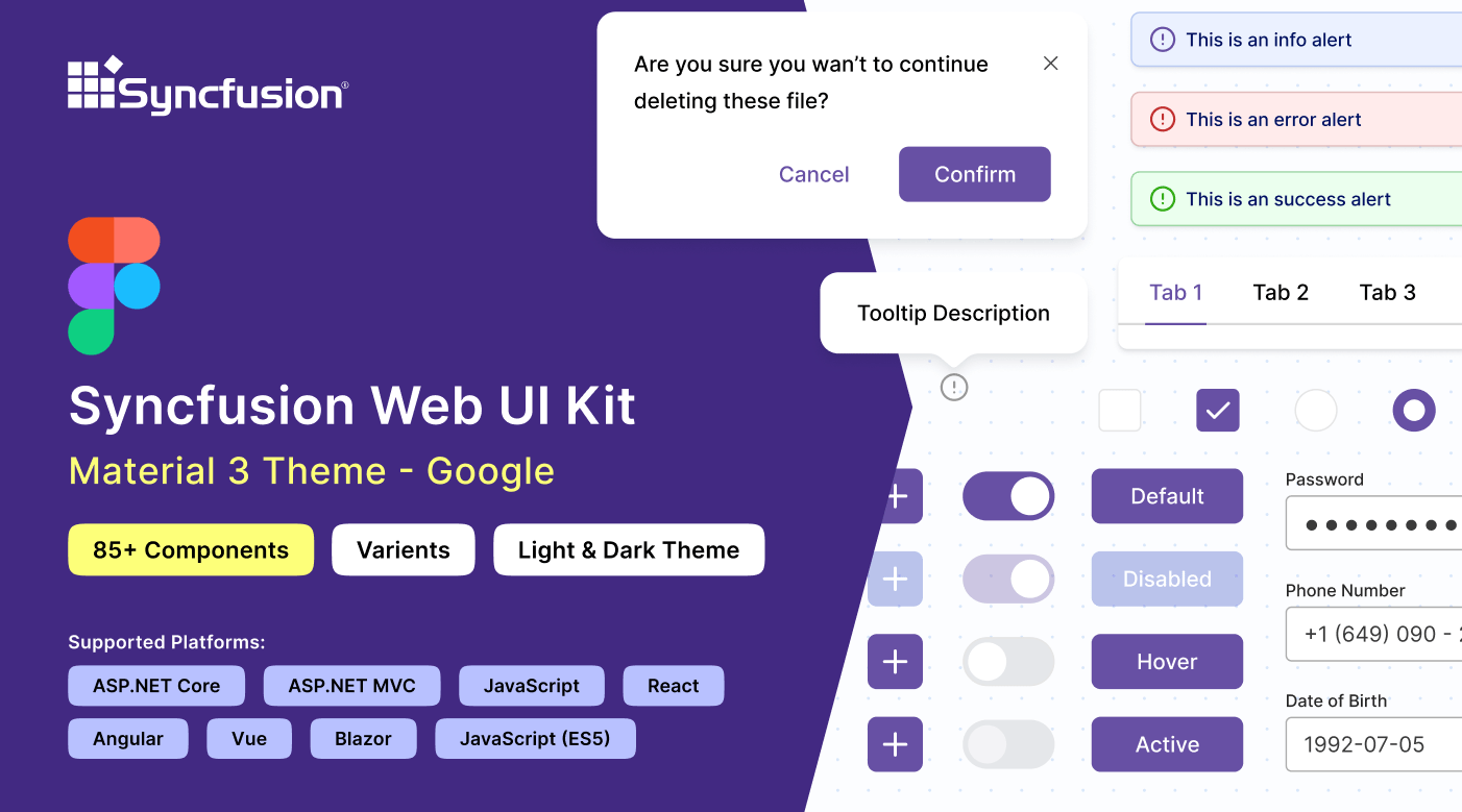
Syncfusion® offers Figma UI kits to facilitate effective collaboration between designers and developers. The Figma UI kits are available in four themes: Material 3, Fluent, Tailwind, and Bootstrap 5. These kits match the themes used in Syncfusion® EJ2 TypeScript controls.
The kits contain reusable design controls with various possible states and variants, along with detailed figures, measurements, and icons, representing the Syncfusion® EJ2 TypeScript controls.
Advantages of UI kits
The Syncfusion® Figma UI kit offers the following key advantages:
- The UI kit includes detailed information about Syncfusion® EJ2 TypeScript controls, such as available control lists, their states, and variants. This facilitates a quick understanding of Syncfusion® EJ2 TypeScript controls.
- Design controls are developed using the atomic design methodology, making customization straightforward and efficient.
- Developers can seamlessly match Syncfusion® EJ2 TypeScript controls with your design requirements, ensuring alignment and accuracy.
- By using standardized controls and themes, the UI kit ensures consistency in your designs, maintaining a uniform look and feel across projects.
Downloading the UI kits
Syncfusion® Figma UI kits are available in the Figma community. You can download the Syncfusion® theme-specific Figma UI kits from the following links:
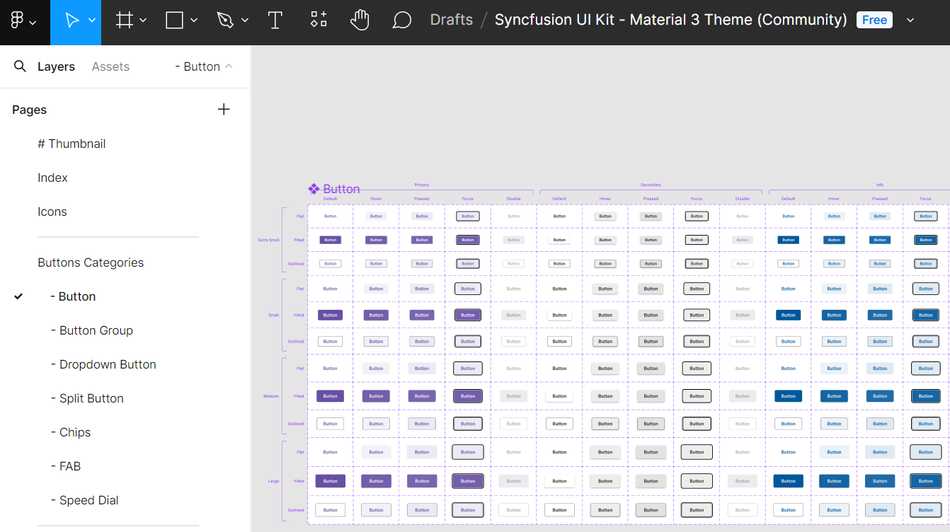
Structure of the UI kits
Syncfusion’s® Figma UI kit is structured to offer a comprehensive and user-friendly layout, facilitating easy navigation and exploration of various controls. It includes the following pages:
- Thumbnail: This page serves as the cover page for the UI kit.
- Index: Here, users can find a detailed list of all control names, making it simple to identify and locate specific controls within the UI kit.
- Icons: Contains a collection of all icons used in the design controls.
- UI Controls: At the core of the UI kit, this section features a wide range of Essential® UI controls. Each control is meticulously designed with detailed figures, measurements, and icons, showcasing various states and variants.
Customizing the UI kits
The Syncfusion® Figma UI kits are easily customizable to meet your specific needs, allowing you to create unique designs and adjust colors to match your brand guidelines. The atomic design methodology used in developing these controls, your customizations will be seamlessly reflected across multiple controls and their variants.
Here’s how to customize the primary button color of the Material 3 theme within your layout:
- Visit our UI kits and choose your preferred theme, such as the Material 3 theme.
- Open the selected theme in the Figma web application by clicking the Open in Figma button.
- For the desktop application, click the Import button in the top-right corner of the page. Select the downloaded Syncfusion® fig file you want to import and click the Open button.
- Identify the button you wish to customize within your layout.
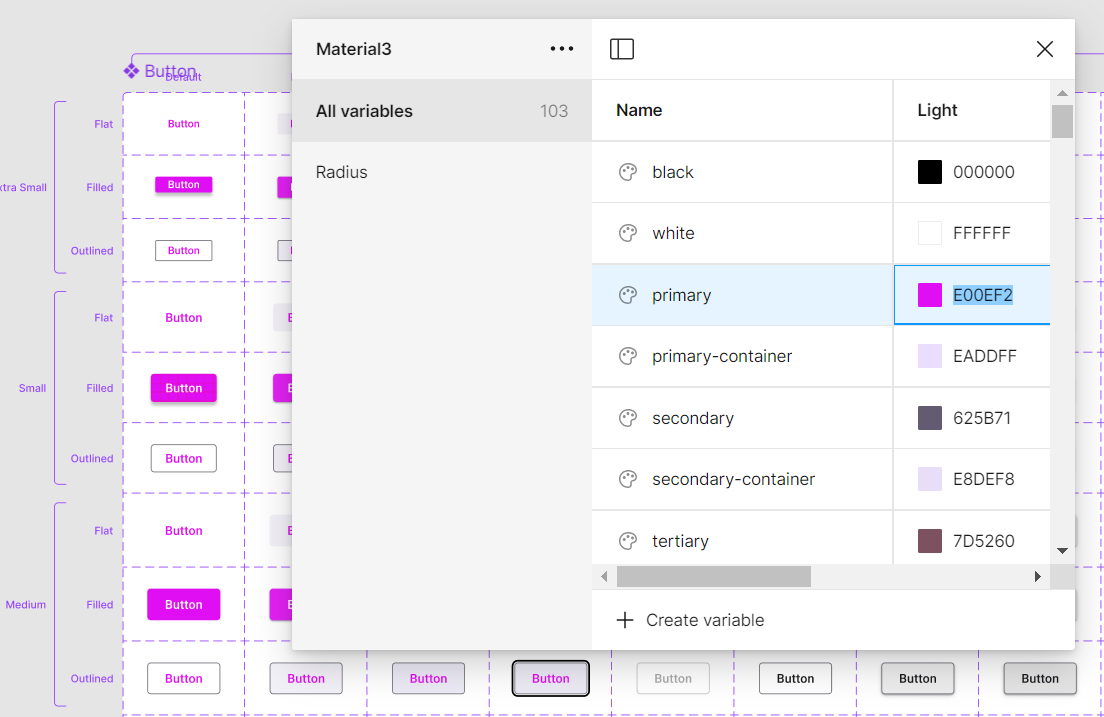
- On the right side of the Figma interface, find the color variable options listed. For example, the variable for a particular button color might be labeled as
$primary-bg-color, derived from the primary color variable. - To customize this primary button control color, click outside the button to see the Local variables option on the right side of the Figma interface. It contains the design token for the color variables. Click the Local variables option.
- A popup will show the design token list. You can change the primary color using a color palette.
- Once you’ve selected the new color (e.g., pink) for the primary variable, the button’s color pattern will be updated accordingly. You’ll see the changes reflected in real-time within your design.
In addition to changing the button color, you can also customize other aspects like font, spacing, shadows, etc., of the UI controls:
Feel free to experiment with these customization options to create a design that perfectly matches your requirements.
Downloading the customized styles
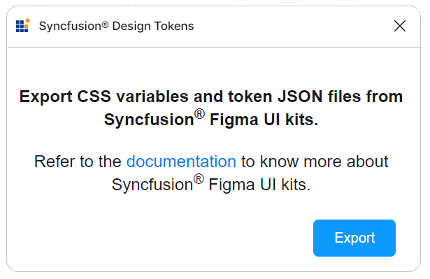
Effortlessly download customized style changes as tokens and CSS variables using the Syncfusion Design Tokens plugin. This plugin bridges the gap between design and development by converting Figma design variables into Syncfusion® tokens for direct use in your applications to ensure a smooth transition from design to implementation.
Exporting design tokens
Follow these steps to download the customized styles from the Figma UI Kit:
- First, open a Syncfusion® Figma UI Kit.
- Navigate to the
Plugins & widgetssection in Figma and search for theSyncfusion Design Tokens. - Once found, run the plugin. A popup will appear with an
Exportbutton. - Click the
Exportbutton. This action will generate a zip file containing your design tokens. - Select a directory to save the exported files.
- Extract the downloaded zip file to access its contents.
Utilizing design tokens
The exported zip file includes the following files:
-
css-variables.css: The css-variables.css file contains CSS variables for both light and dark themes, directly derived from your Figma designs. You can easily import this file into your application alongside the component styles to reflect your custom designs. For more detailed usage instructions, consult the CSS variables documentation. -
<theme-name>-tokens.json: This file (e.g., material3-tokens.json) contains style variables and values in a JSON format compatible with Theme Studio. This file, prefixed with the corresponding theme name, can be imported into Theme Studio for further customization. After processing in Theme Studio, you can download the updated styles file and integrate it into your application, bringing your custom themes to life.
This streamlined process ensures that your unique design vision, crafted in Figma, is accurately translated into your final application, maintaining consistency between design and implementation.
Upgrading the UI kits
To upgrade your UI kits, download the latest version from the provided links. Follow these guidelines for a seamless upgrade process:
- Keep track of updates or new versions of UI kits from Syncfusion®.
- Before upgrading, back up your ongoing projects to prevent data loss or compatibility issues.
- Share your experience with Syncfusion® regarding the upgraded UI kits, including any issues encountered or suggestions for improvement.