About CSS Variables in themes
6 Feb 202624 minutes to read
CSS variables, also known as custom properties, are entities defined by CSS authors that contain specific values to be reused throughout a document. CSS variables are identified by names that begin with two hyphens (–) followed by a unique identifier. These variables can be assigned any valid CSS value, such as colors, lengths, or fonts. To retrieve the value of a CSS variable, use the var() function.
Syncfusion® currently offers two modern and highly customizable themes using CSS variables. These themes are designed to provide a consistent and visually appealing look and feel across all Syncfusion® components. The themes available are:
- Material 3 Theme
- Fluent 2 Theme
- Bootstrap 5.3 Theme
- Tailwind 3.4 Theme
CSS themes - Syncfusion® EJ2 TypeScript Controls
The following themes are available with both light and dark variants:
These themes use CSS variables for easy color customization and seamless light/dark mode switching.
Kindly note that in the Material 3 theme, CSS variables with rgb() values are used for color variables. The use of hex values in this context may lead to improper functionality. For example, in previous versions of the Material theme or other themes, the primary color variable was defined as follows: $primary: #6200ee;. However, in the Material 3 theme, the primary color variable is defined as follows: –color-sf-primary: 98, 0, 238;.
Utilization of CSS variables in modern themes
Modern themes make it easy to change the colors of controls using CSS variables. Each theme has its own way of setting these variables, so it’s important to follow the specific instructions for each theme. Doing this helps keep the styling consistent and efficient across different parts of your application.
Below are examples of how CSS variables can be defined for these themes:
/* rgb() values of material3 theme */
:root {
--color-sf-black: 0, 0, 0;
--color-sf-white: 255, 255, 255;
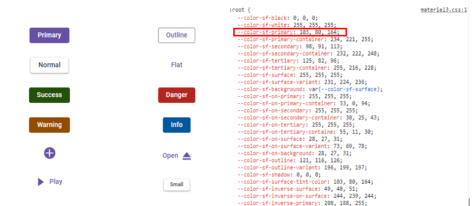
--color-sf-primary: 103, 80, 164;
--color-sf-primary-container: 234, 221, 255;
--color-sf-secondary: 98, 91, 113;
--color-sf-secondary-container: 232, 222, 248;
--color-sf-tertiary: 125, 82, 96;
--color-sf-tertiary-container: 255, 216, 228;
--color-sf-surface: 255, 255, 255;
--color-sf-surface-variant: 231, 224, 236;
--color-sf-background: var(--color-sf-surface);
--color-sf-on-primary: 255, 255, 255;
--color-sf-on-primary-container: 33, 0, 94;
--color-sf-on-secondary: 255, 255, 255;
--color-sf-on-secondary-container: 30, 25, 43;
--color-sf-on-tertiary: 255, 255, 255;
}/* Hex values of fluent2 theme */
:root {
--color-sf-black: #000;
--color-sf-white: #fff;
--color-sf-primary: #0f6cbd;
--color-sf-primary-text-color: #fff;
--color-sf-primary-light: #b4d6fa;
--color-sf-primary-lighter: #ebf3fc;
--color-sf-primary-dark: #0f548c;
--color-sf-primary-darker: #0c3b5e;
--color-sf-success: #0e700e;
--color-sf-info: #008aa9;
--color-sf-warning: #bc4b09;
--color-sf-danger: #d13438;
--color-sf-success-light: #54b054;
--color-sf-info-light: #56bfd7;
--color-sf-warning-light: #fee5d7;
--color-sf-danger-light: #eeacb2;
--color-sf-success-dark: #54b054;
--color-sf-info-dark: #56bfd7;
--color-sf-warning-dark: #8a3707;
--color-sf-danger-dark: #6e0811;
}:root {
--color-sf-black: 0, 0, 0;
--color-sf-white: 255, 255, 255;
--color-sf-content-bg-color: #fff;
--color-sf-content-bg-color-alt1: #f8f9fa;
--color-sf-content-bg-color-alt2: #e9ecef;
--color-sf-content-bg-color-alt3: #dee2e6;
--color-sf-content-bg-color-alt4: #ced4da;
--color-sf-content-bg-color-alt5: #adb5bd;
--color-sf-content-bg-color-hover: #f8f9fa;
--color-sf-content-bg-color-pressed: #e9ecef;
--color-sf-content-bg-color-focus: #e9ecef;
--color-sf-content-bg-color-selected: #0d6efd;
--color-sf-content-bg-color-dragged: #ced4da;
--color-sf-content-bg-color-disabled: #e9ecef;
--color-sf-flyout-bg-color: #fff;
--color-sf-flyout-bg-color-hover: #f8f9fa;
--color-sf-flyout-bg-color-pressed: #0d6efd;
--color-sf-flyout-bg-color-focus: #f8f9fa;
--color-sf-overlay-bg-color: 0, 0, 0;
--color-sf-table-bg-color-hover: rgba(0, 0, 0, .07);
}:root{
--color-sf-content-bg-color: rgba(255, 255, 255);
--color-sf-content-bg-color-alt1: #f9fafb;
--color-sf-content-bg-color-alt2: #f3f4f6;
--color-sf-content-bg-color-alt3: #e5e7eb;
--color-sf-content-bg-color-alt4: #9ca3af;
--color-sf-content-bg-color-alt5: #6b7280;
--color-sf-content-bg-color-hover: #f9fafb;
--color-sf-content-bg-color-pressed: #f3f4f6;
--color-sf-content-bg-color-focus: #f9fafb;
--color-sf-content-bg-color-selected: #e5e7eb;
--color-sf-content-bg-color-dragged: #f3f4f6;
--color-sf-content-bg-color-disabled: #ffffff;
--color-sf-flyout-bg-color: #ffffff;
--color-sf-flyout-bg-color-hover: #f3f4f6;
--color-sf-flyout-bg-color-pressed: #e5e7eb;
--color-sf-flyout-bg-color-focus: #f3f4f6;
--color-sf-flyout-bg-color-selected: #e5e7eb;
--color-sf-flyout-bg-color-disabled: #fff;
--color-sf-overlay-bg-color: rgba(107, 114, 128, 74.9);
--color-sf-table-bg-color-hover: #f9fafb;
--color-sf-table-bg-color-pressed: #f3f4f6;
--color-sf-table-bg-color-selected: #e5e7eb;
--color-sf-text-input-bg-color: #ffffff;
--color-sf-treeview-item-active-hover-bg: #e5e7eb;
}How to get these themes?
To access themes provided by Syncfusion®, you have two primary options,
- Package
- CDN links
Color Customization in themes
CSS variables allows you to dynamically change color values in real-time using JavaScript. This flexibility enables you to create interactive experiences where colors can adjust based on user interactions or other dynamic factors.
Customization using CSS
Here you can find the example for Material 3 customization using CSS class.
import { Button } from '@syncfusion/ej2-buttons';
import { enableRipple } from '@syncfusion/ej2-base';

enableRipple(true);

// Initialize the Button component.
let button: Button = new Button({ content: 'Button', cssClass: 'e-primary' });

// Render initialized button.
button.appendTo('#element');
<!DOCTYPE html><html lang="en"><head>
<title>EJ2 Material3</title>
<meta charset="utf-8">
<meta name="viewport" content="width=device-width, initial-scale=1.0">
<meta name="description" content="Typescript Grid Control">
<meta name="author" content="Syncfusion">
<link href="./index.css" rel="stylesheet">
<link href="https://cdn.syncfusion.com/ej2/34.1.29/material3.css" rel="stylesheet">
<script src="https://cdn.syncfusion.com/ej2/34.1.29/dist/ej2.min.js" type="text/javascript"></script>
<script src="https://cdnjs.cloudflare.com/ajax/libs/systemjs/0.19.38/system.js"></script>
<script src="systemjs.config.js"></script>
</head>
<body>
<div id='container'>
<button id='element'></button>
</div>
</body></html>:root {
--color-sf-primary: 104, 134, 164;
}
body {
touch-action: none;
}
@font-face {
font-family: 'button-icons';
src: url(data:application/x-font-ttf;charset=utf-8;base64,AAEAAAAKAIAAAwAgT1MvMj1uSf8AAAEoAAAAVmNtYXDOXM6wAAABtAAAAFRnbHlmcV/SKgAAAiQAAAJAaGVhZBNt0QcAAADQAAAANmhoZWEIUQQOAAAArAAAACRobXR4NAAAAAAAAYAAAAA0bG9jYQNWA+AAAAIIAAAAHG1heHABGQAZAAABCAAAACBuYW1lASvfhQAABGQAAAJhcG9zdFAouWkAAAbIAAAA2AABAAAEAAAAAFwEAAAAAAAD9AABAAAAAAAAAAAAAAAAAAAADQABAAAAAQAAYD3WXF8PPPUACwQAAAAAANgtxgsAAAAA2C3GCwAAAAAD9AP0AAAACAACAAAAAAAAAAEAAAANAA0AAgAAAAAAAgAAAAoACgAAAP8AAAAAAAAAAQQAAZAABQAAAokCzAAAAI8CiQLMAAAB6wAyAQgAAAIABQMAAAAAAAAAAAAAAAAAAAAAAAAAAAAAUGZFZABA5wHnDQQAAAAAXAQAAAAAAAABAAAAAAAABAAAAAQAAAAEAAAABAAAAAQAAAAEAAAABAAAAAQAAAAEAAAABAAAAAQAAAAEAAAABAAAAAAAAAIAAAADAAAAFAADAAEAAAAUAAQAQAAAAAYABAABAALnCOcN//8AAOcB5wr//wAAAAAAAQAGABQAAAABAAMABAAHAAIACgAJAAgABQAGAAsADAAAAAAADgAkAEQAWgByAIoApgDAAOAA+AEMASAAAQAAAAADYQP0AAIAADcJAZ4CxP08DAH0AfQAAAIAAAAAA9QD9AADAAcAACUhESEBIREhAm4BZv6a/b4BZv6aDAPo/BgD6AAAAgAAAAADpwP0AAMADAAANyE1ISUBBwkBJwERI1kDTvyyAYH+4y4BeQGANv7UTAxNlwEIPf6eAWI9/ukDEwAAAAIAAAAAA/QDngADAAcAADchNSETAyEBDAPo/Bj6+gPo/gxipgFy/t0CRwAAAQAAAAAD9AP0AAsAAAEhFSERMxEhNSERIwHC/koBtnwBtv5KfAI+fP5KAbZ8AbYAAQAAAAAD9AP0AAsAAAEhFSERMxEhNSERIwHh/isB1T4B1f4rPgIfPv4rAdU+AdUAAgAAAAAD9AOlAAMADAAANyE1ISUnBxc3JwcRIwwD6PwYAcWjLO7uLKI/Wj+hoSvs6iyhAm0AAAABAAAAAAP0A/QACwAAAREhFSERMxEhNSERAeH+KwHVPgHV/isD9P4rPv4rAdU+AdUAAAAAAgAAAAADdwP0AAMADAAANyE1ISUBBwkBJwERI4kC7v0SAVj+0SkBdgF4Kf7RPgw+rQEJL/64AUgv/vgC/AAAAAEAAAAAA/QD9AALAAABIRUhETMRITUhESMB2v4yAc5MAc7+MkwCJkz+MgHOTAHOAAIAAAAAA/QDzQADAAcAADchNSE1KQEBDAPo/BgB9AH0/gwzpZUCYAACAAAAAAP0A80AAwAHAAA3ITUhNSkBAQwD6PwYAfQB9P4MM6WVAmAAAAASAN4AAQAAAAAAAAABAAAAAQAAAAAAAQAMAAEAAQAAAAAAAgAHAA0AAQAAAAAAAwAMABQAAQAAAAAABAAMACAAAQAAAAAABQALACwAAQAAAAAABgAMADcAAQAAAAAACgAsAEMAAQAAAAAACwASAG8AAwABBAkAAAACAIEAAwABBAkAAQAYAIMAAwABBAkAAgAOAJsAAwABBAkAAwAYAKkAAwABBAkABAAYAMEAAwABBAkABQAWANkAAwABBAkABgAYAO8AAwABBAkACgBYAQcAAwABBAkACwAkAV8gYnV0dG9uLWljb25zUmVndWxhcmJ1dHRvbi1pY29uc2J1dHRvbi1pY29uc1ZlcnNpb24gMS4wYnV0dG9uLWljb25zRm9udCBnZW5lcmF0ZWQgdXNpbmcgU3luY2Z1c2lvbiBNZXRybyBTdHVkaW93d3cuc3luY2Z1c2lvbi5jb20AIABiAHUAdAB0AG8AbgAtAGkAYwBvAG4AcwBSAGUAZwB1AGwAYQByAGIAdQB0AHQAbwBuAC0AaQBjAG8AbgBzAGIAdQB0AHQAbwBuAC0AaQBjAG8AbgBzAFYAZQByAHMAaQBvAG4AIAAxAC4AMABiAHUAdAB0AG8AbgAtAGkAYwBvAG4AcwBGAG8AbgB0ACAAZwBlAG4AZQByAGEAdABlAGQAIAB1AHMAaQBuAGcAIABTAHkAbgBjAGYAdQBzAGkAbwBuACAATQBlAHQAcgBvACAAUwB0AHUAZABpAG8AdwB3AHcALgBzAHkAbgBjAGYAdQBzAGkAbwBuAC4AYwBvAG0AAAAAAgAAAAAAAAAKAAAAAAAAAAAAAAAAAAAAAAAAAAAAAAANAQIBAwEEAQUBBgEHAQgBCQEKAQsBDAENAQ4ACm1lZGlhLXBsYXkLbWVkaWEtcGF1c2UQLWRvd25sb2FkLTAyLXdmLQltZWRpYS1lbmQHYWRkLW5ldwtuZXctbWFpbC13ZhB1c2VyLWRvd25sb2FkLXdmDGV4cGFuZC0wMy13Zg5kb3dubG9hZC0wMi13ZgphZGQtbmV3XzAxC21lZGlhLWVqZWN0Dm1lZGlhLWVqZWN0LTAxAAA=) format('truetype');
font-weight: normal;
font-style: normal;
}
.e-btn-sb-icons {
font-family: 'button-icons';
line-height: 1;
font-style: normal;
font-weight: normal;
font-variant: normal;
text-transform: none;
-webkit-font-smoothing: antialiased;
-moz-osx-font-smoothing: grayscale;
}
.e-play-icon::before {
content: '\e701';
}
.e-pause-icon::before {
content: '\e705';
}
.e-open-icon::before {
content: '\e70d';
}
.e-add-icon::before {
content: '\e70a';
}
.e-style {
margin-top: 50px;
}
td {
padding: 20px;
}
body.e-dark-mode {
background: #1c1e1f;
}Example for Fluent 2 customization using Css class.
import { Button } from '@syncfusion/ej2-buttons';
import { enableRipple } from '@syncfusion/ej2-base';

enableRipple(true);

// Initialize the Button component.
let button: Button = new Button({ content: 'Button', cssClass: 'e-primary' });

// Render initialized button.
button.appendTo('#element');
<!DOCTYPE html><html lang="en"><head>
<title>EJ2 Material3</title>
<meta charset="utf-8">
<meta name="viewport" content="width=device-width, initial-scale=1.0">
<meta name="description" content="Typescript Grid Control">
<meta name="author" content="Syncfusion">
<link href="./index.css" rel="stylesheet">
<link href="https://cdn.syncfusion.com/ej2/34.1.29/fluent2.css" rel="stylesheet">
<script src="https://cdn.syncfusion.com/ej2/34.1.29/dist/ej2.min.js" type="text/javascript"></script>
<script src="https://cdnjs.cloudflare.com/ajax/libs/systemjs/0.19.38/system.js"></script>
<script src="systemjs.config.js"></script>
</head>
<body>
<div id='container'>
<button id='element'></button>
</div>
</body></html>:root {
--color-sf-primary: #8d969e;
}
body {
touch-action: none;
}
@font-face {
font-family: 'button-icons';
src: url(data:application/x-font-ttf;charset=utf-8;base64,AAEAAAAKAIAAAwAgT1MvMj1uSf8AAAEoAAAAVmNtYXDOXM6wAAABtAAAAFRnbHlmcV/SKgAAAiQAAAJAaGVhZBNt0QcAAADQAAAANmhoZWEIUQQOAAAArAAAACRobXR4NAAAAAAAAYAAAAA0bG9jYQNWA+AAAAIIAAAAHG1heHABGQAZAAABCAAAACBuYW1lASvfhQAABGQAAAJhcG9zdFAouWkAAAbIAAAA2AABAAAEAAAAAFwEAAAAAAAD9AABAAAAAAAAAAAAAAAAAAAADQABAAAAAQAAYD3WXF8PPPUACwQAAAAAANgtxgsAAAAA2C3GCwAAAAAD9AP0AAAACAACAAAAAAAAAAEAAAANAA0AAgAAAAAAAgAAAAoACgAAAP8AAAAAAAAAAQQAAZAABQAAAokCzAAAAI8CiQLMAAAB6wAyAQgAAAIABQMAAAAAAAAAAAAAAAAAAAAAAAAAAAAAUGZFZABA5wHnDQQAAAAAXAQAAAAAAAABAAAAAAAABAAAAAQAAAAEAAAABAAAAAQAAAAEAAAABAAAAAQAAAAEAAAABAAAAAQAAAAEAAAABAAAAAAAAAIAAAADAAAAFAADAAEAAAAUAAQAQAAAAAYABAABAALnCOcN//8AAOcB5wr//wAAAAAAAQAGABQAAAABAAMABAAHAAIACgAJAAgABQAGAAsADAAAAAAADgAkAEQAWgByAIoApgDAAOAA+AEMASAAAQAAAAADYQP0AAIAADcJAZ4CxP08DAH0AfQAAAIAAAAAA9QD9AADAAcAACUhESEBIREhAm4BZv6a/b4BZv6aDAPo/BgD6AAAAgAAAAADpwP0AAMADAAANyE1ISUBBwkBJwERI1kDTvyyAYH+4y4BeQGANv7UTAxNlwEIPf6eAWI9/ukDEwAAAAIAAAAAA/QDngADAAcAADchNSETAyEBDAPo/Bj6+gPo/gxipgFy/t0CRwAAAQAAAAAD9AP0AAsAAAEhFSERMxEhNSERIwHC/koBtnwBtv5KfAI+fP5KAbZ8AbYAAQAAAAAD9AP0AAsAAAEhFSERMxEhNSERIwHh/isB1T4B1f4rPgIfPv4rAdU+AdUAAgAAAAAD9AOlAAMADAAANyE1ISUnBxc3JwcRIwwD6PwYAcWjLO7uLKI/Wj+hoSvs6iyhAm0AAAABAAAAAAP0A/QACwAAAREhFSERMxEhNSERAeH+KwHVPgHV/isD9P4rPv4rAdU+AdUAAAAAAgAAAAADdwP0AAMADAAANyE1ISUBBwkBJwERI4kC7v0SAVj+0SkBdgF4Kf7RPgw+rQEJL/64AUgv/vgC/AAAAAEAAAAAA/QD9AALAAABIRUhETMRITUhESMB2v4yAc5MAc7+MkwCJkz+MgHOTAHOAAIAAAAAA/QDzQADAAcAADchNSE1KQEBDAPo/BgB9AH0/gwzpZUCYAACAAAAAAP0A80AAwAHAAA3ITUhNSkBAQwD6PwYAfQB9P4MM6WVAmAAAAASAN4AAQAAAAAAAAABAAAAAQAAAAAAAQAMAAEAAQAAAAAAAgAHAA0AAQAAAAAAAwAMABQAAQAAAAAABAAMACAAAQAAAAAABQALACwAAQAAAAAABgAMADcAAQAAAAAACgAsAEMAAQAAAAAACwASAG8AAwABBAkAAAACAIEAAwABBAkAAQAYAIMAAwABBAkAAgAOAJsAAwABBAkAAwAYAKkAAwABBAkABAAYAMEAAwABBAkABQAWANkAAwABBAkABgAYAO8AAwABBAkACgBYAQcAAwABBAkACwAkAV8gYnV0dG9uLWljb25zUmVndWxhcmJ1dHRvbi1pY29uc2J1dHRvbi1pY29uc1ZlcnNpb24gMS4wYnV0dG9uLWljb25zRm9udCBnZW5lcmF0ZWQgdXNpbmcgU3luY2Z1c2lvbiBNZXRybyBTdHVkaW93d3cuc3luY2Z1c2lvbi5jb20AIABiAHUAdAB0AG8AbgAtAGkAYwBvAG4AcwBSAGUAZwB1AGwAYQByAGIAdQB0AHQAbwBuAC0AaQBjAG8AbgBzAGIAdQB0AHQAbwBuAC0AaQBjAG8AbgBzAFYAZQByAHMAaQBvAG4AIAAxAC4AMABiAHUAdAB0AG8AbgAtAGkAYwBvAG4AcwBGAG8AbgB0ACAAZwBlAG4AZQByAGEAdABlAGQAIAB1AHMAaQBuAGcAIABTAHkAbgBjAGYAdQBzAGkAbwBuACAATQBlAHQAcgBvACAAUwB0AHUAZABpAG8AdwB3AHcALgBzAHkAbgBjAGYAdQBzAGkAbwBuAC4AYwBvAG0AAAAAAgAAAAAAAAAKAAAAAAAAAAAAAAAAAAAAAAAAAAAAAAANAQIBAwEEAQUBBgEHAQgBCQEKAQsBDAENAQ4ACm1lZGlhLXBsYXkLbWVkaWEtcGF1c2UQLWRvd25sb2FkLTAyLXdmLQltZWRpYS1lbmQHYWRkLW5ldwtuZXctbWFpbC13ZhB1c2VyLWRvd25sb2FkLXdmDGV4cGFuZC0wMy13Zg5kb3dubG9hZC0wMi13ZgphZGQtbmV3XzAxC21lZGlhLWVqZWN0Dm1lZGlhLWVqZWN0LTAxAAA=) format('truetype');
font-weight: normal;
font-style: normal;
}
.e-btn-sb-icons {
font-family: 'button-icons';
line-height: 1;
font-style: normal;
font-weight: normal;
font-variant: normal;
text-transform: none;
-webkit-font-smoothing: antialiased;
-moz-osx-font-smoothing: grayscale;
}
.e-play-icon::before {
content: '\e701';
}
.e-pause-icon::before {
content: '\e705';
}
.e-open-icon::before {
content: '\e70d';
}
.e-add-icon::before {
content: '\e70a';
}
.e-style {
margin-top: 50px;
}
td {
padding: 20px;
}
body.e-dark-mode {
background: #1c1e1f;
}Example for Bootstrap 5.3 customization using Css class.
import { Button } from '@syncfusion/ej2-buttons';
import { enableRipple } from '@syncfusion/ej2-base';

enableRipple(true);

// Initialize the Button component.
let button: Button = new Button({ content: 'Button', cssClass: 'e-primary' });

// Render initialized button.
button.appendTo('#element');
<!DOCTYPE html><html lang="en"><head>
<title>EJ2 Bootstrap5.3</title>
<meta charset="utf-8">
<meta name="viewport" content="width=device-width, initial-scale=1.0">
<meta name="description" content="Typescript Grid Control">
<meta name="author" content="Syncfusion">
<link href="./index.css" rel="stylesheet">
<link href="https://cdn.syncfusion.com/ej2/34.1.29/bootstrap5.3.css" rel="stylesheet">
<script src="https://cdn.syncfusion.com/ej2/34.1.29/dist/ej2.min.js" type="text/javascript"></script>
<script src="https://cdnjs.cloudflare.com/ajax/libs/systemjs/0.19.38/system.js"></script>
<script src="systemjs.config.js"></script>
</head>
<body>
<div id='container'>
<button id='element'></button>
</div>
</body></html>body {
touch-action: none;
}
@font-face {
font-family: 'button-icons';
src: url(data:application/x-font-ttf;charset=utf-8;base64,AAEAAAAKAIAAAwAgT1MvMj1uSf8AAAEoAAAAVmNtYXDOXM6wAAABtAAAAFRnbHlmcV/SKgAAAiQAAAJAaGVhZBNt0QcAAADQAAAANmhoZWEIUQQOAAAArAAAACRobXR4NAAAAAAAAYAAAAA0bG9jYQNWA+AAAAIIAAAAHG1heHABGQAZAAABCAAAACBuYW1lASvfhQAABGQAAAJhcG9zdFAouWkAAAbIAAAA2AABAAAEAAAAAFwEAAAAAAAD9AABAAAAAAAAAAAAAAAAAAAADQABAAAAAQAAYD3WXF8PPPUACwQAAAAAANgtxgsAAAAA2C3GCwAAAAAD9AP0AAAACAACAAAAAAAAAAEAAAANAA0AAgAAAAAAAgAAAAoACgAAAP8AAAAAAAAAAQQAAZAABQAAAokCzAAAAI8CiQLMAAAB6wAyAQgAAAIABQMAAAAAAAAAAAAAAAAAAAAAAAAAAAAAUGZFZABA5wHnDQQAAAAAXAQAAAAAAAABAAAAAAAABAAAAAQAAAAEAAAABAAAAAQAAAAEAAAABAAAAAQAAAAEAAAABAAAAAQAAAAEAAAABAAAAAAAAAIAAAADAAAAFAADAAEAAAAUAAQAQAAAAAYABAABAALnCOcN//8AAOcB5wr//wAAAAAAAQAGABQAAAABAAMABAAHAAIACgAJAAgABQAGAAsADAAAAAAADgAkAEQAWgByAIoApgDAAOAA+AEMASAAAQAAAAADYQP0AAIAADcJAZ4CxP08DAH0AfQAAAIAAAAAA9QD9AADAAcAACUhESEBIREhAm4BZv6a/b4BZv6aDAPo/BgD6AAAAgAAAAADpwP0AAMADAAANyE1ISUBBwkBJwERI1kDTvyyAYH+4y4BeQGANv7UTAxNlwEIPf6eAWI9/ukDEwAAAAIAAAAAA/QDngADAAcAADchNSETAyEBDAPo/Bj6+gPo/gxipgFy/t0CRwAAAQAAAAAD9AP0AAsAAAEhFSERMxEhNSERIwHC/koBtnwBtv5KfAI+fP5KAbZ8AbYAAQAAAAAD9AP0AAsAAAEhFSERMxEhNSERIwHh/isB1T4B1f4rPgIfPv4rAdU+AdUAAgAAAAAD9AOlAAMADAAANyE1ISUnBxc3JwcRIwwD6PwYAcWjLO7uLKI/Wj+hoSvs6iyhAm0AAAABAAAAAAP0A/QACwAAAREhFSERMxEhNSERAeH+KwHVPgHV/isD9P4rPv4rAdU+AdUAAAAAAgAAAAADdwP0AAMADAAANyE1ISUBBwkBJwERI4kC7v0SAVj+0SkBdgF4Kf7RPgw+rQEJL/64AUgv/vgC/AAAAAEAAAAAA/QD9AALAAABIRUhETMRITUhESMB2v4yAc5MAc7+MkwCJkz+MgHOTAHOAAIAAAAAA/QDzQADAAcAADchNSE1KQEBDAPo/BgB9AH0/gwzpZUCYAACAAAAAAP0A80AAwAHAAA3ITUhNSkBAQwD6PwYAfQB9P4MM6WVAmAAAAASAN4AAQAAAAAAAAABAAAAAQAAAAAAAQAMAAEAAQAAAAAAAgAHAA0AAQAAAAAAAwAMABQAAQAAAAAABAAMACAAAQAAAAAABQALACwAAQAAAAAABgAMADcAAQAAAAAACgAsAEMAAQAAAAAACwASAG8AAwABBAkAAAACAIEAAwABBAkAAQAYAIMAAwABBAkAAgAOAJsAAwABBAkAAwAYAKkAAwABBAkABAAYAMEAAwABBAkABQAWANkAAwABBAkABgAYAO8AAwABBAkACgBYAQcAAwABBAkACwAkAV8gYnV0dG9uLWljb25zUmVndWxhcmJ1dHRvbi1pY29uc2J1dHRvbi1pY29uc1ZlcnNpb24gMS4wYnV0dG9uLWljb25zRm9udCBnZW5lcmF0ZWQgdXNpbmcgU3luY2Z1c2lvbiBNZXRybyBTdHVkaW93d3cuc3luY2Z1c2lvbi5jb20AIABiAHUAdAB0AG8AbgAtAGkAYwBvAG4AcwBSAGUAZwB1AGwAYQByAGIAdQB0AHQAbwBuAC0AaQBjAG8AbgBzAGIAdQB0AHQAbwBuAC0AaQBjAG8AbgBzAFYAZQByAHMAaQBvAG4AIAAxAC4AMABiAHUAdAB0AG8AbgAtAGkAYwBvAG4AcwBGAG8AbgB0ACAAZwBlAG4AZQByAGEAdABlAGQAIAB1AHMAaQBuAGcAIABTAHkAbgBjAGYAdQBzAGkAbwBuACAATQBlAHQAcgBvACAAUwB0AHUAZABpAG8AdwB3AHcALgBzAHkAbgBjAGYAdQBzAGkAbwBuAC4AYwBvAG0AAAAAAgAAAAAAAAAKAAAAAAAAAAAAAAAAAAAAAAAAAAAAAAANAQIBAwEEAQUBBgEHAQgBCQEKAQsBDAENAQ4ACm1lZGlhLXBsYXkLbWVkaWEtcGF1c2UQLWRvd25sb2FkLTAyLXdmLQltZWRpYS1lbmQHYWRkLW5ldwtuZXctbWFpbC13ZhB1c2VyLWRvd25sb2FkLXdmDGV4cGFuZC0wMy13Zg5kb3dubG9hZC0wMi13ZgphZGQtbmV3XzAxC21lZGlhLWVqZWN0Dm1lZGlhLWVqZWN0LTAxAAA=) format('truetype');
font-weight: normal;
font-style: normal;
}
.e-btn-sb-icons {
font-family: 'button-icons';
line-height: 1;
font-style: normal;
font-weight: normal;
font-variant: normal;
text-transform: none;
-webkit-font-smoothing: antialiased;
-moz-osx-font-smoothing: grayscale;
}
.e-play-icon::before {
content: '\e701';
}
.e-pause-icon::before {
content: '\e705';
}
.e-open-icon::before {
content: '\e70d';
}
.e-add-icon::before {
content: '\e70a';
}
.e-style {
margin-top: 50px;
}
td {
padding: 20px;
}
body.e-dark-mode {
background: #1c1e1f;
}Here you can find the example for Tailwind 3.4 customization using CSS class.
import { Button } from '@syncfusion/ej2-buttons';
import { enableRipple } from '@syncfusion/ej2-base';
enableRipple(true);
// Initialize the Button component.
let button: Button = new Button({ content: 'Button', cssClass: 'e-primary' });
// Render initialized button.
button.appendTo('#element');<!DOCTYPE html><html lang="en"><head>
<title>EJ2 Tailwind3</title>
<meta charset="utf-8">
<meta name="viewport" content="width=device-width, initial-scale=1.0">
<meta name="description" content="Typescript Grid Control">
<meta name="author" content="Syncfusion">
<link href="./index.css" rel="stylesheet">
<link href="https://cdn.syncfusion.com/ej2/34.1.29/tailwind3.css" rel="stylesheet">
<script src="https://cdn.syncfusion.com/ej2/34.1.29/dist/ej2.min.js" type="text/javascript"></script>
<script src="https://cdnjs.cloudflare.com/ajax/libs/systemjs/0.19.38/system.js"></script>
<script src="systemjs.config.js"></script>
</head>
<body>
<div id='container'>
<button id='element'></button>
</div>
</body></html>:root {
--color-sf-primary: 74, 194, 168;
}
body {
  touch-action: none;
}
@font-face {
  font-family: 'button-icons';
  src: url(data:application/x-font-ttf;charset=utf-8;base64,AAEAAAAKAIAAAwAgT1MvMj1uSf8AAAEoAAAAVmNtYXDOXM6wAAABtAAAAFRnbHlmcV/SKgAAAiQAAAJAaGVhZBNt0QcAAADQAAAANmhoZWEIUQQOAAAArAAAACRobXR4NAAAAAAAAYAAAAA0bG9jYQNWA+AAAAIIAAAAHG1heHABGQAZAAABCAAAACBuYW1lASvfhQAABGQAAAJhcG9zdFAouWkAAAbIAAAA2AABAAAEAAAAAFwEAAAAAAAD9AABAAAAAAAAAAAAAAAAAAAADQABAAAAAQAAYD3WXF8PPPUACwQAAAAAANgtxgsAAAAA2C3GCwAAAAAD9AP0AAAACAACAAAAAAAAAAEAAAANAA0AAgAAAAAAAgAAAAoACgAAAP8AAAAAAAAAAQQAAZAABQAAAokCzAAAAI8CiQLMAAAB6wAyAQgAAAIABQMAAAAAAAAAAAAAAAAAAAAAAAAAAAAAUGZFZABA5wHnDQQAAAAAXAQAAAAAAAABAAAAAAAABAAAAAQAAAAEAAAABAAAAAQAAAAEAAAABAAAAAQAAAAEAAAABAAAAAQAAAAEAAAABAAAAAAAAAIAAAADAAAAFAADAAEAAAAUAAQAQAAAAAYABAABAALnCOcN//8AAOcB5wr//wAAAAAAAQAGABQAAAABAAMABAAHAAIACgAJAAgABQAGAAsADAAAAAAADgAkAEQAWgByAIoApgDAAOAA+AEMASAAAQAAAAADYQP0AAIAADcJAZ4CxP08DAH0AfQAAAIAAAAAA9QD9AADAAcAACUhESEBIREhAm4BZv6a/b4BZv6aDAPo/BgD6AAAAgAAAAADpwP0AAMADAAANyE1ISUBBwkBJwERI1kDTvyyAYH+4y4BeQGANv7UTAxNlwEIPf6eAWI9/ukDEwAAAAIAAAAAA/QDngADAAcAADchNSETAyEBDAPo/Bj6+gPo/gxipgFy/t0CRwAAAQAAAAAD9AP0AAsAAAEhFSERMxEhNSERIwHC/koBtnwBtv5KfAI+fP5KAbZ8AbYAAQAAAAAD9AP0AAsAAAEhFSERMxEhNSERIwHh/isB1T4B1f4rPgIfPv4rAdU+AdUAAgAAAAAD9AOlAAMADAAANyE1ISUnBxc3JwcRIwwD6PwYAcWjLO7uLKI/Wj+hoSvs6iyhAm0AAAABAAAAAAP0A/QACwAAAREhFSERMxEhNSERAeH+KwHVPgHV/isD9P4rPv4rAdU+AdUAAAAAAgAAAAADdwP0AAMADAAANyE1ISUBBwkBJwERI4kC7v0SAVj+0SkBdgF4Kf7RPgw+rQEJL/64AUgv/vgC/AAAAAEAAAAAA/QD9AALAAABIRUhETMRITUhESMB2v4yAc5MAc7+MkwCJkz+MgHOTAHOAAIAAAAAA/QDzQADAAcAADchNSE1KQEBDAPo/BgB9AH0/gwzpZUCYAACAAAAAAP0A80AAwAHAAA3ITUhNSkBAQwD6PwYAfQB9P4MM6WVAmAAAAASAN4AAQAAAAAAAAABAAAAAQAAAAAAAQAMAAEAAQAAAAAAAgAHAA0AAQAAAAAAAwAMABQAAQAAAAAABAAMACAAAQAAAAAABQALACwAAQAAAAAABgAMADcAAQAAAAAACgAsAEMAAQAAAAAACwASAG8AAwABBAkAAAACAIEAAwABBAkAAQAYAIMAAwABBAkAAgAOAJsAAwABBAkAAwAYAKkAAwABBAkABAAYAMEAAwABBAkABQAWANkAAwABBAkABgAYAO8AAwABBAkACgBYAQcAAwABBAkACwAkAV8gYnV0dG9uLWljb25zUmVndWxhcmJ1dHRvbi1pY29uc2J1dHRvbi1pY29uc1ZlcnNpb24gMS4wYnV0dG9uLWljb25zRm9udCBnZW5lcmF0ZWQgdXNpbmcgU3luY2Z1c2lvbiBNZXRybyBTdHVkaW93d3cuc3luY2Z1c2lvbi5jb20AIABiAHUAdAB0AG8AbgAtAGkAYwBvAG4AcwBSAGUAZwB1AGwAYQByAGIAdQB0AHQAbwBuAC0AaQBjAG8AbgBzAGIAdQB0AHQAbwBuAC0AaQBjAG8AbgBzAFYAZQByAHMAaQBvAG4AIAAxAC4AMABiAHUAdAB0AG8AbgAtAGkAYwBvAG4AcwBGAG8AbgB0ACAAZwBlAG4AZQByAGEAdABlAGQAIAB1AHMAaQBuAGcAIABTAHkAbgBjAGYAdQBzAGkAbwBuACAATQBlAHQAcgBvACAAUwB0AHUAZABpAG8AdwB3AHcALgBzAHkAbgBjAGYAdQBzAGkAbwBuAC4AYwBvAG0AAAAAAgAAAAAAAAAKAAAAAAAAAAAAAAAAAAAAAAAAAAAAAAANAQIBAwEEAQUBBgEHAQgBCQEKAQsBDAENAQ4ACm1lZGlhLXBsYXkLbWVkaWEtcGF1c2UQLWRvd25sb2FkLTAyLXdmLQltZWRpYS1lbmQHYWRkLW5ldwtuZXctbWFpbC13ZhB1c2VyLWRvd25sb2FkLXdmDGV4cGFuZC0wMy13Zg5kb3dubG9hZC0wMi13ZgphZGQtbmV3XzAxC21lZGlhLWVqZWN0Dm1lZGlhLWVqZWN0LTAxAAA=) format('truetype');
  font-weight: normal;
  font-style: normal;
}

.e-btn-sb-icons {
  font-family: 'button-icons';
  line-height: 1;
  font-style: normal;
  font-weight: normal;
  font-variant: normal;
  text-transform: none;
  -webkit-font-smoothing: antialiased;
  -moz-osx-font-smoothing: grayscale;
}

.e-play-icon::before {
  content: '\e701';
}

.e-pause-icon::before {
  content: '\e705';
}

.e-open-icon::before {
  content: '\e70d';
}

.e-add-icon::before {
  content: '\e70a';
}

.e-style {
  margin-top: 50px;
}
td {
  padding: 20px;
}

body.e-dark-mode {
  background: #1c1e1f;
}Customization using JavaScript
Here you can find the example for Material 3 customization using JavaScript.
import { Button } from '@syncfusion/ej2-buttons';
import { enableRipple } from '@syncfusion/ej2-base';

enableRipple(true);

// Initialize the Button component.
let button: Button = new Button({ content: 'Button', cssClass: 'e-primary' });

// Render initialized button.
button.appendTo('#element');
var root = document.documentElement;
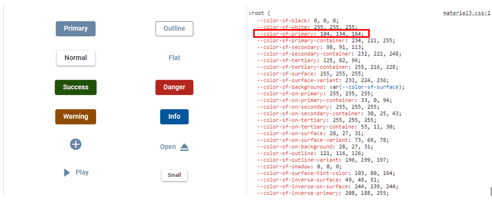
var colorSFPrimary = '104, 134, 164';
root.style.setProperty('--color-sf-primary', colorSFPrimary);<!DOCTYPE html><html lang="en"><head>
<title>EJ2 Material3</title>
<meta charset="utf-8">
<meta name="viewport" content="width=device-width, initial-scale=1.0">
<meta name="description" content="Typescript Grid Control">
<meta name="author" content="Syncfusion">
<link href="./index.css" rel="stylesheet">
<link href="https://cdn.syncfusion.com/ej2/34.1.29/material3.css" rel="stylesheet">
<script src="https://cdn.syncfusion.com/ej2/34.1.29/dist/ej2.min.js" type="text/javascript"></script>
<script src="https://cdnjs.cloudflare.com/ajax/libs/systemjs/0.19.38/system.js"></script>
<script src="systemjs.config.js"></script>
</head>
<body>
<div id='container'>
<button id='element'></button>
</div>
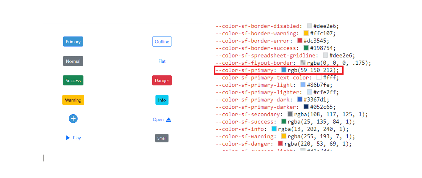
</body></html>Default Material 3 primary value
Customized Material 3 primary value
Example for Fluent 2 customization using JavaScript.
import { Button } from '@syncfusion/ej2-buttons';
import { enableRipple } from '@syncfusion/ej2-base';

enableRipple(true);

// Initialize the Button component.
let button: Button = new Button({ content: 'Button', cssClass: 'e-primary' });

// Render initialized button.
button.appendTo('#element');

var root = document.documentElement;
var colorSFPrimary = '#8d969e';
root.style.setProperty('--color-sf-primary', colorSFPrimary);
<!DOCTYPE html><html lang="en"><head>
<title>EJ2 Fluent2</title>
<meta charset="utf-8">
<meta name="viewport" content="width=device-width, initial-scale=1.0">
<meta name="description" content="Typescript Grid Control">
<meta name="author" content="Syncfusion">
<link href="./index.css" rel="stylesheet">
<link href="https://cdn.syncfusion.com/ej2/34.1.29/fluent2.css" rel="stylesheet">
<script src="https://cdn.syncfusion.com/ej2/34.1.29/dist/ej2.min.js" type="text/javascript"></script>
<script src="https://cdnjs.cloudflare.com/ajax/libs/systemjs/0.19.38/system.js"></script>
<script src="systemjs.config.js"></script>
</head>
<body>
<div id='container'>
<button id='element'></button>
</div>
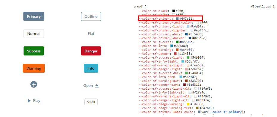
</body></html>Default Fluent 2 primary value

Customized Fluent 2 primary value
Example for Bootstrap 5.3 customization using JavaScript.
import { Button } from '@syncfusion/ej2-buttons';
import { enableRipple } from '@syncfusion/ej2-base';

enableRipple(true);

// Initialize the Button component.
let button: Button = new Button({ content: 'Button', cssClass: 'e-primary' });

// Render initialized button.
button.appendTo('#element');

var root = document.documentElement;
var colorSFPrimary = '#8d969e';
root.style.setProperty('--color-sf-primary', colorSFPrimary);
<!DOCTYPE html><html lang="en"><head>
<title>EJ2 Bootstrap5.3</title>
<meta charset="utf-8">
<meta name="viewport" content="width=device-width, initial-scale=1.0">
<meta name="description" content="Typescript Grid Control">
<meta name="author" content="Syncfusion">
<link href="./index.css" rel="stylesheet">
<link href="https://cdn.syncfusion.com/ej2/34.1.29/bootstrap5.3.css" rel="stylesheet">
<script src="https://cdn.syncfusion.com/ej2/34.1.29/dist/ej2.min.js" type="text/javascript"></script>
<script src="https://cdnjs.cloudflare.com/ajax/libs/systemjs/0.19.38/system.js"></script>
<script src="systemjs.config.js"></script>
</head>
<body>
<div id='container'>
<button id='element'></button>
</div>
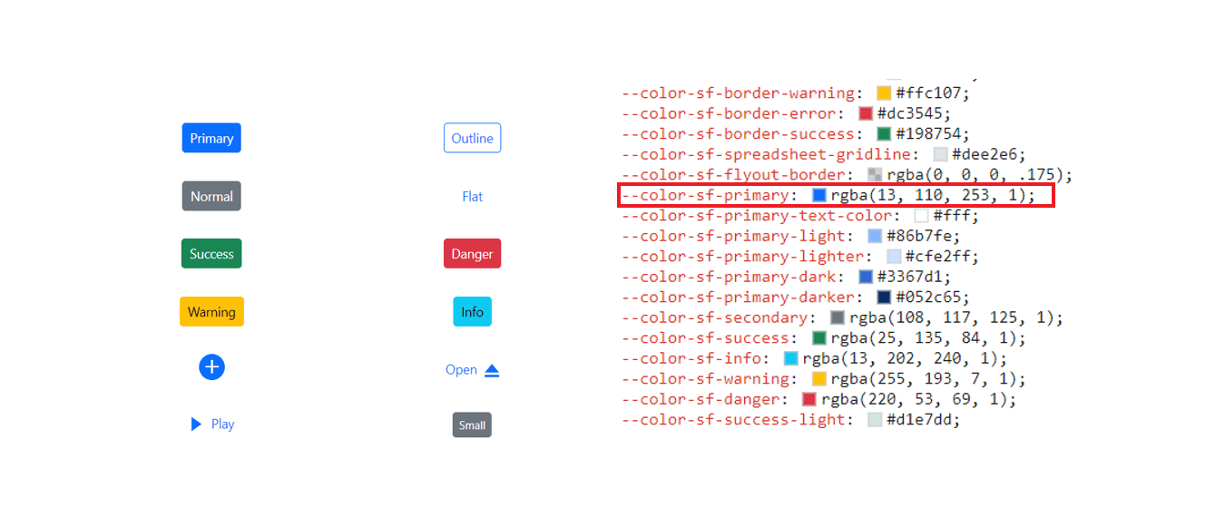
</body></html>Default Bootstrap 5.3 primary value
Customized Bootstrap 5.3 primary value
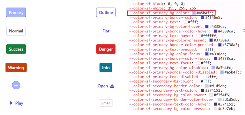
Example for Tailwind 3.4 customization using JavaScript.
import { Button } from '@syncfusion/ej2-buttons';
import { enableRipple } from '@syncfusion/ej2-base';

enableRipple(true);

// Initialize the Button component.
let button: Button = new Button({ content: 'Button', cssClass: 'e-primary' });

// Render initialized button.
button.appendTo('#element');

var root = document.documentElement;
var colorSFPrimaryBgColor = '#a5b4fc';
root.style.setProperty('--color-sf-primary-bg-color', colorSFPrimaryBgColor);
<!DOCTYPE html><html lang="en"><head>
<title>EJ2 Tailwind3</title>
<meta charset="utf-8">
<meta name="viewport" content="width=device-width, initial-scale=1.0">
<meta name="description" content="Typescript Grid Control">
<meta name="author" content="Syncfusion">
<link href="./index.css" rel="stylesheet">
<link href="https://cdn.syncfusion.com/ej2/34.1.29/tailwind3.css" rel="stylesheet">
<script src="https://cdn.syncfusion.com/ej2/34.1.29/dist/ej2.min.js" type="text/javascript"></script>
<script src="https://cdnjs.cloudflare.com/ajax/libs/systemjs/0.19.38/system.js"></script>
<script src="systemjs.config.js"></script>
</head>
<body>
<div id='container'>
<button id='element'></button>
</div>
</body></html>Default Tailwind 3.4 primary value
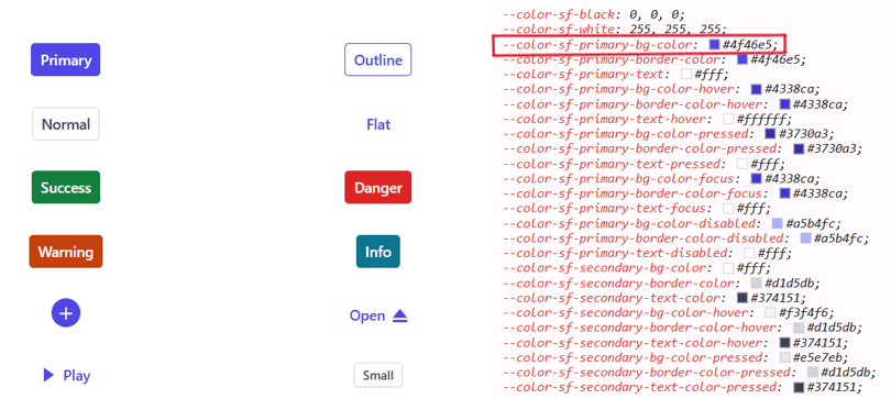
Customized Tailwind 3.4 primary value
With this CSS variable support, you can effortlessly customize the color variable values for Syncfusion® JavaScript controls.
Switching Light and Dark mode with CSS variables
Switching between modes has become easier with the updated modern themes, which offer Light and Dark variants. In all themes, there are distinct class variables for light and dark modes in a single file, providing flexibility for seamless switching between the two modes within your application.
import { Button, CheckBox } from '@syncfusion/ej2-buttons';

var checkBoxObj = new CheckBox({ label: 'Enable DarkMode', change: onDarkMode });
checkBoxObj.appendTo('#darkmode');

function onDarkMode(e: any) {
    e.checked ? document.body.classList.add('e-dark-mode') : document.body.classList.remove('e-dark-mode');
}
var btnObj = new Button({ isPrimary: true });
    btnObj.appendTo('#normal4');
    btnObj = new Button({ cssClass: 'e-success' });
    btnObj.appendTo('#normal5');
    btnObj = new Button({ cssClass: 'e-info' });
    btnObj.appendTo('#normal6');
    btnObj = new Button({ cssClass: 'e-warning' });
    btnObj.appendTo('#normal7');
    btnObj = new Button({ cssClass: 'e-danger' });
    btnObj.appendTo('#normal8');
<!DOCTYPE html><html lang="en"><head>
<title>EJ2 Material3</title>
<meta charset="utf-8">
<meta name="viewport" content="width=device-width, initial-scale=1.0">
<meta name="description" content="Typescript Grid Control">
<meta name="author" content="Syncfusion">
<link href="./index.css" rel="stylesheet">
<link href="https://cdn.syncfusion.com/ej2/34.1.29/material3.css" rel="stylesheet">
<script src="https://cdn.syncfusion.com/ej2/34.1.29/dist/ej2.min.js" type="text/javascript"></script>
<script src="https://cdnjs.cloudflare.com/ajax/libs/systemjs/0.19.38/system.js"></script>
<script src="systemjs.config.js"></script>
</head>
<body>
<div id="container">
<div style="padding: 10px; display: inline-block;">
<input id="darkmode" type="checkbox" />
</div>
<div class="frame">
<table id="basic-button">
<tbody>
<tr>
<td><button id="normal4">Button</button></td>
<td><button id="normal5">Button</button></td>
<td><button id="normal6">Button</button></td>
<td><button id="normal7">Button</button></td>
<td><button id="normal8">Button</button></td>
</tr>
</tbody>
</table>
</div>
</div>
</body></html>Mode switching in Fluent 2 theme
Similar to Material 3, we offer both Light and Dark variants with Fluent 2. In the Fluent 2 theme, there are distinct class variables for light and dark modes, as shown in the preview below.
import { Button, CheckBox } from '@syncfusion/ej2-buttons';

var checkBoxObj = new CheckBox({ label: 'Enable DarkMode', change: onDarkMode });
checkBoxObj.appendTo('#darkmode');

function onDarkMode(e: any) {
    e.checked ? document.body.classList.add('e-dark-mode') : document.body.classList.remove('e-dark-mode');
}
var btnObj = new Button({ isPrimary: true });
    btnObj.appendTo('#normal4');
    btnObj = new Button({ cssClass: 'e-success' });
    btnObj.appendTo('#normal5');
    btnObj = new Button({ cssClass: 'e-info' });
    btnObj.appendTo('#normal6');
    btnObj = new Button({ cssClass: 'e-warning' });
    btnObj.appendTo('#normal7');
    btnObj = new Button({ cssClass: 'e-danger' });
    btnObj.appendTo('#normal8');
<!DOCTYPE html><html lang="en"><head>
<title>EJ2 Material3</title>
<meta charset="utf-8">
<meta name="viewport" content="width=device-width, initial-scale=1.0">
<meta name="description" content="Typescript Grid Control">
<meta name="author" content="Syncfusion">
<link href="./index.css" rel="stylesheet">
<link href="https://cdn.syncfusion.com/ej2/34.1.29/fluent2.css" rel="stylesheet">
<script src="https://cdn.syncfusion.com/ej2/34.1.29/dist/ej2.min.js" type="text/javascript"></script>
<script src="https://cdnjs.cloudflare.com/ajax/libs/systemjs/0.19.38/system.js"></script>
<script src="systemjs.config.js"></script>
</head>
<body>
<div id="container">
<div style="padding: 10px; display: inline-block;">
<input id="darkmode" type="checkbox" />
</div>
<div class="frame">
<table id="basic-button">
<tbody>
<tr>
<td><button id="normal4">Button</button></td>
<td><button id="normal5">Button</button></td>
<td><button id="normal6">Button</button></td>
<td><button id="normal7">Button</button></td>
<td><button id="normal8">Button</button></td>
</tr>
</tbody>
</table>
</div>
</div>
</body></html>Mode switching in Bootstrap 5.3 theme
Similar to Material 3, we offer both Light and Dark variants with Bootstrap 5.3. In the Bootsrap 5.3 theme, there are distinct class variables for light and dark modes, as shown in the preview below.
import { Button, CheckBox } from '@syncfusion/ej2-buttons';

var checkBoxObj = new CheckBox({ label: 'Enable DarkMode', change: onDarkMode });
checkBoxObj.appendTo('#darkmode');

function onDarkMode(e: any) {
    e.checked ? document.body.classList.add('e-dark-mode') : document.body.classList.remove('e-dark-mode');
}
var btnObj = new Button({ isPrimary: true });
    btnObj.appendTo('#normal4');
    btnObj = new Button({ cssClass: 'e-success' });
    btnObj.appendTo('#normal5');
    btnObj = new Button({ cssClass: 'e-info' });
    btnObj.appendTo('#normal6');
    btnObj = new Button({ cssClass: 'e-warning' });
    btnObj.appendTo('#normal7');
    btnObj = new Button({ cssClass: 'e-danger' });
    btnObj.appendTo('#normal8');
<!DOCTYPE html><html lang="en"><head>
<title>EJ2 Bootstrap5.3</title>
<meta charset="utf-8">
<meta name="viewport" content="width=device-width, initial-scale=1.0">
<meta name="description" content="Typescript Grid Control">
<meta name="author" content="Syncfusion">
<link href="./index.css" rel="stylesheet">
<link href="https://cdn.syncfusion.com/ej2/34.1.29/bootstrap5.3.css" rel="stylesheet">
<script src="https://cdn.syncfusion.com/ej2/34.1.29/dist/ej2.min.js" type="text/javascript"></script>
<script src="https://cdnjs.cloudflare.com/ajax/libs/systemjs/0.19.38/system.js"></script>
<script src="systemjs.config.js"></script>
</head>
<body>
<div id="container">
<div style="padding: 10px; display: inline-block;">
<input id="darkmode" type="checkbox" />
</div>
<div class="frame">
<table id="basic-button">
<tbody>
<tr>
<td><button id="normal4">Button</button></td>
<td><button id="normal5">Button</button></td>
<td><button id="normal6">Button</button></td>
<td><button id="normal7">Button</button></td>
<td><button id="normal8">Button</button></td>
</tr>
</tbody>
</table>
</div>
</div>
</body></html>Mode switching in Tailwind 3.4 theme
Similar to Material 3, we offer both Light and Dark variants with Tailwind 3.4. In the Tailwind 3.4 theme, there are distinct class variables for light and dark modes, as shown in the preview below.
import { Button, CheckBox } from '@syncfusion/ej2-buttons';

var checkBoxObj = new CheckBox({ label: 'Enable DarkMode', change: onDarkMode });
checkBoxObj.appendTo('#darkmode');

function onDarkMode(e: any) {
    e.checked ? document.body.classList.add('e-dark-mode') : document.body.classList.remove('e-dark-mode');
}
var btnObj = new Button({ isPrimary: true });
    btnObj.appendTo('#normal4');
    btnObj = new Button({ cssClass: 'e-success' });
    btnObj.appendTo('#normal5');
    btnObj = new Button({ cssClass: 'e-info' });
    btnObj.appendTo('#normal6');
    btnObj = new Button({ cssClass: 'e-warning' });
    btnObj.appendTo('#normal7');
    btnObj = new Button({ cssClass: 'e-danger' });
    btnObj.appendTo('#normal8');
<!DOCTYPE html><html lang="en"><head>
<title>EJ2 Tailwind3</title>
<meta charset="utf-8">
<meta name="viewport" content="width=device-width, initial-scale=1.0">
<meta name="description" content="Typescript Grid Control">
<meta name="author" content="Syncfusion">
<link href="./index.css" rel="stylesheet">
<link href="https://cdn.syncfusion.com/ej2/34.1.29/tailwind3.css" rel="stylesheet">
<script src="https://cdn.syncfusion.com/ej2/34.1.29/dist/ej2.min.js" type="text/javascript"></script>
<script src="https://cdnjs.cloudflare.com/ajax/libs/systemjs/0.19.38/system.js"></script>
<script src="systemjs.config.js"></script>
</head>
<body>
<div id="container">
<div style="padding: 10px; display: inline-block;">
<input id="darkmode" type="checkbox" />
</div>
<div class="frame">
<table id="basic-button">
<tbody>
<tr>
<td><button id="normal4">Button</button></td>
<td><button id="normal5">Button</button></td>
<td><button id="normal6">Button</button></td>
<td><button id="normal7">Button</button></td>
<td><button id="normal8">Button</button></td>
</tr>
</tbody>
</table>
</div>
</div>
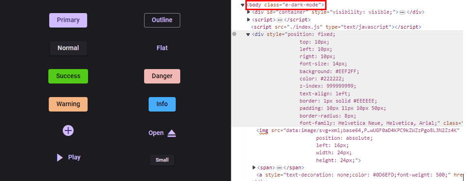
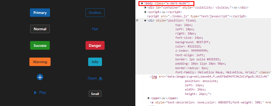
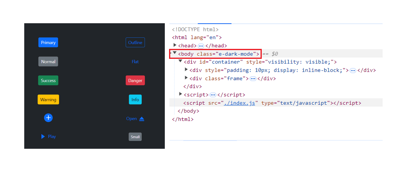
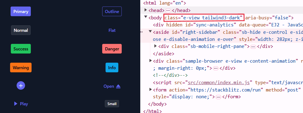
</body></html>How to switch dark mode?
To activate dark mode, just append the e-dark-mode class to the body section of your application for Material 3, Fluent 2, Bootstrap 5.3 and Tailwind 3.4 themes. Once applied, the theme seamlessly switches to dark mode. Please refer to the example image below for visual guidance.
Material 3 dark mode
Fluent 2 dark mode
Bootstrap5.3 dark mode
Tailwind 3.4 dark mode
ThemeStudio Application
The ThemeStudio application now includes seamless integration with the Material 3, Fluent 2, Bootstrap 5.3 and Tailwind 3.4 themes, offering a comprehensive solution for customization requirements. This enhancement enables users to effortlessly customize and personalize their themes.
Access the Syncfusion® ThemeStudio application at: Syncfusion® ThemeStudio